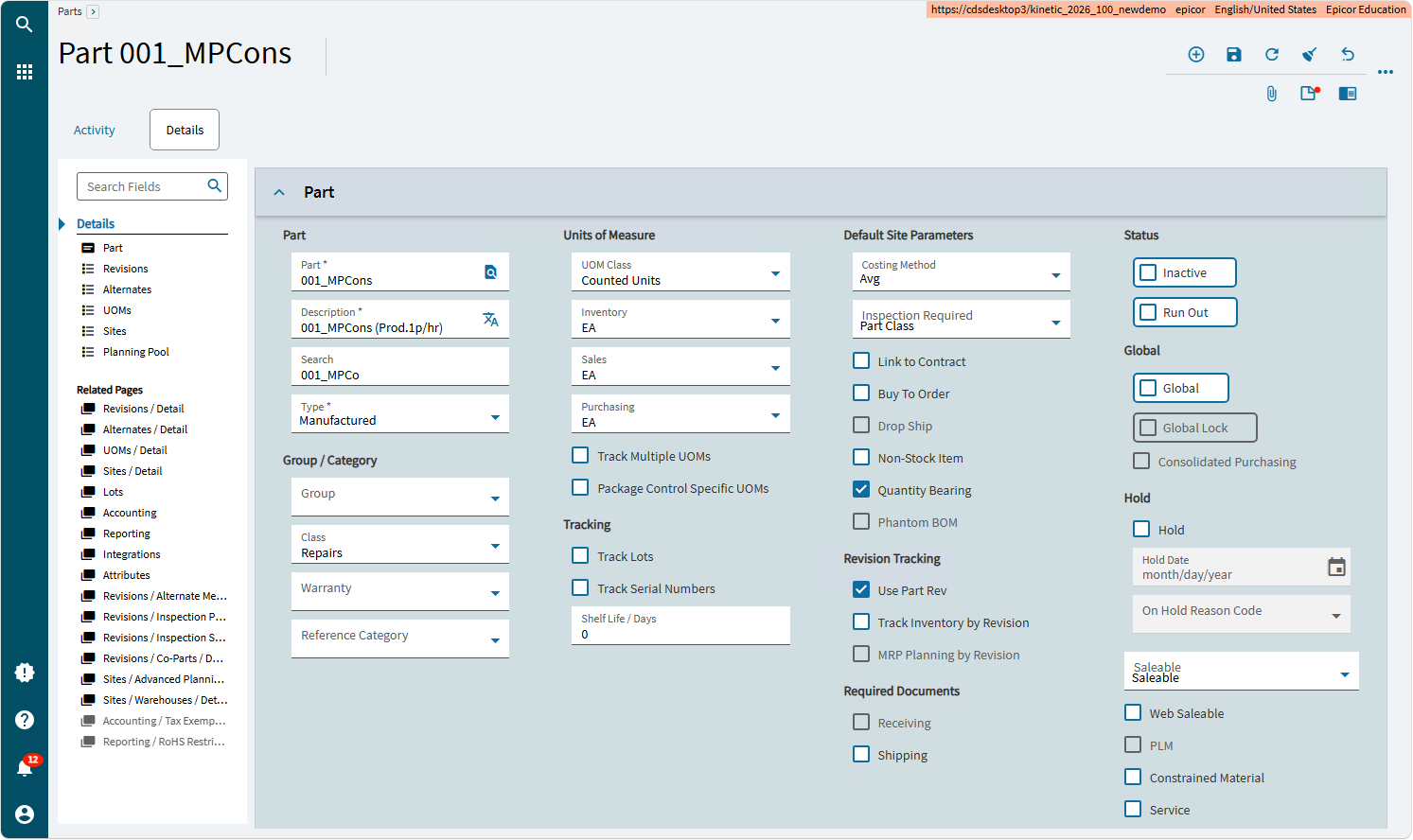
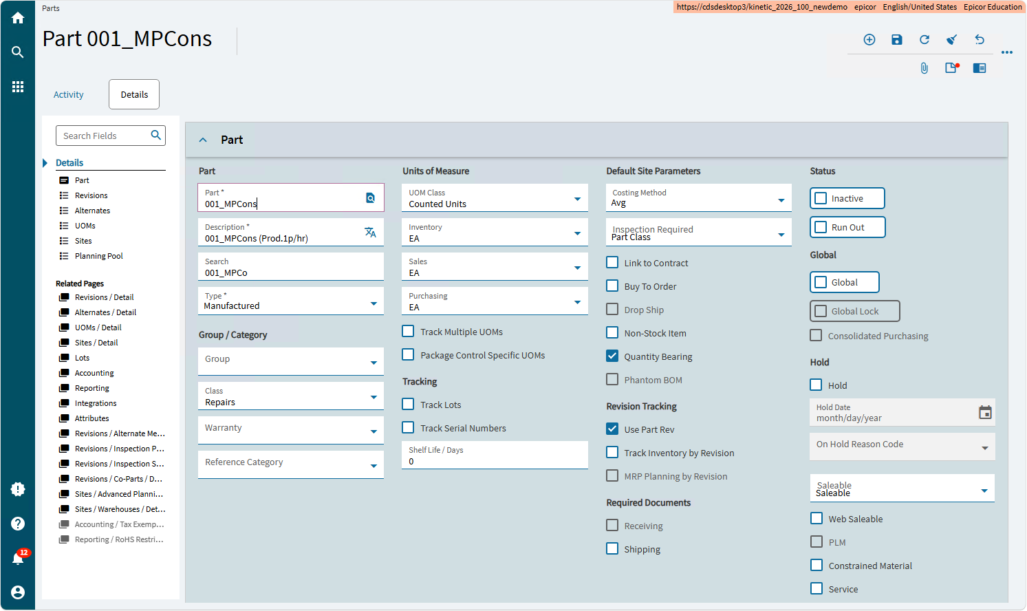
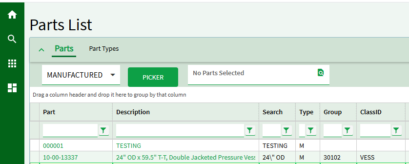
Since it seems Kinetic 2026.100 is now available on EpicWeb for all, and I know many of you also don’t like lots of padding, wasted space on Kinetic UIs, and misaligned controls, I figured that the below hack might be of interest/use:
Please note: Not supported. Please only do at ones own risk after a backup etc..
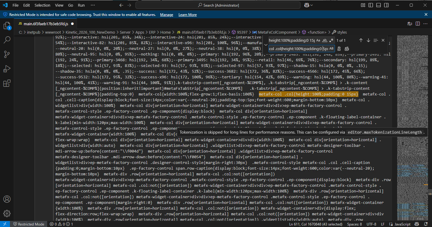
File to edit: “Server\Apps\ERP\Home\main.6f3faeb17b3eb5fd.js”
Text to replace: metafx-col .col{height:100%;padding:0 15px}
New Text: metafx-col .col{height:100%;padding:0 5px}
PS: I don’t know why Epicor have taken a major step backwards here (returning to excessive padding). It has been reported as an issue and hopefully it will be fixed soon. But in the meantime, for those wanting to start experimenting with Kinetic 2026.100, I hope this helps.
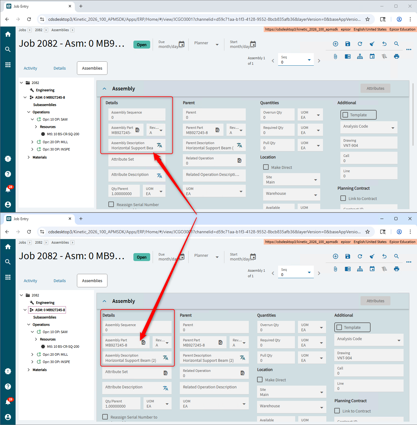
Yeah, the above example was not the best. Within our Advanced Project Management solution, we have some fairly dense Kinetic UIs and see the impact of padding a lot more, but I wanted to provide a more generic example.
The most common standard Kinetic forms where I find the padding the most annoying generally involve ID, description, and notes fields being unnecessarily cut off like the below: