I need to add a new group box and field to the Job Entry. There isn’t a lot of room. Is there a way to move the grid view on the bottom down? I can’t seem to find how to lower it to make room.

I think many people here have had bad things happen when so much as touching those bottom grids. I had to rebuild an entire customisation on Order Entry once after daring to move the grid. Epicor are doing some very strange things with the anchoring, and it just breaks.
My advice - don’t touch it!
I would probably go with @markdamen’s advice though and not touch it if you can find another way around. I just reopened that customization to see how it works, and the anchoring is indeed jacked up.
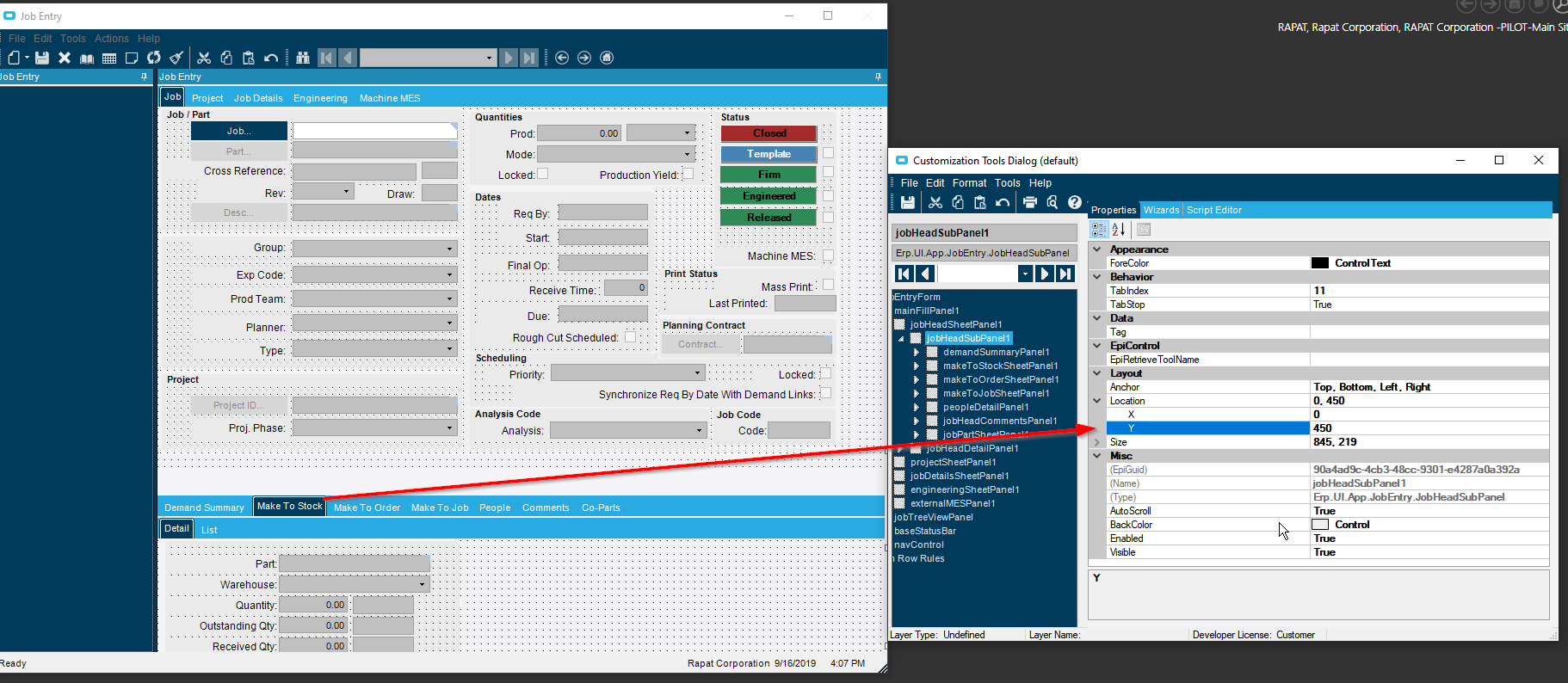
FYI, I ALWAYS update the customization in Customization Maintenance and delete EVERY
AnchorHeight
AnchorWidth
AnchorLeft
AnchorTop
I recommend identifying fields you don’t use and hiding them (setting field’s extended property IsHidden to true is more reliable than setting control’s Visible prop to false) to free up space, as well as shortening controls that rarely or never use the full length. You may have to rearrange more group boxes to maintain a logical flow of information, but you can squeeze room out.
Just warn your users that when they inevitably ask for additional custom fields, you’ll eventually have to overhaul the whole form! (I wound up chopping a screenshot into pieces in an image editor, so I could move pieces around like a layout editor for a newspaper. Nearly everything is in a new place now, but by god they fit.)

We have done it multiple ways including moving the lower grid control (without problem so far  ) and we’ve added a TAB to the whole form and called it “Our Data”. It’s not the best for quick data entry and ‘flow’, but it’s the easiest thing to maintain and upgrade with. And honestly, our users just accepted it as ‘best practice’.
We also add another tab and it is a clean way to upgrade. The few fields that I do have on the main screens are always in the same empty spot Epicor chooses when they add a new field.
I wish. My users lack object permanency. If important information isn’t immediately visible, they will forget it’s something they need to check. Then I’ll get a request for a customization that flashes the tab in bright colors if they move their cursor over the “Release” checkbox, to remind them.