Good morning,
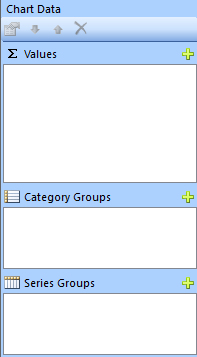
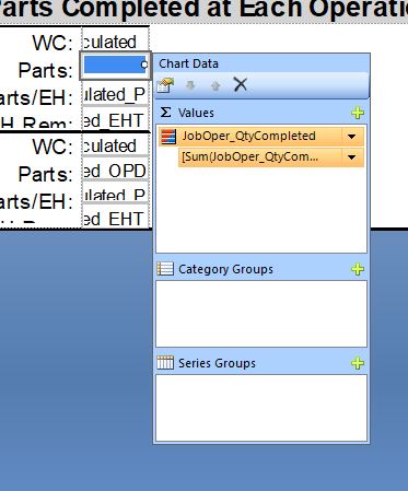
I am playing with some visualization options in the Microsoft Report Builder. I would like to insert a Data Bar inside my tablix. I can’t figure out which property assigns the value to the data bar. I have set its maximum to the total quantity pf parts on the assembly, and I would like the value of the bar to reflect the number of completed parts. The data in my report works fine, but I would like to see a quick visual of how far along the op is using a bar of some kind. I started with charts, but then found the data bar.
Can anyone say how to set the value to particular fields for data bars, or charts?
Thank you for your time!
Nate
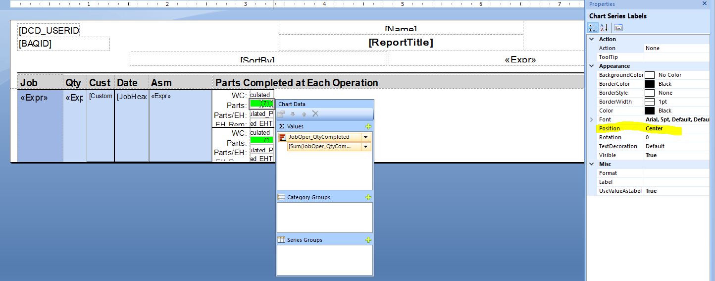
Do you know how to show the value of the data bar inside the data bar, as like a label? When I added labels it seems like it added the axis labels instead of the value label.
I had set the font too big so it wasn’t visible in the tiny box I had it in.
For the record: go to the data bar, click on the value bar, go to properties > labels, and make sure the font size is good.
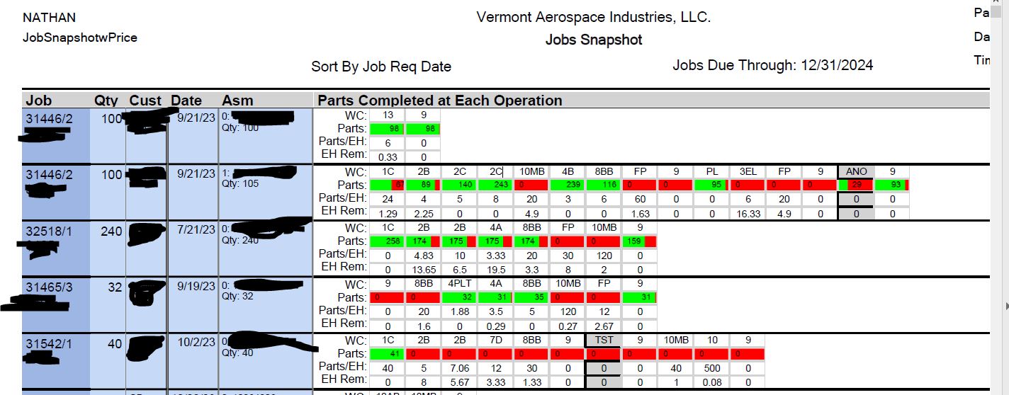
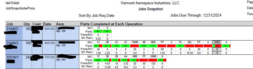
And here is the output report, showing the labels are all over the place. I think there must be something funky with the way data bars show the value label.
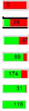
I want my labels to stay either left aligned, or center aligned. It seems like the 0s go to the left, and other values go to the right, except not always…
Looks like the labels are starting in the red… and as the green grows they push out. Then once the green is large enough the flip inside the green, and then follow the right edge of the green bar as it grows.
Not sure if there is a setting to change that behavior. If anything there could be a gap distance setting between the label and the moving bar edge.
… actually, based on the 3rd one below… it looks like the label may flip once it runs out of room in the red. There’s obviously enough room in the green for that label. So, yeah, perhaps it is when it runs out of room in the red, it flips into the green.
Right? It is very confusing! I am not finding the options I need so I am changing a few things and testing. So far not much makes a difference to where that label shows.
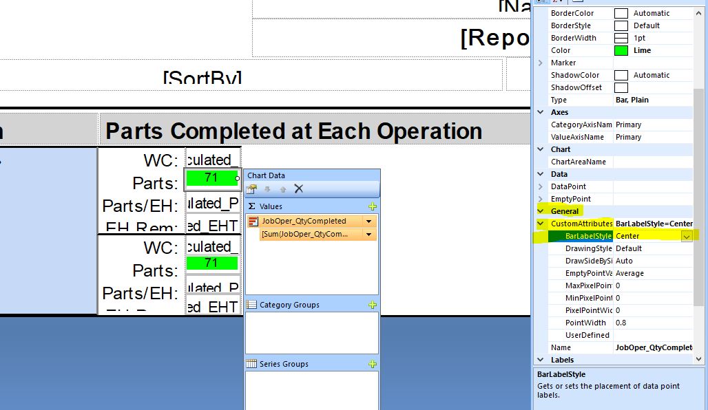
I found in the properties under General > Custom Attributes > BarLabelStyle can be set to center.
That did the trick! Mostly. My 0 values are still going to the left, but at least it is consistent!
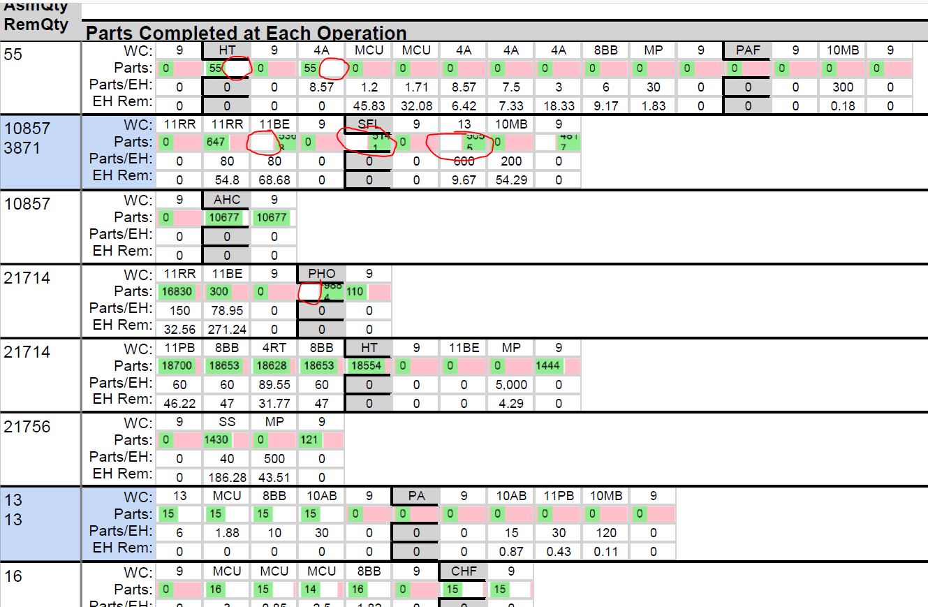
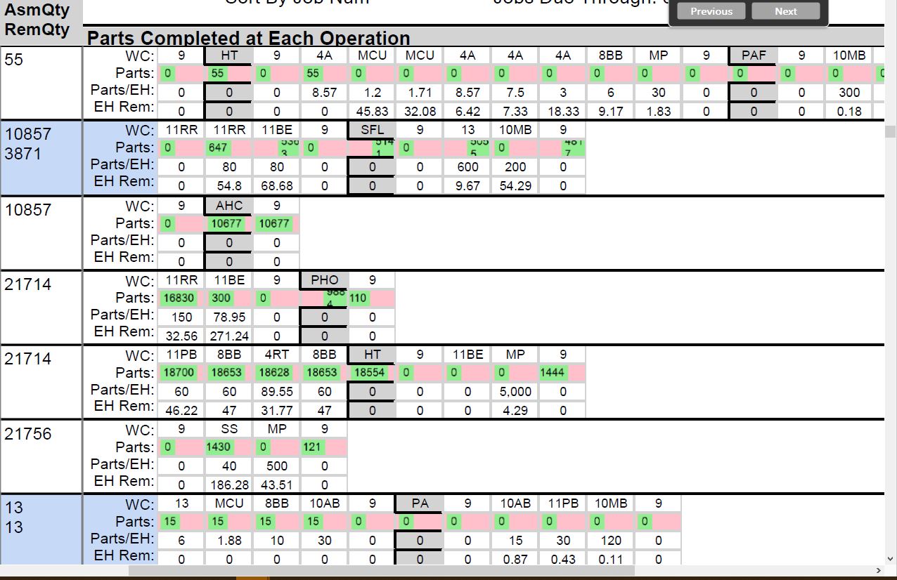
Here you can see that my pink cell background is not staying consistent. And sometimes the green data bar gets squished. As you can see in the example, it seems to be able to display the data just like I want.
See the sections that are not circled in red. I want the pink background to be the default, and the only thing that is visible if the count is 0. Then I want the green bar to grow until the pink is covered when the value is at 100%. I don’t want to see any white bars inside those cells that should be either pink or green (or some combination).
The settings for creating charts in report builder are very terse. Has anyone had any luck working on a report like this?
I have attached it here in case you can look at it, but I doubt you can run it without the BAQ in place. JobSnapshotPric.rdl (149.0 KB)
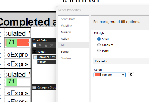
It’s really buried in there. Click on one of the DataBars, to see the properties on the right side. Find the ChartArea Collection and look inside that. From there, look at the BackgroundColor that I set to pink.
I was just curious, if you want the pink to always be there as the default… could you just set the background color to the default and let the green label grow in front of it?
I’ve barely scratched the surface with building charts in my reports, so, completely talking out of ignorance here.
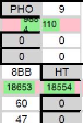
Comparing that image with the one you posted earlier, it looks like the green bars didn’t change at all. So, if they are growing “in unexpected ways”, I feel like that was happening regardless of that change.
Yes, that’s true. I should have said they are STILL growing in weird ways. I have no idea why the bar sometimes gets pushed all the way to the right and wraps the text inside. It clearly is able to show a big number. It seems like it happens when the data value is near the full amount.
I deleted my databar and started over. I tried a few approaches using stacked databars, full charts, and some options in between.
In the end I got this working. I used a single databar, and set the background color of the chart to pink.
Here is the updated RDL if you are interested. I still feel like I got to the solution through trial and error. I don’t really understand what I did differently.