I am looking for a way to visualize how much inventory we have in our yards. An inventory map if you will.
Ops says we have room for 3000 more pallets based on 16,000 PL yard capacity and Epicor says we have 13,000 in inventory. Yard manager says, no only if you produce the stuff we’re short on otherwise you’re burying product behind other product. Sales doesn’t understand why we can’t just stock everything.
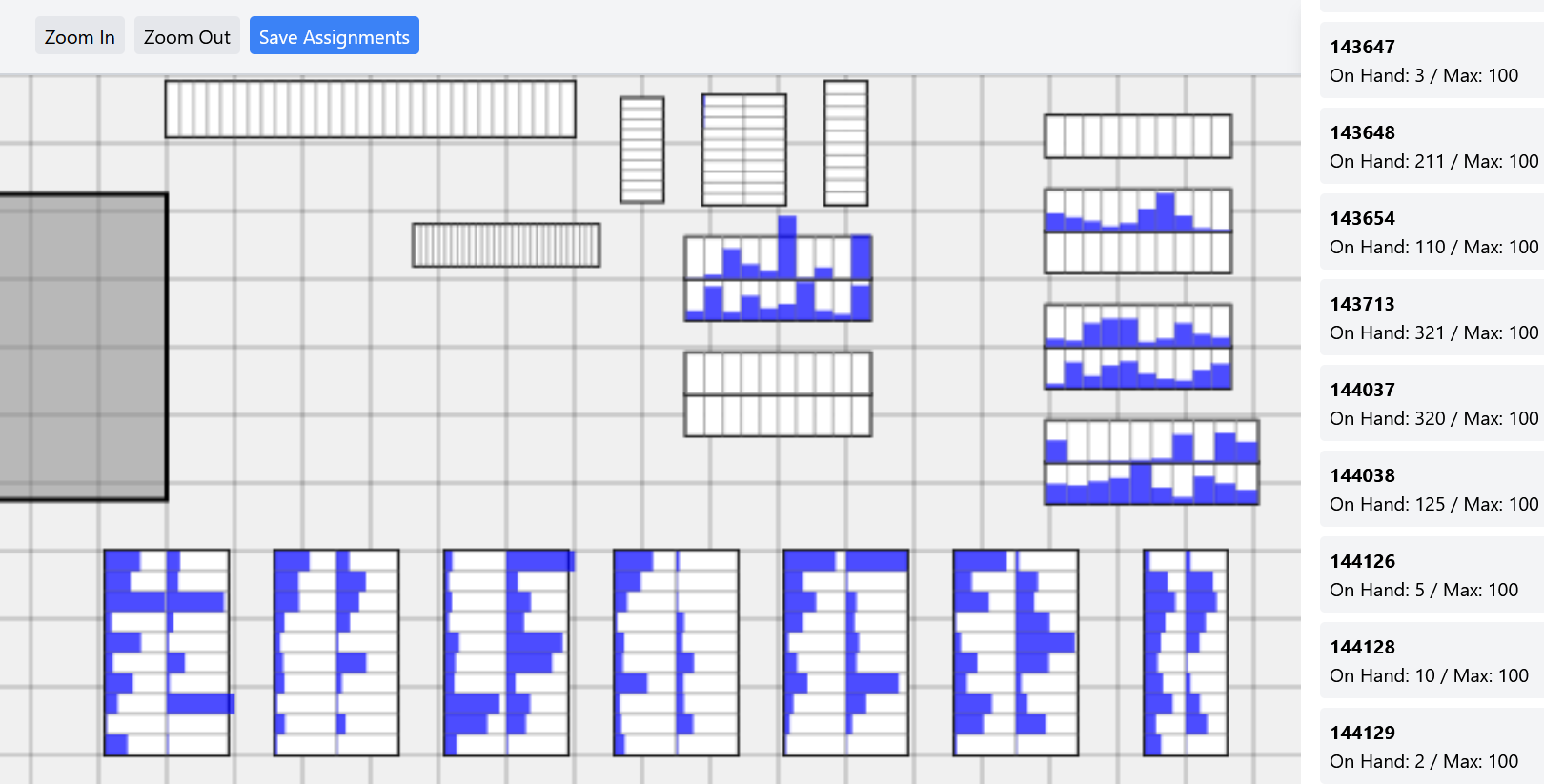
So based on this issue i started talking with Grok (xAI) and had it make both python and now this html map of different ‘Bins’ that i could place, some fill horizontally some fill vertically, some are double column/row, some are single column/row etc. Then i can load a csv file of my inventory and how many PL we have on hand and drop it into each slot. The right hand side is product left to be placed in the yard. That lists gets smaller as you move product into the slots.
The idea is this shows how full the yard is, or how empty it is for some products. How producing or adding another product to ‘stock’ without actually thinking about where it’s going to go. If all slots are assigned and stocked with product i don’t know where you’re going to put an additional 100 PL of a new product without removing something.
This proof of concept has been very well received so i’m onto something here. Is anyone using or know of good software that does this, it would be awesome to have this connected directly to Epicor through API so it could be live data. That sort of stuff is far above my knowledge level.
I’d love to have several variants, current inventory, min/max levels, current - demand, current + production, current - demand + production etc etc etc.
Getting data from the API with epicor is an immensely satisfying feeling of freedom. It feels like you get control back from the database to some extent. We can help get you there. For us the easiest way to get the data is with Excel. That may work nicely with your HTML and Python, or it may need a few tweaks.
Think about it like this, if you can make a BAQ that shows the data, and you can use that BAQ in an excel spreadsheet to populate your HTML, then we can help you get your data from Epicor into Excel to make that happen. Since you are already using AI to help, you know how to ask the right questions. Ask it to help you modify the mcode if you need special grouping, or other summary data.
Here is my mcode template that has been working great. You have to setup the API key and access scope in Epicor first. And assign your BAQ to the access scope. But once you do it is not too hard. Not like trying to make a BAQ in Kinetic!
The ‘Save Assignments’ button creates a csv save file for the inventory locations you’ve assigned to each product so that you don’t have to repeat the process each time, you can just load that file and it’ll show you the data bars.
Now that doesn’t update to new inventory data but i was thinking, if you were to create UD fields on the PartPlant table for these saved ‘BinID’ and ‘RowID’ you could drag and drop to the map, assigning the products you want to stock where, create that csv file, then DMT that into Epicor, you could then make a BAQ you can pull into excel and upload updated data pretty easily. I already use refreshable queries in excel so I think that’s an easy way to go about it until i can explore APIs.
RFID’s is a neat idea but i feel like that’s a phase 3-4
We are pretty unsophisticated and only use 1 warehouse per plant and 1 bin per warehouse so UD fields in my case would be required. This exercise also has helped me realize what i’m doing by assigning bins to each product is basically what would be needed for Mobile Warehouse or whatever it may be called now. That was a dream a few years back but we are not in a position currently to explore it.
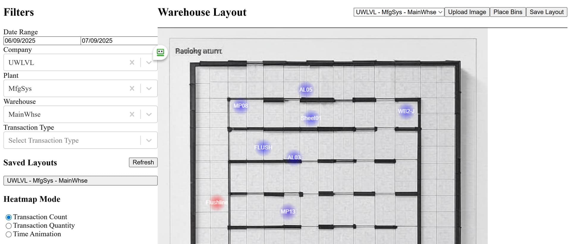
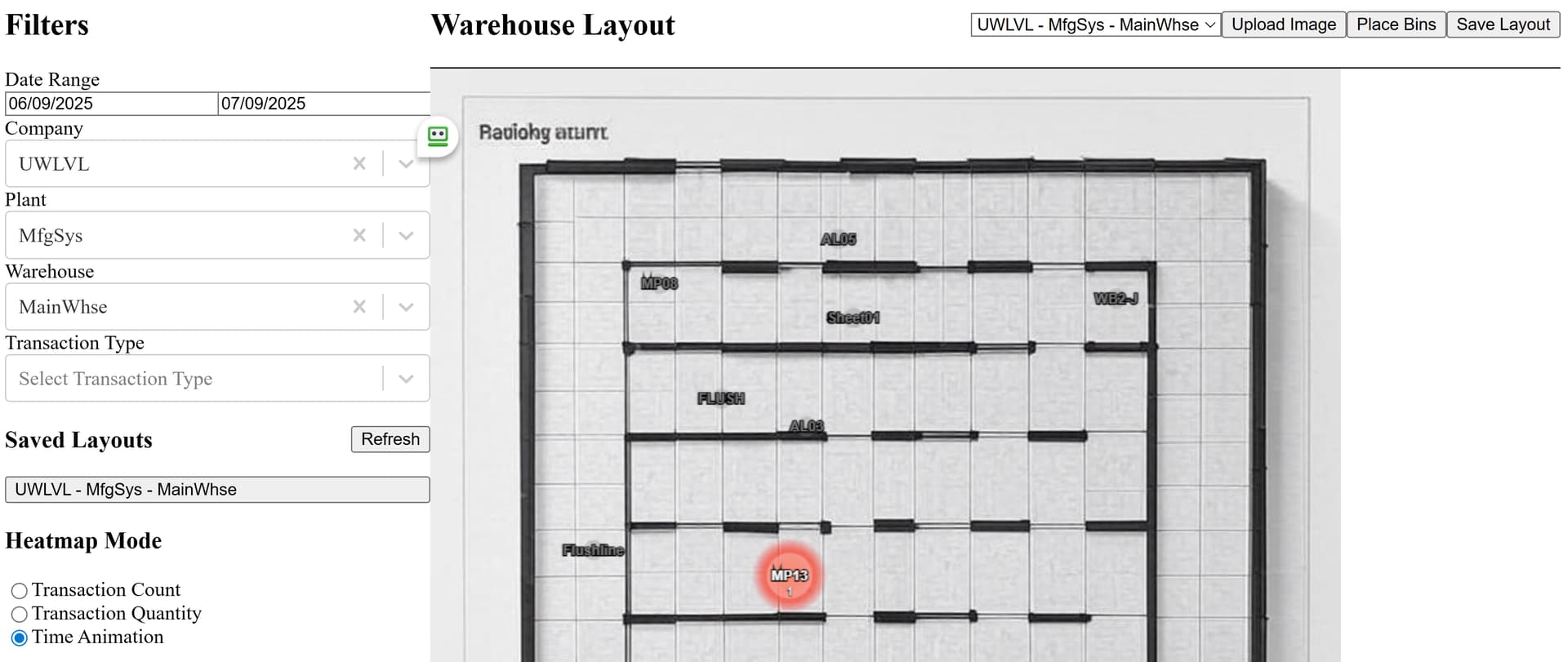
In a similar vein, I seem to recall that the advanced version of Epicor Data Discovery (EDD) was able to do a heat map of transactions on top of an image of the floor. So, this may exist in some way with the paid version of EDD. Please correct me if I misremembered. It was Insights 2022 IIRC.
Interesting, how does it map transactions? Something like MES location for production, or barcode scanning for the yard? We don’t do material request queue and no scanning inventory in/out on the yard.
I can’t find any documentation online, but EDD Advanced allowed image overlays around the web. I can’t upload a screenshot at the moment, but I found an example here:
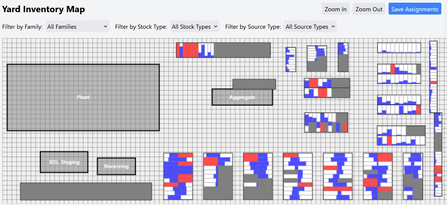
Wanted to share my progress on this idea.
On the inventory visualization side
Grey cells are empty, no product has been assigned to them. When they were all white/blank it was hard to tell what was unused and what was just empty.
Red cells are overfull, either encroaching into the yard aisle, or some of that product has gone to an ‘overfill’ area. This probably still needs more thought) but tells you we have more of that product currently than we have assigned space.
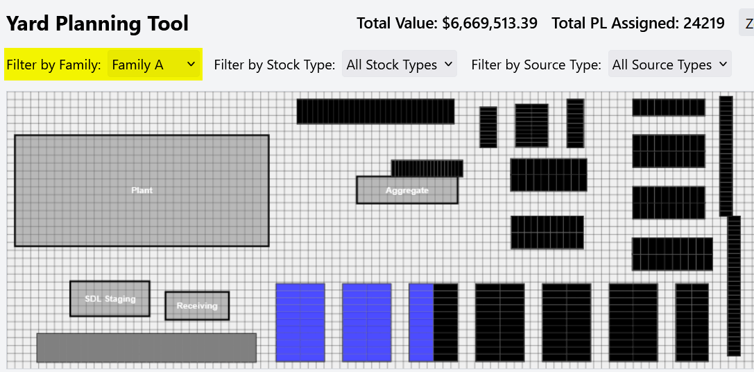
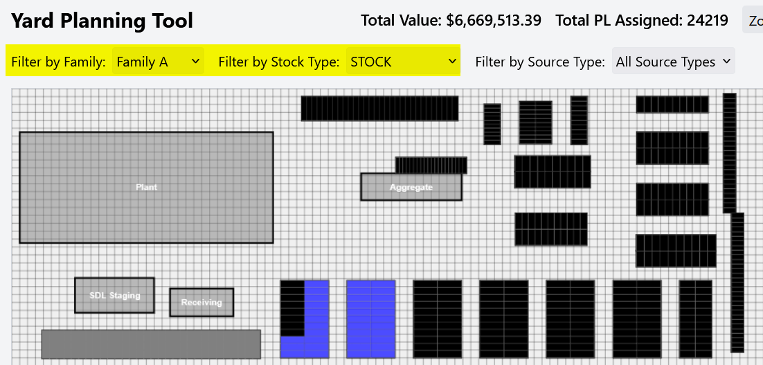
Added filters at the top to sort by families/stock type/source type. Helps identify which product is being produced in that plant and which is being transferred in.
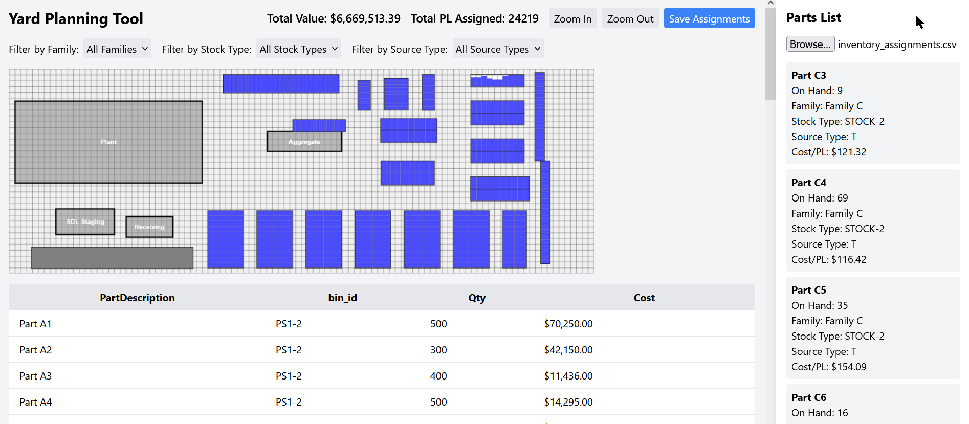
Then i went in a different direction because i needed a way not to visualize current inventory but what i really wanted to use this for was yard planning. Get our executive team making a decision on what to stock instead of trying to stock everything. I will debut this later this week as we begin our annual ‘Product Planning’ meetings. Some additions here that are not yet in the ‘Inventory Visualization’ version.
Total Value in $. As part of my query i have a cost/PL calculation included per part (costs changed for privacy). Value increases and decreases as you add/remove product based on the qty you input for each bin, not the value of the OnHand.
Total PL assigned.
Table underneath tells me which products are assigned to which bins, how many total PL and the cost of that product. If a product is in multiple bins it will show me 2 rows, 1 for each bin.
When adding more product than a cell can hold it will fill in the next cell until it’s reached that qty or until it runs out of cells in a bin. So a bin with each cell able to hold 50 PL, adding 200 PL will fill 4 cells. If you want to reduce that to 150 PL and only use 3 cells, you can click each row/column and remove only that column.
The list on the right shrinks as you add product into the map, and if you remove a product from the map it will return to the list.
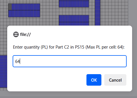
As i add product into the map a popup appears asking me how many PL i would like to place. Also tells me the qty per cell that bin can hold as this changes between bins.
Filters work together. We have ‘Made to Order’ as well as ‘Stock’ that we run extra production for efficiency so these will need a spot in the yard, this allows me to see which of that family is STOCK/MTO. This could also be any other type of UD field, style/category/class of product etc.
@DKehler this is an interesting tool, visually communicating the current state of space available. However, it appears to be finished goods. Cost needs to be based on inventory costing method, and you could overlay additional views based on demand and production counts. You have a couple of paths you could go from here in short term.
Connecting to API is not difficult. You could use a BAQ to get specific counts or use direct object with to query.
You could add camera feed links to see how it looks right now. This is not a substitute for RFID based approach but could help
Should you need further assistance or advice, please contact me directly.