Currency Box
Allows user to have the currency field displayed along with the amount. By default, the currency gets toggled as per value selected from the Currency Selector Control.
So far as I can tell, this will not do the exchange calculation for you. You will need to create events to populate each binding when the currency value changes. For instance, if you set the currency field to be $500.00 USD, you will need to have an event that converts it to Euros (or whatever) and stores it in the Currency Box’s Document Currency binding field. Then, when you switch the Currency Selector control between USD and EUR, it will toggle between each value in the Currency Box Field. This is a very manual control for setup…
| Property Group | Property | Description |
|---|---|---|
| Basic | Id | This is the control’s unique identifier |
| Basic | Label Text | Alter the display text on the button (Fig. A) |
| Behavior | On Click | Click this to create an OnClick Event. On Click is triggered when a user clicks the button. |
| Behavior | On Blur | Click this to create an OnBlur event for the control. On Blur is triggered when the control loses focus. |
| Comments | Comments | Add some developer notes to the control. These are not customer-facing and are only visible in App Studio (Fig. B) |
| Data | Key Field | Indicates that a bound component is a key field. If true, the field is enabled if there is no current record, allowing the user to select an existing record or create a new one. |
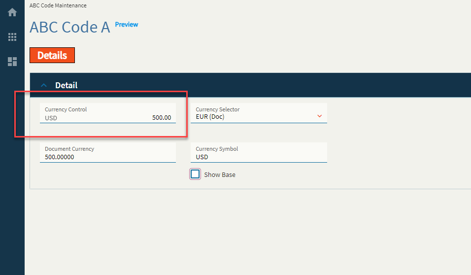
| Data | EpBinding | Bind the control to a DataView.Column. This is your Base Currency field. (All Your Base Are Belong To Us) |
| Data | Ep Binding Document | Bind the control to a DataView.Column. This is your Document Currency field. |
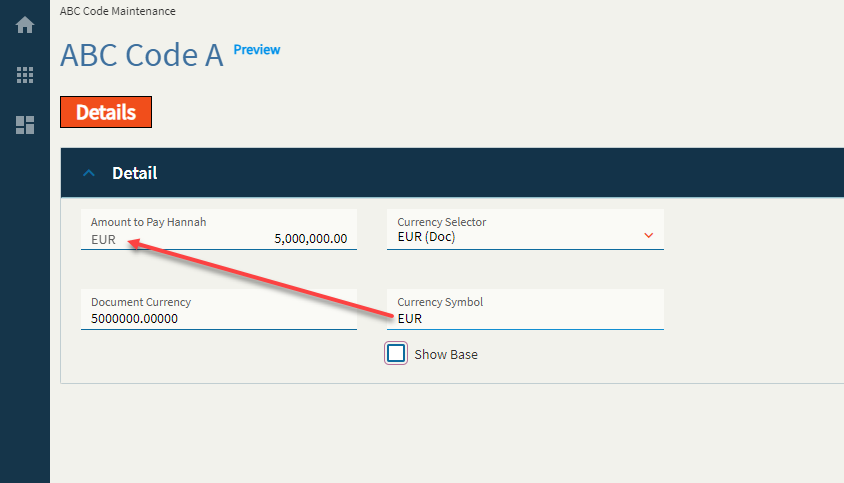
| Data | Ep Binding ShowBase | Bind the control to a DataView.Column. This is a boolean value to indicate whether or not to show the base value when the document currency is selected to be shown. (Fig. C) |
| Data | Ep Binding DocumentSymbol | This is the binding for the document currency symbol. Incidentally, when you switch the currency to base by either using ShowBase or the Currency Selector, it does not change the currency symbol, soooo you’ll likely have to wire up an event to do this yourself. Yeehaw. |
| Layout | Alignment |
 Set the alignment for the control. Valid options are Left, Center, Right. Does not woooork. Set the alignment for the control. Valid options are Left, Center, Right. Does not woooork. |
| Layout | Width |
Sets the specific width (pixels) for the control. Does not woooork. |
| State | Personalizable | If true, a user can personalize this component(hide/show) |
| State | Customizable | If true, a user can customize this component in child layers |
| State | Hidden | Hides the control from view. |
| State | Disabled | Disables the control. The control will not allow editing or focus. |
| State | Read Only | Makes the control read only so that it will not allow editing. The control can still be focused. |
| State | Auto Focus | When enabled, the control is automatically focused on creation. |
| Advanced | Active Currency Type |
This doesn’t seem to do anything? It’s supposed to set the active currency for the control by default, but noooop. Valid options include BASE, DOC, RPT1, RPT2, RPT3, GLOBAL, and Unspecified (It annoys me that the rest are capitalized, but Unspecified is not. I guess someone forgot to specify a consistent format  ) ) |
| Advanced | Mask |
Sets the format for the field by overriding the extended properties Format. Only half works. It only takes into consideration the “>” and “9” options It doesn’t give a hoot what you put for the separators–yer gittin’ commas… and no decimals. And it only works on the base field. <Insert Nathan Fillion lost for words GIF> (Fig. D) |
| Advanced | Show Base |
This forces the control to show the base value. Or dooooes it? Narrator: It does not. |
| Advanced | Show Symbol | Enable to show the currency symbol. (Fig. E) |
| Advanced | Disable Toggle | Enable this to make the Currency Selector useless. Changing the Currency Selector will no longer toggle the Currency Box between your base and document currencies. |
**After thought: I’m not sure why the Active Currency Type property shows anything except BASE and DOC as there are no bindings for RPT1, RPT2, etc. like there were in days of old. Still seems like quite a nonsensical control.
Figure A: Label Text
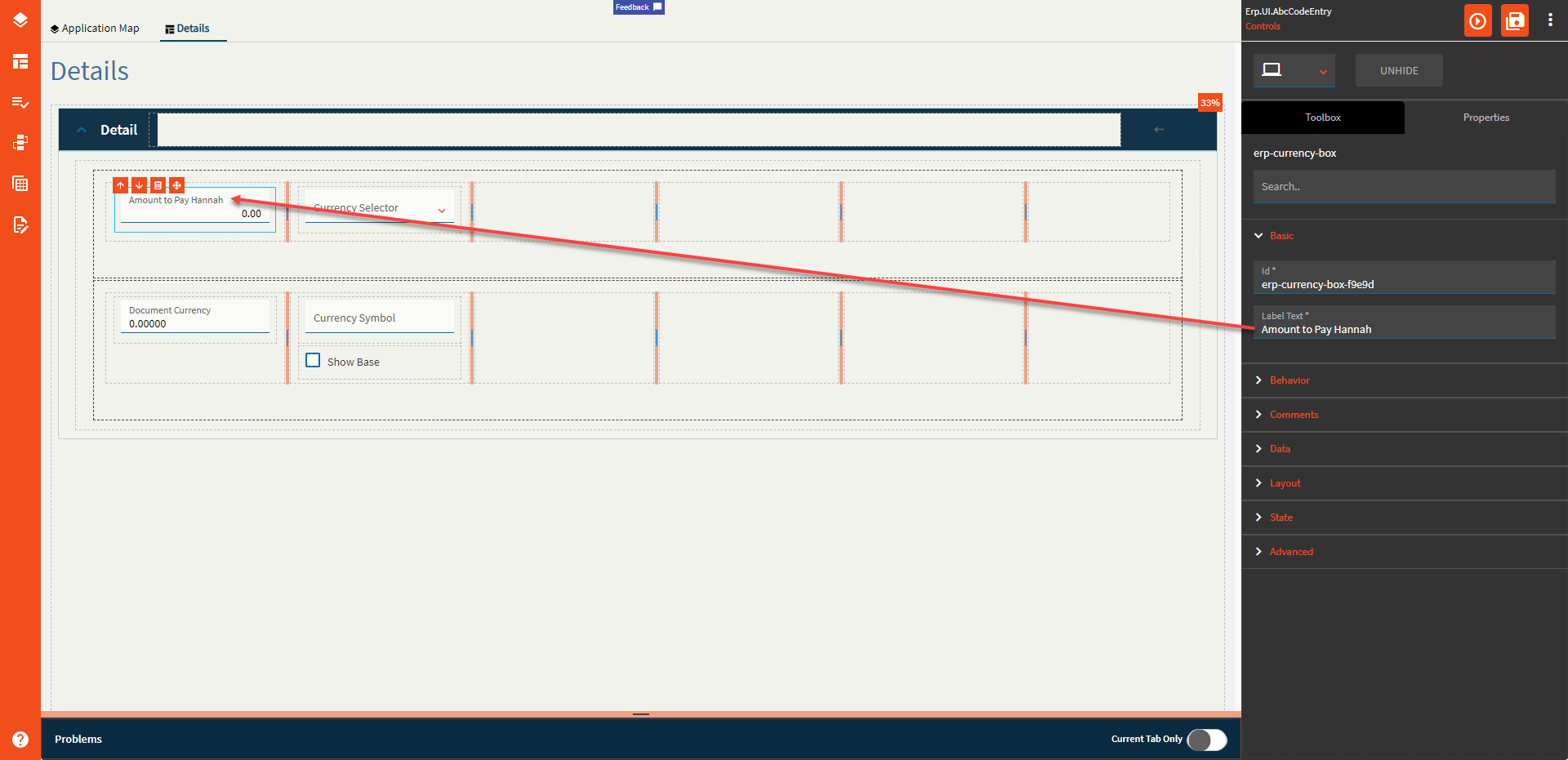
Figure B: Comment Text

Figure C: Show Base
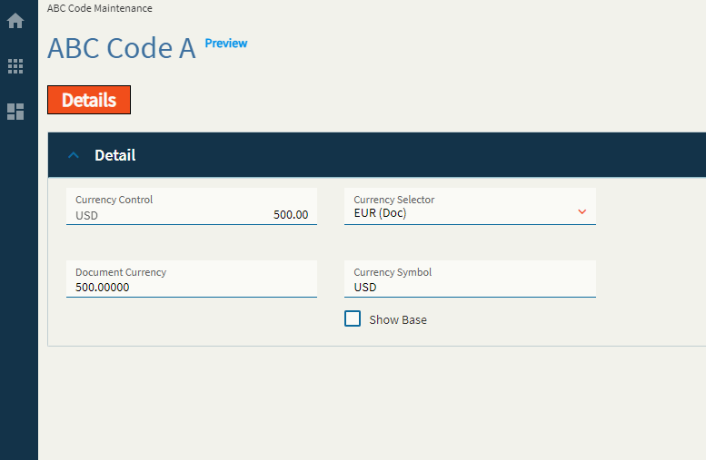
Figure D: Mask
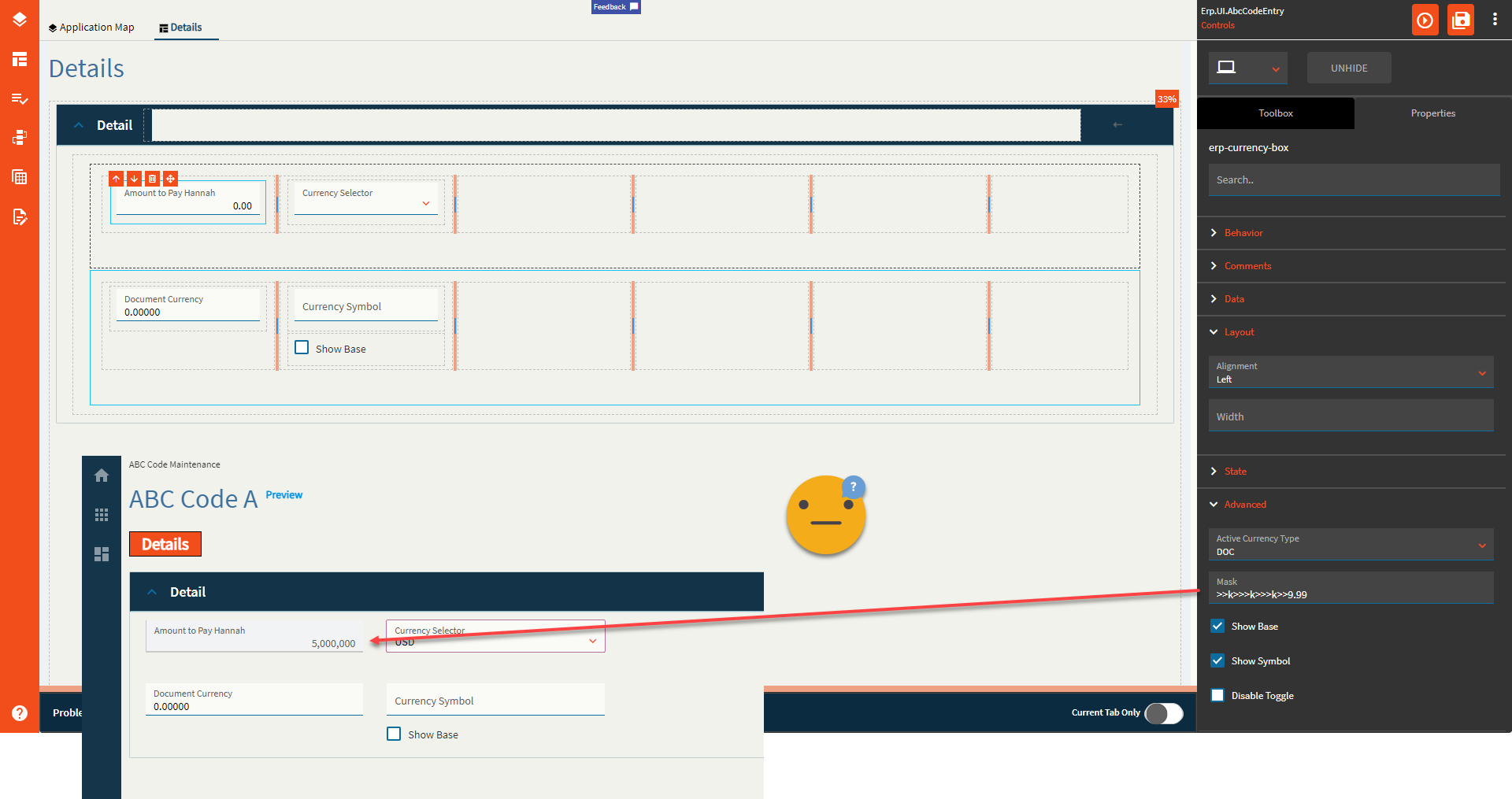
Figure E: Show Symbol
Typically, the textbox where I typed in EUR would be a bound field not shown on the screen. Shown for educational purposes.