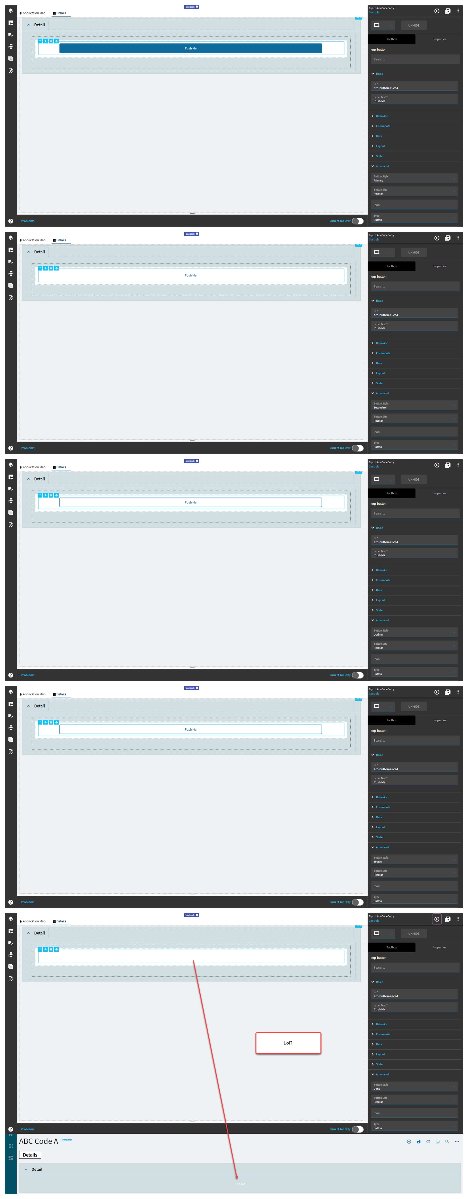
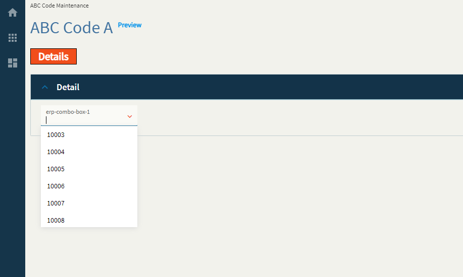
| Basic |
Id |
Unique identifier for the control |
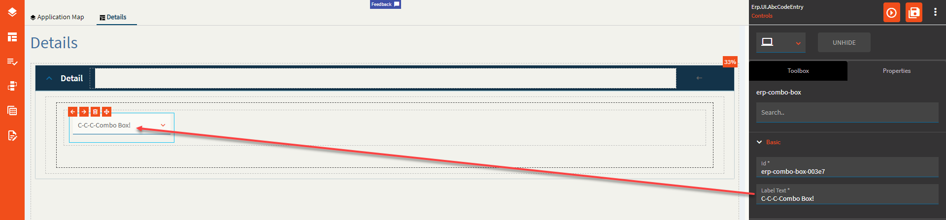
| Basic |
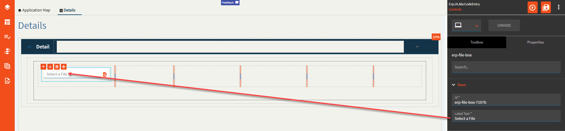
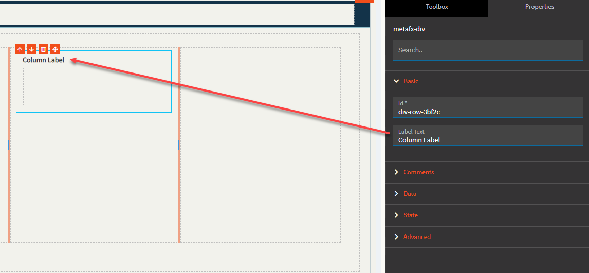
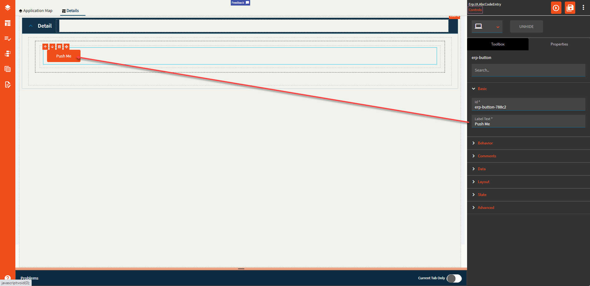
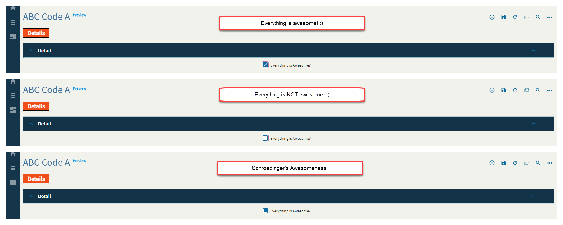
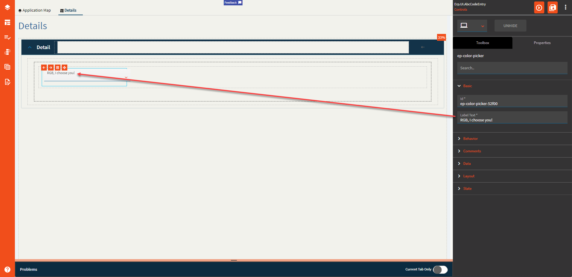
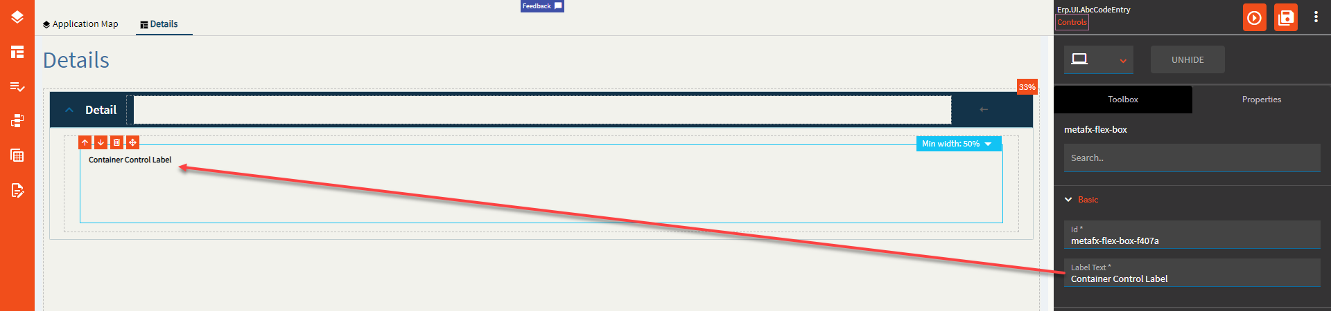
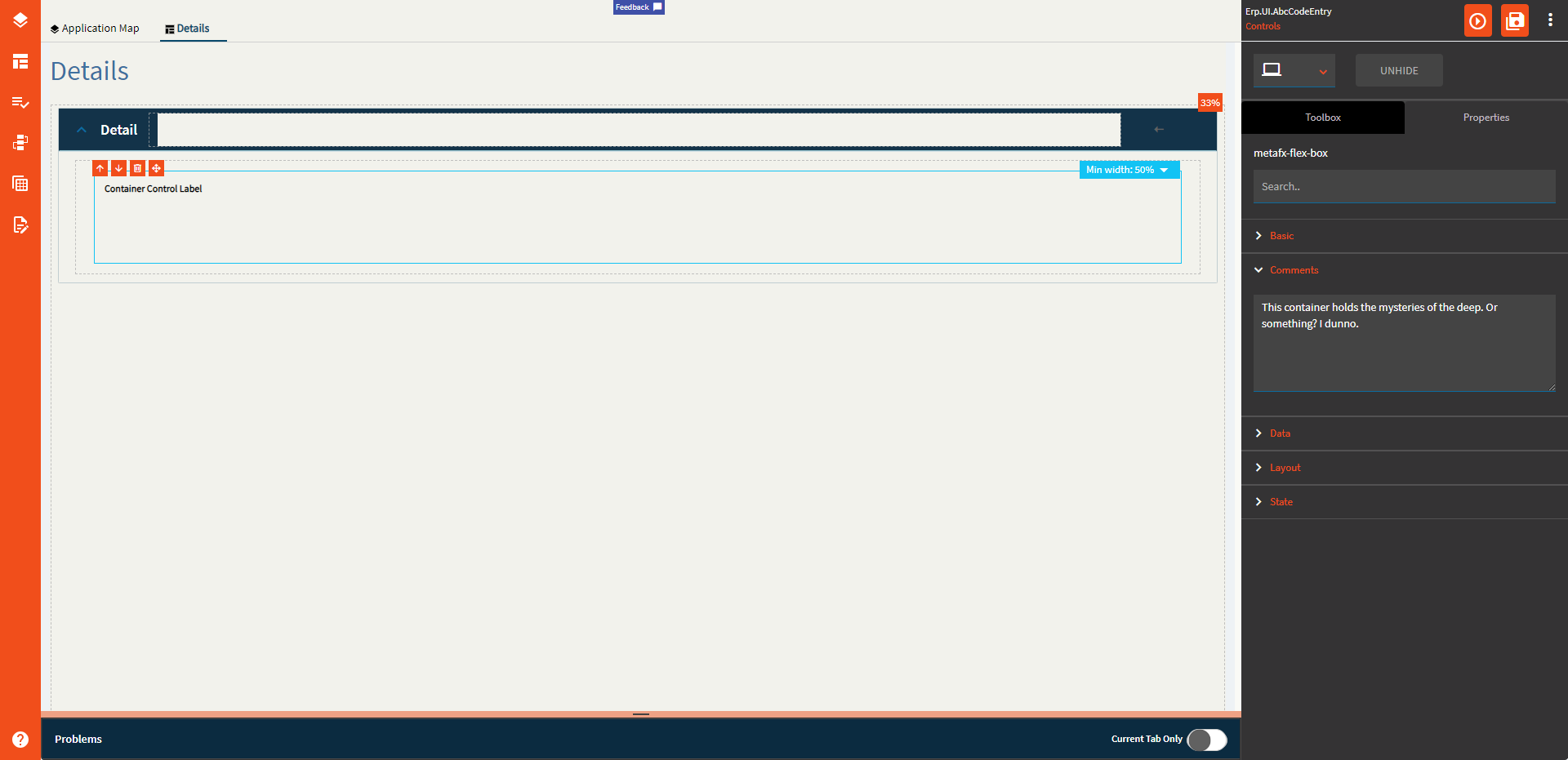
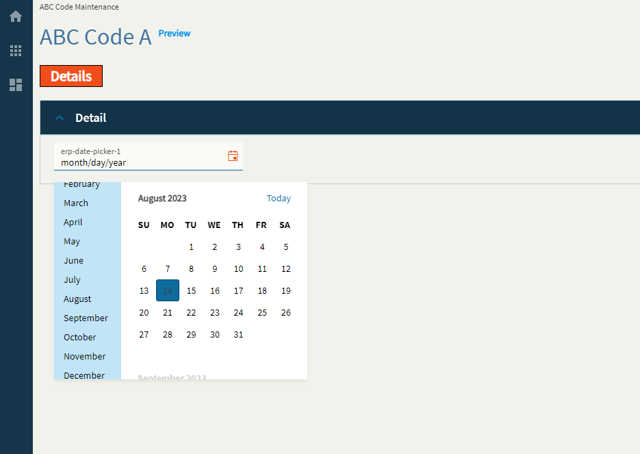
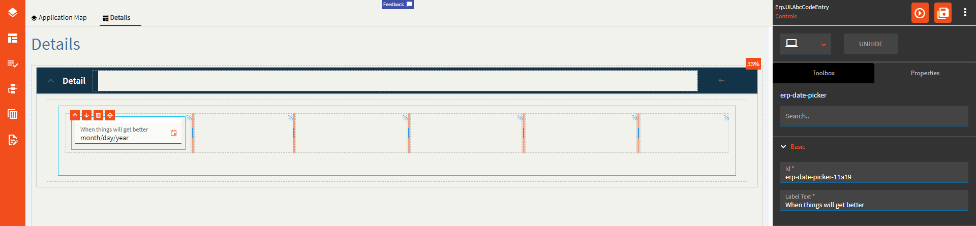
Label Text |
Sets the label text within the control. (Fig. A) |
| Behavior |
On Blur |
Click this to create an OnBlur event for the control. On Blur is triggered when the control loses focus. |
| Behavior |
On Create |
Click this to create an OnCreate event for the control On Create is triggered when the control is painted to the GUI. |
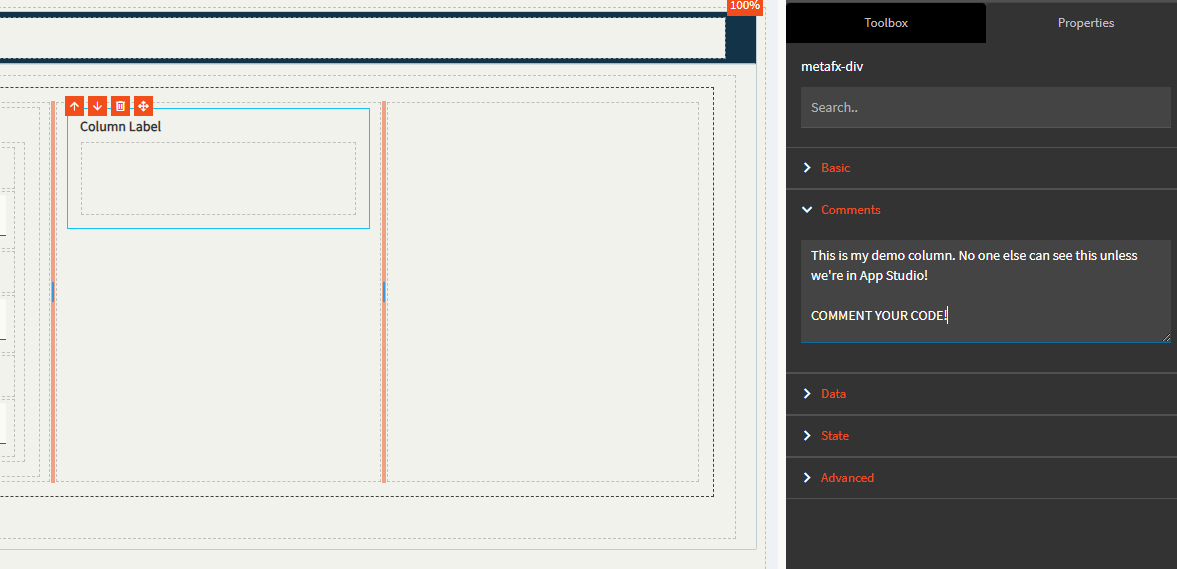
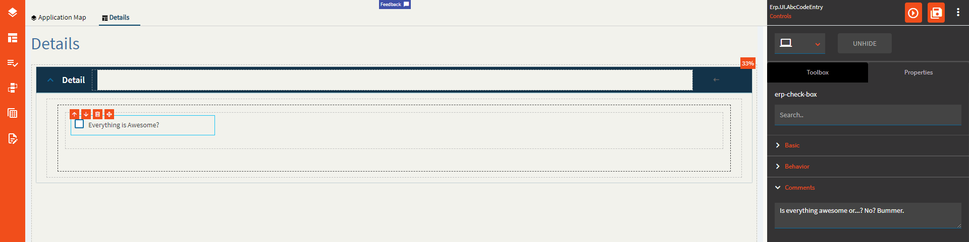
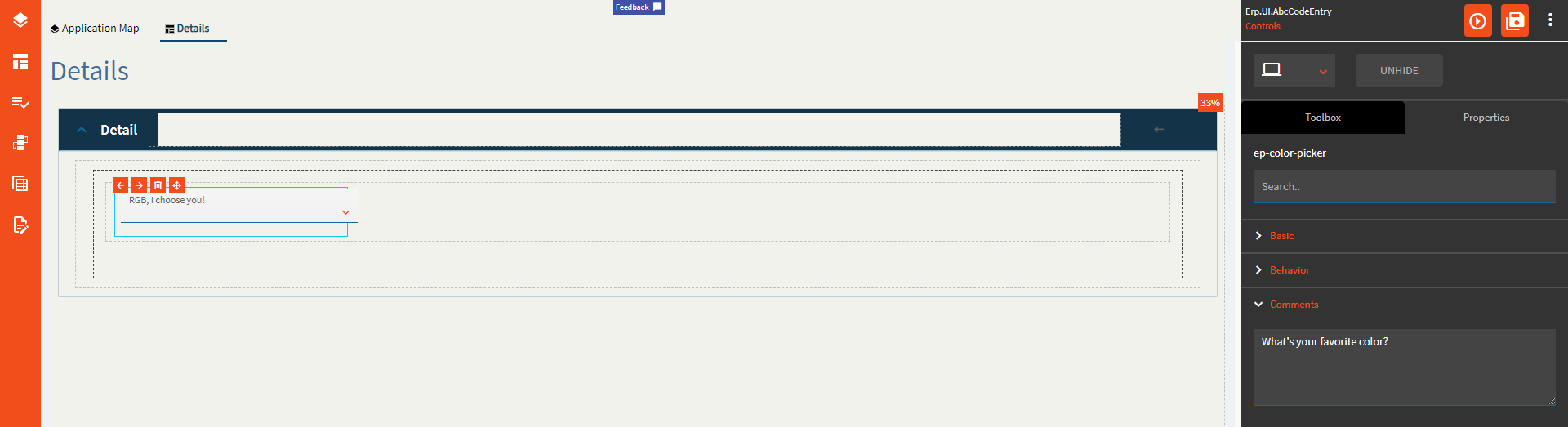
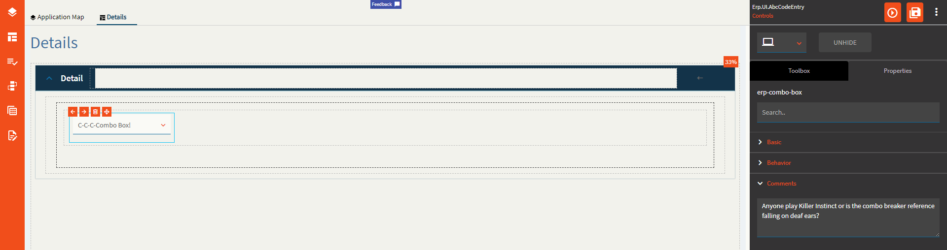
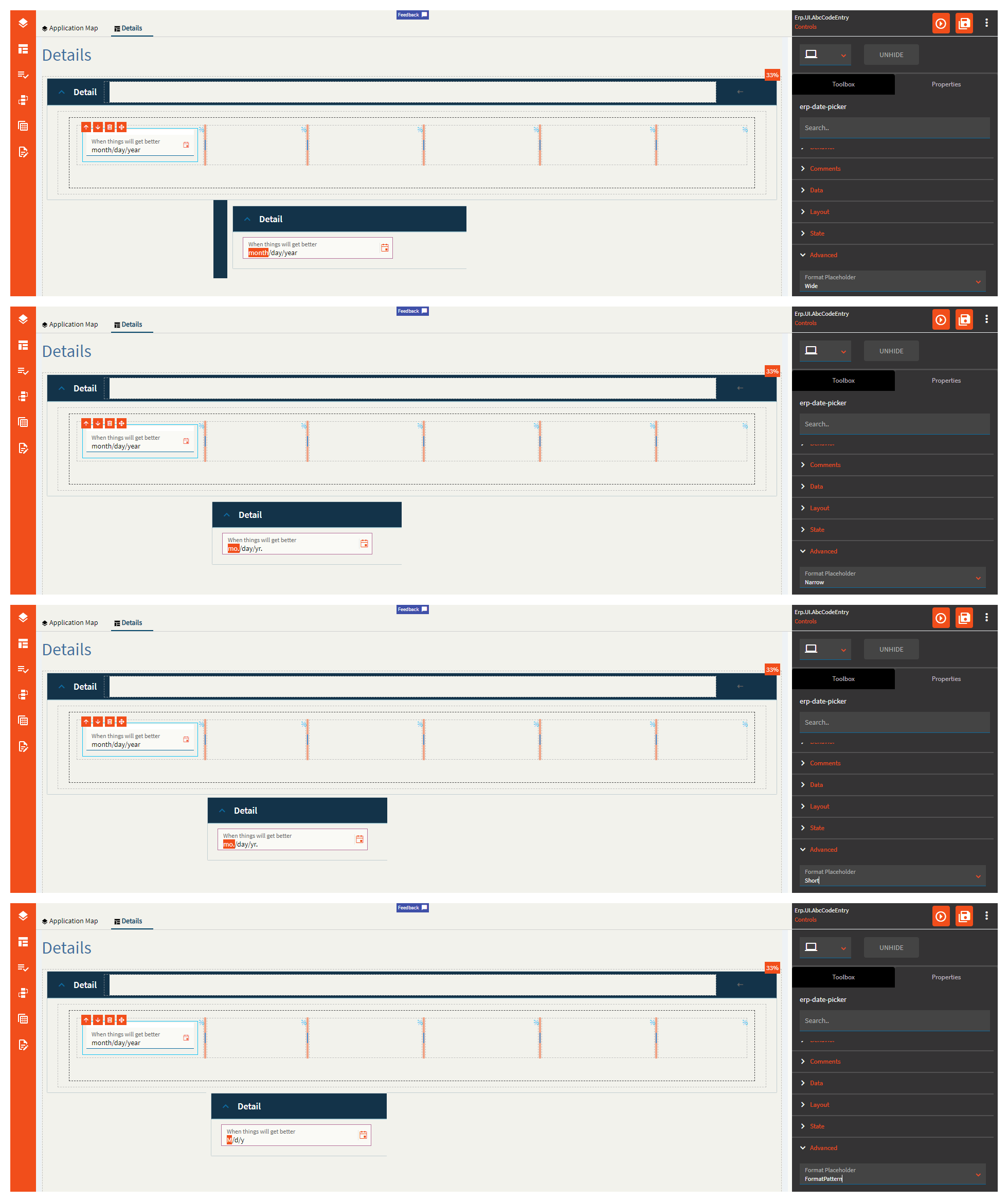
| Comments |
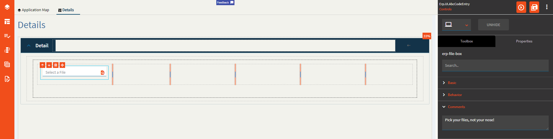
Comments |
Add some developer notes to the control. These are not customer-facing and are only visible in App Studio (Fig. B) |
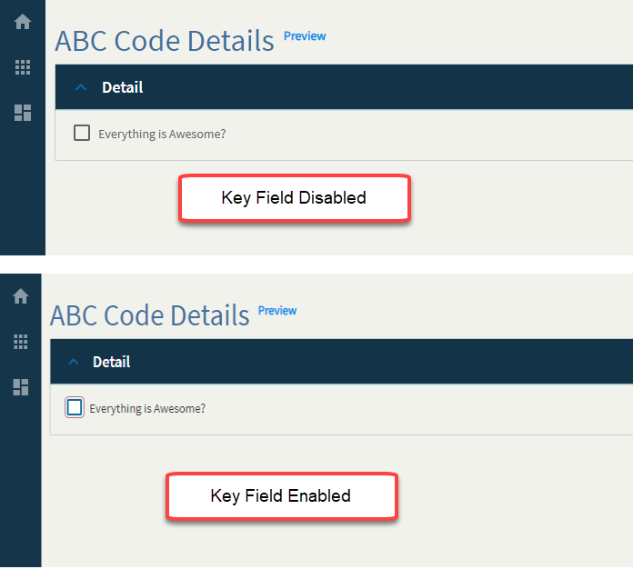
| Data |
Key Field |
Indicates that a bound component is a key field. If true, the field is enabled if there is no current record, allowing the user to select an existing record or create a new one. |
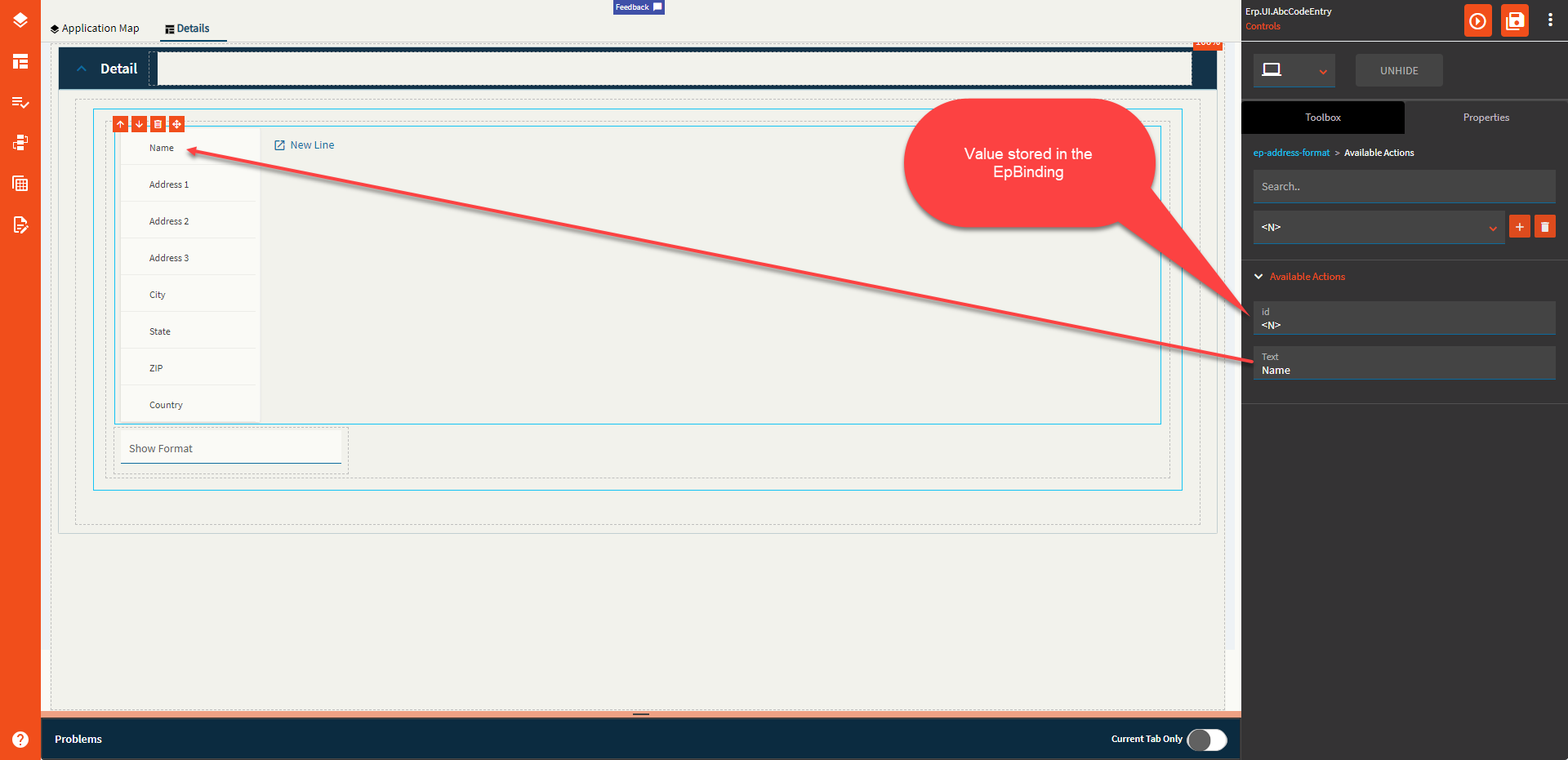
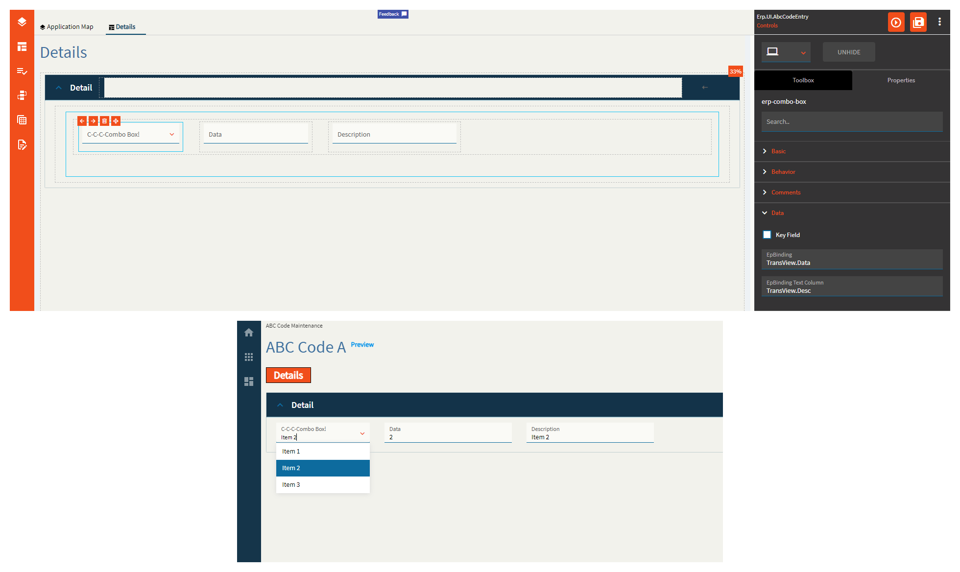
| Data |
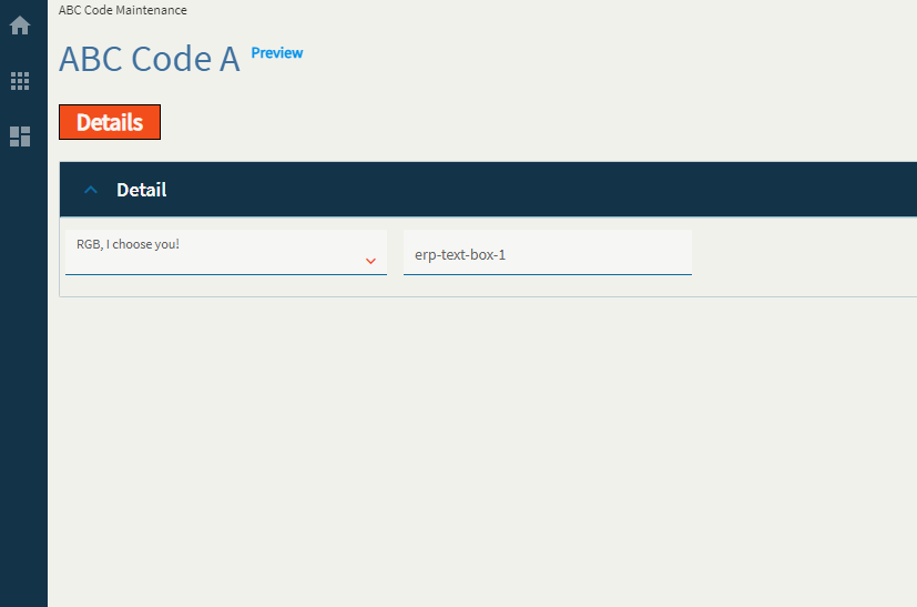
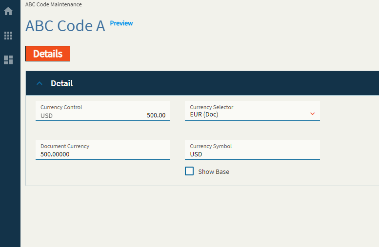
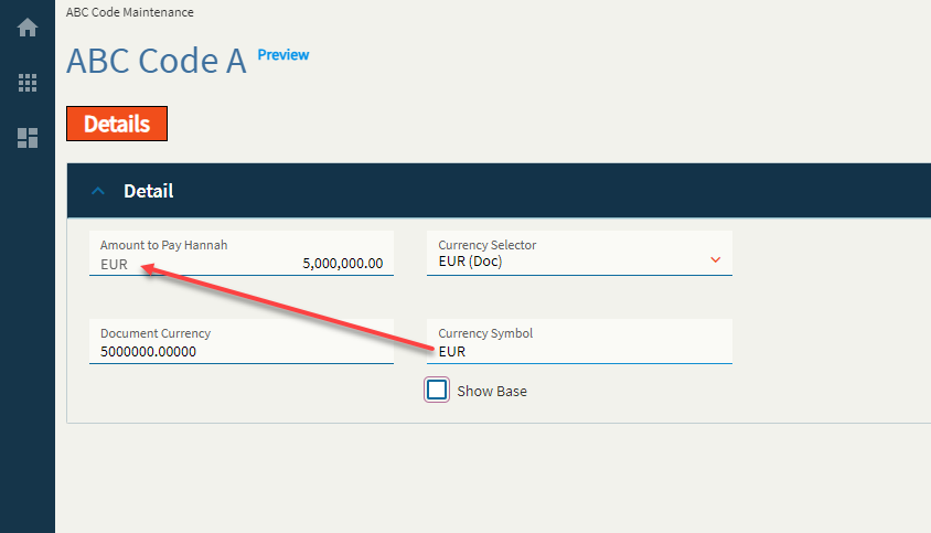
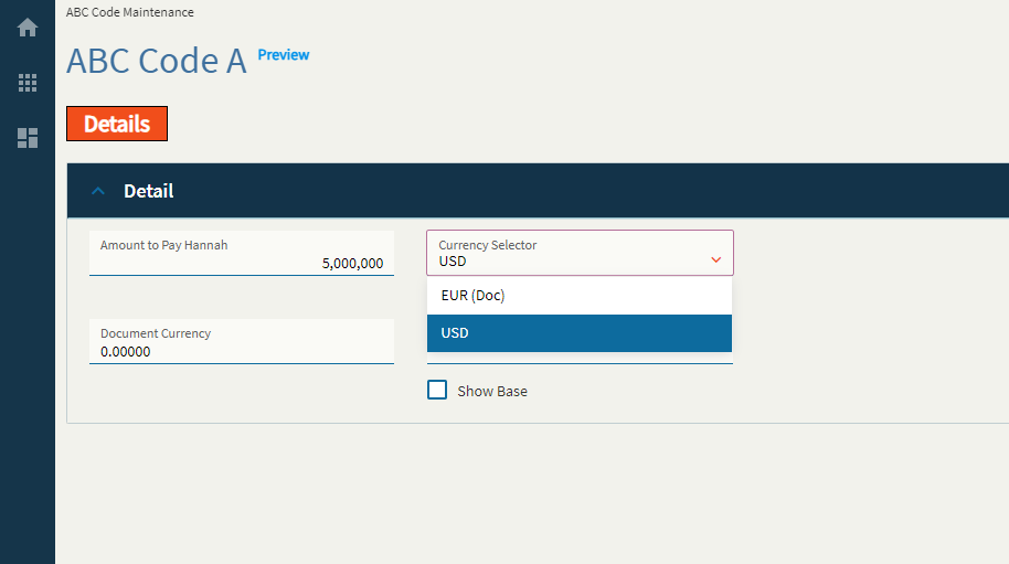
EpBinding |
Bind the data to a DataView.Column. (Fig. C) |
| Data |
EpBinding Text Column |
Bind the text of the combo to a DataView.Column (Fig. C) |
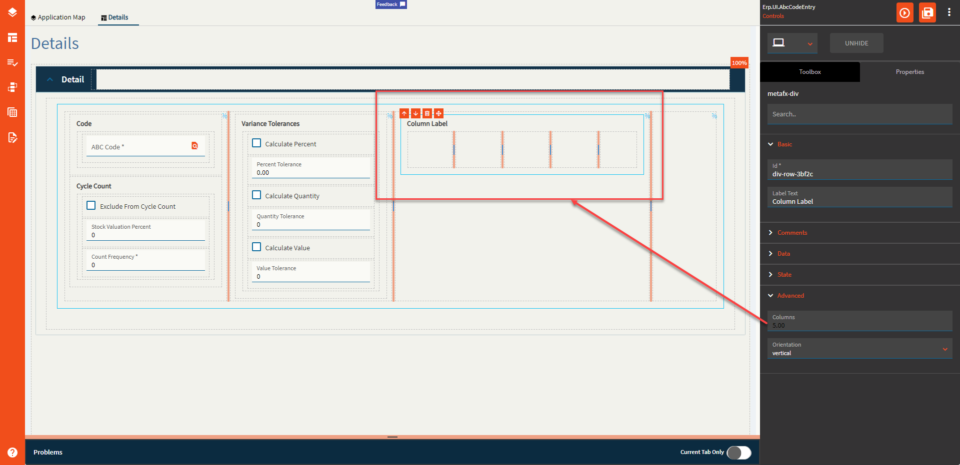
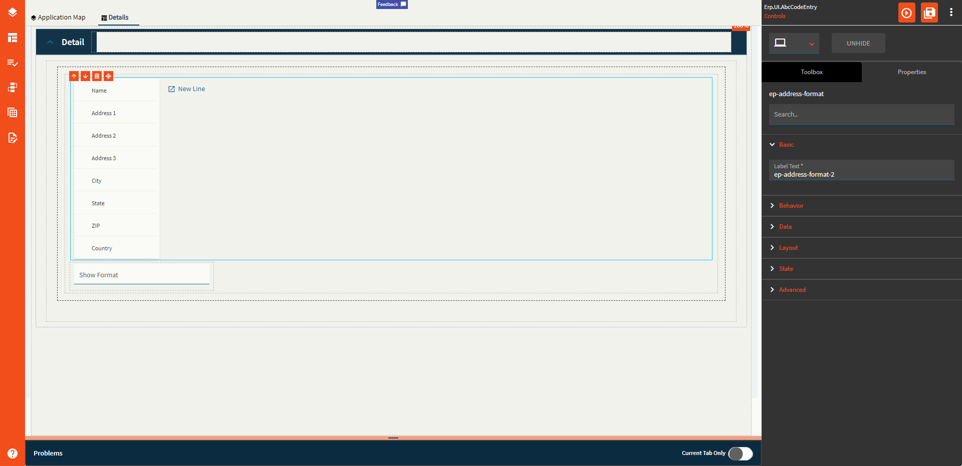
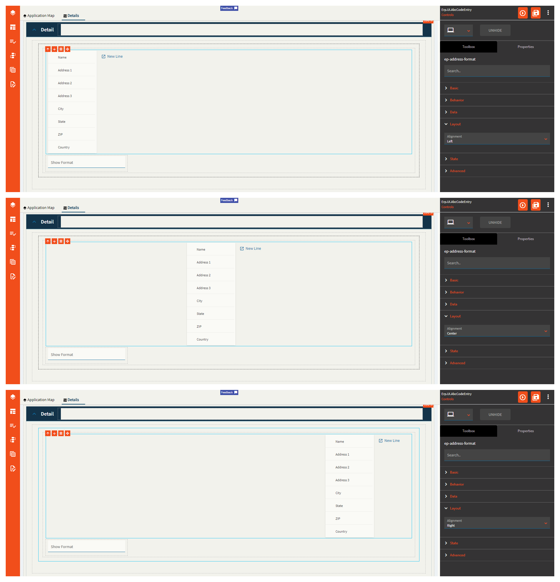
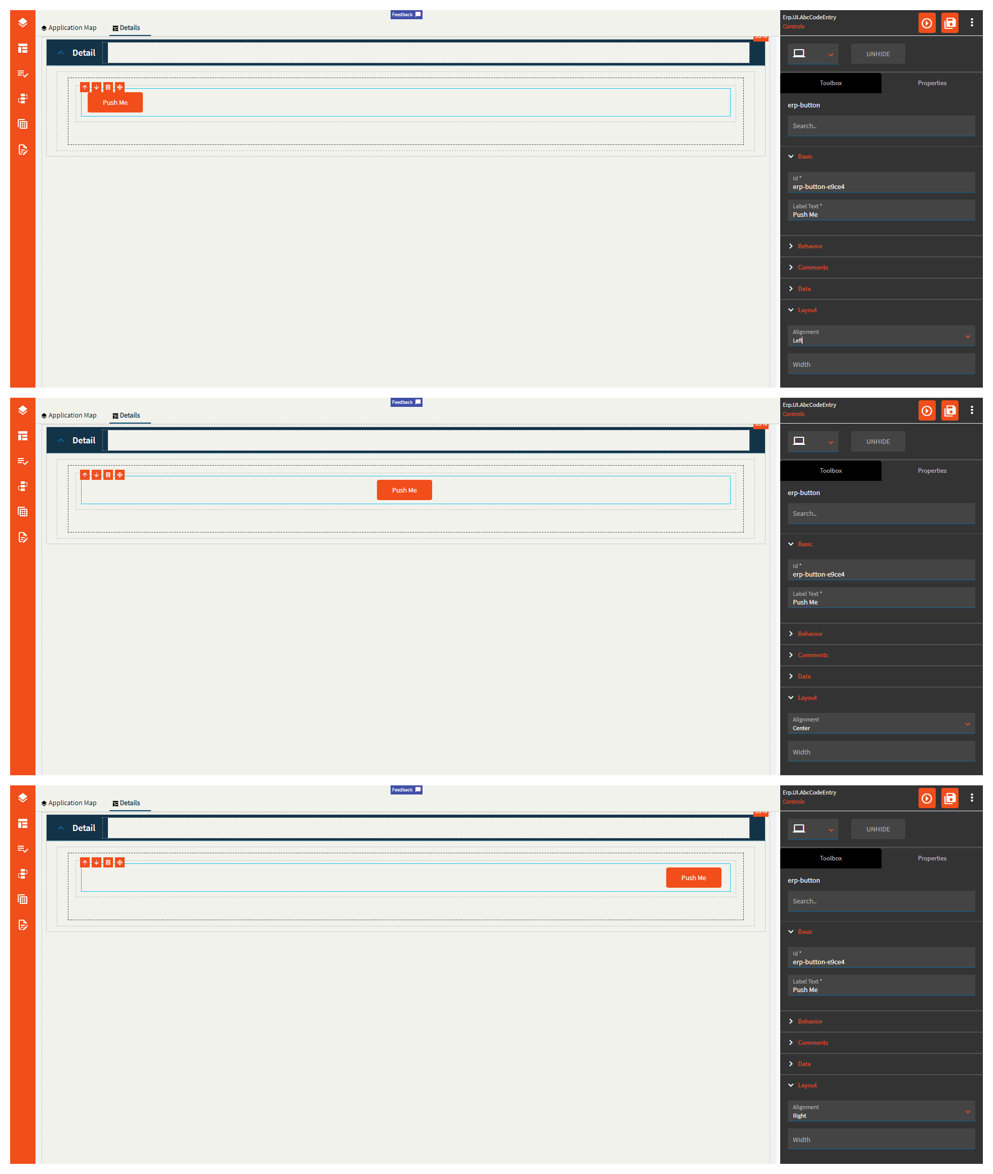
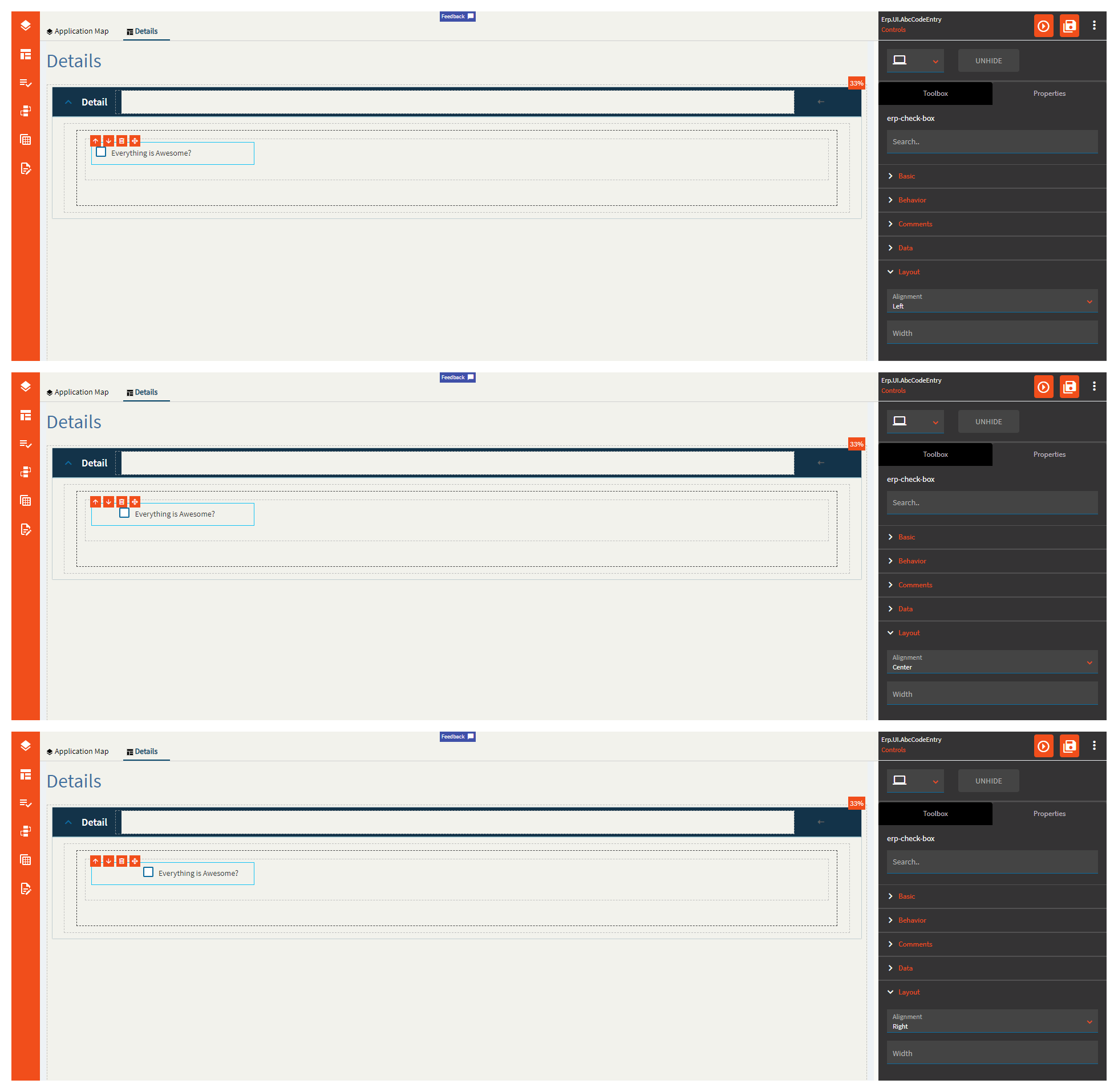
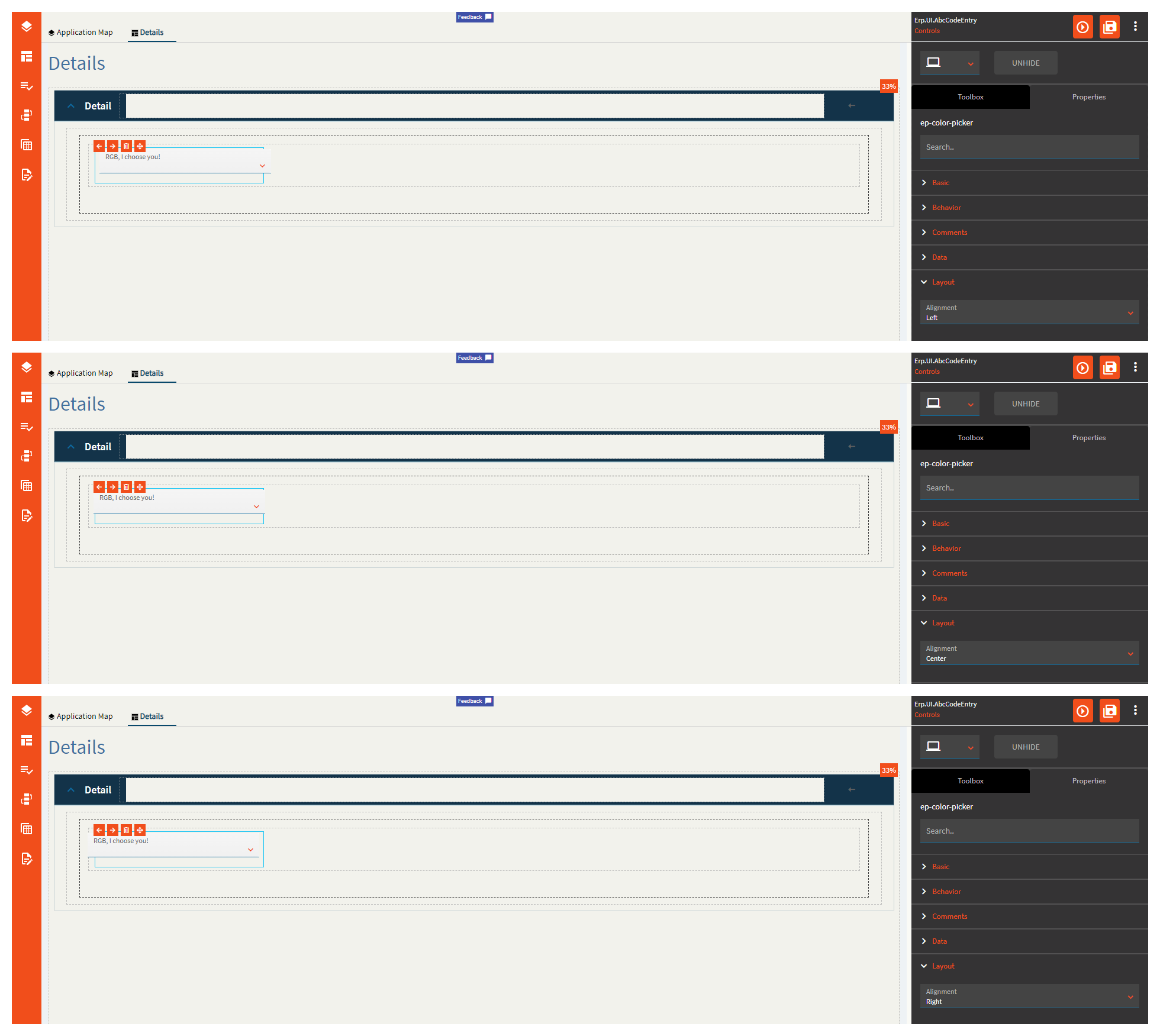
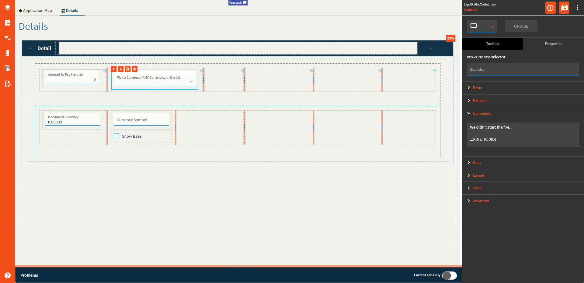
| Layout |
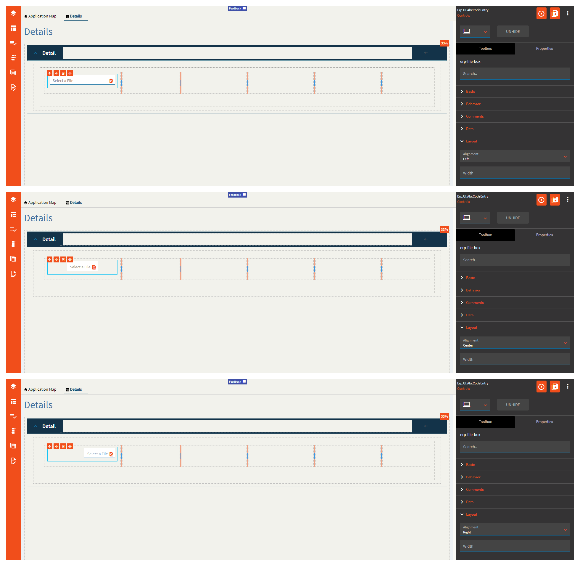
Alignment |
 Does not work. Set the alignment for the control. Valid options are Left, Center, Right. Does not work. Set the alignment for the control. Valid options are Left, Center, Right. |
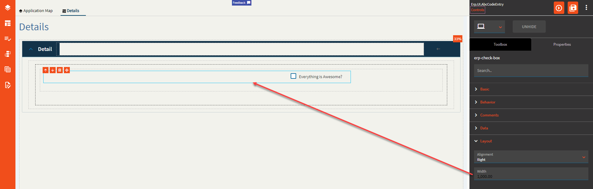
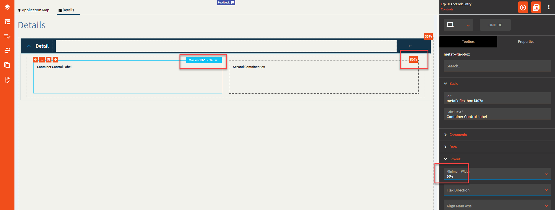
| Layout |
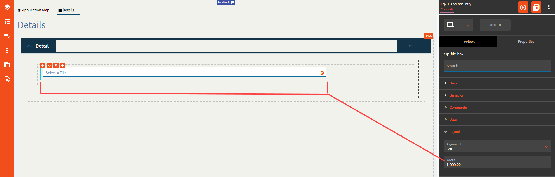
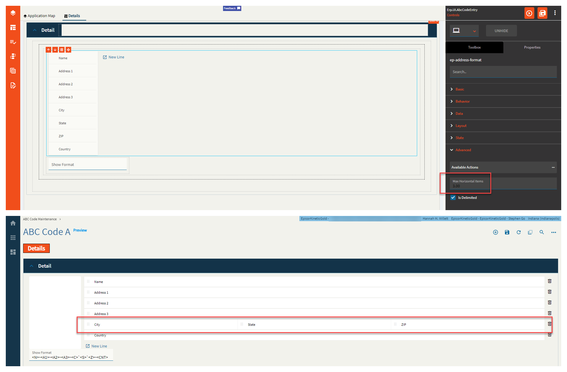
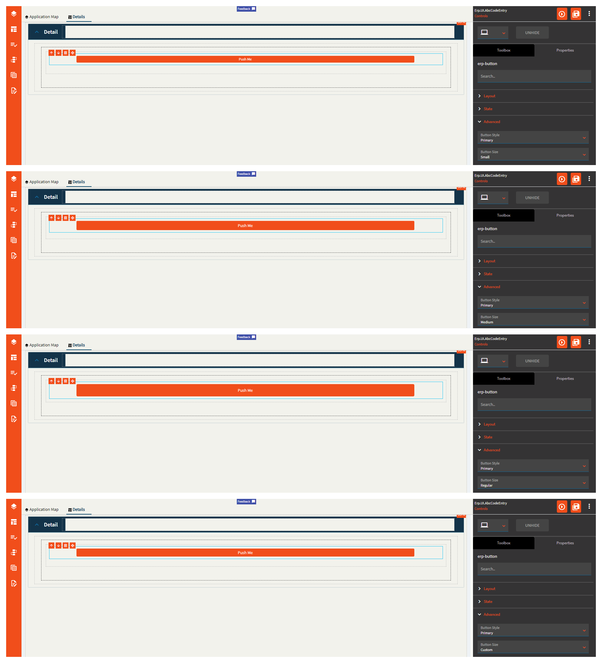
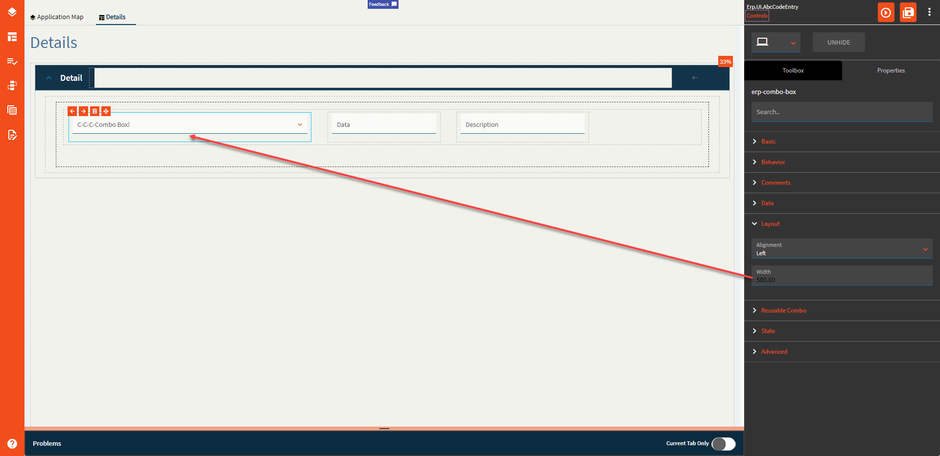
Width |
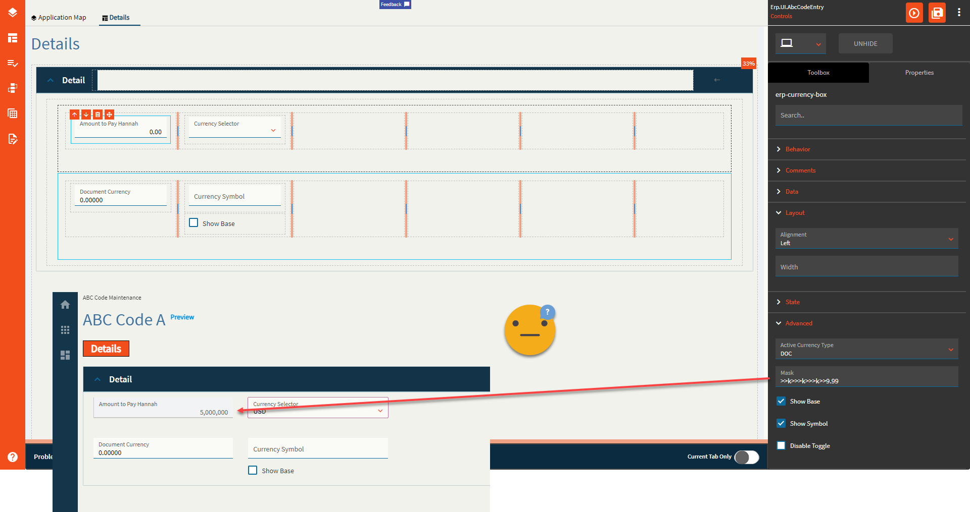
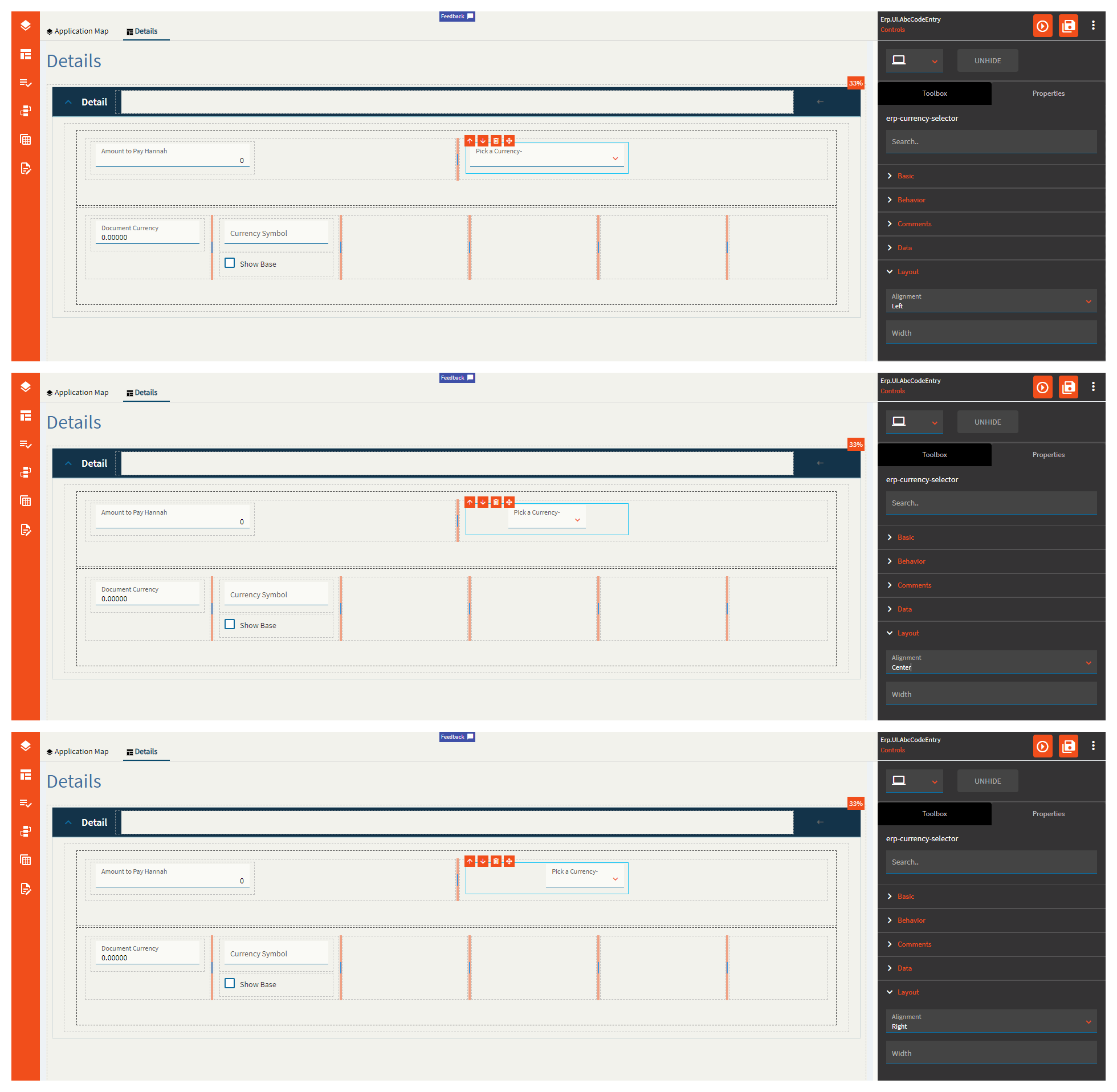
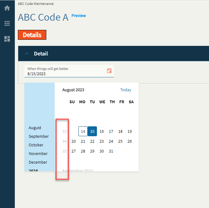
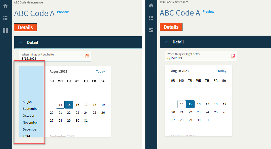
Sets the specific width (pixels) for the control. (Fig. D) |
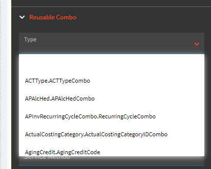
| Reusable Combo |
Type |
Select from a list of reusable combos defined by Epicor. (Fig. E) |
| Reusable Combo |
Sub Type |
Select from a list of sub types. Most often this is “Default” but occasionally has other options that change up the reusable combo configuration that’s pulled in. Note: Once the Type and Sub Type are selected, everything else defaults in and your combo should work as is. The remaining fields are optional or used when setting up your own. |
| Reusable Combo |
ComboId |
Sets a unique identifier for the combo. Example: UD103.UD103Key (can be whatever, really, but I generally follow the format from the reusable ones) |
| Reusable Combo |
Service |
The REST service to load the data from. Example: Ice.BO.UD103Svc |
| Reusable Combo |
Service Method |
The REST method to call from the previously defined service. Example: GetList |
| Reusable Combo |
Table Name |
The name of the table returned from the REST call. This can be found in Swagger, PostMan, Dev Tools, etc. Example: UD103List |
| Reusable Combo |
Field Name |
Set the name of the column within the defined database Table that has tilde delimited list of items used to populate this combo box. Example: SalesRepList |
| Reusable Combo |
Schema |
Set the schema that is related to the database Table property that holds a column that has a tilde delimited list of items used to populate this combo. Valid options include ICE and ERP. |
| Reusable Combo |
View Name |
Set the dataview that is used to populated the items in the combo box. This should be defined when the items for the combo box are to be supplied by a dataview that has been populated elsewhere. Example: ABCCode |
| Reusable Combo |
View Column Name |
Set the column name that exists within the defined view that is used to populate the items in the combo box. Should be defined when the items for the combo box are to be supplied by a dataview that has been populated elsewhere. Example: CountFreq |
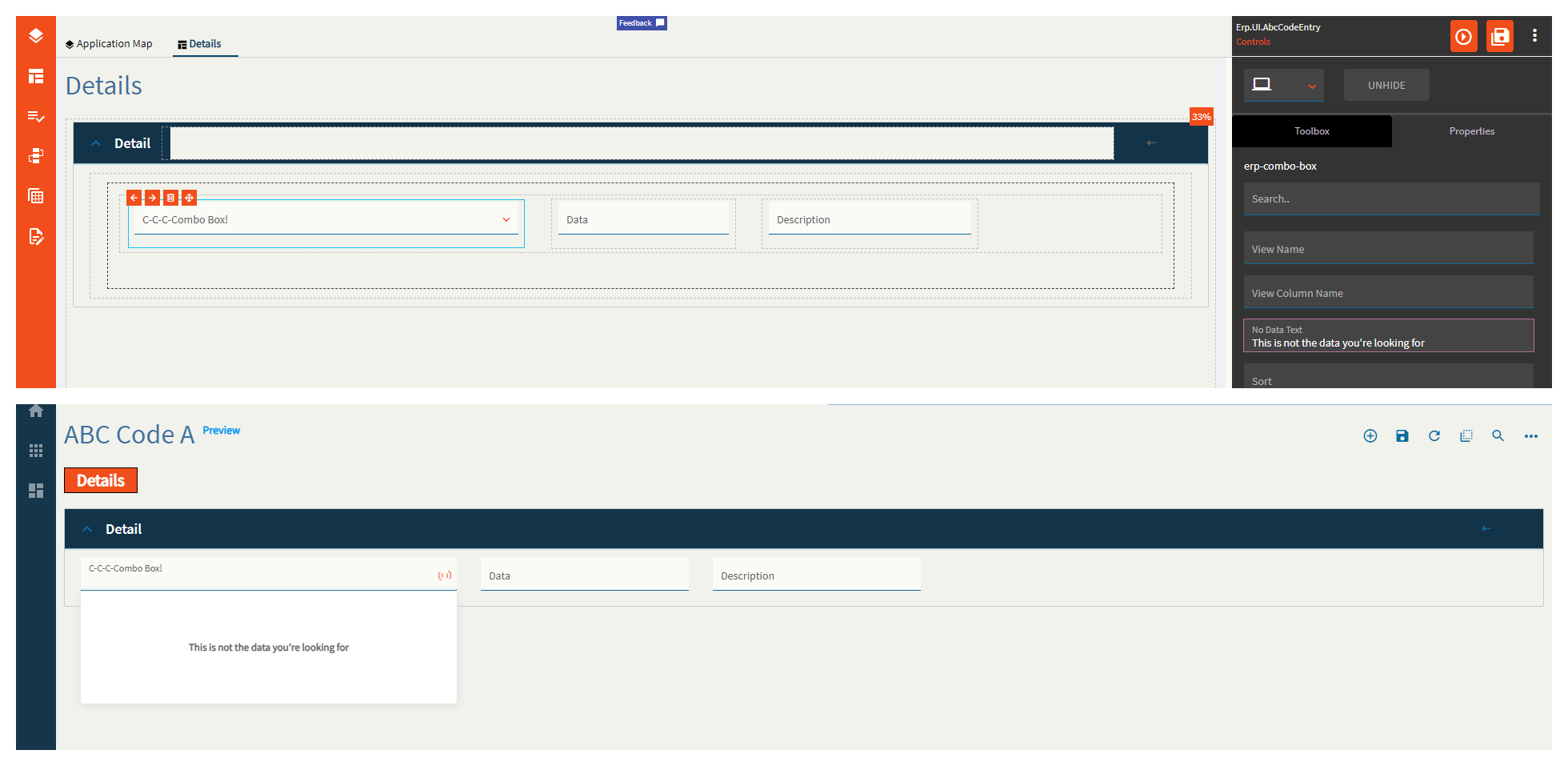
| Reusable Combo |
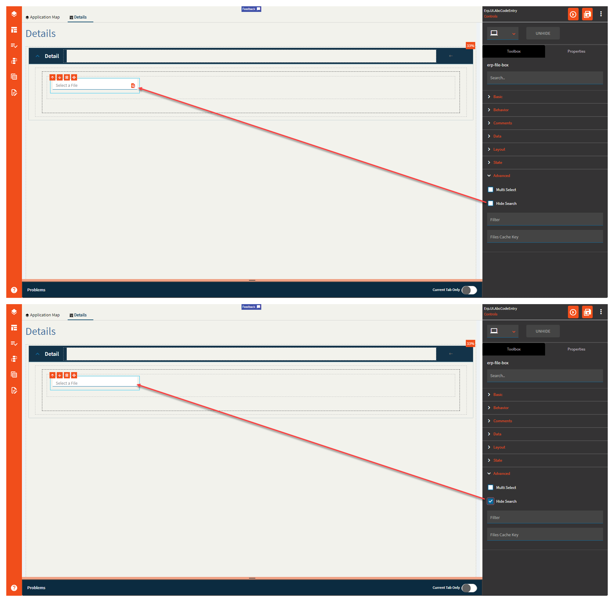
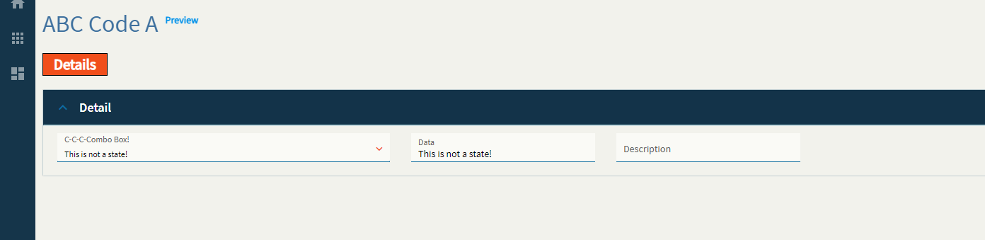
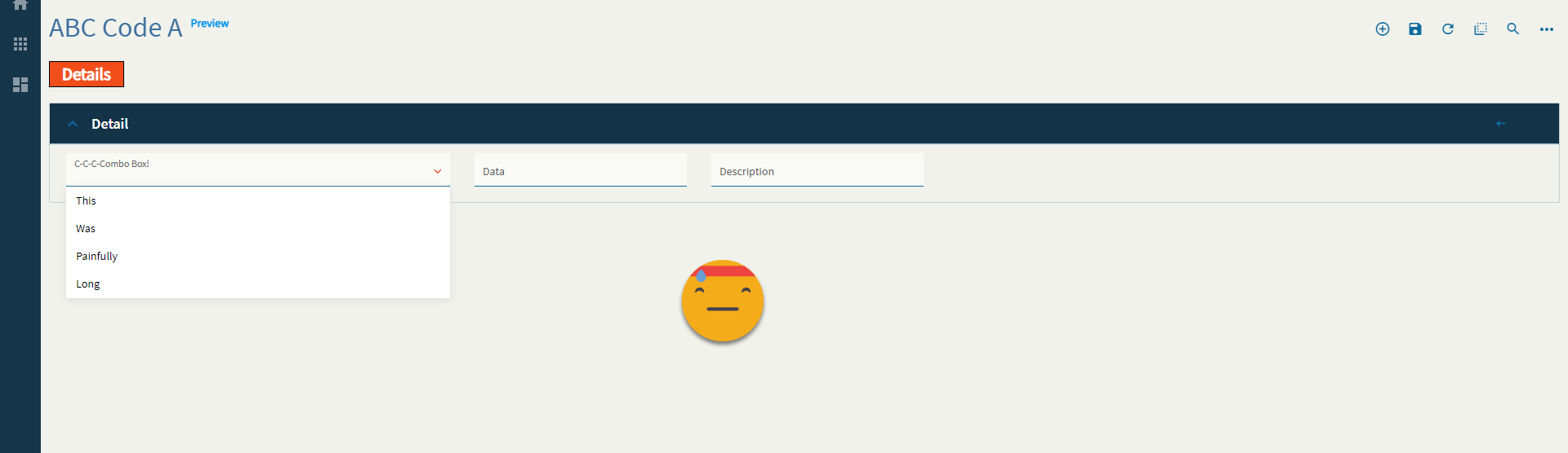
No Data Text |
Text to display when the combo is empty. (Fig. F) |
| Reusable Combo |
Sort |
Set the data item field that the items in the combo are sorted by. Example: PartNum |
| Reusable Combo |
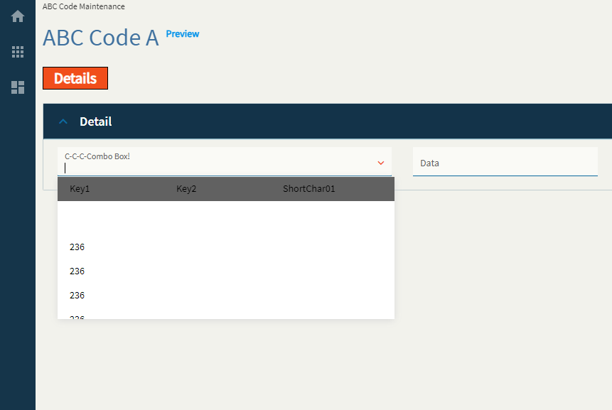
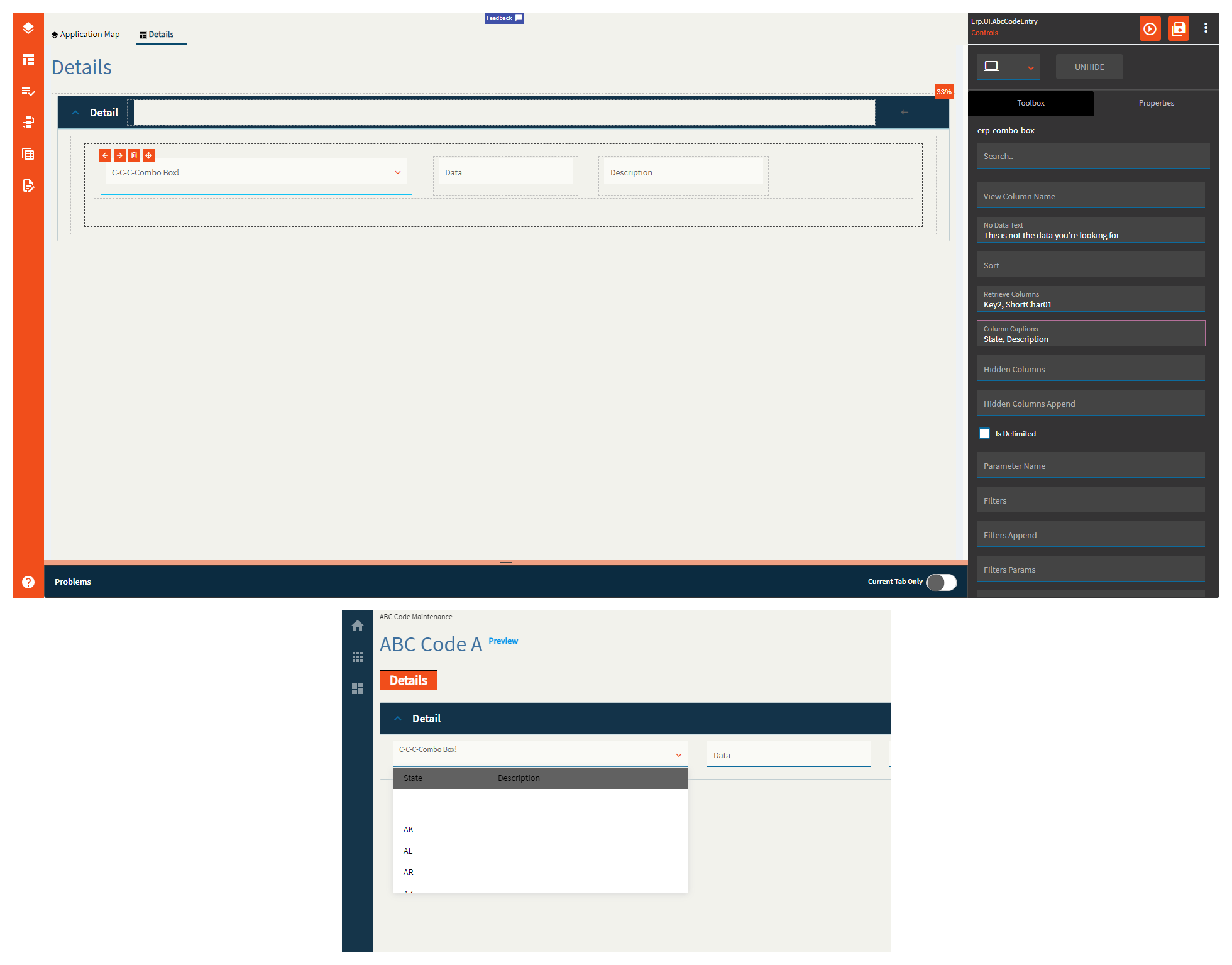
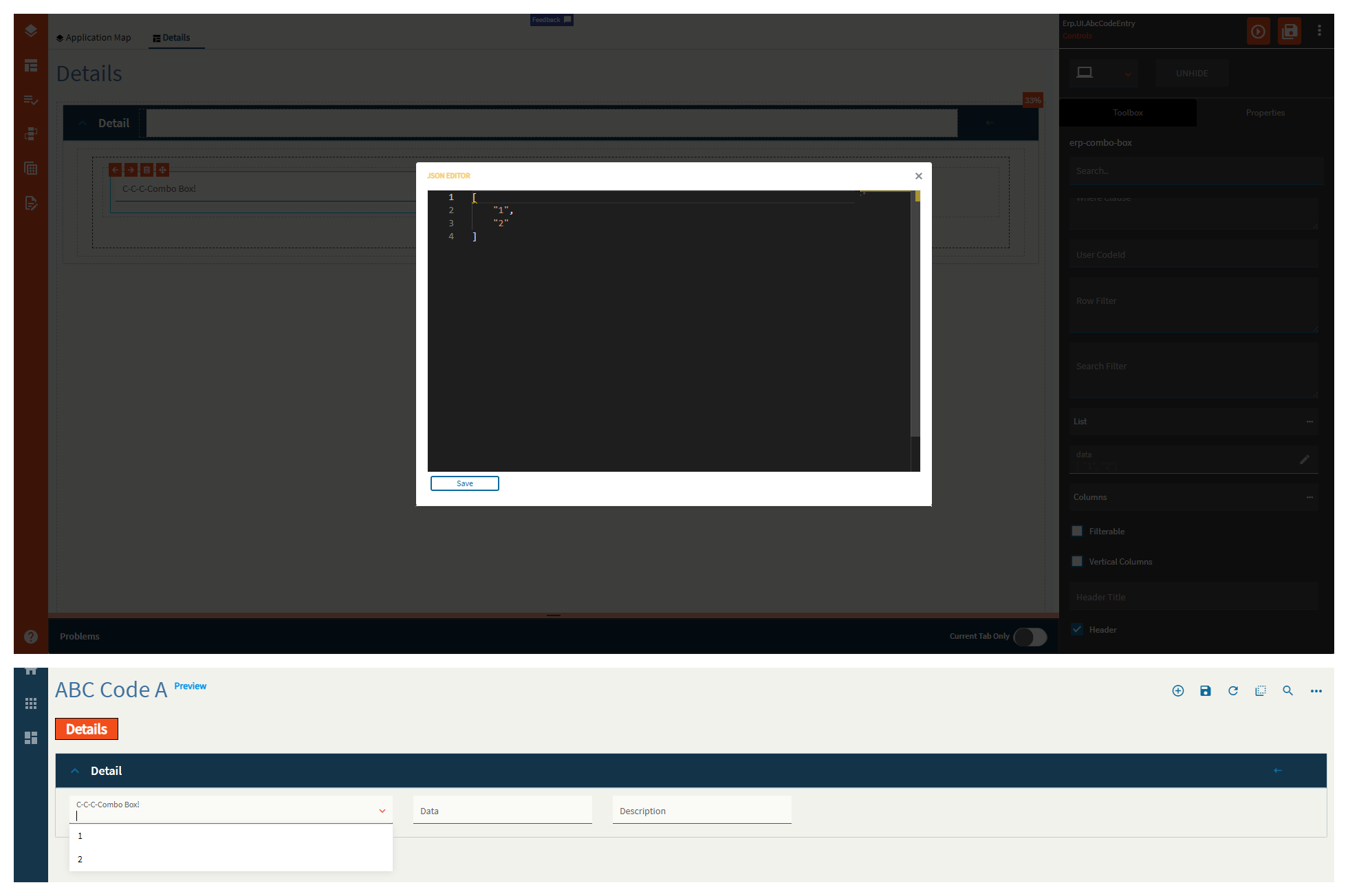
Retrieve Columns |
This doesn’t seem to fully function. This is used to define a list of items to display in the combo. The caption says a string array defined as ["Key1","Key2"] but that breaks it. Just type in Key1, Key2. HOWEVER–it only displays the values of the first item in the list. (Fig. G) |
| Reusable Combo |
Column Captions |
When more than one column is defined in the Retrieve Columns property, you can use this to define their titles. This has no effect with a single column. Example: State, Description (Fig. H) |
| Reusable Combo |
Hidden Columns |
Use this to define columns within the combo that are not shown. This is useful when you want to perform functions on those columns without displaying them to the user. For example, filtering. Example: Key3, Key4, Key5 |
| Reusable Combo |
Hidden Columns Append |
Same as Hidden Columns, but is specifically used to extend a reusable combo as defined in the Type property. |
| Reusable Combo |
Is Delimited |
Indicate if the value returned from a REST service method contains a tilde separated list that is to be used to populate the combo. |
| Reusable Combo |
Parameter Name |
Set the name of the parameter that holds the tilde separated list of items used to populate the combo. Should be defined when a REST service and service method is called and the method returns a parameter that holds a tilde separated list of items. If no parameter is defined, then returnObj is used. Only used when Is Delimited is checked. |
| Reusable Combo |
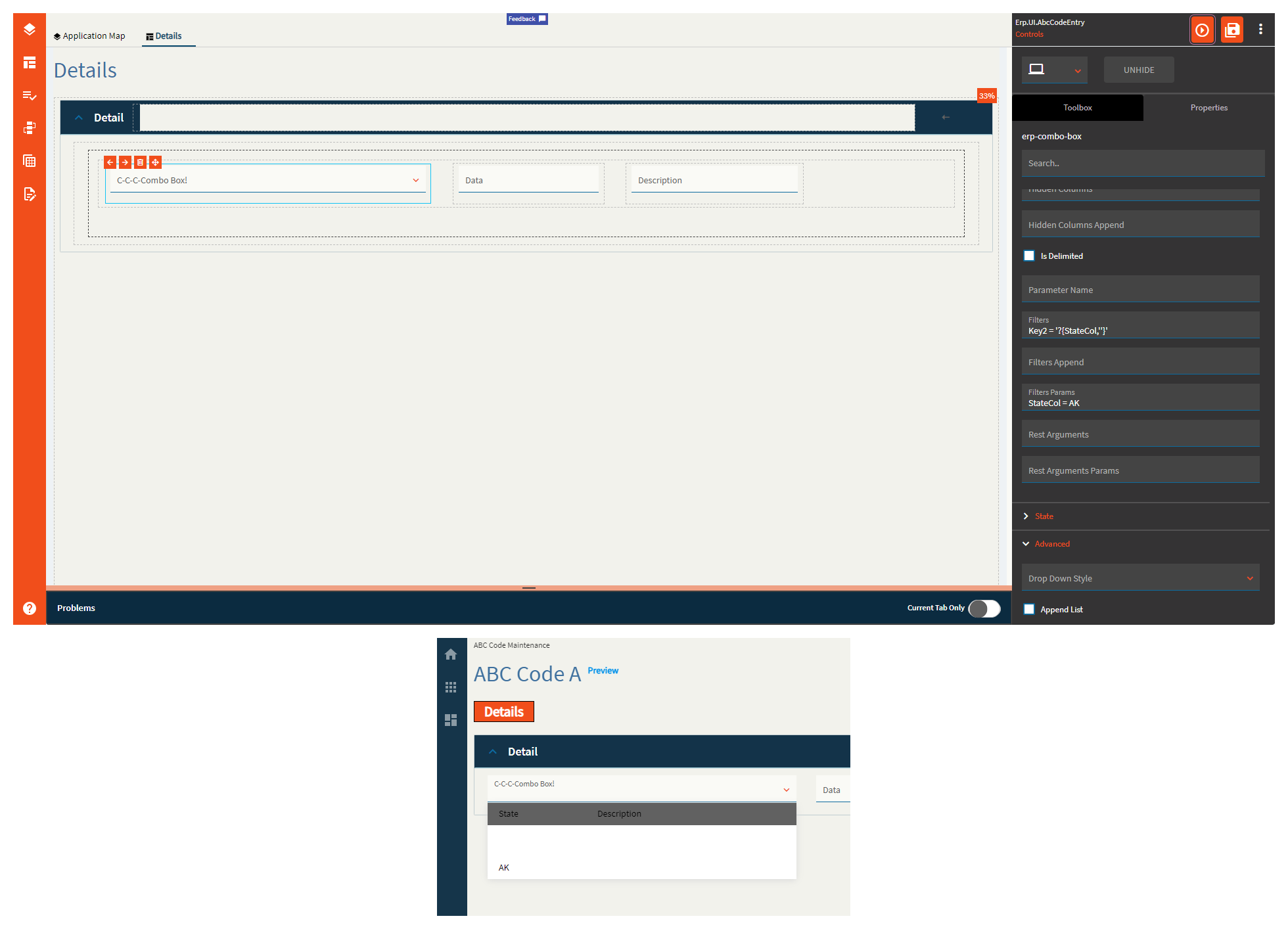
Filters |
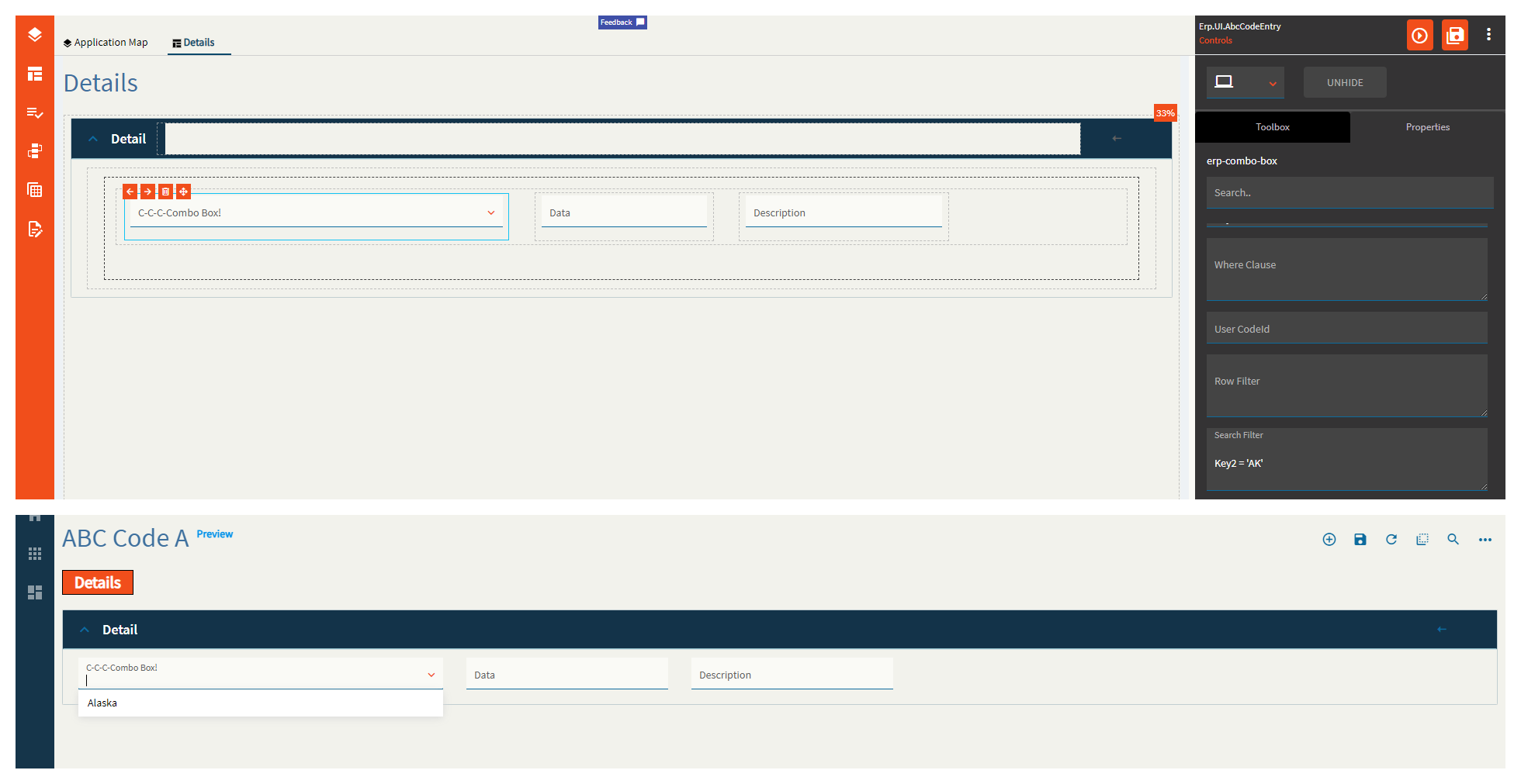
Set filters that are applied to the data when either a service method or BAQ is defined. Syntax is the same as classic and is to be used in conjunction with Filters Params. Example: Key2 = '?{StateCol,''}' (Fig. I) |
| Reusable Combo |
Filters Append |
This is similar to the Filters property, but is specifically used to extend a reusable combo as defined by the Type property. Example: Inactive = false |
| Reusable Combo |
Filters Params |
Maps to the filters property. Example: StateCol = AK |
| Reusable Combo |
Rest Arguments |
Does not work. REST arguments that are sent when the data is retrieved using a REST service. This is to be used in conjunction with Rest Arguments Params. |
| Reusable Combo |
Rest Arguments Params |
Does not work. Maps to the Rest Arguments property. |
| State |
Personalizable |
If true, a user can personalize this component(hide/show) |
| State |
Customizable |
If true, a user can customize this component in child layers |
| State |
Hidden |
Hides the control from view. |
| State |
Disabled |
Disables the control. The control will not allow editing or focus. |
| State |
Read Only |
Makes the control read only so that it will not allow editing. The control can still be focused. |
| State |
Auto Focus |
When enabled, the control is automatically focused on creation. |
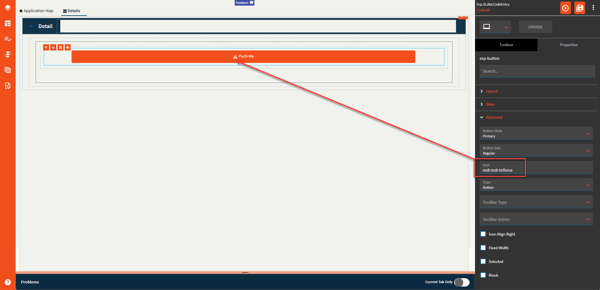
| Advanced |
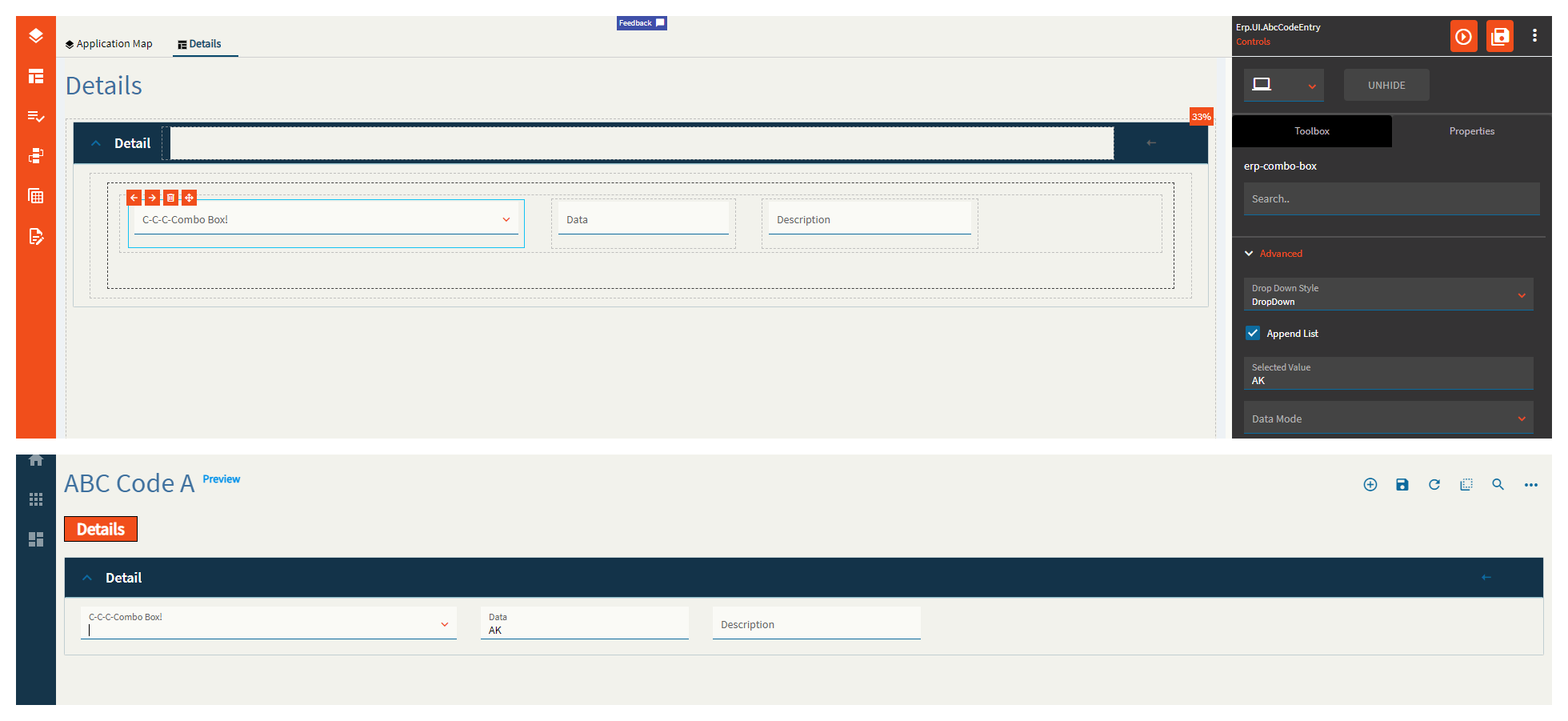
Drop Down Style |
Set a combo style. DropDown style allows typing within the combo text if the “Allow Custom” option is checked. DropDownList style allows selection from available items only. |
| Advanced |
Append List |
This one has issues. In the TextField/ValueField used to define what shows up in the combo and what’s used for the data binding, you need to define the column name (Key2, ShortChar01) however, when using a static list, those should be Display/Value respectively. If you have the column names, the static list items don’t display properly. If you have Display/Value defined, the columns from the service do not display properly. Additionally, the static list items display regardless of this checkbox, so it doesn’t really do anything. WEEEEE! Any who–the idea of this is it’s supposed to append the static list items to the returned service data. |
| Advanced |
Selected Value |
Set the selected value for the combo. This automatically sets the EpBinding to whatever you put here. Incidentally, it does not display anything in the combo. (Fig. J) |
| Advanced |
Data Mode |
This is to be used if you defined a service, but not a service method. Valid options include GetList and GetRows |
| Advanced |
BAQ Query |
Set the BAQ Query ID which should be defined when the items for the combo box are to be supplied by calling a BAQ. Example: zCustomer01 |
| Advanced |
TextField |
Set the data item that represents the item text. Example: ShortChar01 (or display if using a static list) |
| Advanced |
Value Field |
Defines the data object property to be displayed as value once selected. Example: Key2 (or value if using a static list) |
| Advanced |
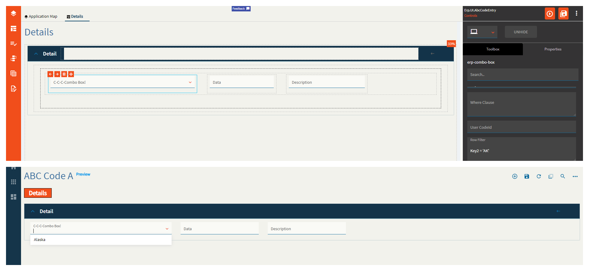
Where Clause |
Obsolete. Use row filter instead. |
| Advanced |
User CodeId |
Obsolete. Set the reusable type to be UserCode.UserCodes instead. |
| Advanced |
Row Filter |
Set the client filter to be applied to the items after data is retrieved, but before filling the combo. (Fig. K) |
| Advanced |
Search Filter |
Set the filter to be applied at the service level while retrieving the components. (Fig. L) |
| Advanced > List |
Display |
When setting a static list, this is the text to be shown in the combo. (Fig. M) |
| Advanced > List |
Value |
When setting a static list, this is the value to be stored in the binding. (Fig. M) |
| Advanced |
Data |
You can define a string array here to display. You’re supposed to be able to do an array of objects for a value/display pair, but I could not get that to render correctly. I believe this has to do with the TextField/ValueField, but I’m not sure what to put here as the usual display/value does not work. Example: ["Item1", "Item2] (Fig. N) |
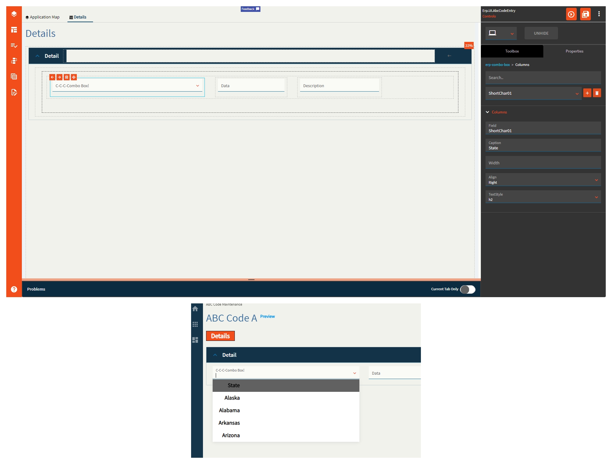
| Advanced > Columns |
Field |
Set the name of the column where you wish the following properties to be applied to. Exampled: ShortChar01 |
| Advanced > Columns |
Caption |
Set the title for the column in the combo. (Fig. O) |
| Advanced > Columns |
Width |
Set the width of the column in the combo. |
| Advanced > Columns |
Align |
Set the alignment of the column in the combo. Valid values include Right, Left, Center. (Fig. O) |
| Advanced > Columns |
TextStyle |
Set the style of the text of the column in the combo. Value values include h1, h2, h3, normal. (Fig. O) |
| Advanced |
Filterable |
Does not seem to do anything. This is suppose to allow the user to filter the data in the combo. |
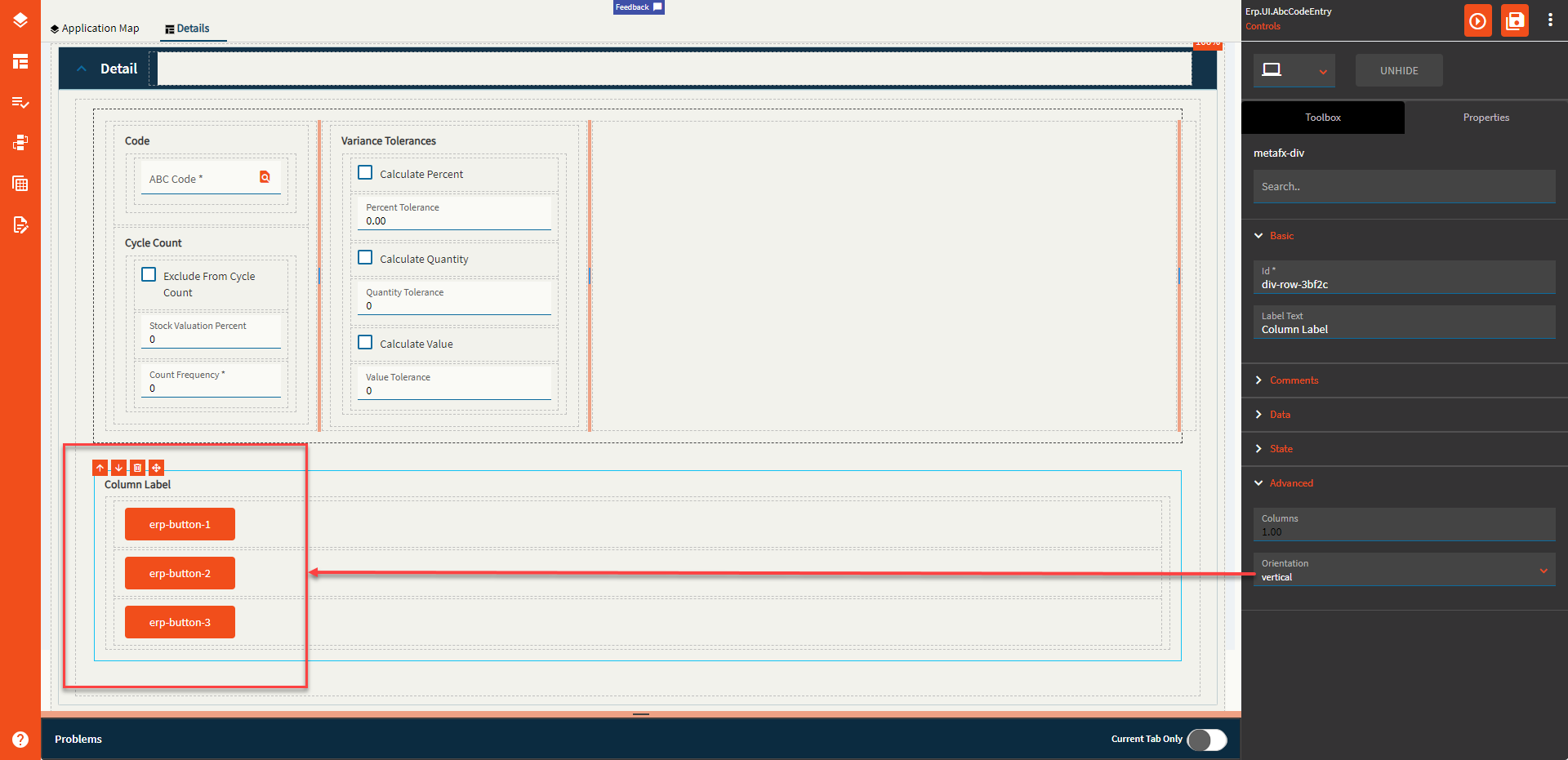
| Advanced |
Vertical Columns |
Set to true if null values can be saved to data. Not sure how the property name relates, but #Shrug |
| Advanced |
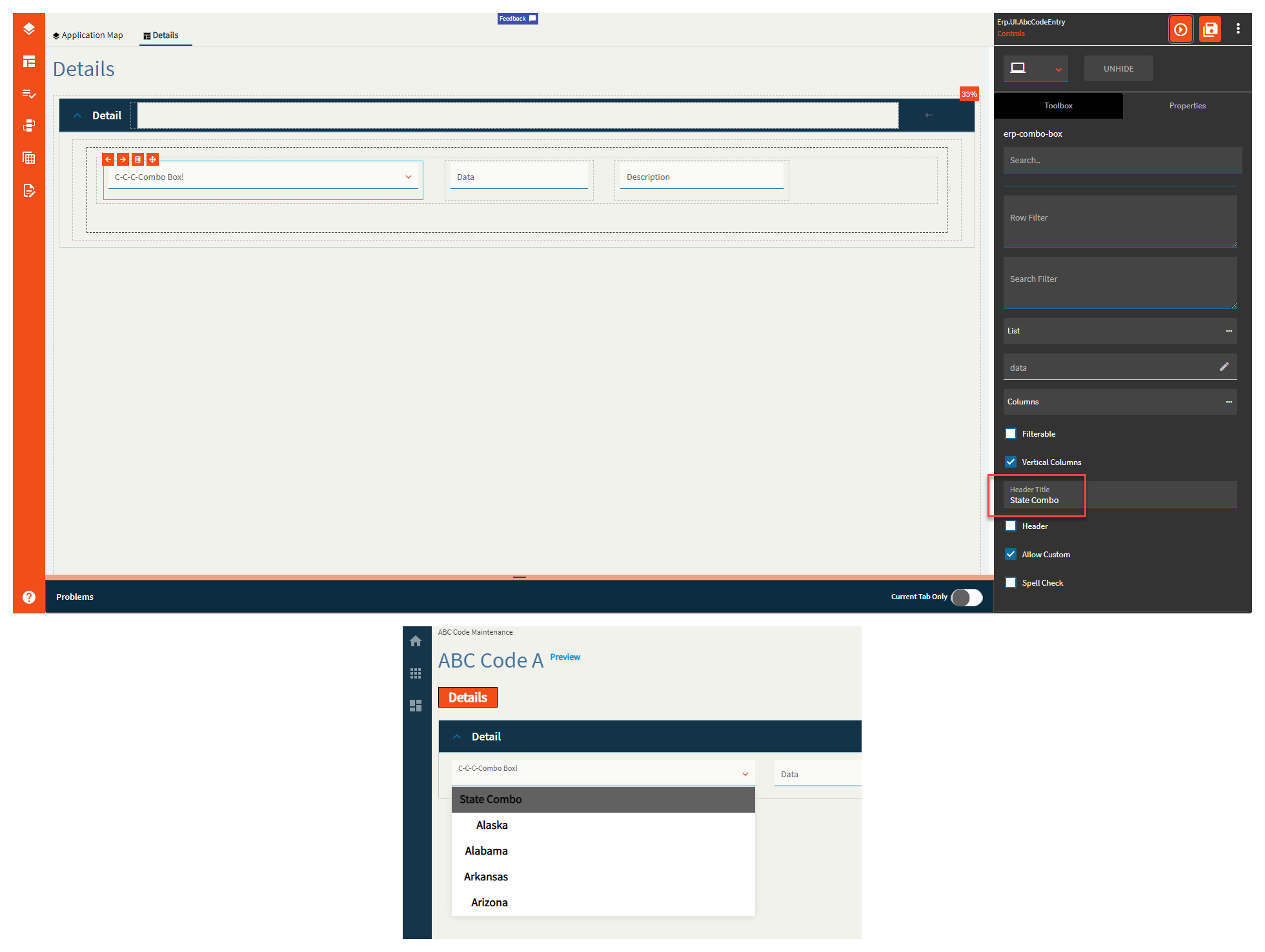
Header Title |
Sets the title of the combo. (Fig. P) |
| Advanced |
Header |
Does not seem to do anything. “Set to add headers for columns on comboBox”. |
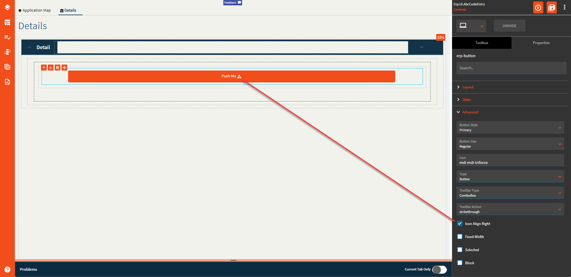
| Advanced |
Allow Custom |
Set to allow user-defined values that are not present in the dataset. (Fig. Q) |
| Advanced |
Spell Check |
Does not seem to do anything and would be silly anyways? Enable to check for spelling and grammar. |
 Panel Card Gantt | (metafx-panel-card-gantt)


 )
)


 )
)