Date Picker
Dates here! Get your dates here! Fresh and mostly working!
This control allows you to enter or pick a date. Shocking, I know!
| Property Group | Property | Description |
|---|---|---|
| Basic | Id | Unique identifier for the control |
| Basic | Label Text | Sets the label within the control. (Fig. A) |
| Behavior | On Blur | Click this to create an OnBlur event for the control. On Blur is triggered when the control loses focus. |
| Behavior | On Create | Click this to create an OnCreate event for the control On Create is triggered when the control is painted to the GUI. |
| Comments | Comments | Add some developer notes to the control. These are not customer-facing and are only visible in App Studio (Fig. B) |
| Data | Key Field | Indicates that a bound component is a key field. If true, the field is enabled if there is no current record, allowing the user to select an existing record or create a new one. |
| Data | EpBinding | Bind the button to a DataView.Column. |
| Layout | Alignment |
 Set the alignment for the control. Valid options are Left, Center, Right. Doesn’t work. Set the alignment for the control. Valid options are Left, Center, Right. Doesn’t work. |
| Layout | Width |
Sets the specific width (pixels) for the control. Doesn’t work. |
| State | Personalizable | If true, a user can personalize this component(hide/show) |
| State | Customizable | If true, a user can customize this component in child layers |
| State | Hidden | Hides the control from view. |
| State | Disabled | Disables the control. The control will not allow editing or focus. |
| State | Read Only | Makes the control read only so that it will not allow editing. The control can still be focused. |
| State | Auto Focus | When enabled, the control is automatically focused on creation. |
| Advanced | Format Placeholder | Sets the way the format sections of the input field are rendered. Valid options incluuuude Wide, Narrow, Short, FormatPattern. Narrow and Short appear to be the same. (Fig. C) |
| Advanced | Place Holder |
Sets the hint the DatePicker display when its value is null. No. No it doesn’t. This does nothing. |
| Advanced | Min Allowed Date | Specifies the minimum date allowed for the control. (Fig. D) |
| Advanced | Max Allowed Date | Specifies the maximum date allowed for the control. (Fig. E) |
| Advanced | Range Validation | If enabled, this will enforce the min and max allowed dates. |
| Advanced | Week Number | If enabled, this will display a week number column in the month view of the calendar (Fig. F) |
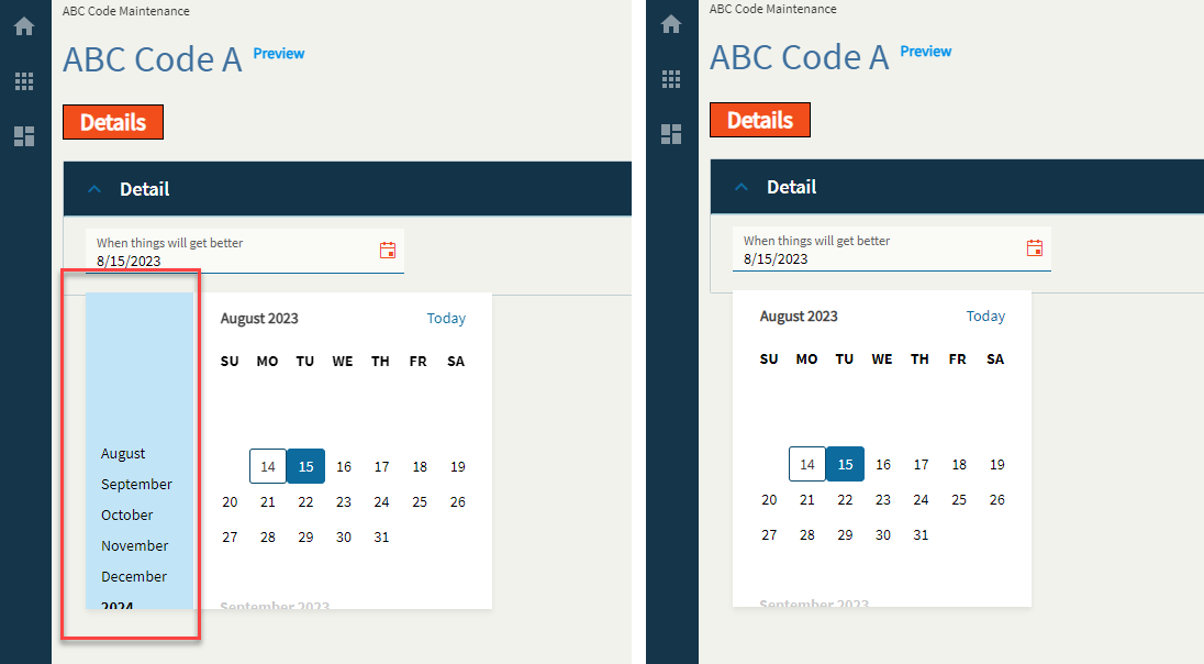
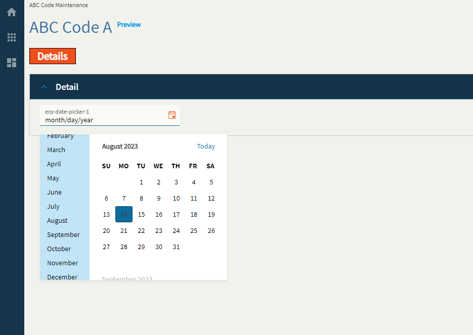
| Advanced | Navigation | If enabled, this will display the navigation side-bar on the calendar. (Fig. G) |
| Advanced | Mask |
Override the default display format for the date time value using Standard DateTime Format strings such as MM/dd/yyyy (08/15/2023) or MMM yyyy (Aug 2023). Doesn’t work. |
Figure A: Label Text
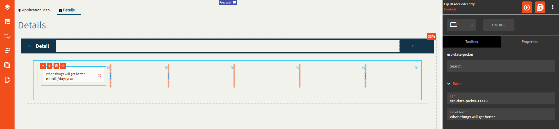
Figure B: Comments
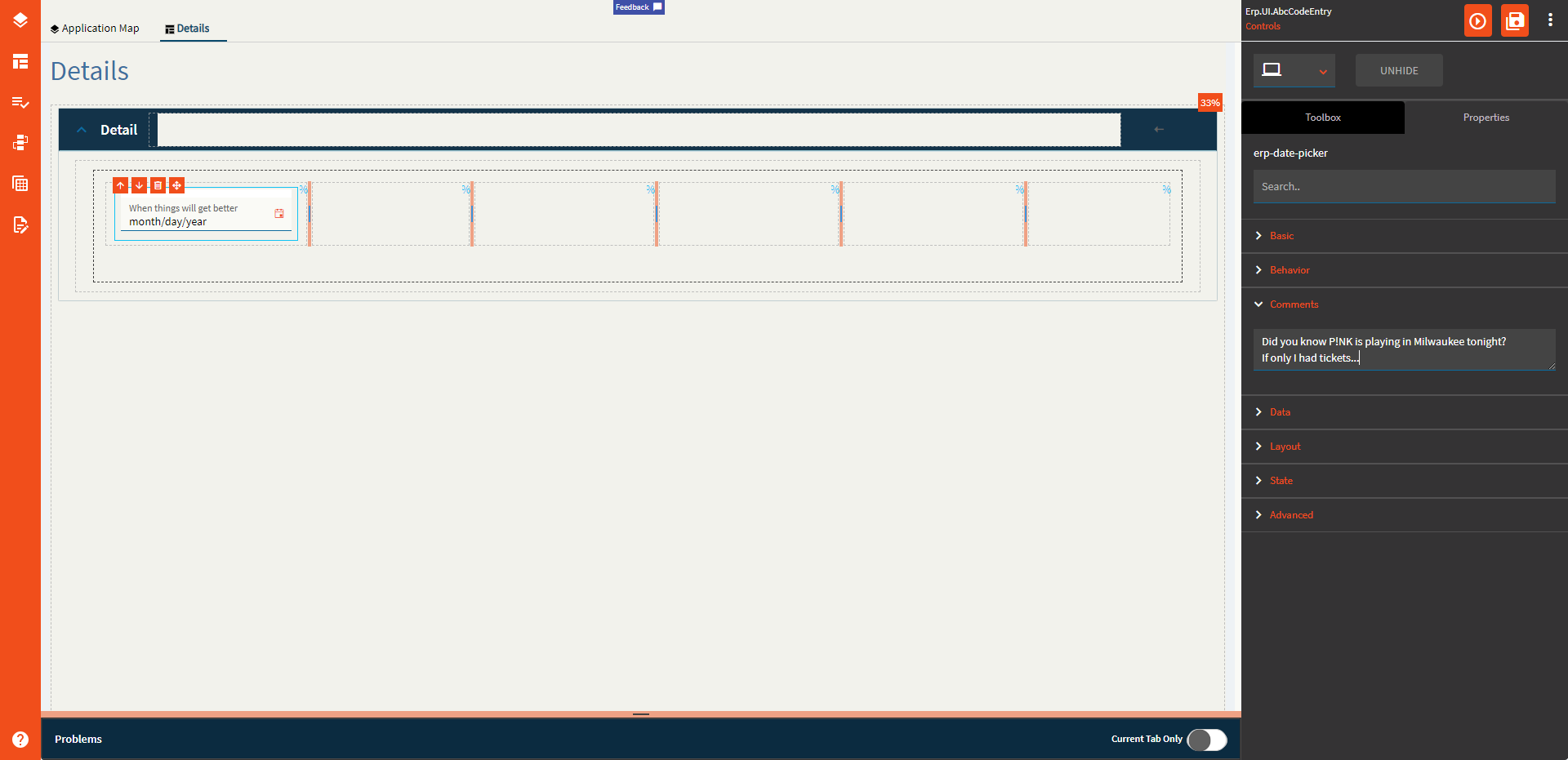
Figure C: Format Placeholder
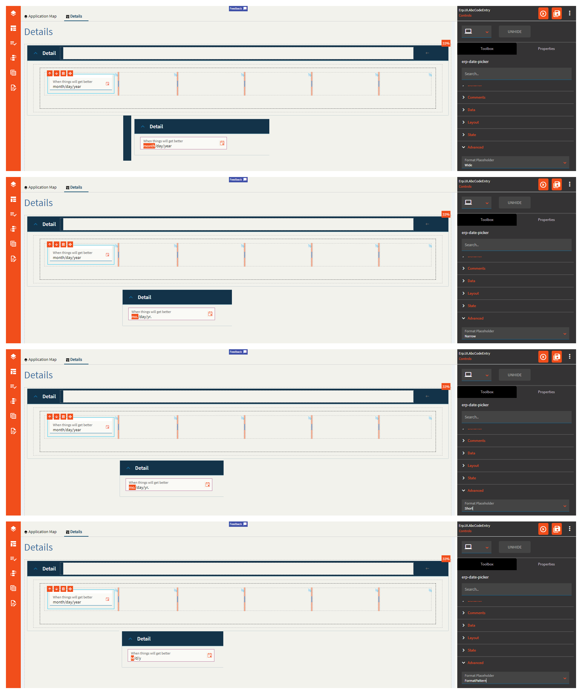
Figure D: Min Allowed Date
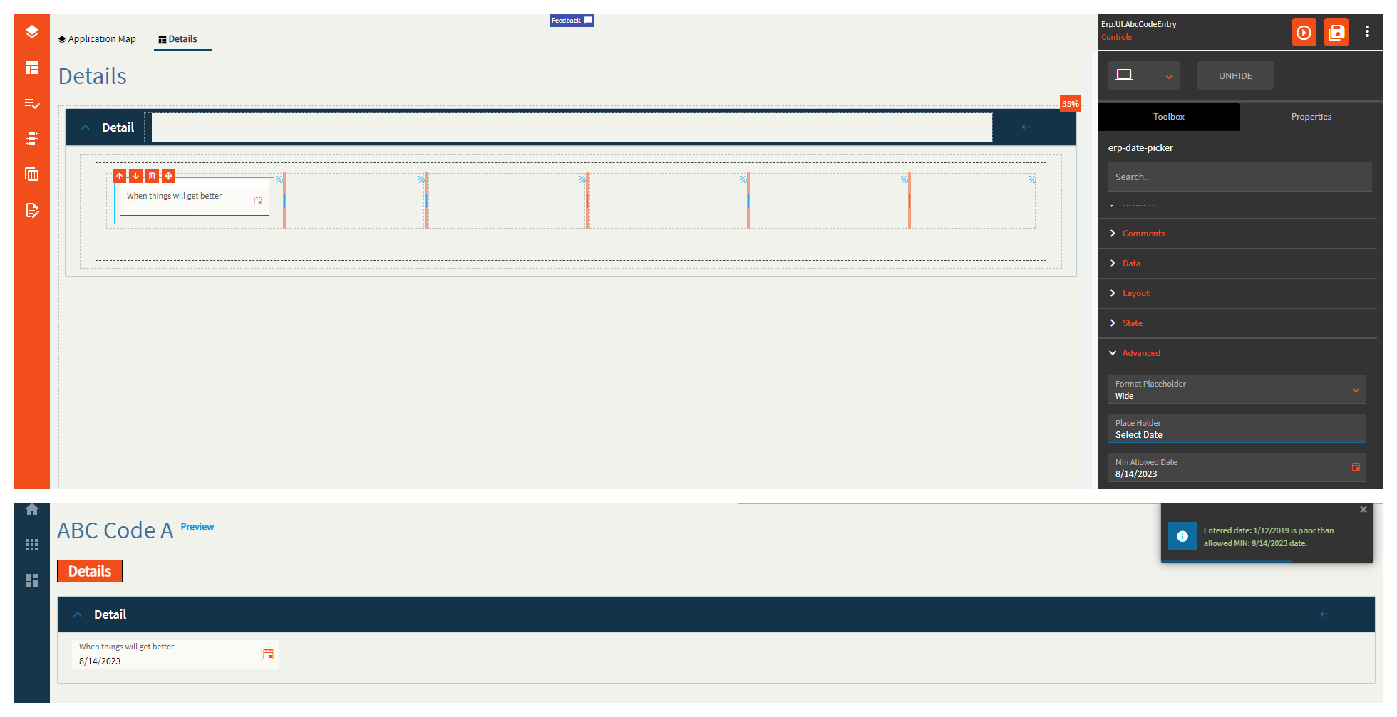
Figure E: Max Allowed Date
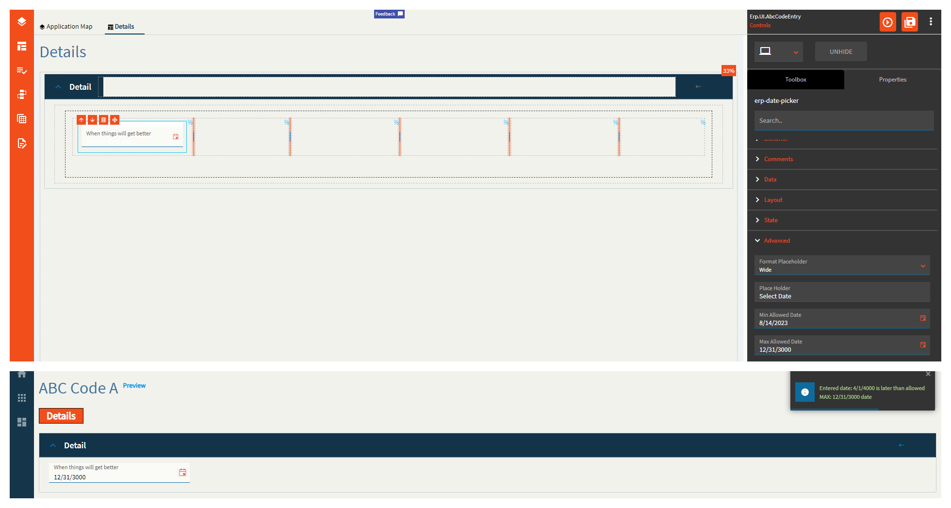
Figure F: Week Number
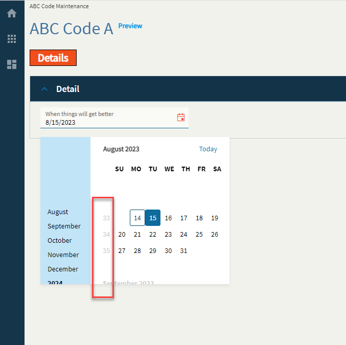
Figure G: Navigation