Grid 
The formation of each driver’s starting position at the beginning of the ra-- …ope, nope. Not that one.
Expandable container that displays a grid and allows interaction with the grid using additional components in the panel card header.
| Property Group | Property | Description |
|---|---|---|
| Basic | Id | Unique identifier for the control |
| Basic | Label Text | Sets the Title of the grid found on the Panel Header. (Fig. A) |
| Behavior | On Panel Card Expand | Hook into an event which occurs when the panel card is opened. (Fig. B) |
| Behavior | On Panel Card Collapse | Hook into an event which occurs when the panel card is closed. (Fig. B) |
| Comments | Comments | Add some developer notes to the control. These are not customer-facing and are only visible in App Studio (Fig. C) |
| Data | Key Field | Indicates that a bound component is a key field. If true, the field is enabled if there is no current record, allowing the user to select an existing record or create a new one. Not relevant to this control. |
| Data | EpBinding | Bind the control to a DataView.Column. I’ve never used this binding field. I don’t believe this is relevant to this control. |
| Data > Grid | Scrollable | Determines how the data in the grid is rendered. Valid options include: None, Scrollable, Virtual (requires page size property as well). None will load the entire dataset up front and load it into the grid.  Presumably, scrollable does the same? Virtual render the number of rows (page size) and will load that many more as you scroll. Presumably, scrollable does the same? Virtual render the number of rows (page size) and will load that many more as you scroll. |
| Data > Grid | Height | Sets the height of the grid in pixels. (Fig D.) |
| Data > Grid | Width | Sets the width of the grid in pixels. (Fig D.) |
| Data > Grid | Row Height | Has no effect. |
| Data > Grid | Page Size | Sets the number of records to render for the Virtual scroll model. (Fig. E) |
| Data > Grid | Entity Type | No idea! |
| Data > Grid | Drag Image Icon | No idea! |
| Data > Grid | Resizable | Enable to allow the user to resize the column headers. |
| Data > Grid | Sortable | Sorting is enabled regardless of this checkbox. |
| Data > Grid | Pageable | Paging seems to happen regardless. |
| Data > Grid | Groupable | Not sure why this is tri-state, but enabling it allows a user to group on columns. (Fig. F) |
| Data > Grid | Filterable | Enable to allow filtering. (Fig. G) |
| Data > Grid | Advanced Filter | Doesn’t change the filter settings. #Shrug |
| Data > Grid | Reorderable | Allows the user to reorder the columns to their fancy. (Fig. H) |
| Data > Grid > Row Reorder | Reorder Rows | Reorder Rows |
| Data > Grid > Row Reorder | Sortable Column Name | Set the sortable column name. So, I just have no words here. There’s some effed up looping going on. Here’s a GIF for the lulz, but I would stay away from this property. (Fig. I) *Okay, so this is definitely broken. What’s needed to make this work is a sort applied to the dataview that sorts on the Sortable Column Name. This column should be an integer sequence. I was able to get this to work by injecting the sort into the JSON and updating SQL. A fix should be in motion as of 2/24/25. |
| Data > Grid | Editable | Enables editing of the grid cells. This is to be used in conjunction with Columns > Editable. (Fig. J) |
| Data > Grid | Disable Paste New | Disables the paste new operation from the right-click menu. (Fig. K) |
| Data > Grid | Disable Paste Update | Disables the paste update operation from the right-click menu. (Fig. K) |
| Data > Grid | Selectable | Enables the selection of rows. Used in conjunction with Data > Grid > Selection Options. (Fig. L) |
| Data > Grid | Maximum Columns | Set the max number of columns to be displayed. This will display the first N columns returned from the dataset. (Fig. M) |
| Data > Grid > Selection Options | Checkbox Selection | Shows a column of checkbox selectors. (Fig. L) |
| Data > Grid > Selection Options | Show Select All | Shows a checkbox in the upper-left that selects all rows. (Fig. N) |
| Data > Grid > Selection Options | Select by Field | Boolean field to designate that the row has been selected. Generally, this is a hidden column you create. (Fig. O) |
| Data > Grid > Selection Options | Select All EpBinding | Set the data binding to indicate select all has been checked in the format of DataView.Column. (Fig. P) |
| Data > Grid > Selection Options | Select All Page Count | Set the Select All page total for how many rows/pages are loaded and selected if not all the records can be selected up front. Didn’t seem to do anything. |
| Data > Grid > Edit Options | Edit Mode | Not sure. They don’t seem to do anything different. |
| Data > Grid > Edit Options | Update On Change | Enable the update on change mode (otherwise update occurs on leaving control). Doesn’t seem to trigger anything. |
| Data > Grid > Columns | Field | Set the field name from the dataset. If it’s from a BAQ, then it would be in the format of Table_Column. If it’s from a dataview bound to the grid, then it would just be the column name with no table or dataview prefix. BAQ Example: Part_PartNum | BO Example: PartNum |
| Data > Grid > Columns | Title | Give the column header a title. This will default to the Field name if none is supplied. (Fig. Q) |
| Data > Grid > Columns | Ep Binding | Set the data binding for the column using format View.Column (special cases). What are those special cases? Who knows? |
| Data > Grid > Columns | ID | Set the ID for the column. This can be used in events. |
| Data > Grid > Columns | Erp Editor | Select the type that the column will be such as Boolean, Combo, Text, Currency, etc. This is used in conjunction with the Erp Editor Model to define the special behaviors of each. For instance, if setting the Erp Editor to Combo, you can then define the data in said combo by using the Erp Editor Model. |
| Data > Grid > Columns | Erp Editor Model | As mentioned above, this is used to define the properties of the Erp Editor. To find out more, reference the appropriate control within this page. Text = Textbox, Boolean = Checkbox, Combo = Combo, etc. |
| Data > Grid > Columns | Disable Currency Toggle | Enable this to prevent the currency from toggling when using the Currency Selector control. |
| Data > Grid > Columns | Is Link | Turns the data within this column into a clickable link. You will need to set up any actions by creating an event using the Grid/onClick event. (Fig. R) |
| Data > Grid > Columns | Skip Row Change On Link Click | Disables any row change events that may fire when clicking the link. |
| Data > Grid > Columns | Filterable | Enables or Disables filters for the column. (Fig. S) |
| Data > Grid > Columns | Sortable | Enables or Disables sorting for the column. |
| Data > Grid > Columns | Width | Sets the specific width of the column in pixels. (Fig. T) |
| Data > Grid > Columns | Editable | Enables editing for the column. (Fig. J) |
| Data > Grid > Columns | Selector | Sets the column as the designated selector. (Fig. O) |
| Data > Grid > Columns | Hidden | Hides a column (Fig. U) |
| Data > Grid > Export Excel Settings | File Name | Name of the Excel file when exporting. (Fig. V) |
| Data > Grid > Export Excel Settings | Number of pages to export | Doesn’t do anything. My page size is 50, I set this to 1, and it downloaded all 1,000 rows. |
| Data > Grid | ID | Set the ID of the grid. This is used to affect the grid in events. |
| Data > Grid | Ep Binding | The data binding for the grid when the view is populated elsewhere (events). Format: DataView Example: ABCCode |
| Data > Grid > Columns Hidden | Field | The column name to hide from the grid. This is useful if you only want to hide one or two vs using Columns to explicitly define what to show. If it’s from a BAQ, then it would be in the format of Table_Column. If it’s from a dataview bound to the grid, then it would just be the column name with no table or dataview prefix. BAQ Example: Part_PartNum | BO Example: PartNum |
| Data > Grid > Provider Model | Ep Binding | Set the name of the view that receives the data from the server call. Format: ABCCode |
| Data > Grid > Provider Model | Description | This is basically just a comment for the provider model. |
| Data > Grid > Provider Model | Svc | The REST service that provides the data. Example: Erp.BO.PartSvc (Fig. W) |
| Data > Grid > Provider Model | Svc Path | The REST method to be called. Example: GetList (Fig. W) |
| Data > Grid > Provider Model | Table Name | The table name that holds the data. Example: PartList (Fig. W) |
| Data > Grid > Provider Model | Out Param Name | Set the out parameter name that holds the rows of data. Example: returnObj (Fig. W) |
| Data > Grid > Provider Model | Client Filter | Filters the dataset after it’s returned from the server. Example: Part_Typecode = 'M'. |
| Data > Grid > Provider Model | Rest Params | Set a JSON object composed of key-value pairs that define the parameters that are sent into the service call. Example: { "whereClause": "PartNum = '10008'" } (Fig. W) |
| Data > Grid > Provider Model | Columns | Doesn’t work. Use the columns from the Grid Model section. |
| Data > Grid > Provider Model | BAQ ID | BAQ Identifier that will provide data. Example: PartList (Fig. X) |
| Data > Grid > Provider Model > BAQ Options | Page Number | If there are multiple pages, this defines the first page to display. |
| Data > Grid > Provider Model > BAQ Options | Page Size | Page size (number of rows) of data to return. |
| Data > Grid > Provider Model > BAQ Options | Where | Where Clause for the BAQ. (Fig. Y) |
| Data > Grid > Provider Model > BAQ Options > Where List | Column | The BAQ column name to filter on. Format: Table_Column (Fig. Z) |
| Data > Grid > Provider Model > BAQ Options > Where List | Condition | The operator to use. Valid options include =, <=, >=, <>, starts, matches, like (% wildcard). (Fig. Z) |
| Data > Grid > Provider Model > BAQ Options > Where List | Value | The value to check against. Format is '??{DataView.Column}' or a literal. Use single quotes around strings. A single ‘?’ will not let the REST call happen if the value is empty or null. ‘??’ will make the REST call regardless of the value. (Fig. Z) |
| Data > Grid > Provider Model > BAQ Options > Where List | Honor Null | Honor null will send null if the value is.. null! Otherwise, it will NOT append that where item to the where clause in the case of a null value. |
| Data > Grid > Provider Model > BAQ Options > Where List | Empty Value | If the value of the binding is empty, this will get sent instead. |
| Data > Grid > Provider Model | Page Padding Size | Overrides the default of 2 additional pages of data that should be retrieved when using server paging with a BAQ data provider. |
| Data > Grid > Provider Model | Auto Load Grid | Indicate if the grid column definitions should be autoloaded using existing definitions for the bound dataview columns. |
| Data > Grid > Provider Model | Set Default | Indicate if this provider is the default selection in the provider list on the panel card grid. Not sure with this one since you cannot add multiple providers here. |
| Data > Grid > Provider Model | Server Paging | Indicate if this provider retrieves data as needed as the user scrolls through grid pages instead of returning them all at once. |
| Data > Grid | Collapse Groups | Collapse all groups by default. Doesn’t work. |
| Data > Grid | Auto Load Columns | Not sure what this does because the columns auto load by default anyways. |
| Layout | Minimum Width | Sets the minimum width the panel can shrink to when the page is in Flex Layout Mode. (Fig I ← Roman Numeral 1) |
| Layout | Width | Doesn’t seem to do anything. |
| State | Personalizable | If true, a user can personalize this component(hide/show) |
| State | Customizable | If true, a user can customize this component in child layers |
| State | Hidden | Hides the control from view. |
| State | Disabled | Disables the control. The control will not allow editing or focus. |
| State | Read Only | Makes the control read only so that it will not allow editing. The control can still be focused. |
| State | Auto Focus | When enabled, the control is automatically focused on creation. |
| Advanced | Auto Fill Container | Enable this to have the grid take the full size of the container it’s in. (Fig. II) |
| Advanced | Expand At Runtime | Enable this to expand the panel card at runtime. When the panel is expanded, it attempts to load data from the provider model. In the case of a dashboard, you may want to disable this to allow users time to fill in the filters. |
| Advanced | Hide Filter Icon | Hides the filter icon from the Panel Card. |
| Advanced | Disable Panel Card Style | Pretty much removes the padding around the outside. This is nice when you’re embedding a panel in a tab control. (Fig. III) |
| Advanced | Export to Excel Disabled | Removes the option to Export to Excel from the Overflow Menu |
| Advanced | Disable Copy Options | Removes the Copy Options from the right-click. (Fig. IV) |
| Advanced | Show Filter and Group Options | Turns on the Group Box and Filters by default. (Fig. V) |
| Advanced > Action Data | ID | The ID of the toolbar button. |
| Advanced > Action Data | Description | The description of the toolbar button. This shows up as the label. (Fig. VI) |
| Advanced > Action Data | Icon | Sets the icon next to the description. Format: mdi mdi-icon-name Icon names can be found here: Material Design Icons (pictogrammers.github.io) (Fig. VII) |
| Advanced > Action Data | Image Url | Set the url that points to the image that is to be displayed on the action item. Couldn’t figure this one out. |
| Advanced > Action Data | Ep Binding | Set the data binding for the action item. This is used for onClick events and others as well as rules. Format: DataView.Column. |
| Advanced > Action Data | ShortCut | Set the keyboard shortcut to fire the onClick event. Example: CTRL+ALT+A |
| Advanced > Action Data | Add to Primary ToolBar | Indicate if the item should be shown in the toolbar next to the overflow menu on the panel card header. (Fig. VIII) |
| Advanced > Action Data | Disabled | Disables the tool. This still seems to show the click animation, but the event doesn’t fire. #SuperGoodEnough? (Fig. IX) |
| Advanced > Action Data | Add Divider | Adds a divider below the menu item. (Fig. X RN) |
| Advanced > Action Data | Sequence | Set the numeric sequence of this item in relation to the other items. (Fig. XI) |
| Advanced > Action Data | System Tool Type | Set the system defined type for this action item. If this value is set, all properties of the item will be overridden with the system defined properties. Doesn’t do anything when set. #Shrug |
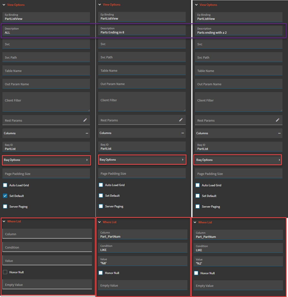
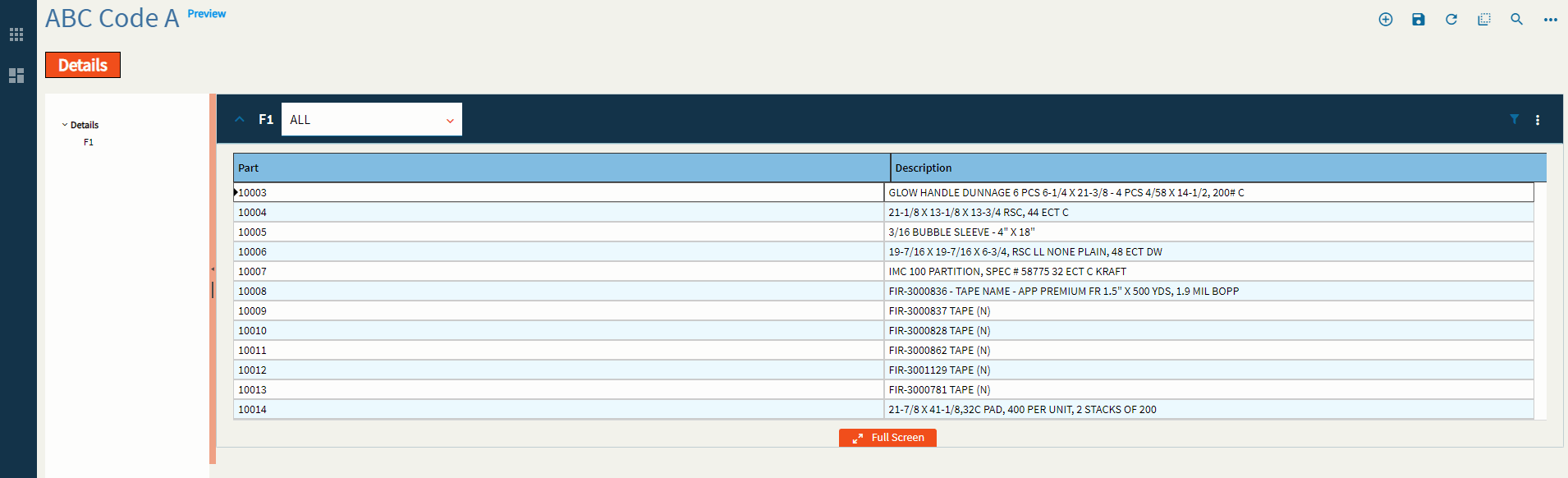
| Advanced | View Options | This is where you can define different, selectable views for a single grid. For instance, if you have a sales order grid, you can have views for All, Open, and Closed. To configure these, please refer to the previously mentioned Provider Model. The setup is the same. You would just set different where clauses for each view. Some points of note that work here and not the overall provider model is the Description shows the text in the View combo and the Set Default selects that view over the others to load by default. (Fig. XII) |
Figure A: Title
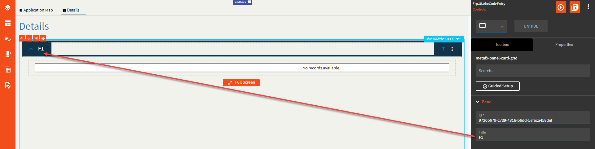
Figure B: Behaviors

Figure C: Comments
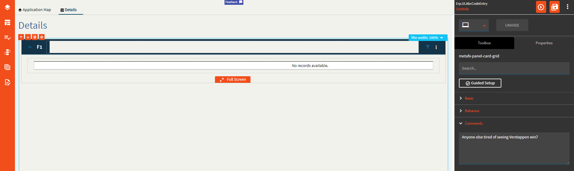
Figure D: Height/Width

Figure E: Page Size
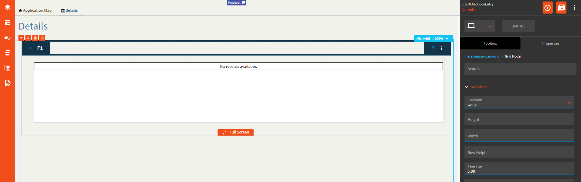
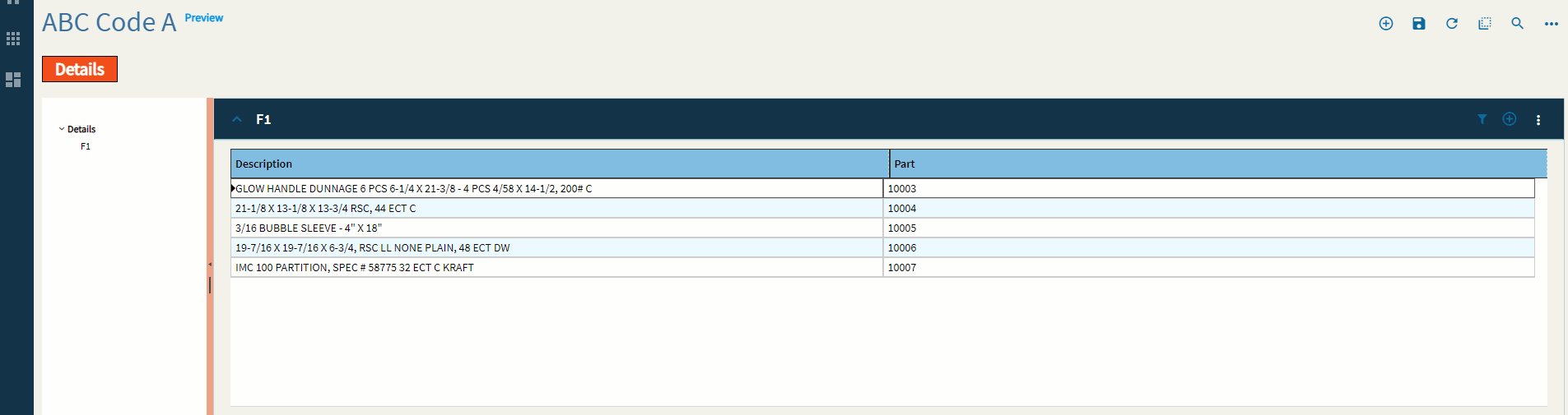
Figure F: Groupable
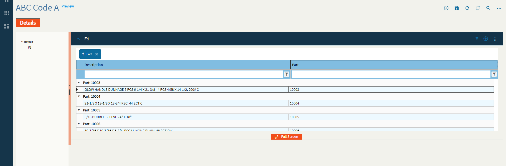
Figure G: Filterable
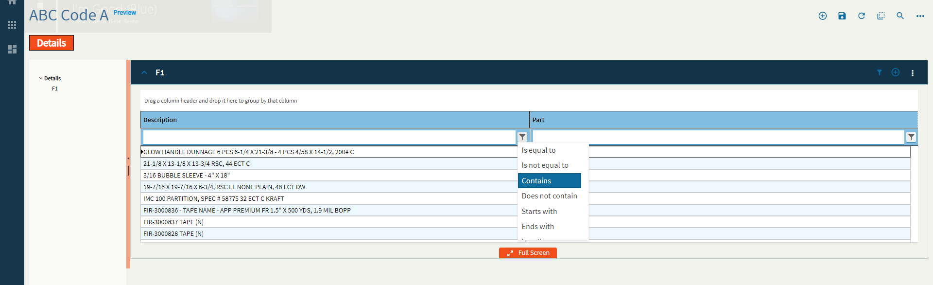
Figure H: Reorderable
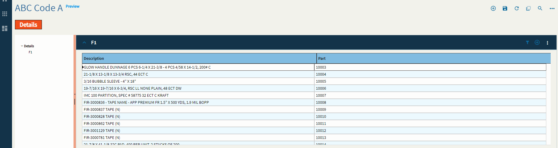
Figure I: Reordering of Rows?
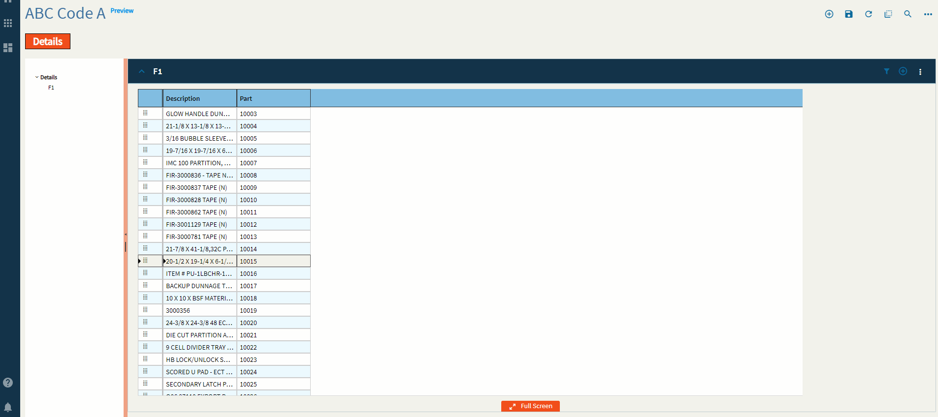
Figure J: Editable
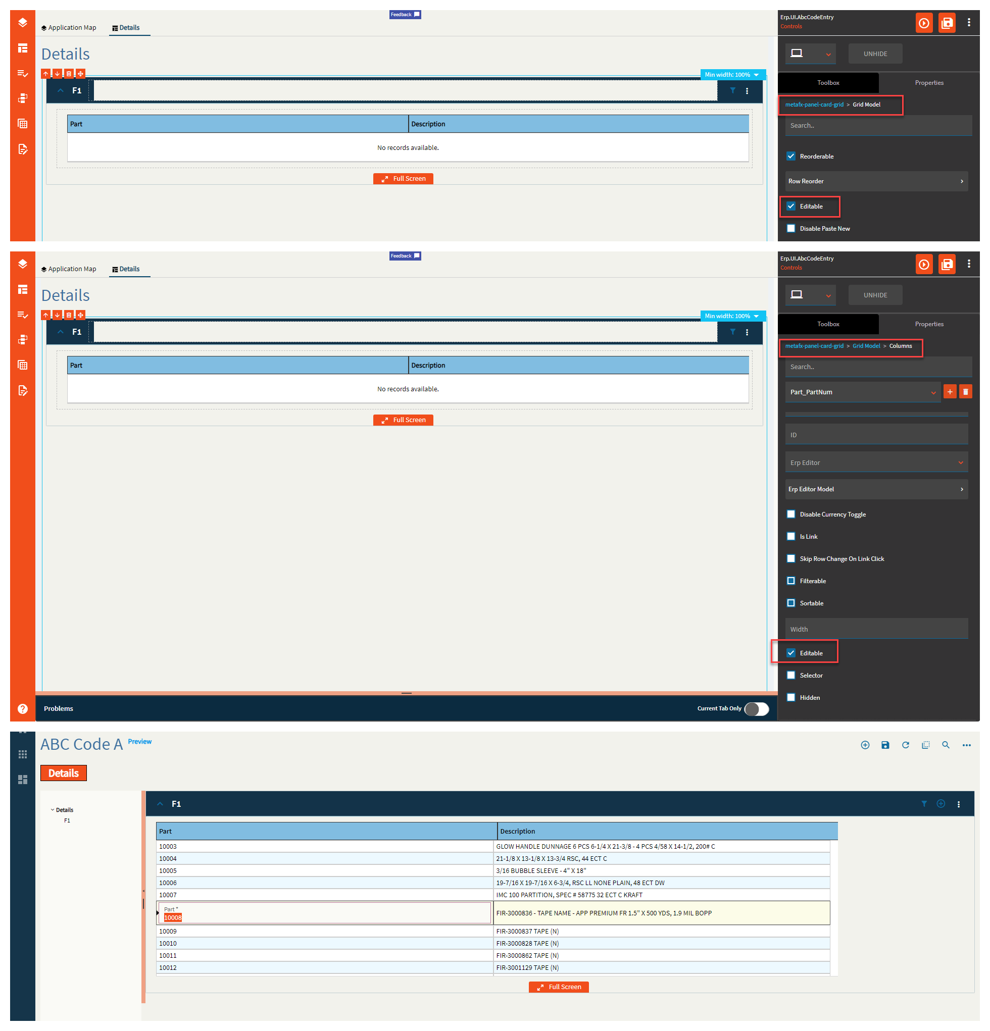
Figure K: Disable Paste Operations
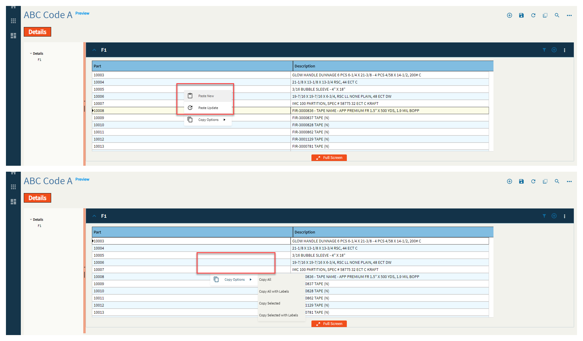
Figure L: Selectable
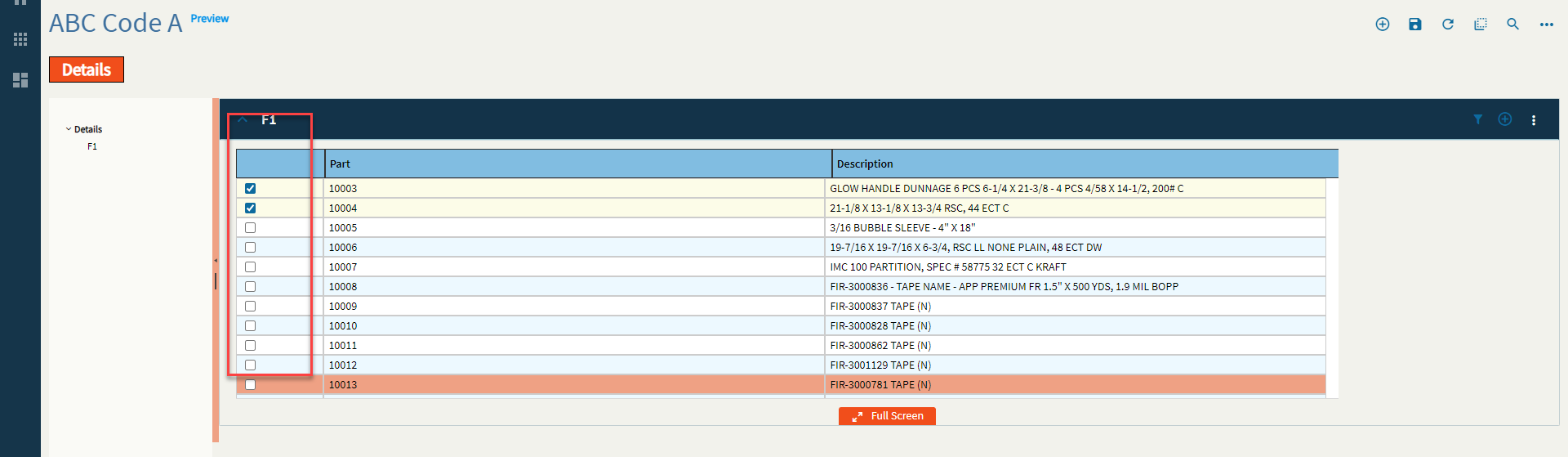
Figure M: Max Columns
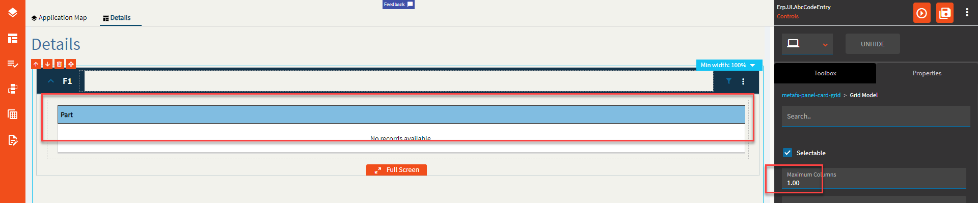
Figure N: Select All
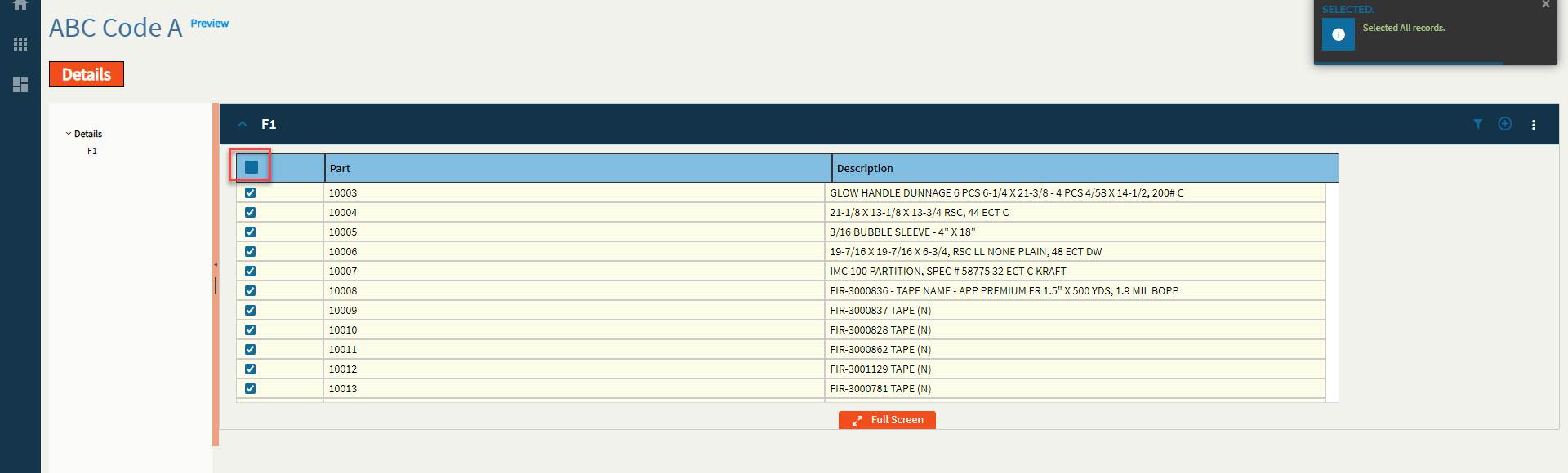
Figure O: Select by Field
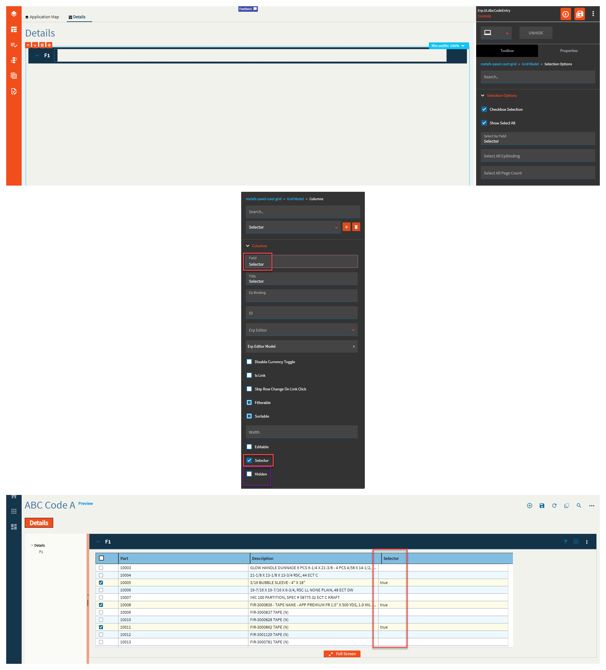
Figure P: Select All EpBinding
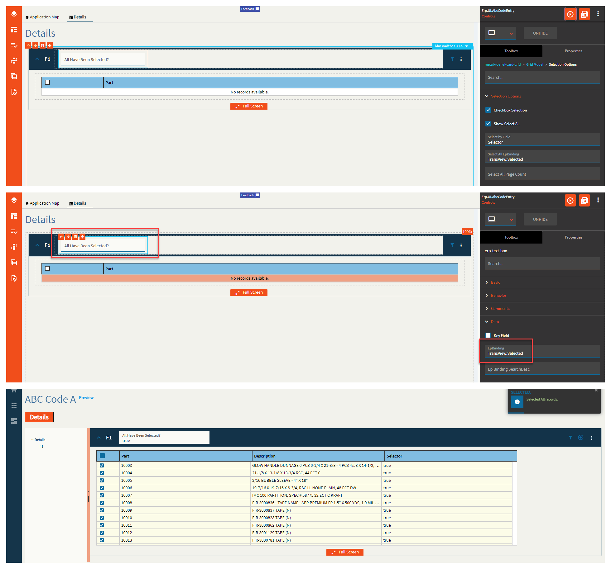
Figure Q: Title
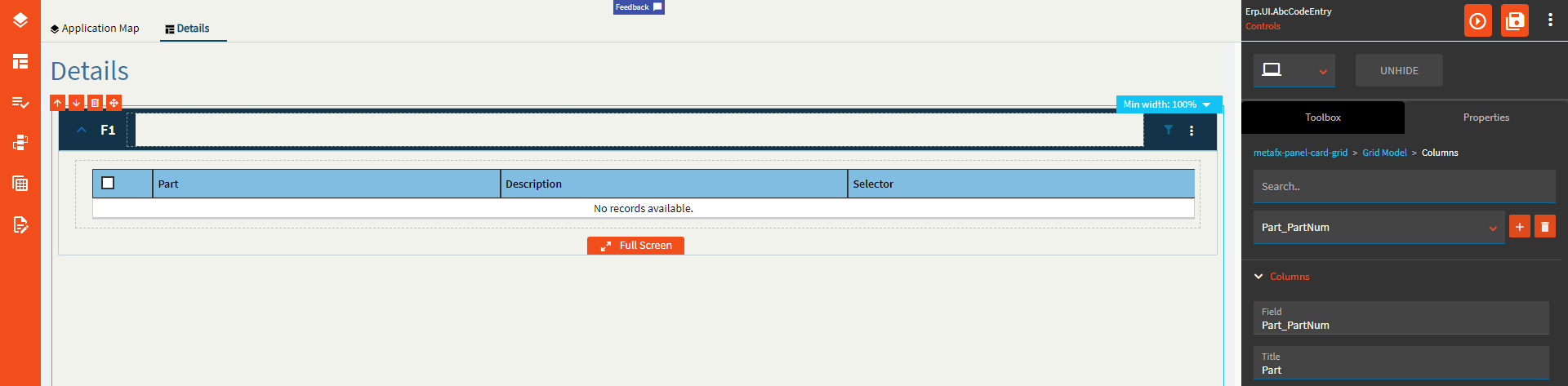
Figure R: Is Link
Figure S: Filterable
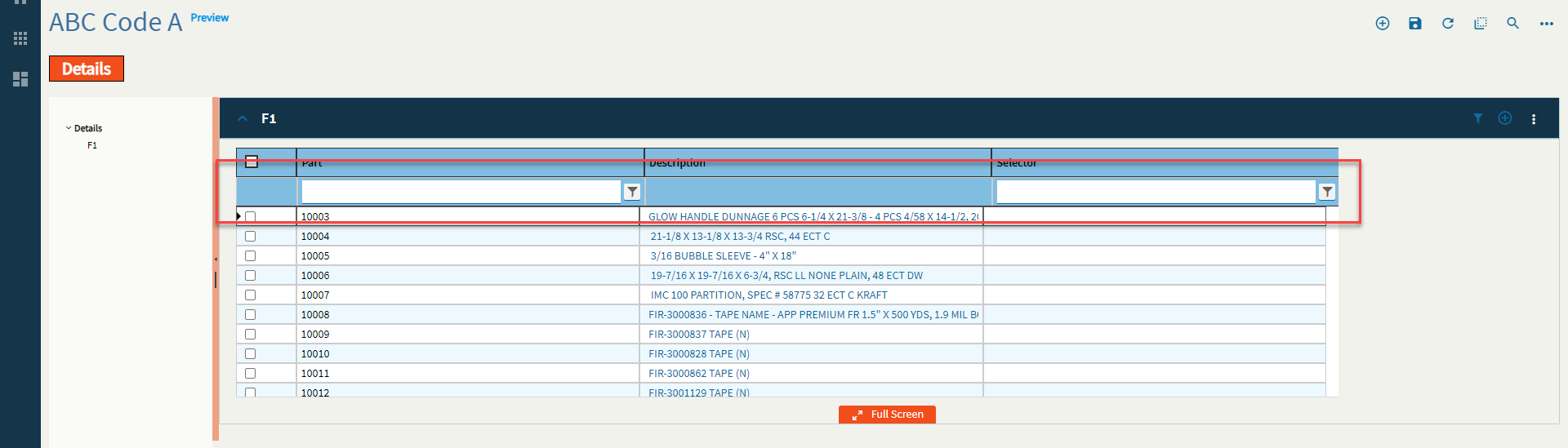
Figure T: Width
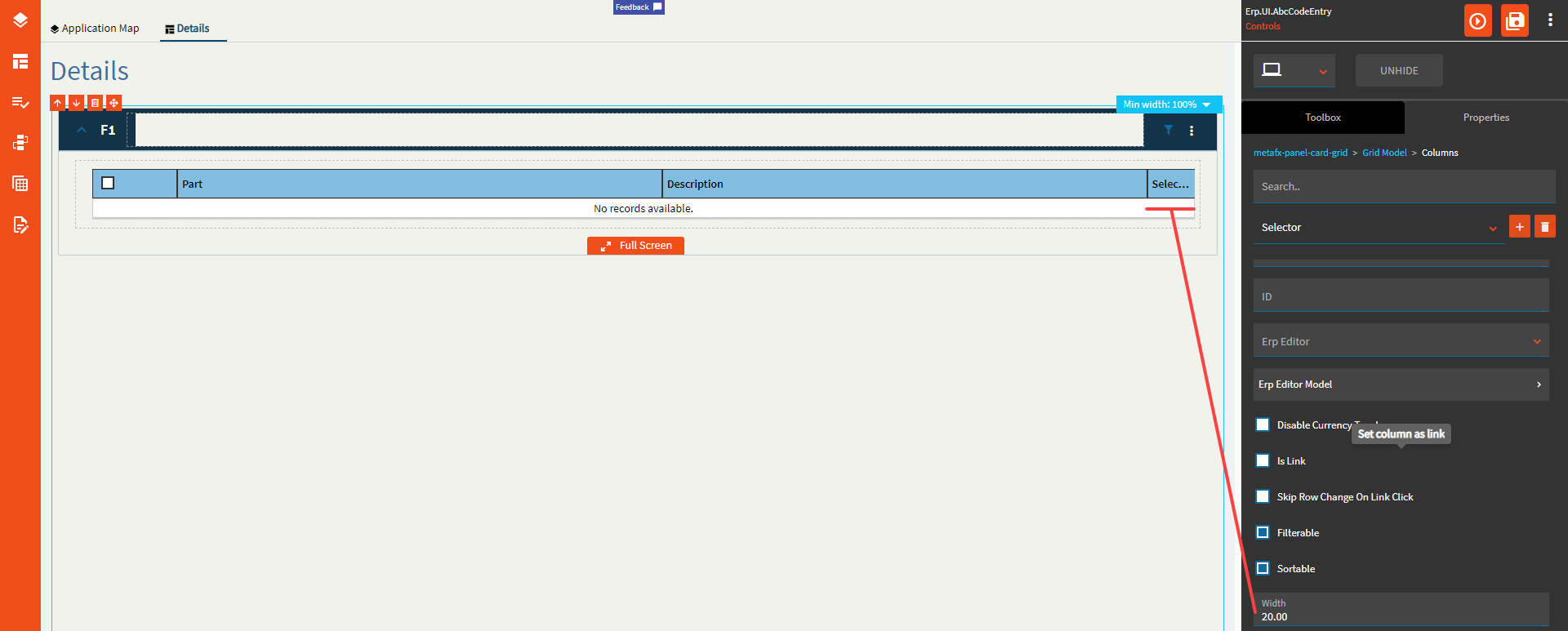
Figure U: Hidden
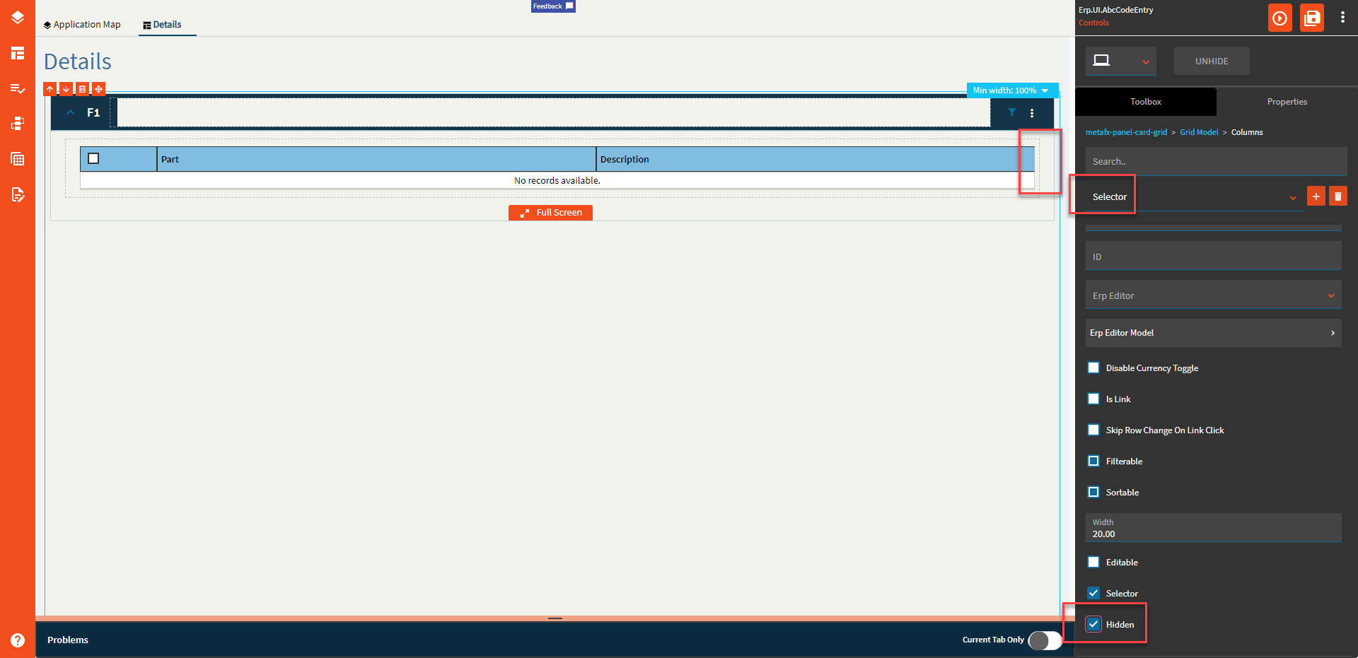
Figure V: File Name
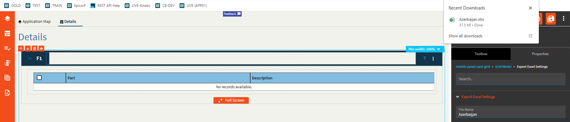
Figure W: Provider Model
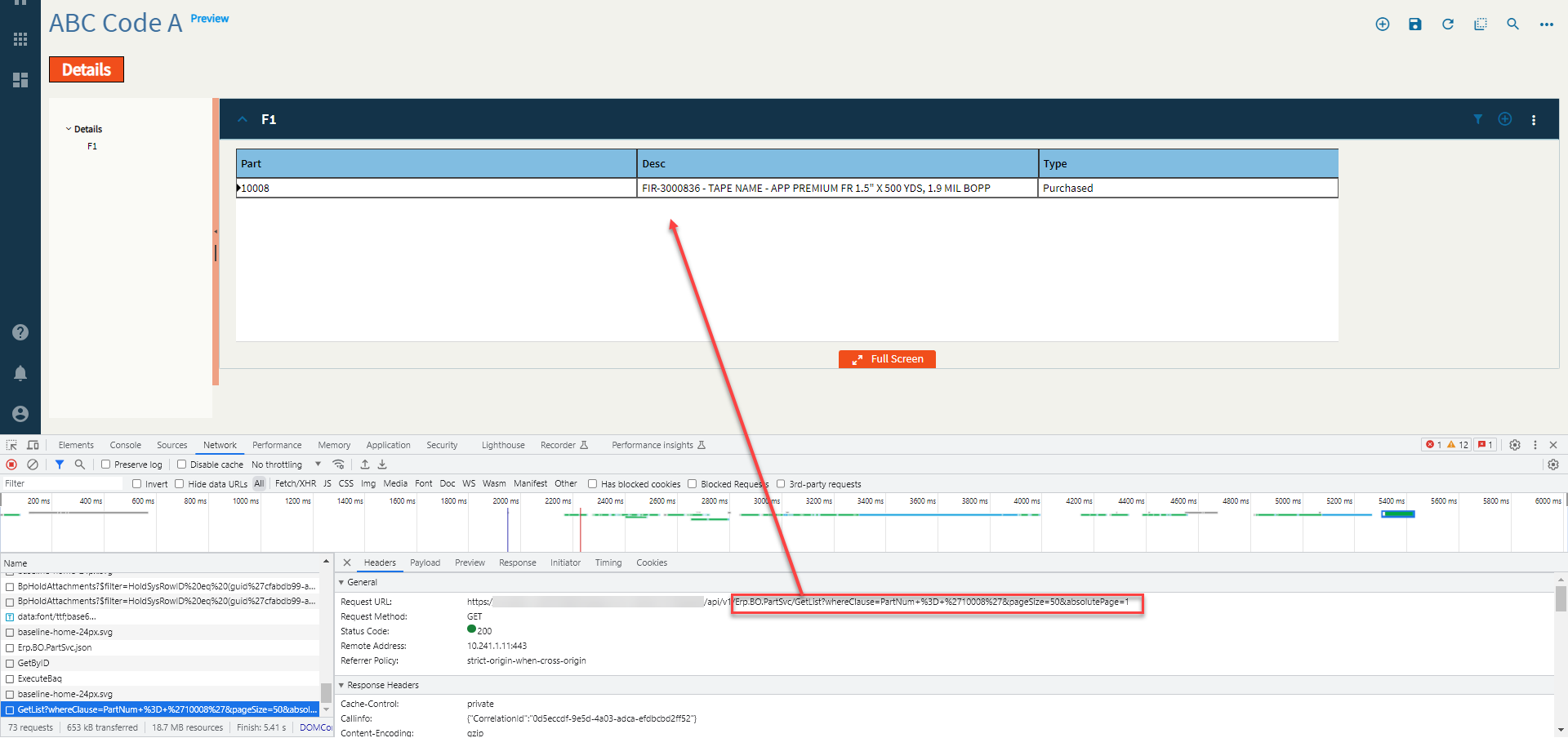
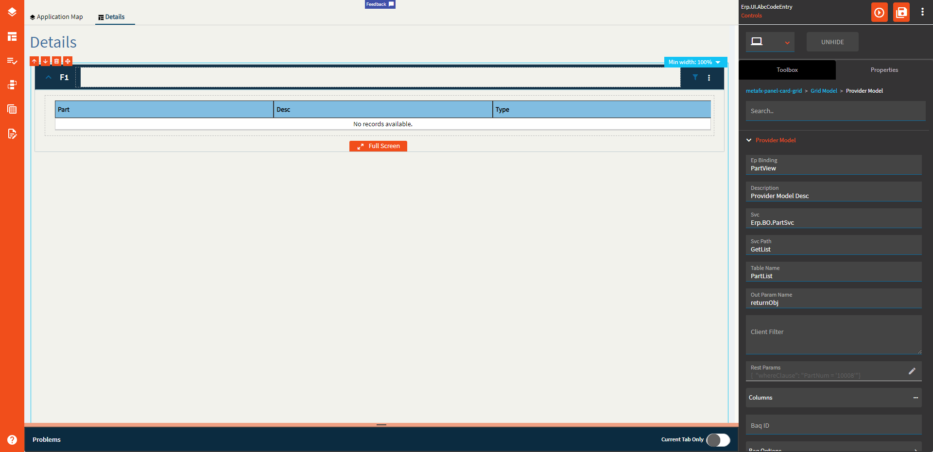
Figure X: BAQ ID

Figure Y: Where Clause
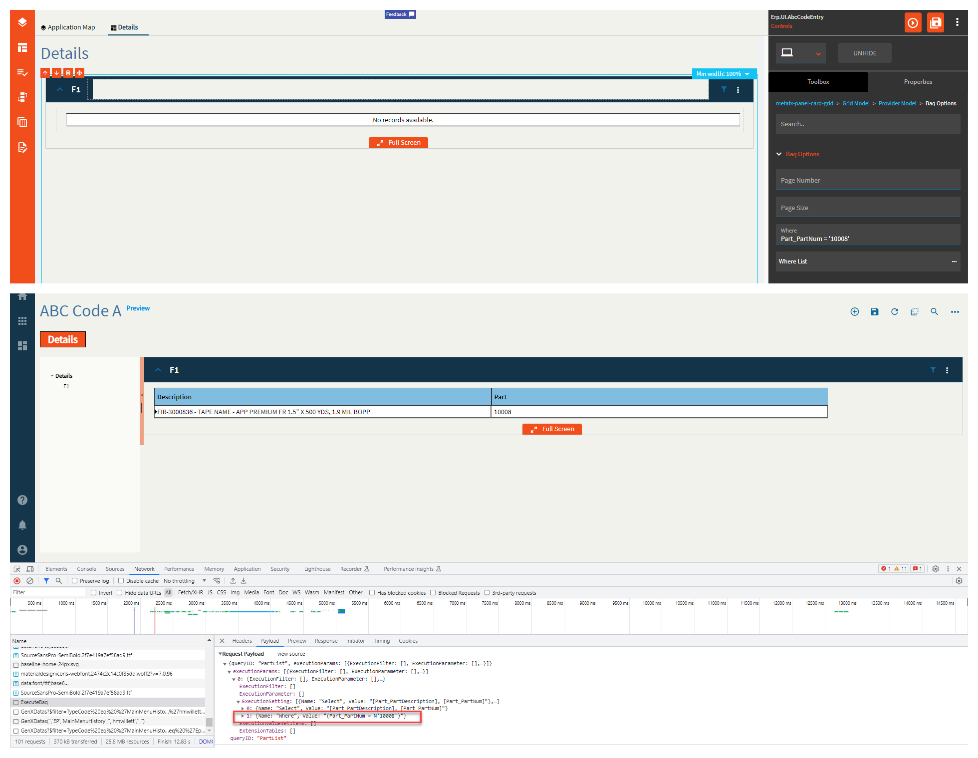
Figure Z: Where List
You can add as many of these as you need, but they will always be concatenated with “AND”. If you want to do an “OR” you will need to write it yourself in the “Where” found in the BAQ Options.
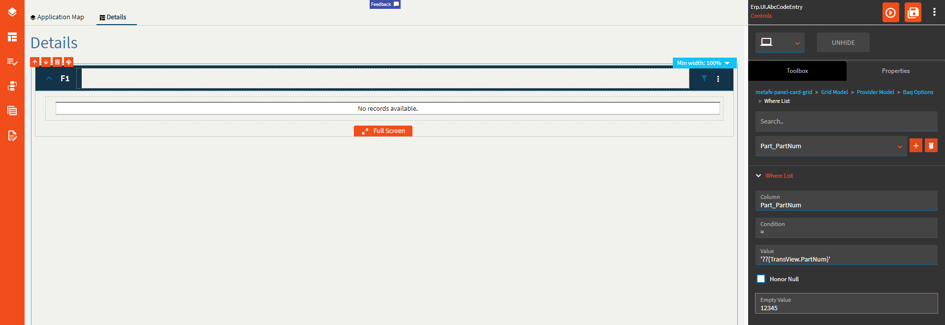
Figure I (Roman Numeral): Minimum Width
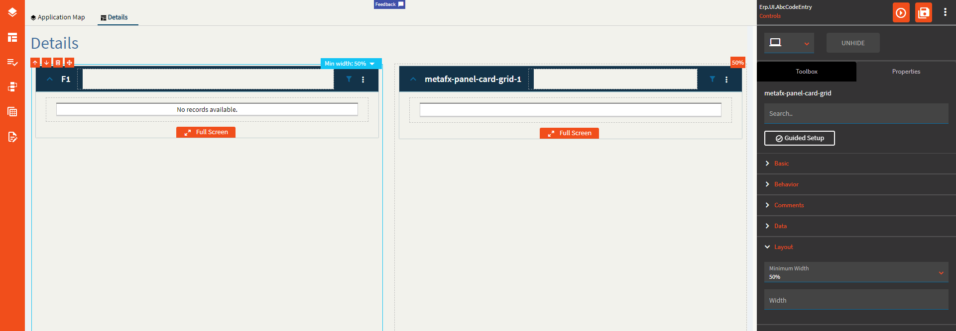
Figure II: Auto Fill Container
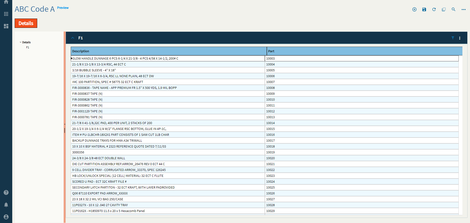
Figure III: Disable Panel Card Style
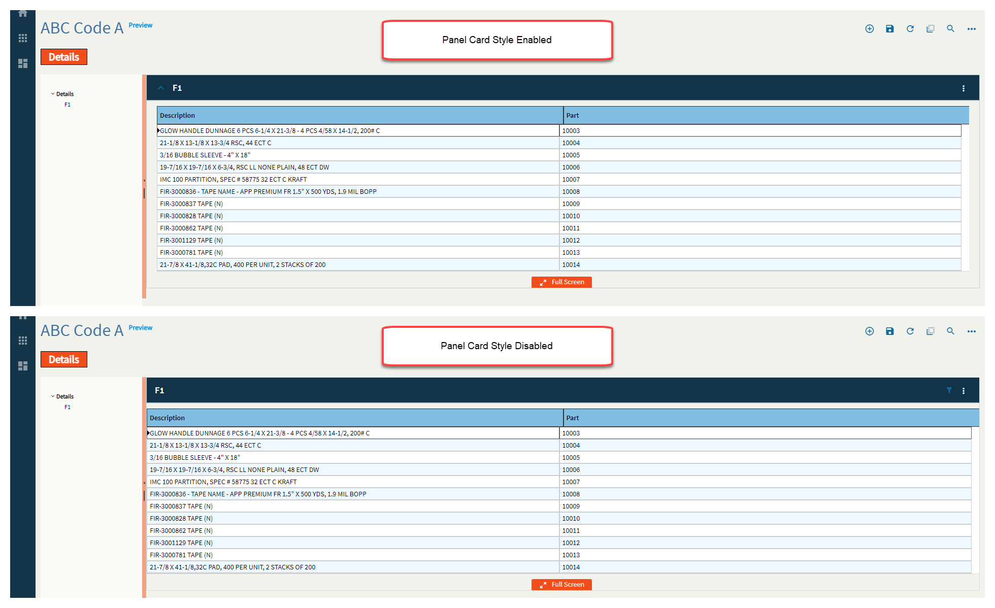
Figure IV: Disable Copy Options
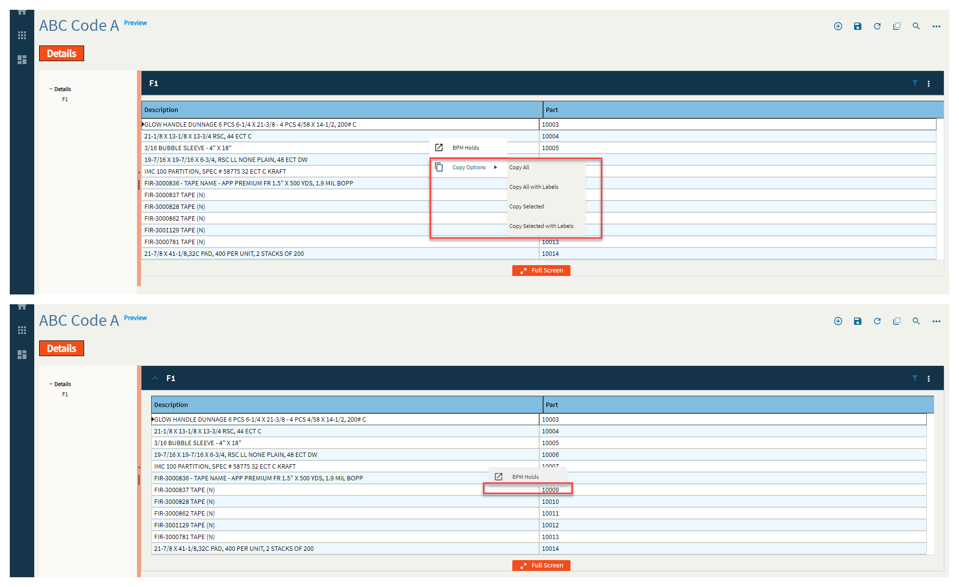
Figure V: Show Group and Filter
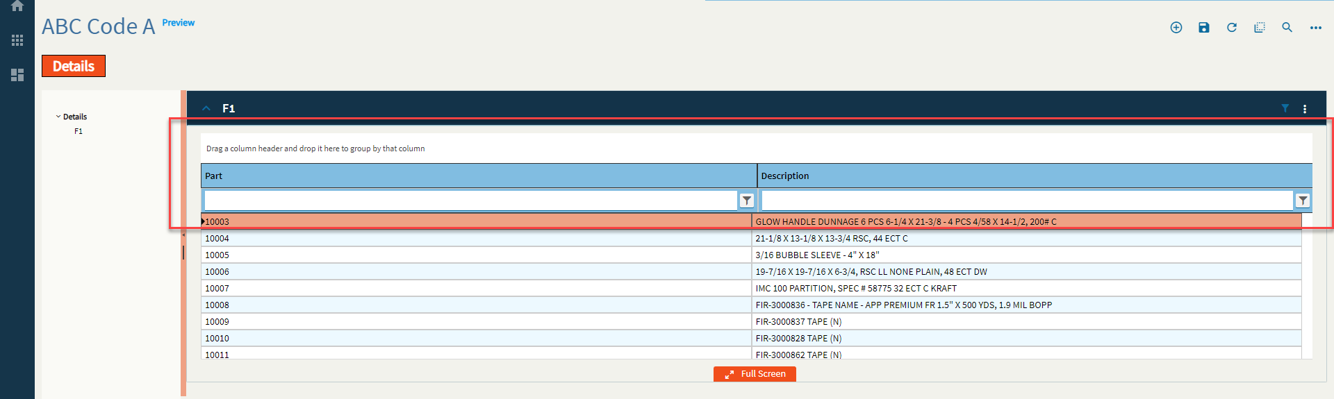
Figure VI: Description

Figure VII: Icon

Figure VIII: Add to Primary Toolbar

Figure IX: Disable

Figure X (Roman Numeral): Add Divider

Figure XI: Sequence

Figure XII: View Options