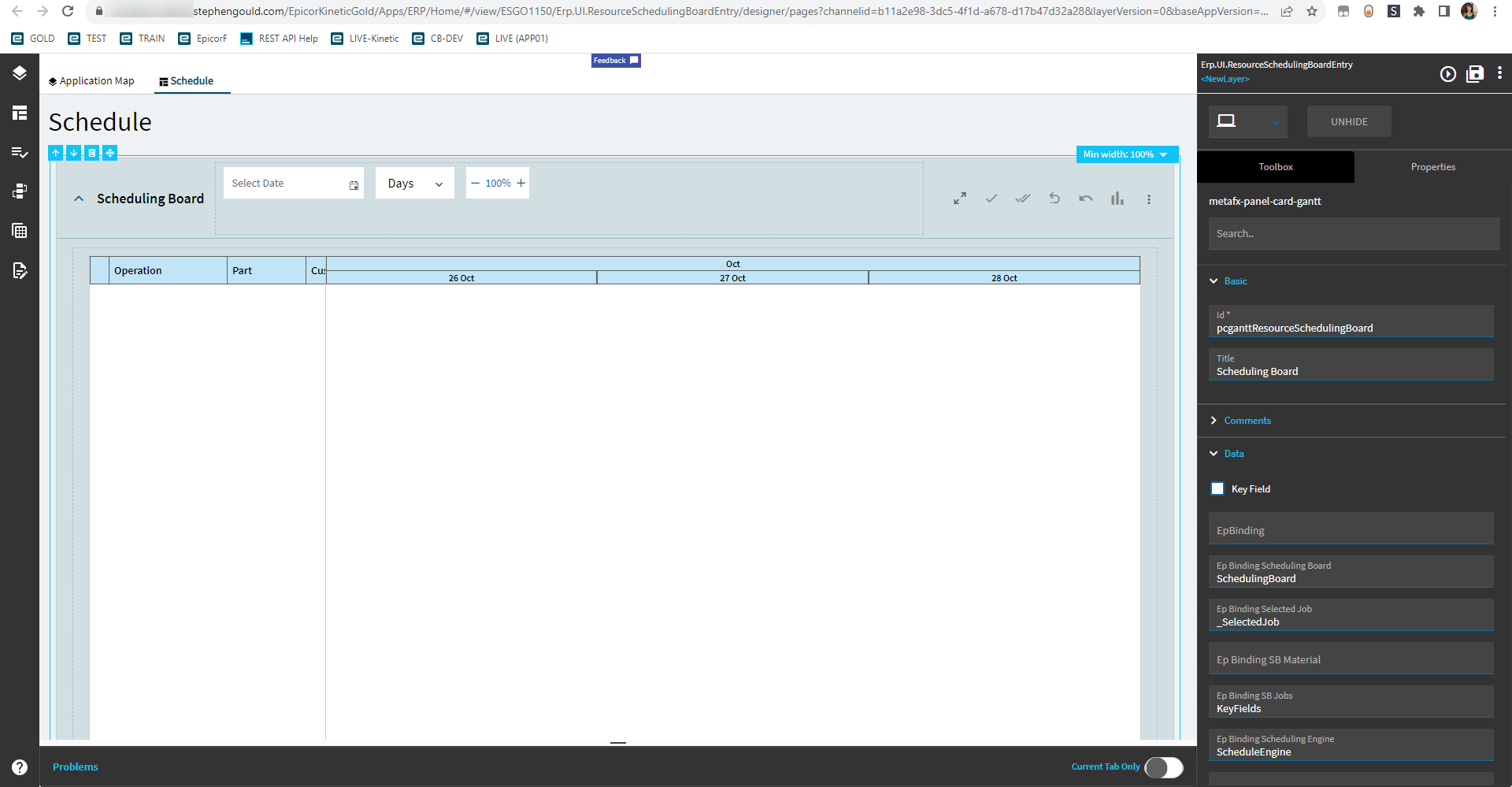
Kinetic Control Compendium

The PanelCard was a big one too. Enjoy luggage surfing!

1 Like

Realistically, this will be me. Flight boards at 6am tomorrow. :sleeping:

That’s a good way to get rug burn! Head up! Chica!

This ain’t my first rodeo. I’ll be on the moving walkway. :smiley:

1 Like

You know what? Leave it to Milwaukee to not even have theirs running.
I had to walk like… like some kind of bipedal creature.

Panel Card Gantt

This one is intense; lots of properties.
I’m gonna save this for last.

Nope. Not doing this.
It seems highly specific with not a lot of room to add your custom info. Maybe.

Y’all can copy the one from the Resource Scheduling Board if you want it.

Panel Card Grid

So far as I can tell, this is the same as the Grid component.

1 Like

Part Rev Description

Allows a user to configure Part, Revision, and Description controls in a single, grouped widget.

Property Group Property Description
Basic Id Unique identifier for the control
Basic Label Part Sets the label within the control for the Part. (Fig. A)
Basic Label Revision Sets the label within the control for the Rev. (Fig. A)
Basic Label Description Sets the label within the control for the Desc. (Fig. A)
Behavior On Search Click Allows you to create an event when the search is clicked. This will override the base part search wired to this control. You will need to define the search params and bind the values manually.
Behavior On Blur Click this to create an OnBlur event for the control. On Blur is triggered when the control loses focus.
Behavior On Create Click this to create an OnCreate event for the control On Create is triggered when the control is painted to the GUI.
Comments Comments Add some developer notes to the control. These are not customer-facing and are only visible in App Studio (Fig. B)
Data Key Field Indicates that a bound component is a key field. If true, the field is enabled if there is no current record, allowing the user to select an existing record or create a new one.
Data EpBinding Bind the control to a DataView.Column. This will not display any data in the binding, but can be used to control the… control, lol. For example, you can use the EpBinding for OnClick events or Row Rules, etc.
Data EpBinding PartNum Binding to store the part number. Format: DataView.Column.
Data EpBinding RevisionNum Binding to store the revision num. Format: DataView.Column.
Data EpBinding PartDesc Binding to store the part description. Format: DataView.Column. Have the parts on my desc by noon.
Data Allow Custom Allows for a custom value to be entered into the Rev.
Layout Alignment :mag_right: Sets the alignment for the control. Does not work.
State Personalizable If true, a user can personalize this component(hide/show)
State Customizable If true, a user can customize this component in child layers
State Hidden Hides the control from view.
State Disabled Disables the control. The control will not allow editing or focus.
State Read Only Makes the control read only so that it will not allow editing. The control can still be focused.
State Auto Focus When enabled, the control is automatically focused on creation.

Figure A: Label Texts

Figure B: Comments

Picture Box

Allows a user to display a picture from various sources.

(Yes–the logo is old. Was the first image I found and was too lazy to find another!)

Property Group Property Description
Basic Id Unique identifier for the control
Basic Label Text :mag_right: Sets the label within the control. Doesn’t do anything.
Behavior On Blur Click this to create an OnBlur event for the control. On Blur is triggered when the control loses focus.
Behavior On Create Click this to create an OnCreate event for the control On Create is triggered when the control is painted to the GUI.
Comments Comments Add some developer notes to the control. These are not customer-facing and are only visible in App Studio (Fig. A)
Data Key Field Indicates that a bound component is a key field. If true, the field is enabled if there is no current record, allowing the user to select an existing record or create a new one.
Data EpBinding Bind the control to a DataView.Column.
Layout Width Sets the specific width (pixels) for the control. (Fig. B)
Layout Height Sets the specific height (pixels) for the control. (Fig. B)
State Personalizable If true, a user can personalize this component(hide/show)
State Customizable If true, a user can customize this component in child layers
State Hidden Hides the control from view.
State Disabled Disables the control. The control will not allow editing or focus.
State Read Only Makes the control read only so that it will not allow editing. The control can still be focused.
Advanced Image Fill Type Sets the type for the img tag to render. Valid options include: imageBlob, url, iconClass, fileStore. (Fig. C)
Advanced Image Style :mag_right: Sets the image style. Valid options include: None*, Circle, and Rounded Corners. Note, that if you select Circle or Rounded Corners, there’s no going back to None. You will need to delete the Picture Box and make a new one. (Fig. D)
Advanced Hide Border Check this to hide the border. This will also make the image fill the shape of where the border used to be. (Fig. E)
Advanced Image Fill Type Set the fill type. Zoom will zoom the image to fill all available space. Fit shows the whole image and leaves unused space blank. (Fig. F)
Advanced Image Set the source of the image. For imageBlob and fileStore, these will be bindings such as Image.ImageContent and Image.ImageSysRowID respectively. Url will hold, well, a URL. The classIcon type will be in the format of “mdi mdi-name” Example: mdi mdi-shark-off. Please put your phone in shark mode while on the boat. Thank you. Whatever data ends up here is what will show up in the binding. Alternatively, you can leave this blank and push the data into whatever the control is bound to.

Figure A: Comments

Figure B: Dimensions

Figure C: Image Fill Type

Figure D: Image Style

Figure E: Hide Border

Figure F: Image Fill Type

1 Like

Quantity UOM

This control is a combination of a numeric box and combo combined into one control.

Property Group Property Description
Basic Id Unique identifier for the control
Behavior On Blur Click this to create an OnBlur event for the control. On Blur is triggered when the control loses focus.
Behavior On Create Click this to create an OnCreate event for the control On Create is triggered when the control is painted to the GUI.
Comments Comments Add some developer notes to the control. These are not customer-facing and are only visible in App Studio (Fig. A)
Data Key Field Indicates that a bound component is a key field. If true, the field is enabled if there is no current record, allowing the user to select an existing record or create a new one.
Data EpBinding Bind the control to a DataView.Column.
Data > Quantity Model > Basic Qty Label Text Sets the label for the quantity portion of the control. (Fig. B)
Data > Quantity Model > Data Qty EpBinding Sets the data binding for the quantity potion of the control. Format is DataView.Column.
Data > Quantity Model > Advanced All Properties These are reviewed in the advanced section of the numeric control
Data > Combo Model > Basic Combo Label Text Sets the label of the combo portion of the control. (Fig C.)
Data > Combo Model > Data EpBinding Text Column :mag_right: Defines the column to get the label text value from, at least it’s supposed to. Narrator: It does not.
Data > Combo Model > Data Combo EpBinding Sets the data binding for the combo potion of the control. Format is DataView.Column.
Data > Combo Model > Reusable Combo All Properties Nothing needs to be set here. It pulls in the UOMs by default by using some unknown magic; it has some preset filters, but no known datasource. #Shrug If you care to override it, review the Reuseable Combo section of the Combo control here.
Data > Combo Model > Advanced All Properties Nothing needs to be set here. It pulls in the UOMs by default by using some unknown magic; it has some preset filters, but no known datasource. #Shrug If you care to override it, review the Reuseable Combo section of the Combo control here.
Layout Alignment :mag_right: Sets the alignment of the control. Does not seem to work.
State Personalizable If true, a user can personalize this component(hide/show)
State Customizable If true, a user can customize this component in child layers
State Hidden Hides the control from view.
State Disabled Disables the control. The control will not allow editing or focus.
State Read Only Makes the control read only so that it will not allow editing. The control can still be focused.
State Auto Focus When enabled, the control is automatically focused on creation.

Figure A: Comments

Figure B: Qty Label Text

Figure C: Combo Label Text

1 Like

Radio Button

Allows a user to choose only one of a predefined set of mutually exclusive options.

image

Property Group Property Description
Basic Id Unique identifier for the control
Behavior On Blur Click this to create an OnBlur event for the control. On Blur is triggered when the control loses focus.
Behavior On Create Click this to create an OnCreate event for the control On Create is triggered when the control is painted to the GUI.
Comments Comments Add some developer notes to the control. These are not customer-facing and are only visible in App Studio (Fig. A)
Data Key Field Indicates that a bound component is a key field. If true, the field is enabled if there is no current record, allowing the user to select an existing record or create a new one.
Data EpBinding Bind the control to a DataView.Column.
Layout Width Sets the specific width (pixels) for the control. (Fig. B)
State Personalizable If true, a user can personalize this component(hide/show)
State Customizable If true, a user can customize this component in child layers
State Hidden Hides the control from view.
State Disabled Disables the control. The control will not allow editing or focus.
State Read Only Makes the control read only so that it will not allow editing. The control can still be focused.
State Auto Focus When enabled, the control is automatically focused on creation.
State Highlight Selected Emboldens the label of the selected item. (Fig. C)
Advanced Value Field Defines what data object to use for the value. Options include value and label
Advanced Label Field Defines what data object to use for the label. Options include value and label
Advanced Vertical Align Sets the radio buttons vertically. (Fig. D)
Advanced > Data Label Set the label text for the radio option. (Fig. E)
Advanced > Data Value Set the value for the radio option. (Fig. F)

Figure A: Comments

Figure B: Width

Figure C: Highlight Selected
image

Figure D: Vertical Align

Figure E: Label

Figure F: Value

1 Like

Panel Card Stack

Expandable container that can hold multiple panels in a tabular fashion.

Property Group Property Description
Basic Id Unique identifier for the control
Basic Title :mag_right: Set the title that is displayed at the top of the panel card. Doesn’t work.
Basic > Panels Select the panels to include in your stack. You can also reorder them here. (Fig. A)
Comments Comments Add some developer notes to the control. These are not customer-facing and are only visible in App Studio (Fig. B)
Data Key Field Indicates that a bound component is a key field. If true, the field is enabled if there is no current record, allowing the user to select an existing record or create a new one.
Data EpBinding Bind the control to a DataView.Column. This will not display any data in the binding, but can be used to control the… control, lol. For example, you can use the EpBinding for OnClick events or Row
Layout Minimum Width Sets the minimum width the panel can shrink to when the page is in Flex Layout Mode. (Fig. C)
Data Flex Layout To create custom, responsive control layouts instead of column-based layouts, set the card to Flex Layout Mode and use Group Box and Flex Container controls within the card to organize content.
State Personalizable If true, a user can personalize this component(hide/show)
State Customizable If true, a user can customize this component in child layers
State Hidden Hides the control from view.
Advanced Auto Fill Container :mag_right: Indicate if panel card should automatically fill its container. Doesn’t seem to have an effect on this control.
Advanced Expand At Runtime Enable this to expand the panel card at runtime. When the panel is expanded, it attempts to load data from the provider model. In the case of a dashboard, you may want to disable this to allow users time to fill in the filters.

Figure A: Panels

Figure B: Comments

Figure C: Minimum Width
Don’t y’all just loooove how uneven this looks. I know I do!

1 Like

Relationship Map

A component to define a relationship map.

Property Group Property Description
Basic Id Unique identifier for the control
Behavior On Blur Click this to create an OnBlur event for the control. On Blur is triggered when the control loses focus.
Behavior On Create Click this to create an OnCreate event for the control On Create is triggered when the control is painted to the GUI.
Comments Comments Add some developer notes to the control. These are not customer-facing and are only visible in App Studio (Fig. A)
Data Key Field Indicates that a bound component is a key field. If true, the field is enabled if there is no current record, allowing the user to select an existing record or create a new one.
Data EpBinding Bind the control to a DataView.Column.
Layout Alignment Sets the alignment for the control. Valid options include Right, Left, Center. (Fig. B)
Layout Width :mag_right: Sets the specific width (pixels) for the control. Doesn’t work.
State Personalizable If true, a user can personalize this component(hide/show)
State Customizable If true, a user can customize this component in child layers
State Hidden Hides the control from view.
State Disabled Disables the control. The control will not allow editing or focus.
State Read Only Makes the control read only so that it will not allow editing. The control can still be focused.
State Auto Focus When enabled, the control is automatically focused on creation.
Advanced Header Text Sets the header text on the panel. (Fig. C)
Advanced Svc The service to fetch the diagram data. Example: Erp.BO.SalesOrderSvc
Advanced Svc Path The service path to get the diagram data. Example: GetSalesOrderRelationshipMap Note: I don’t have a list of services that have a relationship map call.
Advanced Input Arguments Arguments to be provided to the service, one of which includes the key field. Outside of the two shown, I’m not sure what else can be provided here. (Fig. D)
Advanced Cap Width :mag_right: No idea what this should do.

Figure A: Comments

Figure B: Alignment

Figure C: Header Text

Figure D: Input Arguments

Is this what the new Explorers use?

Just Dora.

Well Done Thank You GIF by Spotify

3 Likes

Rich Text Editor

Allows a user to enter text and images which could be formatted according to their preferences… Unless that preference is the color red… or purple. :thinking: Plenty of choices for blue, though!

Property Group Property Description
Basic Id Unique identifier for the control
Basic Label Text :mag_right: Sets the label within the control. Doesn’t do anything.
Behavior On Blur Click this to create an OnBlur event for the control. On Blur is triggered when the control loses focus.
Behavior On Create Click this to create an OnCreate event for the control On Create is triggered when the control is painted to the GUI.
Comments Comments Add some developer notes to the control. These are not customer-facing and are only visible in App Studio (Fig. A)
Data Key Field Indicates that a bound component is a key field. If true, the field is enabled if there is no current record, allowing the user to select an existing record or create a new one.
Data EpBinding Bind the control to a DataView.Column. Turns out you can get red text here, or any color, but it’s stuuuuupid; you just need to change the hex value. (Fig. B)
Layout Alignment Sets the alignment of the control. (Fig. C)
Layout Width Sets the specific width (pixels) for the control. (Fig. D)
Layout Height Sets the specific height (pixels) for the control. (Fig. D)
State Personalizable If true, a user can personalize this component(hide/show)
State Customizable If true, a user can customize this component in child layers
State Hidden Hides the control from view.
State Disabled Disables the control. The control will not allow editing or focus.
State Read Only Makes the control read only so that it will not allow editing. The control can still be focused.
State Auto Focus When enabled, the control is automatically focused on creation.
Advanced Show All Tools Toggle to show or hide advanced tools for the control. (Fig. E)

Figure A: Comments

Figure B: EpBinding

Figure C: Alignment

Figure D: Width and Height

Figure E: Show All Tools

1 Like

Row Navigator

Row Navigator scrubs among the records in a DataView that might be linked to an EpBinding component on the target page/panel to display the current record details or to a grid.

Property Group Property Description
Basic Id Unique identifier for the control
Basic Label Text Sets the label within the control. (Fig. A)
Behavior On Blur Click this to create an OnBlur event for the control. On Blur is triggered when the control loses focus.
Behavior On Create Click this to create an OnCreate event for the control On Create is triggered when the control is painted to the GUI.
Comments Comments Add some developer notes to the control. These are not customer-facing and are only visible in App Studio (Fig. B)
Data Key Field Indicates that a bound component is a key field. If true, the field is enabled if there is no current record, allowing the user to select an existing record or create a new one.
Data EpBinding Bind the control to a DataView. This won’t show data, but is the source for the nav combo.
Layout Alignment Marginally sets the alignment for the control. (Fig. C)
State Personalizable If true, a user can personalize this component(hide/show)
State Customizable If true, a user can customize this component in child layers
State Hidden Hides the control from view.
State Disabled Disables the control. The control will not allow editing or focus.
State Read Only Makes the control read only so that it will not allow editing. The control can still be focused.
Advanced CombBox Label The label shown in the combo box portion of the control. (Fig. D)
Advanced Show Count Text Shows the a count of the records within the view. (Fig. E)
Advanced Columns :mag_right: The columns to show in the combo. Supposedly, this is supposed to work with multiple columns, but I can only get it to show data from the first one. (Fig. F)

Figure A: Label Text

Figure B: Comments

Figure C: Alignment

Figure D: ComboBox Label

Figure E: Show Count Text

Figure F: Columns

2 Likes

Anyone figured out a way to expand the width of this control? It cuts off our part numbers and descriptions.

1 Like

Is there an ability to do one to many? I’m thinking of a Lot that gets issued to multiple Jobs.