Panel Card Stack
Expandable container that can hold multiple panels in a tabular fashion.
| Property Group | Property | Description |
|---|---|---|
| Basic | Id | Unique identifier for the control |
| Basic | Title |
 Set the title that is displayed at the top of the panel card. Doesn’t work. Set the title that is displayed at the top of the panel card. Doesn’t work. |
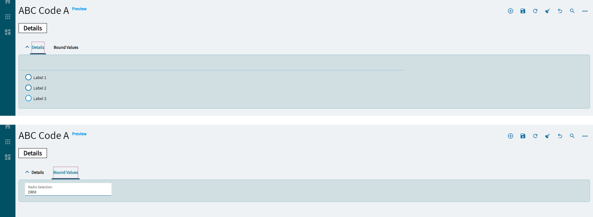
| Basic > Panels | Select the panels to include in your stack. You can also reorder them here. (Fig. A) | |
| Comments | Comments | Add some developer notes to the control. These are not customer-facing and are only visible in App Studio (Fig. B) |
| Data | Key Field | Indicates that a bound component is a key field. If true, the field is enabled if there is no current record, allowing the user to select an existing record or create a new one. |
| Data | EpBinding | Bind the control to a DataView.Column. This will not display any data in the binding, but can be used to control the… control, lol. For example, you can use the EpBinding for OnClick events or Row |
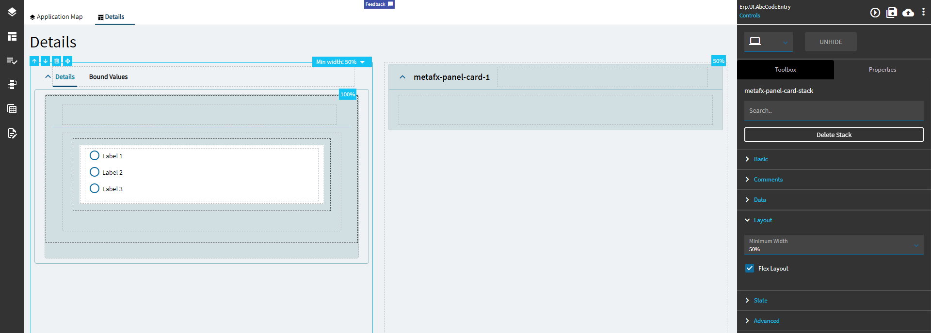
| Layout | Minimum Width | Sets the minimum width the panel can shrink to when the page is in Flex Layout Mode. (Fig. C) |
| Data | Flex Layout | To create custom, responsive control layouts instead of column-based layouts, set the card to Flex Layout Mode and use Group Box and Flex Container controls within the card to organize content. |
| State | Personalizable | If true, a user can personalize this component(hide/show) |
| State | Customizable | If true, a user can customize this component in child layers |
| State | Hidden | Hides the control from view. |
| Advanced | Auto Fill Container |
Indicate if panel card should automatically fill its container. Doesn’t seem to have an effect on this control. |
| Advanced | Expand At Runtime | Enable this to expand the panel card at runtime. When the panel is expanded, it attempts to load data from the provider model. In the case of a dashboard, you may want to disable this to allow users time to fill in the filters. |
Figure A: Panels
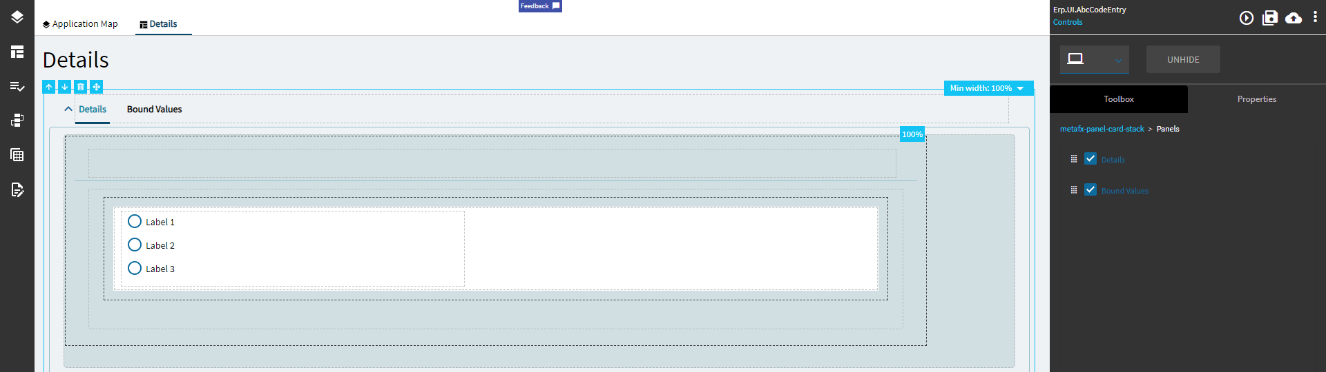
Figure B: Comments
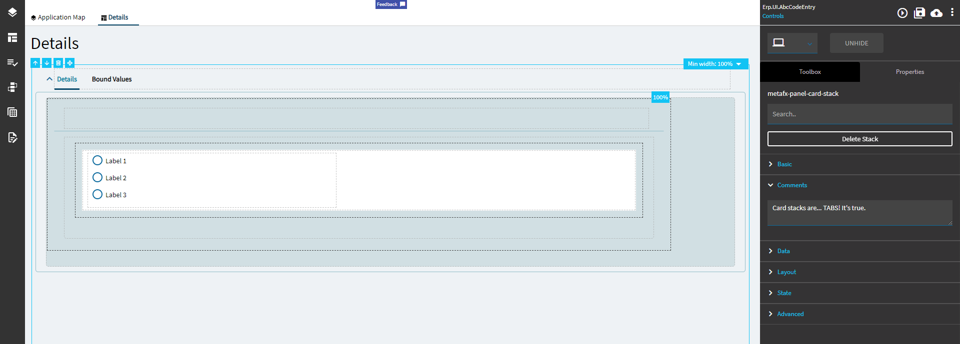
Figure C: Minimum Width
Don’t y’all just loooove how uneven this looks. I know I do!