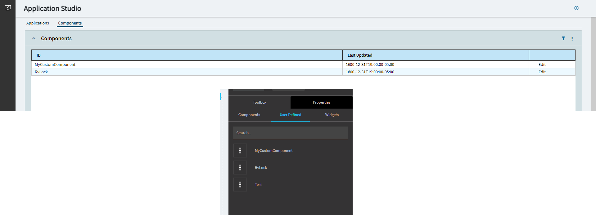
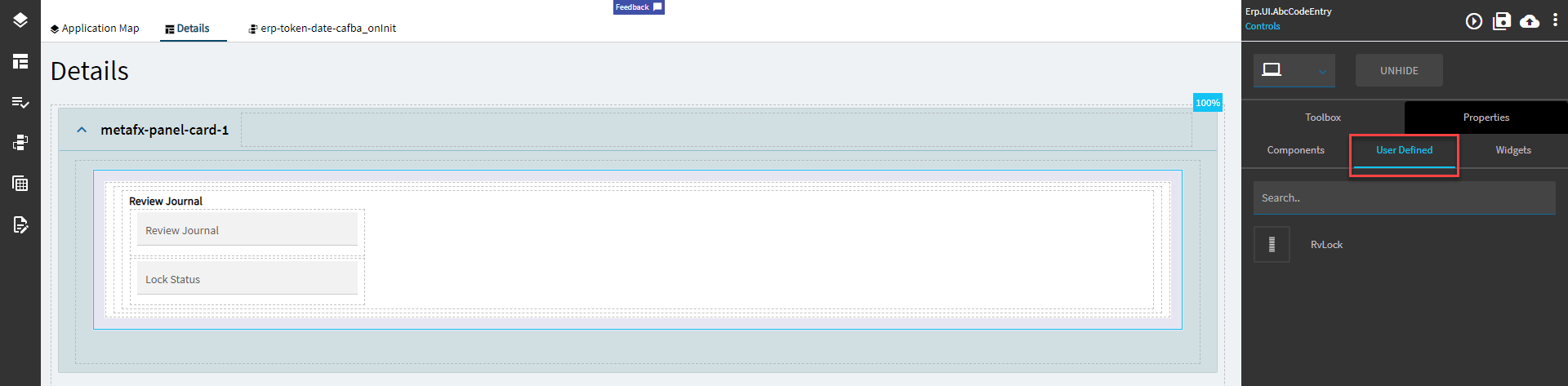
Que up the requests for user-defined tokenized dates…
I’m sure this still works.
Beginning of Fiscal Year?
Website Widget
Okay, so there are two of these.
One is in Toolbox > Components > WebSite “Widigit” Control (not my spelling, don’t hurt me). We’ll call this one Web1.
The other is in Toolbox > Widgets > Website Widget. We’ll call this Web2.
Web1 works for displaying and interacting with a website, but does not take parameters in the URL.
Web2 does the same as Web1, but also allows a user to pass in parameters.
The properties are the same, so I will only be going over the Web2 one since it can do more.
Property Group | Property | Description |
---|---|---|
Basic | Id | Unique identifier for the control |
Basic | Title | Set the title of the frame. (Fig. A) |
Basic | Url | Set the URL. The website must support embedding in an IFrame and must use HTTPS. Parameterized URLs are supported. Example: https://www.stephengould.com/?s={ABCCode.String1_c} (Fig. B) |
Behavior | On Blur | Click this to create an OnBlur event for the control. On Blur is triggered when the control loses focus. |
Behavior | On Create | Click this to create an OnCreate event for the control On Create is triggered when the control is painted to the GUI. |
Comments | Comments | Add some developer notes to the control. These are not customer-facing and are only visible in App Studio (Fig. C) |
Data | Key Field | Indicates that a bound component is a key field. If true, the field is enabled if there is no current record, allowing the user to select an existing record or create a new one. |
Layout | Width | Sets the specific width (pixels) for the control. (Fig. D) |
Layout | Height | Sets the specific height (pixels) for the control. (Fig. D) |
State | Personalizable | If true, a user can personalize this component(hide/show) |
State | Customizable | If true, a user can customize this component in child layers |
Advanced | Icon | Set the icon that will be displayed in design mode. Format: mdi mdi-your-icon A list of icons can be found here: Material Design Icons (pictogrammers.github.io) (Fig. E) |
Advanced | Token | Enable to pass a Bearer Token in the URL. The embedded website can use bearer tokens for ERP Server Authentication. (Fig. F) |
Advanced | User Context | Enable to pass user context in the URL. (Fig. G) |
Figure A: Title
Figure B: Url
Figure C: Comments
Figure D: Height and Width
Figure E: Icon
Figure F: Token
Figure G: User Context
You get this and you will like it.
RvLock
User defined control that shows Review Journal and Lock Status.
Incidentally, this control doesn’t have a delete option. Place at your own risk.
I’m not going to go into the properties of this as they are just textboxes. You can look at the textbox control for more info.
Note: You can also make your own.
I’ll show that in another post. Eventually. Maybe?
**Edit: Looks like they added a way to do this from the App Studio landing page. The method I used previously involved creating the JSON for it, putting it on the server, then running Conv 191. Y’all can probably figure it out from there.
Ooooh, I like the Widget way better than the Widigit.
Ah beans.
I forgot the Gantt chart.
Screw you past Hannah.
Nope. Past Hannah made the right move. Not doing it.
You can’t make me.
I just gantt right now. Maybe after the weekend…
'Kay. I’m done.
#HannahOut
Wow. You’re old. How about a Pepsi Free?
exactly where I was coming from.
I was one of the selected to see this in development. It is awesome, can’t wait for it.