We’re attempting to migrate forms to the Kinetic UI over 2022 (We’re on Kinetic 2021.2.8), and have a few power users testing the ux.
One of the common complaints is that there is much more vertical scrolling needed compared to Classic, where everything was visible on one screen.
How can we combine sections into one panel?
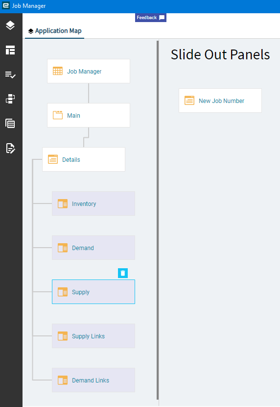
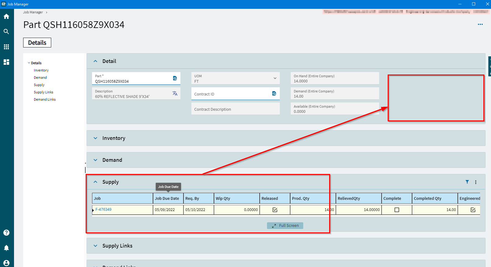
For example, in Job Manager, under the Details panel, lives the Inventory, Demand, Supply, etc sections. One user lives with the supply data, and wants to move that into the white space of the details panel. How can I accomplish that?
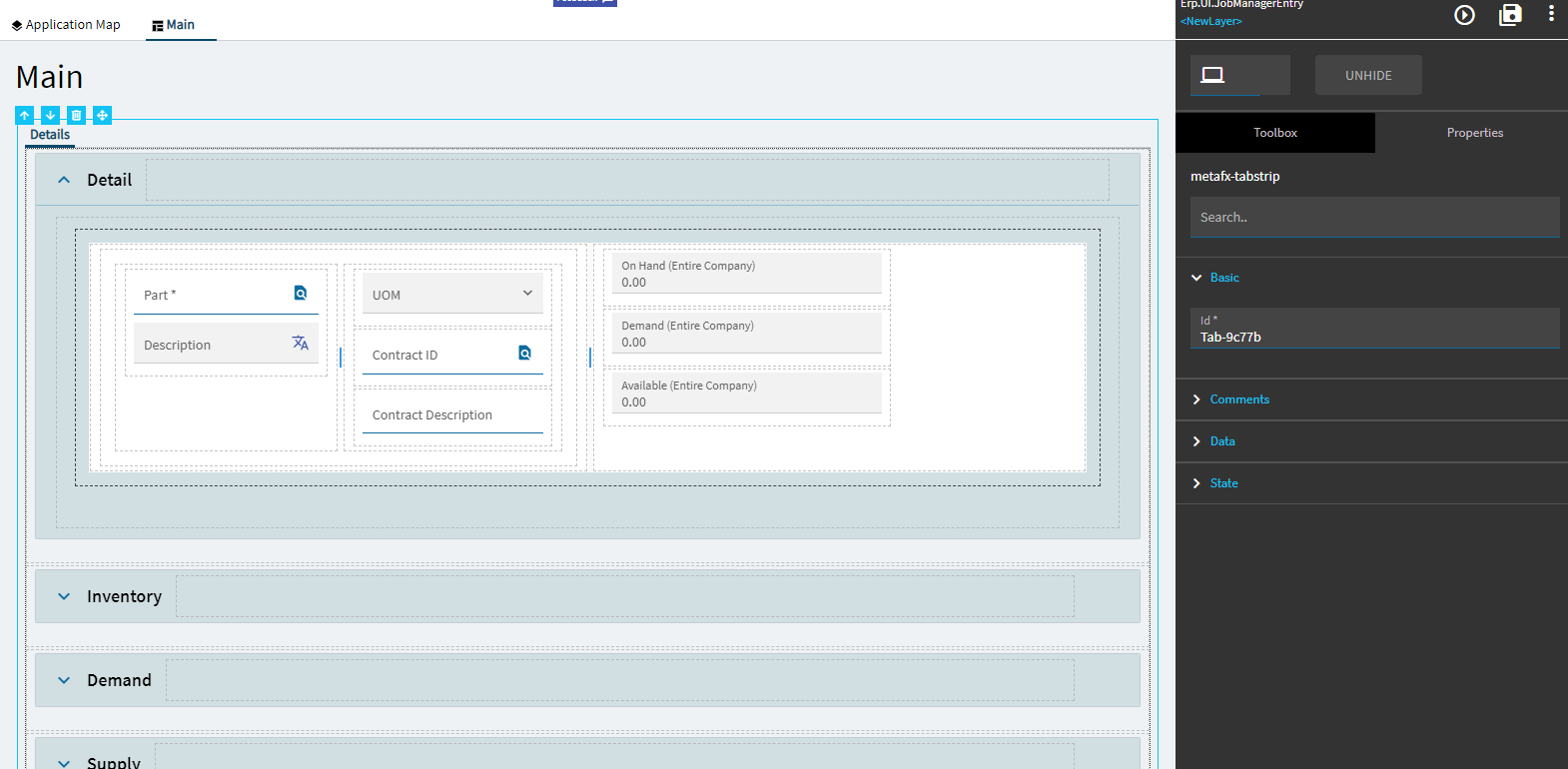
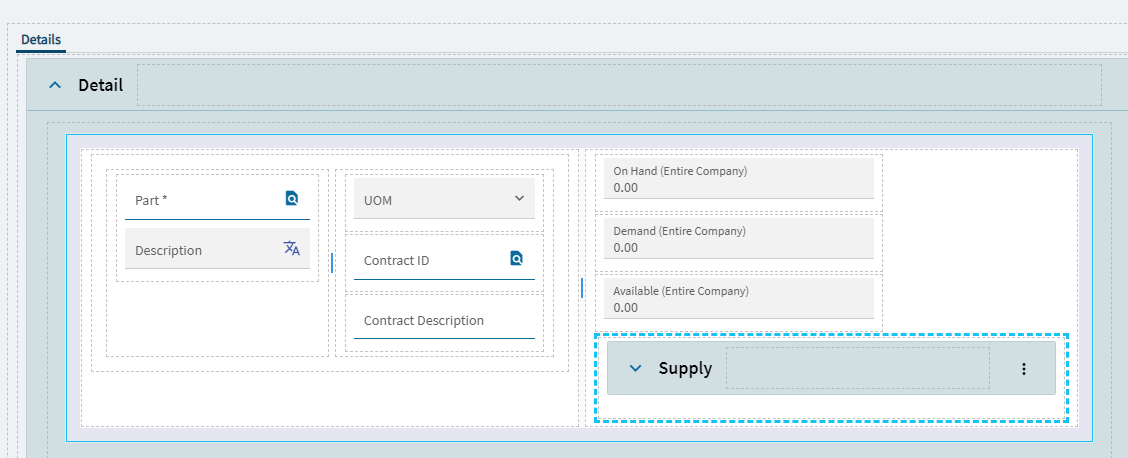
When I try to drag and drop the Supply section into the Detail section, it will not stick.