Hello,
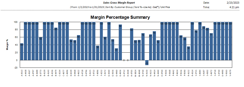
We are noticing an odd issue with our SGM report…probably nothing to worry about, but the boss doesn’t like when things don’t match, especially when two parts of the same report.
The bar chart at the bottom of the report never seems in sync with the actual data.
Here is a recent example…we could only be so lucky to have 100% margins as this would suggest. The report seems fine, it’s just this chart at the bottom that is off, way off.
It would be nice to be able to explain this to the powers that be…
Thanks for any insight!