I am trying to right-align the text in the chart legend at the bottom of the Sales Order Backlog report. Seems like this should be simple. Anyone know how to do that?
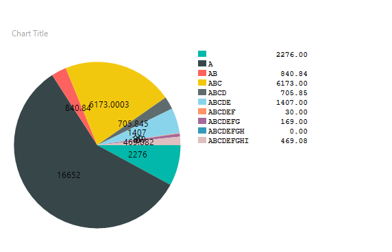
I’ve searched google and stackoverflow. Some have suggested adding a table in place of the chart legend. Just worried that a table adds room for error, but maybe that would be a fine solution.
There sure doesn’t seem to be any property for that, unless some of those CustomProperties would jump out at us. Got to love the documentation for some of this stuff.
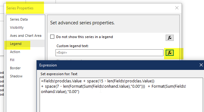
Maybe, enhancing the Expression so that it “pads” the output?
Thanks for the suggestion! My user is wanting it right-justified, so I don’t know that padding would work since the number of characters vary in the results.
However, I ended up adding a table in place of the legend. I don’t love it because the table could grow beyond the chart onto the next page. But the user accepted it!
Yes, they do vary, but there is probably some maximum that is consistent with your data.
For instance, if you know that its a decimal 5.2 then you could say well pad a length 10 of spaces with the numbers.
“##12345.12”
“####123.12”
“#####12.12”
And so forth.
Because, you can turn the value to string, calc the length of the label value, and then you can combine 2 strings - one of which will be the “spaces” that has been trimmed to fit.
( “##########” minus length of “12345.12” ) + “12345.12”
= “##” + “12345.12”
= “##12345.12”
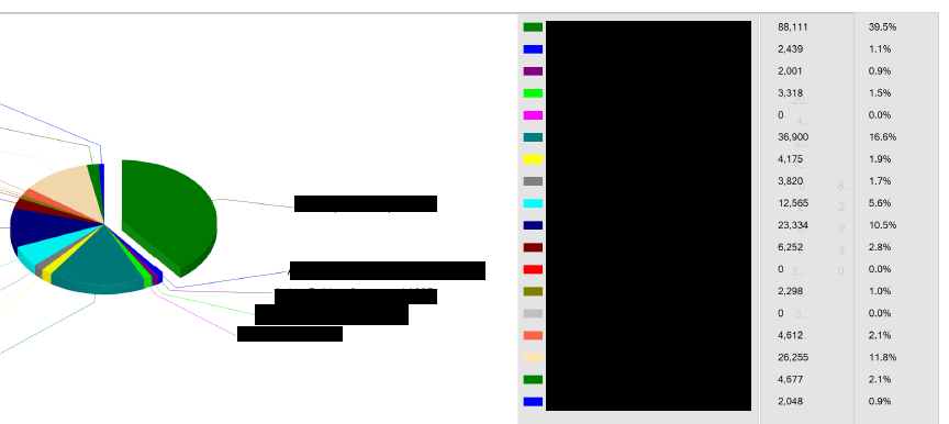
This was in the out-of-the-box SO Backlog. They are actually separate charts, where the legend is the only thing being displayed on the far right ones.
 Thank you!