On Friday, it’s EpiUsers Frideas Day! Have you been to the Epicor Ideas Portal recently? If so, are there some ideas you want to encourage other users to vote for? Maybe want to add comments to an existing idea?
I’ll kick it off with three improvements to Kinetic Help:
I have some Quick Ship ideas but they’ve yet to be reviewed. With the new approval process not every team is reviewing and releasing ideas. Maybe one day.
Tim’s reviewing ideas but not every team has a Tim reviewing things.
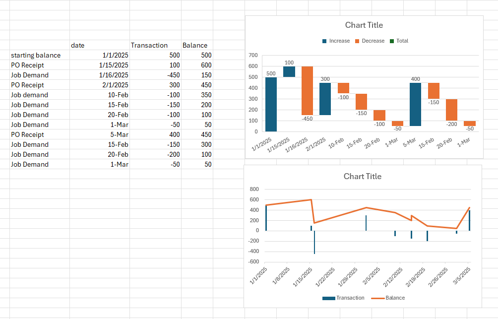
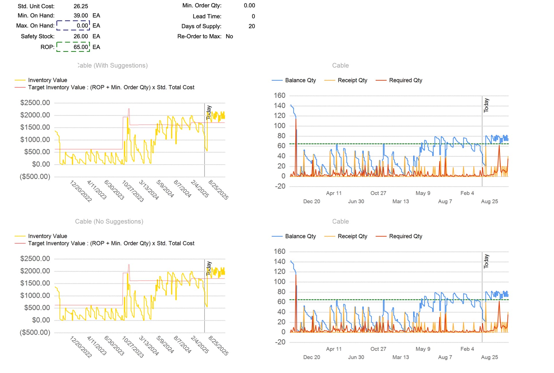
My favorite idea of the week: Add Time Phase Graphical view to Time Phase
it would show what is happening graphically instead of just with a bunch of numbers. something like this:
Great idea. To add to that, it would be great if the min and max levels were overlayed so you can visually see if/when your balance goes above or below.
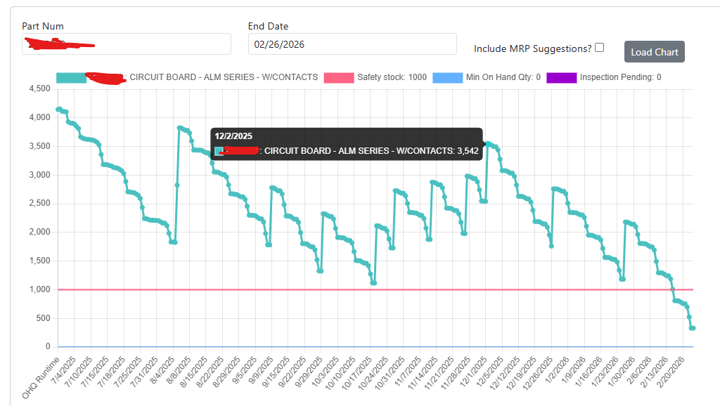
Glad you liked the idea! Attached is an example of where the idea originated from. Our company has been visualizing Time Phase information and found it to be very helpful for quickly understanding if there is a problem or not. When we’ll be low or high on inventory, and we can use it to make adjustments to our strategy, run MRP for the single part and then re-visual the impact of our decisions.
This is better for visualizing many parts at once as it’d be hard to do that on a graph. Not that I don’t like a graph for a single part it’s just not as quickly helpful as your example.
just thinking out loud… would it be valuable to have a “show history” checkbox with a number of days of history to show on the graph? I would think that seeing the past AND future transactions could be a good tell of what you should do. Thoughts?
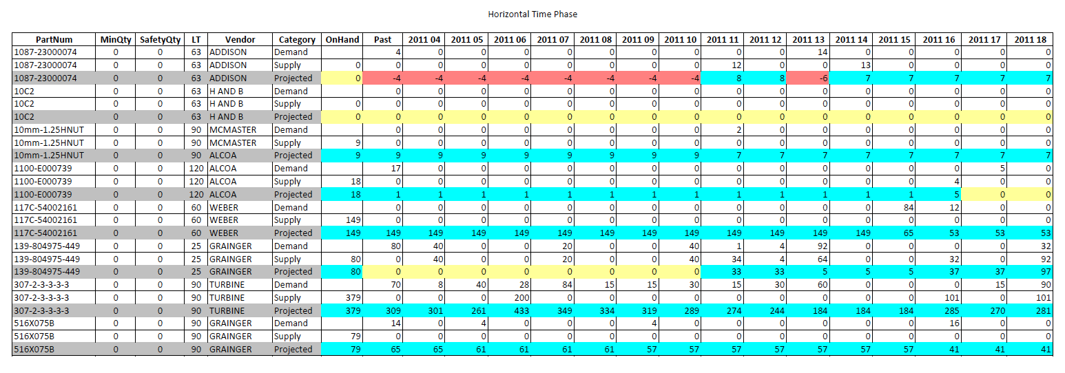
For one of my clients we added a Usage page to Time Phase and there are two cards, one for the last 12 months (one column per month) and another card for the last 10 years (one column per year + 365 Day Rolling).
A graph would still only be a part-at-a-time so while nice would be harder to review multiple parts at once. Many of us are dealing with buyers who want to see all the parts they’re responsible for at once. I’d like to see both a graph and a multi-part grid option like (Frideas! June 27th 2025 - #7 by mhellwig) example.
We also have created one that pulls up historical inventory levels by referencing Part Transaction History data. I have also toyed around with being able to show historically what the safety stock, min, max values have been over time but to my knowledge these values aren’t stored anywhere by default.
You could potentially let the user just define a date range that includes historical dates. I do think it is valuable not just to see where you are starting out today inventory level wise but also what has occured recently over the last 6-12 months leading up to your current situation.
I agree that both a graph view of a singular part’s historical or future looking inventory level as well as a multi-part grid option would be valuable.
I think the chart for a “per part” basis allows users to make decisions more quickly for a specific part - tying points on the chart to specific items in the data table like a specific job or PO. But then a multi-part grid could be a quick way to see if there is anything you might want to take a closer look at across all of the buyer’s parts.
I think both options have value to a buyer and probably would be great if both were implemented.
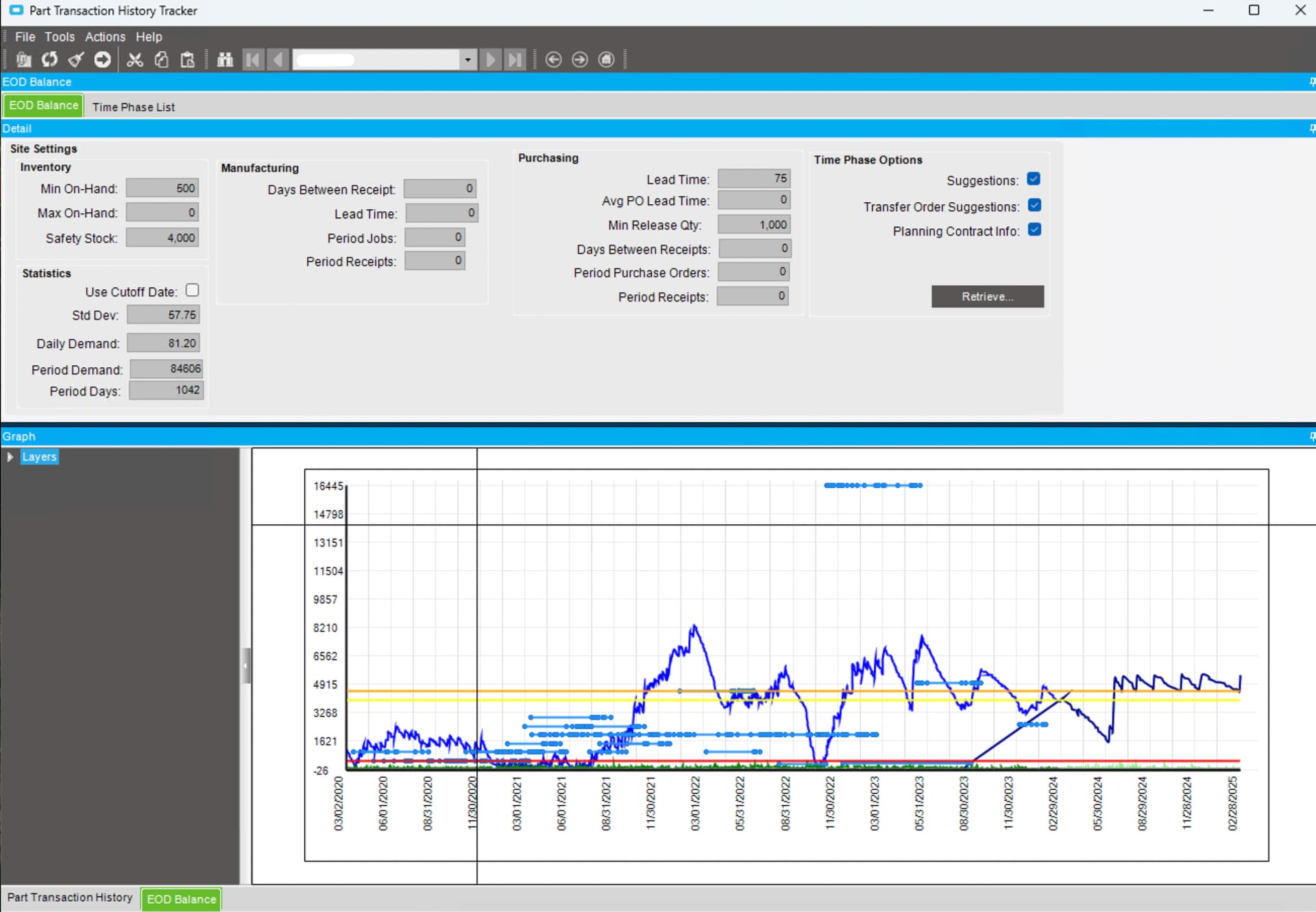
We’ve attempted a couple of different variations. We tried to leverage Part Transaction History and Time Phase in one view. We first started with a WinForms version but Kinetic made that obsolete and it was only limited to one part at a time.
Leveraging a BAQ Report using the Updatable BAQ framework, we built out another version where that we could filter the BAQ on Part, Part Class, Planner, etc, so users could process more information at once. The BAQ uses the Part Transaction History and Time Phase objects to populate the dataset that is used. The user can go also go back in time as far as they want and also cutoff Time Phase in the future to target specific periods to get a more granular look.
The report also shows the impact on inventory, past and future. The past kind of acts like a stock status while the future uses current cost. There isn’t a good way in Kinect to show how the part settings will impact the Total Inventory Value of a part in the future and just seeing a set of numbers side by side doesn’t always show a good picture. You can really see difference when someone arbitrarily sets the Maximum to high.
If it is built out in Kinetic, I would like to see the Min-Max-Safety program incorporated with it so we can compare what Epicor calculates versus the current settings. Maybe that is where it should live anyway.