Couldn’t find an energetic fist pump emoji…

Couldn’t find an energetic fist pump emoji…
Allows user to have the currency field displayed along with the amount. By default, the currency gets toggled as per value selected from the Currency Selector Control.
So far as I can tell, this will not do the exchange calculation for you. You will need to create events to populate each binding when the currency value changes. For instance, if you set the currency field to be $500.00 USD, you will need to have an event that converts it to Euros (or whatever) and stores it in the Currency Box’s Document Currency binding field. Then, when you switch the Currency Selector control between USD and EUR, it will toggle between each value in the Currency Box Field. This is a very manual control for setup…
| Property Group | Property | Description |
|---|---|---|
| Basic | Id | This is the control’s unique identifier |
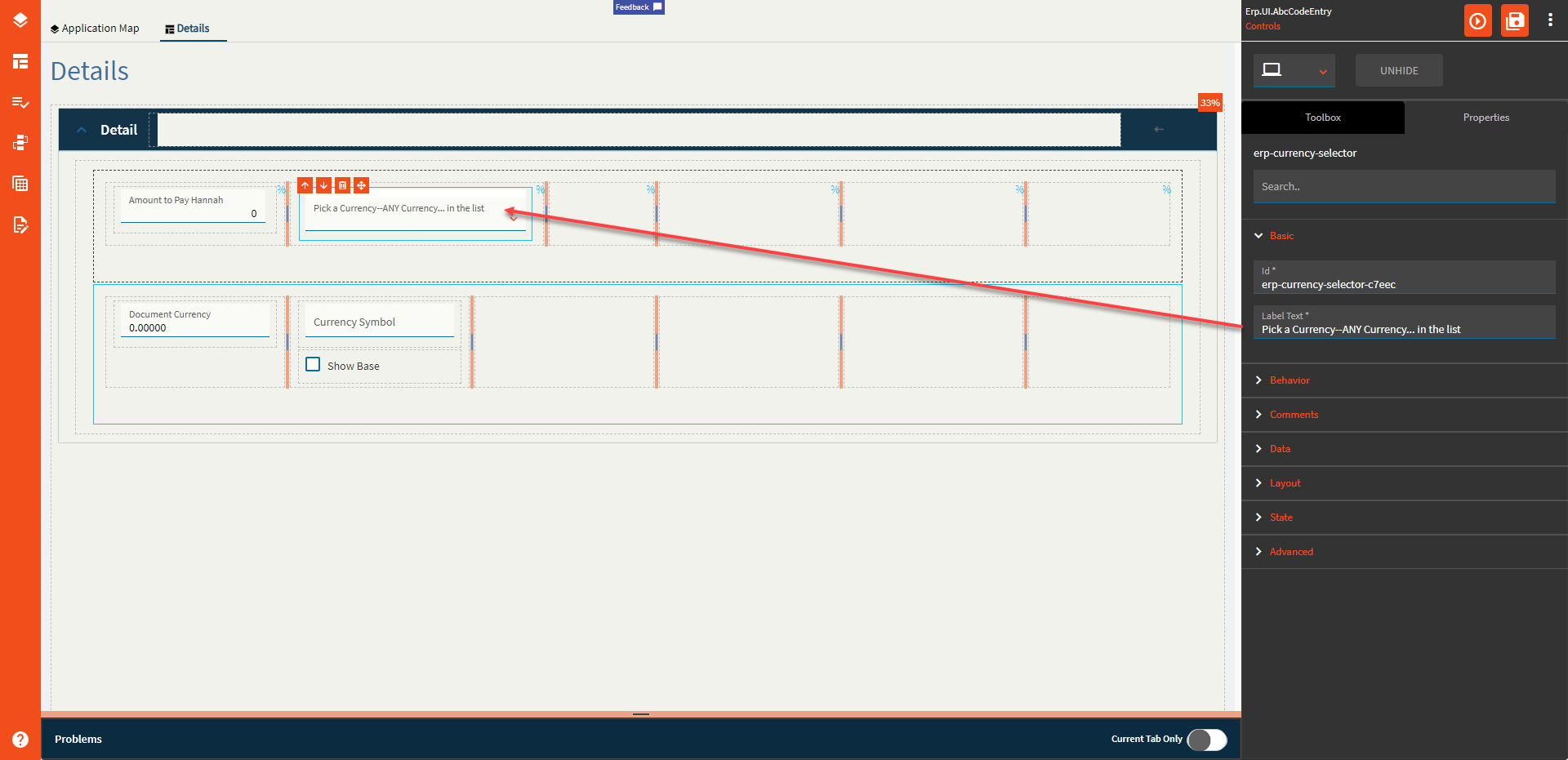
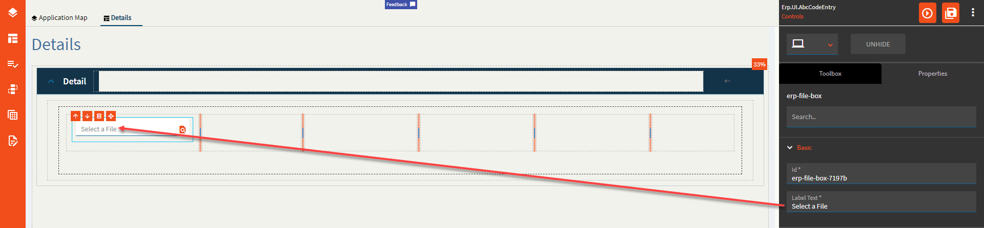
| Basic | Label Text | Alter the display text on the button (Fig. A) |
| Behavior | On Click | Click this to create an OnClick Event. On Click is triggered when a user clicks the button. |
| Behavior | On Blur | Click this to create an OnBlur event for the control. On Blur is triggered when the control loses focus. |
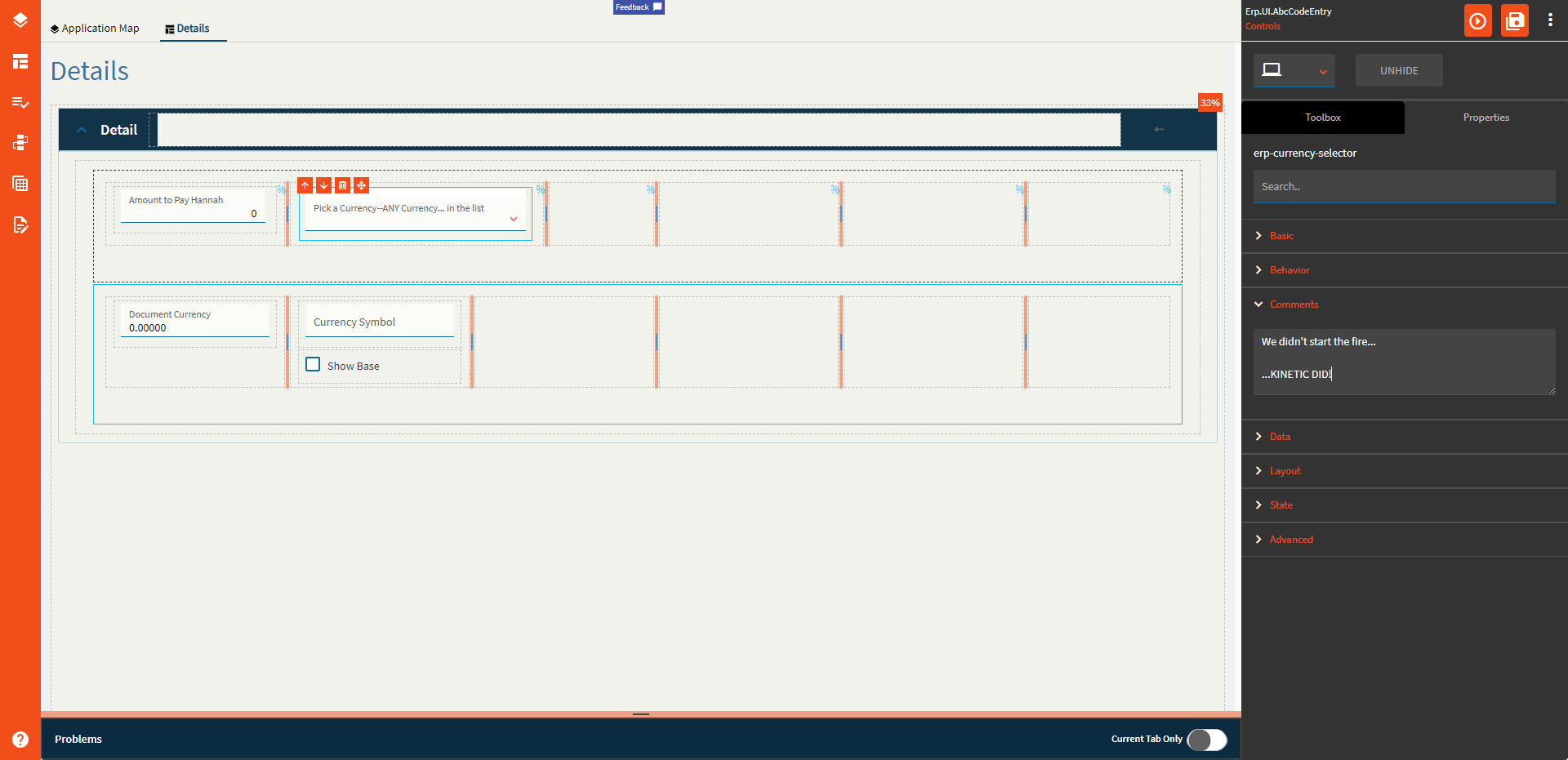
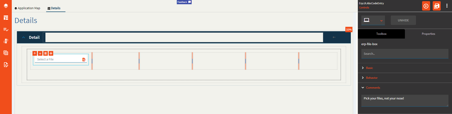
| Comments | Comments | Add some developer notes to the control. These are not customer-facing and are only visible in App Studio (Fig. B) |
| Data | Key Field | Indicates that a bound component is a key field. If true, the field is enabled if there is no current record, allowing the user to select an existing record or create a new one. |
| Data | EpBinding | Bind the control to a DataView.Column. This is your Base Currency field. (All Your Base Are Belong To Us) |
| Data | Ep Binding Document | Bind the control to a DataView.Column. This is your Document Currency field. |
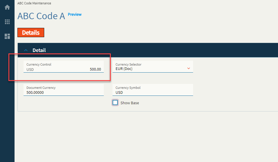
| Data | Ep Binding ShowBase | Bind the control to a DataView.Column. This is a boolean value to indicate whether or not to show the base value when the document currency is selected to be shown. (Fig. C) |
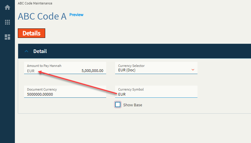
| Data | Ep Binding DocumentSymbol | This is the binding for the document currency symbol. Incidentally, when you switch the currency to base by either using ShowBase or the Currency Selector, it does not change the currency symbol, soooo you’ll likely have to wire up an event to do this yourself. Yeehaw. |
| Layout | Alignment |
 Set the alignment for the control. Valid options are Left, Center, Right. Does not woooork. Set the alignment for the control. Valid options are Left, Center, Right. Does not woooork. |
| Layout | Width |
Sets the specific width (pixels) for the control. Does not woooork. |
| State | Personalizable | If true, a user can personalize this component(hide/show) |
| State | Customizable | If true, a user can customize this component in child layers |
| State | Hidden | Hides the control from view. |
| State | Disabled | Disables the control. The control will not allow editing or focus. |
| State | Read Only | Makes the control read only so that it will not allow editing. The control can still be focused. |
| State | Auto Focus | When enabled, the control is automatically focused on creation. |
| Advanced | Active Currency Type |
This doesn’t seem to do anything? It’s supposed to set the active currency for the control by default, but noooop. Valid options include BASE, DOC, RPT1, RPT2, RPT3, GLOBAL, and Unspecified (It annoys me that the rest are capitalized, but Unspecified is not. I guess someone forgot to specify a consistent format  ) ) |
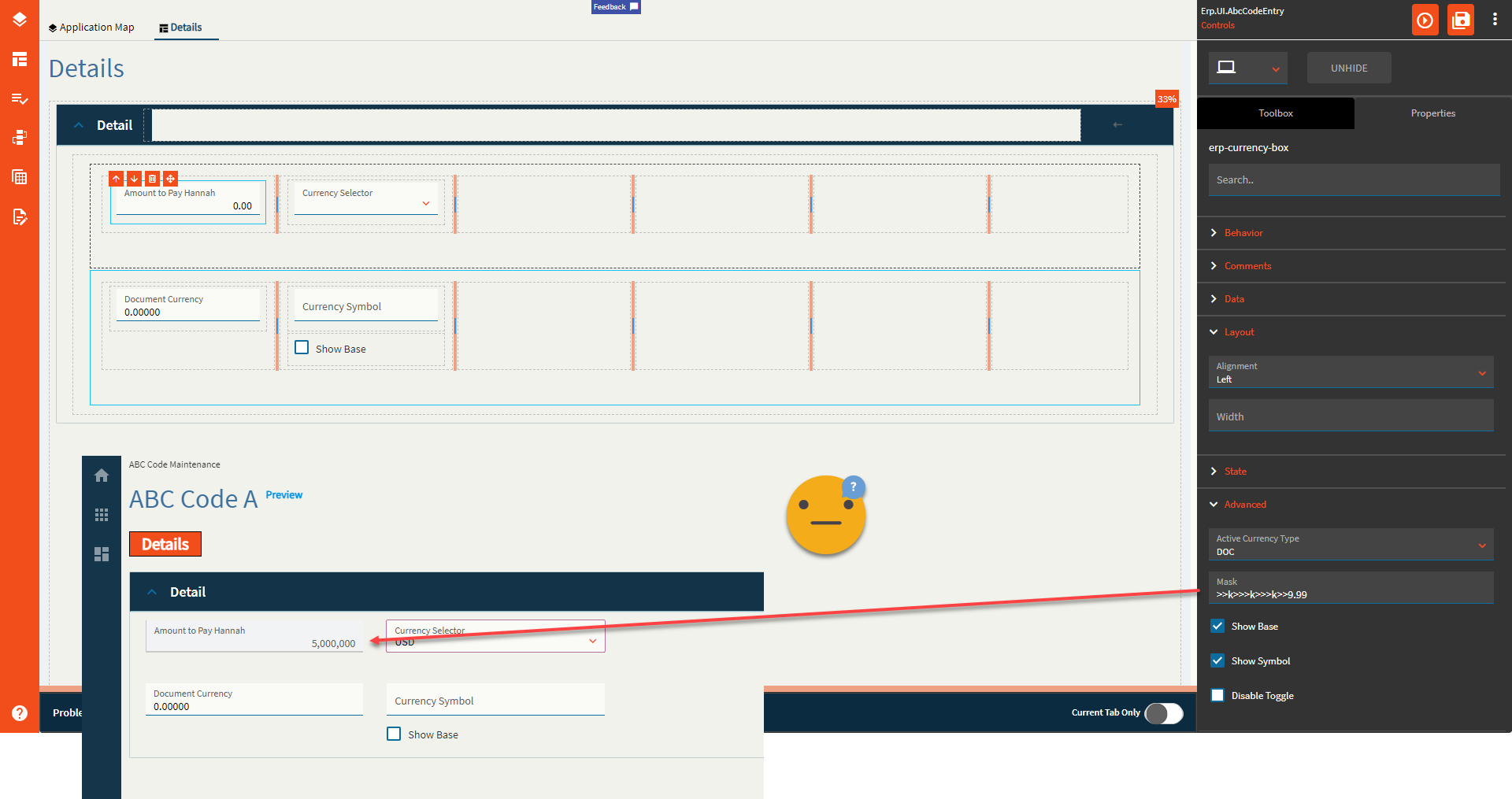
| Advanced | Mask |
Sets the format for the field by overriding the extended properties Format. Only half works. It only takes into consideration the “>” and “9” options It doesn’t give a hoot what you put for the separators–yer gittin’ commas… and no decimals. And it only works on the base field. <Insert Nathan Fillion lost for words GIF> (Fig. D) |
| Advanced | Show Base |
This forces the control to show the base value. Or dooooes it? Narrator: It does not. |
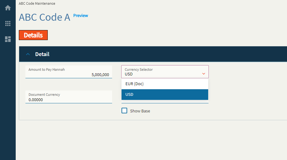
| Advanced | Show Symbol | Enable to show the currency symbol. (Fig. E) |
| Advanced | Disable Toggle | Enable this to make the Currency Selector useless. Changing the Currency Selector will no longer toggle the Currency Box between your base and document currencies. |
**After thought: I’m not sure why the Active Currency Type property shows anything except BASE and DOC as there are no bindings for RPT1, RPT2, etc. like there were in days of old. Still seems like quite a nonsensical control.
Figure A: Label Text
Figure B: Comment Text
Figure C: Show Base
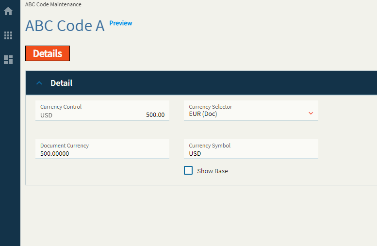
Figure D: Mask
Figure E: Show Symbol
Typically, the textbox where I typed in EUR would be a bound field not shown on the screen. Shown for educational purposes.
Sister control to the Currency Box–this allows a user to select a currency type from a dropdown.
| Property Group | Property | Description |
|---|---|---|
| Basic | Id | This is the control’s unique identifier |
| Basic | Label Text | Alter the display text on the button (Fig. A) |
| Behavior | On Click | Click this to create an OnClick Event. On Click is triggered when a user clicks the button. |
| Behavior | On Blur | Click this to create an OnBlur event for the control. On Blur is triggered when the control loses focus. |
| Comments | Comments | Add some developer notes to the control. These are not customer-facing and are only visible in App Studio (Fig. B) |
| Data | Key Field | Indicates that a bound component is a key field. If true, the field is enabled if there is no current record, allowing the user to select an existing record or create a new one. Not applicable to this control. |
| Data | EpBindingDocument | Bind the control to a DataView.Column. This is your Document Currency field. |
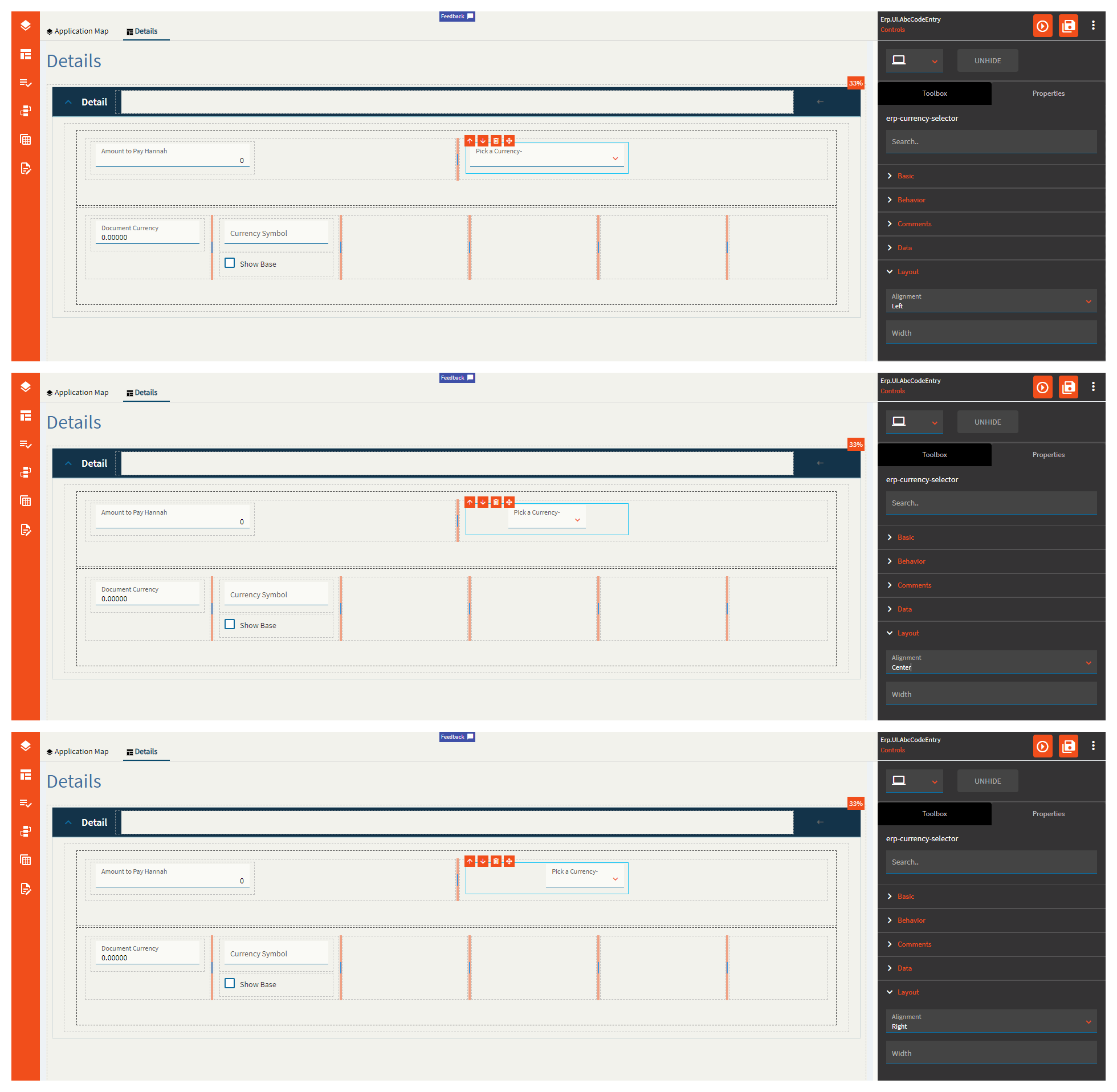
| Layout | Alignment | Set the alignment for the control. Valid options are Left, Center, Right. (Fig. C) **Behaves weirdly depending on the control size. |
| Layout | Width |
Sets the specific width (pixels) for the control. Does not woooork. |
| State | Personalizable | If true, a user can personalize this component(hide/show) |
| State | Customizable | If true, a user can customize this component in child layers |
| State | Hidden | Hides the control from view. |
| State | Disabled | Disables the control. The control will not allow editing or focus. |
| State | Read Only | Makes the control read only so that it will not allow editing. The control can still be focused. |
| Advanced | Show Document Currency |
When enabled the doc currency type will be ignored and base currency will be used. Does not seem to work. |
Figure A: Label Text
Figure B: Comments
Figure C: Alignment
Dates here! Get your dates here! Fresh and mostly working!
This control allows you to enter or pick a date. Shocking, I know!
| Property Group | Property | Description |
|---|---|---|
| Basic | Id | Unique identifier for the control |
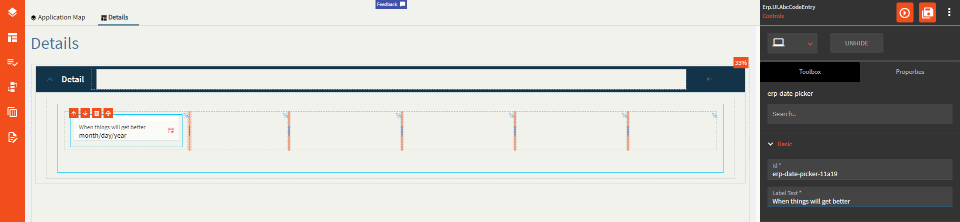
| Basic | Label Text | Sets the label within the control. (Fig. A) |
| Behavior | On Blur | Click this to create an OnBlur event for the control. On Blur is triggered when the control loses focus. |
| Behavior | On Create | Click this to create an OnCreate event for the control On Create is triggered when the control is painted to the GUI. |
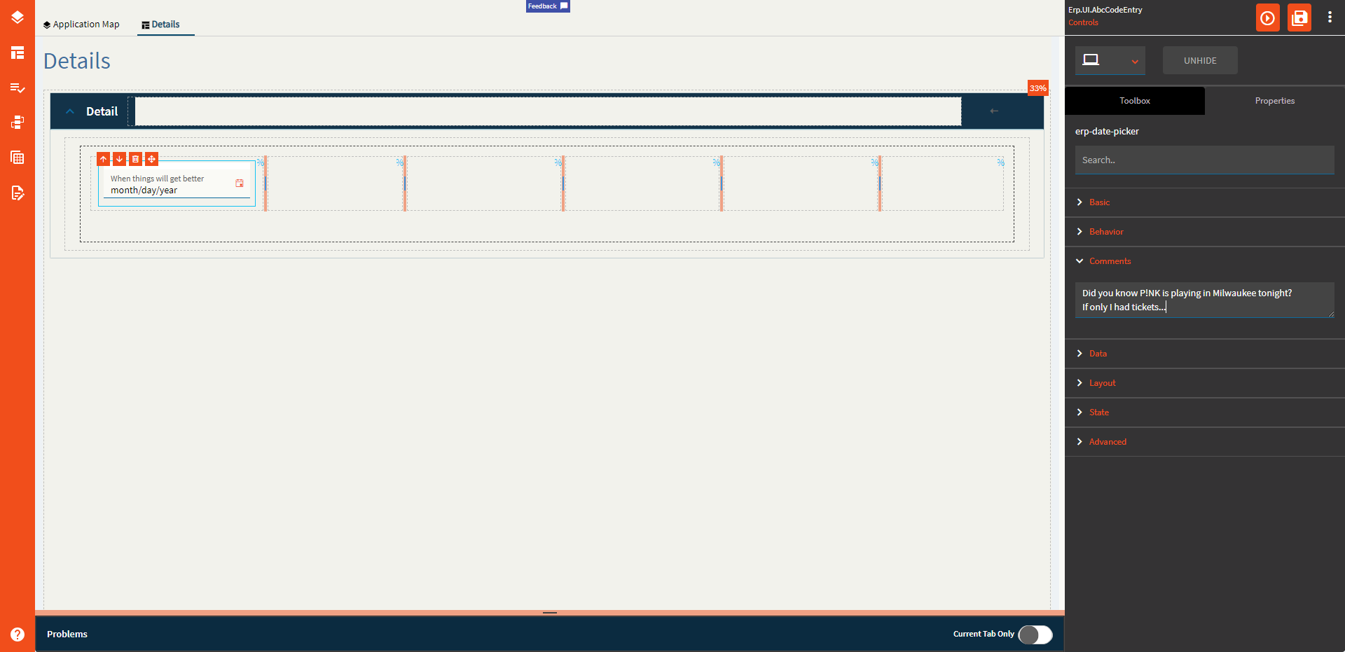
| Comments | Comments | Add some developer notes to the control. These are not customer-facing and are only visible in App Studio (Fig. B) |
| Data | Key Field | Indicates that a bound component is a key field. If true, the field is enabled if there is no current record, allowing the user to select an existing record or create a new one. |
| Data | EpBinding | Bind the button to a DataView.Column. |
| Layout | Alignment |
Set the alignment for the control. Valid options are Left, Center, Right. Doesn’t work. |
| Layout | Width |
Sets the specific width (pixels) for the control. Doesn’t work. |
| State | Personalizable | If true, a user can personalize this component(hide/show) |
| State | Customizable | If true, a user can customize this component in child layers |
| State | Hidden | Hides the control from view. |
| State | Disabled | Disables the control. The control will not allow editing or focus. |
| State | Read Only | Makes the control read only so that it will not allow editing. The control can still be focused. |
| State | Auto Focus | When enabled, the control is automatically focused on creation. |
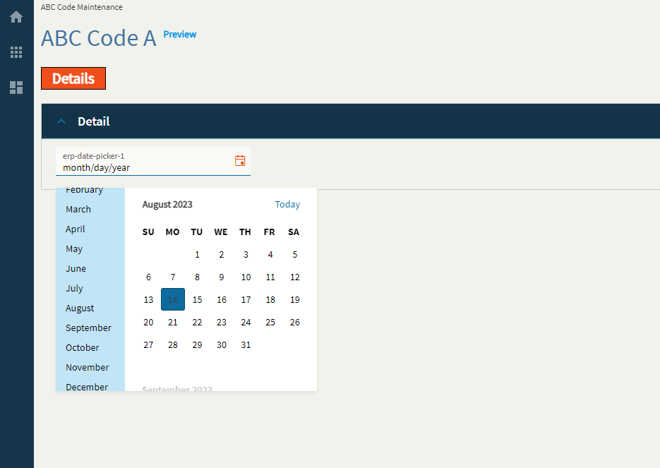
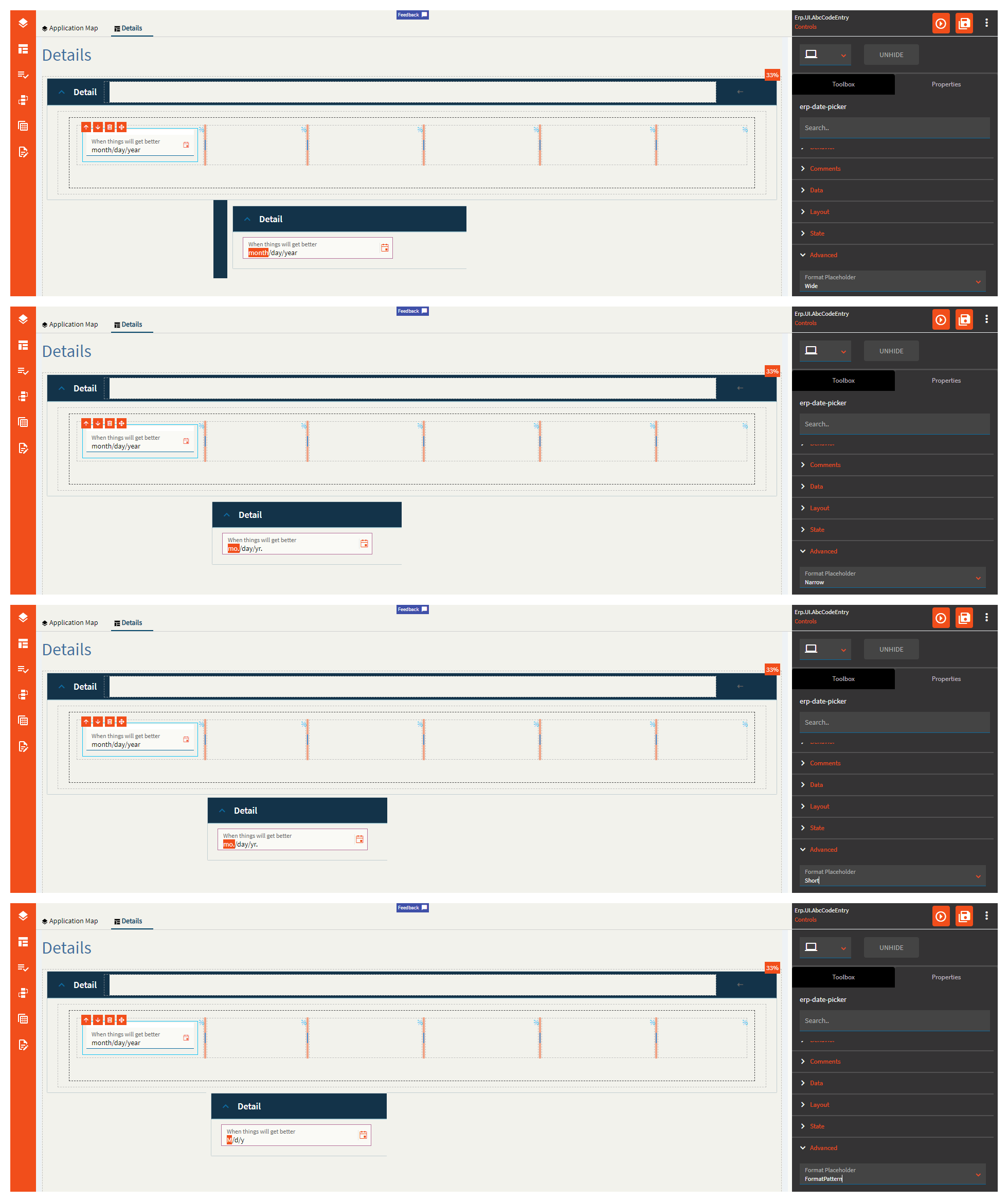
| Advanced | Format Placeholder | Sets the way the format sections of the input field are rendered. Valid options incluuuude Wide, Narrow, Short, FormatPattern. Narrow and Short appear to be the same. (Fig. C) |
| Advanced | Place Holder |
Sets the hint the DatePicker display when its value is null. No. No it doesn’t. This does nothing. |
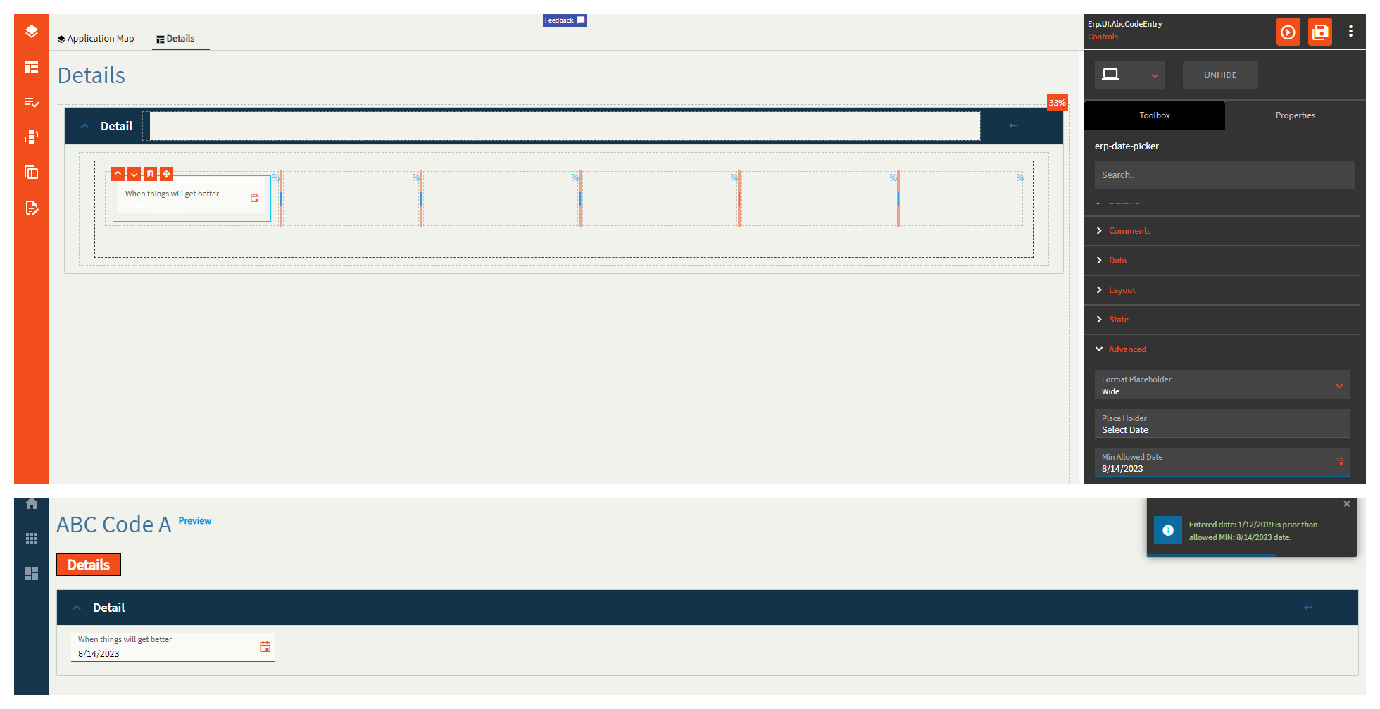
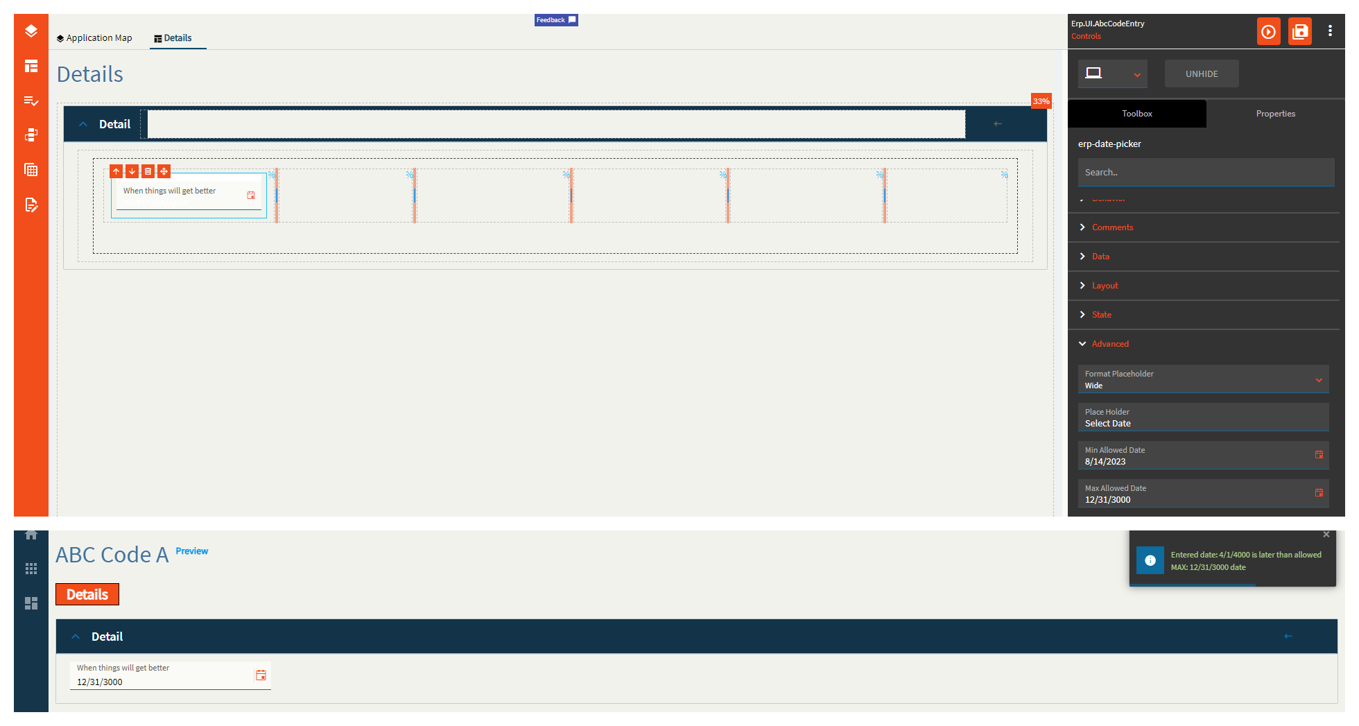
| Advanced | Min Allowed Date | Specifies the minimum date allowed for the control. (Fig. D) |
| Advanced | Max Allowed Date | Specifies the maximum date allowed for the control. (Fig. E) |
| Advanced | Range Validation | If enabled, this will enforce the min and max allowed dates. |
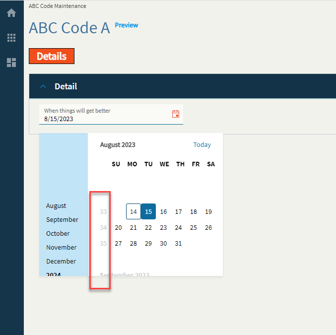
| Advanced | Week Number | If enabled, this will display a week number column in the month view of the calendar (Fig. F) |
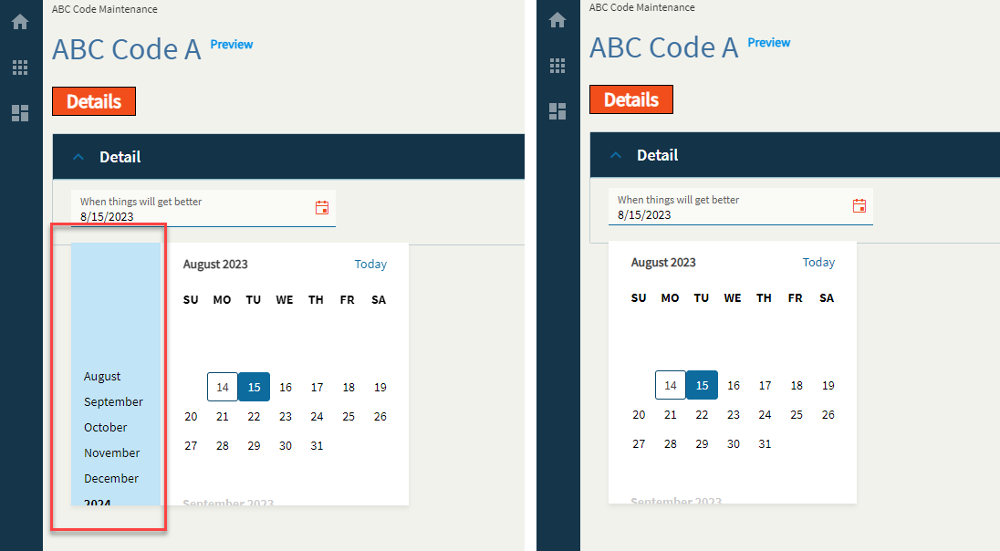
| Advanced | Navigation | If enabled, this will display the navigation side-bar on the calendar. (Fig. G) |
| Advanced | Mask |
Override the default display format for the date time value using Standard DateTime Format strings such as MM/dd/yyyy (08/15/2023) or MMM yyyy (Aug 2023). Doesn’t work. |
Figure A: Label Text
Figure B: Comments
Figure C: Format Placeholder
Figure D: Min Allowed Date
Figure E: Max Allowed Date
Figure F: Week Number
Figure G: Navigation
Thank you so much for doing this!
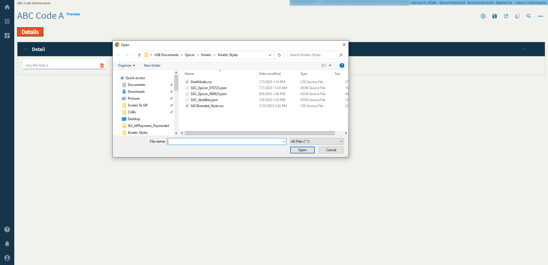
The file picker client allows a user to select a local file.
Note: This does not actually upload a document anywhere. It just saves the file name to a binding. You will need to create an event and use the file-transfer-erp widget to make things happen with the file.
| Property Group | Properties | Description |
|---|---|---|
| Basic | Id | Unique identifier for the control |
| — | — | — |
| Basic | Label Text | Sets the label text within the control. (Fig. A) |
| Behavior | On Blur | Click this to create an OnBlur event for the control. On Blur is triggered when the control loses focus. |
| Behavior | On Create | Click this to create an OnCreate event for the control On Create is triggered when the control is painted to the GUI. |
| Comments | Comments | Add some developer notes to the control. These are not customer-facing and are only visible in App Studio (Fig. B) |
| Data | Key Field | Indicates that a bound component is a key field. If true, the field is enabled if there is no current record, allowing the user to select an existing record or create a new one. Would not make sense to be used with this control. |
| Data | EpBinding | Bind the button to a DataView.Column. |
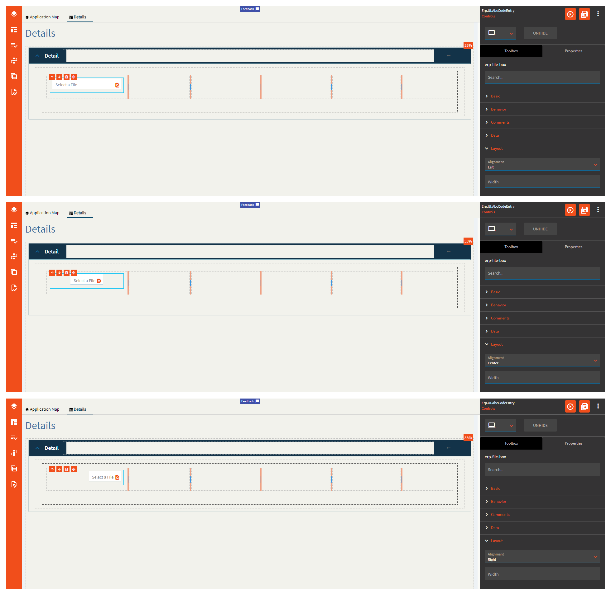
| Layout | Alignment | Set the alignment for the control. Valid options are |
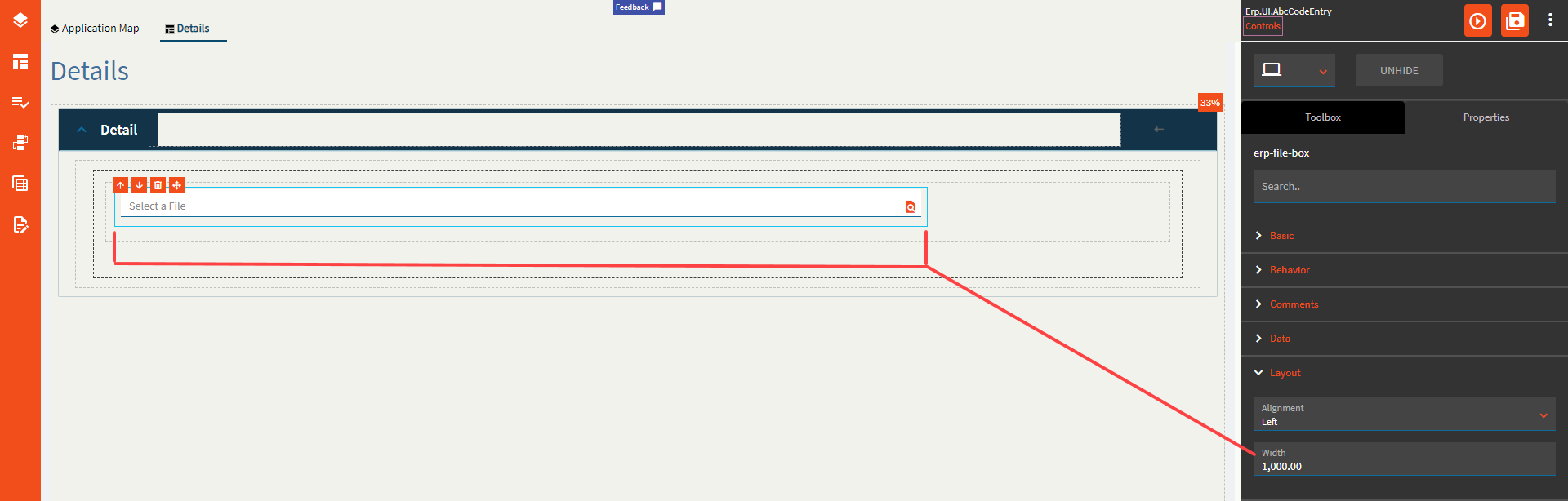
| Layout | Width | Sets the specific width (pixels) for the control. It would seem you cannot go below 290px (Fig. D) |
| State | Personalizable | If true, a user can personalize this component(hide/show) |
| State | Customizable | If true, a user can customize this component in child layers |
| State | Hidden | Hides the control from view. |
| State | Disabled | Disables the control. The control will not allow editing or focus. |
| State | Read Only | Makes the control read only so that it will not allow editing. The control can still be focused. |
| State | Auto Focus | When enabled, the control is automatically focused on creation. |
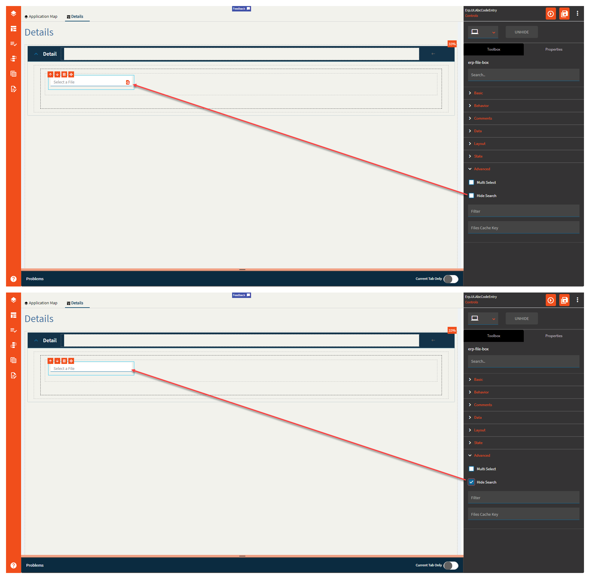
| Advanced | Multi Select | Allows a user to select multiple files. (Fig. E) |
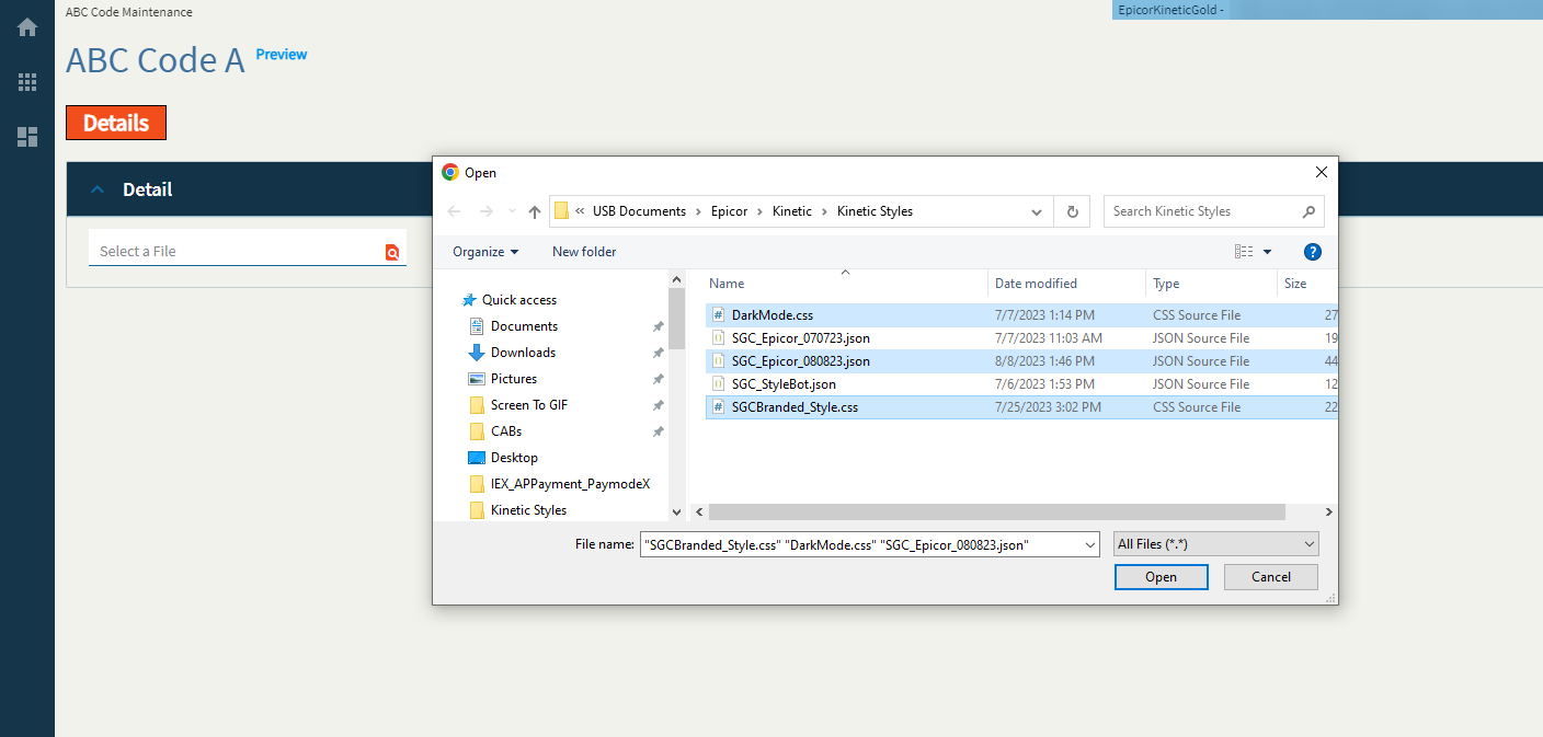
| Advanced | Hide Search | Hides the search icon which disables the file selection. <Insert “But Why” Ryan Reynolds GIF> (Fig. F) |
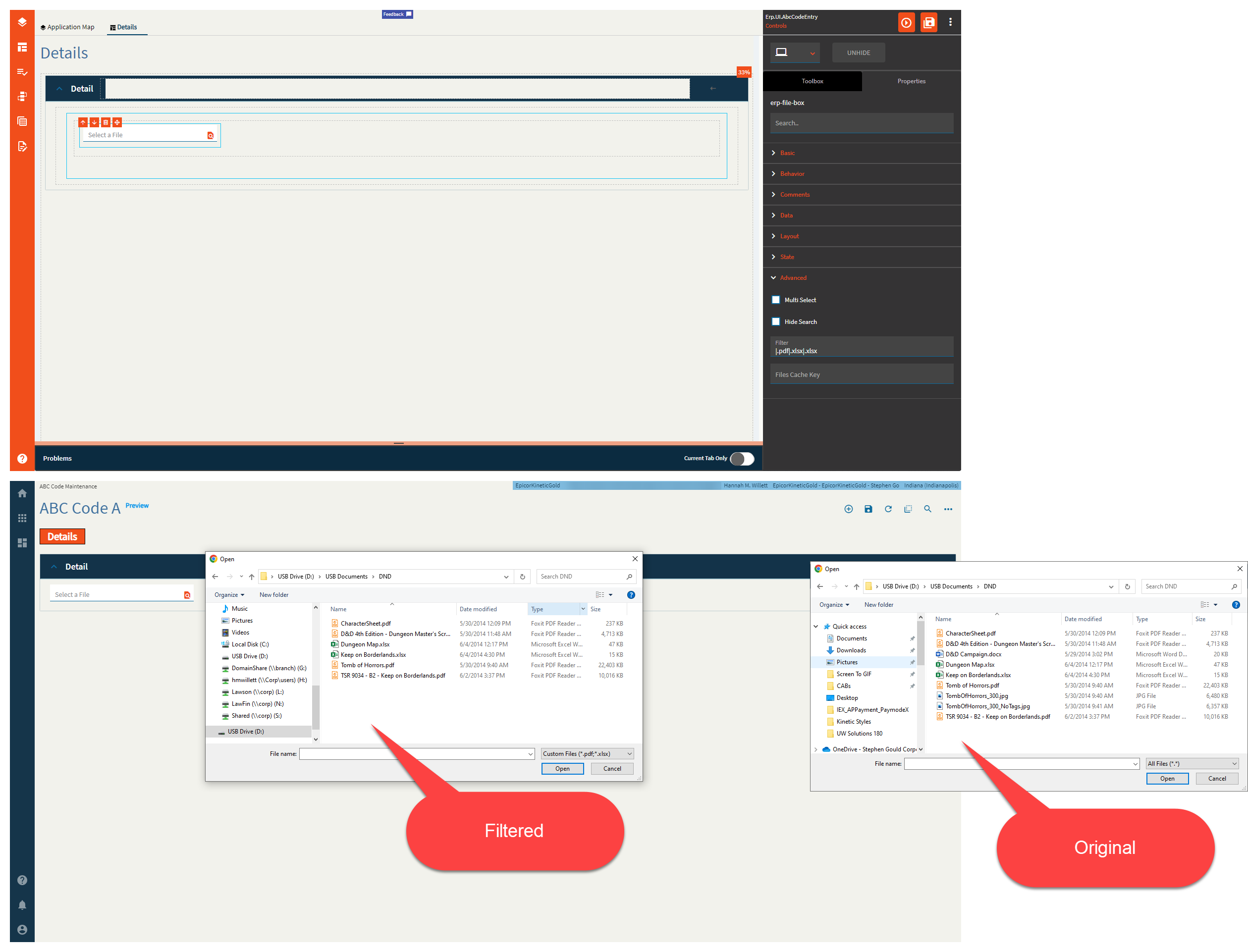
| Advanced | Filter |
Filters the file types allowed. Syntax is |.pdf If you want multiple file types, there’s a bug |.pdf|.xlsx|.xlsx The second |.xlsx will be ignored.|.pdf|.xlsx|.doc|.txt|.css will give you a filter for PDFs, DOCs, and CSS… (Fig. G) I GUESS I’ll submit a ticket for that one. (CS0003827637 ← This was a mistake…  ) ) |
| Advanced | File Cache Key |
Cache key to be used to store the file in cache. If empty, the file is not stored in cache. Not sure if this works, but I could not find the file in either the browser cache or the local cache. |
Figure A: Label Text
Figure B: Comments
Figure C: Alignment
Figure D: Width
Figure E: Multi Select
Figure F: Hide Search
Figure G: Filter
Hannah, we (or at least not me) are not worthy of such incredible insights! 
Thank you!!! 
Ahahaha!
My mind went here:

Or if you have kids:

That’s exactly the GIF to represent how I feel.
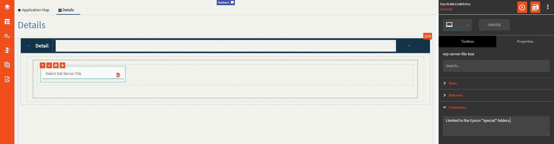
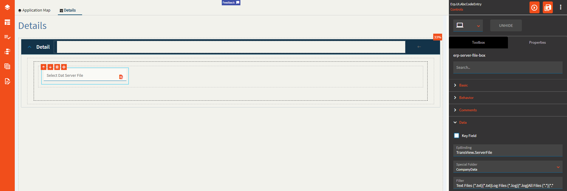
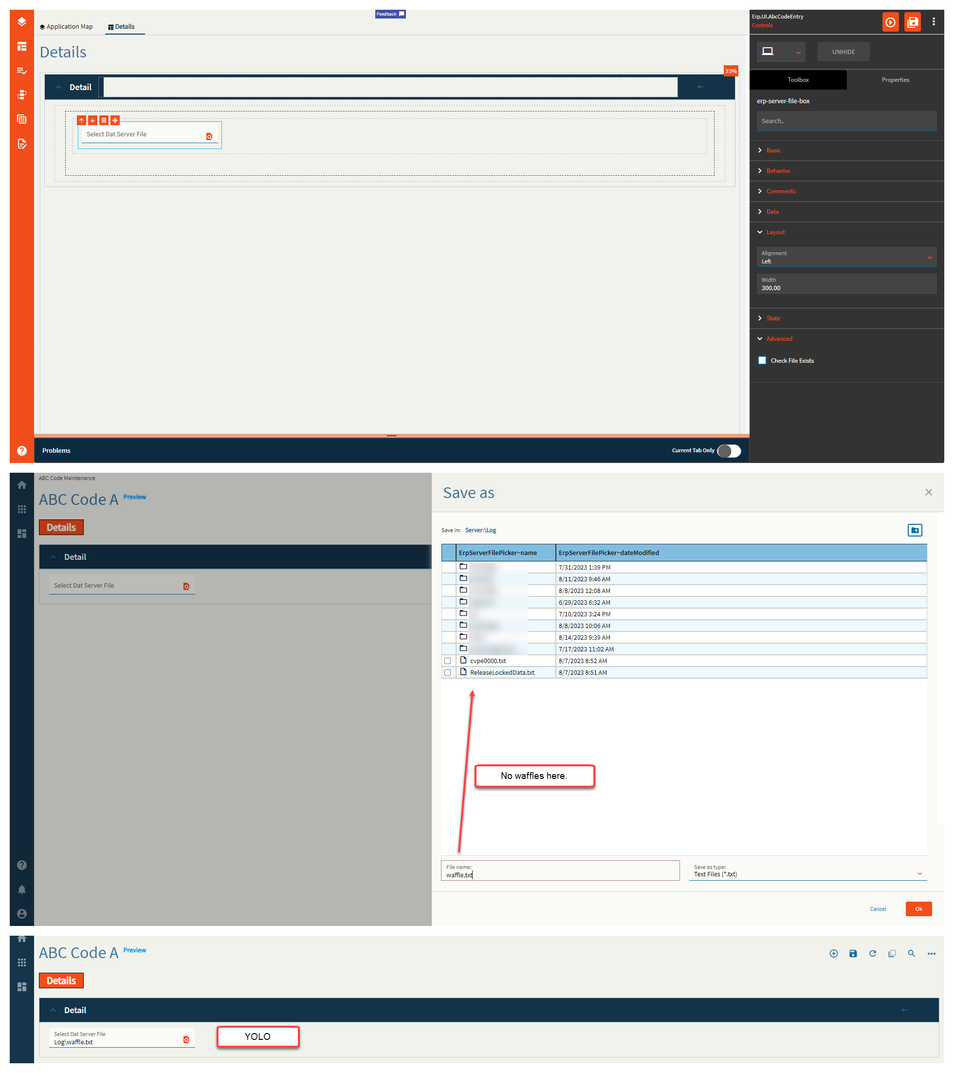
Allows a user to “select” a file form the server. I say “select” in quotes because this does not bring the file down. It only binds the path to the data binding fields. You will need to use an event with the erp-file-transfer widget to move things about.
I don’t know what I’m doing.
| Property Group | Properties | Description |
|---|---|---|
| Basic | Id | Unique identifier for the control |
| Basic | Label Text | Sets the label within the control. (Fig. A) |
| Behavior | On Blur | Click this to create an OnBlur event for the control. On Blur is triggered when the control loses focus. |
| Behavior | On Create | Click this to create an OnCreate event for the control On Create is triggered when the control is painted to the GUI. |
| Comments | Comments | Add some developer notes to the control. These are not customer-facing and are only visible in App Studio (Fig. B) |
| Data | Key Field | Indicates that a bound component is a key field. If true, the field is enabled if there is no current record, allowing the user to select an existing record or create a new one. |
| Data | EpBinding | Bind the  . This will store the file name and partial path such as . This will store the file name and partial path such as Log\LogTextFile.txt. |
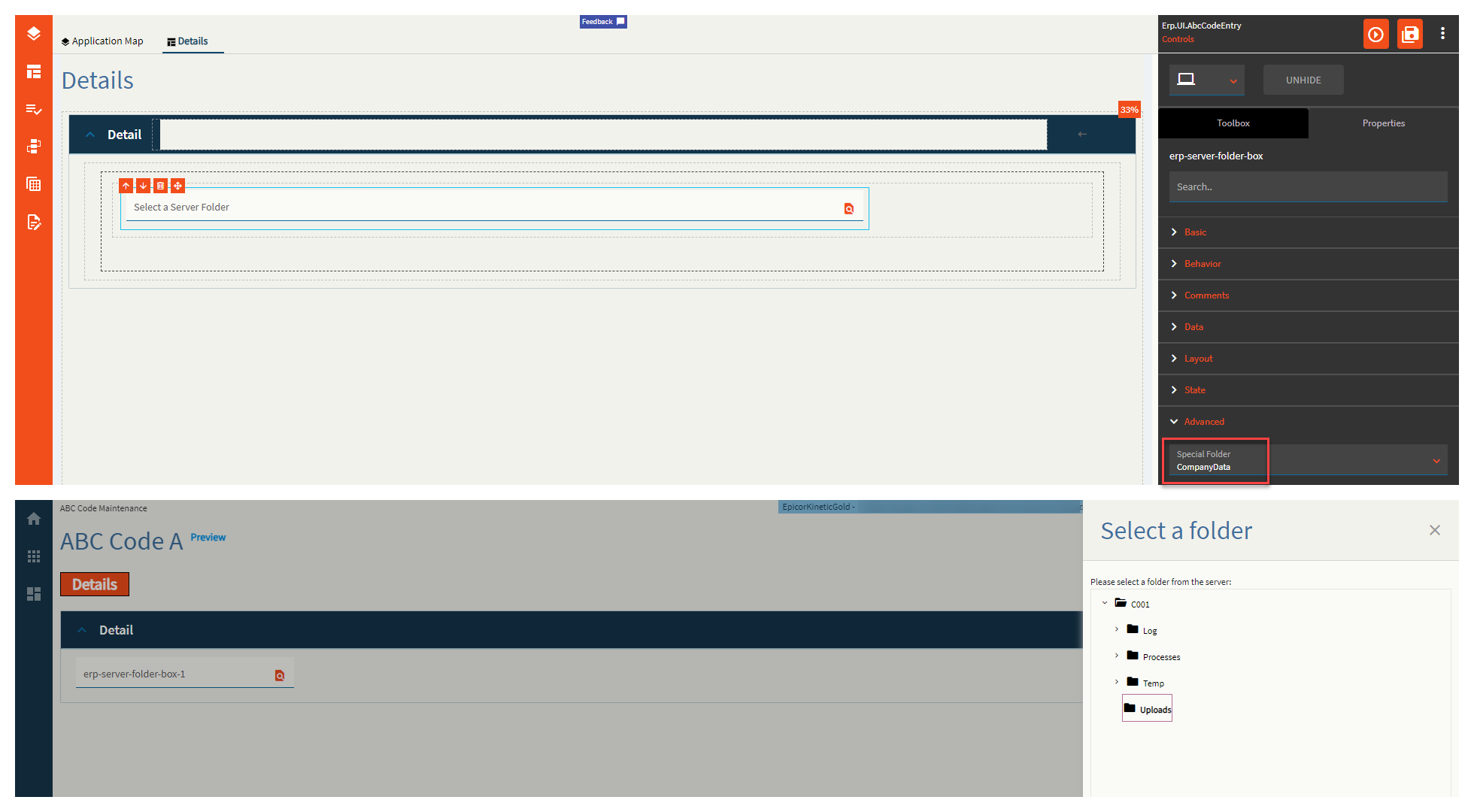
| Data | Special Folder | Server folder that should be navigated to in order to select files. Valid Options Include: Report, WebDeployment, ReportDefinition, CustomReportDefinition, UserData, CompanyData, EWADeployment, and Attachment. (Fig. C) |
| Data | Filter | Filters to be added to the file selector type. Format: Text Files (*.txt)|*.txt|All Files (*.*)|*.* In plain words Description|WildCard.FileExtension (Fig. D) |
| Data | Binding File Name | Binding to store the relative file path such as C:\EpicorData\EpicorKineticGold\Companies\C001\Log\LogTextFile.txt (Fig. E) |
| Layout | Alignment | Set the alignment for the control. Valid options are Left, Center, Right. (Fig. F) |
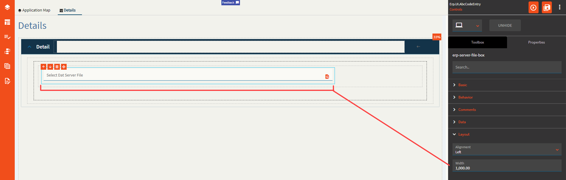
| Layout | Width | Sets the specific width (pixels) for the control. (Fig. G) |
| State | Personalizable | If true, a user can personalize this component(hide/show) |
| State | Customizable | If true, a user can customize this component in child layers |
| State | Hidden | Hides the control from view. |
| State | Disabled | Disables the control. The control will not allow editing or focus. |
| State | Read Only | Makes the control read only so that it will not allow editing. The control can still be focused. |
| State | Auto Focus | When enabled, the control is automatically focused on creation. |
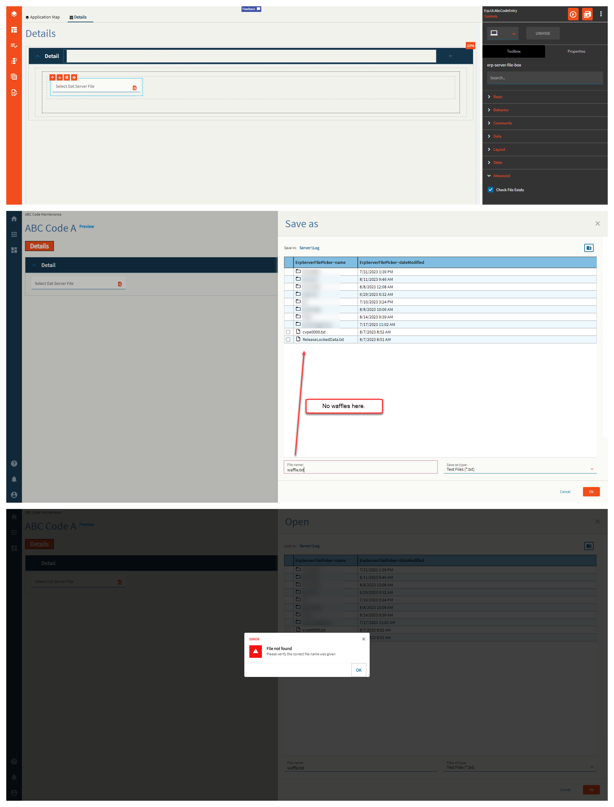
| Advanced | Check File Exists | If this is false, you can type in whatever you want in the file name box from the slide out and it will accept it as truth. If enabled, this will check if the file actually exists and sternly yell at you if it doesn’t! (Fig. H) |
Figure A: Label Text
Figure B: Comments
Figure C: Special Folder
Figure D: Filter
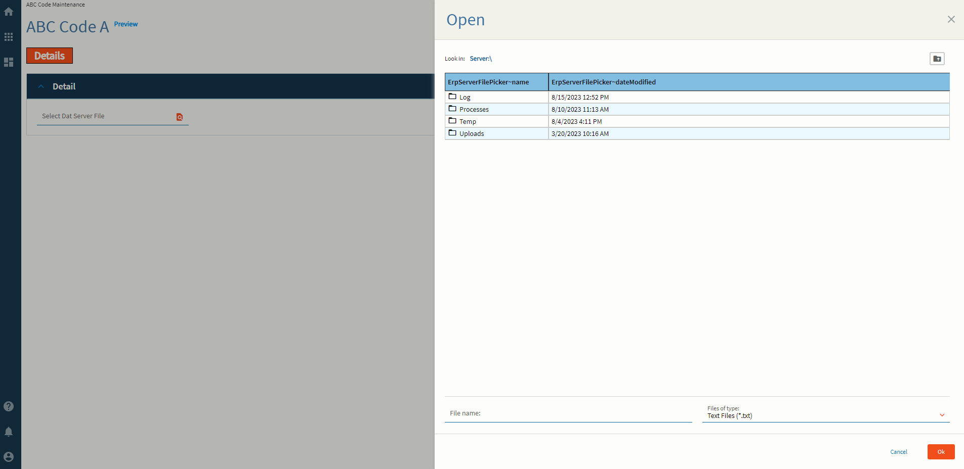
Figure E: Binding File Name
Figure F: Alignment
Figure G: Width
Figure H: Check File Exists = FALSE
Figure H: Check File Exists = TRUE
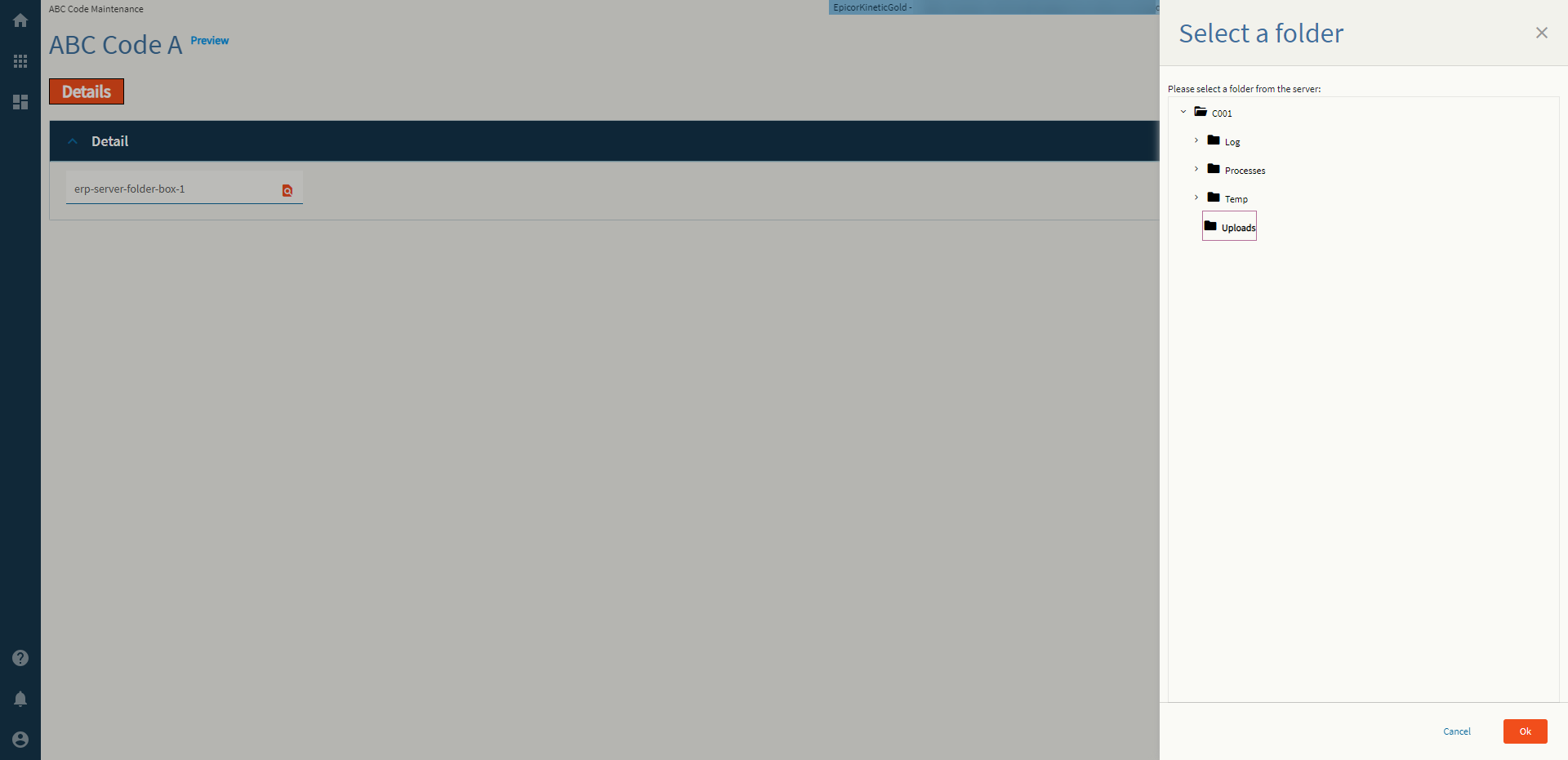
Allows a user to select a folder from the server. And by “select” I mean it just puts the name of it into the binding.
| Property Group | Property | Description |
|---|---|---|
| Basic | Id | Unique identifier for the control |
| Basic | Label Text | Sets the label within the control. (Fig. A) |
| Behavior | On Blur | Click this to create an OnBlur event for the control. On Blur is triggered when the control loses focus. |
| Behavior | On Create | Click this to create an OnCreate event for the control On Create is triggered when the control is painted to the GUI. |
| Comments | Comments | Add some developer notes to the control. These are not customer-facing and are only visible in App Studio (Fig. B) |
| Data | Key Field | Indicates that a bound component is a key field. If true, the field is enabled if there is no current record, allowing the user to select an existing record or create a new one. |
| Data | EpBinding | Bind the control to a DataView.Column. |
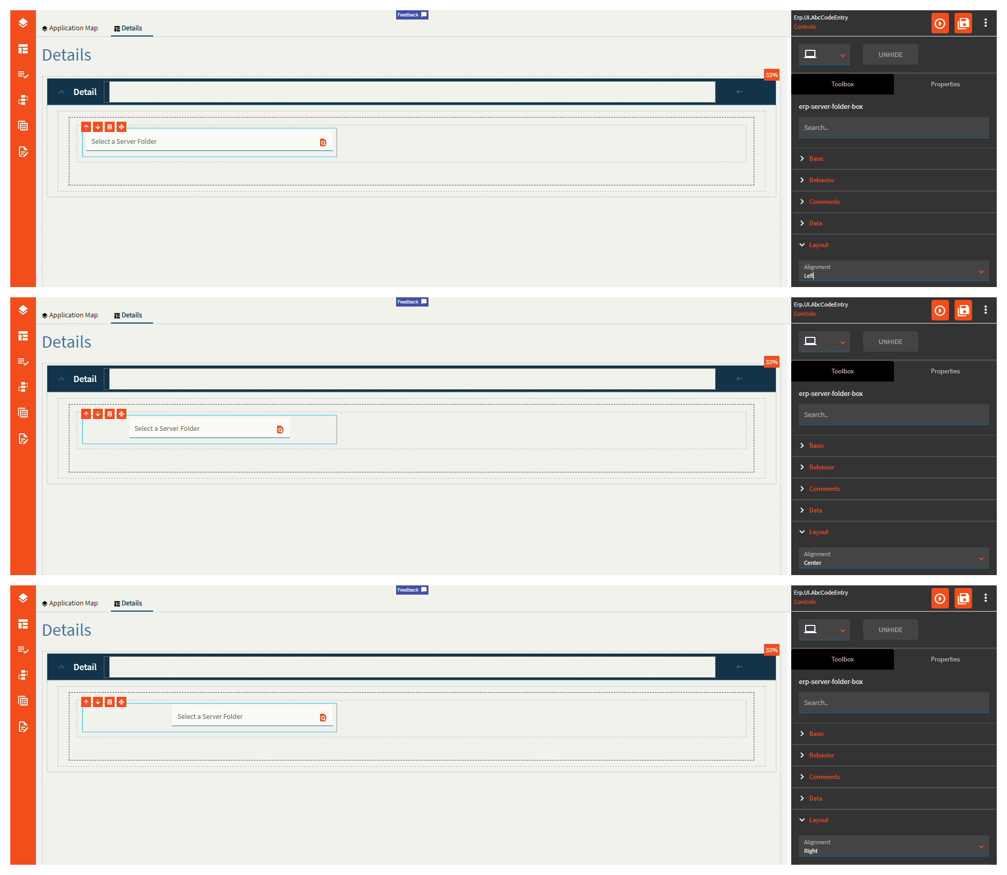
| Layout | Alignment | Set the alignment for the control. Valid options are Left, Center, Right. (Fig. C) |
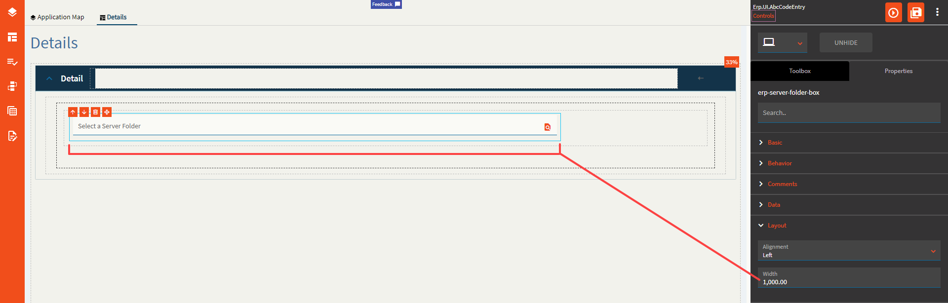
| Layout | Width | Sets the specific width (pixels) for the control. (Fig. D) |
| State | Personalizable | If true, a user can personalize this component(hide/show) |
| State | Customizable | If true, a user can customize this component in child layers |
| State | Hidden | Hides the control from view. |
| State | Disabled | Disables the control. The control will not allow editing or focus. |
| State | Read Only | Makes the control read only so that it will not allow editing. The control can still be focused. |
| State | Auto Focus | When enabled, the control is automatically focused on creation. |
| Advanced | Special Folder | Root Folder to display subfolders in. Valid Options Include: Report, WebDeployment, ReportDefinition, CustomReportDefinition, UserData, CompanyData, EWADeployment, and Attachment. (Fig. E) |
| Advanced | Disable Validation |
Validates the folder still exists on the server on click of OK. This doesn’t work. |
Figure A: Label Text
Figure B: Comments
Figure C: Alignment
Figure D: Width
Figure E: Special Folder
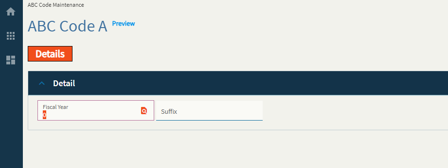
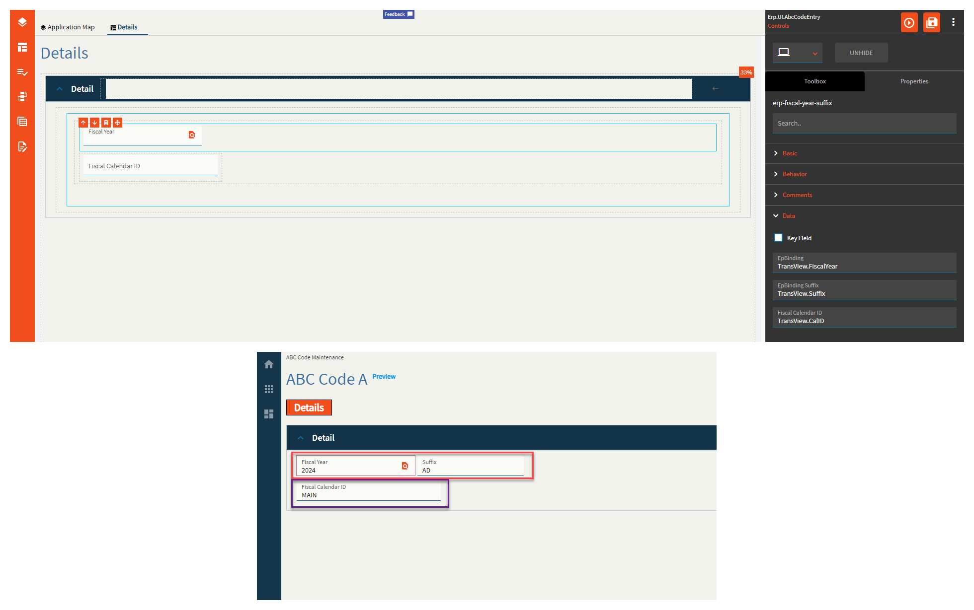
Combines the Fiscal Year and Suffix into a singular control.
This control has a built-in search that looks up the fiscal calendars.
| Property Group | Property | Description |
|---|---|---|
| Basic | Id | Unique identifier for the control |
| Behavior | On Blur | Click this to create an OnBlur event for the control. On Blur is triggered when the control loses focus. |
| Behavior | On Create | Click this to create an OnCreate event for the control On Create is triggered when the control is painted to the GUI. |
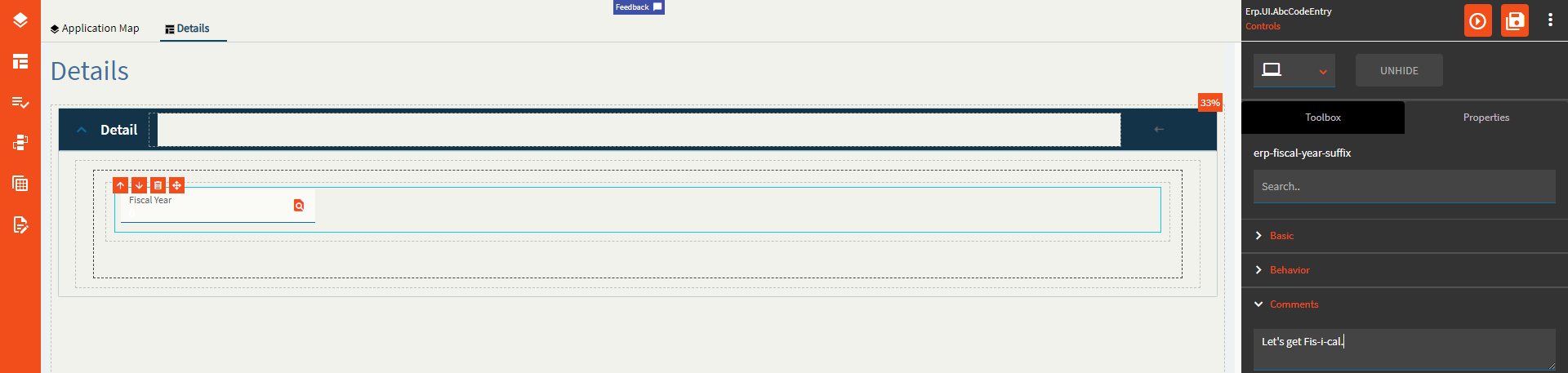
| Comments | Comments | Add some developer notes to the control. These are not customer-facing and are only visible in App Studio (Fig. A) |
| Data | Key Field | Indicates that a bound component is a key field. If true, the field is enabled if there is no current record, allowing the user to select an existing record or create a new one. |
| Data | EpBinding | Bind the fiscal year to a DataView.Column. (Fig. B) |
| Data | EpBinding Suffix | Bind the fiscal suffix to a DataView.Column. If this field is not bound, the suffix part of the control is hidden. (Fig. B) |
| Data | Fiscal Calendar ID | Binding for the fiscal calendar ID to be used in the search (Fig. B) |
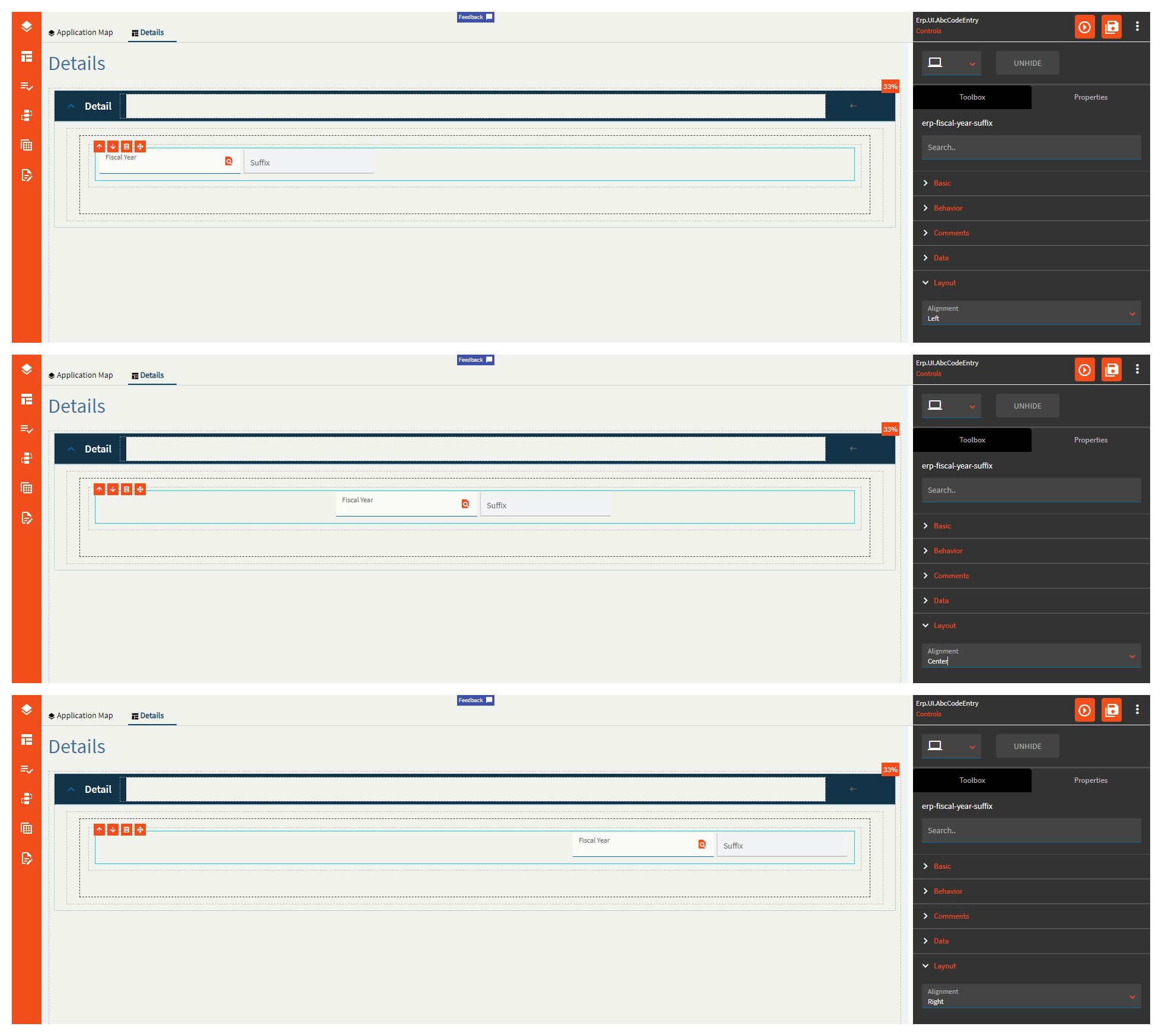
| Layout | Alignment | Set the alignment for the control. Valid options are Left, Center, Right. (Fig. C) |
| State | Personalizable | If true, a user can personalize this component(hide/show) |
| State | Customizable | If true, a user can customize this component in child layers |
| State | Hidden | Hides the control from view. |
| State | Disabled | Disables the control. The control will not allow editing or focus. |
| State | Read Only | Makes the control read only so that it will not allow editing. The control can still be focused. |
| State | Auto Focus | When enabled, the control is automatically focused on creation. |
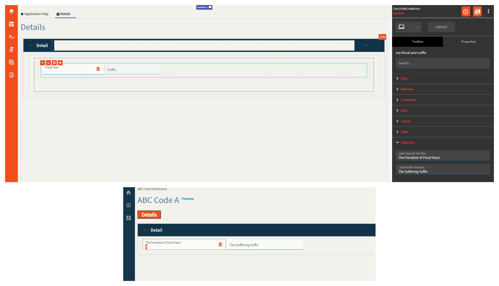
| Advanced | Label Search Text Box | The label within the fiscal year control. (Fig. D) |
| Advanced | Label Suffix Text Box | The label within the suffix control. (Fig. D) |
Figure A: Comments
Figure B: EpBindings
Red box is the Fiscal Year Suffix Control
Purple is a textbox I added to show the Fiscal Calendar ID.
Figure C: Alignment
Figure D: Labels
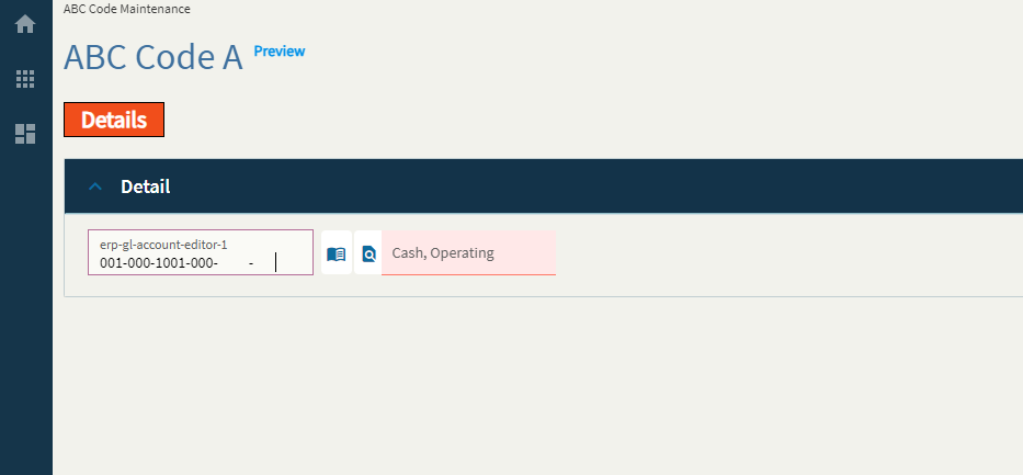
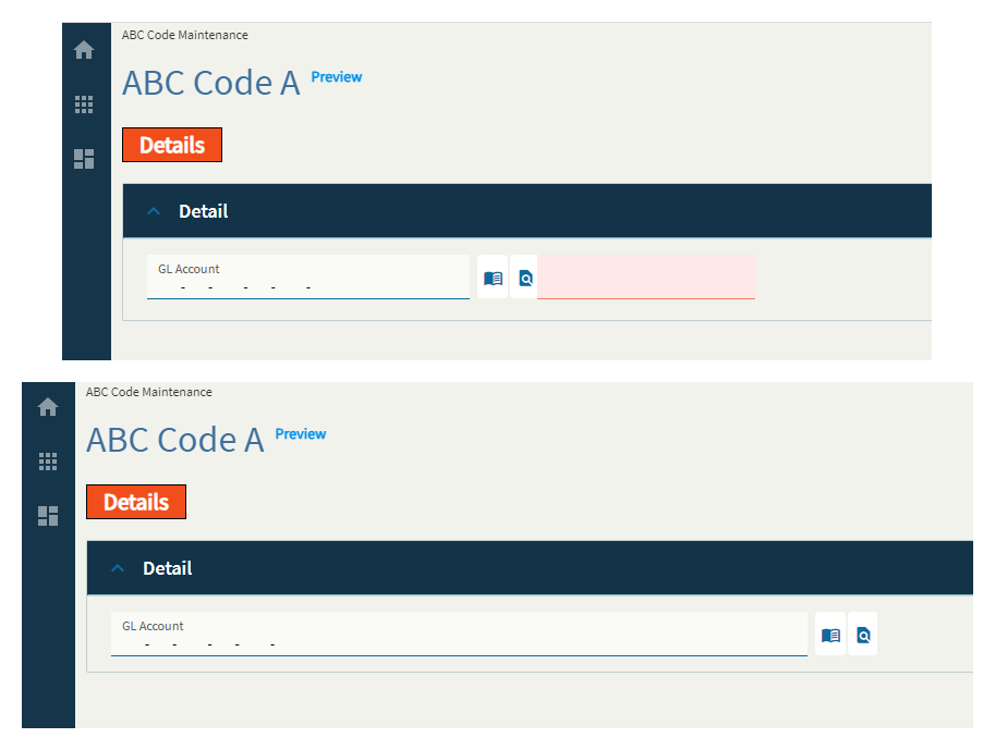
General Ledger Multi-book account editor component with possible multi-book account code entries.
I can’t, for the life of me, figure out how to make the description stop being red by using the properties of this field alone.
| Property Group | Property | Description |
|---|---|---|
| Basic | Id | Unique identifier for the control |
| Basic | Label Text | Sets the label within the control. (Fig. A) |
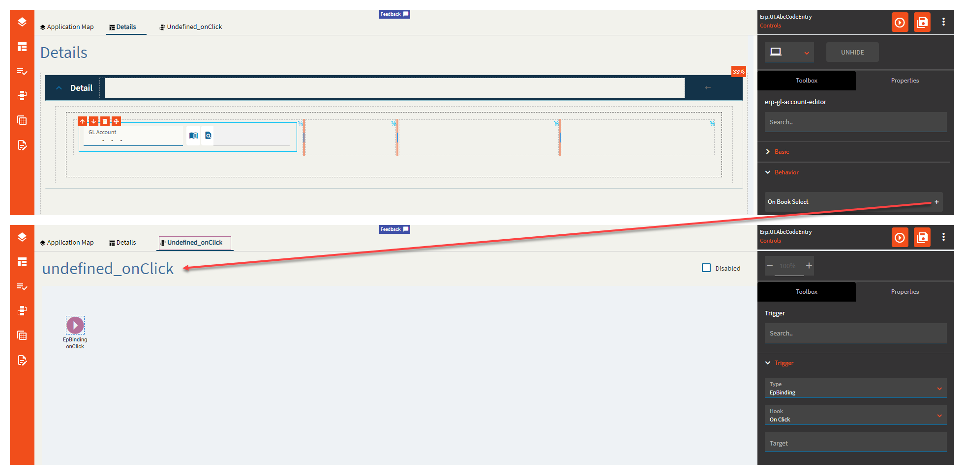
| Behavior | On Book Select |
Click this to create a useless event you’ll have to delete. (Fig. B for the lulz) |
| Behavior | On Blur | Click this to create an OnBlur event for the control. On Blur is triggered when the control loses focus. |
| Behavior | On Create | Click this to create an OnCreate event for the control On Create is triggered when the control is painted to the GUI. |
| Comments | Comments | Add some developer notes to the control. These are not customer-facing and are only visible in App Studio (Fig. C) |
| Data | Key Field | Indicates that a bound component is a key field. If true, the field is enabled if there is no current record, allowing the user to select an existing record or create a new one. |
| Data | EpBinding | Bind the control to a DataView.Column. |
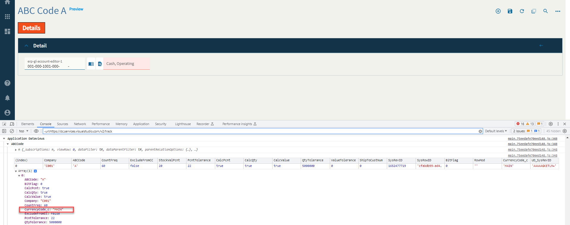
| Data | Coa Code Column | Set the data binding for the COA Code using the format View.Column. This is a column the control pulls from to read the COA Code. Needs to be an actual DB column. (Fig. D) |
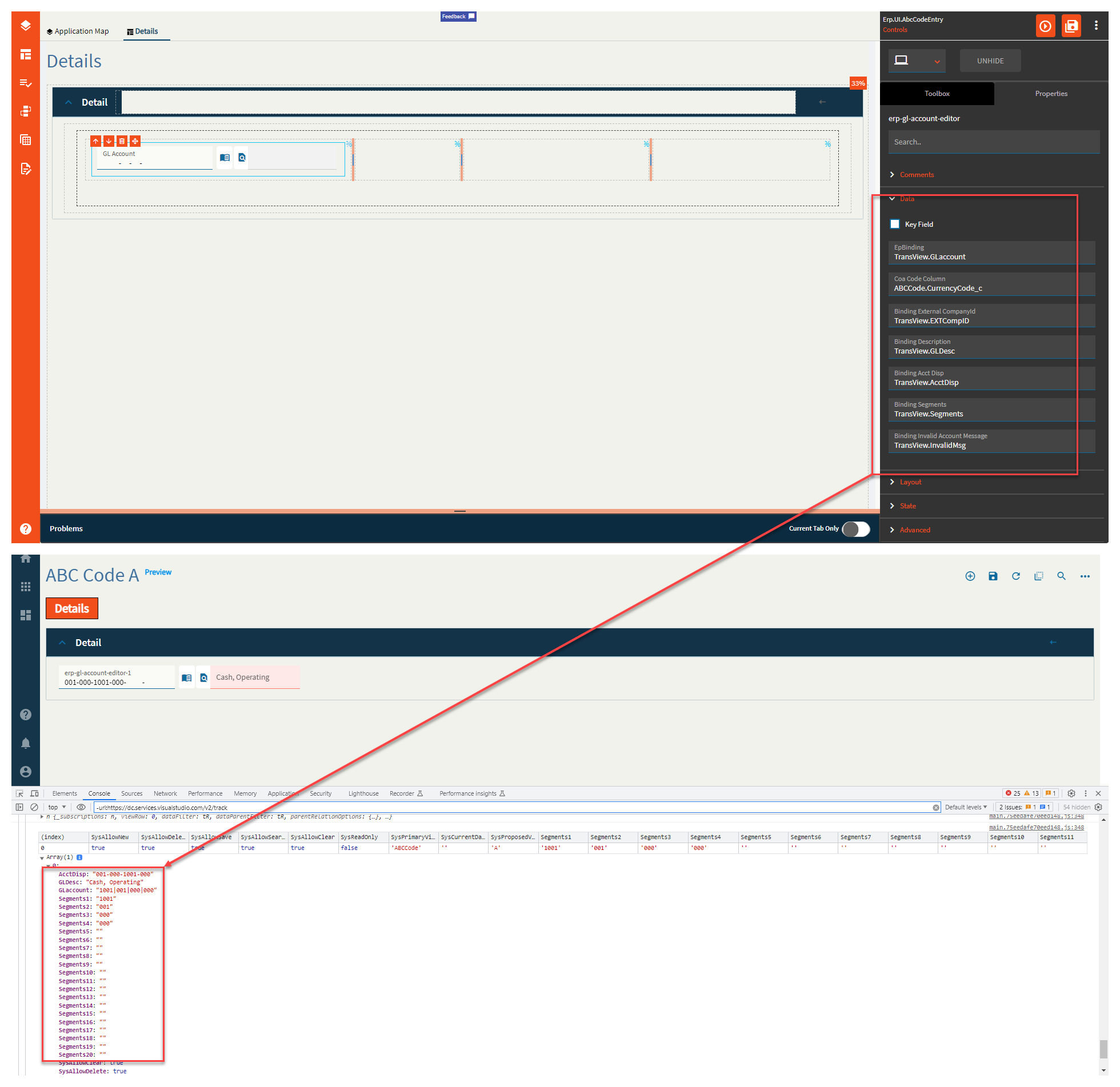
| Data | Binding External CompanyId | Set data binding for the External CompanyID. Format: View.Column. (Fig. E) |
| Data | Binding Description | Set the data binding for the Description. Format: View.Column (Fig.E) |
| Data | Binding Acct Disp | Set the data binding for the Account Display. Format: View.Column. (Fig. E) |
| Data | Binding Segments | Set the data binding for the Segments. This will generate 20 different bindings in the format of View.Column1 - View.Column20. Format: View.Column (Fig. E) |
| Data | Binding Invalid Account Message | Set the data binding to retrieve the invalid message. Format: View.Column. (Fig. E) |
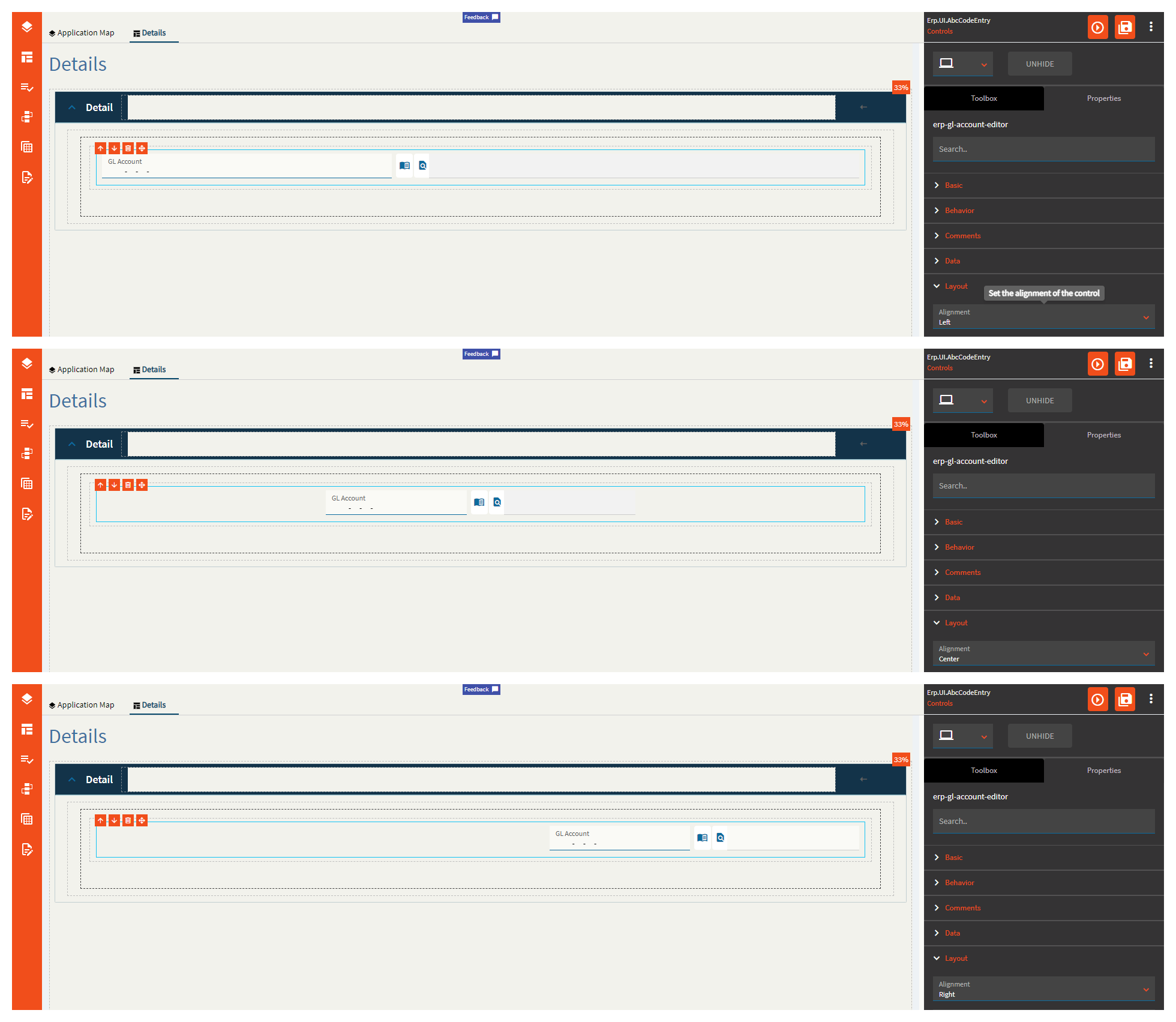
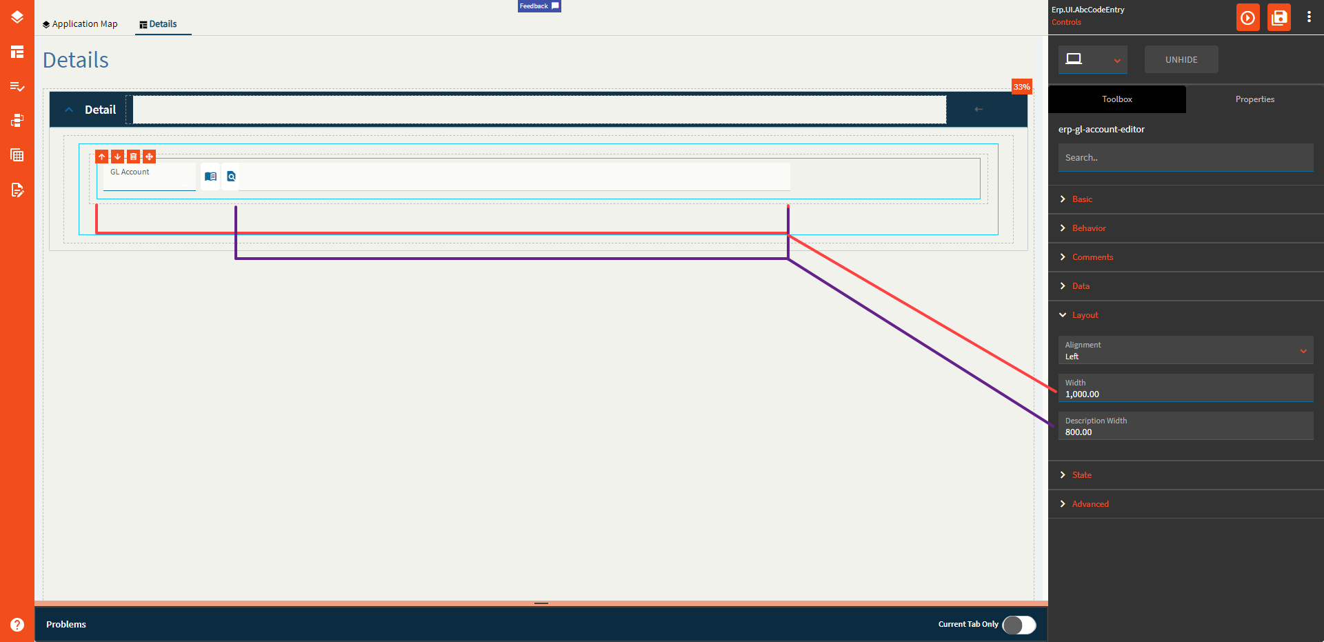
| Layout | Alignment | Set the alignment for the control. Valid options are Left, Center, Right. (Fig. F) |
| Layout | Width | Sets the specific width (pixels) for the control. (Fig. G) |
| Layout | Description Width | Sets the width of the description which must be less than the total width. (Fig. G) |
| State | Personalizable | If true, a user can personalize this component(hide/show) |
| State | Customizable | If true, a user can customize this component in child layers |
| State | Hidden | Hides the control from view. |
| State | Disabled | Disables the control. The control will not allow editing or focus. |
| State | Read Only | Makes the control read only so that it will not allow editing. The control can still be focused. |
| State | Auto Focus | When enabled, the control is automatically focused on creation. |
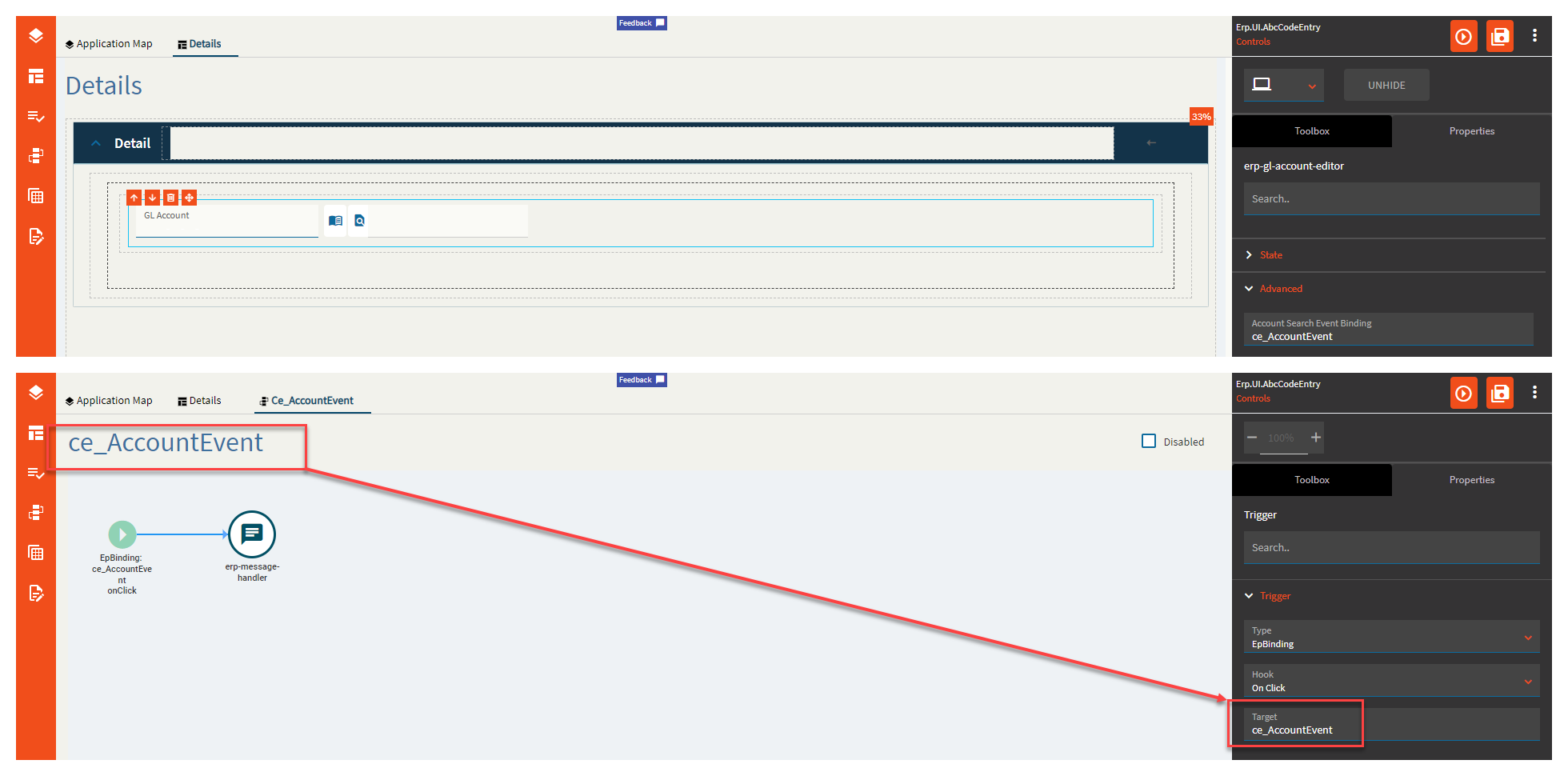
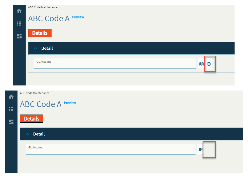
| Advanced | Account Search Event Binding | Set an event name to overwrite the default account search event. The trigger for the event needs to be EpBinding/OnClick/EventName where the event name is the event you’re currently editing. Yup. (Fig. H) |
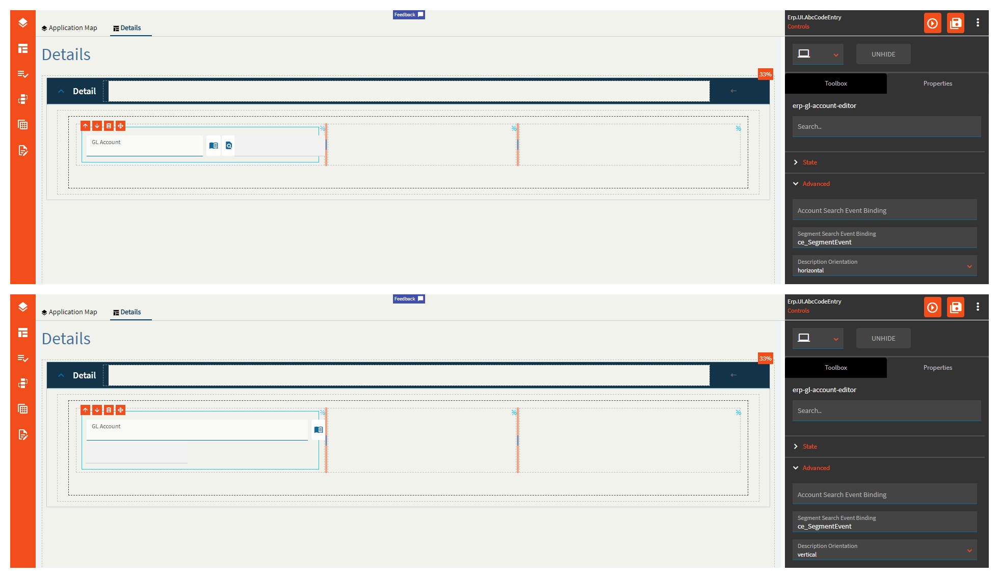
| Advanced | Segment Search Event Binding |
Supposed to be the same as the account one, but for segments, but I could not get this one to fire. Maybe it’s the book icon? If so–that one is broken too. |
| Advanced | Description Orientation | Set the orientation for the description field. Valid Options include: horizontal and vertical. (Fig. I) |
| Advanced | Hide Dynamic | Enable to hide dynamic segments. |
| Advanced | Do not require Dynamic | Check this to disable dynamic segments required |
| Advanced | Allow Pattern |
Enables patterns in account. This is some GL-ese I don’t speak. Not sure what this does. |
| Advanced | Pattern Options | Select a pattern option allowed in the account. Valid options include: All, percent, underscore. Again–this is some GL-ese I don’t speak. Maybe someone in finance can weigh in? |
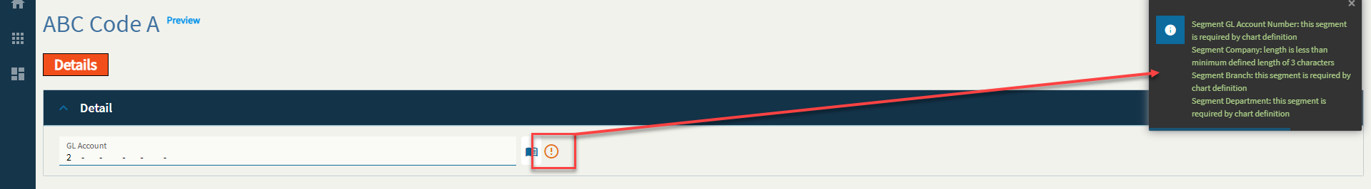
| Advanced | Validate Segment Values | Enable to include segment validation when typing in a GL. (Fig. J) |
| Advanced | Validate Account Code | Enable to include account code validation when typing in a GL. (Fig. J) |
| Advanced | Validate Account on Load |
Enables validation when the account is loaded. Not sure how to test this to fully describe it. |
| Advanced | Validate Required Segments | Enables validation of the entered required segments. (Fig. J) |
| Advanced | Validate Segment Properties | Enable to include segment property validation. (Fig. J) |
| Advanced | Hide Segment Labels |
Marked as obsolete. |
| Advanced | Show Description | Enable to show the description field. (Fig. K) |
| Advanced | Do not cache description |
Checking this disables the description caching. Not quite sure what this means. |
| Advanced | Show Account Search Button | Checking this shows the search button. (Fig. L) |
Figure A: Label Text
Figure B: On Book Select

Figure C: Comments
Figure D: COA Code Binding
Note–I’m using the currency column because it’s the only string column I had to use that wasn’t a KeyField.
Figure E: Data Bindings
Figure F: Alignment
Figure G: Width
Figure H: Account Event Binding
Custom Event
Figure I: Description Orientation
Figure J: Validations
Figure K: Show Description
Figure L: Show Account Search
This is my favorite one. 
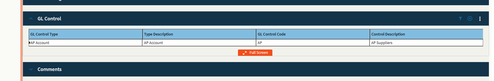
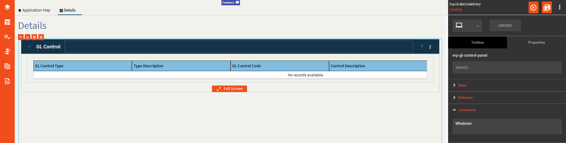
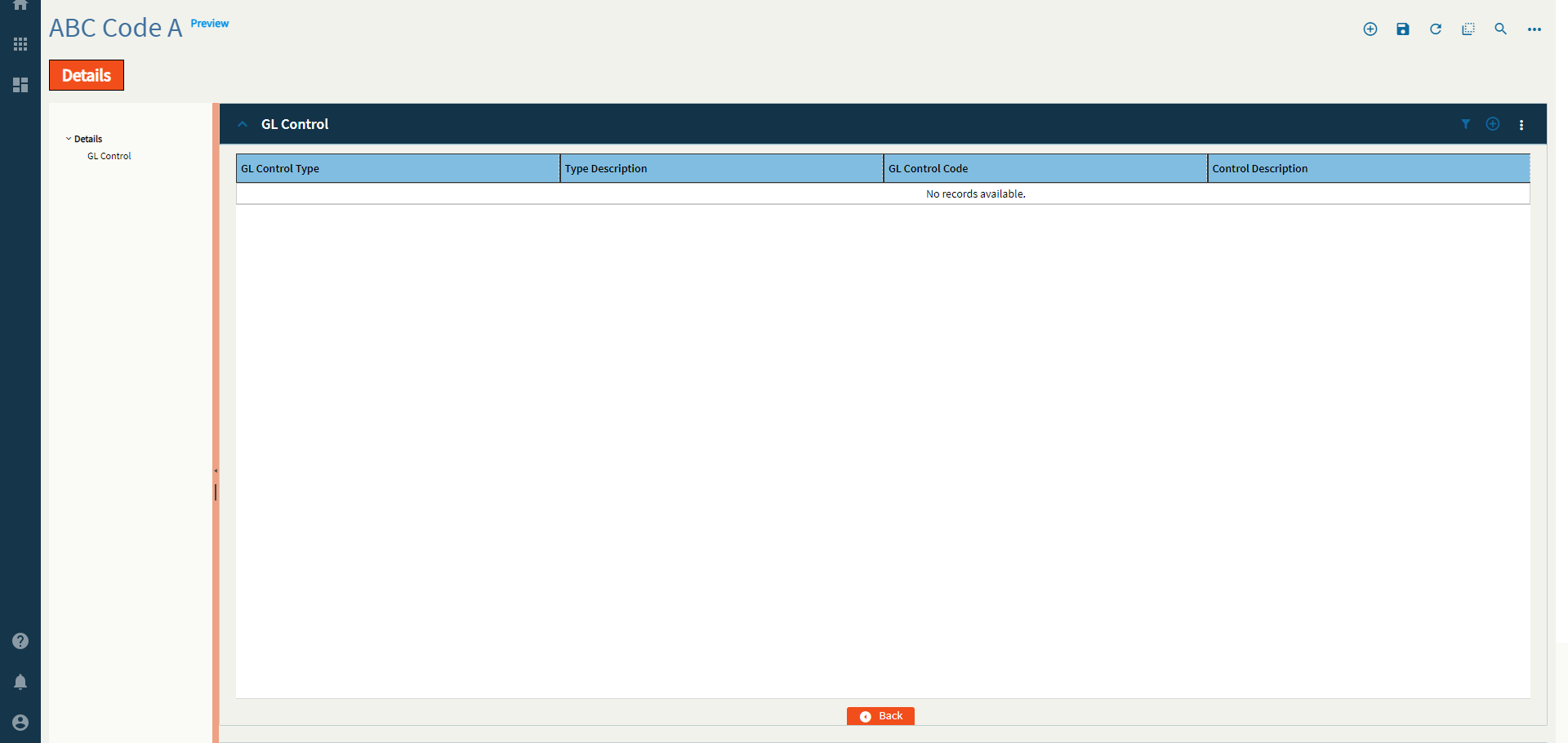
A grid of GL Control Types and Codes.
This control is busted. I can’t get it to do anything. It doesn’t even react–as in no console or network activity of any kind. At all.
I will outline the properties and what they should do, but don’t expect this one to work. Or–if you do get it working, come tell me what TF I’m missing.
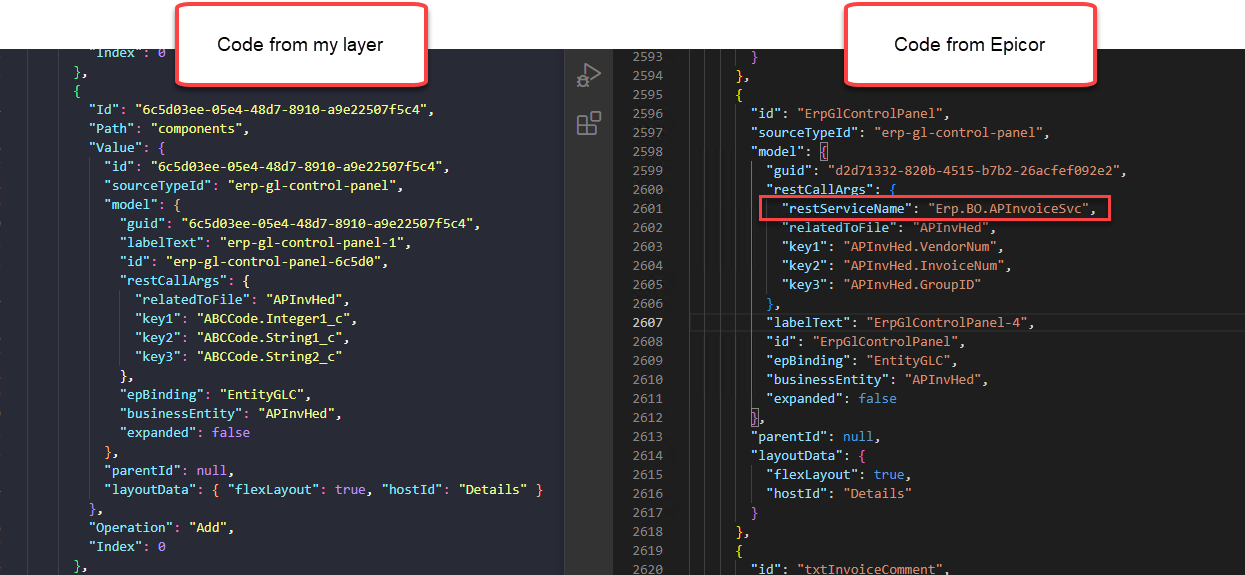
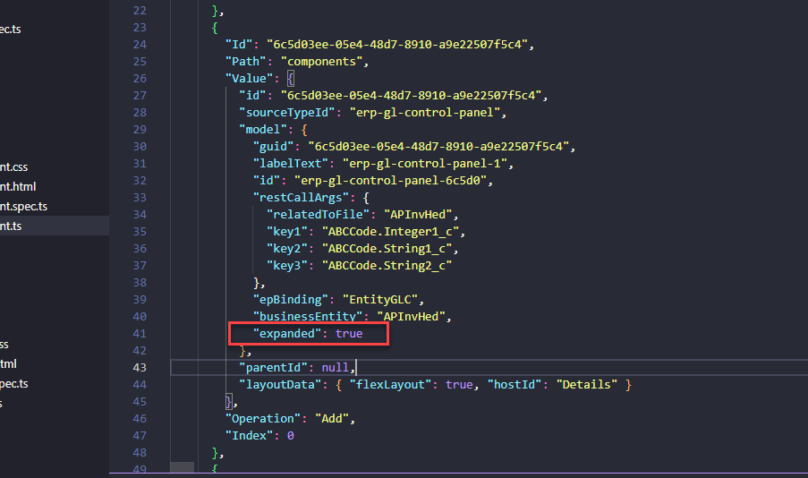
But FIRST! … Some code discrepancies between my control setup and Epicor’s native one.
Look at that. That boxed line there. The Rest Service.
Do you see that property anywhere? No? Me neither. But has that ever stopped me? …Nope! So, I went and added the line in myself in the JSON and pushed it back into the DB. Did it fix the control? Also nope. Whatever. I’m over it. I am NOT patient enough to submit this one to support. To walk them through how to set this up… I can’t won’t do it!
And now for something completely different.
| Property Group | Property | Description |
|---|---|---|
| Basic | Id | Unique identifier for the control |
| Behavior | On Blur | Click this to create an OnBlur event for the control. On Blur is triggered when the control loses focus. |
| Behavior | On Create | Click this to create an OnCreate event for the control On Create is triggered when the control is painted to the GUI. |
| Comments | Comments | Add some developer notes to the control. These are not customer-facing and are only visible in App Studio (Fig. A) |
| Data | Key Field | Indicates that a bound component is a key field. If true, the field is enabled if there is no current record, allowing the user to select an existing record or create a new one. Not really relevant to this control. |
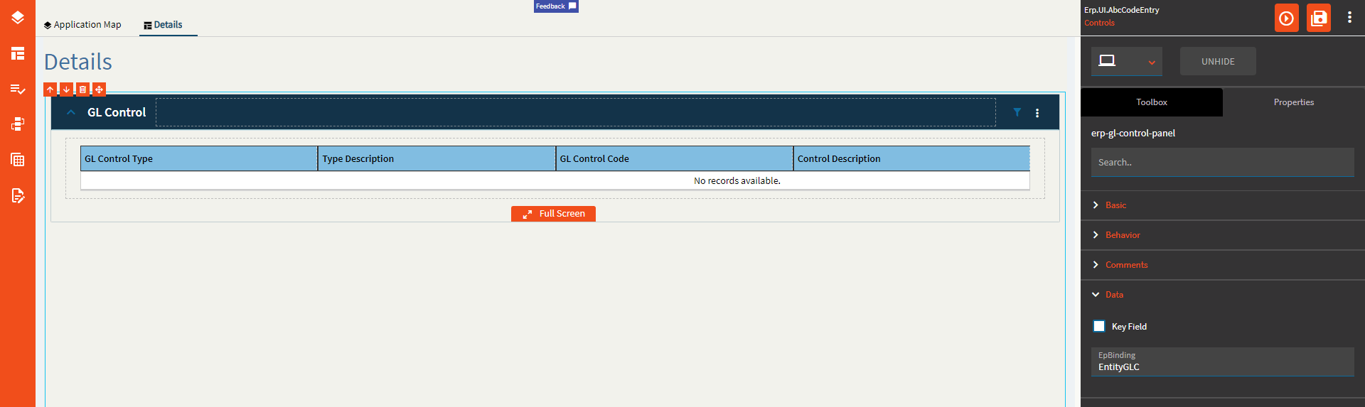
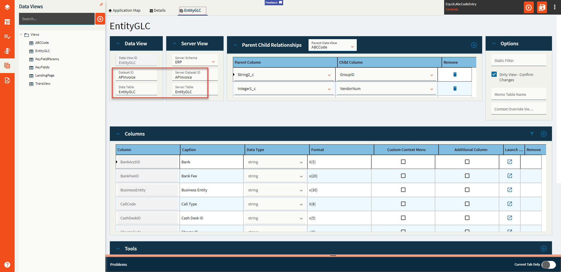
| Data | EpBinding | Bind the control to a DataView only. No column. You will also need to configure the dataview (Fig. B) |
| State | Personalizable | If true, a user can personalize this component(hide/show) |
| State | Customizable | If true, a user can customize this component in child layers |
| State | Hidden | Hides the control from view. |
| Advanced | Expand At Runtime |
Expand the panel by default when the form opens at runtime. Doesn’t work. At all. It doesn’t even add it to the JSON. I can add it to the JSON and make it work. But the property doesn’t. (Fig. C) |
| Advanced | Business Entity | Set the business entity that the GL control type links to. The business entity defines what areas of the database the GL control type updates through its account and journal contexts. Example: APInvHed |
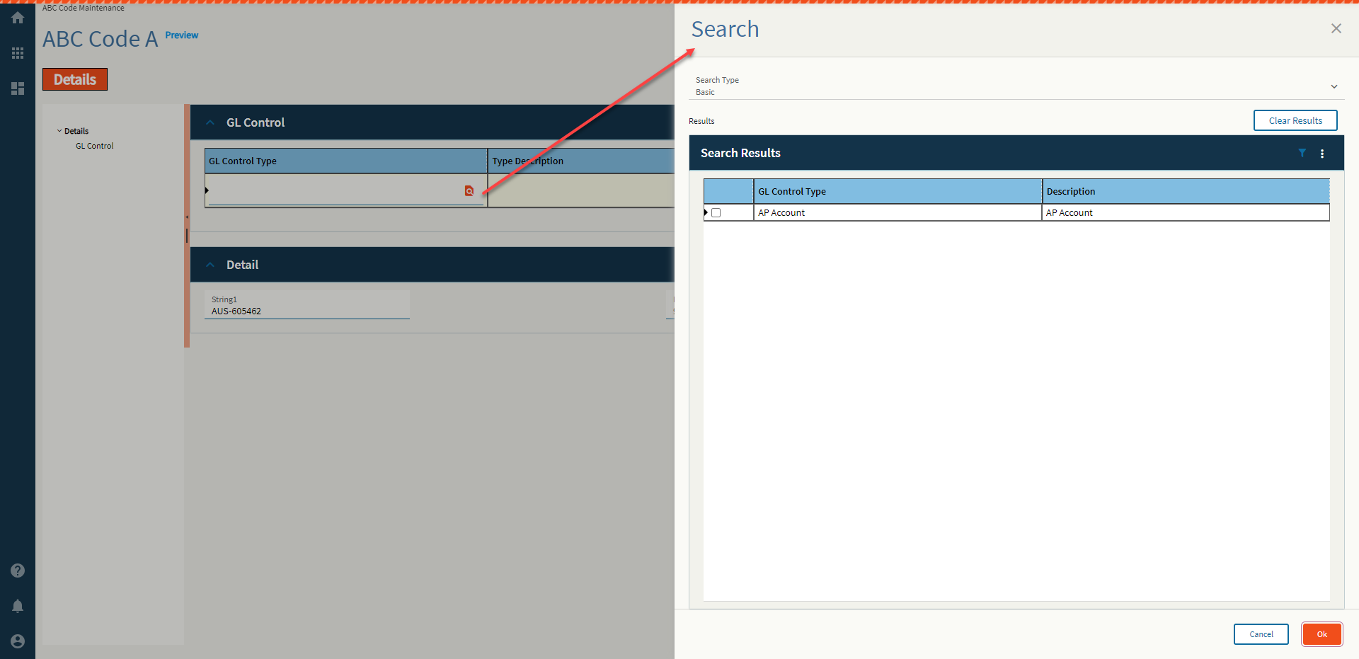
| Advanced | Search for GL Control Type | Set the search to run for the GL Control Type Field. Default search used is ‘GLCTEntity.GLControlType’. This comes up when you click the New Row icon, then Search. (Fig. D) See Addendum for how to configure the REST call to make new New button work. |
| Advanced | Search for GL Control | Set the search to run for the GL Control Type Field. Default search used is ‘GLCTEntity.GLControlCode’. This comes up when you click the New Row icon, then Search. See Addendum for how to configure the REST call to make new New button work. |
| Advanced | Full Screen | Enable full screen mode! (Fig. E) |
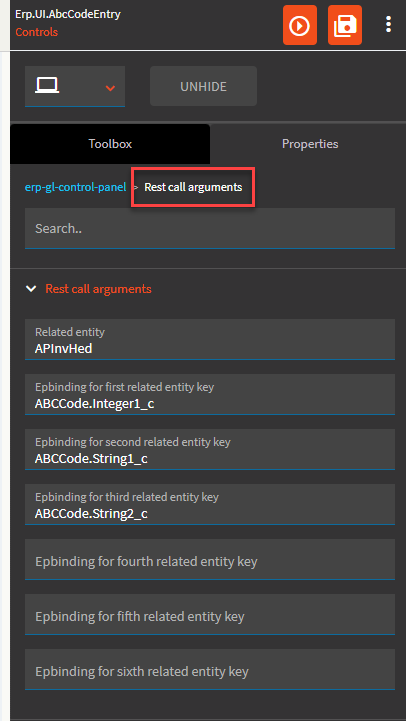
| Advanced > Rest call arguments | Related Entity | Set the data binding in the format View.Column for the realtedToFile parameter value. Example: ApInvHed |
| Advanced > Rest call arguments | Epbinding for first related entity key | Set the data binding in the format View.Column that will provide the value for the first key in the relatedToFile Table. Example: ABCCode.Integer1_c which maps to VendorNum. Run a BAQ on the EntityGLC table to get some sample data for each RelatedToFile. |
| Advanced > Rest call arguments | Epbinding for second related entity key | Set the data binding in the format View.Column that will provide the value for the second key in the relatedToFile Table. Example: ABCCode.String1_c which maps to InvoiceNum. |
| Advanced > Rest call arguments | Epbinding for third related entity key | Set the data binding in the format View.Column that will provide the value for the third key in the relatedToFile Table. Example: ABCCode.String2_c which maps to GroupID. |
| Advanced > Rest call arguments | Epbinding for fourth related entity key | Set the data binding in the format View.Column that will provide the value for the fourth key in the relatedToFile Table. |
| Advanced > Rest call arguments | Epbinding for fifth related entity key | Set the data binding in the format View.Column that will provide the value for the fifth key in the relatedToFile Table. |
| Advanced > Rest call arguments | Epbinding for sixth related entity key | Set the data binding in the format View.Column that will provide the value for the sixth key in the relatedToFile Table. |
Figure A: Comments
Figure B: EpBinding
Note the difference Dataset/Table
Figure C: Expand at Runtime JSON
The only way I could get this to work is to add it myself to the code. I’m not going to explain how.
Figure D: Search for GL Control Type
Figure E: Full Screen
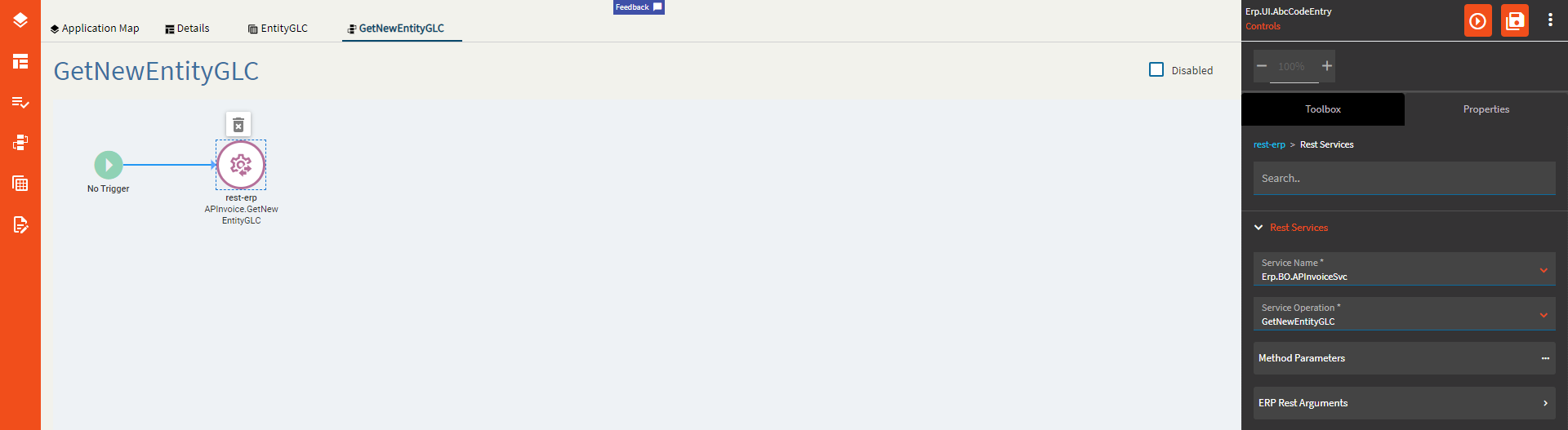
The event must be called GetNewEntityGLC (or some variation of your dataview). If you named your dataview Stroopwafel, then name the event ‘GetNewStroopwafel’.
ds: empty
realtedToFile APInvHed
key1: Bound vendor column {ABCCode.Integer1_c}
key2: Bound invoice number column {ABCCode.String1_c}
key3: Enter a space, this is empty.
key4: Enter a space, this is empty.
key5: Enter a space, this is empty.
key6: Enter a space, this is empty.
System Code: ERP
Dataset Id: APInvoice
#SuperGoodEnough
.
.
.
.
.
.
.
.
.
.
.
.
.
.
.
.
.


Some of these I just don’t know what to tell y’all.
It seems like the GL Account Editor with extra steps that… don’t work. And it pulls dataviews out of it’s magical GL ass. I hate accounting.
Gonna keep on going and revisit these ones later.
The formation of each driver’s starting position at the beginning of the ra-- …ope, nope. Not that one.
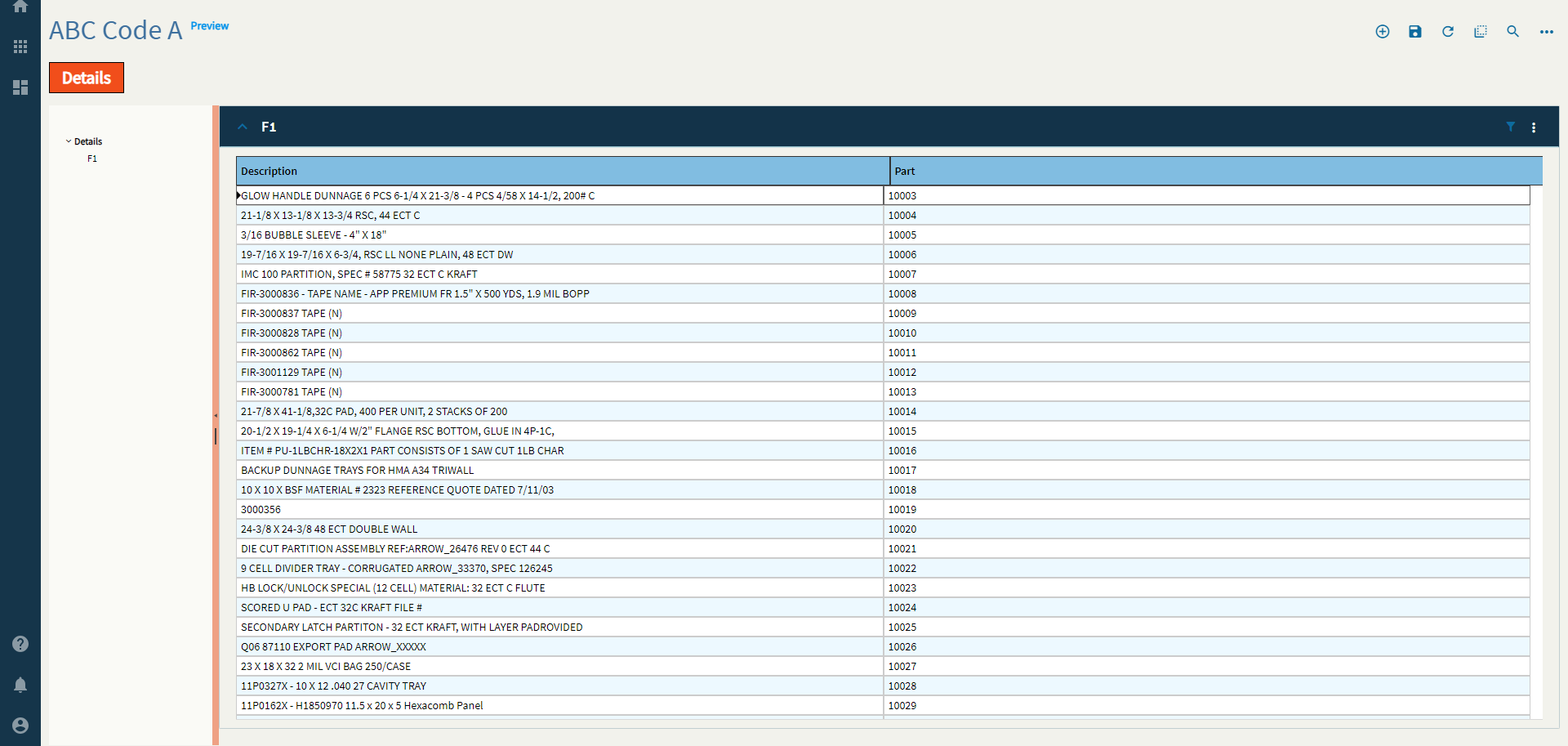
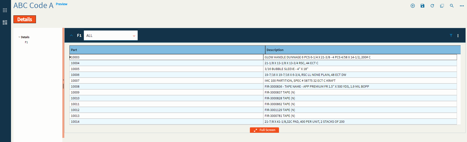
Expandable container that displays a grid and allows interaction with the grid using additional components in the panel card header.
| Property Group | Property | Description |
|---|---|---|
| Basic | Id | Unique identifier for the control |
| Basic | Label Text | Sets the Title of the grid found on the Panel Header. (Fig. A) |
| Behavior | On Panel Card Expand | Hook into an event which occurs when the panel card is opened. (Fig. B) |
| Behavior | On Panel Card Collapse | Hook into an event which occurs when the panel card is closed. (Fig. B) |
| Comments | Comments | Add some developer notes to the control. These are not customer-facing and are only visible in App Studio (Fig. C) |
| Data | Key Field | Indicates that a bound component is a key field. If true, the field is enabled if there is no current record, allowing the user to select an existing record or create a new one. Not relevant to this control. |
| Data | EpBinding | Bind the control to a DataView.Column. I’ve never used this binding field. I don’t believe this is relevant to this control. |
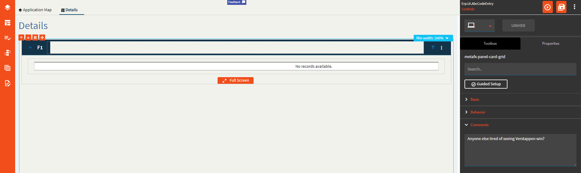
| Data > Grid | Scrollable | Determines how the data in the grid is rendered. Valid options include: None, Scrollable, Virtual (requires page size property as well). None will load the entire dataset up front and load it into the grid. Presumably, scrollable does the same? Virtual render the number of rows (page size) and will load that many more as you scroll. |
| Data > Grid | Height | Sets the height of the grid in pixels. (Fig D.) |
| Data > Grid | Width | Sets the width of the grid in pixels. (Fig D.) |
| Data > Grid | Row Height |
Has no effect. |
| Data > Grid | Page Size | Sets the number of records to render for the Virtual scroll model. (Fig. E) |
| Data > Grid | Entity Type |
No idea! |
| Data > Grid | Drag Image Icon |
No idea! |
| Data > Grid | Resizable | Enable to allow the user to resize the column headers. |
| Data > Grid | Sortable |
Sorting is enabled regardless of this checkbox. |
| Data > Grid | Pageable |
Paging seems to happen regardless. |
| Data > Grid | Groupable | Not sure why this is tri-state, but enabling it allows a user to group on columns. (Fig. F) |
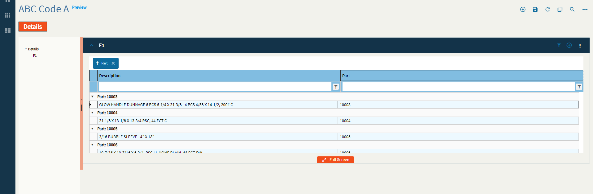
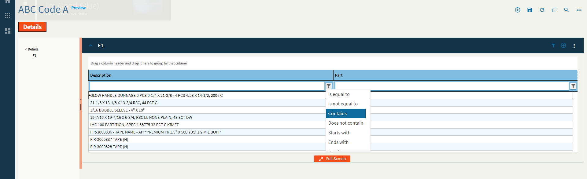
| Data > Grid | Filterable | Enable to allow filtering. (Fig. G) |
| Data > Grid | Advanced Filter |
Doesn’t change the filter settings. #Shrug
|
| Data > Grid | Reorderable | Allows the user to reorder the columns to their fancy. (Fig. H) |
| Data > Grid > Row Reorder | Reorder Rows |
Reorder Rows |
| Data > Grid > Row Reorder | Sortable Column Name |
Set the sortable column name. So, I just have no words here. There’s some effed up looping going on. Here’s a GIF for the lulz, but I would stay away from this property. (Fig. I) |
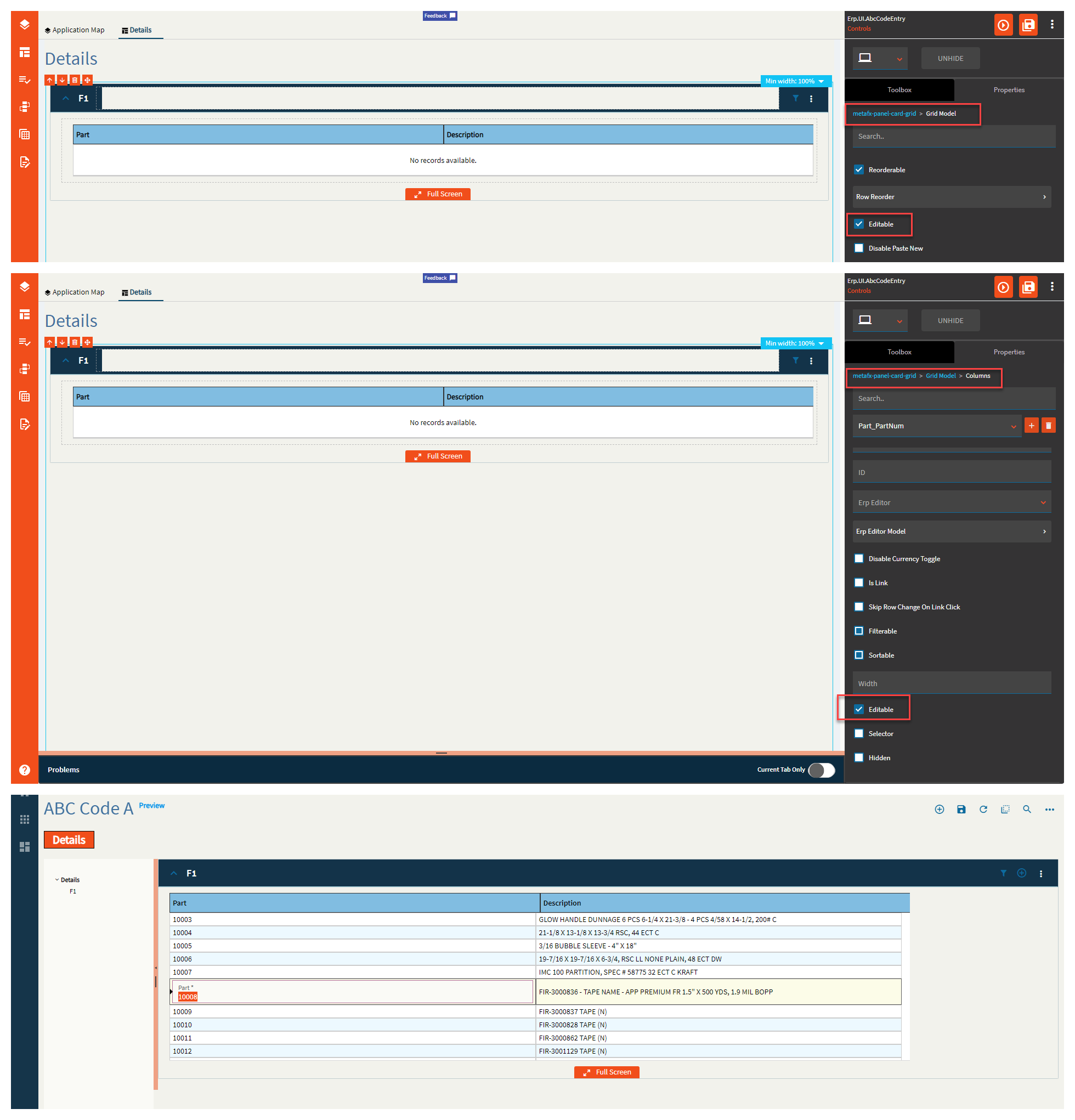
| Data > Grid | Editable | Enables editing of the grid cells. This is to be used in conjunction with Columns > Editable. (Fig. J) |
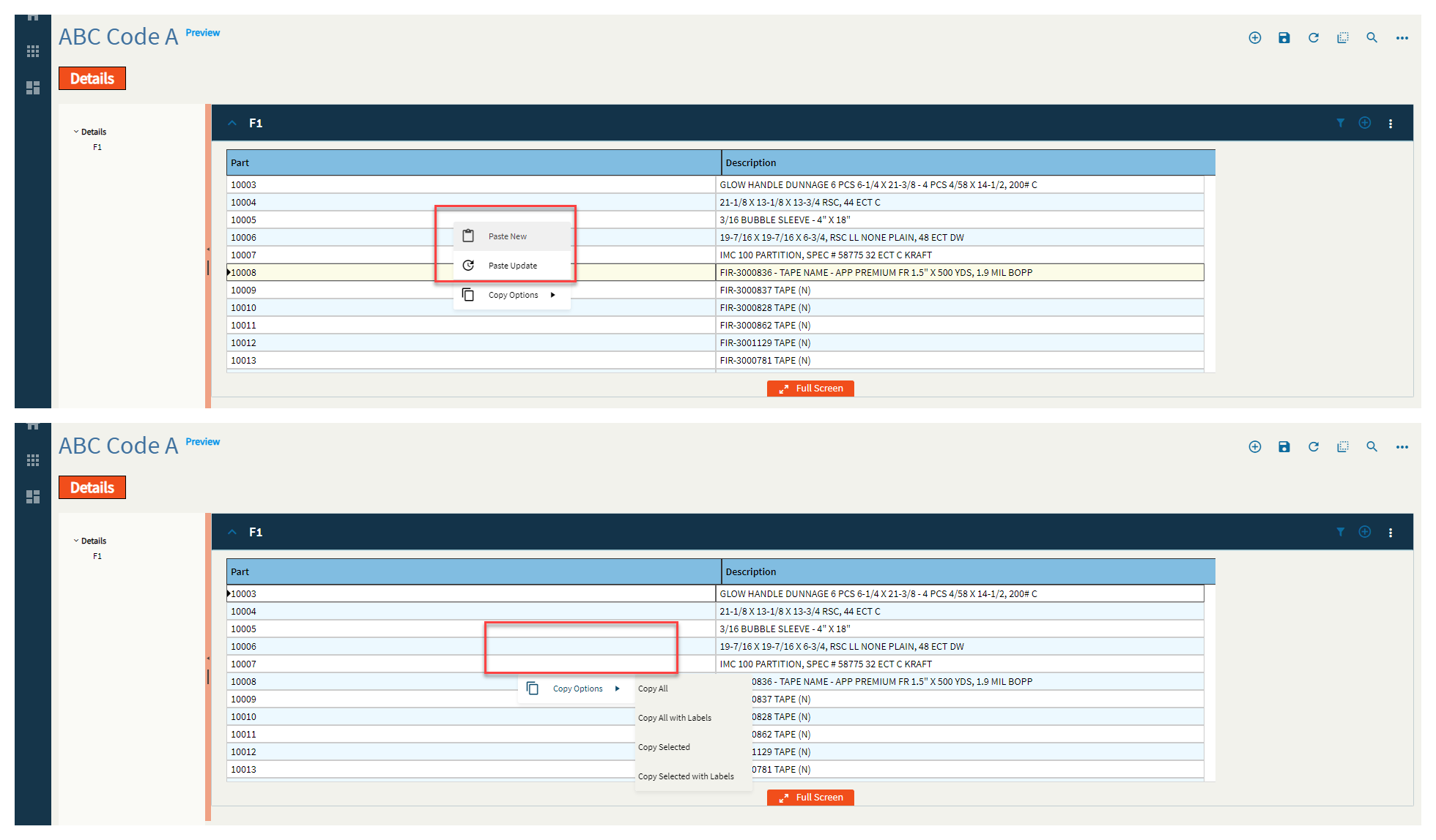
| Data > Grid | Disable Paste New | Disables the paste new operation from the right-click menu. (Fig. K) |
| Data > Grid | Disable Paste Update | Disables the paste update operation from the right-click menu. (Fig. K) |
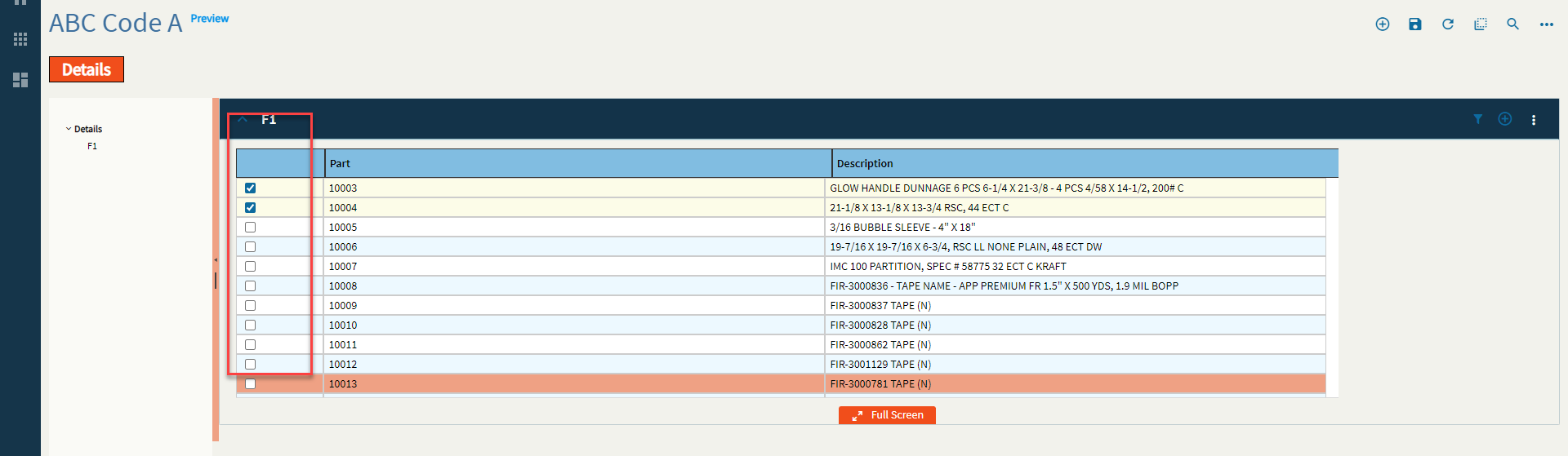
| Data > Grid | Selectable | Enables the selection of rows. Used in conjunction with Data > Grid > Selection Options. (Fig. L) |
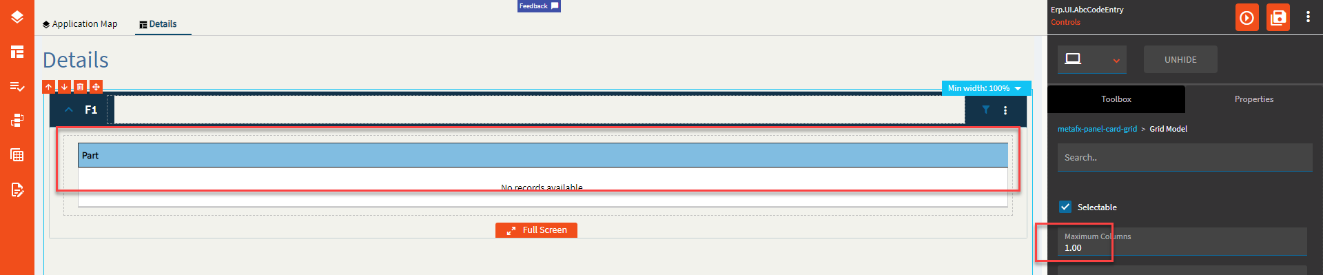
| Data > Grid | Maximum Columns | Set the max number of columns to be displayed. This will display the first N columns returned from the dataset. (Fig. M) |
| Data > Grid > Selection Options | Checkbox Selection | Shows a column of checkbox selectors. (Fig. L) |
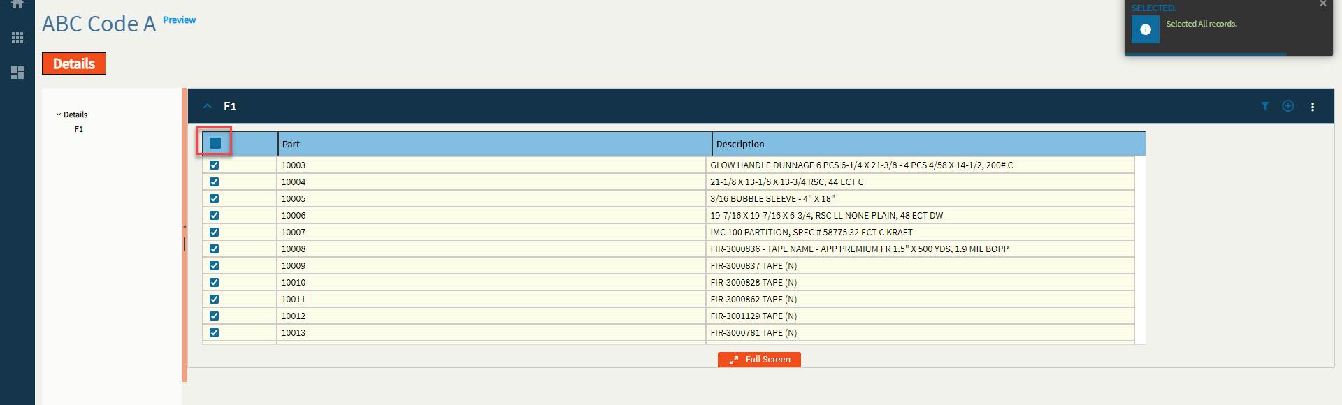
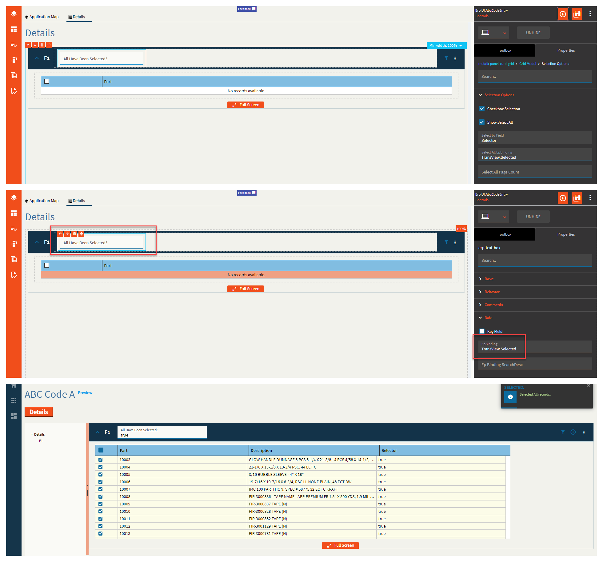
| Data > Grid > Selection Options | Show Select All | Shows a checkbox in the upper-left that selects all rows. (Fig. N) |
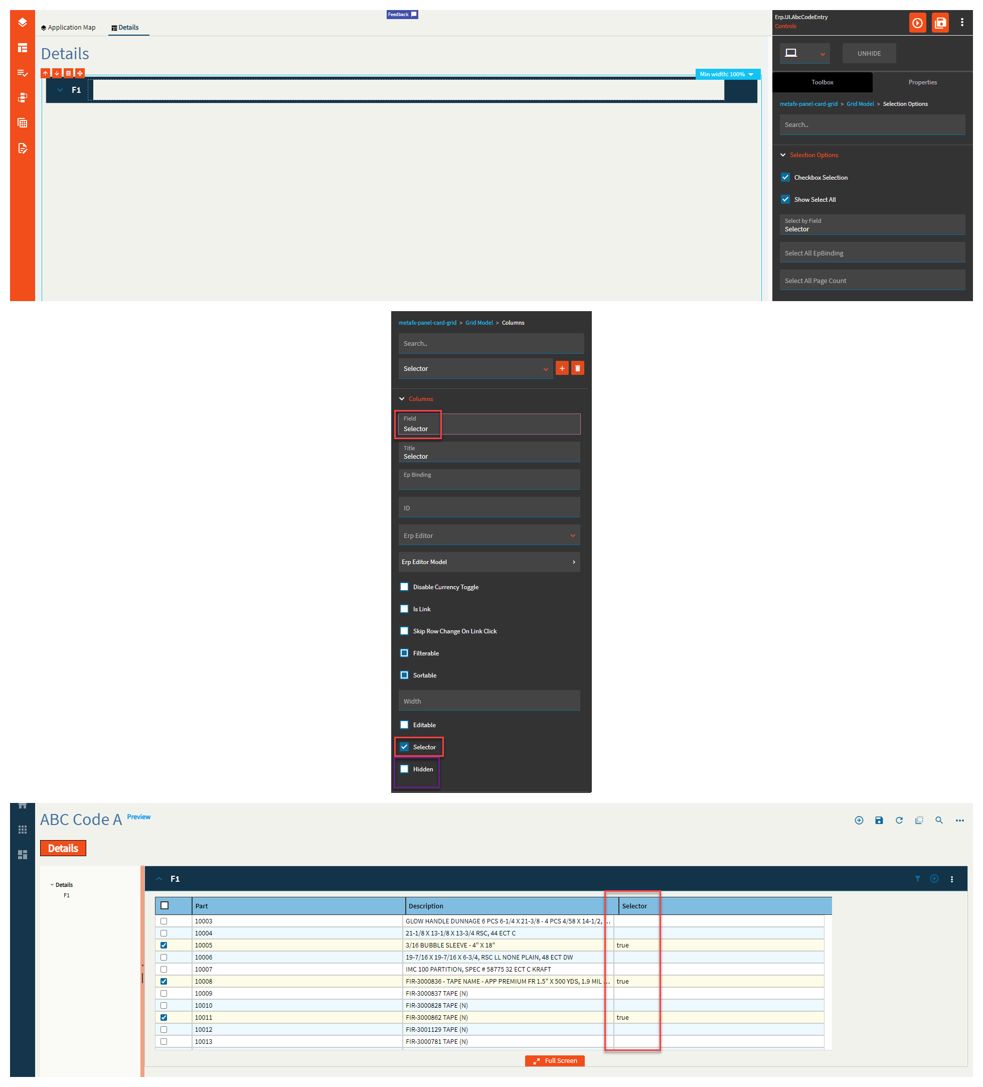
| Data > Grid > Selection Options | Select by Field | Boolean field to designate that the row has been selected. Generally, this is a hidden column you create. (Fig. O) |
| Data > Grid > Selection Options | Select All EpBinding | Set the data binding to indicate select all has been checked in the format of DataView.Column. (Fig. P) |
| Data > Grid > Selection Options | Select All Page Count |
Set the Select All page total for how many rows/pages are loaded and selected if not all the records can be selected up front. Didn’t seem to do anything. |
| Data > Grid > Edit Options | Edit Mode |
Not sure. They don’t seem to do anything different. |
| Data > Grid > Edit Options | Update On Change |
Enable the update on change mode (otherwise update occurs on leaving control). Doesn’t seem to trigger anything. |
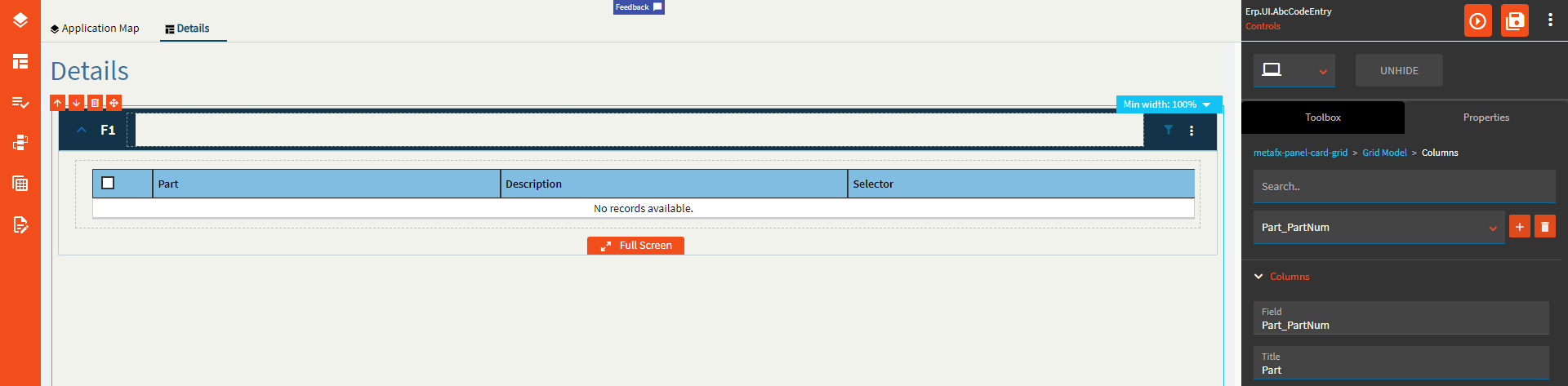
| Data > Grid > Columns | Field | Set the field name from the dataset. If it’s from a BAQ, then it would be in the format of Table_Column. If it’s from a dataview bound to the grid, then it would just be the column name with no table or dataview prefix. BAQ Example: Part_PartNum | BO Example: PartNum |
| Data > Grid > Columns | Title | Give the column header a title. This will default to the Field name if none is supplied. (Fig. Q) |
| Data > Grid > Columns | Ep Binding |
Set the data binding for the column using format View.Column (special cases). What are those special cases? Who knows? |
| Data > Grid > Columns | ID | Set the ID for the column. This can be used in events. |
| Data > Grid > Columns | Erp Editor | Select the type that the column will be such as Boolean, Combo, Text, Currency, etc. This is used in conjunction with the Erp Editor Model to define the special behaviors of each. For instance, if setting the Erp Editor to Combo, you can then define the data in said combo by using the Erp Editor Model. |
| Data > Grid > Columns | Erp Editor Model | As mentioned above, this is used to define the properties of the Erp Editor. To find out more, reference the appropriate control within this page. Text = Textbox, Boolean = Checkbox, Combo = Combo, etc. |
| Data > Grid > Columns | Disable Currency Toggle | Enable this to prevent the currency from toggling when using the Currency Selector control. |
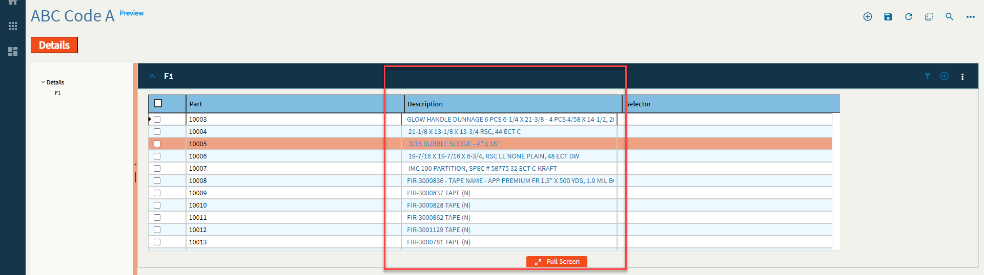
| Data > Grid > Columns | Is Link | Turns the data within this column into a clickable link. You will need to set up any actions by creating an event using the Grid/onClick event. (Fig. R) |
| Data > Grid > Columns | Skip Row Change On Link Click | Disables any row change events that may fire when clicking the link. |
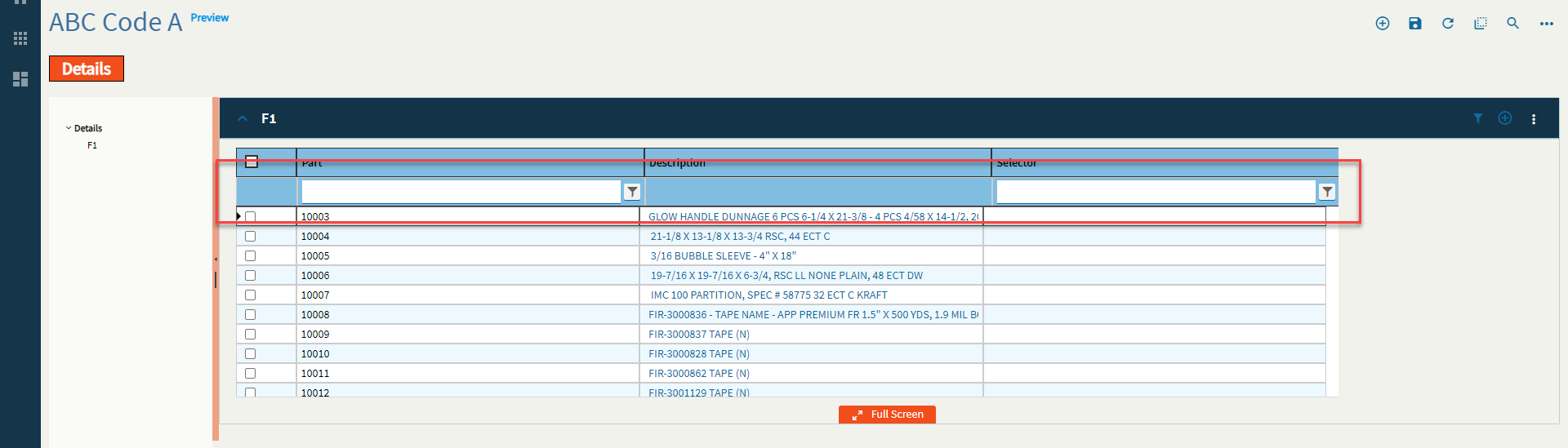
| Data > Grid > Columns | Filterable | Enables or Disables filters for the column. (Fig. S) |
| Data > Grid > Columns | Sortable | Enables or Disables sorting for the column. |
| Data > Grid > Columns | Width | Sets the specific width of the column in pixels. (Fig. T) |
| Data > Grid > Columns | Editable | Enables editing for the column. (Fig. J) |
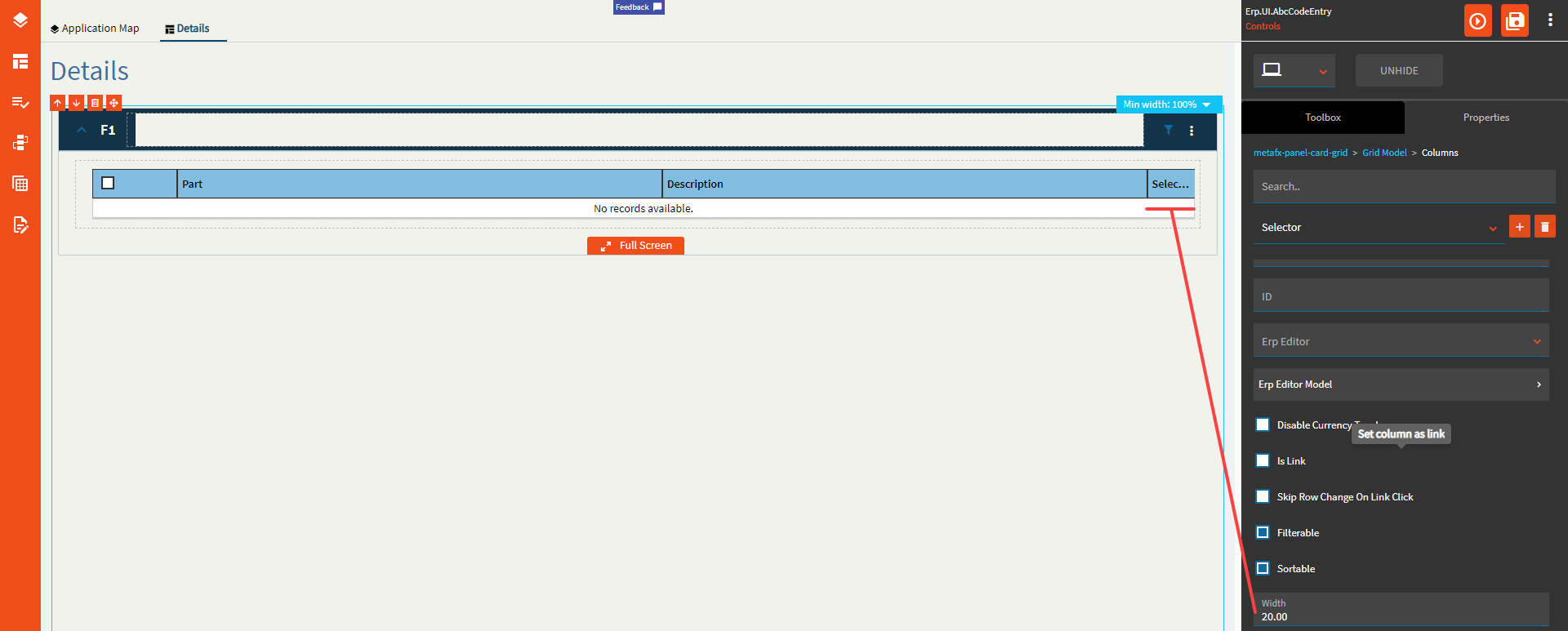
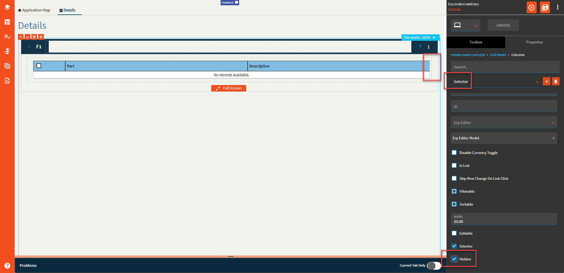
| Data > Grid > Columns | Selector | Sets the column as the designated selector. (Fig. O) |
| Data > Grid > Columns | Hidden | Hides a column (Fig. U) |
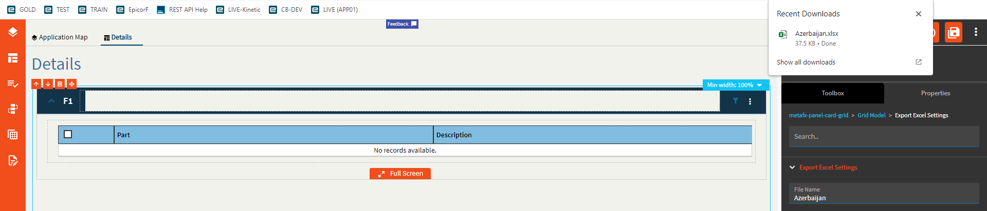
| Data > Grid > Export Excel Settings | File Name | Name of the Excel file when exporting. (Fig. V) |
| Data > Grid > Export Excel Settings | Number of pages to export |
Doesn’t do anything. My page size is 50, I set this to 1, and it downloaded all 1,000 rows. |
| Data > Grid | ID | Set the ID of the grid. This is used to affect the grid in events. |
| Data > Grid | Ep Binding | The data binding for the grid when the view is populated elsewhere (events). Format: DataView Example: ABCCode |
| Data > Grid > Columns Hidden | Field | The column name to hide from the grid. This is useful if you only want to hide one or two vs using Columns to explicitly define what to show. If it’s from a BAQ, then it would be in the format of Table_Column. If it’s from a dataview bound to the grid, then it would just be the column name with no table or dataview prefix. BAQ Example: Part_PartNum | BO Example: PartNum |
| Data > Grid > Provider Model | Ep Binding | Set the name of the view that receives the data from the server call. Format: ABCCode |
| Data > Grid > Provider Model | Description | This is basically just a comment for the provider model. |
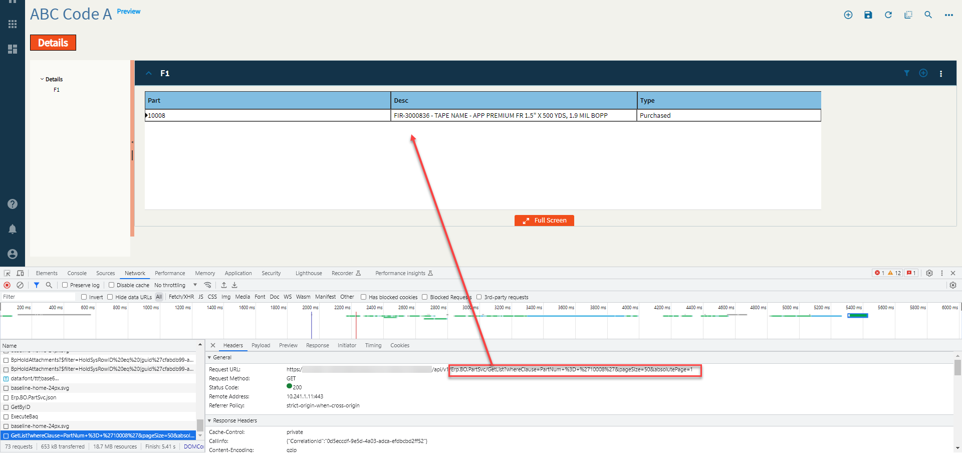
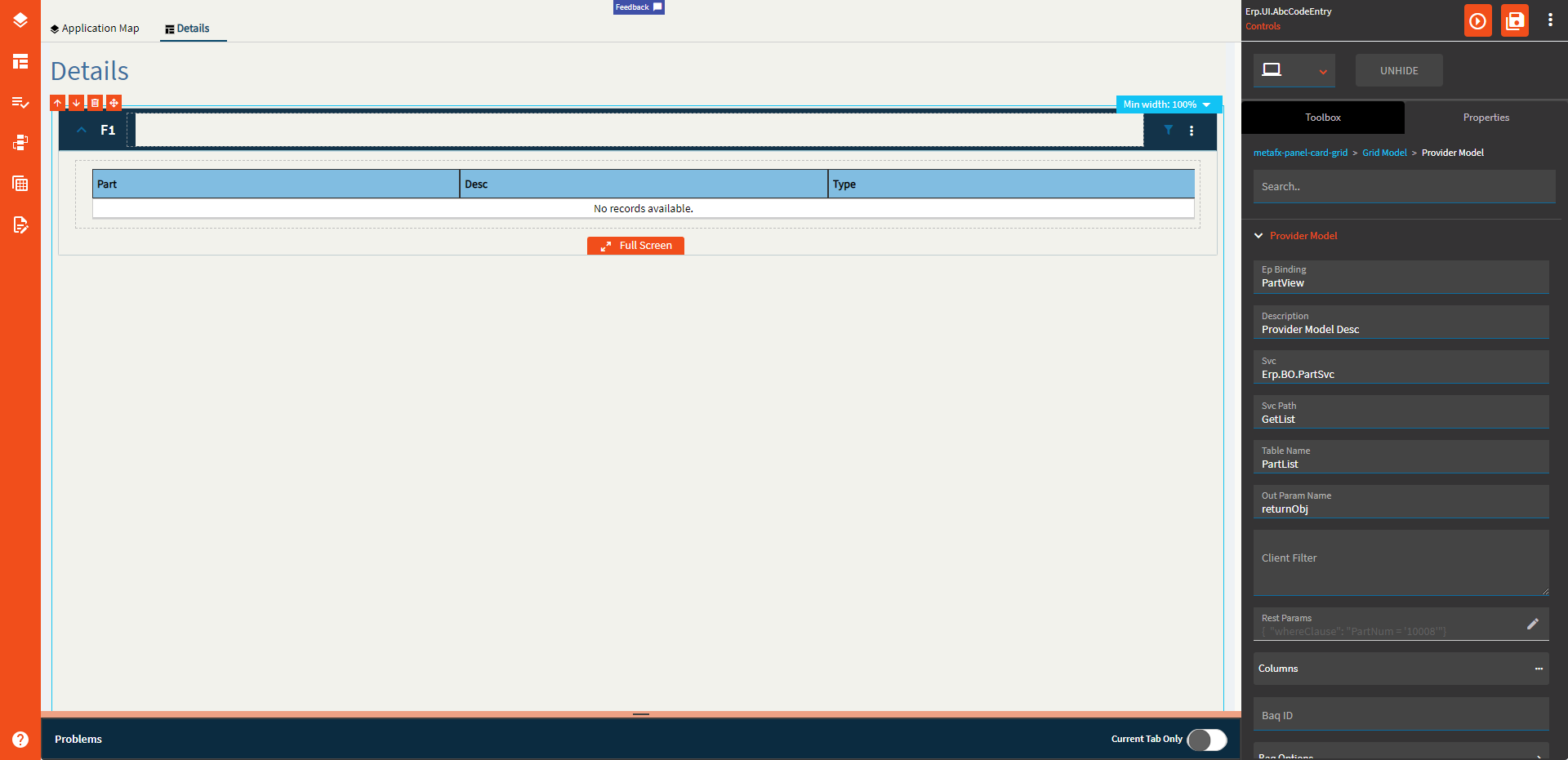
| Data > Grid > Provider Model | Svc | The REST service that provides the data. Example: Erp.BO.PartSvc (Fig. W) |
| Data > Grid > Provider Model | Svc Path | The REST method to be called. Example: GetList (Fig. W) |
| Data > Grid > Provider Model | Table Name | The table name that holds the data. Example: PartList (Fig. W) |
| Data > Grid > Provider Model | Out Param Name | Set the out parameter name that holds the rows of data. Example: returnObj (Fig. W) |
| Data > Grid > Provider Model | Client Filter |
Supposed to filter the dataset after it’s returned from the server. Can’t get it to work. |
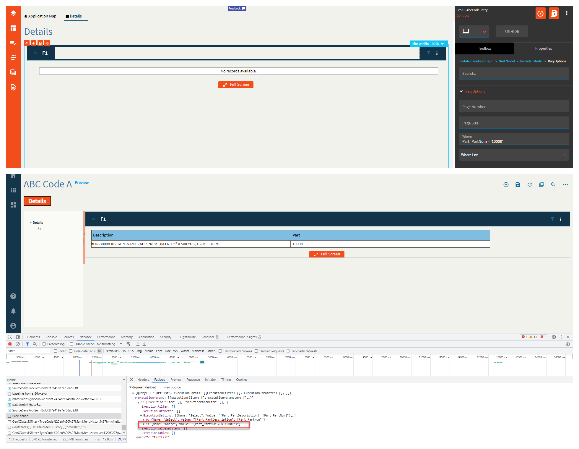
| Data > Grid > Provider Model | Rest Params | Set a JSON object composed of key-value pairs that define the parameters that are sent into the service call. Example: { "whereClause": "PartNum = '10008'" } (Fig. W) |
| Data > Grid > Provider Model | Columns |
Doesn’t work. Use the columns from the Grid Model section. |
| Data > Grid > Provider Model | BAQ ID | BAQ Identifier that will provide data. Example: PartList (Fig. X) |
| Data > Grid > Provider Model > BAQ Options | Page Number | If there are multiple pages, this defines the first page to display. |
| Data > Grid > Provider Model > BAQ Options | Page Size | Page size (number of rows) of data to return. |
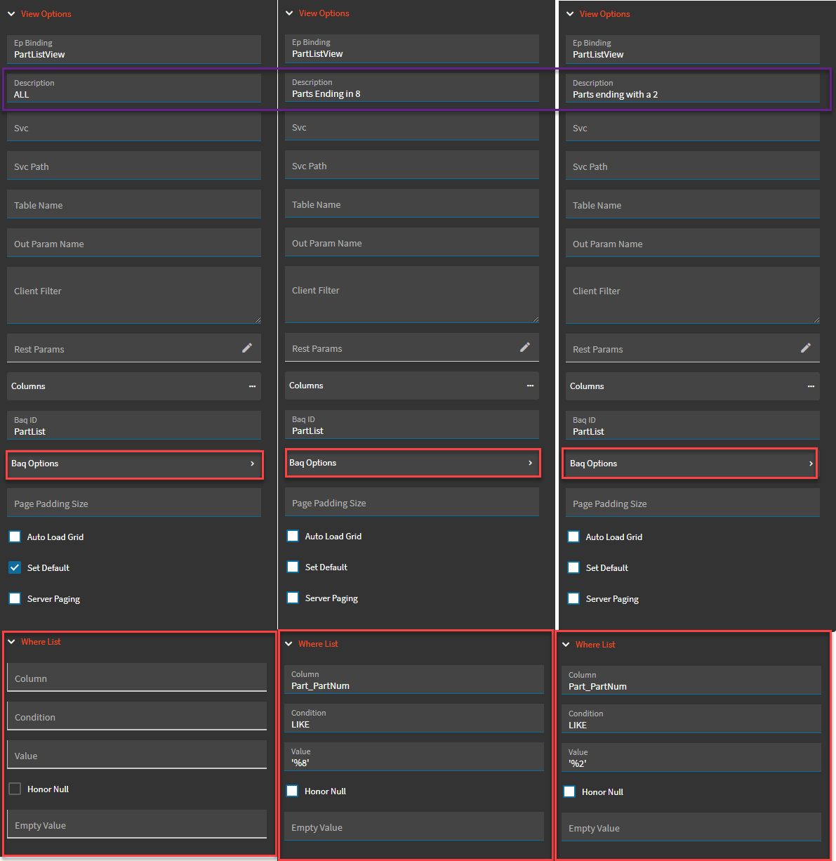
| Data > Grid > Provider Model > BAQ Options | Where | Where Clause for the BAQ. (Fig. Y) |
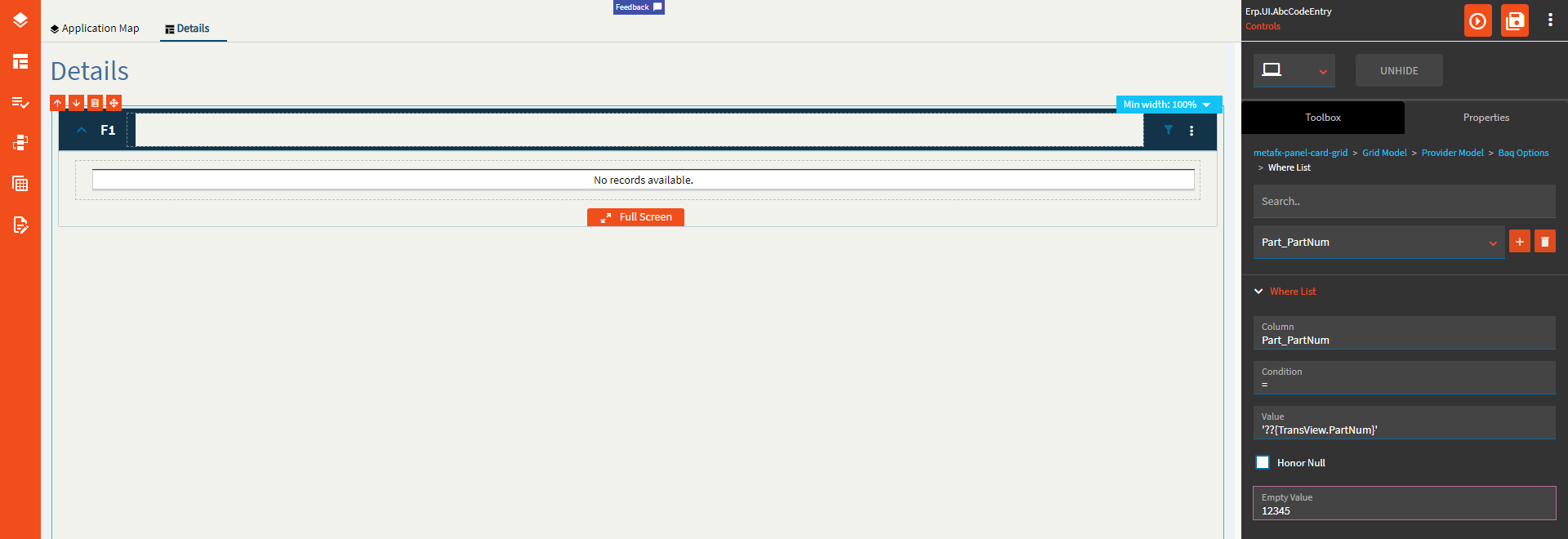
| Data > Grid > Provider Model > BAQ Options > Where List | Column | The BAQ column name to filter on. Format: Table_Column (Fig. Z) |
| Data > Grid > Provider Model > BAQ Options > Where List | Condition | The operator to use. Valid options include =, <=, >=, <>, starts, matches, like (% wildcard). (Fig. Z) |
| Data > Grid > Provider Model > BAQ Options > Where List | Value | The value to check against. Format is '??{DataView.Column}' or a literal. Use single quotes around strings. A single ‘?’ will not let the REST call happen if the value is empty or null. ‘??’ will make the REST call regardless of the value. (Fig. Z) |
| Data > Grid > Provider Model > BAQ Options > Where List | Honor Null | Honor null will send null if the value is… null! Otherwise, it will NOT append that where item to the where clause in the case of a null value. |
| Data > Grid > Provider Model > BAQ Options > Where List | Empty Value | If the value of the binding is empty, this will get sent instead. |
| Data > Grid > Provider Model | Page Padding Size | Overrides the default of 2 additional pages of data that should be retrieved when using server paging with a BAQ data provider. |
| Data > Grid > Provider Model | Auto Load Grid | Indicate if the grid column definitions should be autoloaded using existing definitions for the bound dataview columns. |
| Data > Grid > Provider Model | Set Default |
Indicate if this provider is the default selection in the provider list on the panel card grid. Not sure with this one since you cannot add multiple providers here. |
| Data > Grid > Provider Model | Server Paging | Indicate if this provider retrieves data as needed as the user scrolls through grid pages instead of returning them all at once. |
| Data > Grid | Collapse Groups |
Collapse all groups by default. Doesn’t work. |
| Data > Grid | Auto Load Columns |
Not sure what this does because the columns auto load by default anyways. |
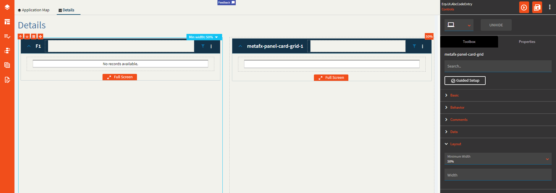
| Layout | Minimum Width | Sets the minimum width the panel can shrink to when the page is in Flex Layout Mode. (Fig I ← Roman Numeral 1) |
| Layout | Width |
Doesn’t seem to do anything. |
| State | Personalizable | If true, a user can personalize this component(hide/show) |
| State | Customizable | If true, a user can customize this component in child layers |
| State | Hidden | Hides the control from view. |
| State | Disabled | Disables the control. The control will not allow editing or focus. |
| State | Read Only | Makes the control read only so that it will not allow editing. The control can still be focused. |
| State | Auto Focus | When enabled, the control is automatically focused on creation. |
| Advanced | Auto Fill Container | Enable this to have the grid take the full size of the container it’s in. (Fig. II) |
| Advanced | Expand At Runtime | Enable this to expand the panel card at runtime. When the panel is expanded, it attempts to load data from the provider model. In the case of a dashboard, you may want to disable this to allow users time to fill in the filters. |
| Advanced | Hide Filter Icon | Hides the filter icon from the Panel Card. |
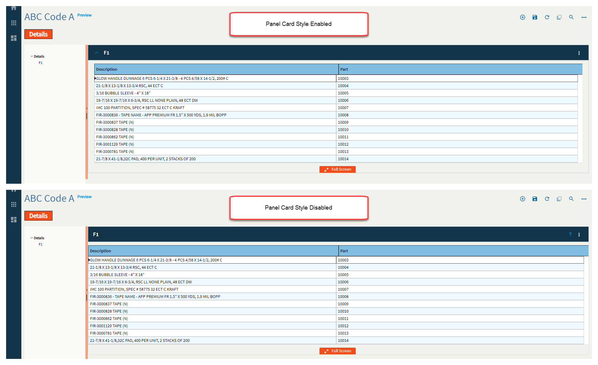
| Advanced | Disable Panel Card Style | Pretty much removes the padding around the outside. This is nice when you’re embedding a panel in a tab control. (Fig. III) |
| Advanced | Export to Excel Disabled | Removes the option to Export to Excel from the Overflow Menu |
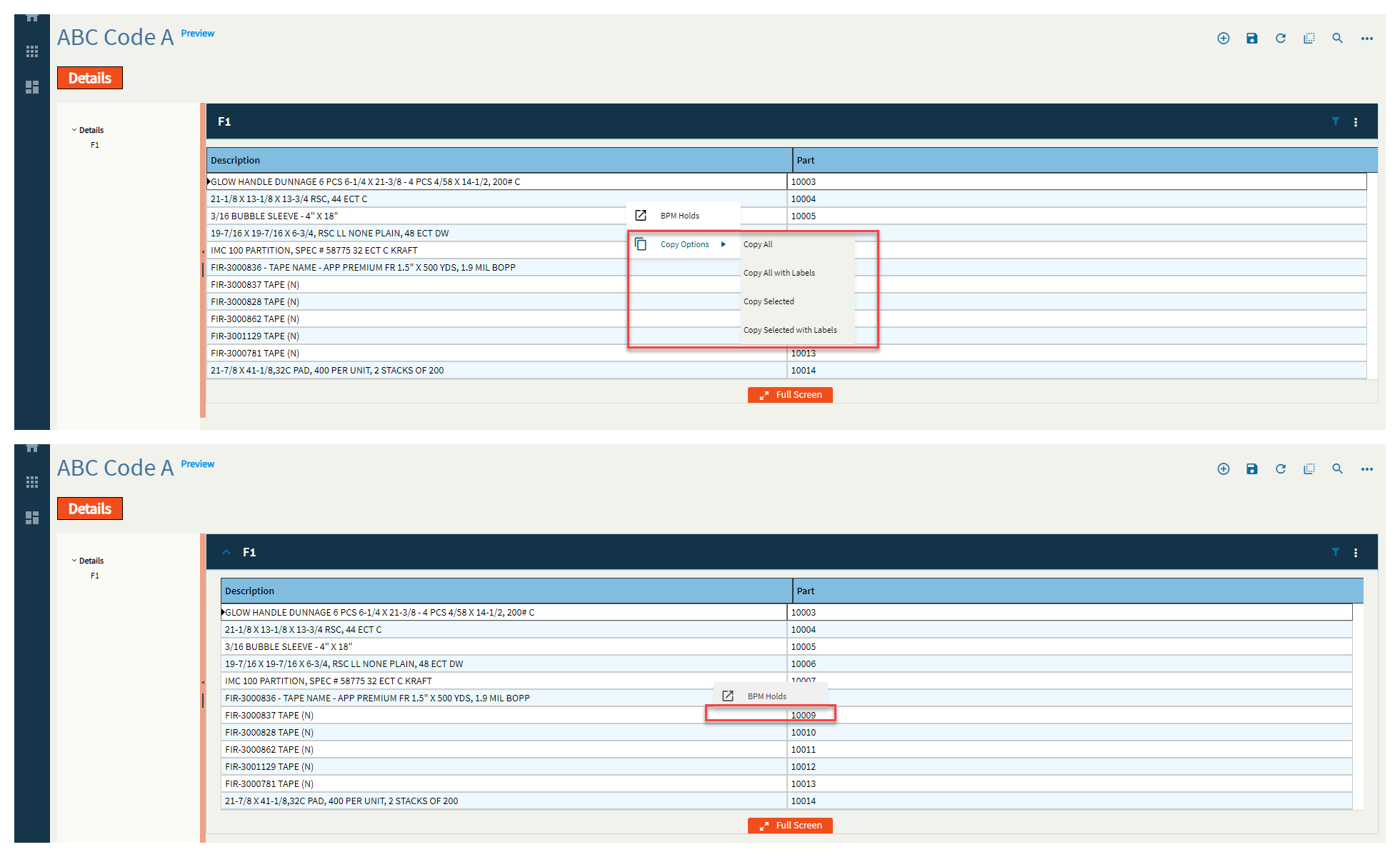
| Advanced | Disable Copy Options | Removes the Copy Options from the right-click. (Fig. IV) |
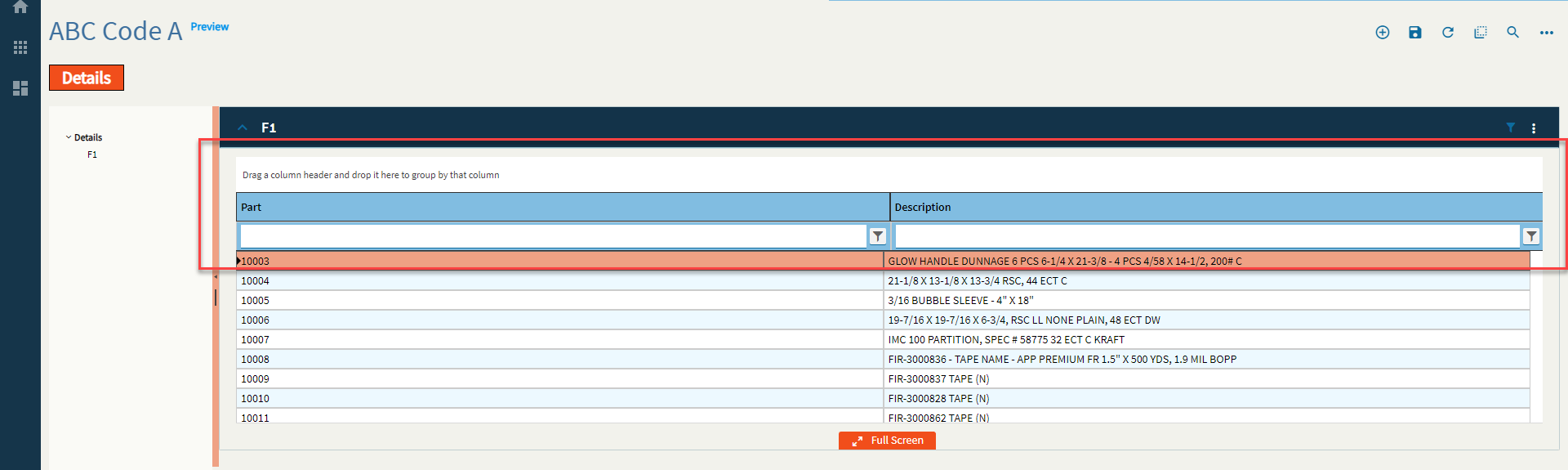
| Advanced | Show Filter and Group Options | Turns on the Group Box and Filters by default. (Fig. V) |
| Advanced > Action Data | ID | The ID of the toolbar button. |
| Advanced > Action Data | Description | The description of the toolbar button. This shows up as the label. (Fig. VI) |
| Advanced > Action Data | Icon | Sets the icon next to the description. Format: mdi mdi-icon-name Icon names can be found here: Material Design Icons (pictogrammers.github.io) (Fig. VII) |
| Advanced > Action Data | Image Url |
Set the url that points to the image that is to be displayed on the action item. Couldn’t figure this one out. |
| Advanced > Action Data | Ep Binding | Set the data binding for the action item. This is used for onClick events and others as well as rules. Format: DataView.Column. |
| Advanced > Action Data | ShortCut | Set the keyboard shortcut to fire the onClick event. Example: CTRL+ALT+A |
| Advanced > Action Data | Add to Primary ToolBar | Indicate if the item should be shown in the toolbar next to the overflow menu on the panel card header. (Fig. VIII) |
| Advanced > Action Data | Disabled |
Disables the tool. This still seems to show the click animation, but the event doesn’t fire. #SuperGoodEnough? (Fig. IX) |
| Advanced > Action Data | Add Divider | Adds a divider below the menu item. (Fig. X RN) |
| Advanced > Action Data | Sequence | Set the numeric sequence of this item in relation to the other items. (Fig. XI) |
| Advanced > Action Data | System Tool Type |
Set the system defined type for this action item. If this value is set, all properties of the item will be overridden with the system defined properties. Doesn’t do anything when set. #Shrug
|
| Advanced | View Options | This is where you can define different, selectable views for a single grid. For instance, if you have a sales order grid, you can have views for All, Open, and Closed. To configure these, please refer to the previously mentioned Provider Model. The setup is the same. You would just set different where clauses for each view. Some points of note that work here and not the overall provider model is the Description shows the text in the View combo and the Set Default selects that view over the others to load by default. (Fig. XII) |
Figure A: Title
Figure B: Behaviors

Figure C: Comments
Figure D: Height/Width
Figure E: Page Size
Figure F: Groupable
Figure G: Filterable
Figure H: Reorderable
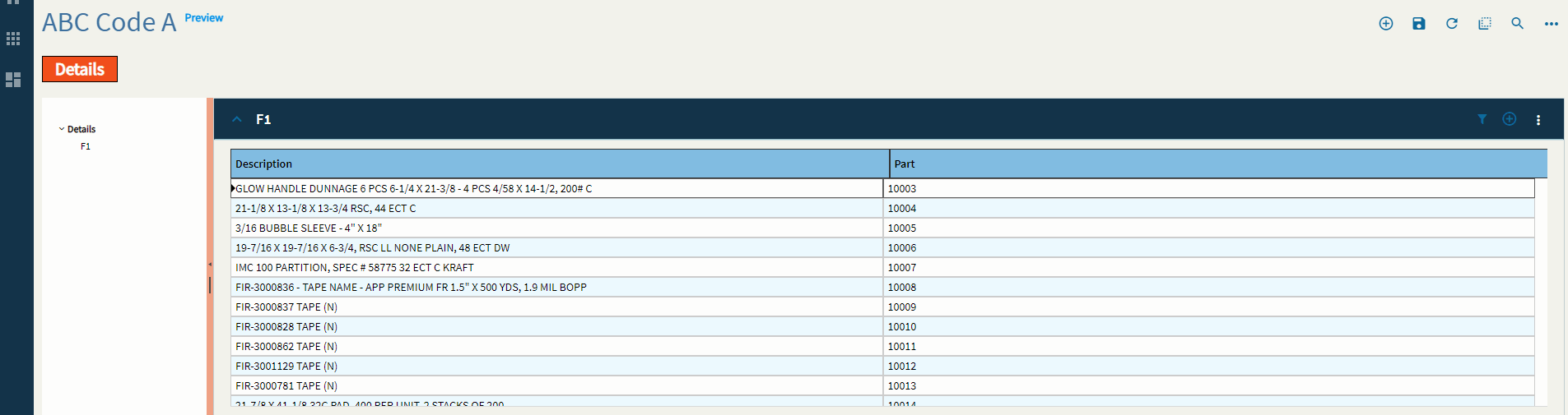
Figure I: Reordering of Rows?
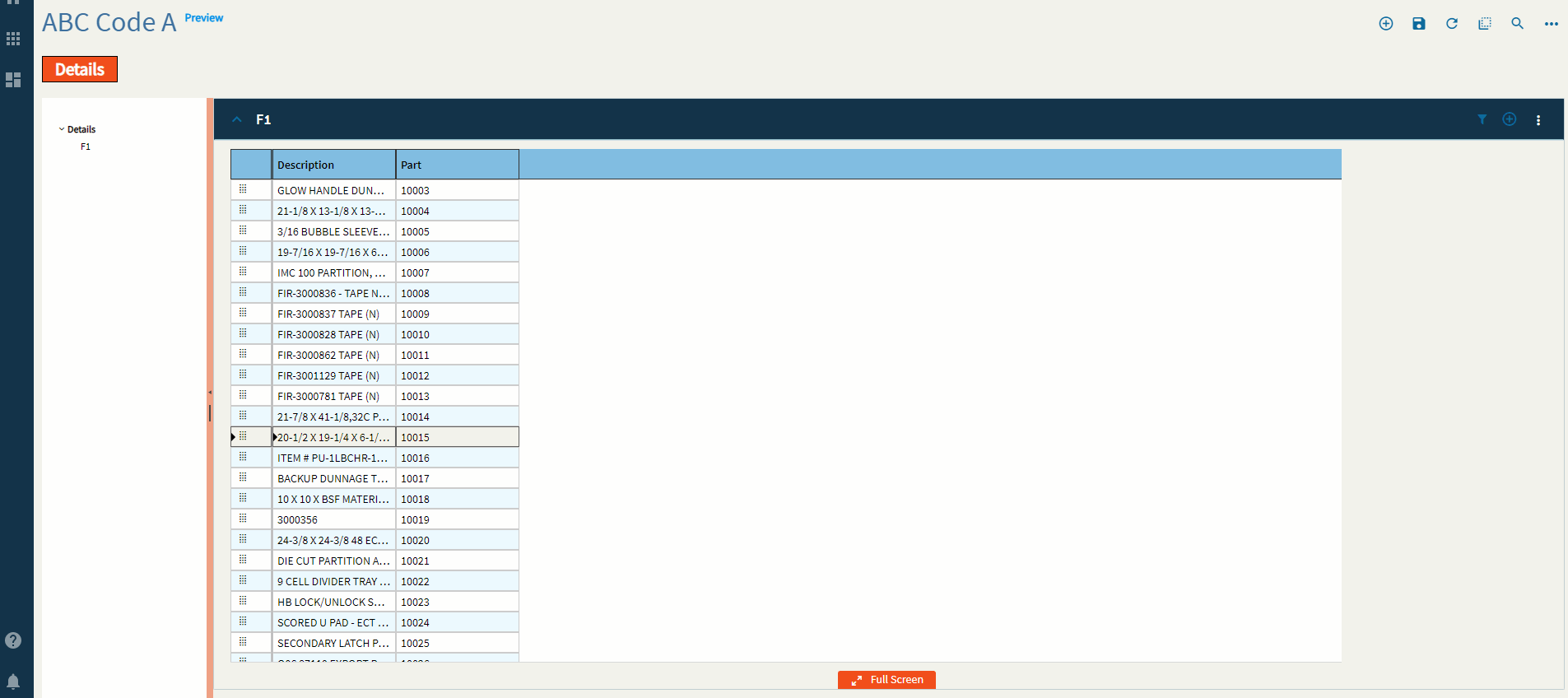
Figure J: Editable
Figure K: Disable Paste Operations
Figure L: Selectable
Figure M: Max Columns
Figure N: Select All
Figure O: Select by Field
Figure P: Select All EpBinding
Figure Q: Title
Figure R: Is Link
Figure S: Filterable
Figure T: Width
Figure U: Hidden
Figure V: File Name
Figure W: Provider Model
Figure X: BAQ ID
Figure Y: Where Clause
Figure Z: Where List
You can add as many of these as you need, but they will always be concatenated with “AND”. If you want to do an “OR” you will need to write it yourself in the “Where” found in the BAQ Options.
Figure I (Roman Numeral): Minimum Width
Figure II: Auto Fill Container
Figure III: Disable Panel Card Style
Figure IV: Disable Copy Options
Figure V: Show Group and Filter
Figure VI: Description
Figure VII: Icon
Figure VIII: Add to Primary Toolbar
Figure IX: Disable
Figure X (Roman Numeral): Add Divider
Figure XI: Sequence
Figure XII: View Options
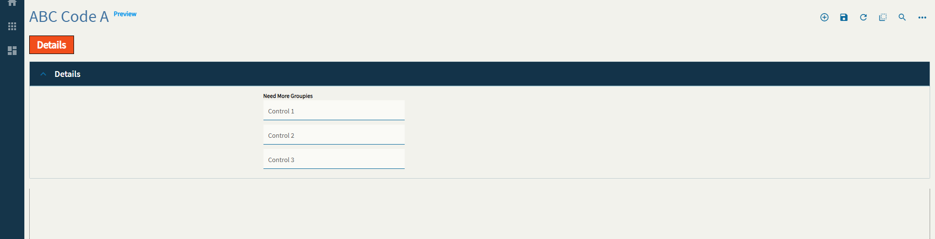
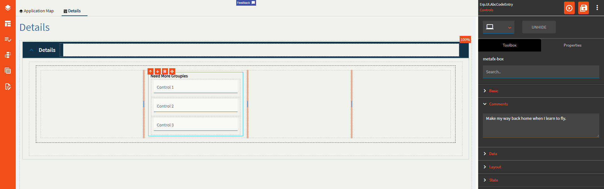
Use to group controls with an optional label so that they stay together as the UI responds to smaller screens.
| Property Group | Property | Description |
|---|---|---|
| Basic | Id | Unique identifier for the control |
| Basic | Label Text | Sets the Title of the group. (Fig. A) |
| Comments | Comments | Add some developer notes to the control. These are not customer-facing and are only visible in App Studio (Fig. B) |
| Data | Key Field |
No idea why this is even here as you can’t bind a group box… |
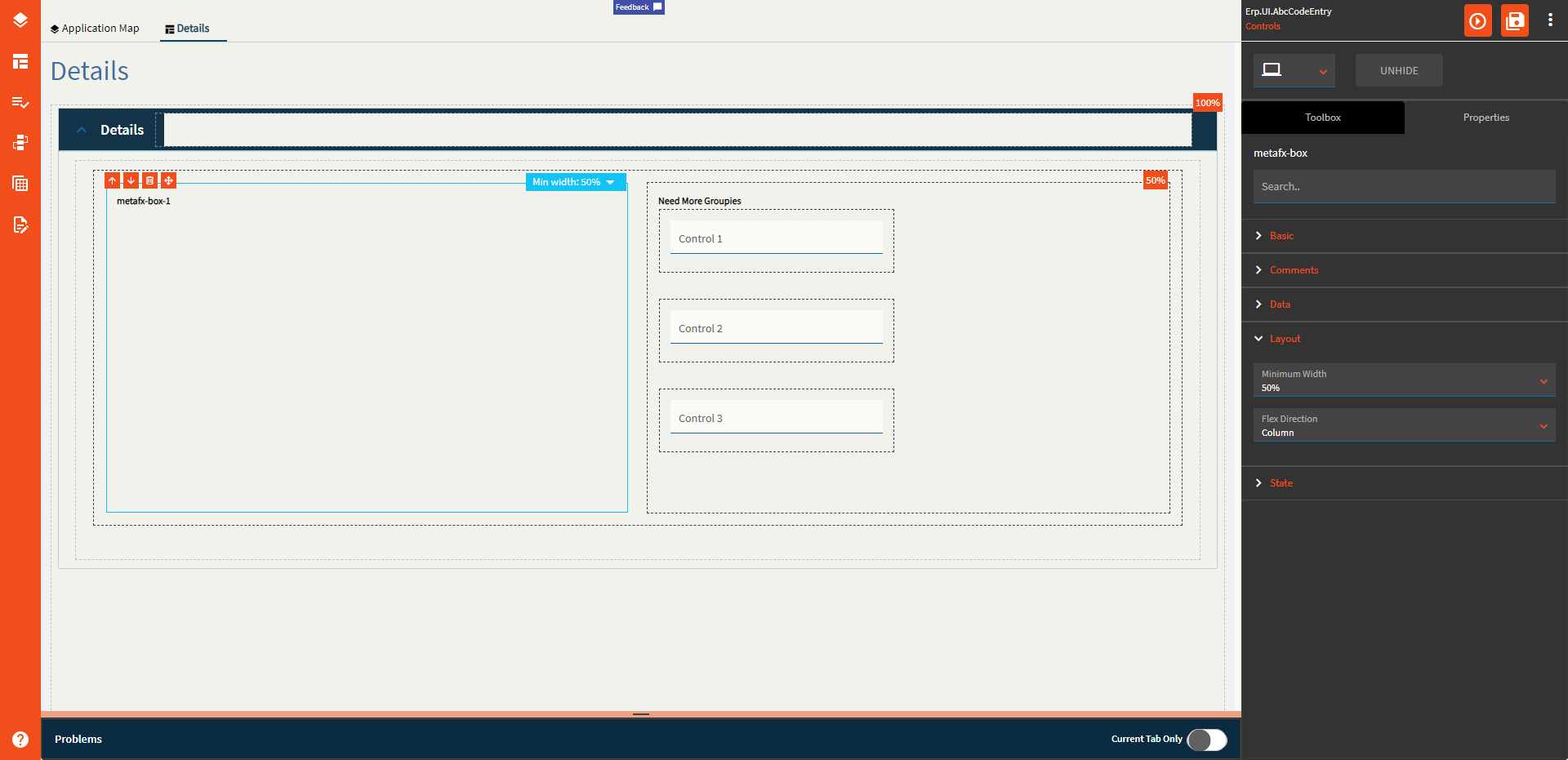
| Layout | Minimum Width | Sets the minimum width the panel can shrink to when the page is in Flex Layout Mode. (Fig. C) |
| Layout | Flex Direction |
Options include: Row, Column, Default. Couldn’t get it to flex at all. This one may need to hit up the gym some more. |
| State | Personalizable | If true, a user can personalize this component(hide/show) |
| State | Customizable | If true, a user can customize this component in child layers |
Figure A: Label Text
Figure B: Comments
Figure C: Minimum Width
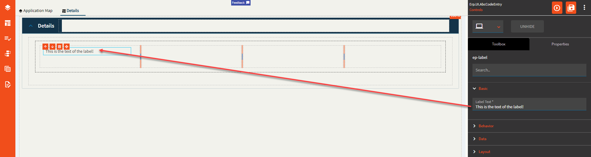
Allows the user to create a label.
| Property Group | Property | Description |
|---|---|---|
| Basic | Label Text | Set the text of the label. (Fig. A) |
| Behavior | On Blur | Click this to create an OnBlur event for the control. On Blur is triggered when the control loses focus. |
| Behavior | On Create | Click this to create an OnCreate event for the control On Create is triggered when the control is painted to the GUI. |
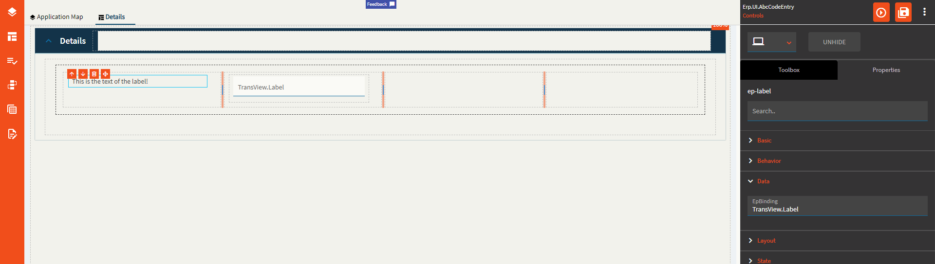
| Data | EpBinding | Set the data binding in the format of DataView.Column. This will replace what’s in the LabelText property. (Fig. B) |
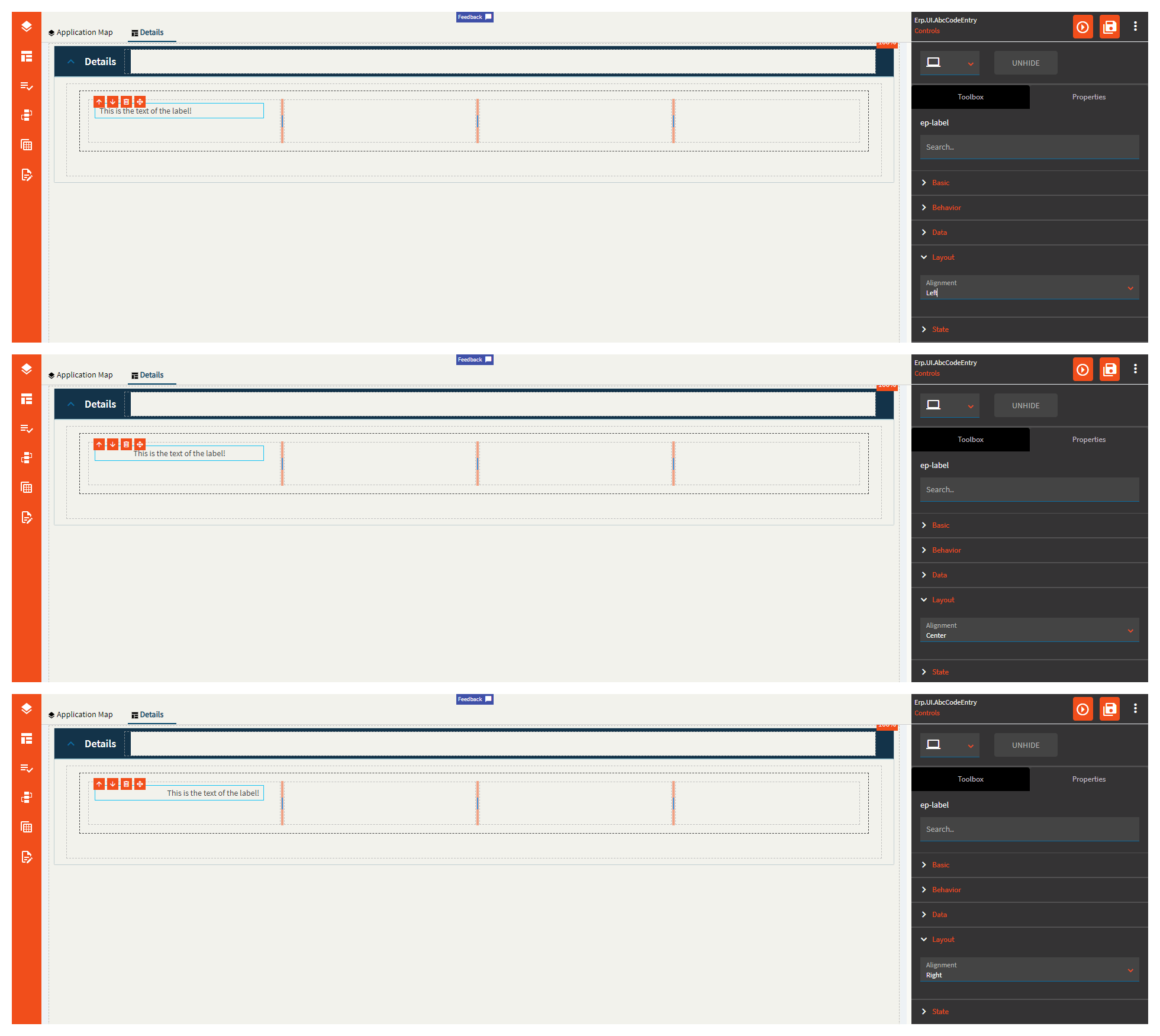
| Layout | Alignment | Set the alignment of the text to Right, Center, or Left. (Fig. C) |
| State | Hidden | Hides the control from view. |
Figure A: Label Text
Figure B: EpBinding
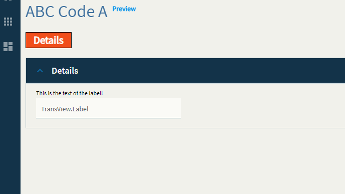
Figure C: Alignment