File Picker Server
Allows a user to “select” a file form the server. I say “select” in quotes because this does not bring the file down. It only binds the path to the data binding fields. You will need to use an event with the erp-file-transfer widget to move things about.
I don’t know what I’m doing.
| Property Group | Properties | Description |
|---|---|---|
| Basic | Id | Unique identifier for the control |
| Basic | Label Text | Sets the label within the control. (Fig. A) |
| Behavior | On Blur | Click this to create an OnBlur event for the control. On Blur is triggered when the control loses focus. |
| Behavior | On Create | Click this to create an OnCreate event for the control On Create is triggered when the control is painted to the GUI. |
| Comments | Comments | Add some developer notes to the control. These are not customer-facing and are only visible in App Studio (Fig. B) |
| Data | Key Field | Indicates that a bound component is a key field. If true, the field is enabled if there is no current record, allowing the user to select an existing record or create a new one. |
| Data | EpBinding | Bind the  . This will store the file name and partial path such as . This will store the file name and partial path such as Log\LogTextFile.txt. |
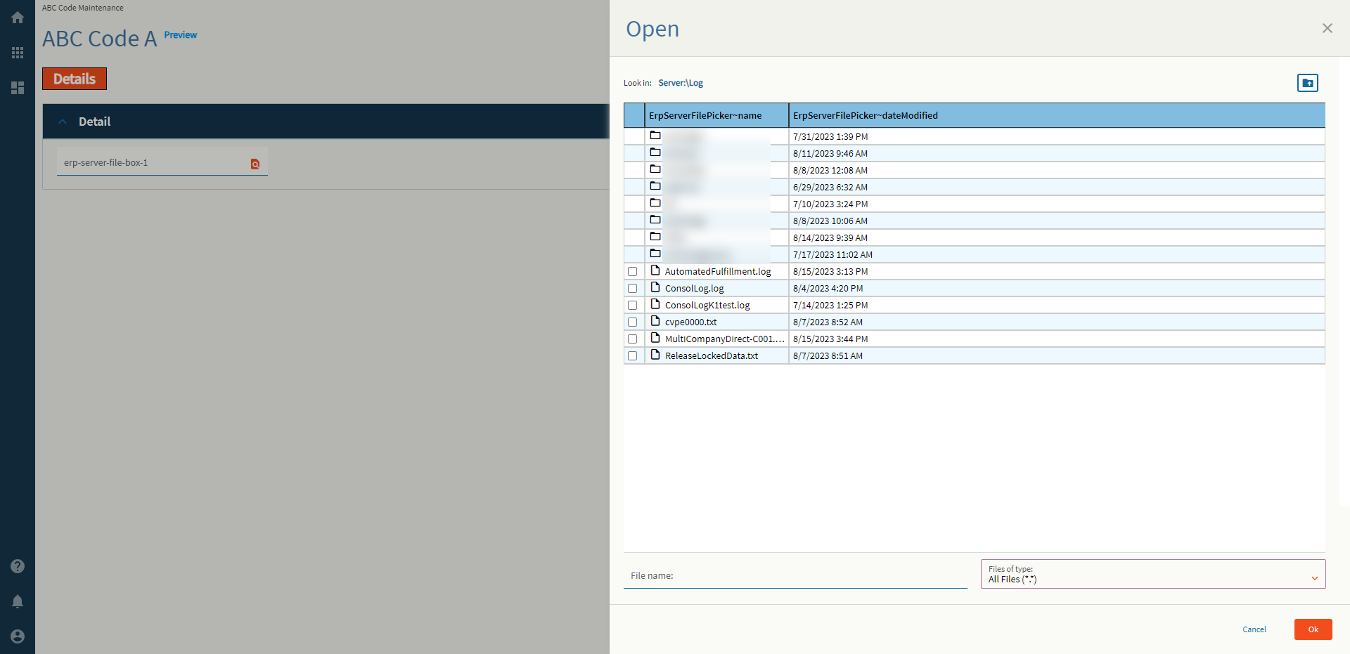
| Data | Special Folder | Server folder that should be navigated to in order to select files. Valid Options Include: Report, WebDeployment, ReportDefinition, CustomReportDefinition, UserData, CompanyData, EWADeployment, and Attachment. (Fig. C) |
| Data | Filter | Filters to be added to the file selector type. Format: Text Files (*.txt)|*.txt|All Files (*.*)|*.* In plain words Description|WildCard.FileExtension (Fig. D) |
| Data | Binding File Name | Binding to store the relative file path such as C:\EpicorData\EpicorKineticGold\Companies\C001\Log\LogTextFile.txt (Fig. E) |
| Layout | Alignment | Set the alignment for the control. Valid options are Left, Center, Right. (Fig. F) |
| Layout | Width | Sets the specific width (pixels) for the control. (Fig. G) |
| State | Personalizable | If true, a user can personalize this component(hide/show) |
| State | Customizable | If true, a user can customize this component in child layers |
| State | Hidden | Hides the control from view. |
| State | Disabled | Disables the control. The control will not allow editing or focus. |
| State | Read Only | Makes the control read only so that it will not allow editing. The control can still be focused. |
| State | Auto Focus | When enabled, the control is automatically focused on creation. |
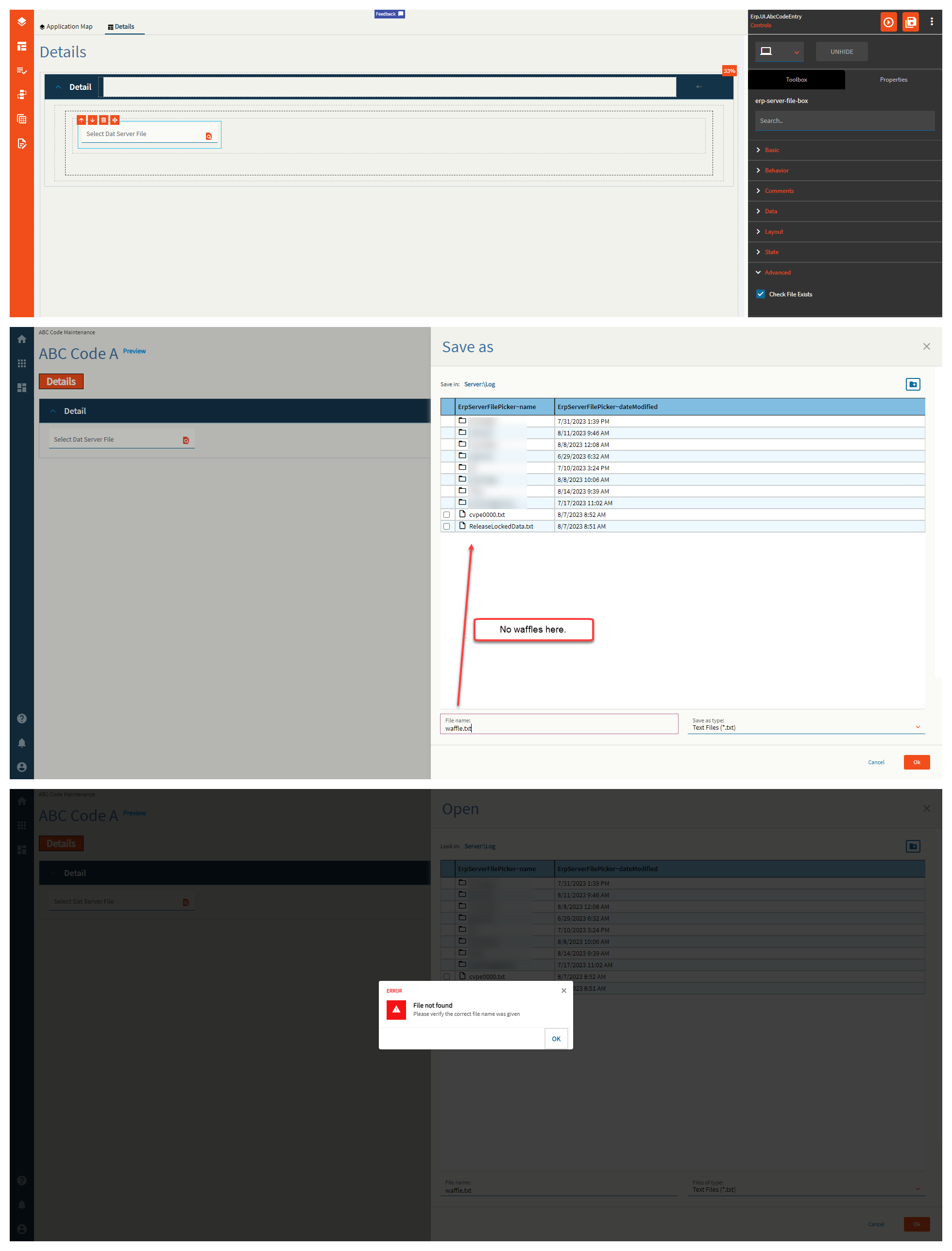
| Advanced | Check File Exists | If this is false, you can type in whatever you want in the file name box from the slide out and it will accept it as truth. If enabled, this will check if the file actually exists and sternly yell at you if it doesn’t! (Fig. H) |
Figure A: Label Text
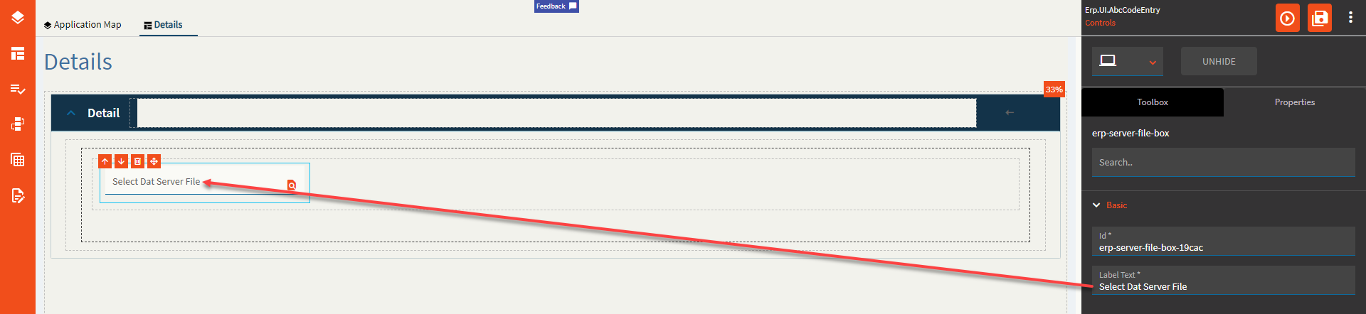
Figure B: Comments
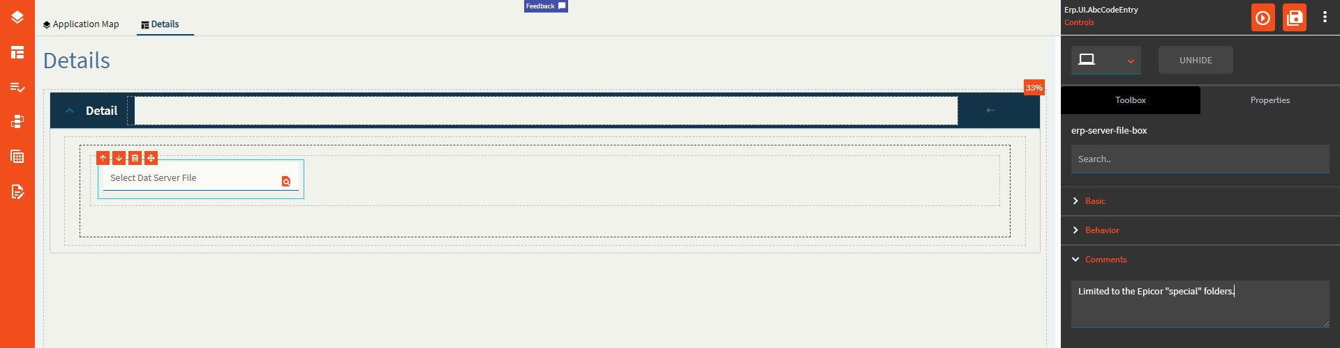
Figure C: Special Folder

Figure D: Filter
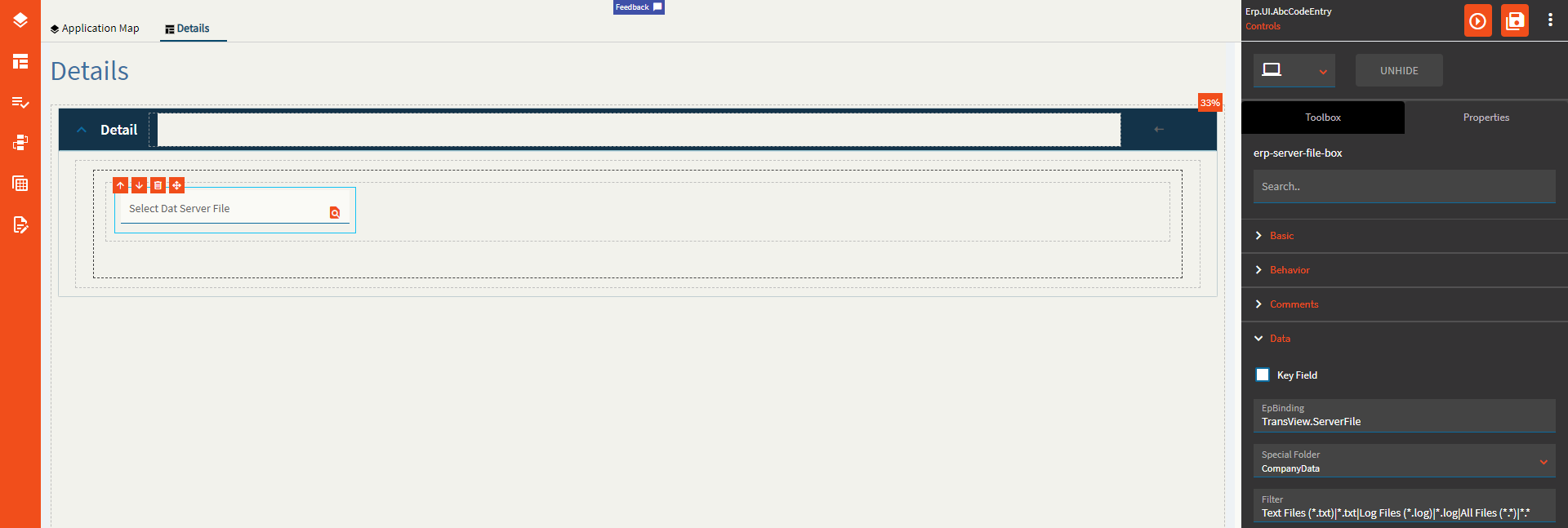
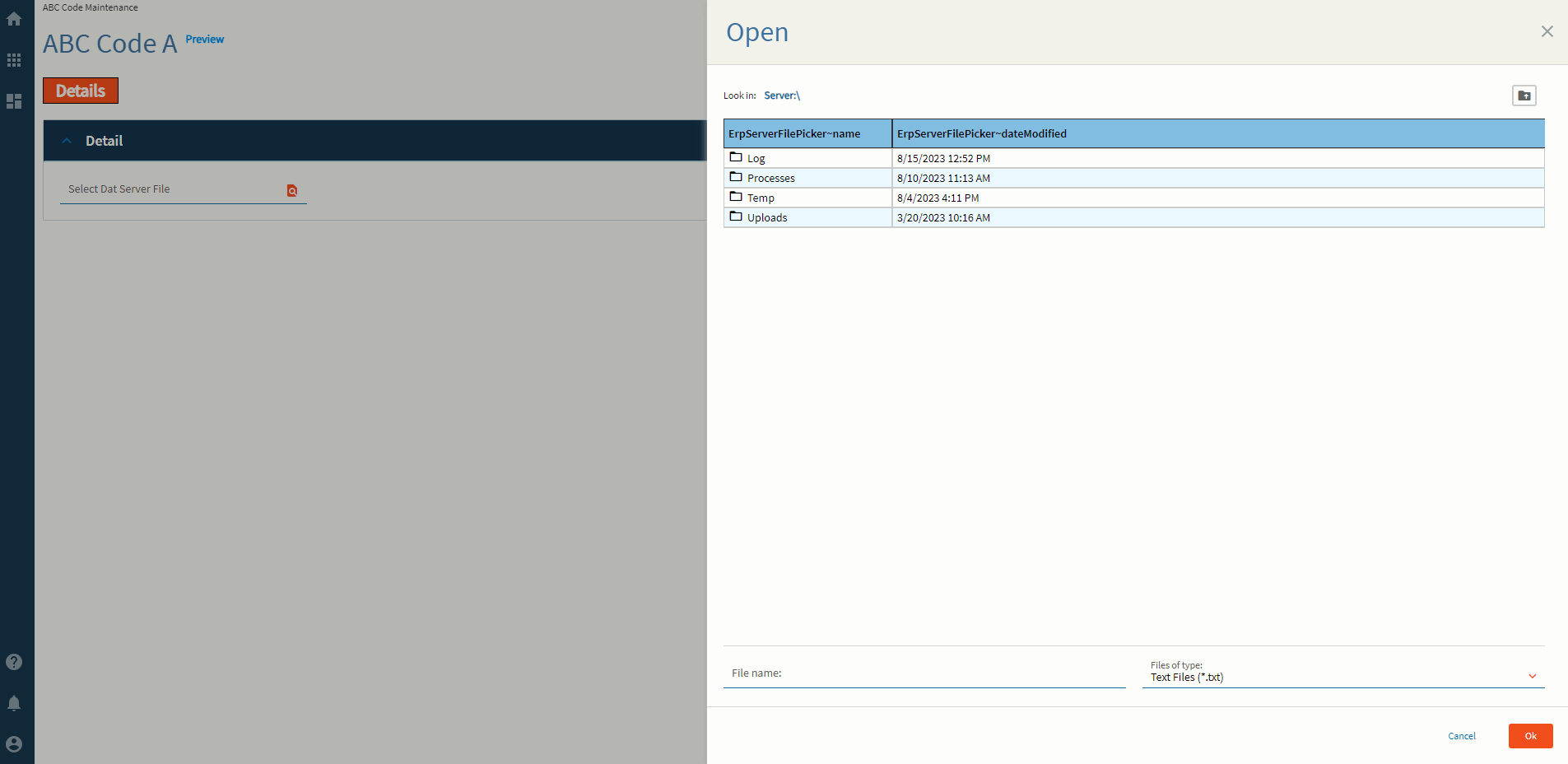
Figure E: Binding File Name

Figure F: Alignment

Figure G: Width
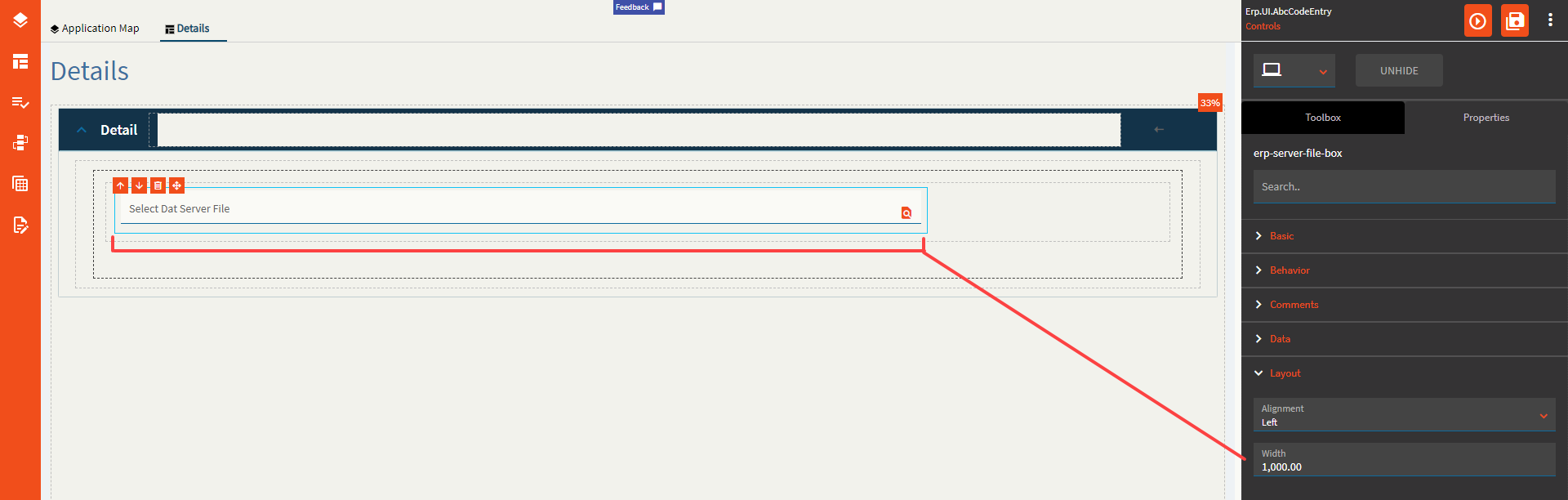
Figure H: Check File Exists = FALSE
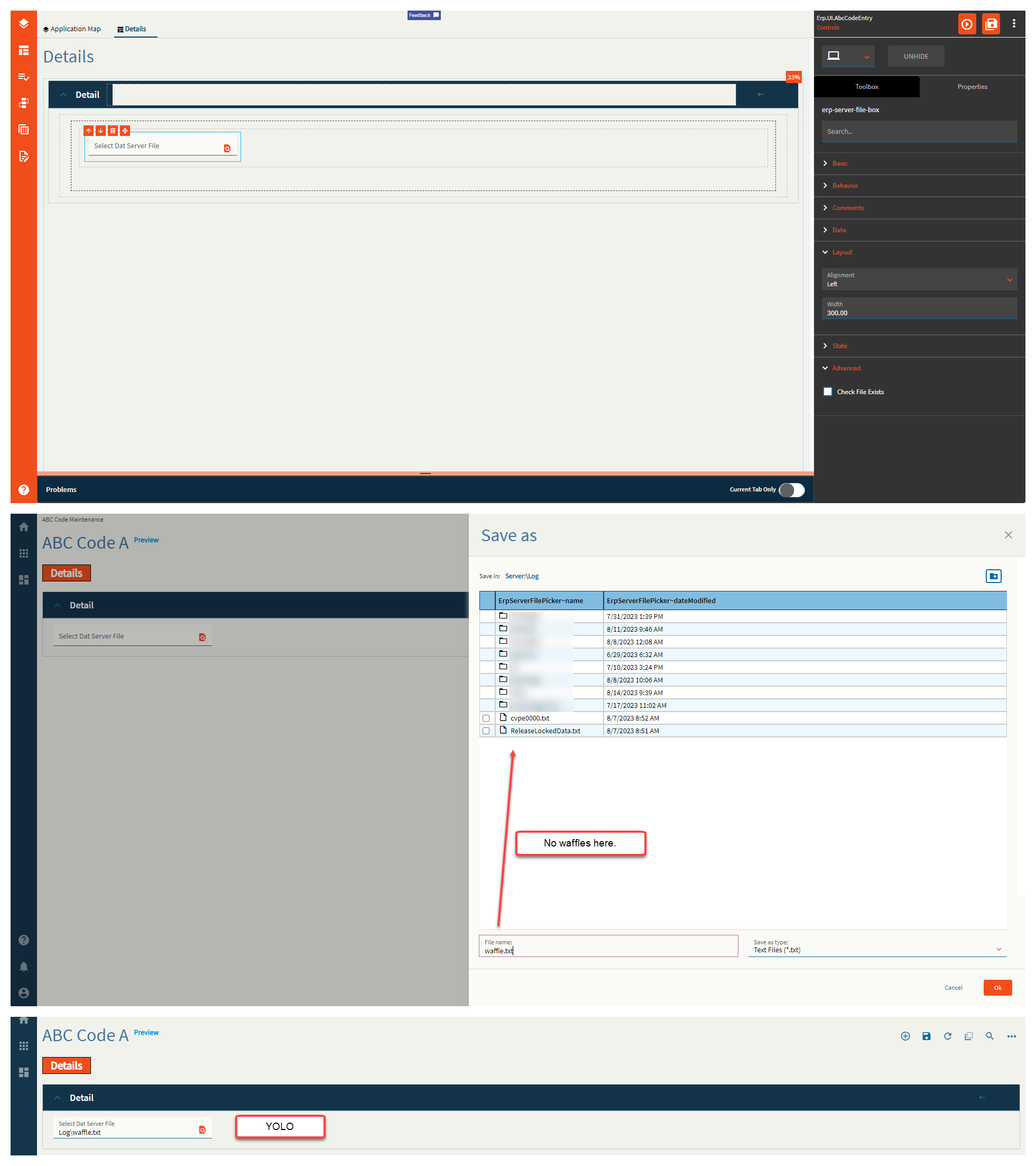
Figure H: Check File Exists = TRUE