File Server Folder
Allows a user to select a folder from the server. And by “select” I mean it just puts the name of it into the binding.
| Property Group | Property | Description |
|---|---|---|
| Basic | Id | Unique identifier for the control |
| Basic | Label Text | Sets the label within the control. (Fig. A) |
| Behavior | On Blur | Click this to create an OnBlur event for the control. On Blur is triggered when the control loses focus. |
| Behavior | On Create | Click this to create an OnCreate event for the control On Create is triggered when the control is painted to the GUI. |
| Comments | Comments | Add some developer notes to the control. These are not customer-facing and are only visible in App Studio (Fig. B) |
| Data | Key Field | Indicates that a bound component is a key field. If true, the field is enabled if there is no current record, allowing the user to select an existing record or create a new one. |
| Data | EpBinding | Bind the control to a DataView.Column. |
| Layout | Alignment | Set the alignment for the control. Valid options are Left, Center, Right. (Fig. C) |
| Layout | Width | Sets the specific width (pixels) for the control. (Fig. D) |
| State | Personalizable | If true, a user can personalize this component(hide/show) |
| State | Customizable | If true, a user can customize this component in child layers |
| State | Hidden | Hides the control from view. |
| State | Disabled | Disables the control. The control will not allow editing or focus. |
| State | Read Only | Makes the control read only so that it will not allow editing. The control can still be focused. |
| State | Auto Focus | When enabled, the control is automatically focused on creation. |
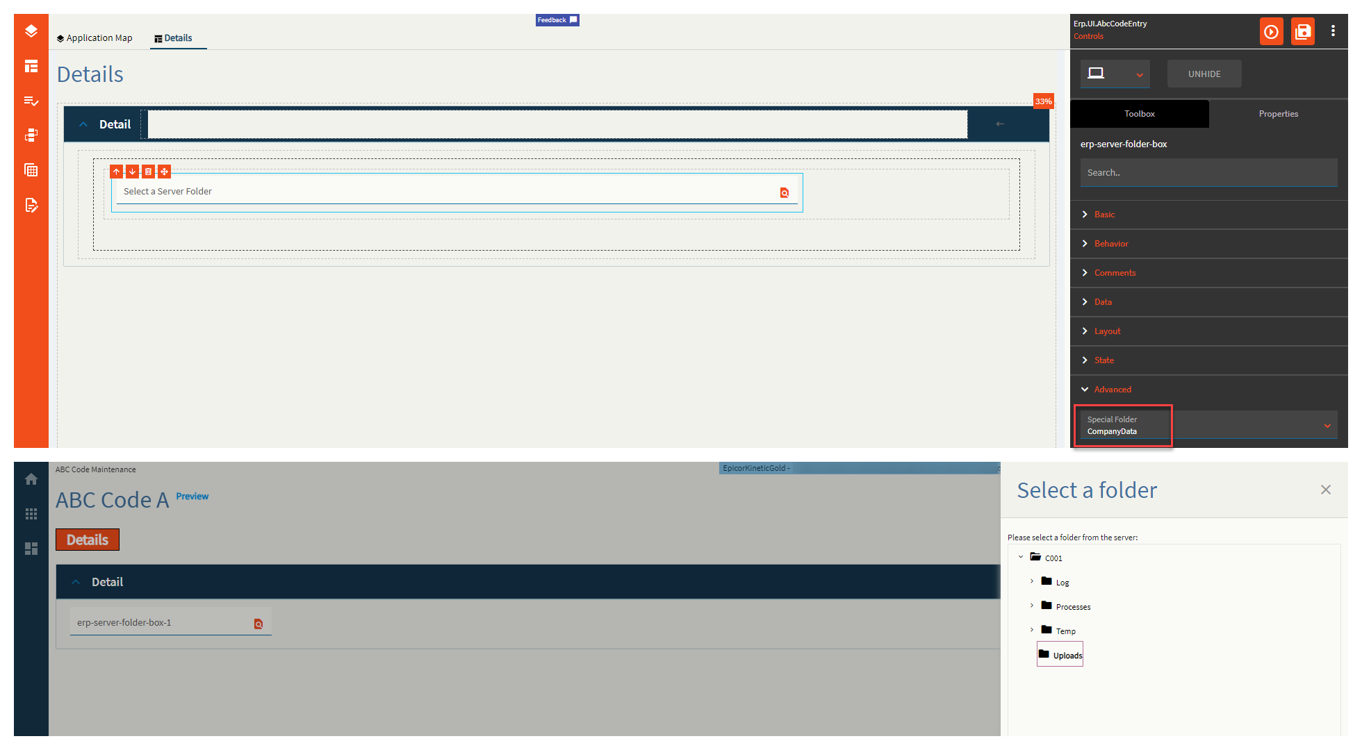
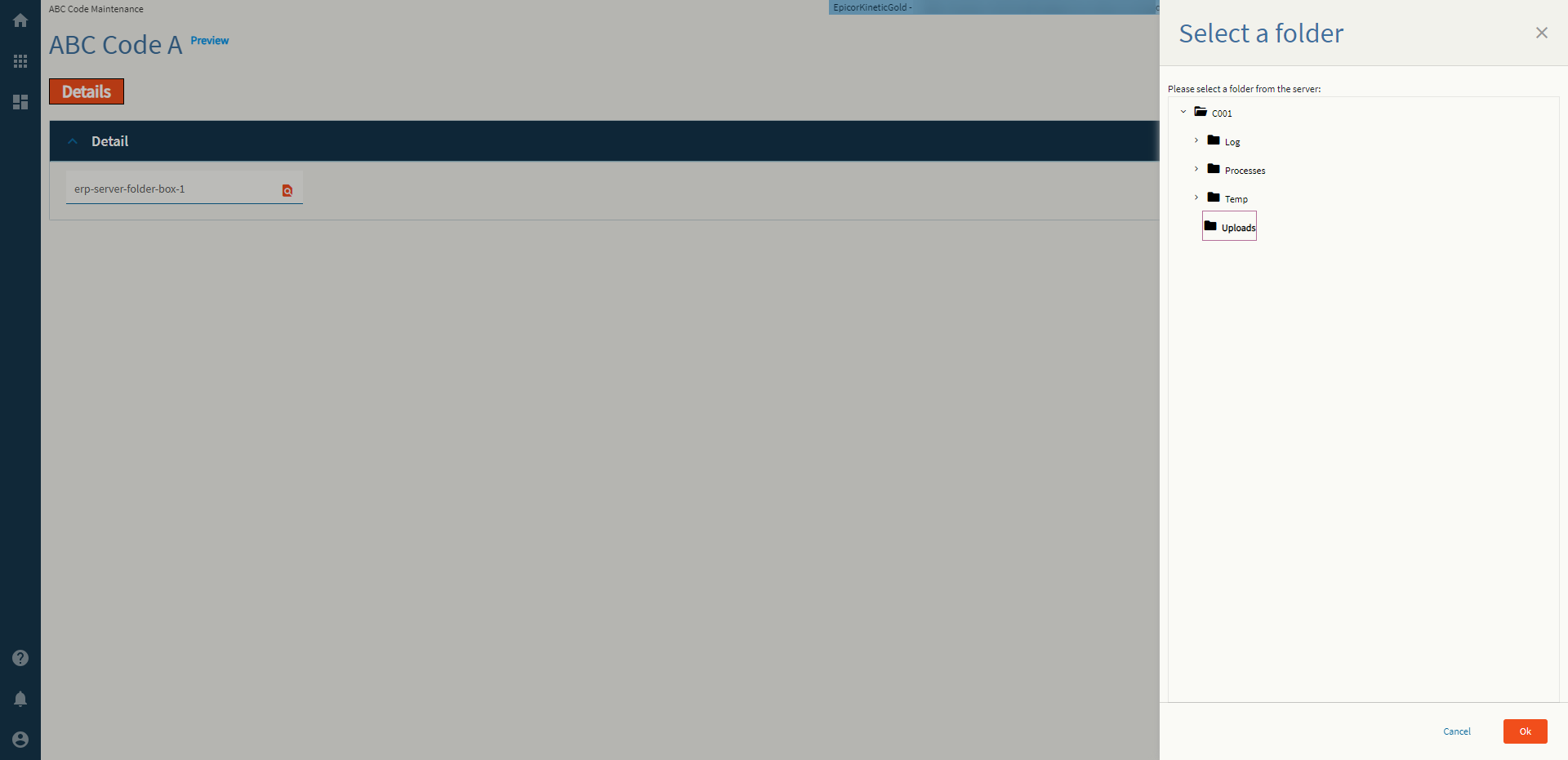
| Advanced | Special Folder | Root Folder to display subfolders in. Valid Options Include: Report, WebDeployment, ReportDefinition, CustomReportDefinition, UserData, CompanyData, EWADeployment, and Attachment. (Fig. E) |
| Advanced | Disable Validation |
 Validates the folder still exists on the server on click of OK. This doesn’t work. Validates the folder still exists on the server on click of OK. This doesn’t work. |
Figure A: Label Text
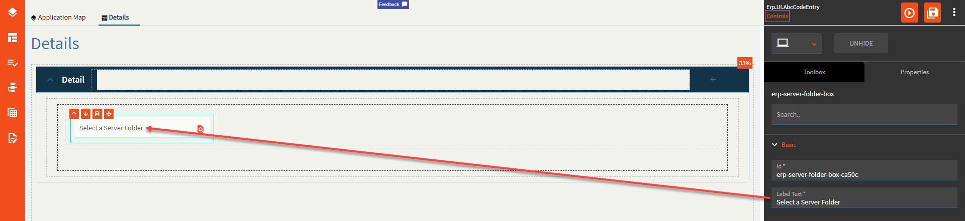
Figure B: Comments
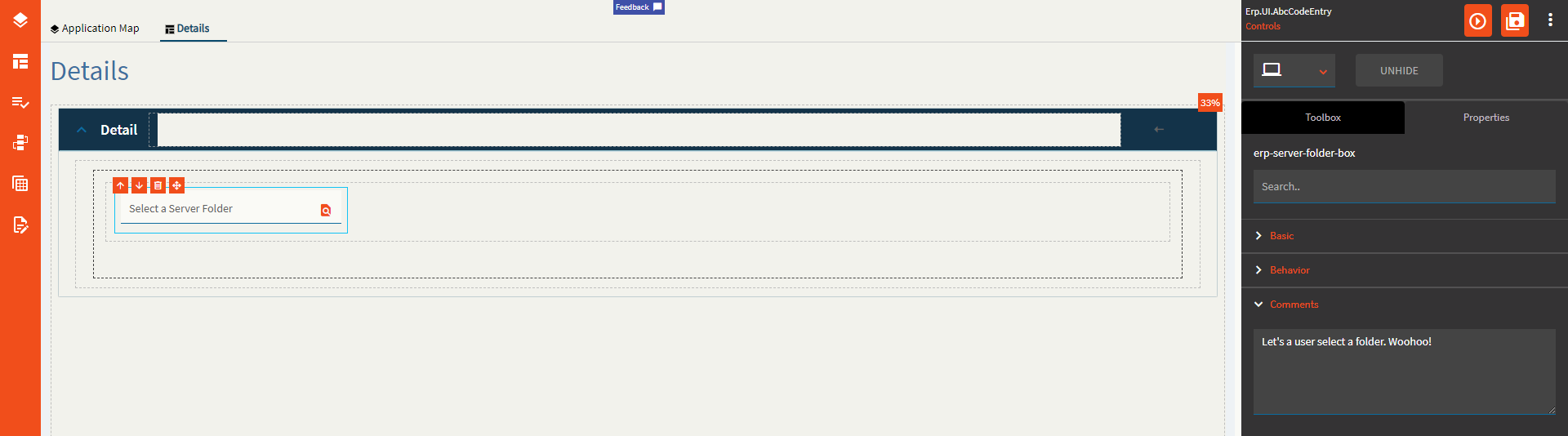
Figure C: Alignment
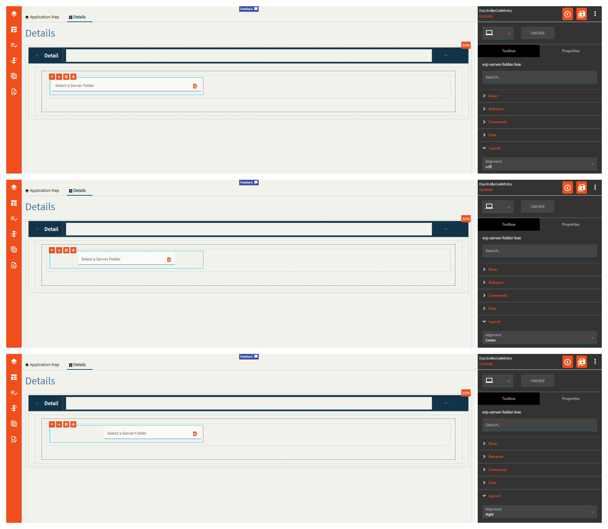
Figure D: Width
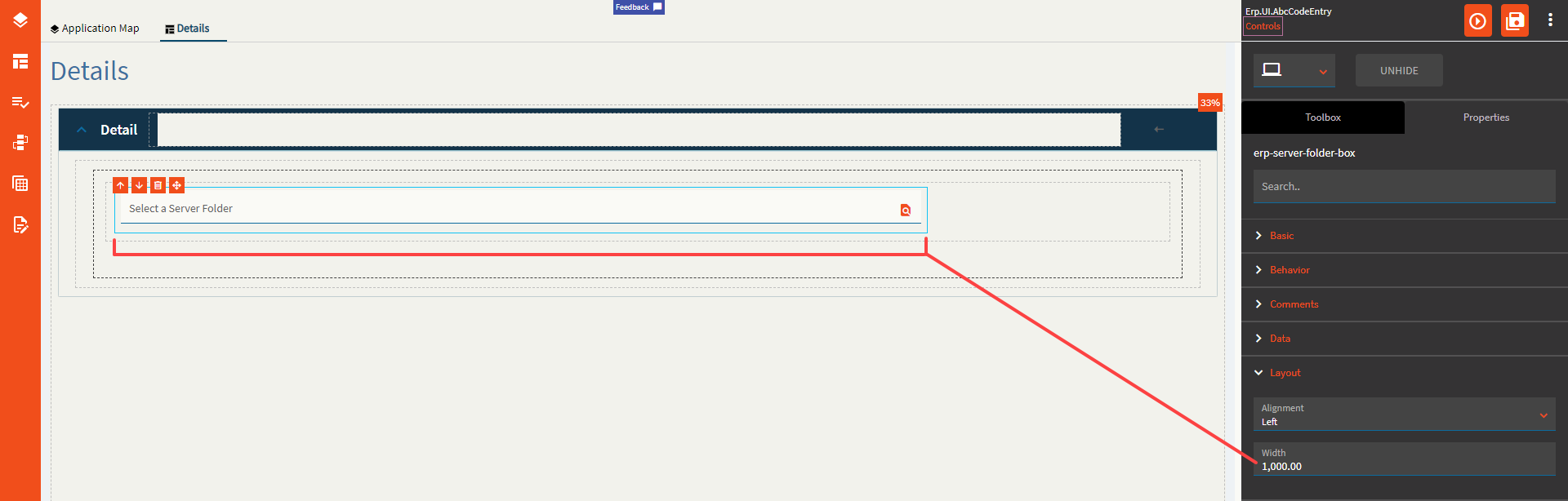
Figure E: Special Folder