PDF Viewer
A component which can show a PDF file inline in the application.

| Property Group | Property | Description |
|---|---|---|
| Basic | Id | Unique identifier for the control |
| Basic | Label Text |  Sets the label within the control. Doesn’t Show up anywhere. Sets the label within the control. Doesn’t Show up anywhere. |
| Behavior | On Blur | Click this to create an OnBlur event for the control. On Blur is triggered when the control loses focus. |
| Behavior | On Create | Click this to create an OnCreate event for the control On Create is triggered when the control is painted to the GUI. |
| Comments | Comments | Add some developer notes to the control. These are not customer-facing and are only visible in App Studio (Fig. A) |
| Data | Key Field | Indicates that a bound component is a key field. If true, the field is enabled if there is no current record, allowing the user to select an existing record or create a new one. |
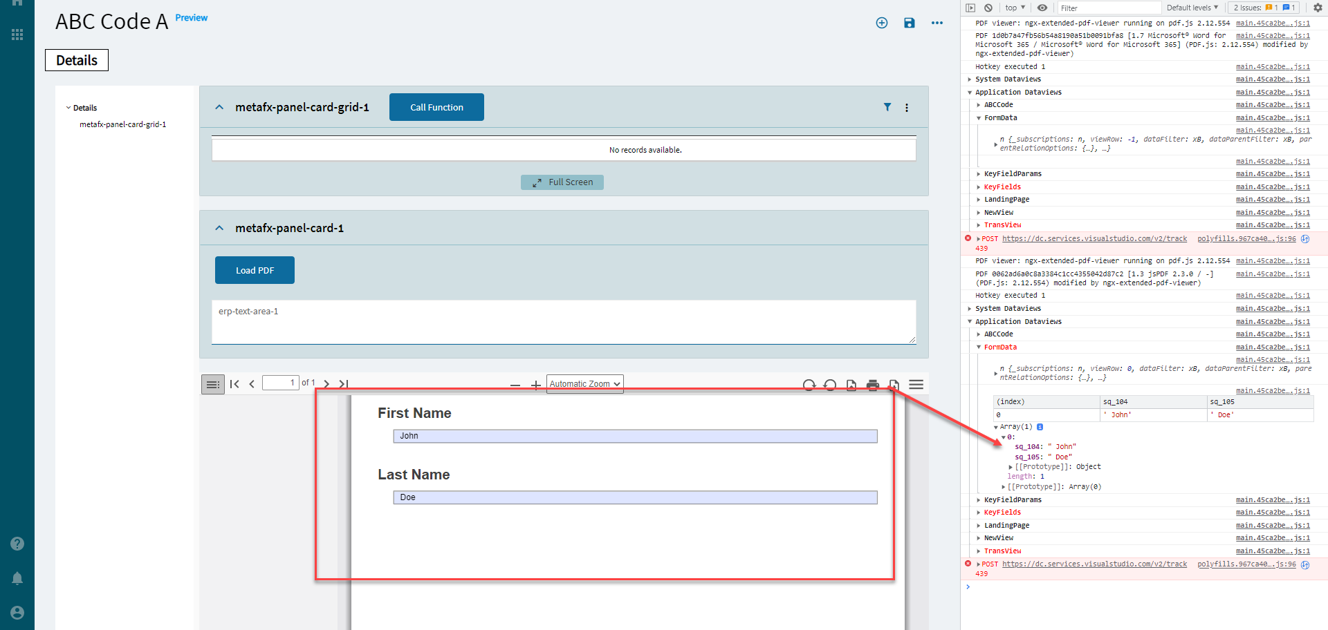
| Data | EpBinding | Bind the form data to a DataView. This view will automatically be populated if the imported PDF form has form fields included in it. Format: DataView. (Fig. B) |
| Data | Selected Page | Tool tip says “Actual selected page”. Typing in a numeric value does nothing. |
| Layout | Alignment | Set the alignment for the control. Valid options are Left, Center, Right. Doesn’t work. I mean, it does something, but Right and Center throw the whole thing off of the screen.  |
| Layout | Width | Sets the specific width (pixels) for the control. Doesn’t work. |
| State | Personalizable | If true, a user can personalize this component(hide/show) |
| State | Customizable | If true, a user can customize this component in child layers |
| State | Hidden | Hides the control from view. |
| State | Disabled | Disables the control. The control will not allow editing or focus. |
| State | Read Only | Makes the control read only so that it will not allow editing. The control can still be focused. |
| State | Auto Focus | When enabled, the control is automatically focused on creation. |
| Advanced | Show in Toolbar | Disable to hide the entire toolbar. (Fig. C) |
| Advanced | Show Open File Button | Disable to hide the Open File Button. (Fig. C) |
| Advanced | Show Zoom Buttons | Disable to hide the Zoom Buttons. (Fig. C) |
| Advanced | Page View Mode | So, this worked for me initially to where single would show one page at a time and multiple would allow you to scroll down through them all, buuuut it stopped working. |
| Advanced | Show Paging Buttons | Disable to hide the Paging Buttons (Fig. C) |
| Advanced | Show Sidebar Button | Disable to hide the Show Sidebar Button. (Fig. C) |
Figure A: Comments

Figure B: EpBinding
Here’s it in action from an old post: PDF Viewer Widget - #15 by hmwillett
Figure C: Show Buttons
