Allows a user to customize a color and shape based on different statuses.
Property Group
Property
Description
Basic
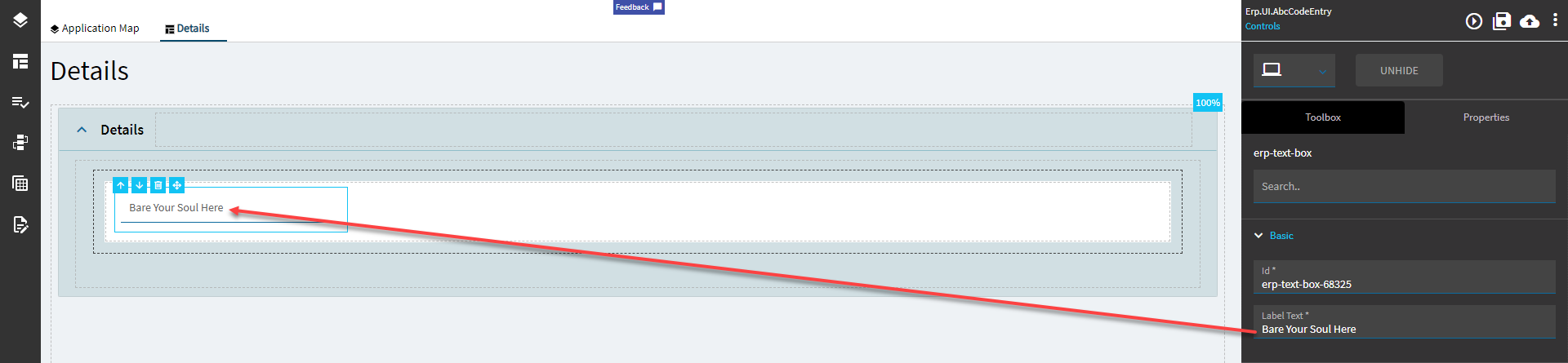
Id
Unique identifier for the control
Behavior
On Blur
Click this to create an OnBlur event for the control. On Blur is triggered when the control loses focus.
Behavior
On Create
Click this to create an OnCreate event for the control On Create is triggered when the control is painted to the GUI.
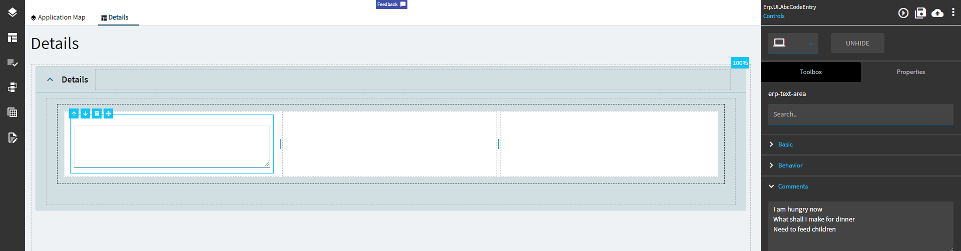
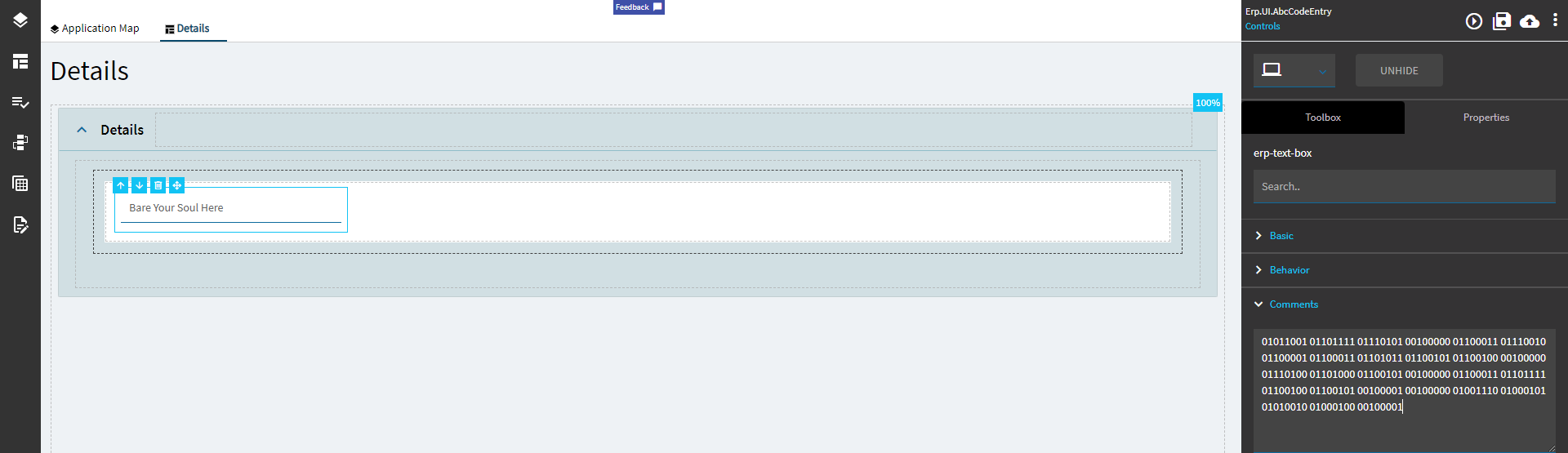
Comments
Comments
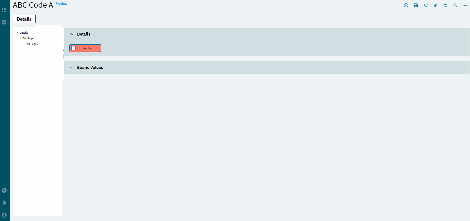
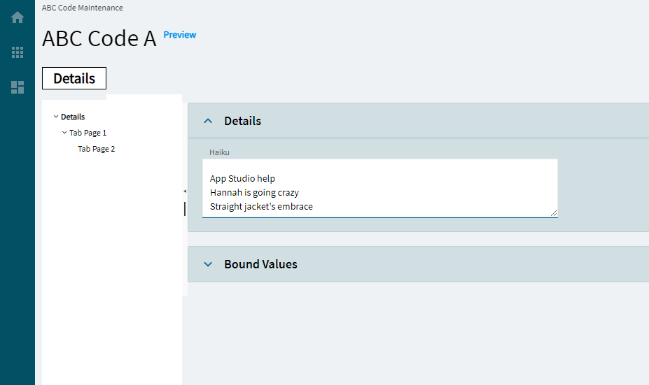
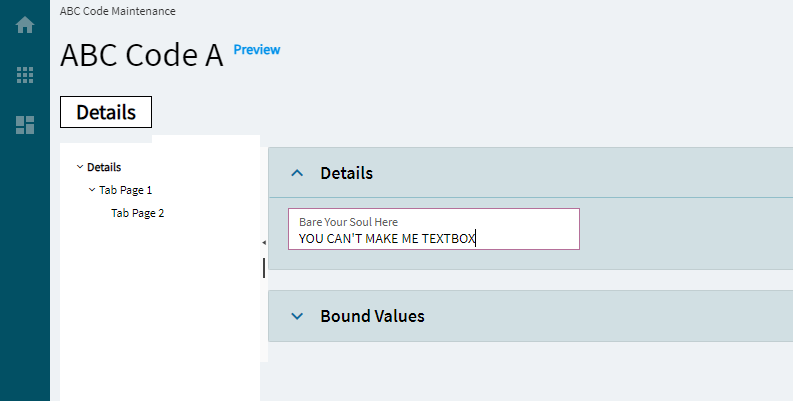
Add some developer notes to the control. These are not customer-facing and are only visible in App Studio (Fig. A)
Data
Key Field
Indicates that a bound component is a key field. If true, the field is enabled if there is no current record, allowing the user to select an existing record or create a new one.
Data
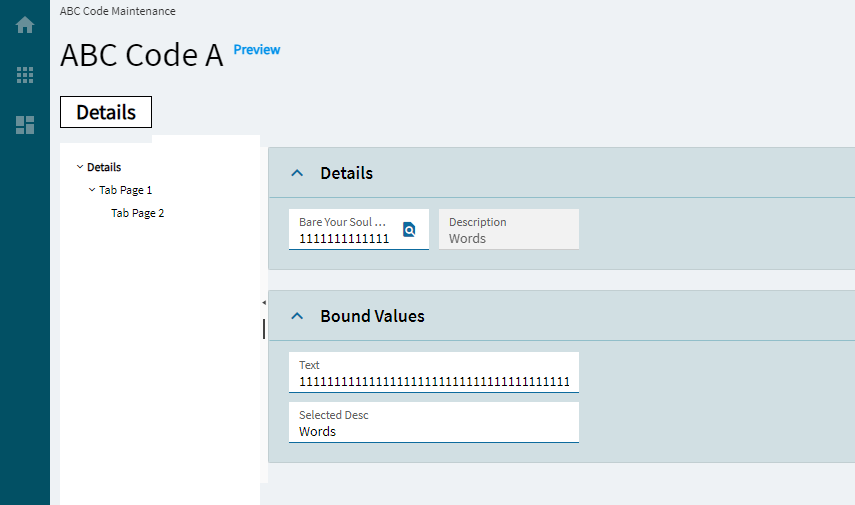
EpBinding
Bind the control to a DataView.Column. Set this to apply row rules to the shape.
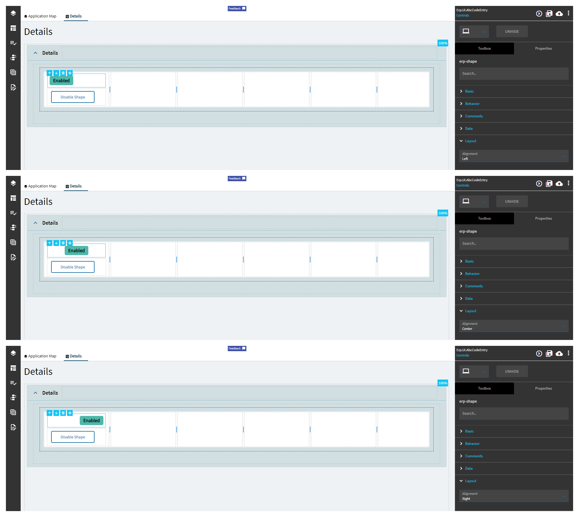
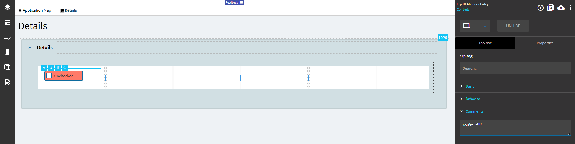
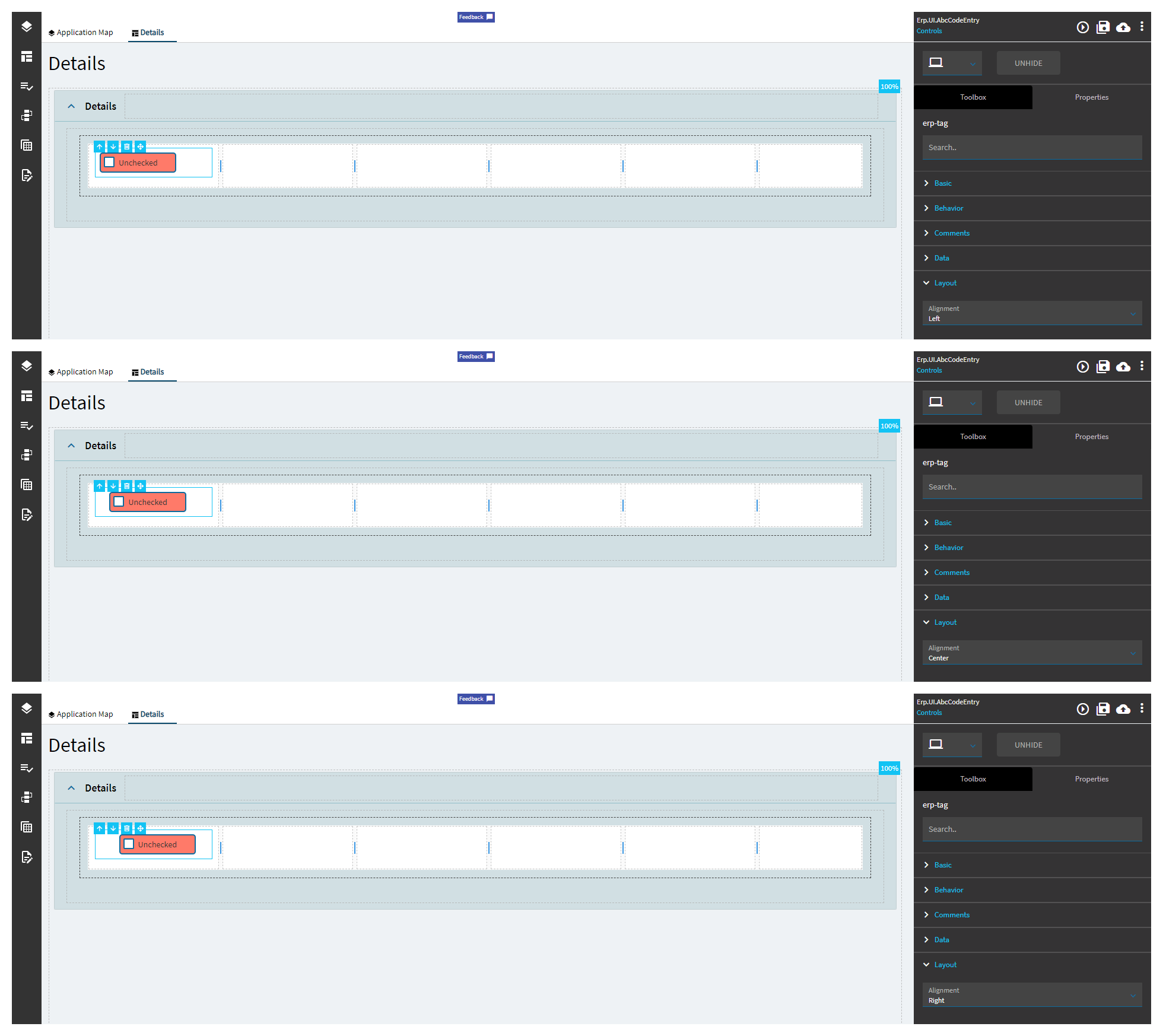
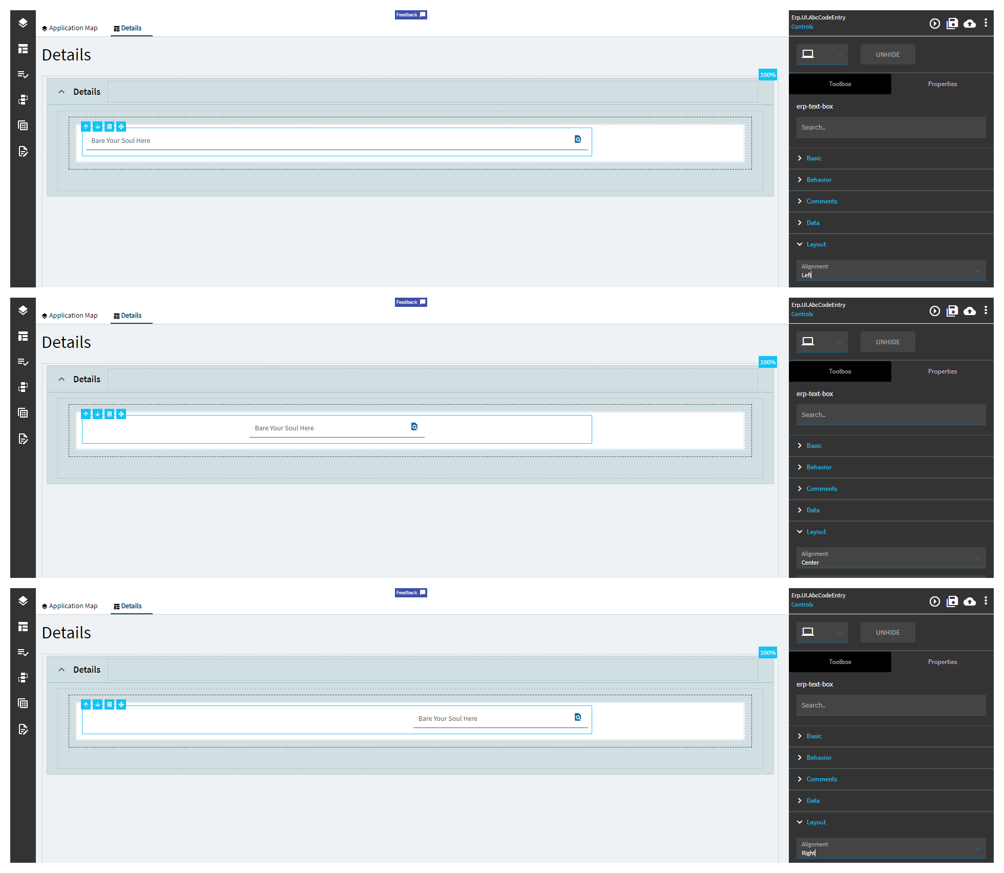
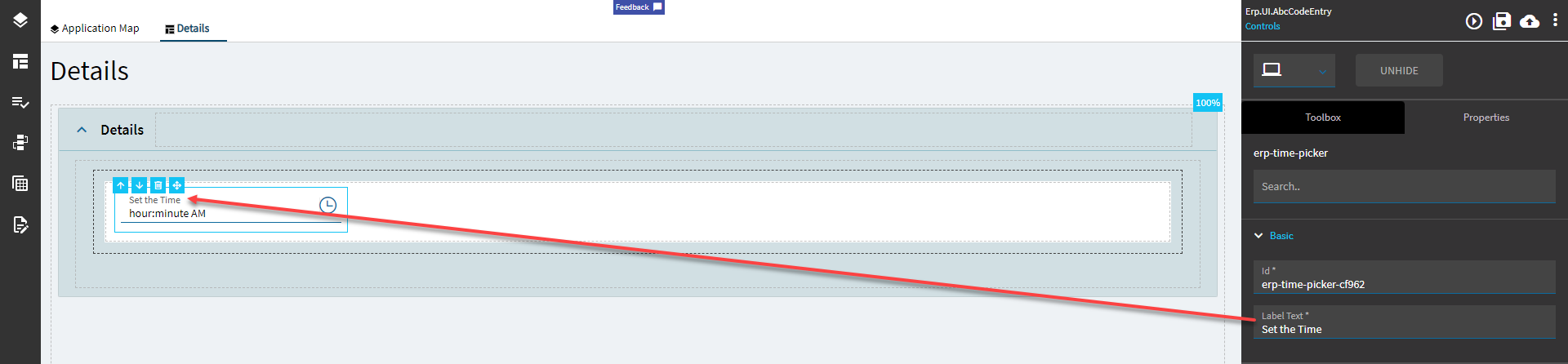
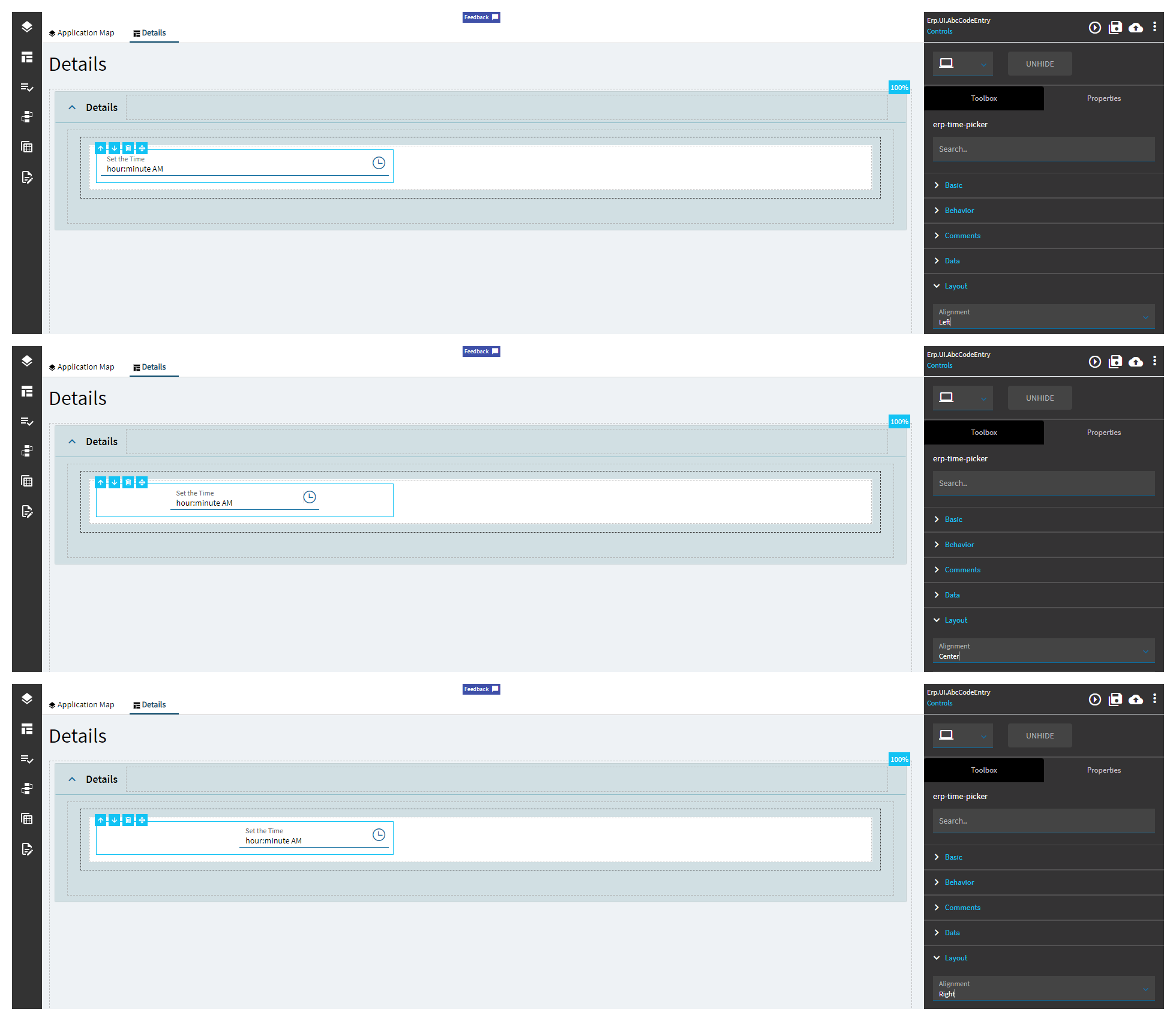
Layout
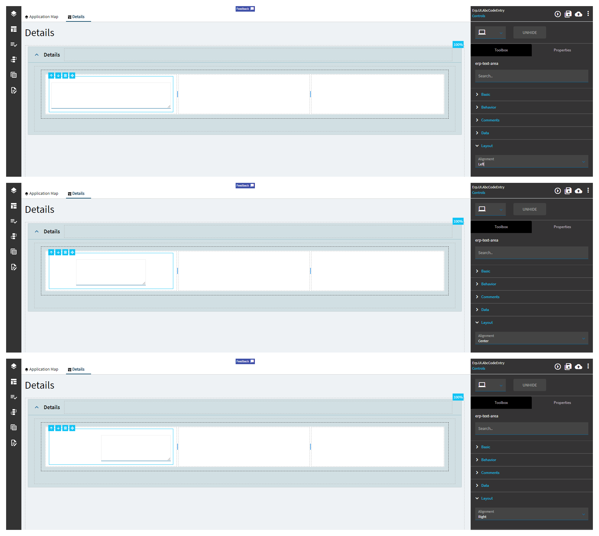
Alignment
Sets the alignment of the control. (Fig. B)
State
Personalizable
If true, a user can personalize this component(hide/show)
State
Customizable
If true, a user can customize this component in child layers
State
Hidden
Hides the control from view.
State
Disabled
Disables the control. The control will not allow editing or focus.
State
Read Only
Makes the control read only so that it will not allow editing. The control can still be focused.
Advanced
Enabled Caption
Set the text to show when the shape is enabled.
Advanced
Disabled Caption
Set the text to show when the shape is disabled.
Advanced
Status
Set the status to change the color of the shape. Valid options include: OK, Warning, Stop, Global, and None which are Green, Yellow, Red, Blue, and None, respectively.
Add some developer notes to the control. These are not customer-facing and are only visible in App Studio (Fig. A)
Data
Key Field
Indicates that a bound component is a key field. If true, the field is enabled if there is no current record, allowing the user to select an existing record or create a new one. Not applicable.
Data
Data
This is where you bind the pages to tabs.
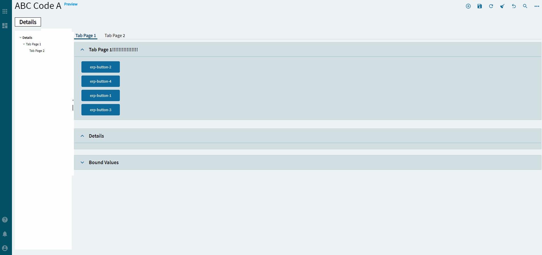
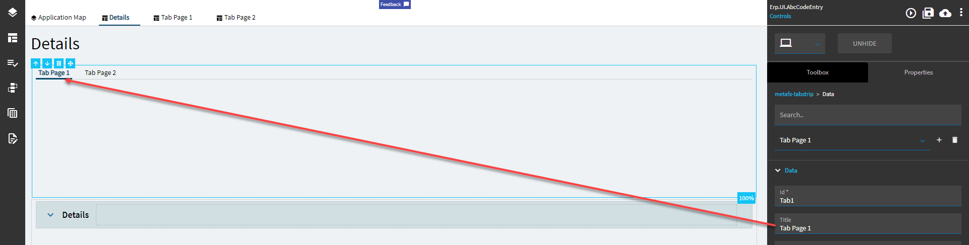
Data > Data
Id
Unique ID for the tab.
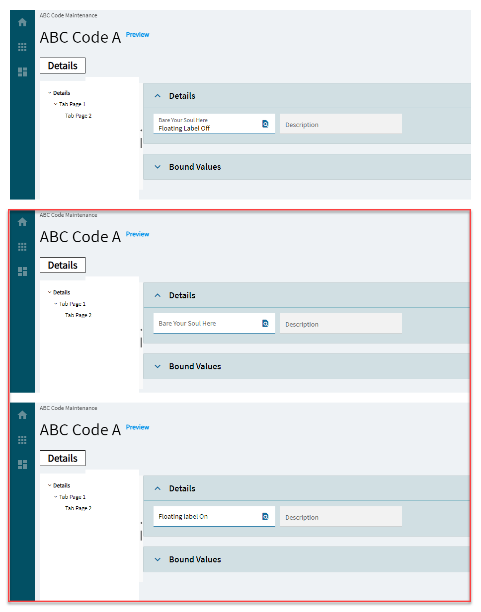
Data > Data
Title
Title for the tab. (Fig. B)
Data > Data
EpBinding
EpBinding for the tab in the format of DataView.Column. You can use this to enact row rules on the tab (like hiding or showing by user or something).
Allows users to have different colored labels and checkboxes for different statuses.
Property Group
Property
Description
Basic
Id
Unique identifier for the control
Behavior
On Blur
Click this to create an OnBlur event for the control. On Blur is triggered when the control loses focus.
Behavior
On Create
Click this to create an OnCreate event for the control On Create is triggered when the control is painted to the GUI.
Comments
Comments
Add some developer notes to the control. These are not customer-facing and are only visible in App Studio (Fig. A)
Data
Key Field
Indicates that a bound component is a key field. If true, the field is enabled if there is no current record, allowing the user to select an existing record or create a new one.
Data
EpBinding
Bind the control to a DataView.Column.
Layout
Alignment
Sets the alignment of the control. (Fig. B)
State
Personalizable
If true, a user can personalize this component(hide/show)
State
Customizable
If true, a user can customize this component in child layers
State
Hidden
Hides the control from view.
State
Disabled
Disables the control. The control will not allow editing or focus.
State
Read Only
Makes the control read only so that it will not allow editing. The control can still be focused.
Advanced
True Caption
Set the caption on the shape when the checkbox is true.
Advanced
True Status
Set the shape color when the checkbox is true. Valid options include: OK, Warning, Stop, Global, and None for Green, Yellow, Red, Blue, and None, respectively.
Advanced
False Caption
Set the caption on the shape when the checkbox is false.
Advanced
False Status
Set the shape color when the checkbox is false. Valid options include: OK, Warning, Stop, Global, and None for Green, Yellow, Red, Blue, and None, respectively.
Click this to create an OnBlur event for the control. On Blur is triggered when the control loses focus.
Behavior
On Create
Click this to create an OnCreate event for the control On Create is triggered when the control is painted to the GUI.
Comments
Comments
Add some developer notes to the control. These are not customer-facing and are only visible in App Studio (Fig. A)
Data
Key Field
Indicates that a bound component is a key field. If true, the field is enabled if there is no current record, allowing the user to select an existing record or create a new one.
Data
EpBinding
Bind the control to a DataView.Column.
Layout
Alignment
Sets the alignment of the control. (Fig. C)
State
Personalizable
If true, a user can personalize this component(hide/show)
State
Customizable
If true, a user can customize this component in child layers
State
Hidden
Hides the control from view.
State
Disabled
Disables the control. The control will not allow editing or focus.
State
Read Only
Makes the control read only so that it will not allow editing. The control can still be focused.
State
Auto Focus
When enabled, the control is automatically focused on creation.
Advanced
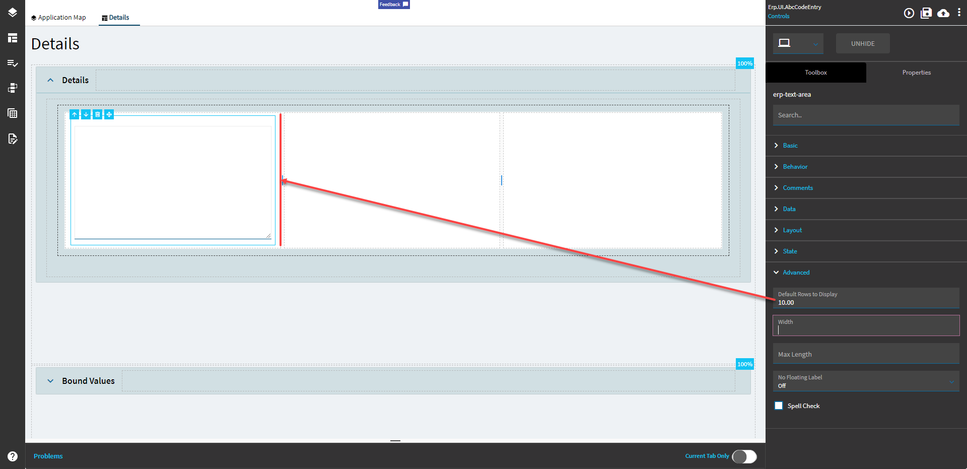
Default Rows to Display
Default number of rows to be displayed in the text area. (Fig. D)
Advanced
Width
Sets the specific width (pixels) for the control. Doesn’t work.
Advanced
Max Length
Maximum number of characters allowed in text area. Doesn’t work.
Sets the label within the control. Doesn’t do anything. (Fig. A)
Behavior
On Search Click
Click this to create an OnSearchClick event for the control.
Behavior
On Blur
Click this to create an OnBlur event for the control. On Blur is triggered when the control loses focus.
Behavior
On Create
Click this to create an OnCreate event for the control On Create is triggered when the control is painted to the GUI.
Comments
Comments
Add some developer notes to the control. These are not customer-facing and are only visible in App Studio (Fig. B)
Data
Key Field
Indicates that a bound component is a key field. If true, the field is enabled if there is no current record, allowing the user to select an existing record or create a new one.
Data
EpBinding
Bind the control to a DataView.Column.
Data
Ep Binding SearchDesc
Binding for the Description element added to display a search with an additional description element. (Fig. C)
Layout
Alignment
Sets the alignment of the control. (Fig. D)
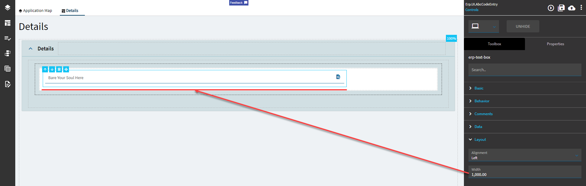
Layout
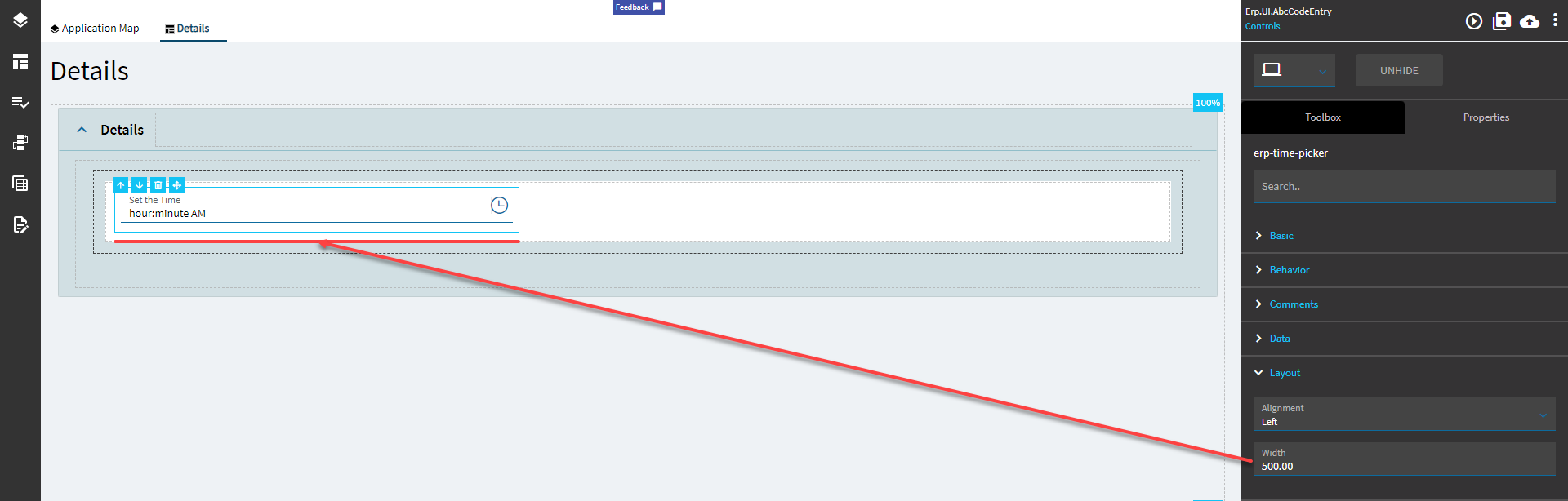
Width
Sets the specific width (pixels) for the control. (Fig. E)
State
Personalizable
If true, a user can personalize this component(hide/show)
State
Customizable
If true, a user can customize this component in child layers
State
Hidden
Hides the control from view.
State
Disabled
Disables the control. The control will not allow editing or focus.
State
Read Only
Makes the control read only so that it will not allow editing. The control can still be focused.
State
Auto Focus
When enabled, the control is automatically focused on creation.
Advanced
Max Length
Maximum number of characters allowed in the text box. Doesn’t work.
Advanced
Pattern
Force input to match this regular expression. Doesn’t work. In fact, this fails soooo badly because it only allows numeric characters. What kind of RegEx is THAT going to be? HM? Update: Okay, it’s trying it’s hardest. Dev Tools shows an error “Qt.test is not a function”. And because of that lil nugget, it won’t let you commit your data.
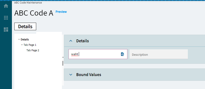
Advanced
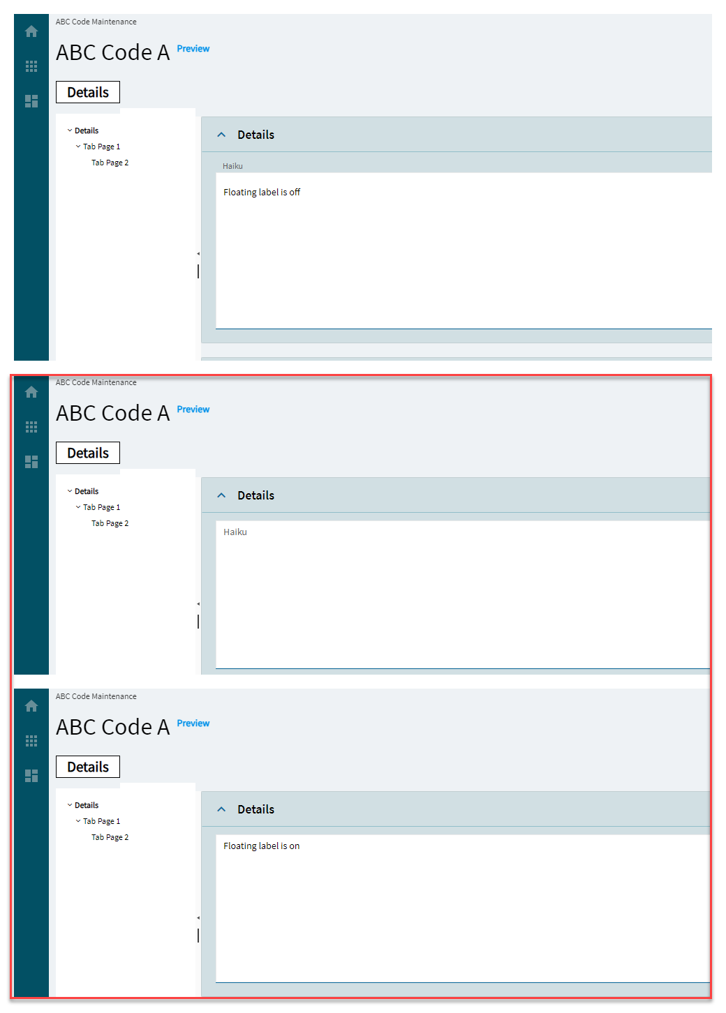
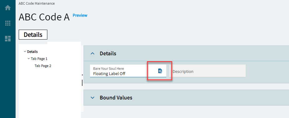
No Floating Label
Hide the floating label. (Fig. F)
Advanced
Auto Complete
Allows the browser to predict the value to be typed in the text box. Doesn’t work.
Advanced
Auto Correct
Corrects typos, capitalization errors, and misspelled words, as well as automatically inserting symbols and other pieces of text. Doesn’t work.
Advanced
Auto Capitalize
Makes text input automatically capitalized as it is entered/edited. Doesn’t work.
Advanced
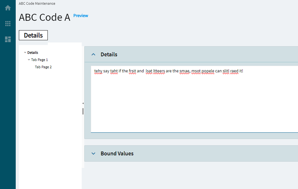
Spell Check
Enables spell check and grammar. (Fig. G)
Advanced
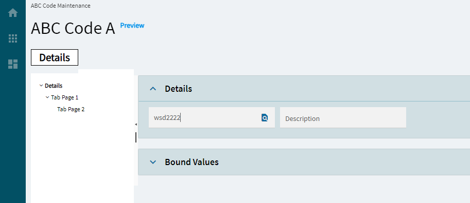
Enable Search
Enables the search button. (Fig. H)
Advanced
Search Only
Disables text entry, but leaves the search button enabled. (Fig. I)
Advanced
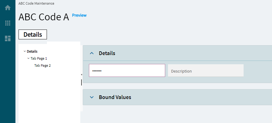
Masked
Enables the masking of the text, usually used for password fields. (Fig. J)
Advanced
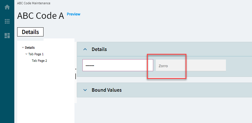
LabelText SearchDesc
Caption for the description element. Use with epBindingSearchDesc to set a custom label for the description element. (Fig. K)
Click this to create an OnBlur event for the control. On Blur is triggered when the control loses focus.
Behavior
On Create
Click this to create an OnCreate event for the control On Create is triggered when the control is painted to the GUI.
Comments
Comments
Add some developer notes to the control. These are not customer-facing and are only visible in App Studio (Fig. B)
Data
Key Field
Indicates that a bound component is a key field. If true, the field is enabled if there is no current record, allowing the user to select an existing record or create a new one.
Data
EpBinding
Bind the control to a DataView.Column.
Layout
Alignment
Sets the alignment of the control. (Fig. C)
Layout
Width
Sets the specific width (pixels) for the control. (Fig. D)
State
Personalizable
If true, a user can personalize this component(hide/show)
State
Customizable
If true, a user can customize this component in child layers
State
Hidden
Hides the control from view.
State
Disabled
Disables the control. The control will not allow editing or focus.
State
Read Only
Makes the control read only so that it will not allow editing. The control can still be focused.
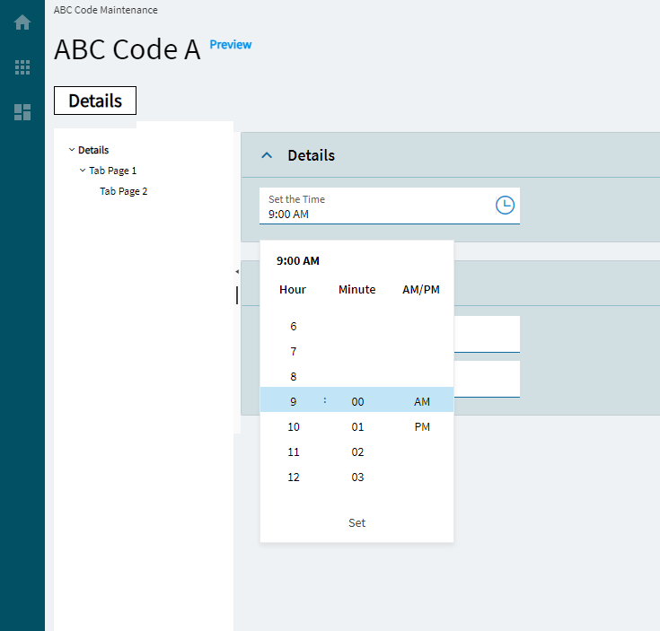
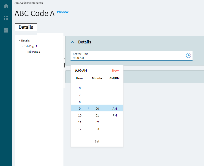
Advanced
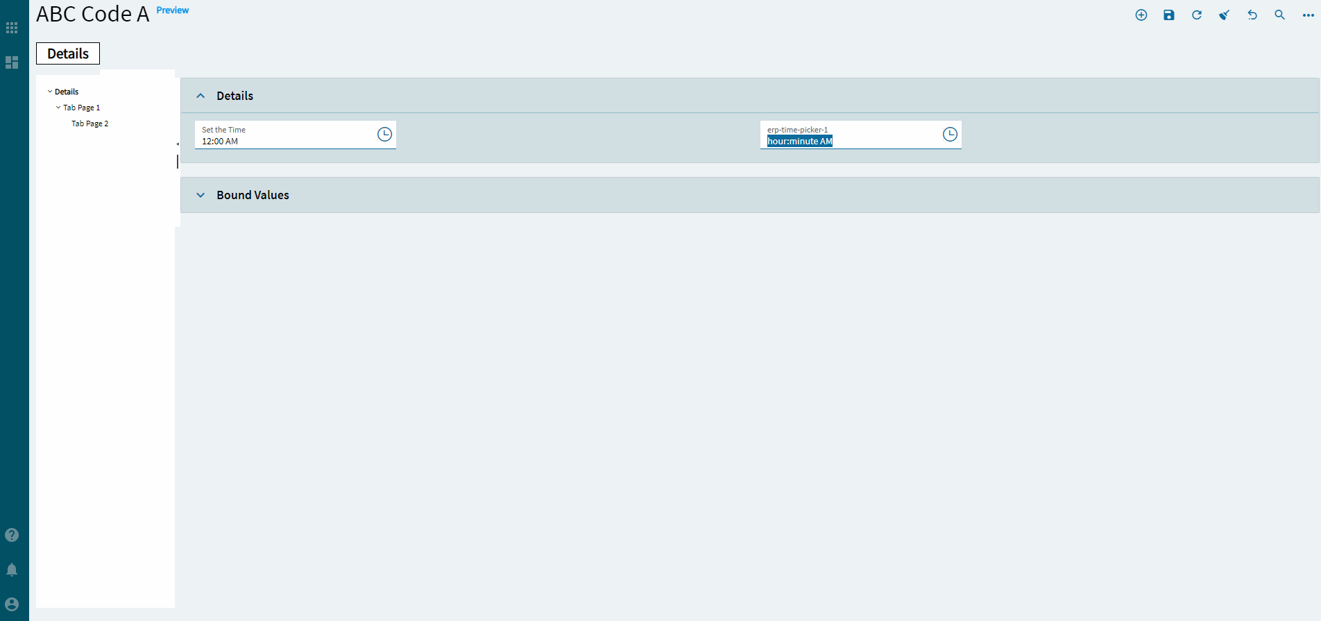
Format
Specifies the time format such as HH:mm:ss or hh:mm. The visual changes in App Studio, but nothing functionally happens.
Advanced
Now Button
Displays a Now button in the popup. (Fig. E)
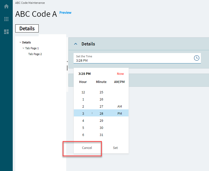
Advanced
Cancel Button
Displays a Cancel button in the popup. Or… OR… You could just click out of it? (Fig. F)
Advanced
Format Placeholder
Defines the descriptions of the format sections in the input field. Valid options include: Short, Narrow, Wide, formatPattern (Fig. G)
Advanced
Placeholder
Specifies the hint the TimePicker displays when its value is null. But it doesn’t.
Advanced
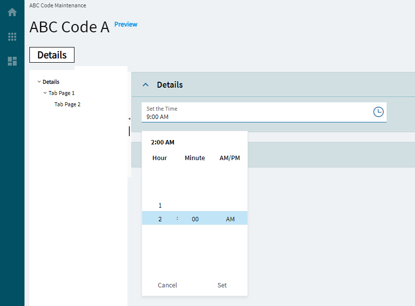
Max
Specifies the largest, valid time value. (Fig. H)
Advanced
Min
Specifies the smallest, valid time value. (Fig. H)
Advanced
Popup Settings
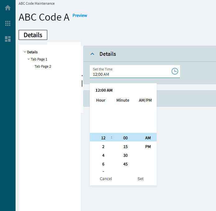
Configures the popup of the Time Picker
Advanced > Popup Settings
Animate
Controls the popup animation. By default, the open and close animations are disabled. (Fig. I)
Advanced > Popup Settings
AppendTo
Controls the popup container. By default, the popup will be appended to the root component. Couldn’t get this to do anything.
Advanced > Popup Settings
Popup Class
Specifies a list of CSS classes that are used to style the popup. Couldn’t get this to do anything.
Advanced
Steps
Configures the incremental steps of the TimePicker
Advanced > Steps
Hour
Controls the hours incremental value. (Fig. J)
Advanced > Steps
Minutes
Controls the Minutes incremental value. (Fig. J)
Advanced > Steps
Seconds
Controls the Seconds incremental value. (Fig. J)
Advanced
Range Validation
Determines whether the built-in min or max validators are enforced when the form is being validated. Couldn’t get this to do anything.
Advanced
ReadOnly Input
Sets the read-only state of the TimePicker input field. Note: this does not gray out the field.
Advanced
Mask
Override the default display format for the time value using standard DateTime formats. Examples: hh:mm:ss (01:02:34.75), hh:mm TT (01:02 AM), h:mm:ss TT (1:02 AM) (Fig. K)
Advanced
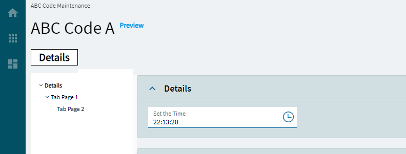
Use 24Hour Clock
Determines whether to use the 24H clock. (Fig. L)
Advanced
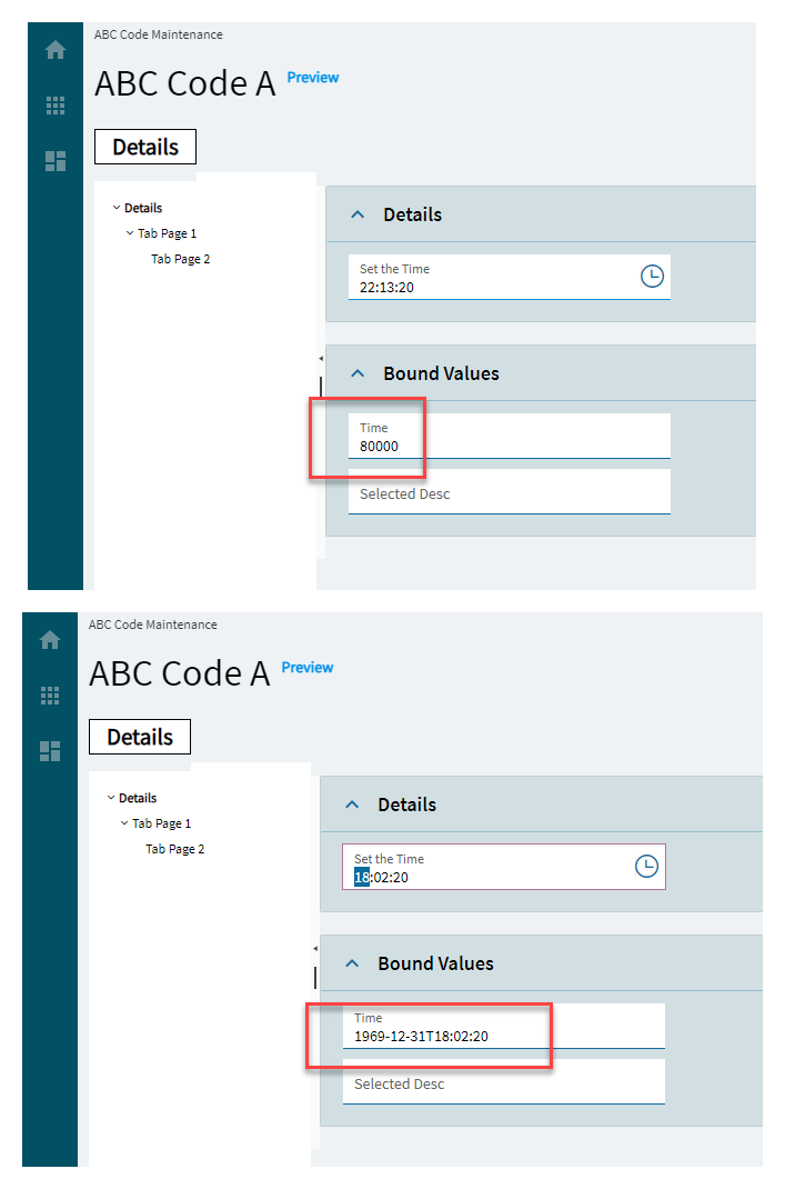
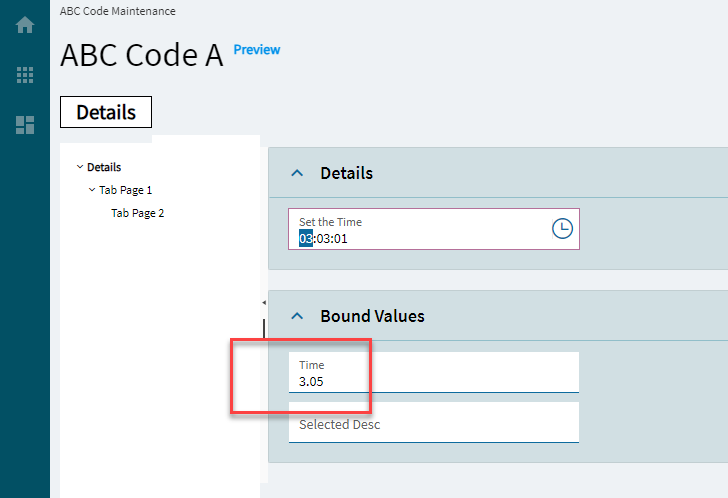
Time Stored As Date Time
Determines whether to store the selected time as datetime or an integer (seconds from midnight). (Fig. M)
Advanced
Is Decimal
Determines whether to store the time as a decimal. (Fig. N)
Advanced
Round To Minutes
Specifies whether to round off seconds to minutes. Doesn’t work.
Bonus thing to know about tabstrip is we did not really intend it to be used on the page body it was for inside-card data organization but we didn’t prohibit the use on the page body therefore folks are using it in a way that doesn’t work as well as we’d like. Epicor has used it also but will be replacing it with our intended solution.
Our intended solution for this is in 2023.2 where you can join cards together into a group in studio and we strongly recommend using that instead of placing tabstrips on the page body like you are showing here. This will make more sense in 2024.1 - users will be able to group and ungroup cards in personalization, but not if you have built a custom tabstrip layout.
Thanks! This is a workable solution. Alas, it also scales the rev field larger so it wastes a lot of space on a field that is typically only a couple characters, but I guess that’s the theme in Kinetic.
Click this to create an OnBlur event for the control. On Blur is triggered when the control loses focus.
Behavior
On Create
Click this to create an OnCreate event for the control On Create is triggered when the control is painted to the GUI.
Comments
Comments
Add some developer notes to the control. These are not customer-facing and are only visible in App Studio (Fig. B)
Data
Key Field
Indicates that a bound component is a key field. If true, the field is enabled if there is no current record, allowing the user to select an existing record or create a new one.
Data
EpBinding
Bind the control to a DataView.Column. This is for the date value when the token is not used.
Data
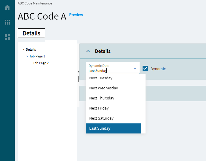
EpBinding ShowToken
Bind the control to a DataView.Column. This is for the “Dynamic” checkbox that shows true or false towards using the token.
Data
EpBinding Token
Bind the control to a DataView.Column. This stores the token value. Example: &Today+1
Layout
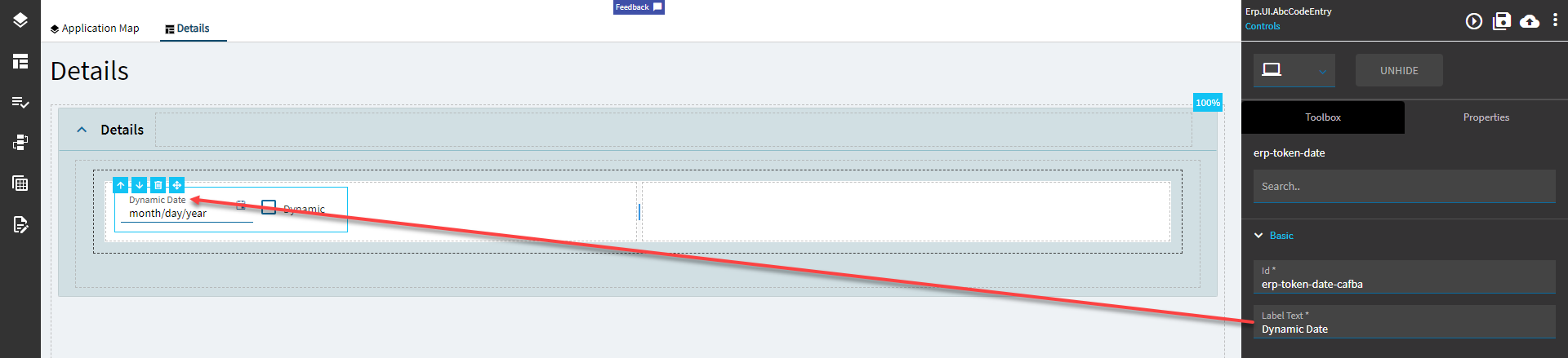
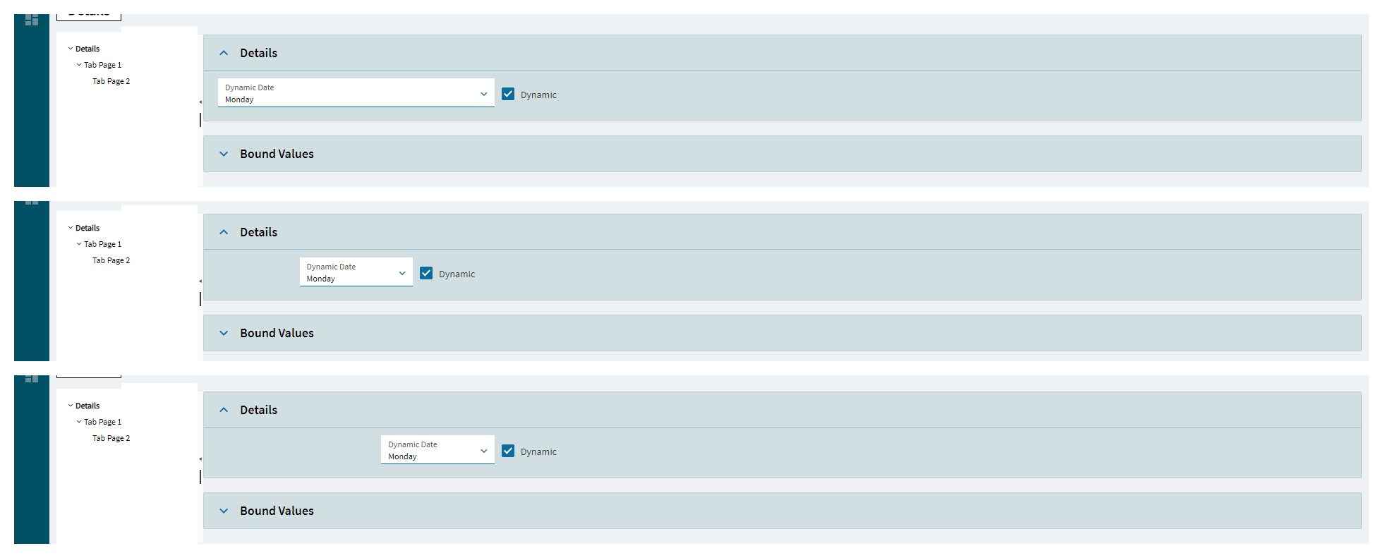
Alignment
Sets the alignment of the control. Doesn’t work without some effort. In order for this to display anything, you need to set the width property which is not inherently available. You will need to do an OnCreate event and then use the property-set widget for the width. Then this will show some visible effect. (Fig. C)
State
Personalizable
If true, a user can personalize this component(hide/show)
State
Customizable
If true, a user can customize this component in child layers
State
Hidden
Hides the control from view.
State
Disabled
Disables the control. The control will not allow editing or focus.
State
Read Only
Makes the control read only so that it will not allow editing. The control can still be focused.
State
Auto Focus
When enabled, the control is automatically focused on creation.
Advanced
Token Value
Set the default token value. Example: &Today-1 to set the value to “Yesterday”. Pro Tip. Bind the EpBinding Show Token to a string field, then put a textbox bound to the same field to see the different token values when selected.
Advanced
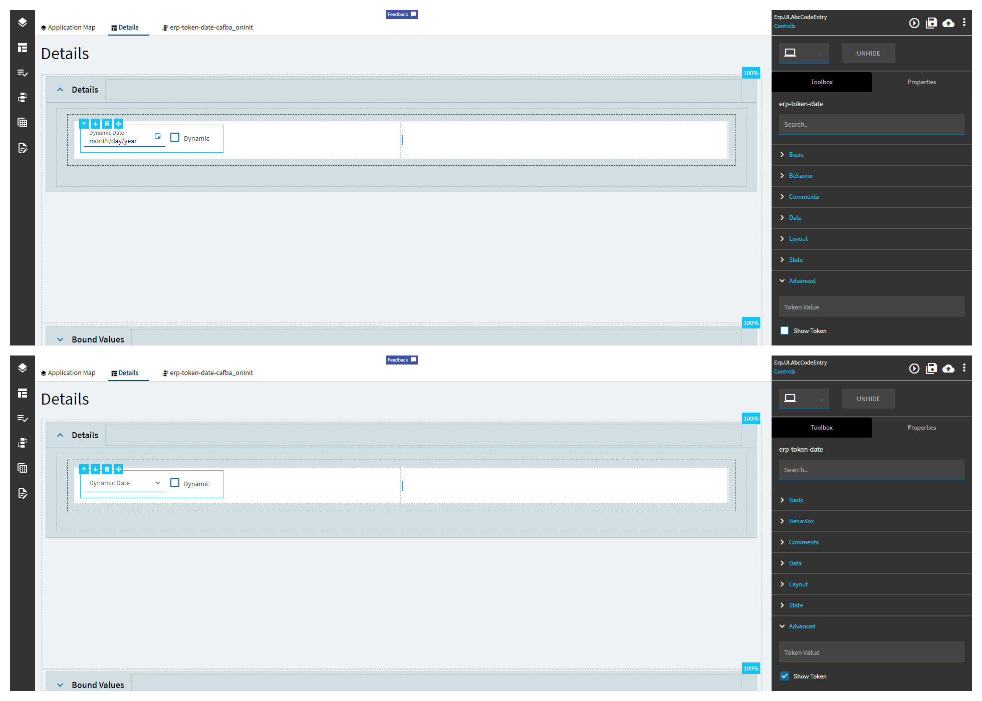
Show Token
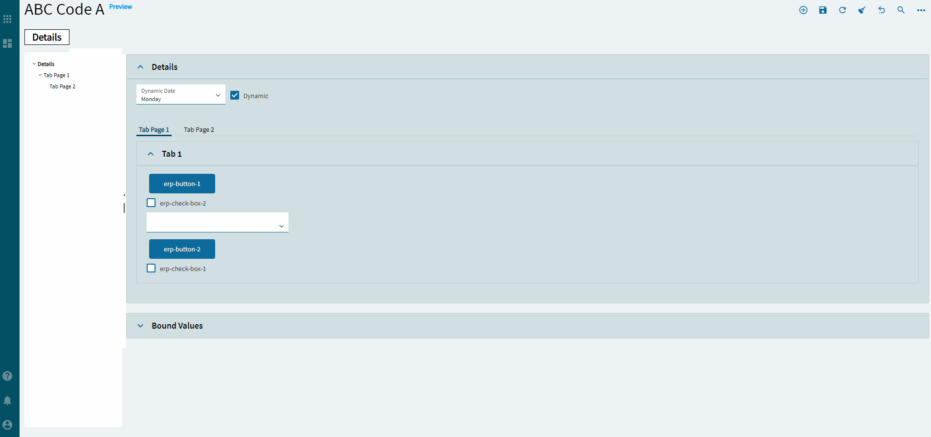
Set the flag to determine if the token dropdown should be visible. (Fig. D)
Advanced
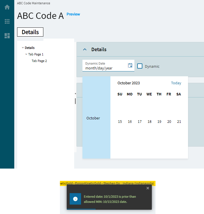
Min Allowed Date
Set the date’s minimum allowed value. (Fig. E) Note, this does not stop a user from setting a token that would go past that date.
Advanced
Max Allowed Date
Set the date’s maximumallowed value. (Fig. E) Note, this does not stop a user from setting a token that would go past that date.
Okay, so there are two of these.
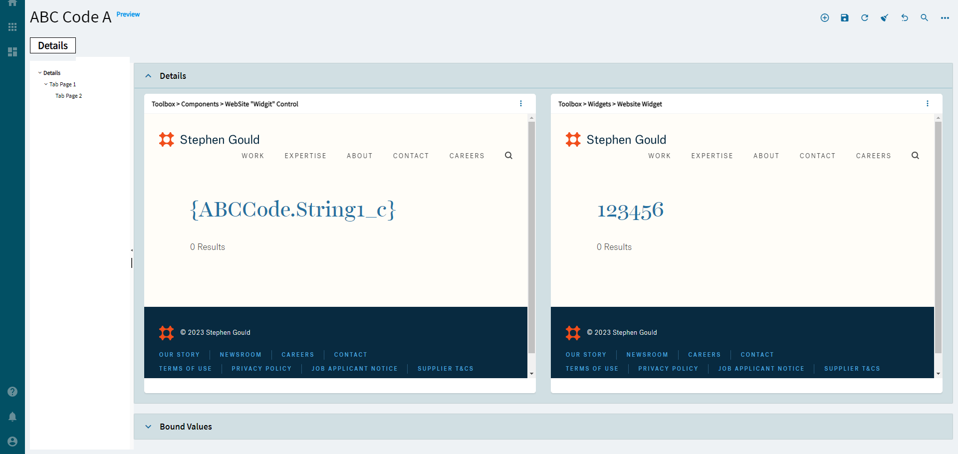
One is in Toolbox > Components > WebSite “Widigit” Control (not my spelling, don’t hurt me). We’ll call this one Web1.
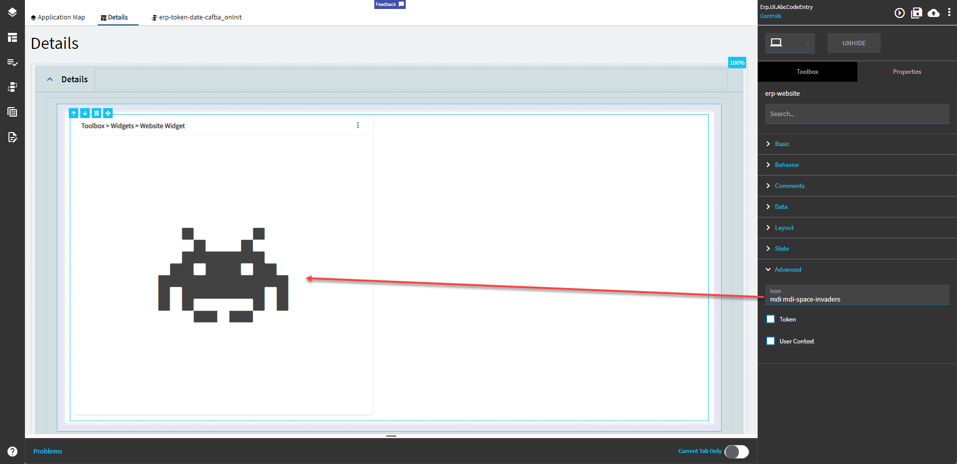
The other is in Toolbox > Widgets > Website Widget. We’ll call this Web2.
Web1 works for displaying and interacting with a website, but does not take parameters in the URL.
Web2 does the same as Web1, but also allows a user to pass in parameters.
The properties are the same, so I will only be going over the Web2 one since it can do more.
Property Group
Property
Description
Basic
Id
Unique identifier for the control
Basic
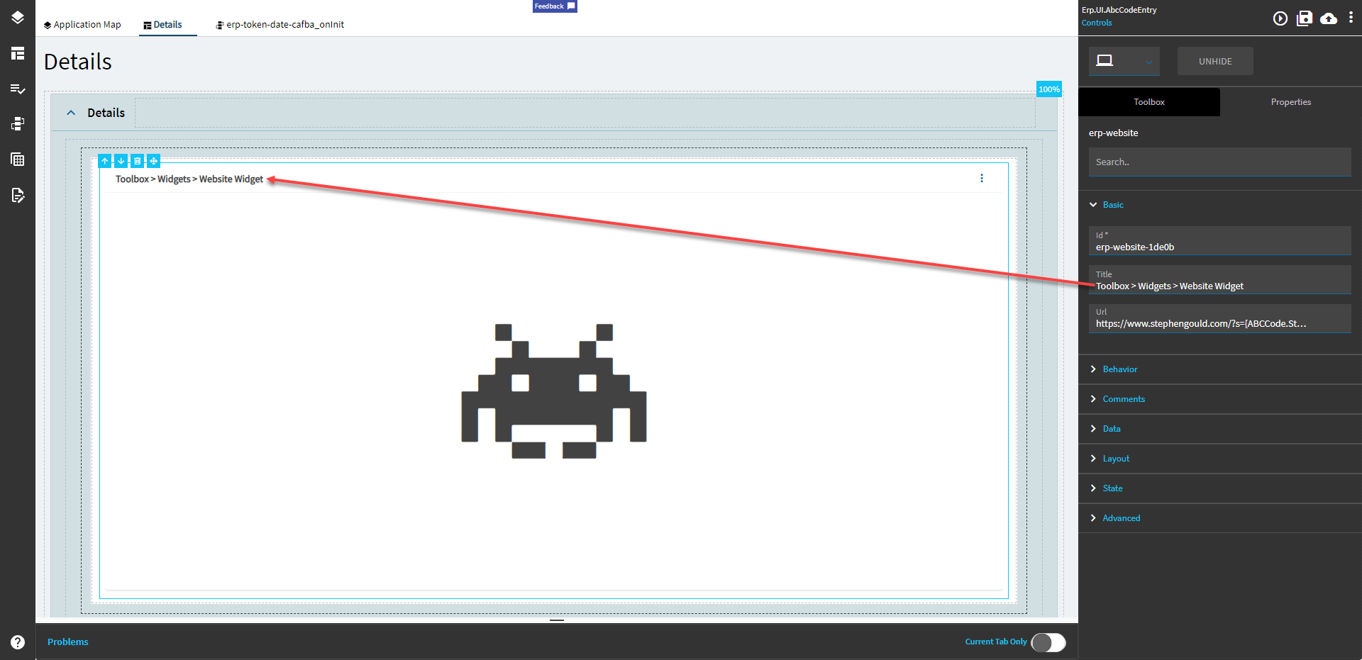
Title
Set the title of the frame. (Fig. A)
Basic
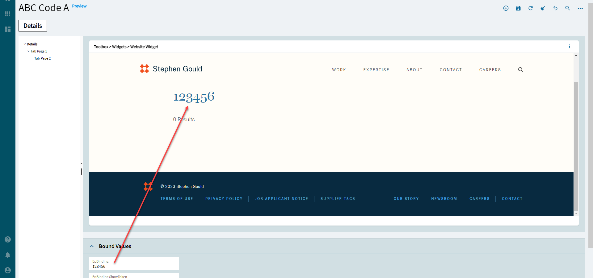
Url
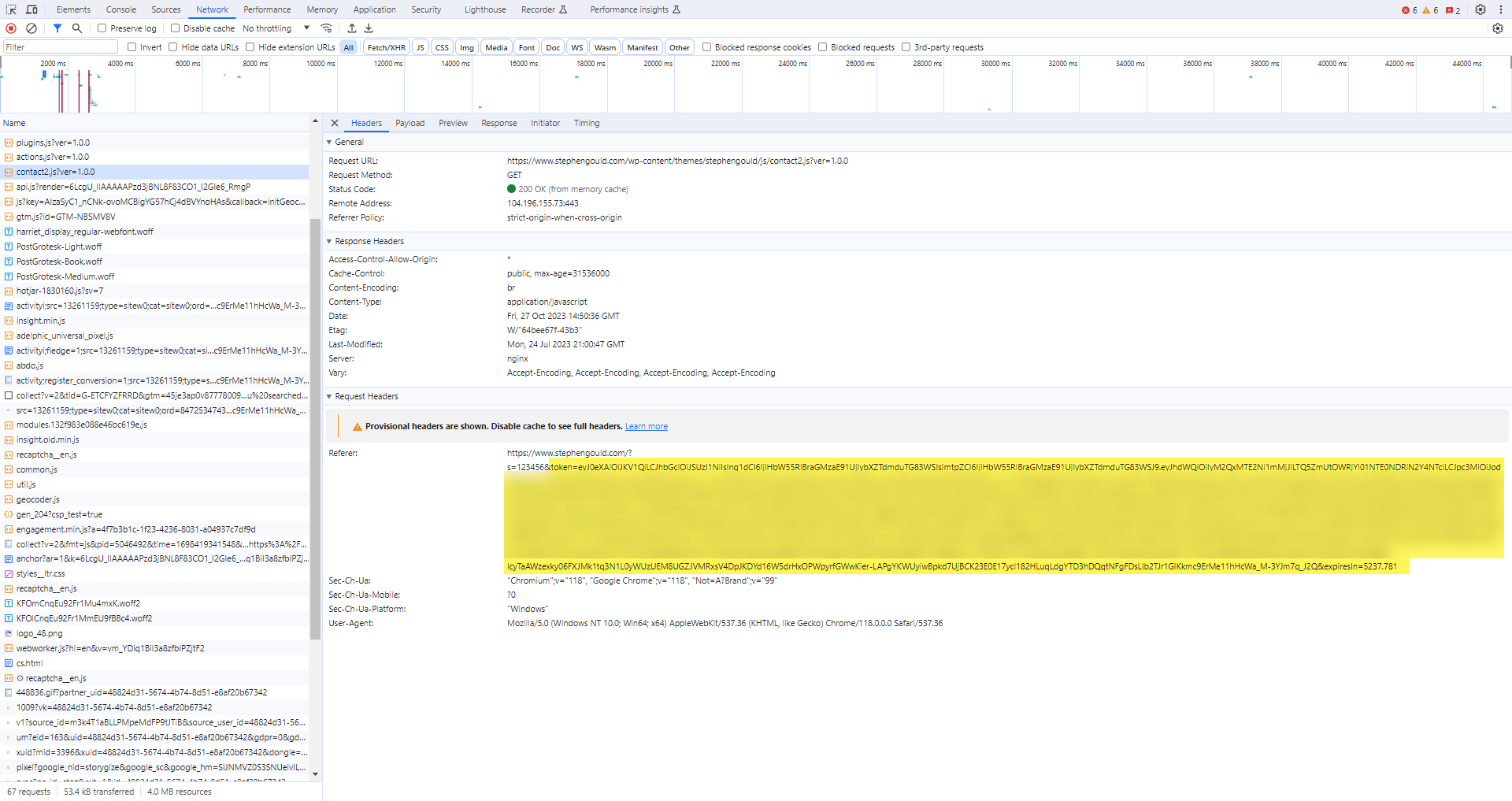
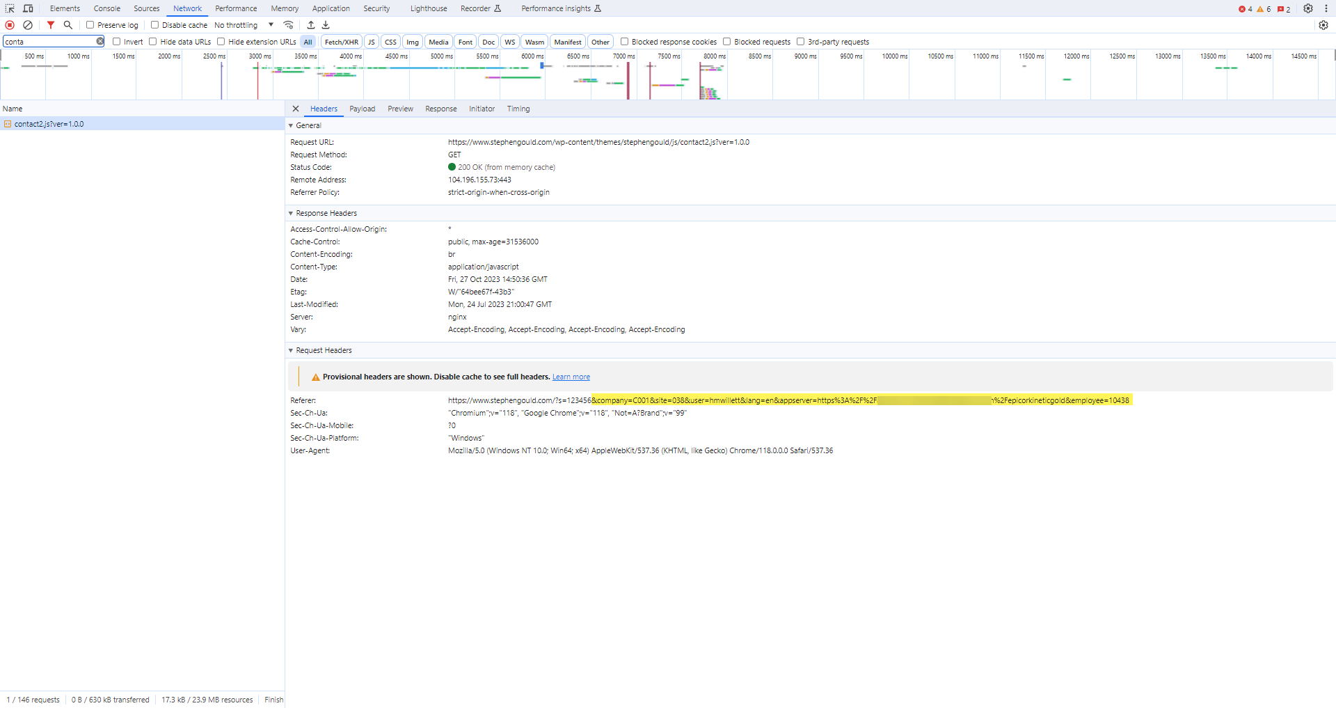
Set the URL. The website must support embedding in an IFrame and must use HTTPS. Parameterized URLs are supported. Example: https://www.stephengould.com/?s={ABCCode.String1_c} (Fig. B)
Behavior
On Blur
Click this to create an OnBlur event for the control. On Blur is triggered when the control loses focus.
Behavior
On Create
Click this to create an OnCreate event for the control On Create is triggered when the control is painted to the GUI.
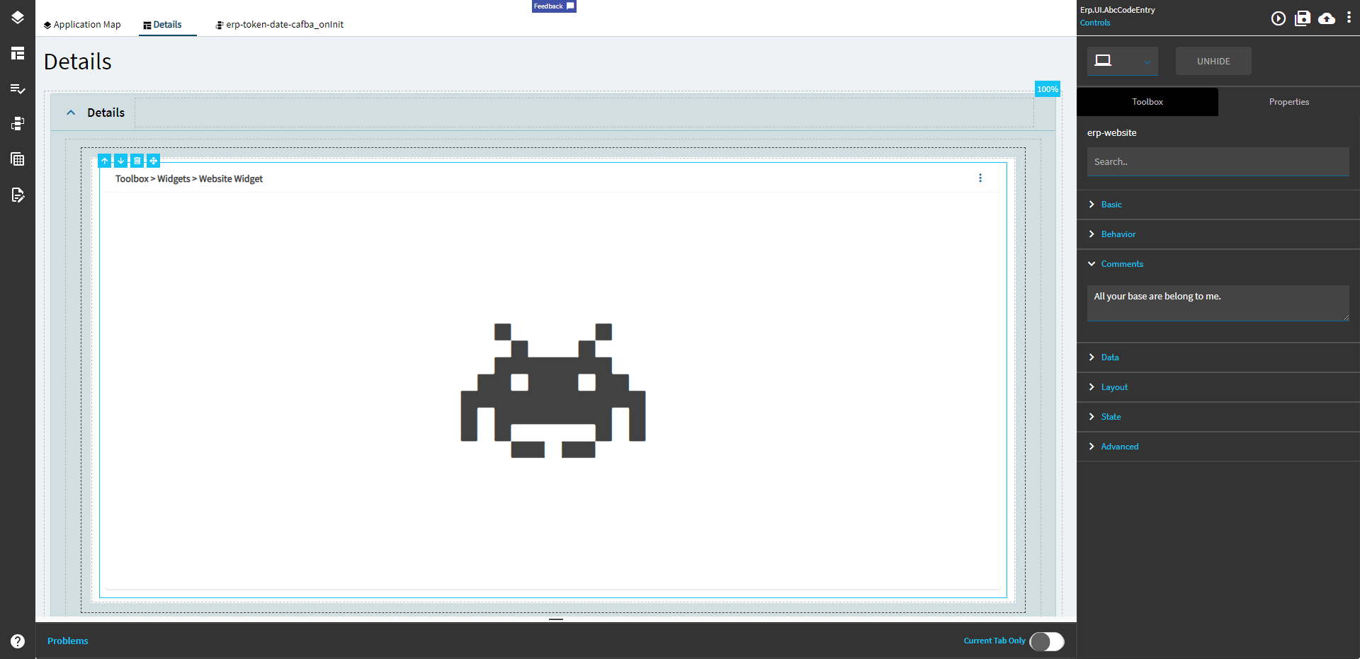
Comments
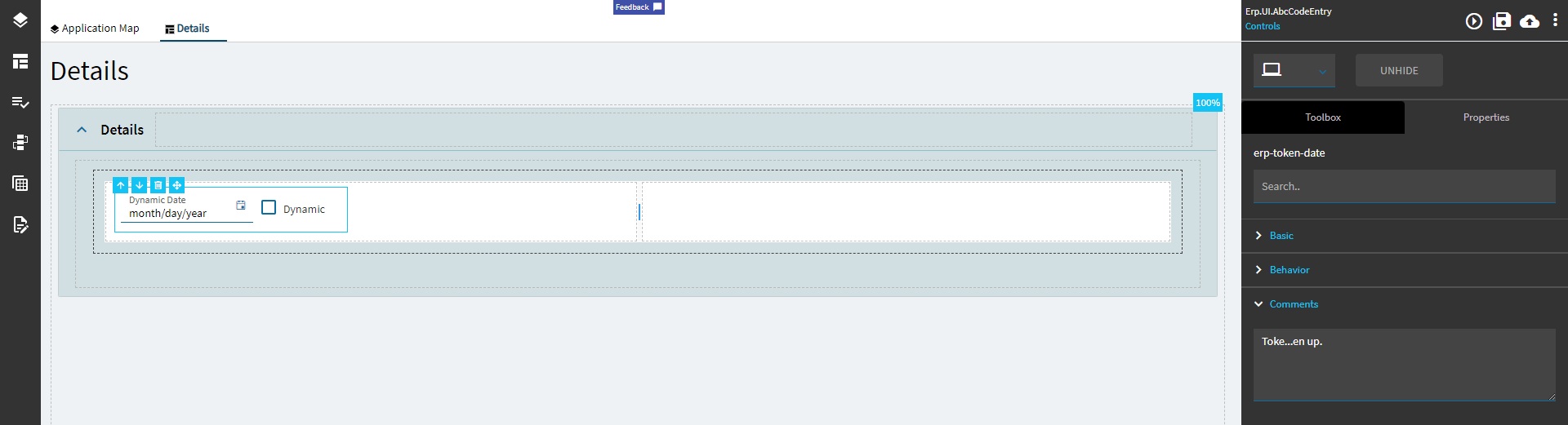
Comments
Add some developer notes to the control. These are not customer-facing and are only visible in App Studio (Fig. C)
Data
Key Field
Indicates that a bound component is a key field. If true, the field is enabled if there is no current record, allowing the user to select an existing record or create a new one.
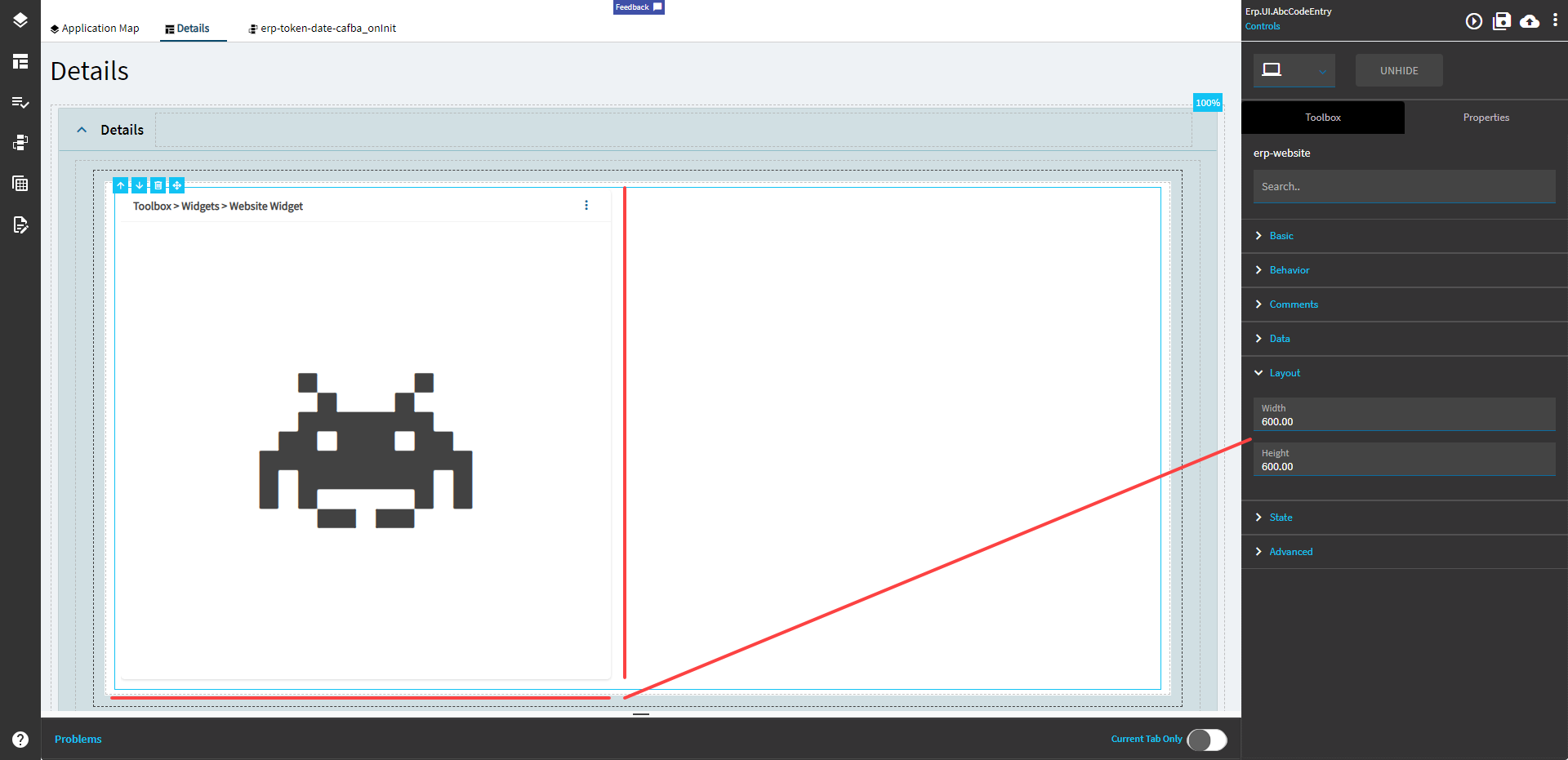
Layout
Width
Sets the specific width (pixels) for the control. (Fig. D)
Layout
Height
Sets the specific height (pixels) for the control. (Fig. D)
State
Personalizable
If true, a user can personalize this component(hide/show)
State
Customizable
If true, a user can customize this component in child layers
Note: You can also make your own.
I’ll show that in another post. Eventually. Maybe?
**Edit: Looks like they added a way to do this from the App Studio landing page. The method I used previously involved creating the JSON for it, putting it on the server, then running Conv 191. Y’all can probably figure it out from there.
 )
)
 Sets the specific width (pixels) for the control. Doesn’t work.
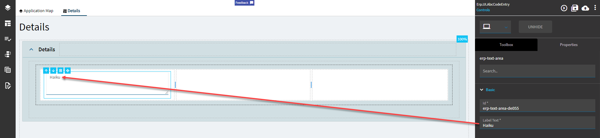


