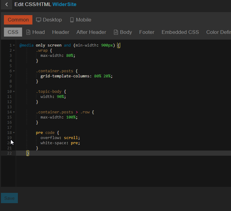
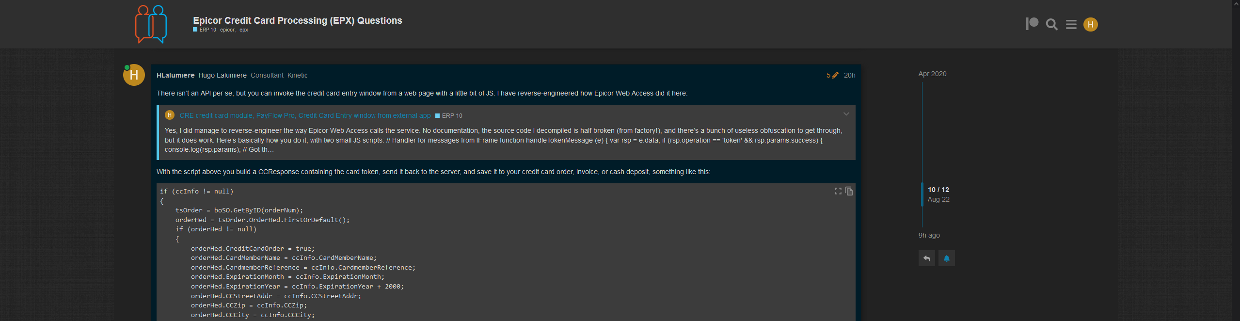
The site looks kind of dumb on high resolution displays, in 1440p over half the maximized window is lost in gigantic margins, and at the same time I am constantly having to deal with line wraps as I try to read code on here…
With a couple of simple tweaks, using the browser addon Stylus, I have had the following styles injected into this site for a while now. I have wrapped the thing in a media query so it doesn’t affect the responsive phone layout.
I can live with using the addon, but the new layout looks better at all resolutions anyway, so I figured I might as well propose you implement it site-wide…
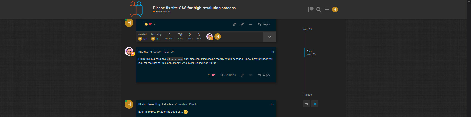
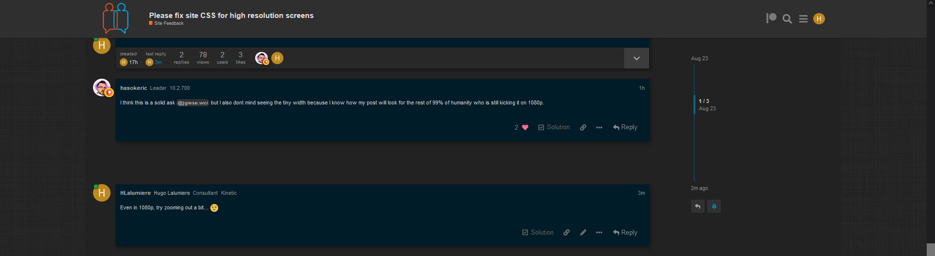
I think this is a solid ask @jgiese.wci but I also dont mind seeing the tiny width because I know how my post will look for the rest of 99% of humanity who is still kicking it on 1080p.
I’ve created a component with this fix and enabled it for Dark, Light and Rainbow themes… Let’s see how many people’s cheese gets moved by this. I definitely think its too wide for my own taste, but I could get used to it.
UGH I’m having strong feelings about this one haha its causing my brain to go all wonky. The sentences on posts being longer than 80-90 characters is definitely abnormal makes it hard to read a paragraph. I’m throwing a poll on this let’s see how the “general” public feels about it.
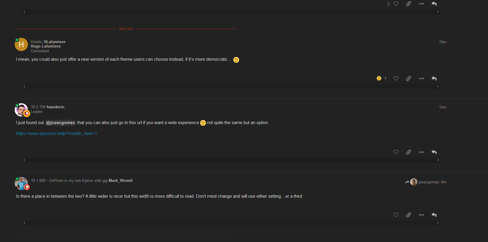
We can always have a theme that is wider for those who like it…(or narrow)
Is there a place in between the two? A little wider is nicer but this width is more difficult to read. Don’t mind change and will use either setting…or a third.
And can’t we do media queries instead of voting on one setting?