Please fix site CSS for high resolution screens

What’s abnormal? I just added one component changed nothing else. (Screen shot of what you are seeing , also do a hard refresh)

I think your extensions are messing with you that’s not at all what it looks like for me. I cannot over-write any CSS since its an independent component, and it has now been turned off so everything is back to how it was this morning.

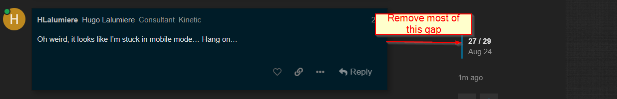
Oh weird, it looks like I’m stuck in mobile mode… Hang on…

EDIT: LOL yeah somehow when I tried mobile mode that was linked before it got “remembered”… I had to add /?mobile_view=0 and now it’s back to normal. So I guess what I thought was abnormal before was because of this. Same reason @Evan_Purdy started seeing scrollbars too!

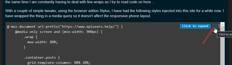
I did just test I can expand the post itself to right around 90% of this middle section without much effect. I can try that without changing anything else.

Just made this change

Also for code related issues you can always click to expand and that gives a full view of the code byitself

Or, you can just put it back to normal and I’ll keep using Stylus… :smiley:

I think this is a fair compromise for now :slight_smile:

And you fixed my half-screen margins, too. Thank you.

You know, 20 minutes ago I came here to research something relevant to my job. What happened?

BTW throw us a bone and don’t turn that on on this site. We do minimal banners but it helps keep the lights on :wink:

You wasted an hour of @josecgomez s life… (he likes to jump into rabbit holes more than Alice does)

Just because you asked nicely, I’ll add the site to the white-list… :wink:

Yeah this looks pretty good to me

Why the dumpsterfire @Aaron_Moreng did we break something? :joy:

Lol no I just enjoy the constructive conversation

Did something break? I have like ZERO px margins now, which seems a little extreme on a desktop monitor.

Maybe the site is for some reason doing a mobile rendering? My editor looks different now too!?

I don’t know why, but on just one post so far I had the following: