Gosh. This sounds like a, well, a Wiki.
Gosh. This sounds like a, well, a Wiki.
This is a basic container component. It allows you to organize additional components in a single area.
| Property Group | Property | Description |
|---|---|---|
| Basic | Id | This is the control’s unique identifier |
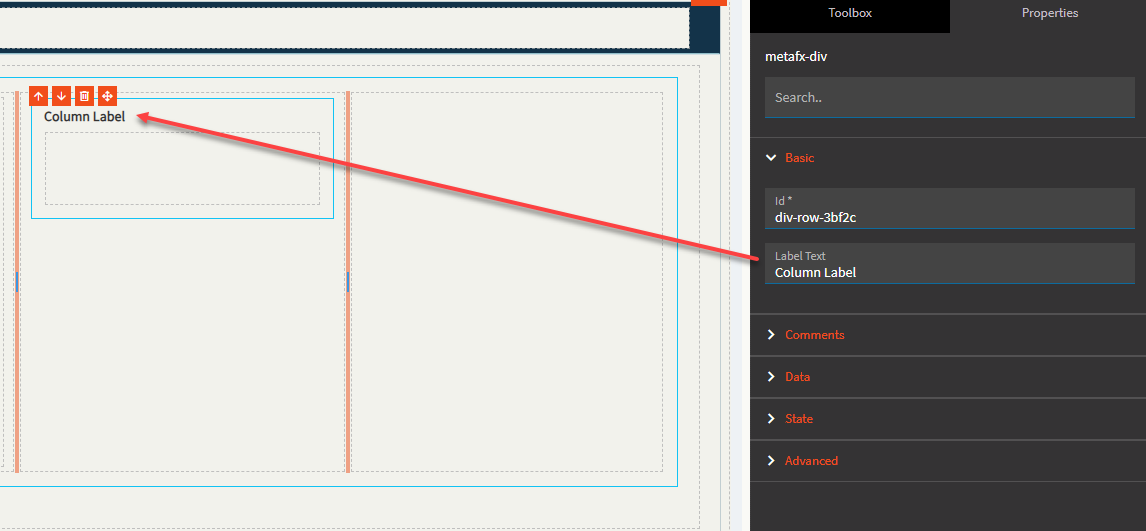
| Basic | Label Text | Give the column control a bolded header (Fig. A) |
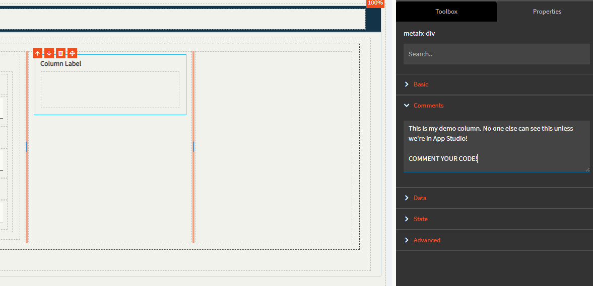
| Comments | Comments | Add some developer notes to the control. These are not customer-facing and are only visible in App Studio (Fig. B) |
| Data | Key Field | Indicates that a bound component is a key field. If true, the field is enabled if there is no current record, allowing the user to select an existing record or create a new one. Not relevant to this component |
| State | Personalizable | If true, a user can personalize this component(hide/show) |
| State | Customizable | If true, a user can customize this component in child layers |
| State | Hidden | Hide or show the component |
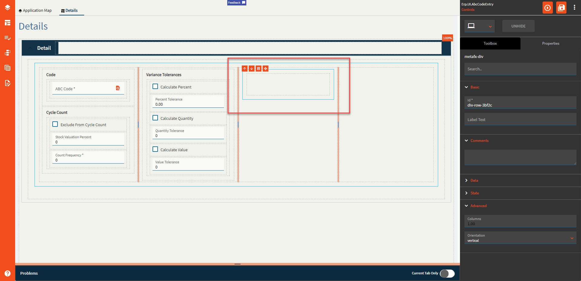
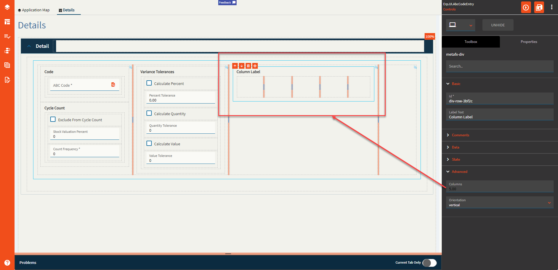
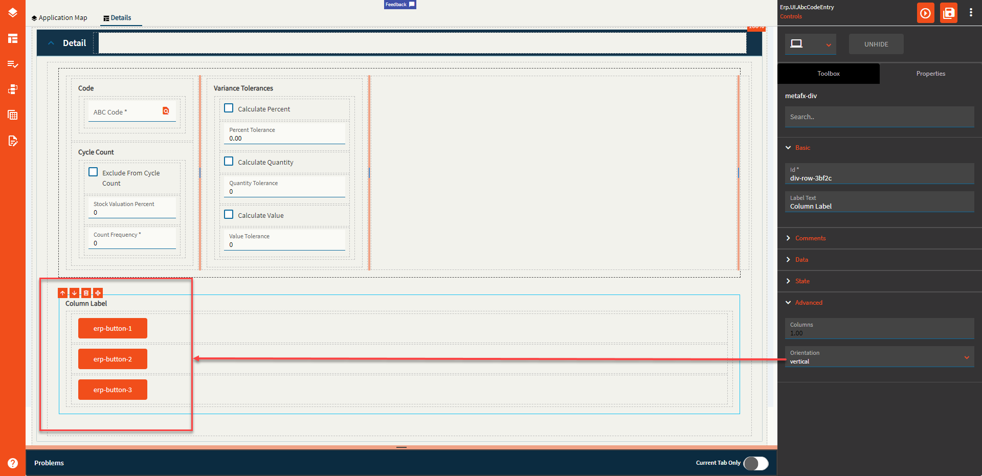
| Advanced | Columns | Changes the number of columns in this component. Valid numbers are between 1 and 10 (Fig. C) |
| Advanced | Orientation | Direction to show the controls. Options are Vertical (Fig. D) and Horizontal (Fig. E) |
Figure A: Label Text
Figure B: Comments
Figure C: Columns
Figure D: Vertical Orientation
Figure E: Horizontal Orientation
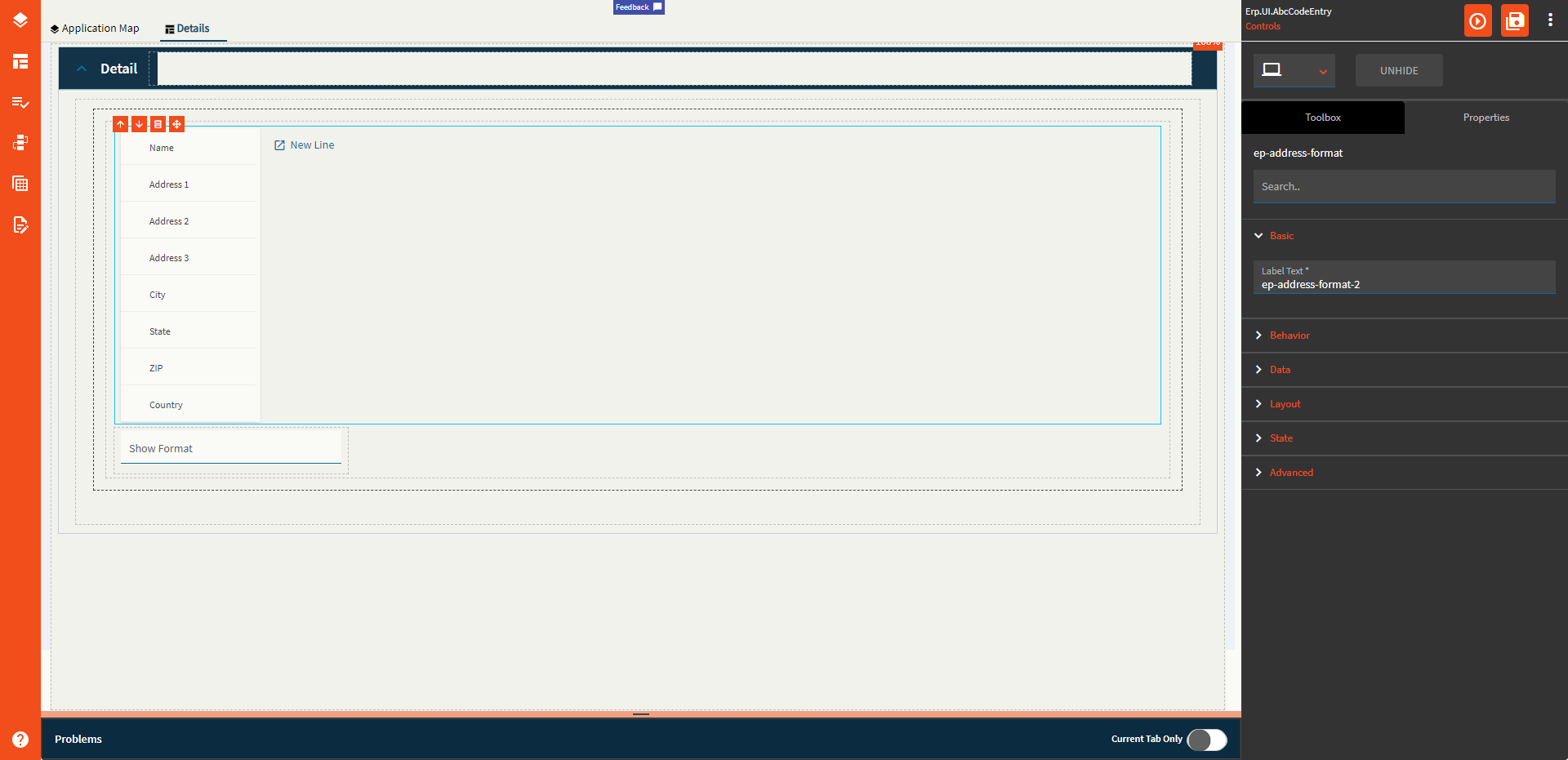
This component is used to define the format of an address. This is to be used in conjunction with some code/function to display the format in a text area properly.
| Property Group | Property | Description |
|---|---|---|
| Basic | Label Text | Typically used to give the component a header label, but this one does not appear to do much of anything. |
| Behavior | On Blur | Click this to create an OnBlur event for the control. On Blur is triggered when the control loses focus. |
| Behavior | On Create | Click this to create an OnCreate event for the control On Create is triggered when the control is painted to the GUI. |
| Data | EpBinding | This property is used to bind the data of the control to a DataView.Column such as TransView.AddressFormat. |
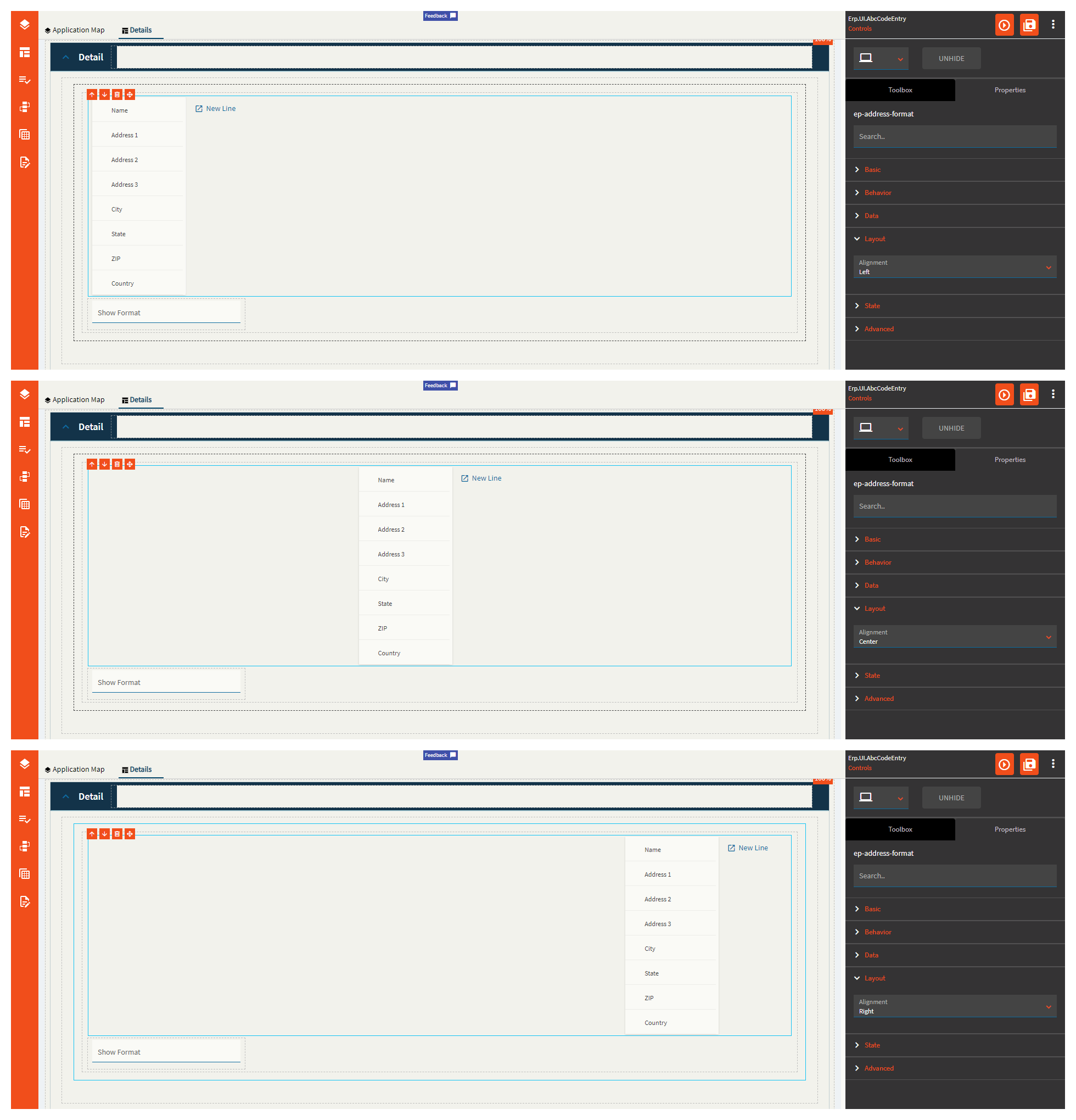
| Layout | Alignment | Set the alignment for the control (Zomg, this actually works! Most don’t). Valid options are Left, Center, Right. (Fig. A) |
| State | Hidden | Hides the control from view. |
| State | Disabled | Disables the control. The control will not allow editing or focus. |
| State | Read Only | Makes the control read only so that it will not allow editing. The control can still be focused. |
| State | Highlight Selected | Obsolete–this does nothing now. |
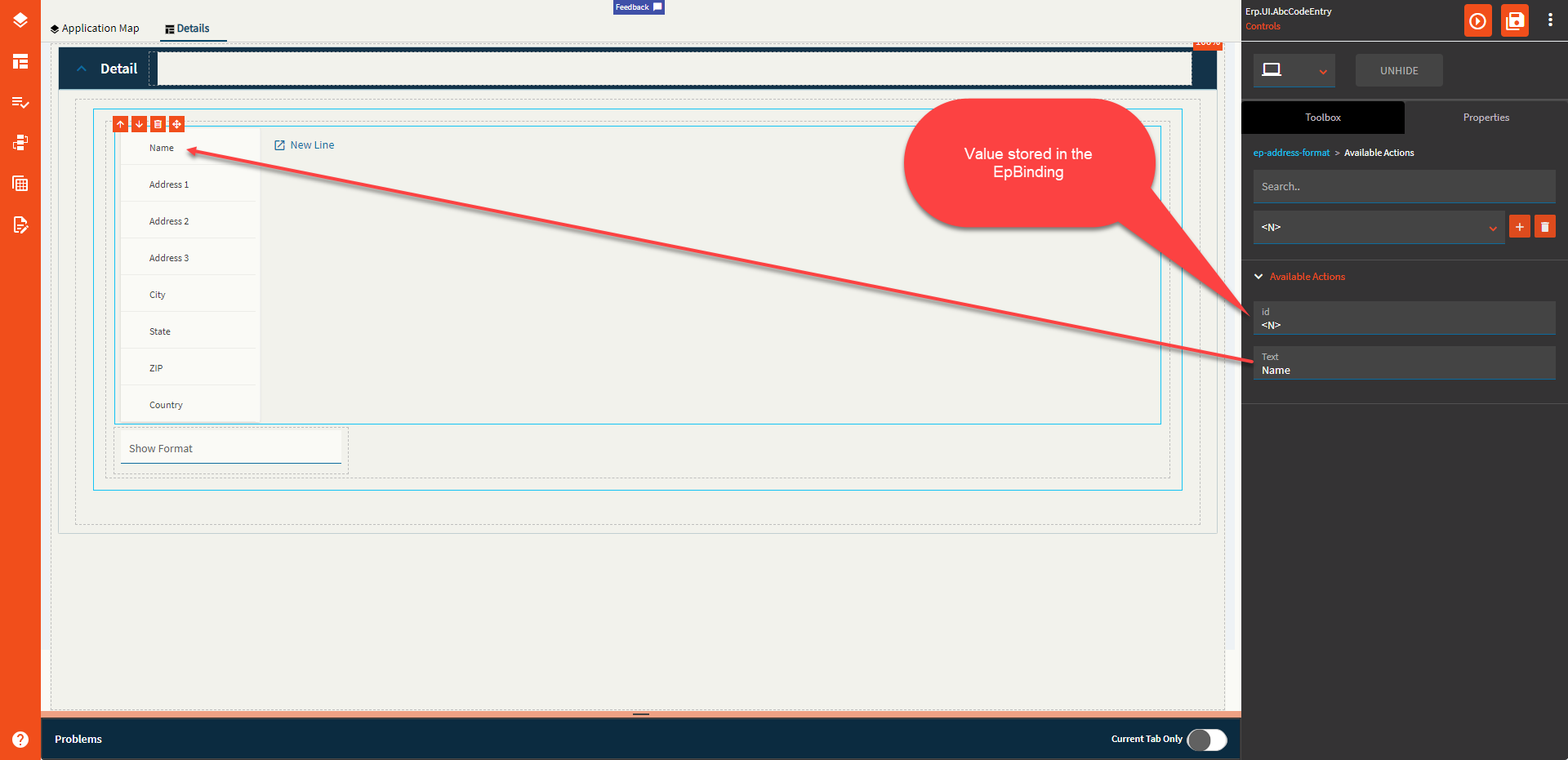
| Advanced > Available Actions | Id | Unique identifier of the list item. (Fig. B) |
| Advanced > Available Actions | Text | The text to show on the control. (Fig. B) |
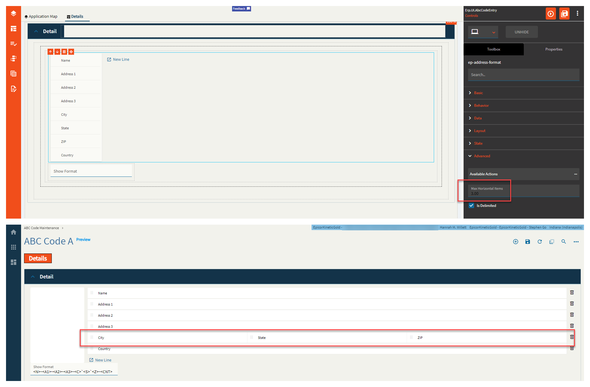
| Advanced | Max Horizontal Items | Integer value that allows control over how many items can show in a single line. (Fig. C) |
| Advanced | Is Delimited |
 (Obsolete?) The bound column shows delimited values whether this is true or false. (Obsolete?) The bound column shows delimited values whether this is true or false. |
Figure A: Alignment
Figure B: Available Actions
Figure C: Max Horizontal Items
Y’all know what a button is, right?

| Property Group | Property | Description |
|---|---|---|
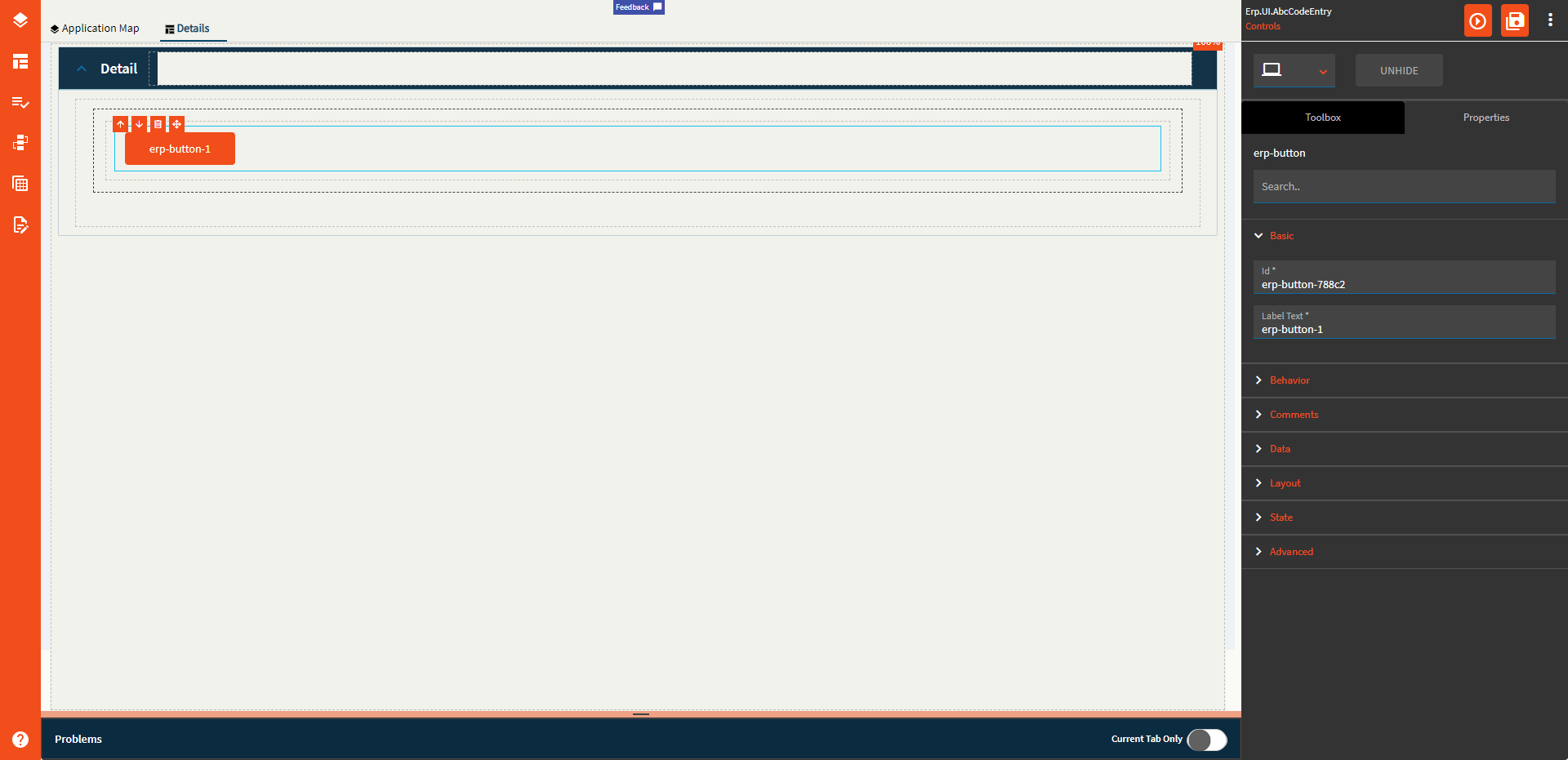
| Basic | Id | This is the control’s unique identifier |
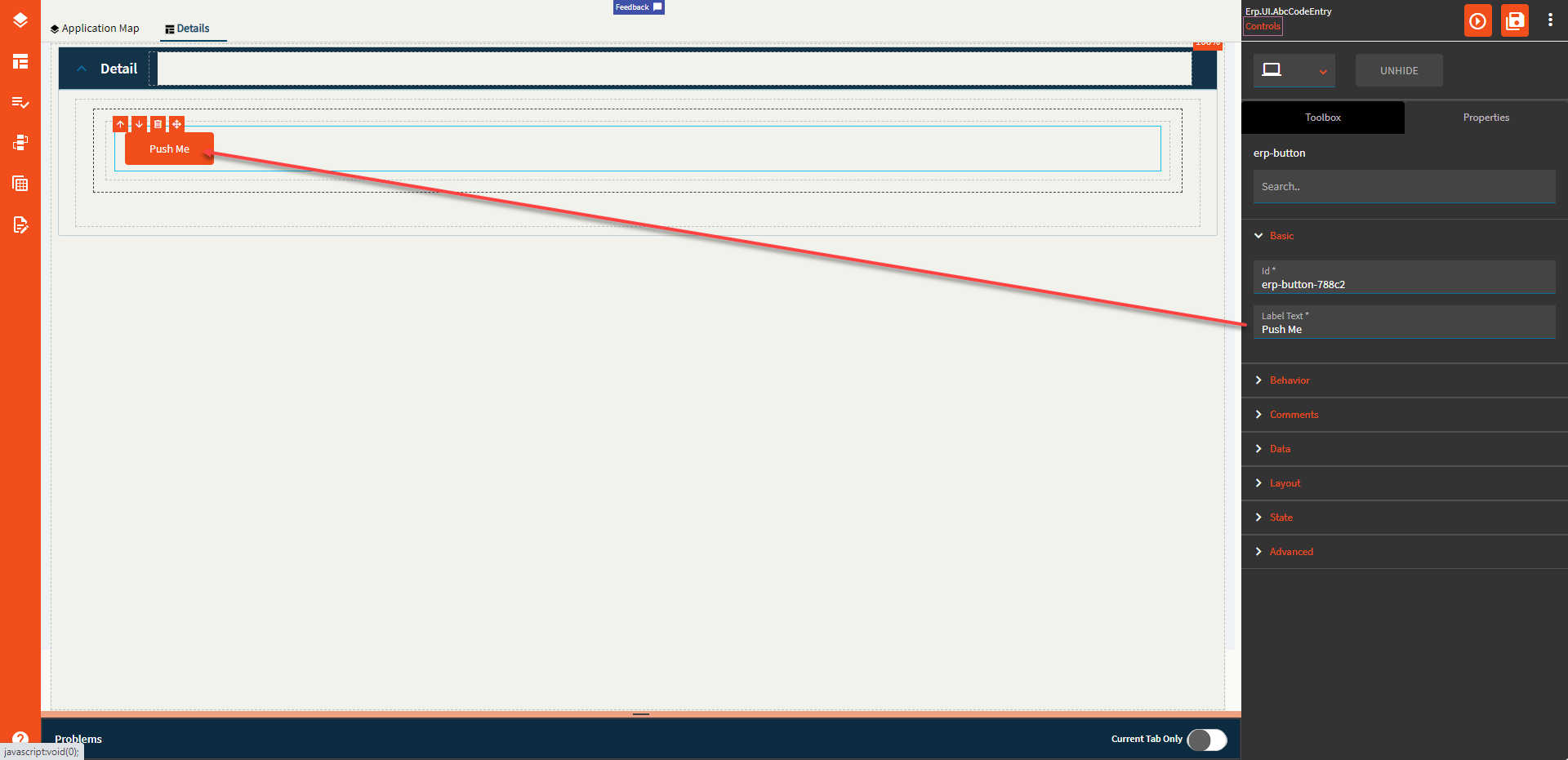
| Basic | Label Text | Alter the display text on the button (Fig. A) |
| Behavior | On Click | Click this to create an OnClick Event. On Click is triggered when a user clicks the button. |
| Behavior | On Blur | Click this to create an OnBlur event for the control. On Blur is triggered when the control loses focus. |
| Behavior | On Create | Click this to create an OnCreate event for the control On Create is triggered when the control is painted to the GUI. |
| Comments | Comments | Add some developer notes to the control. These are not customer-facing and are only visible in App Studio (Fig. B) |
| Data | Key Field | Indicates that a bound component is a key field. If true, the field is enabled if there is no current record, allowing the user to select an existing record or create a new one. Not relevant to this component |
| Data | EpBinding | Bind the button to a DataView.Column. This is useful if you want to create rules around the button such as disabling based on certain conditions. You can set the binding to disabled in the rule. |
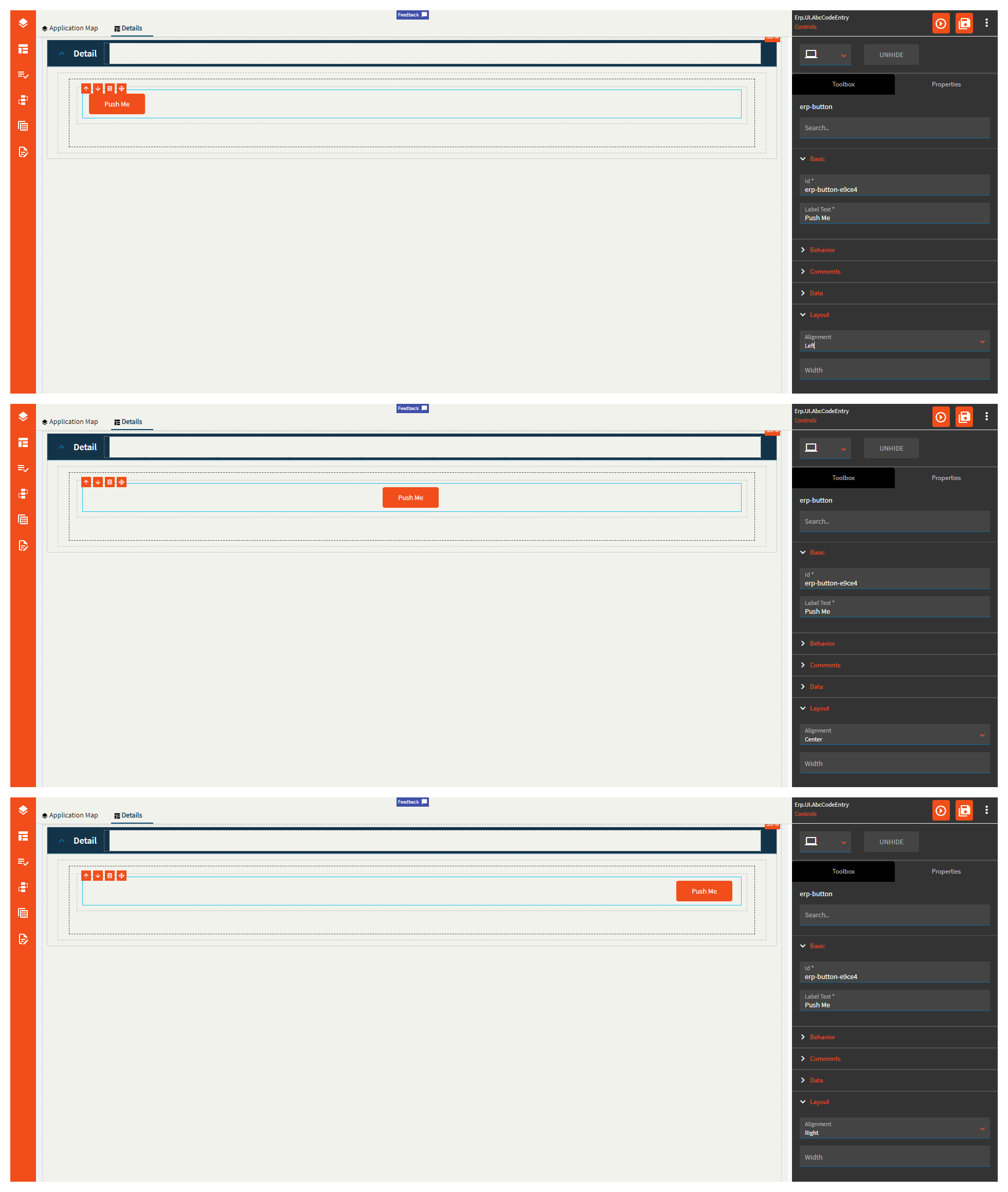
| Layout | Alignment | Set the alignment for the control. Valid options are Left, Center, Right. (Fig. C) |
| Layout | Width | Sets the specific width (pixels) for the control. (Fig. D) |
| State | Personalizable | If true, a user can personalize this component(hide/show) |
| State | Customizable | If true, a user can customize this component in child layers |
| State | Hidden | Hides the control from view. |
| State | Disabled | Disables the control. The control will not allow editing or focus. |
| State | Read Only | Makes the control read only so that it will not allow editing. The control can still be focused. |
| State | Auto Focus | When enabled, the control is automatically focused on creation. |
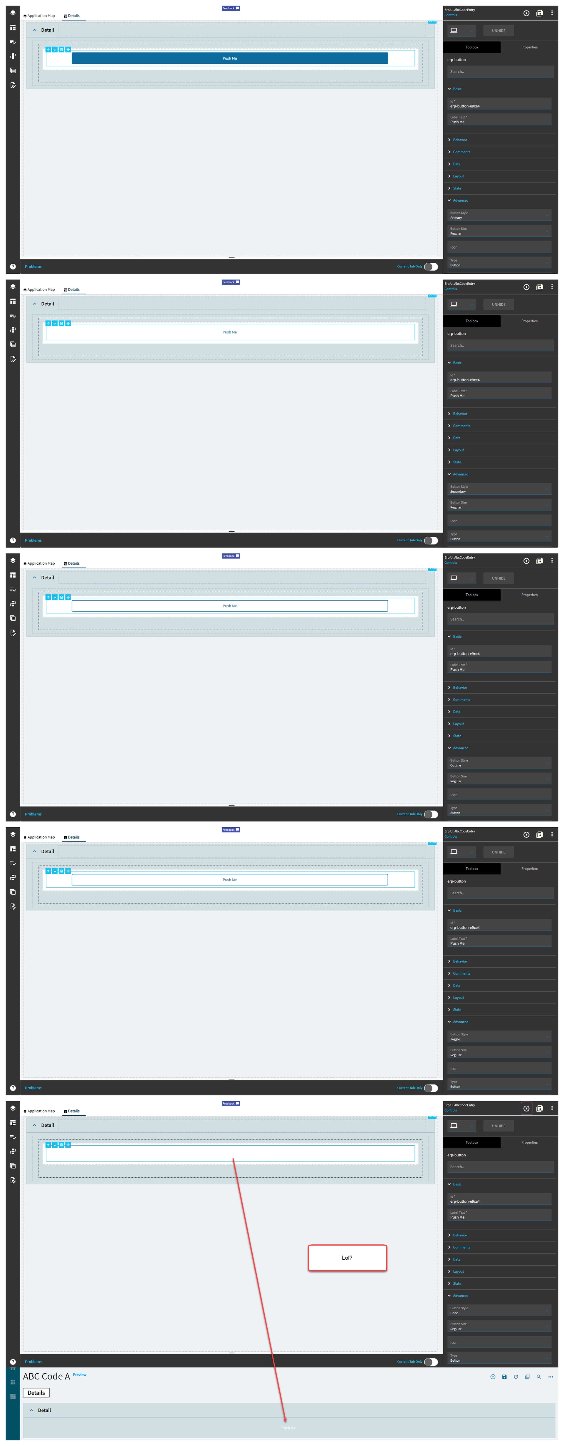
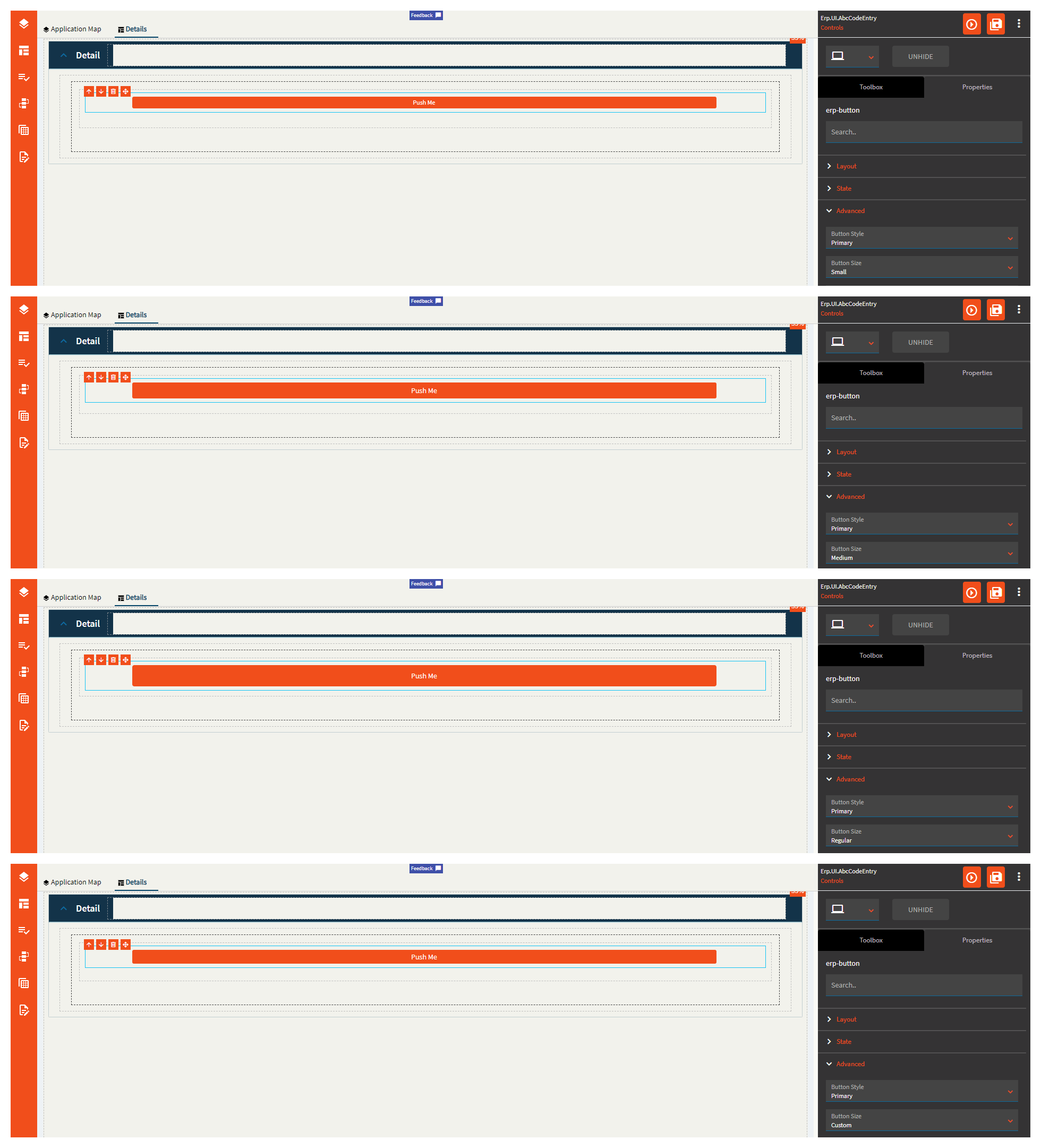
| Advanced | Button Style | Sets the style for the button. Valid options include Primary, Secondar, Outline, Toggle, and Done. (Fig. E). |
| Advanced | Button Size | Sets the size (height) of the button. Valid options include Small, Medium, Regular, Custom . Note–custom doesn’t seem to inherently do anything. You may have to add your own JSON to the MetaUI/Shared, but that’s speculation. (Fig. F). |
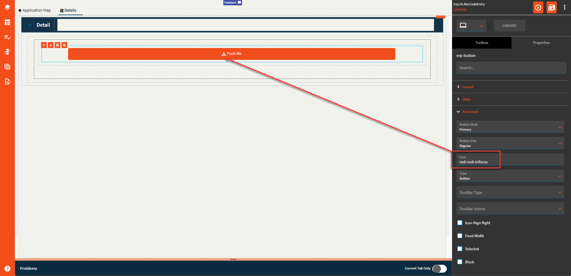
| Advanced | Icon | Add an icon to the button. Syntax: mdi mdi-sitemap-outline You can find available icons here: Material Design Icons (pictogrammers.github.io) Note: When the button is on a toolbar, the icon will replace the description. (Fig. G) |
| Advanced | Type |
No idea what this does; it doesn’t seem to do anything. Valid options include Button, Submit, and Reset |
| Advanced | Toolbar Type |
This seems like an extraneous property seeing as how this specific property is not available when adding it to a toolbar. |
| Advanced | Toolbar Action |
This seems like an extraneous property seeing as how this specific property is not available when adding it to a toolbar. |
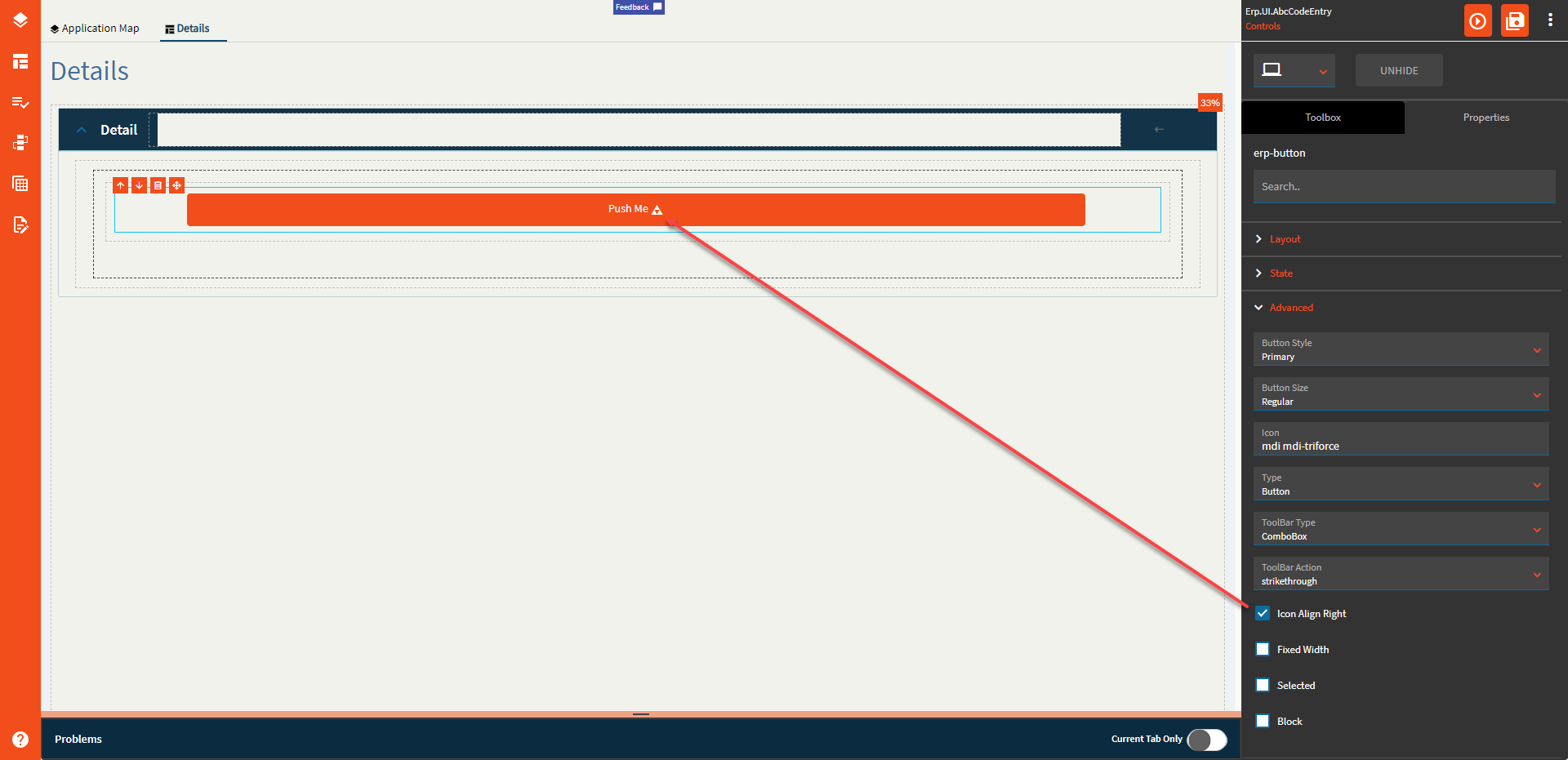
| Advanced | Icon Align Right | Aligns the icon to the… wait for it… Right! (Fig. H) |
| Advanced | Fixed Width | Fixes the width of the control. This will truncate the text if the screen shrinks too much. (Fig. I) |
| Advanced | Selected | Sets the selected state of the button. Appears to have a similar function to Auto Focus. |
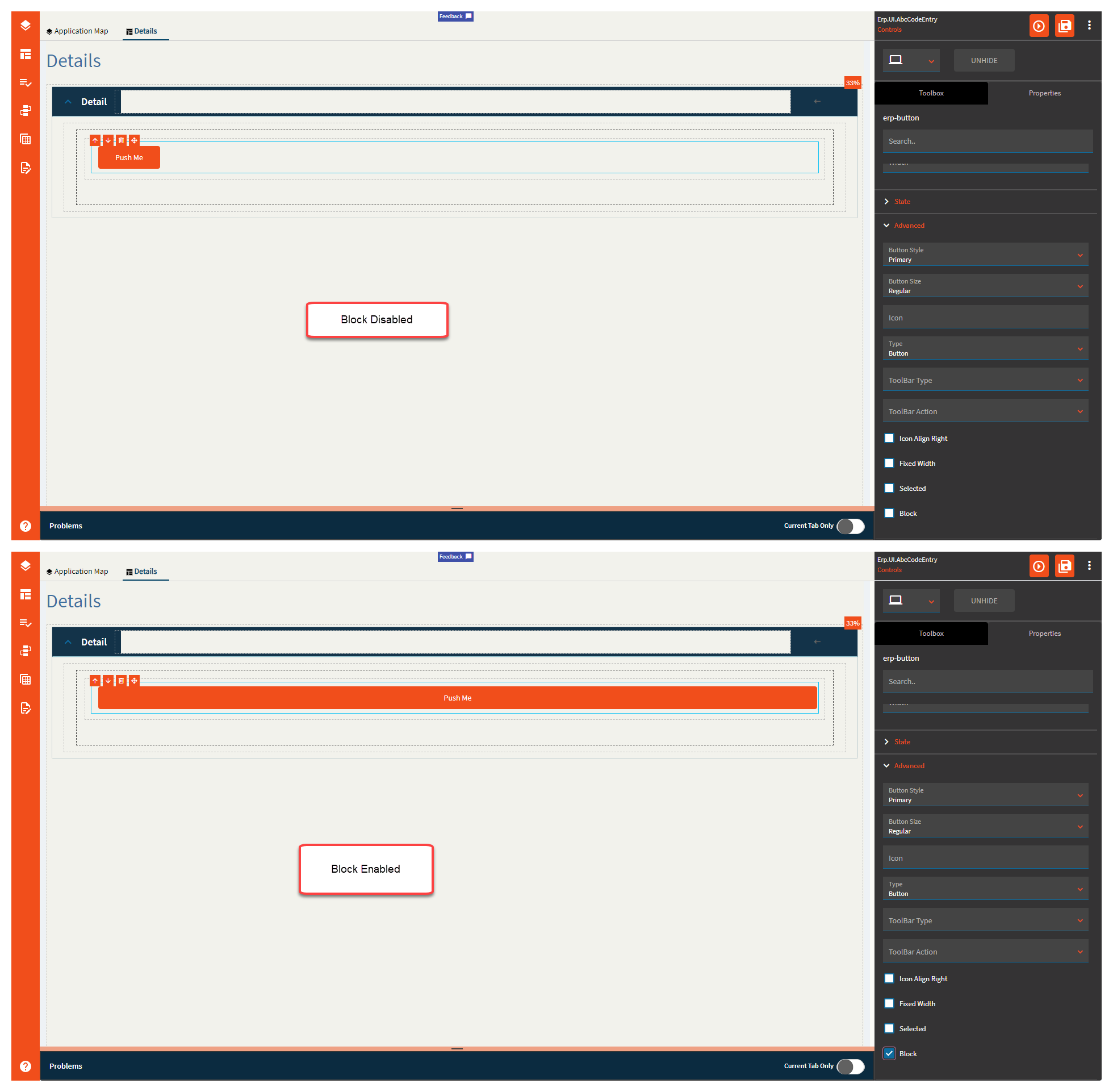
| Advanced | Block | When enabled, the button takes up the full space of the container it’s in. (Fig. J). |
Figure A: Label Text
Figure B: Comments
Figure C: Alignment
Figure D: Width
Figure E: Button Style
Figure F: Button Size
Figure G: Icon
Figure H: Icon Align Right
Figure I: Fixed Width
Figure J: Block
A checkbox is a control that allows a user to set a binding to true, false, or null (tri-state).
| Property Group | Property | Description |
|---|---|---|
| Basic | Id | Unique identifier for the control |
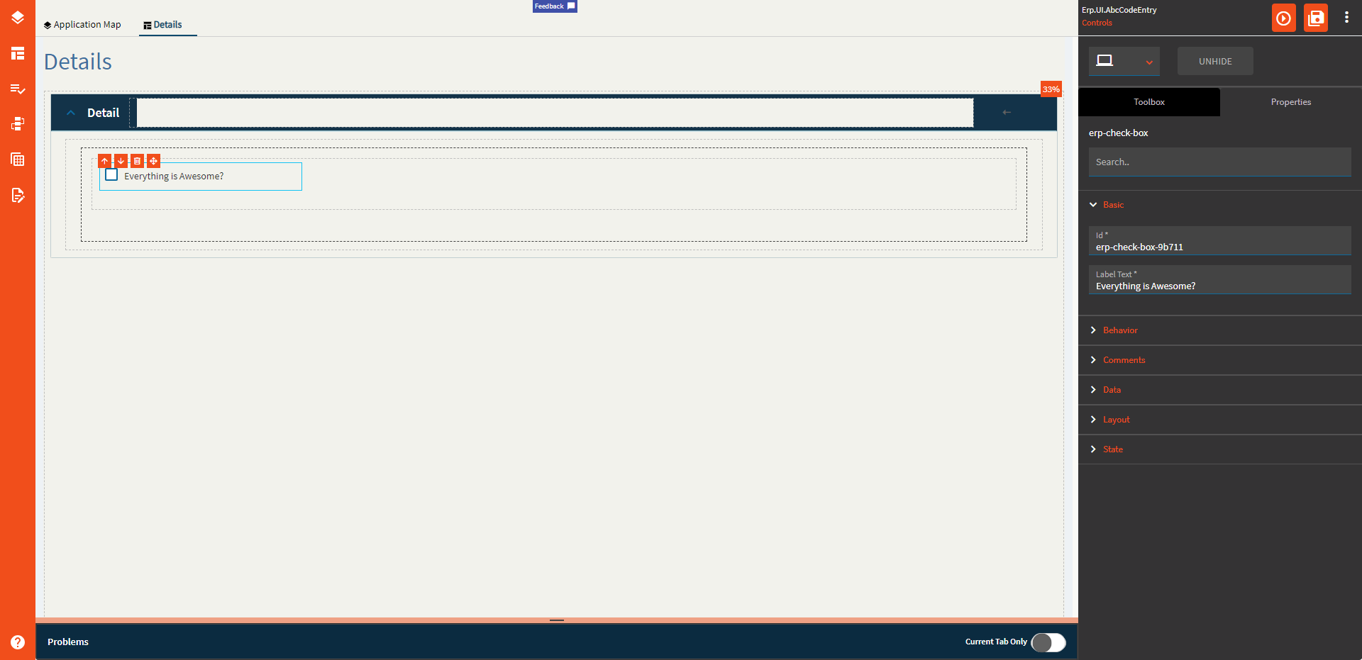
| Basic | Label Text | Sets the label next to the checkbox control. (Fig. A) |
| Behavior | On Blur | Click this to create an OnBlur event for the control. On Blur is triggered when the control loses focus. |
| Behavior | On Create | Click this to create an OnCreate event for the control On Create is triggered when the control is painted to the GUI. |
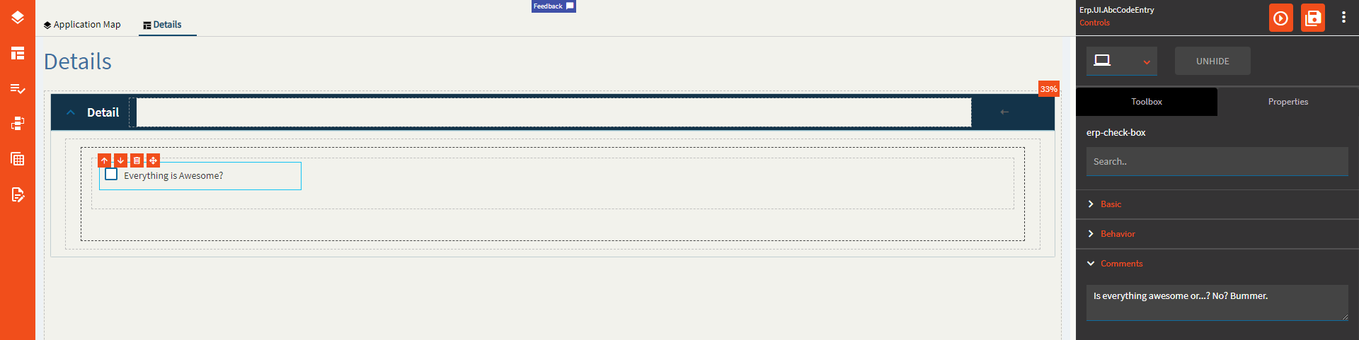
| Comments | Comments | Add some developer notes to the control. These are not customer-facing and are only visible in App Studio (Fig. B) |
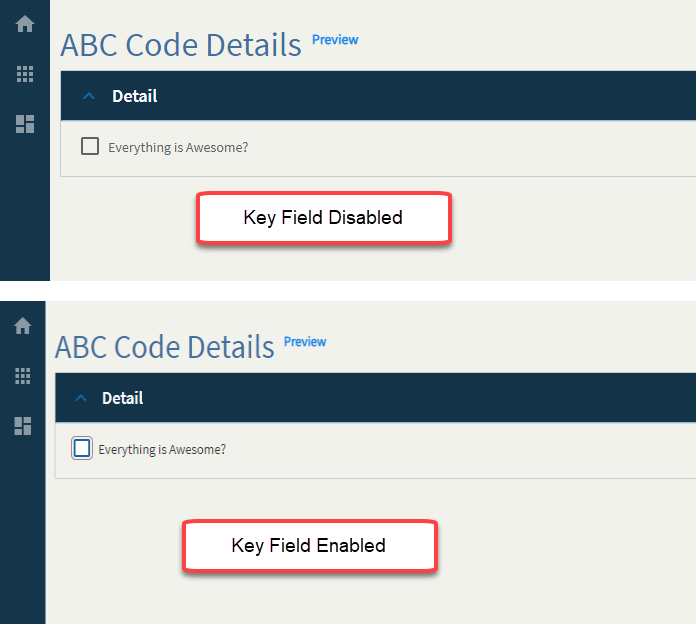
| Data | Key Field | Indicates that a bound component is a key field. If true, the field is enabled if there is no current record, allowing the user to select an existing record or create a new one. (Fig. C) |
| Data | EpBinding | Bind the button to a DataView.Column. |
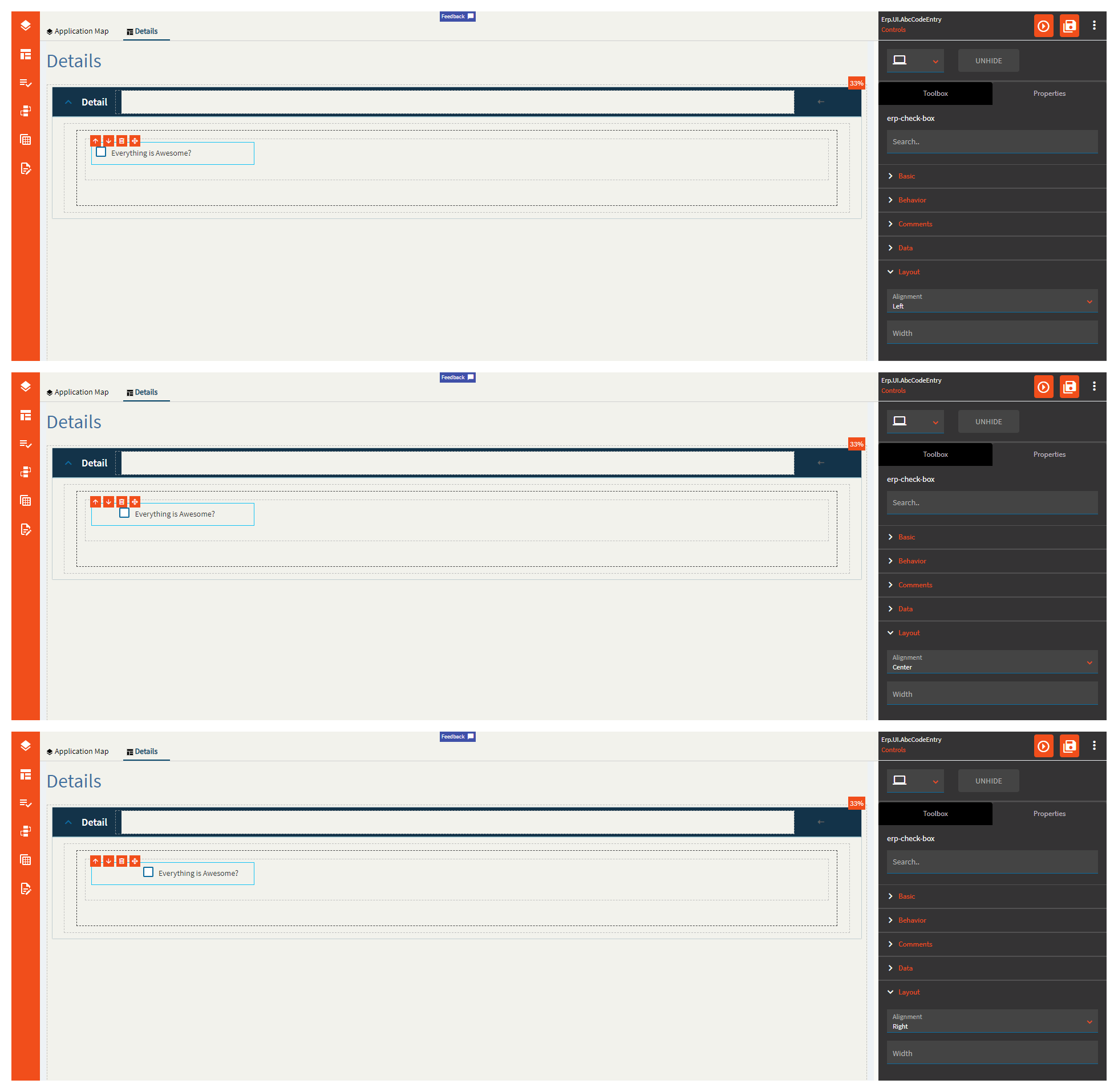
| Layout | Alignment | Set the alignment for the control. Valid options are Left, Center, Right. (Fig. D) |
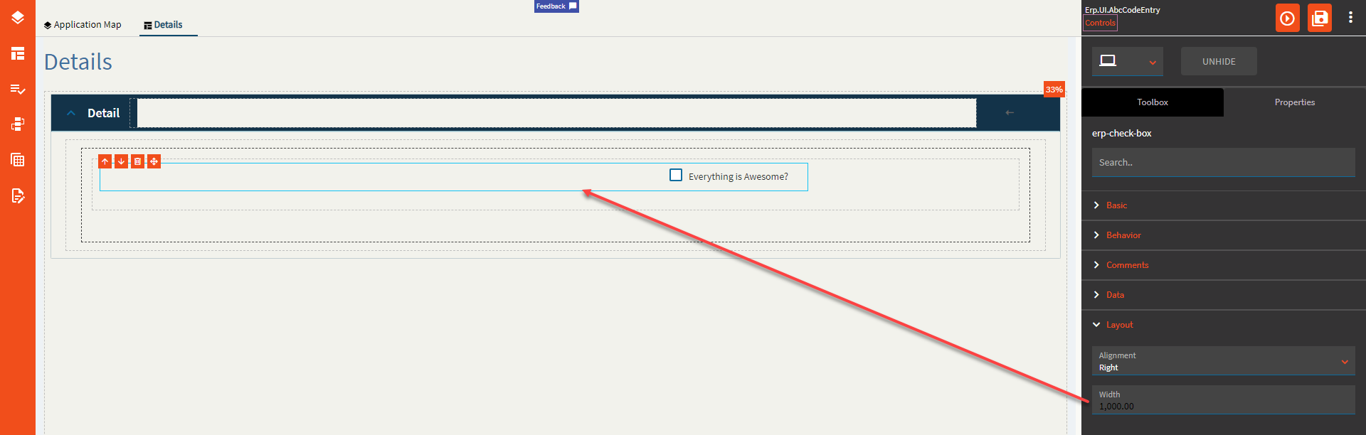
| Layout | Width | Sets the specific width (pixels) for the control. (Fig. E) |
| State | Personalizable | If true, a user can personalize this component(hide/show) |
| State | Customizable | If true, a user can customize this component in child layers |
| State | Hidden | Hides the control from view. |
| State | Disabled | Disables the control. The control will not allow editing or focus. |
| State | Read Only | Makes the control read only so that it will not allow editing. The control can still be focused. |
| State | Auto Focus | When enabled, the control is automatically focused on creation. |
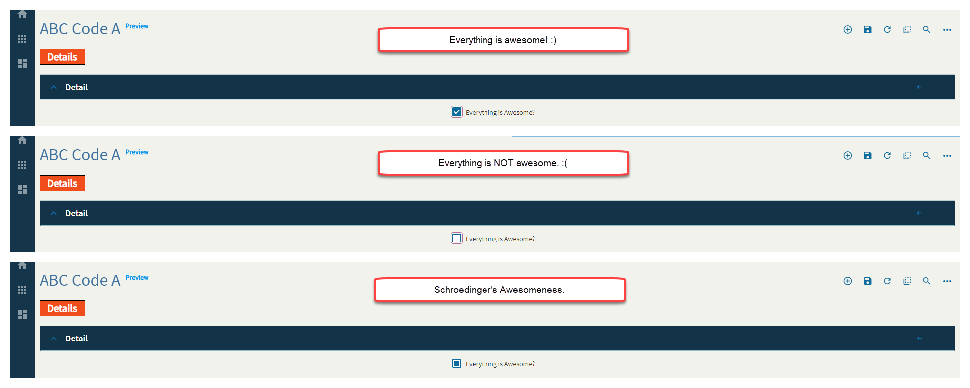
| State | Highlight Selected |
Supposed to bold the label text when the checkbox is selected, but does not appear to be functional. |
| State | Three State | Sets the control to be a tri-state control which allows for true, false, and null (all). (Fig. F) |
Figure A: Label Text
Figure B: Comments
Figure C: Key Field
Figure D: Alignment
Figure E: Width
Figure F: Three State
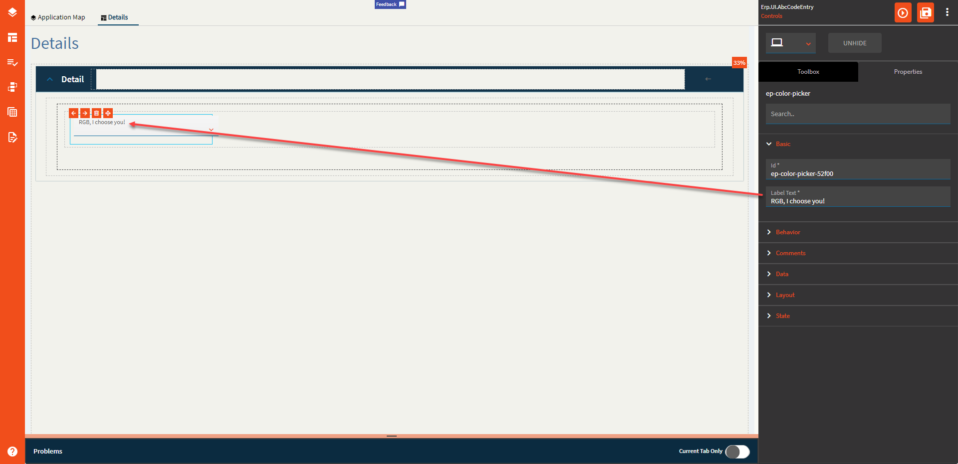
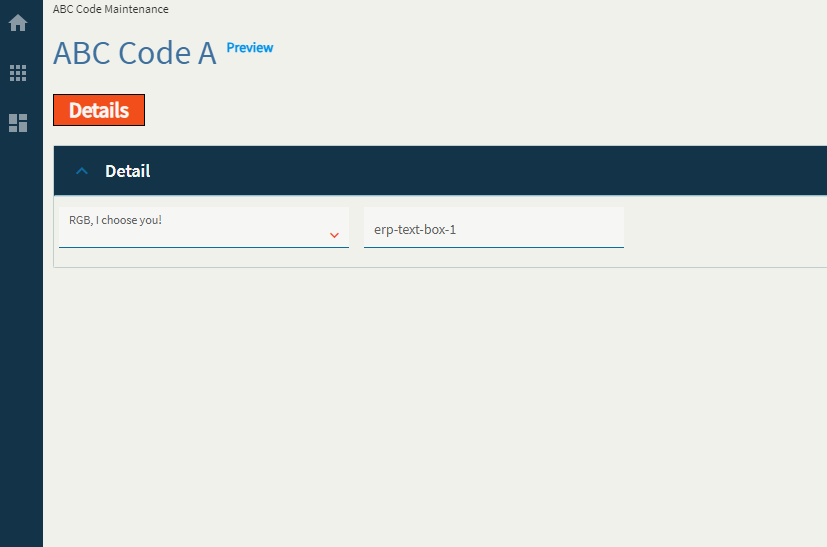
A control that allows you to bind a DataView.Column to an RGB value from the selected color.
| Property Group | Property | Description |
|---|---|---|
| Basic | Id | Unique identifier for the control |
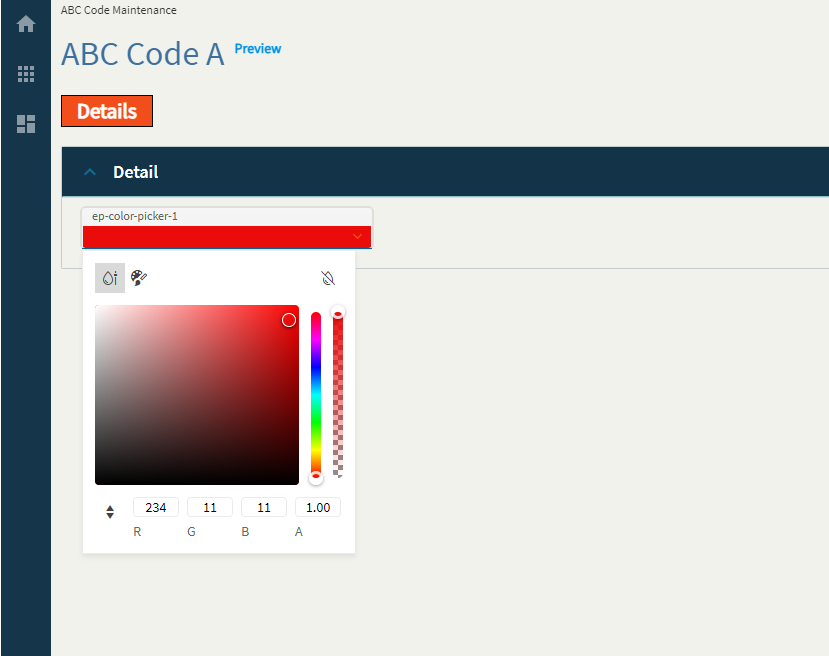
| Basic | Label Text | Sets the label text within the control. (Fig. A) |
| Behavior | On Blur | Click this to create an OnBlur event for the control. On Blur is triggered when the control loses focus. |
| Behavior | On Create | Click this to create an OnCreate event for the control On Create is triggered when the control is painted to the GUI. |
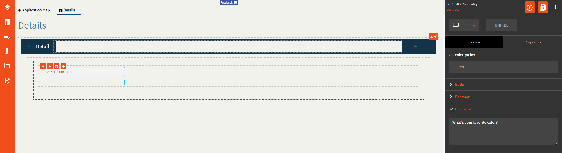
| Comments | Comments | Add some developer notes to the control. These are not customer-facing and are only visible in App Studio (Fig. B) |
| Data | Key Field | Indicates that a bound component is a key field. If true, the field is enabled if there is no current record, allowing the user to select an existing record or create a new one. |
| Data | EpBinding | Bind the button to a DataView.Column. |
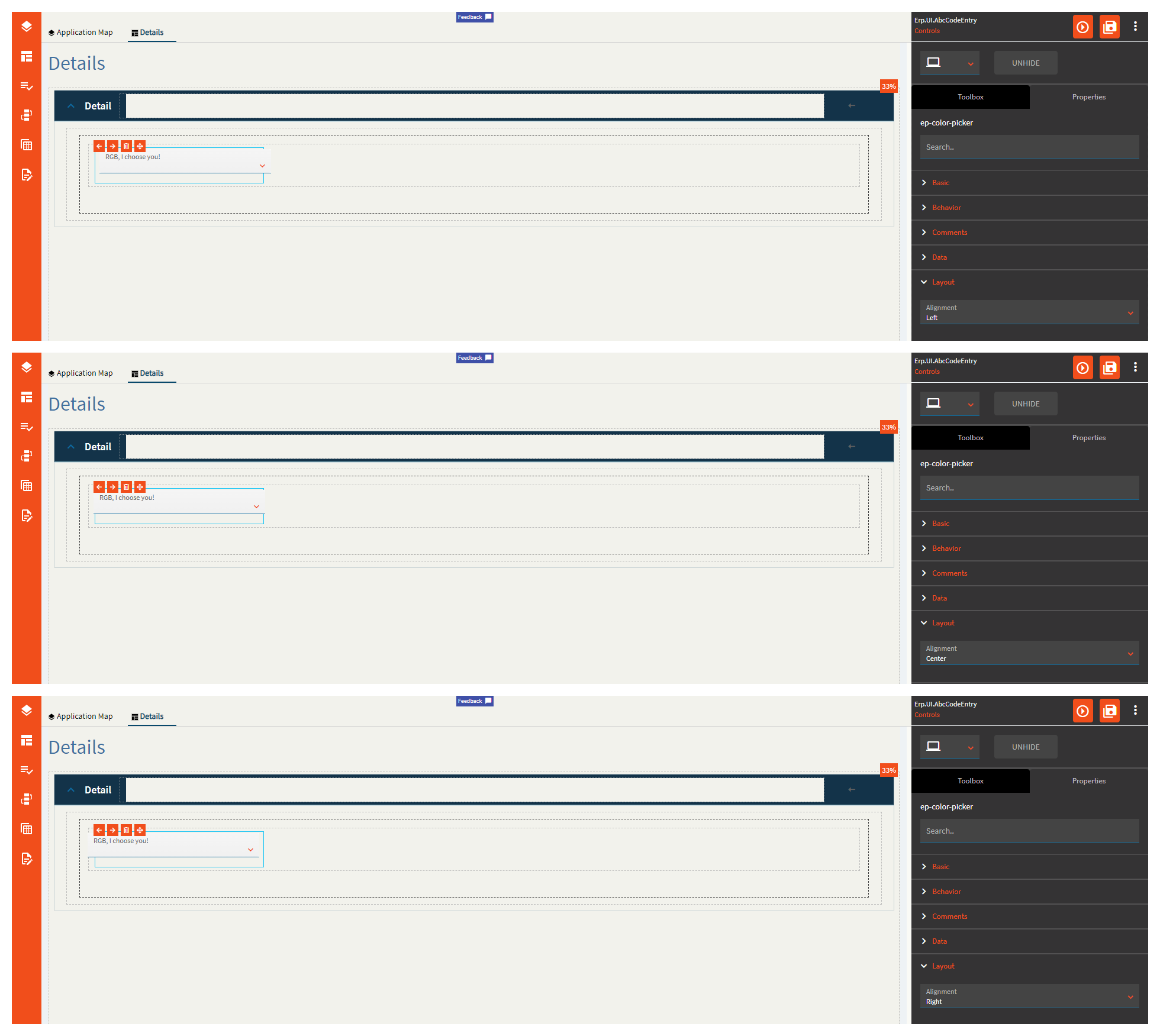
| Layout | Alignment | Set the alignment for the control. Valid options are Left, Center, Right. This is hilariously backwards on this control! (Fig. C) |
| State | Personalizable | If true, a user can personalize this component(hide/show) |
| State | Customizable | If true, a user can customize this component in child layers |
| State | Hidden | Hides the control from view. |
| State | Disabled | Disables the control. The control will not allow editing or focus. |
| State | Read Only | Makes the control read only so that it will not allow editing. The control can still be focused. |
Figure A: Label Text
Figure B: Comments
Figure C: Alignment
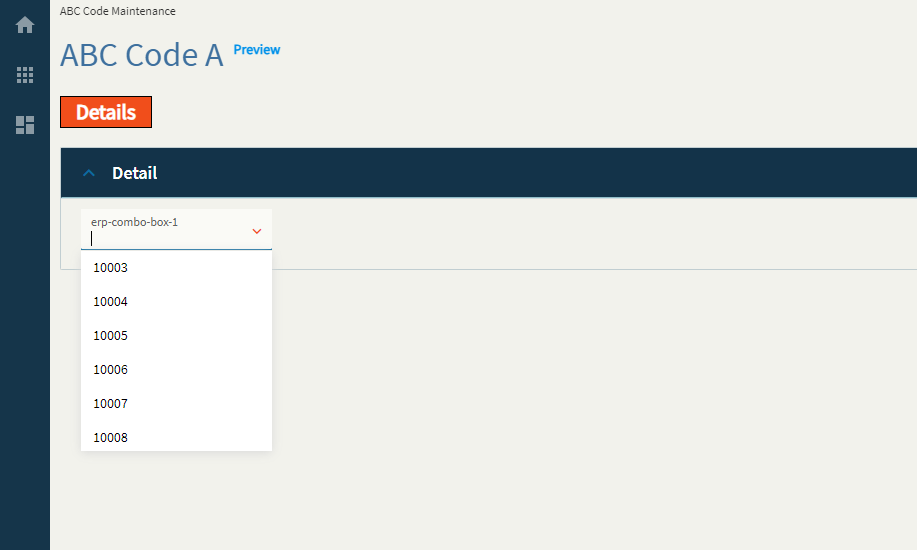
A combo box is a dropdown control that displays data. The data can come from a business object, BAQ, REST or a static list. It can display a user-friendly description while storing the value.
| Property Group | Property | Description |
|---|---|---|
| Basic | Id | Unique identifier for the control |
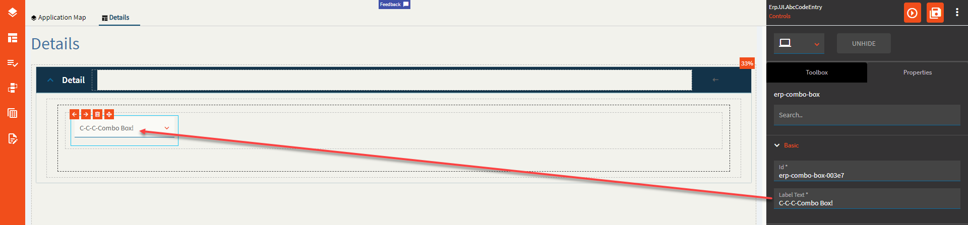
| Basic | Label Text | Sets the label text within the control. (Fig. A) |
| Behavior | On Blur | Click this to create an OnBlur event for the control. On Blur is triggered when the control loses focus. |
| Behavior | On Create | Click this to create an OnCreate event for the control On Create is triggered when the control is painted to the GUI. |
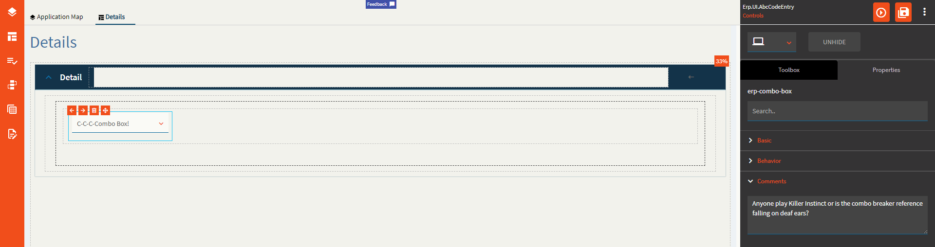
| Comments | Comments | Add some developer notes to the control. These are not customer-facing and are only visible in App Studio (Fig. B) |
| Data | Key Field | Indicates that a bound component is a key field. If true, the field is enabled if there is no current record, allowing the user to select an existing record or create a new one. |
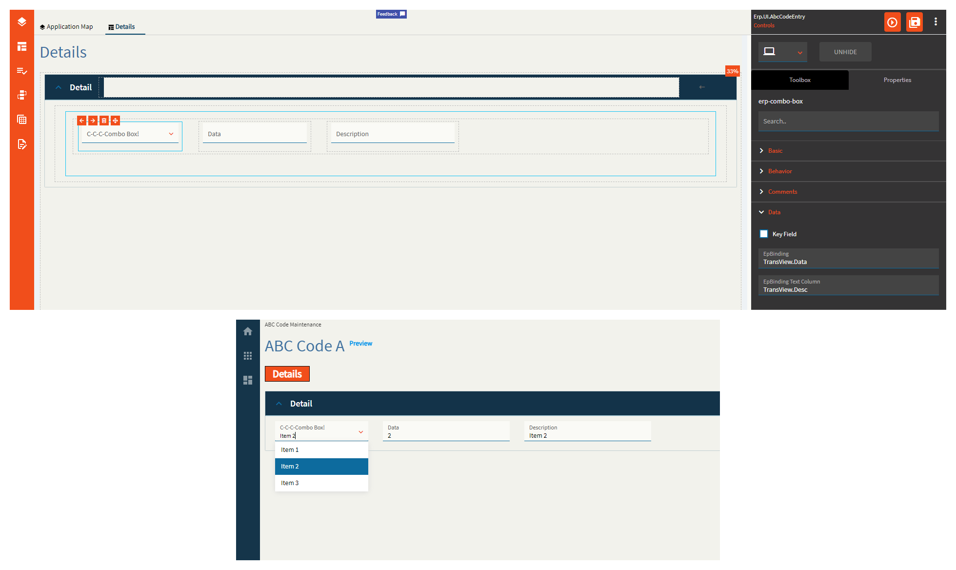
| Data | EpBinding | Bind the data to a DataView.Column. (Fig. C) |
| Data | EpBinding Text Column | Bind the text of the combo to a DataView.Column (Fig. C) |
| Layout | Alignment |
Does not work. Set the alignment for the control. Valid options are Left, Center, Right. |
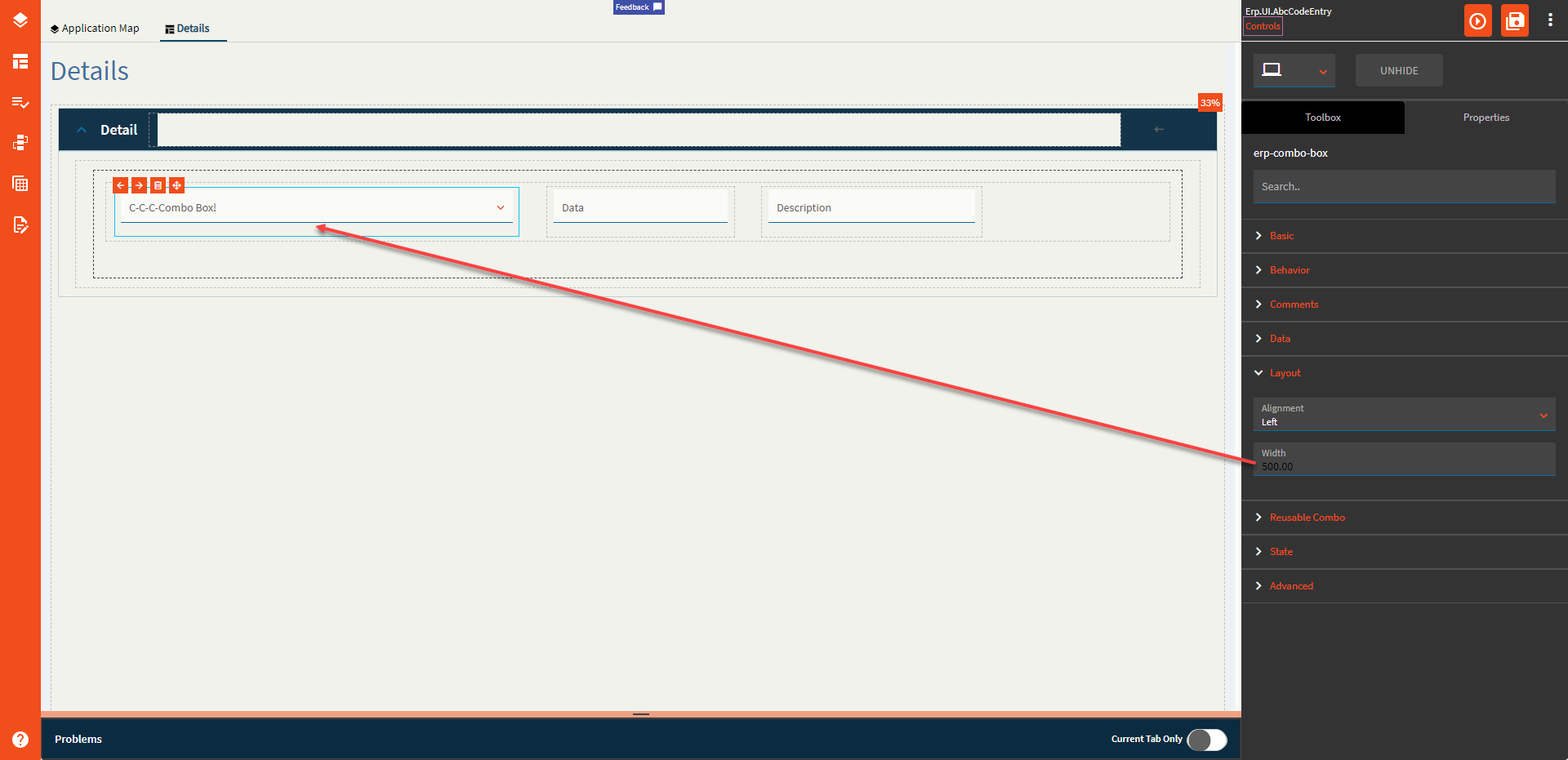
| Layout | Width | Sets the specific width (pixels) for the control. (Fig. D) |
| Reusable Combo | Type | Select from a list of reusable combos defined by Epicor. (Fig. E) |
| Reusable Combo | Sub Type | Select from a list of sub types. Most often this is “Default” but occasionally has other options that change up the reusable combo configuration that’s pulled in. Note: Once the Type and Sub Type are selected, everything else defaults in and your combo should work as is. The remaining fields are optional or used when setting up your own. |
| Reusable Combo | ComboId | Sets a unique identifier for the combo. Example: UD103.UD103Key (can be whatever, really, but I generally follow the format from the reusable ones) |
| Reusable Combo | Service | The REST service to load the data from. Example: Ice.BO.UD103Svc |
| Reusable Combo | Service Method | The REST method to call from the previously defined service. Example: GetList |
| Reusable Combo | Table Name | The name of the table returned from the REST call. This can be found in Swagger, PostMan, Dev Tools, etc. Example: UD103List |
| Reusable Combo | Field Name | Set the name of the column within the defined database Table that has tilde delimited list of items used to populate this combo box. Example: SalesRepList |
| Reusable Combo | Schema | Set the schema that is related to the database Table property that holds a column that has a tilde delimited list of items used to populate this combo. Valid options include ICE and ERP. |
| Reusable Combo | View Name | Set the dataview that is used to populated the items in the combo box. This should be defined when the items for the combo box are to be supplied by a dataview that has been populated elsewhere. Example: ABCCode |
| Reusable Combo | View Column Name | Set the column name that exists within the defined view that is used to populate the items in the combo box. Should be defined when the items for the combo box are to be supplied by a dataview that has been populated elsewhere. Example: CountFreq |
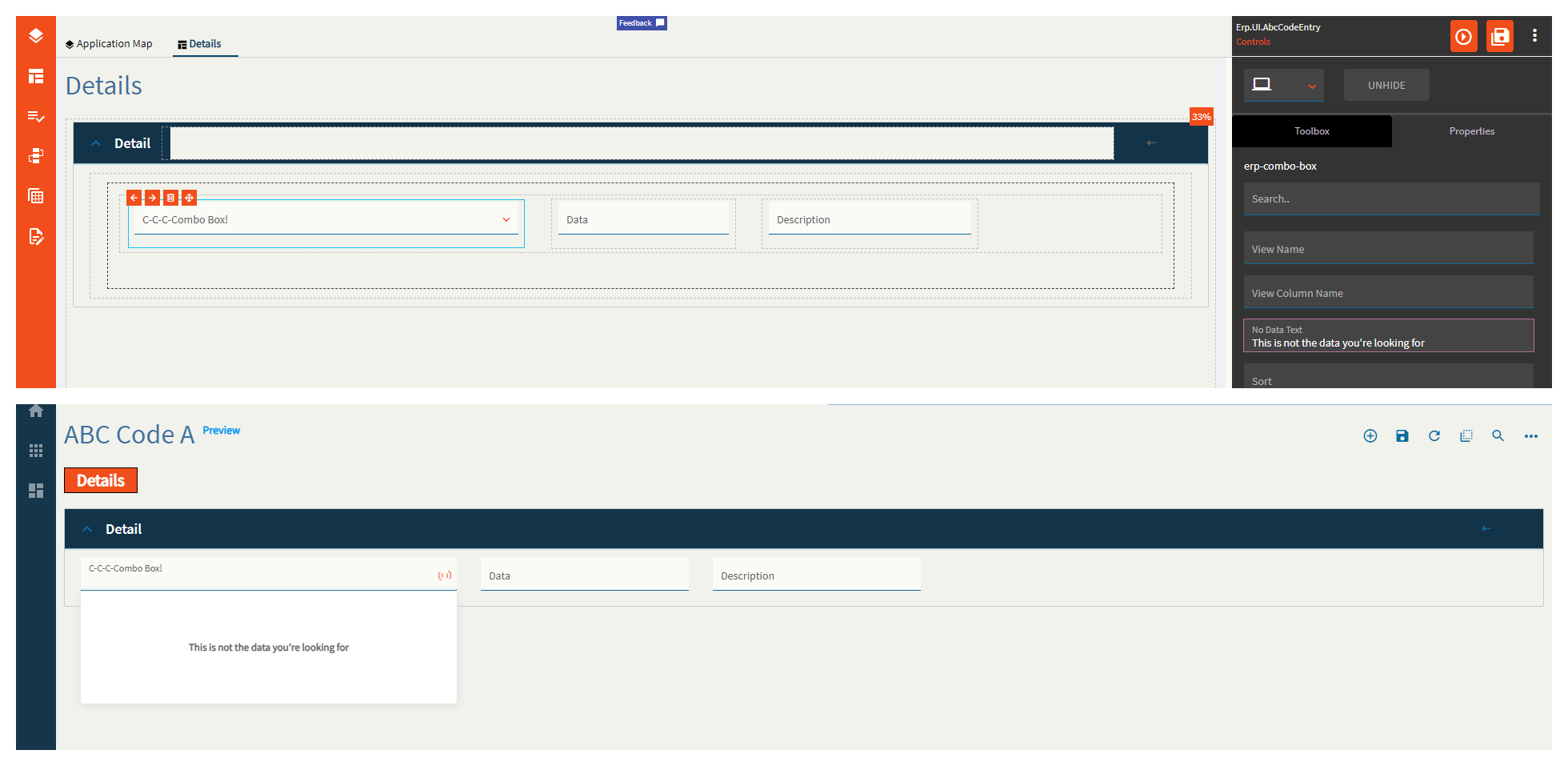
| Reusable Combo | No Data Text | Text to display when the combo is empty. (Fig. F) |
| Reusable Combo | Sort | Set the data item field that the items in the combo are sorted by. Example: PartNum |
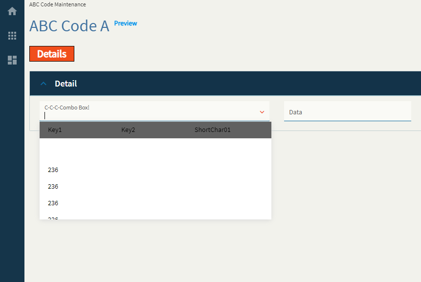
| Reusable Combo | Retrieve Columns |
This doesn’t seem to fully function. This is used to define a list of items to display in the combo. The caption says a string array defined as ["Key1","Key2"] but that breaks it. Just type in Key1, Key2. HOWEVER–it only displays the values of the first item in the list. (Fig. G) |
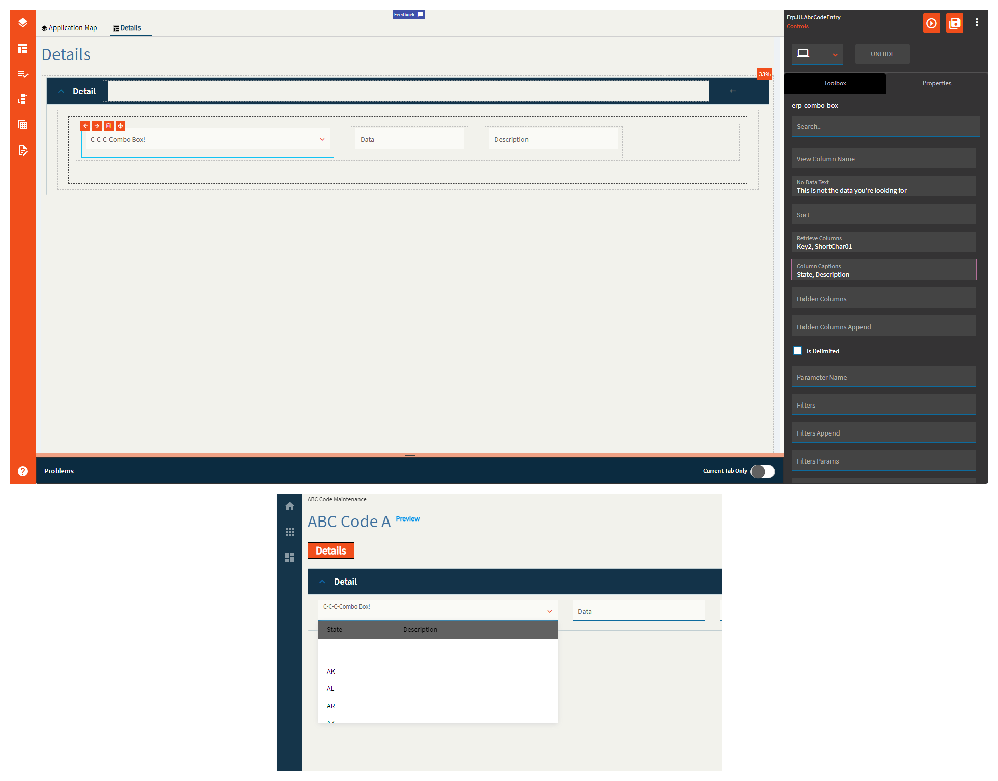
| Reusable Combo | Column Captions | When more than one column is defined in the Retrieve Columns property, you can use this to define their titles. This has no effect with a single column. Example: State, Description (Fig. H) |
| Reusable Combo | Hidden Columns | Use this to define columns within the combo that are not shown. This is useful when you want to perform functions on those columns without displaying them to the user. For example, filtering. Example: Key3, Key4, Key5 |
| Reusable Combo | Hidden Columns Append | Same as Hidden Columns, but is specifically used to extend a reusable combo as defined in the Type property. |
| Reusable Combo | Is Delimited | Indicate if the value returned from a REST service method contains a tilde separated list that is to be used to populate the combo. |
| Reusable Combo | Parameter Name | Set the name of the parameter that holds the tilde separated list of items used to populate the combo. Should be defined when a REST service and service method is called and the method returns a parameter that holds a tilde separated list of items. If no parameter is defined, then returnObj is used. Only used when Is Delimited is checked. |
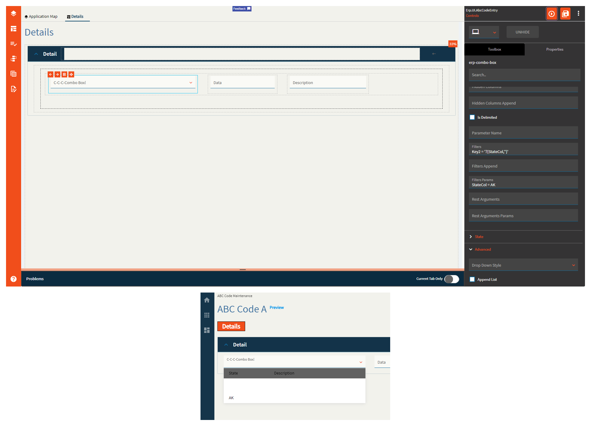
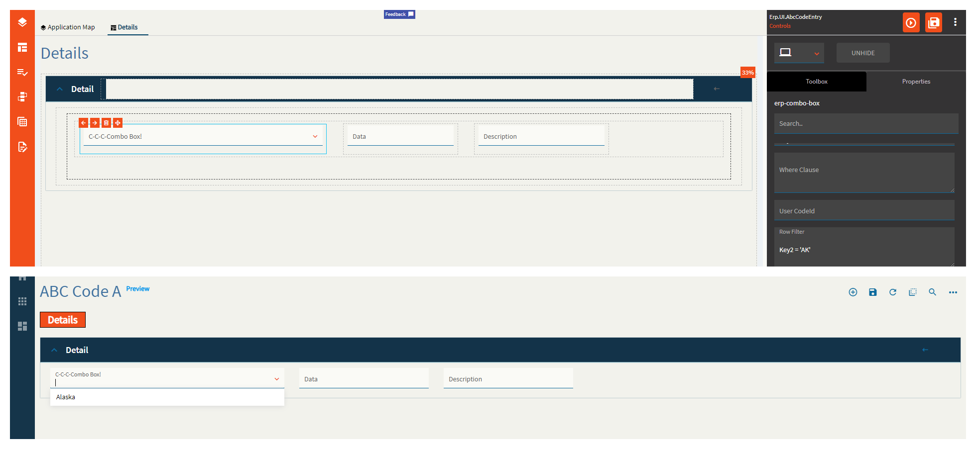
| Reusable Combo | Filters | Set filters that are applied to the data when either a service method or BAQ is defined. Syntax is the same as classic and is to be used in conjunction with Filters Params. Example: Key2 = '?{StateCol,''}' (Fig. I) |
| Reusable Combo | Filters Append | This is similar to the Filters property, but is specifically used to extend a reusable combo as defined by the Type property. Example: Inactive = false |
| Reusable Combo | Filters Params | Maps to the filters property. Example: StateCol = AK |
| Reusable Combo | Rest Arguments |
Does not work. REST arguments that are sent when the data is retrieved using a REST service. This is to be used in conjunction with Rest Arguments Params. |
| Reusable Combo | Rest Arguments Params |
Does not work. Maps to the Rest Arguments property. |
| State | Personalizable | If true, a user can personalize this component(hide/show) |
| State | Customizable | If true, a user can customize this component in child layers |
| State | Hidden | Hides the control from view. |
| State | Disabled | Disables the control. The control will not allow editing or focus. |
| State | Read Only | Makes the control read only so that it will not allow editing. The control can still be focused. |
| State | Auto Focus | When enabled, the control is automatically focused on creation. |
| Advanced | Drop Down Style | Set a combo style. DropDown style allows typing within the combo text if the “Allow Custom” option is checked. DropDownList style allows selection from available items only. |
| Advanced | Append List |
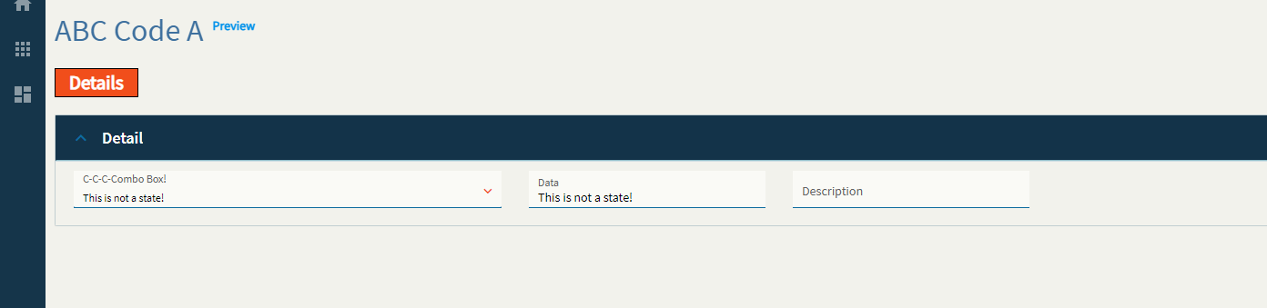
This one has issues. In the TextField/ValueField used to define what shows up in the combo and what’s used for the data binding, you need to define the column name (Key2, ShortChar01) however, when using a static list, those should be Display/Value respectively. If you have the column names, the static list items don’t display properly. If you have Display/Value defined, the columns from the service do not display properly. Additionally, the static list items display regardless of this checkbox, so it doesn’t really do anything. WEEEEE! Any who–the idea of this is it’s supposed to append the static list items to the returned service data. |
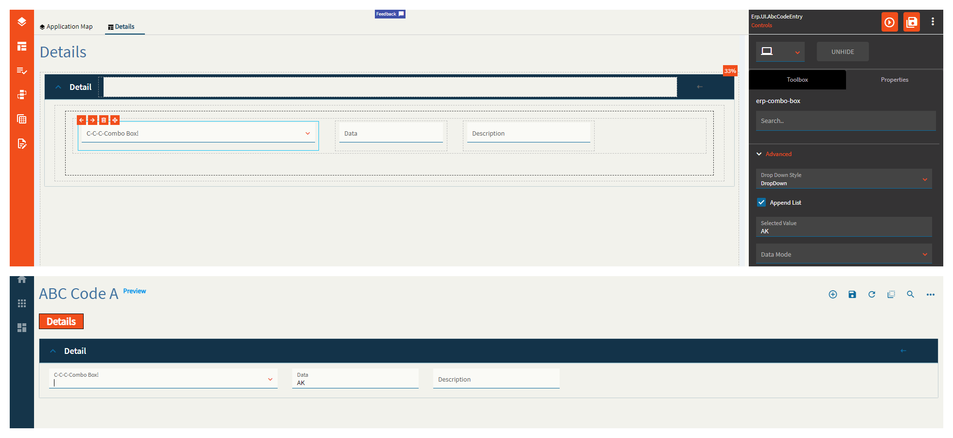
| Advanced | Selected Value | Set the selected value for the combo. This automatically sets the EpBinding to whatever you put here. Incidentally, it does not display anything in the combo. (Fig. J) |
| Advanced | Data Mode | This is to be used if you defined a service, but not a service method. Valid options include GetList and GetRows |
| Advanced | BAQ Query | Set the BAQ Query ID which should be defined when the items for the combo box are to be supplied by calling a BAQ. Example: zCustomer01 |
| Advanced | TextField | Set the data item that represents the item text. Example: ShortChar01 (or display if using a static list) |
| Advanced | Value Field | Defines the data object property to be displayed as value once selected. Example: Key2 (or value if using a static list) |
| Advanced | Where Clause | Obsolete. Use row filter instead. |
| Advanced | User CodeId | Obsolete. Set the reusable type to be UserCode.UserCodes instead. |
| Advanced | Row Filter | Set the client filter to be applied to the items after data is retrieved, but before filling the combo. (Fig. K) |
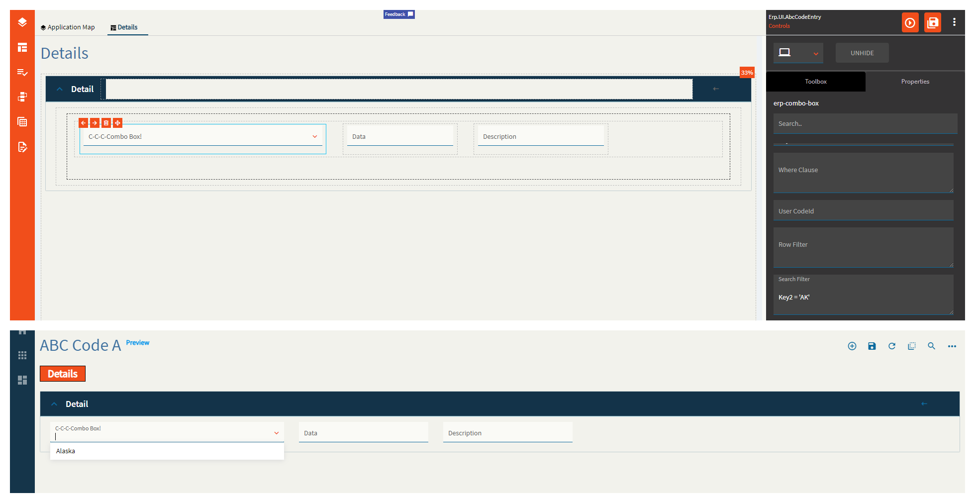
| Advanced | Search Filter | Set the filter to be applied at the service level while retrieving the components. (Fig. L) |
| Advanced > List | Display | When setting a static list, this is the text to be shown in the combo. (Fig. M) |
| Advanced > List | Value | When setting a static list, this is the value to be stored in the binding. (Fig. M) |
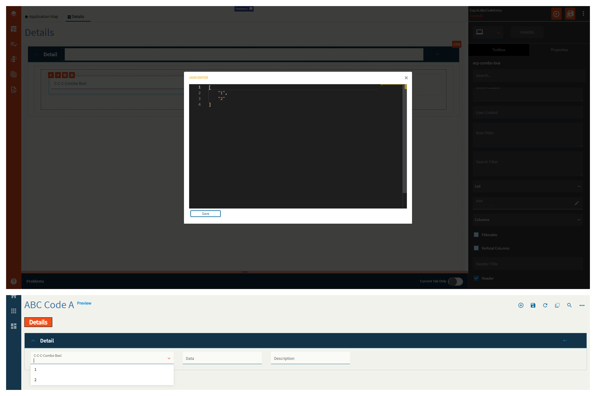
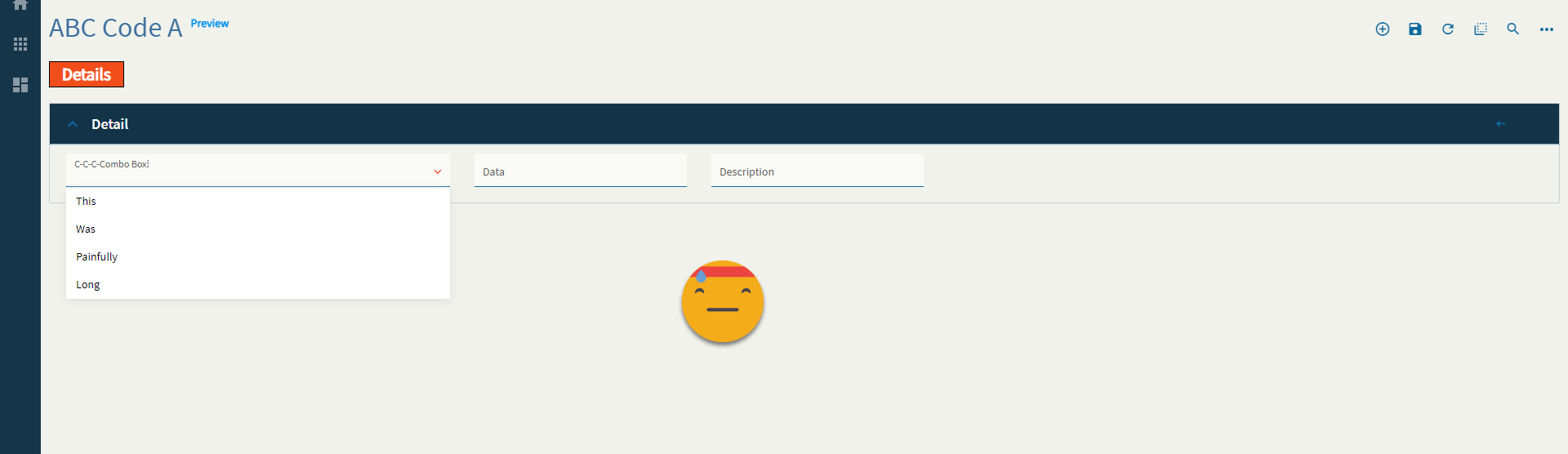
| Advanced | Data | You can define a string array here to display. You’re supposed to be able to do an array of objects for a value/display pair, but I could not get that to render correctly. I believe this has to do with the TextField/ValueField, but I’m not sure what to put here as the usual display/value does not work. Example: ["Item1", "Item2] (Fig. N) |
| Advanced > Columns | Field | Set the name of the column where you wish the following properties to be applied to. Exampled: ShortChar01 |
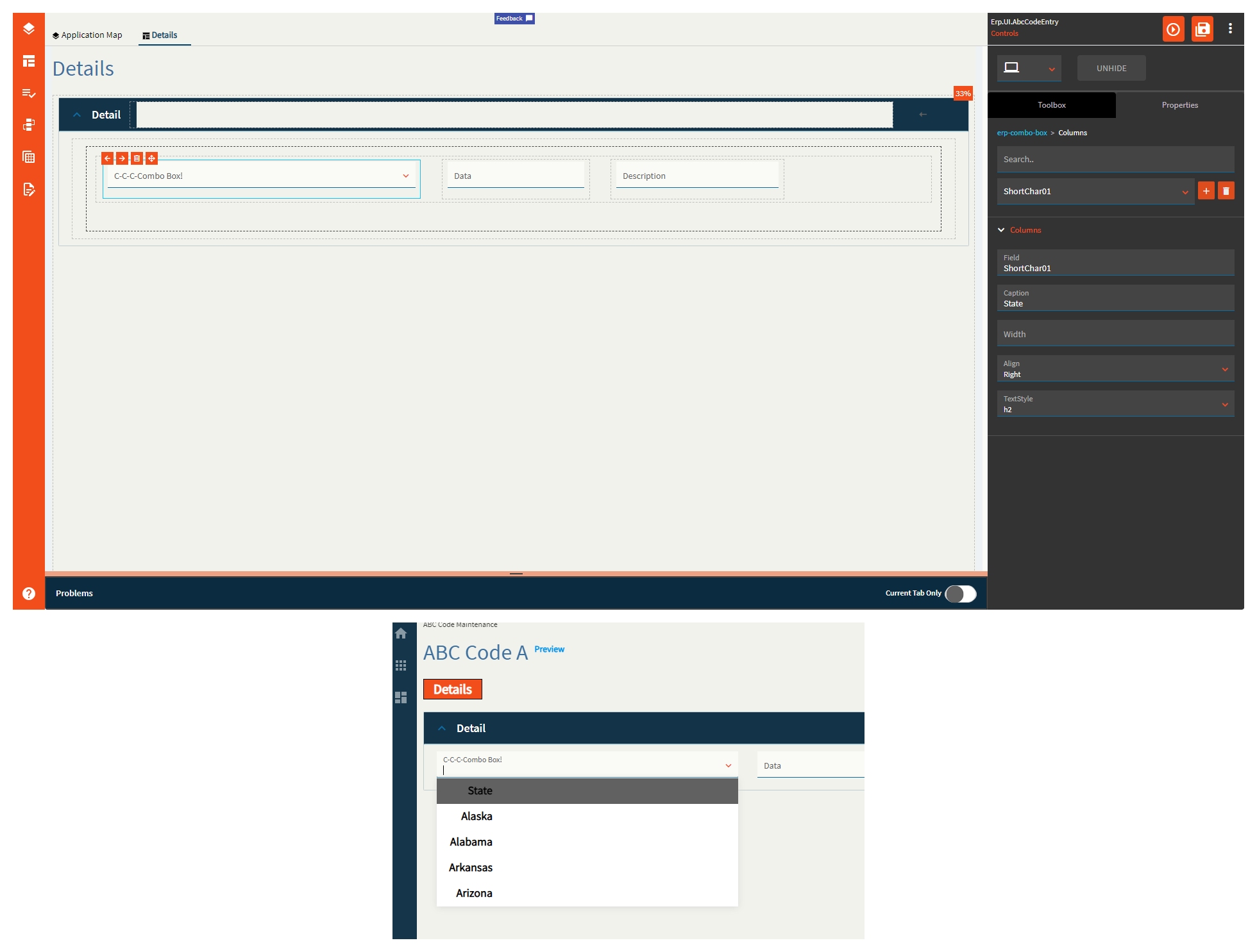
| Advanced > Columns | Caption | Set the title for the column in the combo. (Fig. O) |
| Advanced > Columns | Width | Set the width of the column in the combo. |
| Advanced > Columns | Align | Set the alignment of the column in the combo. Valid values include Right, Left, Center. (Fig. O) |
| Advanced > Columns | TextStyle | Set the style of the text of the column in the combo. Value values include h1, h2, h3, normal. (Fig. O) |
| Advanced | Filterable |
Does not seem to do anything. This is suppose to allow the user to filter the data in the combo. |
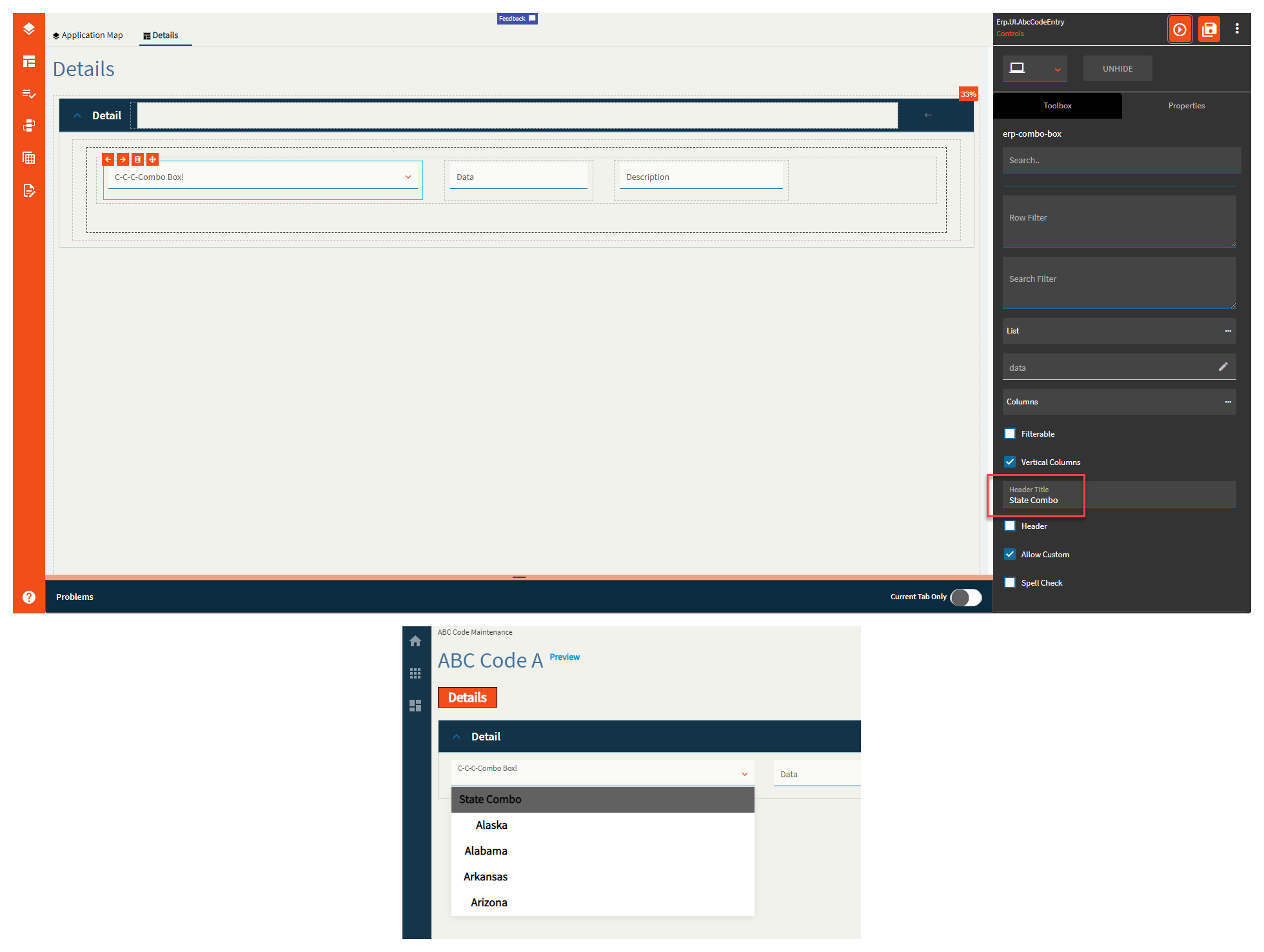
| Advanced | Vertical Columns | Set to true if null values can be saved to data. Not sure how the property name relates, but #Shrug |
| Advanced | Header Title | Sets the title of the combo. (Fig. P) |
| Advanced | Header |
Does not seem to do anything. “Set to add headers for columns on comboBox”. |
| Advanced | Allow Custom | Set to allow user-defined values that are not present in the dataset. (Fig. Q) |
| Advanced | Spell Check |
Does not seem to do anything and would be silly anyways? Enable to check for spelling and grammar. |
Figure A: Label Text
Figure B: Comments
Figure C: Ep Binding Data/Text
Figure D: Width
Figure E: Type
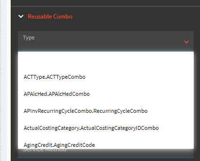
Figure F: No Data Text
Figure G: Retrieve Columns
Figure H: Column Captions
Figure I: Filters
Figure J: Selected Value
Figure K: Row Filter
Figure L: Search Filter
Figure M: List
Fig Newton: Data
Figure O: Columns
Figure P: Header Title
Figure Q: Allow Custom
It’s what you and Jose continually push each other’s of.
I think you’re confusing Jose with my children. They know where every single one of my buttons are and they relish in pushing them.

It could well be an additive list… perhaps even a compendium.
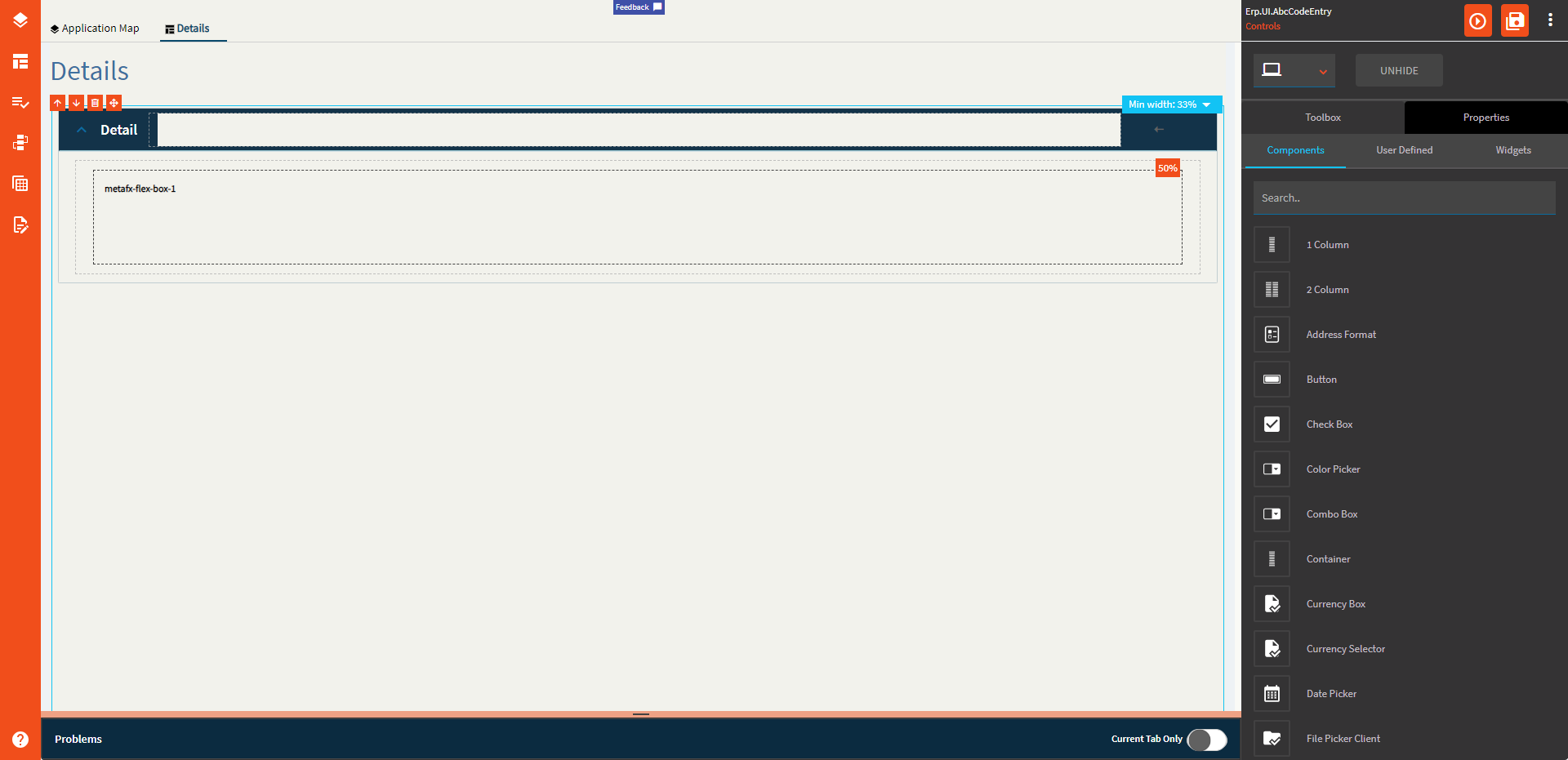
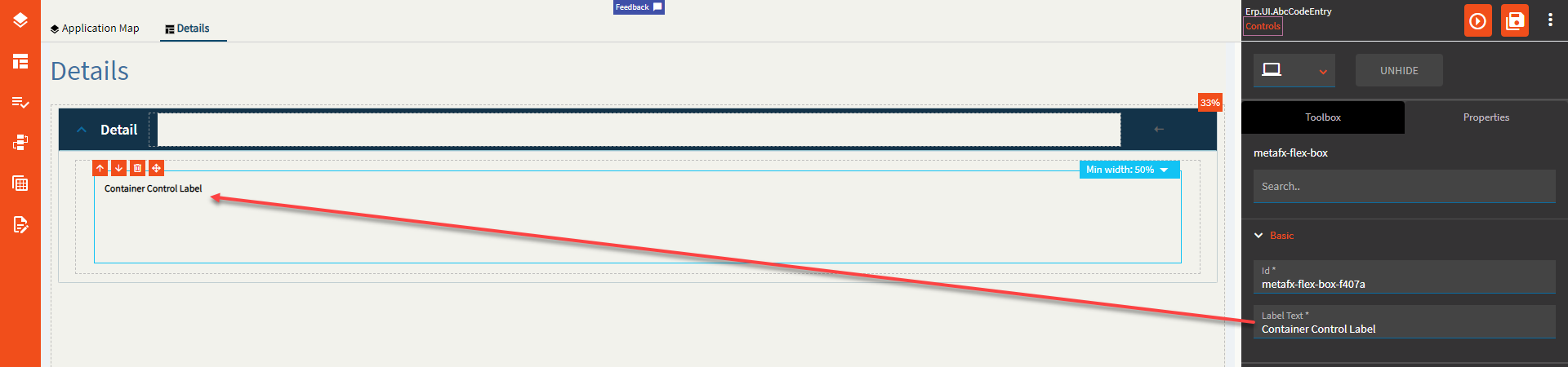
A container is a control that groups other controls together.
This is one of the few controls that can exist outside of a column control. Most other controls need to be placed within a column control.
| Property Group | Property | Description |
|---|---|---|
| Basic | Id | Unique identifier for the control |
| Basic | Label Text | Sets the label text within the control. (Fig. A) |
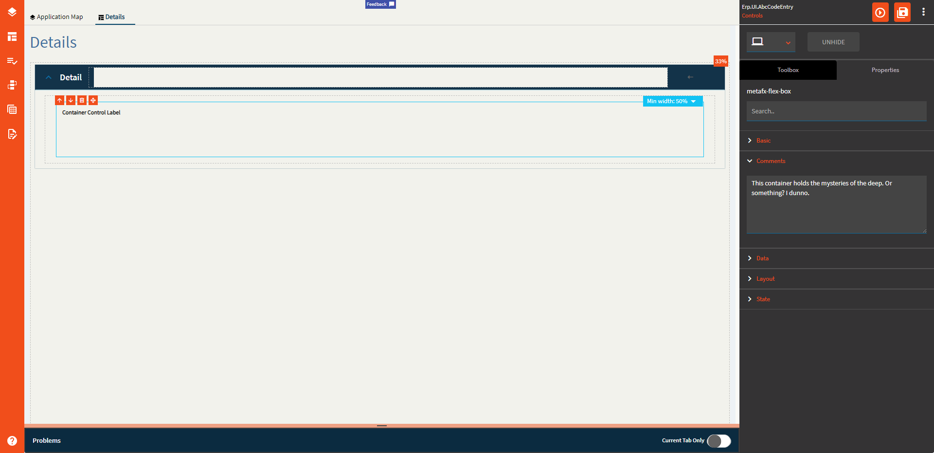
| Comments | Comments | Add some developer notes to the control. These are not customer-facing and are only visible in App Studio (Fig. B) |
| Data | Key Field | Indicates that a bound component is a key field. If true, the field is enabled if there is no current record, allowing the user to select an existing record or create a new one. Not relevant to this component |
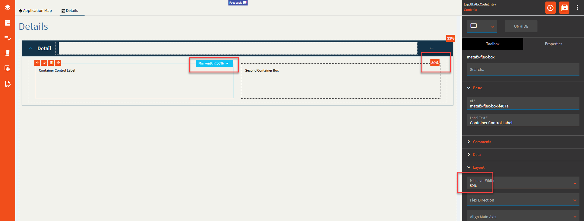
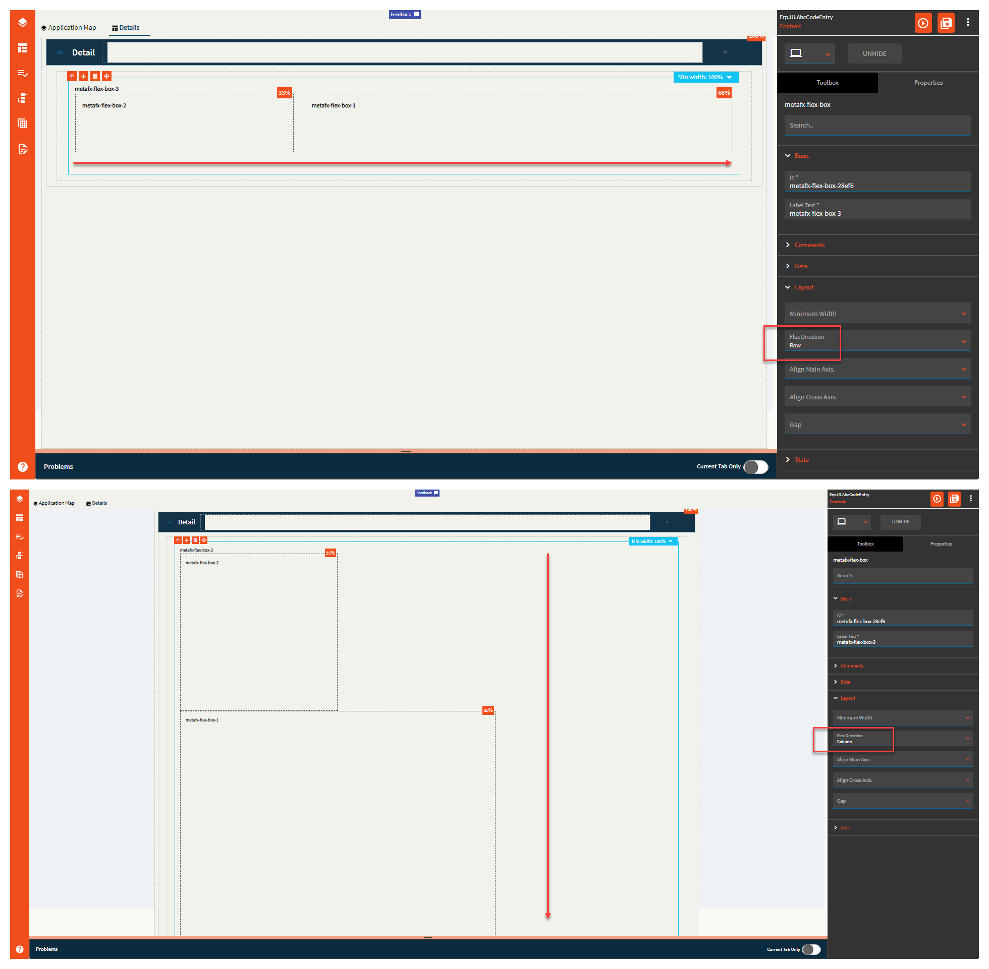
| Layout | Minimum Width | Setting this allows 2 or more containers to “flex” their size and show up side-by-side if the space is available. (Fig. C) |
| Layout | Flex Direction | This defines the direction the controls (that can flex with a min width property themselves) within the container can flex. Values include Row (horizontal), Column (vertical), and Default (horizontal). (Fig. D) |
| Layout | Align Main Axis |
No idea what this does. I would assume this is suppose to align them on the horizontal axis, but it does not do anythign. |
| Layout | Align Cross Axis | This aligns the controls on the vertical axis if the Flex Direction is “column”. If it’s set to “Row”, it just slightly shrinks the control. #Shrug. Valid options include Start, Center, and End. (Fig. E) |
| Layout | Gap |
Where you buy clothes? I have no idea. This doesn’t seem to do anything. |
| State | Personalizable | If true, a user can personalize this component(hide/show) |
| State | Customizable | If true, a user can customize this component in child layers |
Figure A: Label Text
Figure B: Comments
Figure C: Minimum Width
Figure D: Flex Direction
Figure E: Align Cross Axis
Mark be like:

Couldn’t find an energetic fist pump emoji…

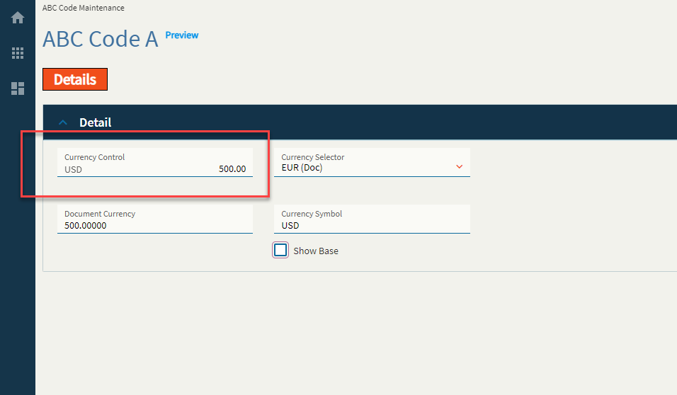
Allows user to have the currency field displayed along with the amount. By default, the currency gets toggled as per value selected from the Currency Selector Control.
So far as I can tell, this will not do the exchange calculation for you. You will need to create events to populate each binding when the currency value changes. For instance, if you set the currency field to be $500.00 USD, you will need to have an event that converts it to Euros (or whatever) and stores it in the Currency Box’s Document Currency binding field. Then, when you switch the Currency Selector control between USD and EUR, it will toggle between each value in the Currency Box Field. This is a very manual control for setup…
| Property Group | Property | Description |
|---|---|---|
| Basic | Id | This is the control’s unique identifier |
| Basic | Label Text | Alter the display text on the button (Fig. A) |
| Behavior | On Click | Click this to create an OnClick Event. On Click is triggered when a user clicks the button. |
| Behavior | On Blur | Click this to create an OnBlur event for the control. On Blur is triggered when the control loses focus. |
| Comments | Comments | Add some developer notes to the control. These are not customer-facing and are only visible in App Studio (Fig. B) |
| Data | Key Field | Indicates that a bound component is a key field. If true, the field is enabled if there is no current record, allowing the user to select an existing record or create a new one. |
| Data | EpBinding | Bind the control to a DataView.Column. This is your Base Currency field. (All Your Base Are Belong To Us) |
| Data | Ep Binding Document | Bind the control to a DataView.Column. This is your Document Currency field. |
| Data | Ep Binding ShowBase | Bind the control to a DataView.Column. This is a boolean value to indicate whether or not to show the base value when the document currency is selected to be shown. (Fig. C) |
| Data | Ep Binding DocumentSymbol | This is the binding for the document currency symbol. Incidentally, when you switch the currency to base by either using ShowBase or the Currency Selector, it does not change the currency symbol, soooo you’ll likely have to wire up an event to do this yourself. Yeehaw. |
| Layout | Alignment |
Set the alignment for the control. Valid options are Left, Center, Right. Does not woooork. |
| Layout | Width |
Sets the specific width (pixels) for the control. Does not woooork. |
| State | Personalizable | If true, a user can personalize this component(hide/show) |
| State | Customizable | If true, a user can customize this component in child layers |
| State | Hidden | Hides the control from view. |
| State | Disabled | Disables the control. The control will not allow editing or focus. |
| State | Read Only | Makes the control read only so that it will not allow editing. The control can still be focused. |
| State | Auto Focus | When enabled, the control is automatically focused on creation. |
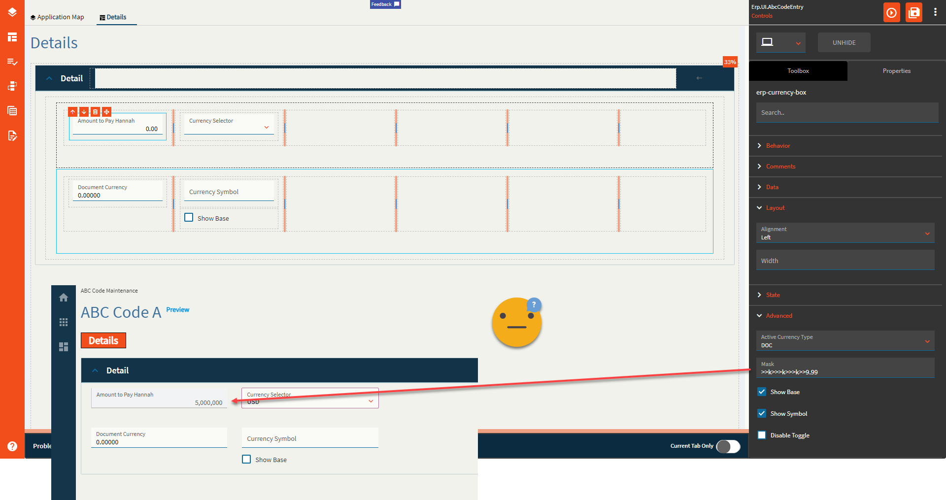
| Advanced | Active Currency Type |
This doesn’t seem to do anything? It’s supposed to set the active currency for the control by default, but noooop. Valid options include BASE, DOC, RPT1, RPT2, RPT3, GLOBAL, and Unspecified (It annoys me that the rest are capitalized, but Unspecified is not. I guess someone forgot to specify a consistent format  ) ) |
| Advanced | Mask |
Sets the format for the field by overriding the extended properties Format. Only half works. It only takes into consideration the “>” and “9” options It doesn’t give a hoot what you put for the separators–yer gittin’ commas… and no decimals. And it only works on the base field. <Insert Nathan Fillion lost for words GIF> (Fig. D) |
| Advanced | Show Base |
This forces the control to show the base value. Or dooooes it? Narrator: It does not. |
| Advanced | Show Symbol | Enable to show the currency symbol. (Fig. E) |
| Advanced | Disable Toggle | Enable this to make the Currency Selector useless. Changing the Currency Selector will no longer toggle the Currency Box between your base and document currencies. |
**After thought: I’m not sure why the Active Currency Type property shows anything except BASE and DOC as there are no bindings for RPT1, RPT2, etc. like there were in days of old. Still seems like quite a nonsensical control.
Figure A: Label Text
Figure B: Comment Text
Figure C: Show Base
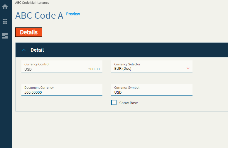
Figure D: Mask
Figure E: Show Symbol
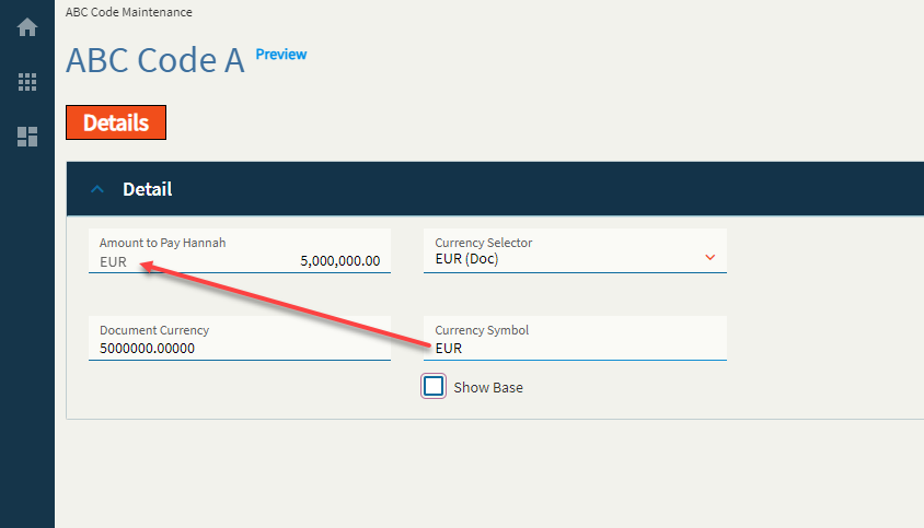
Typically, the textbox where I typed in EUR would be a bound field not shown on the screen. Shown for educational purposes.
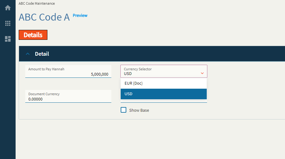
Sister control to the Currency Box–this allows a user to select a currency type from a dropdown.
| Property Group | Property | Description |
|---|---|---|
| Basic | Id | This is the control’s unique identifier |
| Basic | Label Text | Alter the display text on the button (Fig. A) |
| Behavior | On Click | Click this to create an OnClick Event. On Click is triggered when a user clicks the button. |
| Behavior | On Blur | Click this to create an OnBlur event for the control. On Blur is triggered when the control loses focus. |
| Comments | Comments | Add some developer notes to the control. These are not customer-facing and are only visible in App Studio (Fig. B) |
| Data | Key Field | Indicates that a bound component is a key field. If true, the field is enabled if there is no current record, allowing the user to select an existing record or create a new one. Not applicable to this control. |
| Data | EpBindingDocument | Bind the control to a DataView.Column. This is your Document Currency field. |
| Layout | Alignment | Set the alignment for the control. Valid options are Left, Center, Right. (Fig. C) **Behaves weirdly depending on the control size. |
| Layout | Width |
Sets the specific width (pixels) for the control. Does not woooork. |
| State | Personalizable | If true, a user can personalize this component(hide/show) |
| State | Customizable | If true, a user can customize this component in child layers |
| State | Hidden | Hides the control from view. |
| State | Disabled | Disables the control. The control will not allow editing or focus. |
| State | Read Only | Makes the control read only so that it will not allow editing. The control can still be focused. |
| Advanced | Show Document Currency |
When enabled the doc currency type will be ignored and base currency will be used. Does not seem to work. |
Figure A: Label Text
Figure B: Comments
Figure C: Alignment
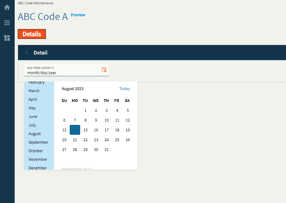
Dates here! Get your dates here! Fresh and mostly working!
This control allows you to enter or pick a date. Shocking, I know!
| Property Group | Property | Description |
|---|---|---|
| Basic | Id | Unique identifier for the control |
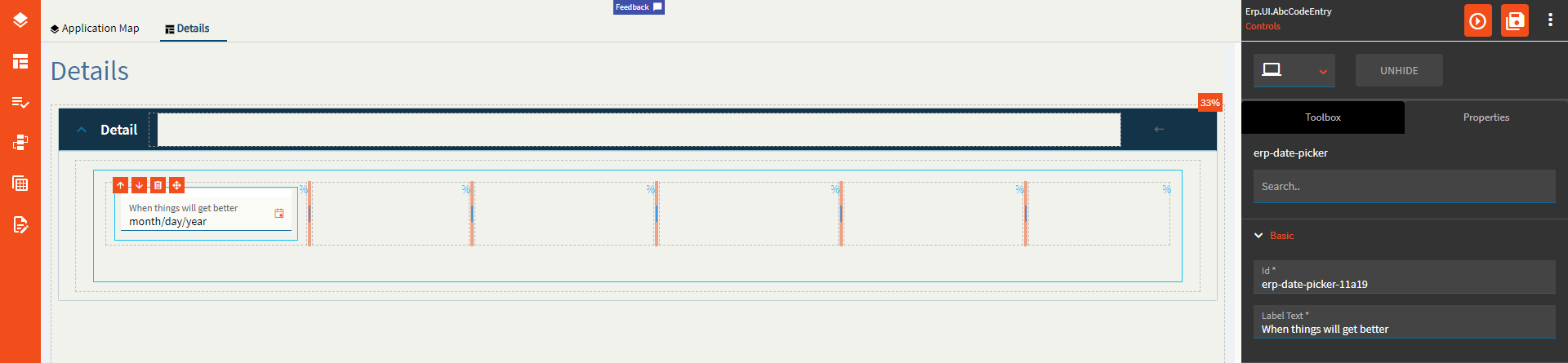
| Basic | Label Text | Sets the label within the control. (Fig. A) |
| Behavior | On Blur | Click this to create an OnBlur event for the control. On Blur is triggered when the control loses focus. |
| Behavior | On Create | Click this to create an OnCreate event for the control On Create is triggered when the control is painted to the GUI. |
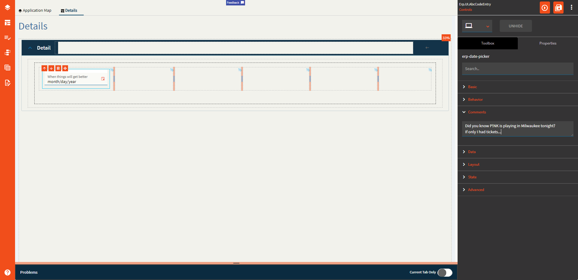
| Comments | Comments | Add some developer notes to the control. These are not customer-facing and are only visible in App Studio (Fig. B) |
| Data | Key Field | Indicates that a bound component is a key field. If true, the field is enabled if there is no current record, allowing the user to select an existing record or create a new one. |
| Data | EpBinding | Bind the button to a DataView.Column. |
| Layout | Alignment |
Set the alignment for the control. Valid options are Left, Center, Right. Doesn’t work. |
| Layout | Width |
Sets the specific width (pixels) for the control. Doesn’t work. |
| State | Personalizable | If true, a user can personalize this component(hide/show) |
| State | Customizable | If true, a user can customize this component in child layers |
| State | Hidden | Hides the control from view. |
| State | Disabled | Disables the control. The control will not allow editing or focus. |
| State | Read Only | Makes the control read only so that it will not allow editing. The control can still be focused. |
| State | Auto Focus | When enabled, the control is automatically focused on creation. |
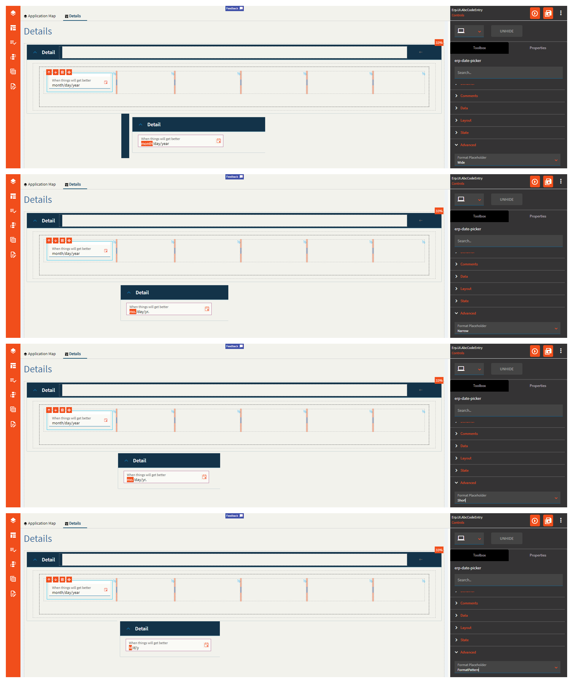
| Advanced | Format Placeholder | Sets the way the format sections of the input field are rendered. Valid options incluuuude Wide, Narrow, Short, FormatPattern. Narrow and Short appear to be the same. (Fig. C) |
| Advanced | Place Holder |
Sets the hint the DatePicker display when its value is null. No. No it doesn’t. This does nothing. |
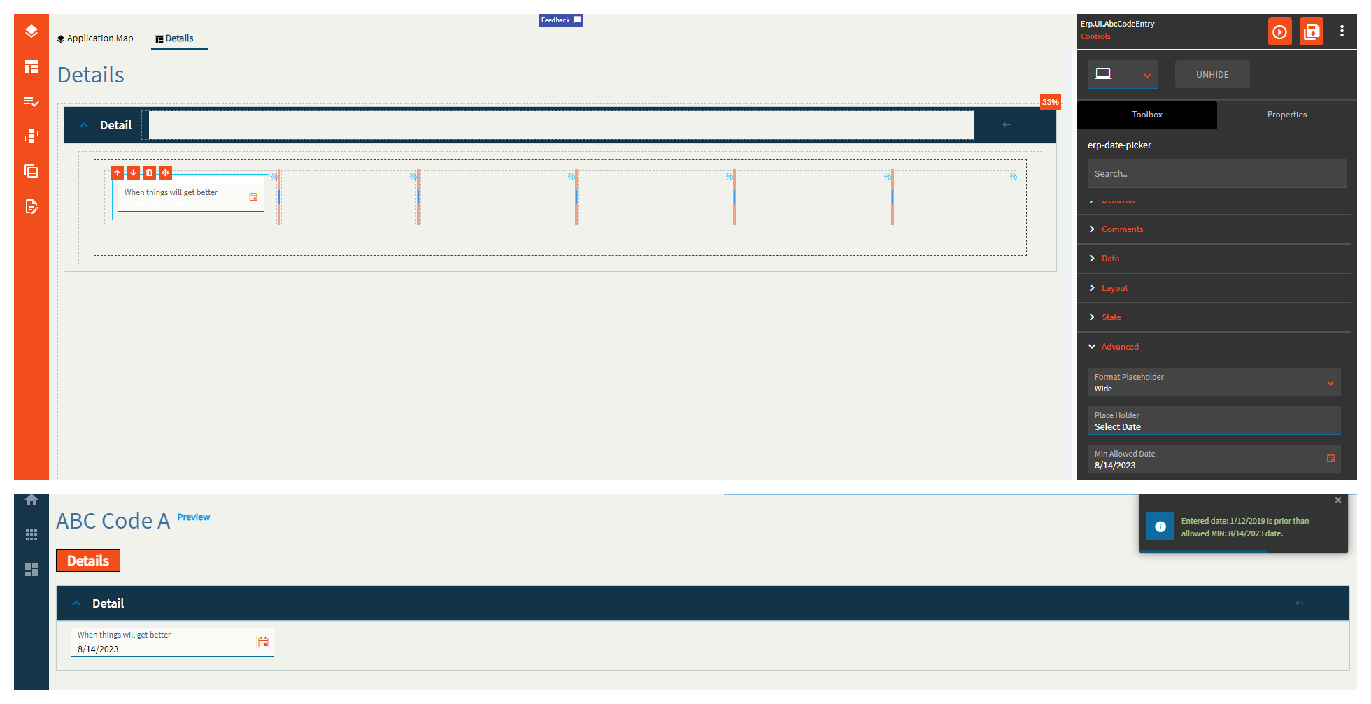
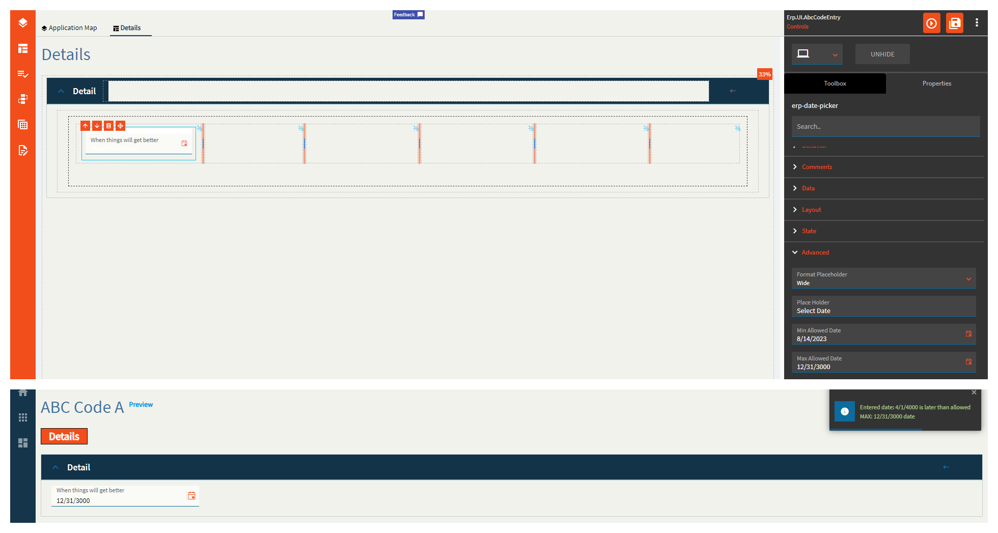
| Advanced | Min Allowed Date | Specifies the minimum date allowed for the control. (Fig. D) |
| Advanced | Max Allowed Date | Specifies the maximum date allowed for the control. (Fig. E) |
| Advanced | Range Validation | If enabled, this will enforce the min and max allowed dates. |
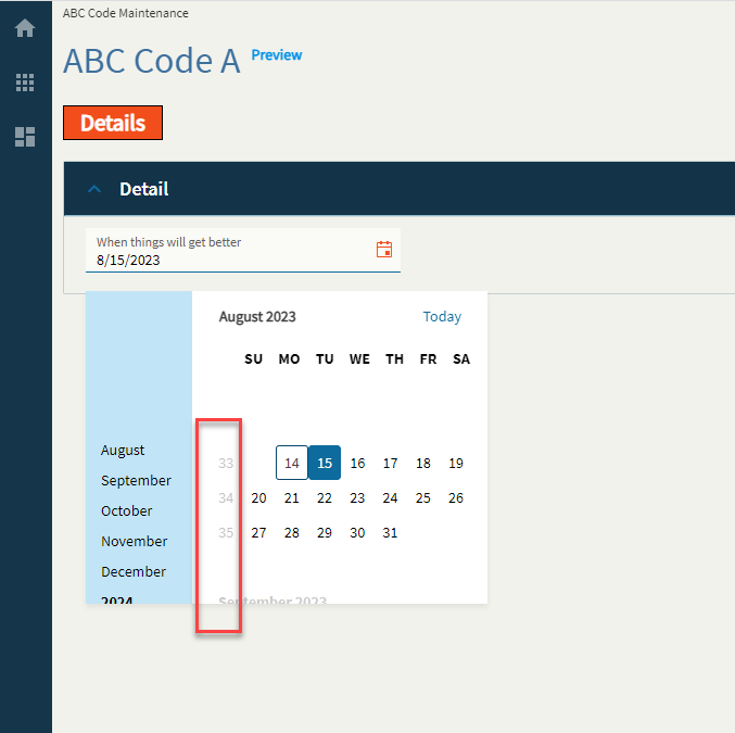
| Advanced | Week Number | If enabled, this will display a week number column in the month view of the calendar (Fig. F) |
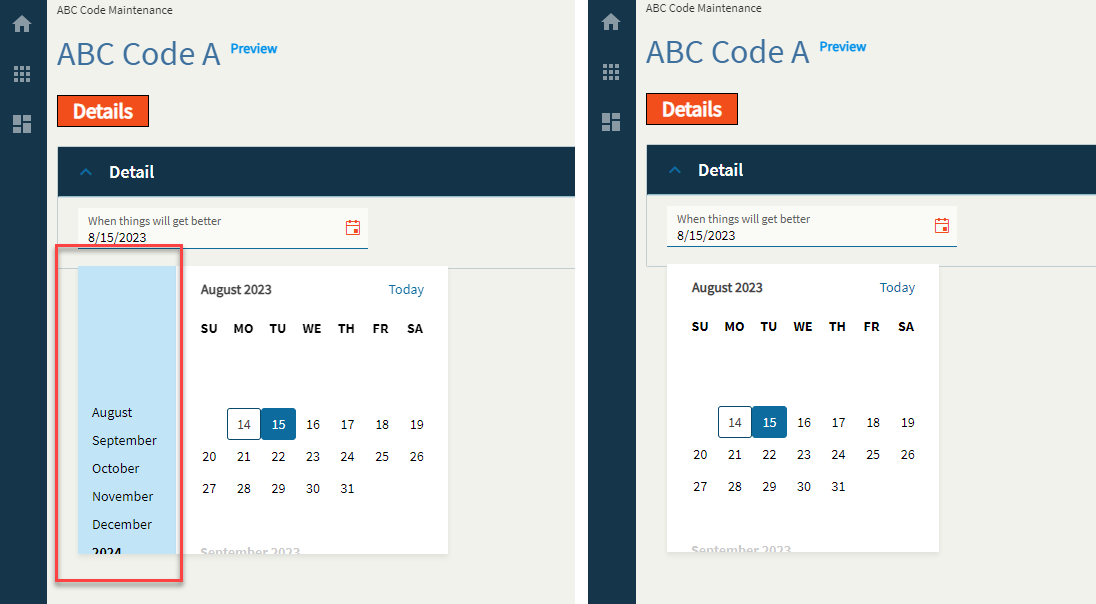
| Advanced | Navigation | If enabled, this will display the navigation side-bar on the calendar. (Fig. G) |
| Advanced | Mask |
Override the default display format for the date time value using Standard DateTime Format strings such as MM/dd/yyyy (08/15/2023) or MMM yyyy (Aug 2023). Doesn’t work. |
Figure A: Label Text
Figure B: Comments
Figure C: Format Placeholder
Figure D: Min Allowed Date
Figure E: Max Allowed Date
Figure F: Week Number
Figure G: Navigation
Thank you so much for doing this!
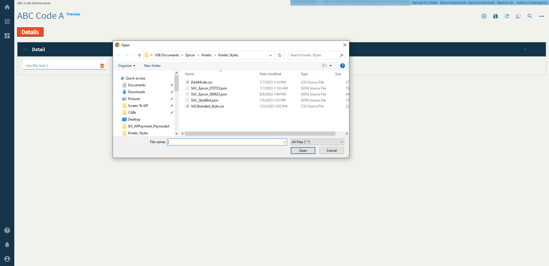
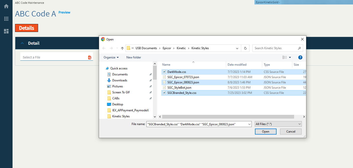
The file picker client allows a user to select a local file.
Note: This does not actually upload a document anywhere. It just saves the file name to a binding. You will need to create an event and use the file-transfer-erp widget to make things happen with the file.
| Property Group | Properties | Description |
|---|---|---|
| Basic | Id | Unique identifier for the control |
| — | — | — |
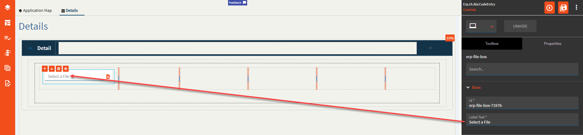
| Basic | Label Text | Sets the label text within the control. (Fig. A) |
| Behavior | On Blur | Click this to create an OnBlur event for the control. On Blur is triggered when the control loses focus. |
| Behavior | On Create | Click this to create an OnCreate event for the control On Create is triggered when the control is painted to the GUI. |
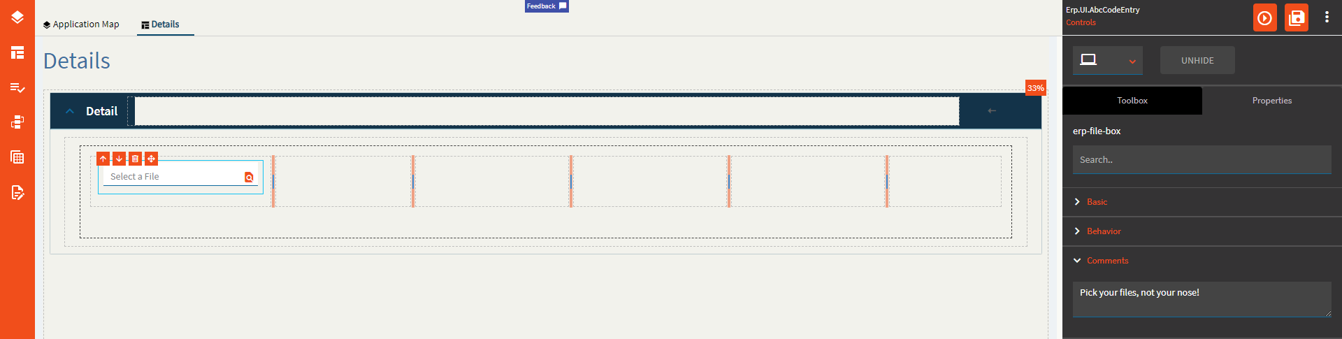
| Comments | Comments | Add some developer notes to the control. These are not customer-facing and are only visible in App Studio (Fig. B) |
| Data | Key Field | Indicates that a bound component is a key field. If true, the field is enabled if there is no current record, allowing the user to select an existing record or create a new one. Would not make sense to be used with this control. |
| Data | EpBinding | Bind the button to a DataView.Column. |
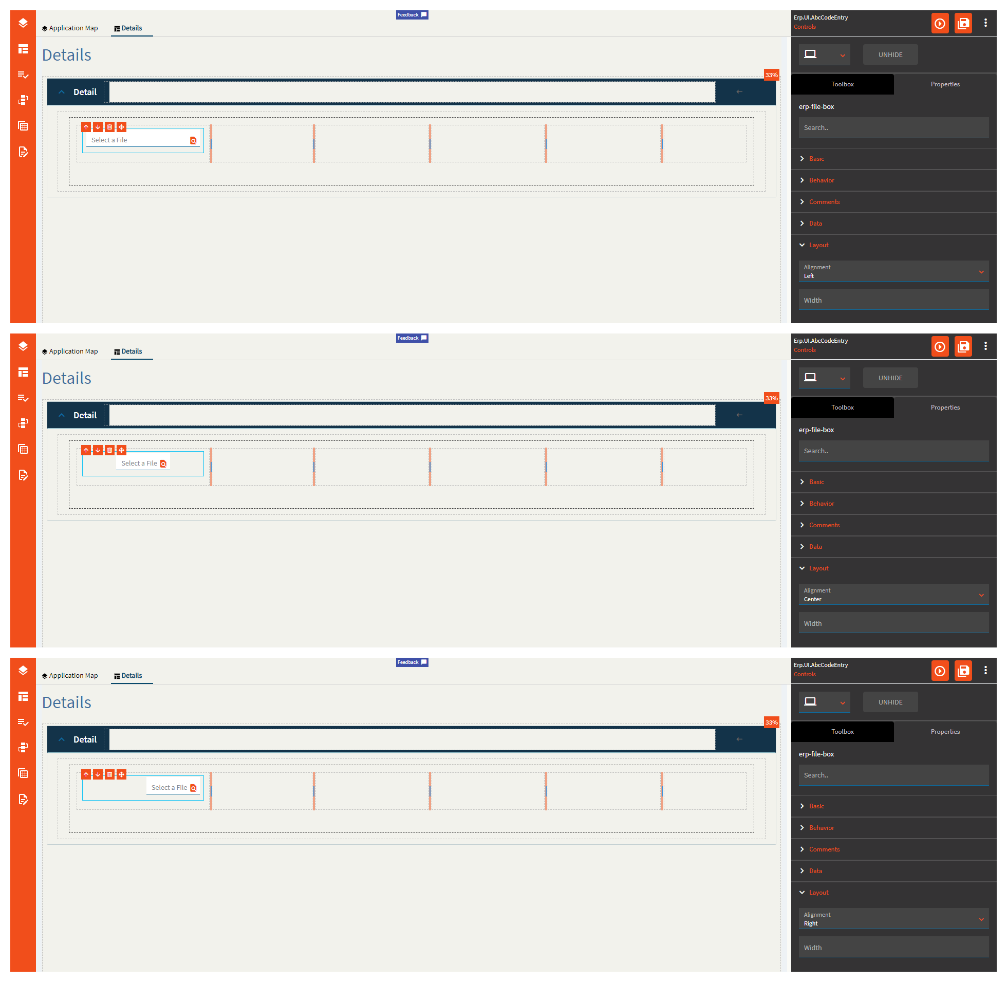
| Layout | Alignment | Set the alignment for the control. Valid options are |
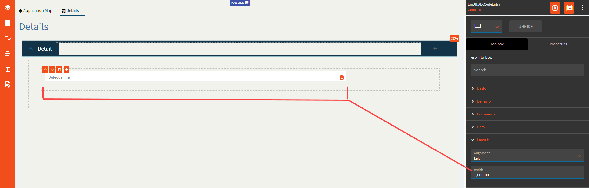
| Layout | Width | Sets the specific width (pixels) for the control. It would seem you cannot go below 290px (Fig. D) |
| State | Personalizable | If true, a user can personalize this component(hide/show) |
| State | Customizable | If true, a user can customize this component in child layers |
| State | Hidden | Hides the control from view. |
| State | Disabled | Disables the control. The control will not allow editing or focus. |
| State | Read Only | Makes the control read only so that it will not allow editing. The control can still be focused. |
| State | Auto Focus | When enabled, the control is automatically focused on creation. |
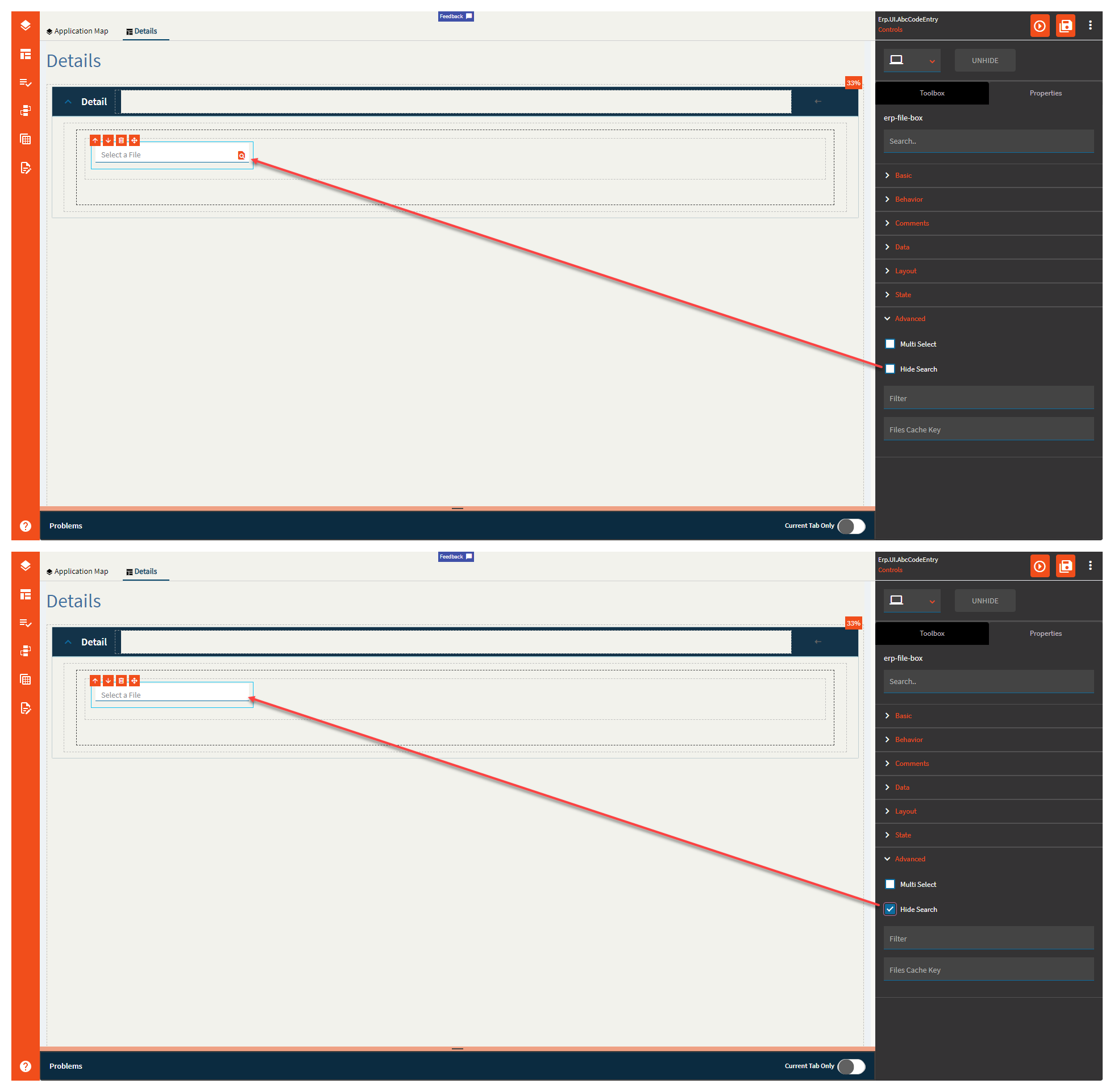
| Advanced | Multi Select | Allows a user to select multiple files. (Fig. E) |
| Advanced | Hide Search | Hides the search icon which disables the file selection. <Insert “But Why” Ryan Reynolds GIF> (Fig. F) |
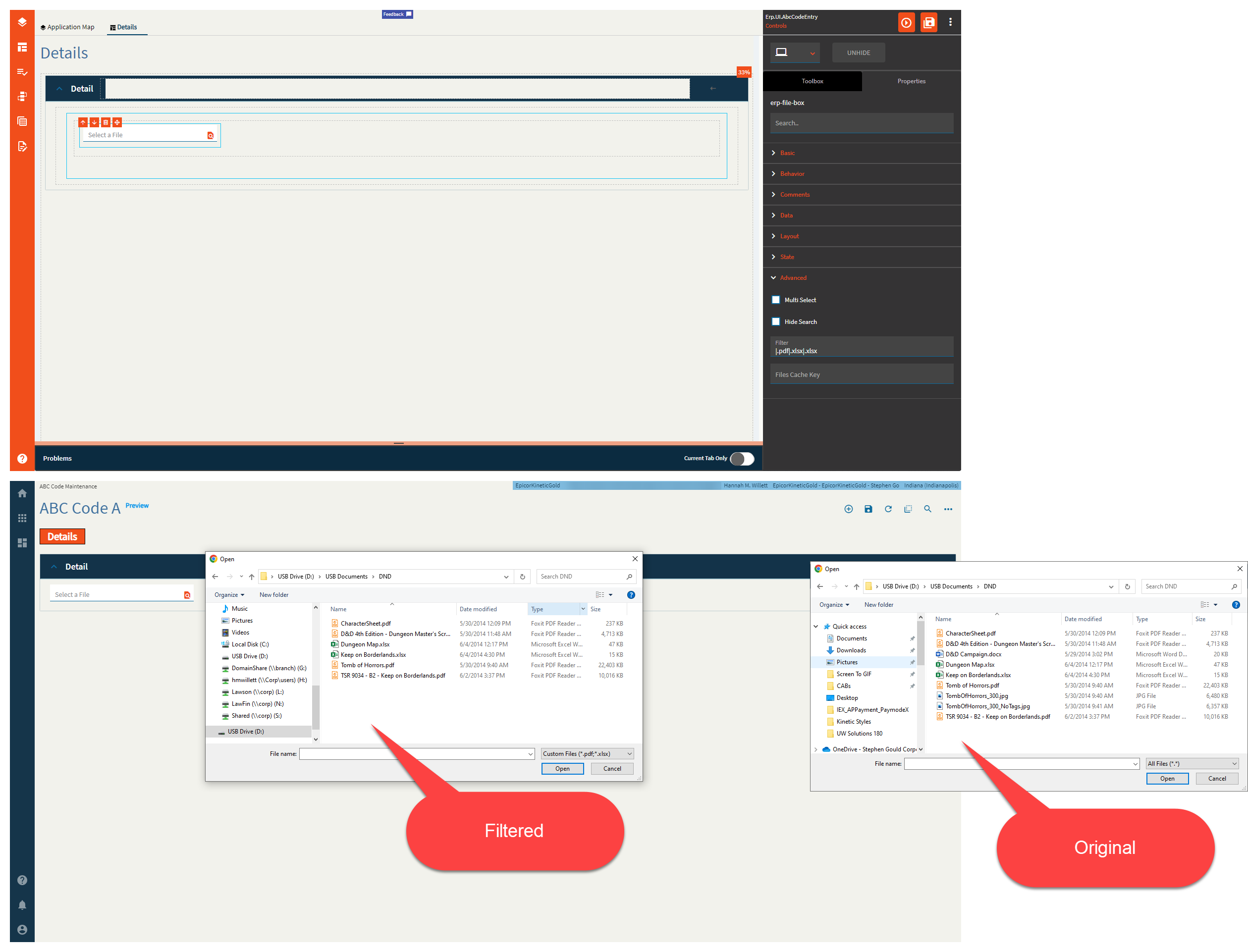
| Advanced | Filter |
Filters the file types allowed. Syntax is |.pdf If you want multiple file types, there’s a bug |.pdf|.xlsx|.xlsx The second |.xlsx will be ignored.|.pdf|.xlsx|.doc|.txt|.css will give you a filter for PDFs, DOCs, and CSS… (Fig. G) I GUESS I’ll submit a ticket for that one. (CS0003827637 ← This was a mistake…  ) ) |
| Advanced | File Cache Key |
Cache key to be used to store the file in cache. If empty, the file is not stored in cache. Not sure if this works, but I could not find the file in either the browser cache or the local cache. |
Figure A: Label Text
Figure B: Comments
Figure C: Alignment
Figure D: Width
Figure E: Multi Select
Figure F: Hide Search
Figure G: Filter
Hannah, we (or at least not me) are not worthy of such incredible insights! 
Thank you!!!