Tab
Allows a user to add a tabstrip where multiple tabs can be added.
**Use a Panel Card Stack for this if in 2023.2+ (See clarification below)
Clarification from @bconner:
See Panel Card Stacks for this.
| Property Group | Property | Description |
|---|---|---|
| Basic | Id | Unique identifier for the control |
| Comments | Comments | Add some developer notes to the control. These are not customer-facing and are only visible in App Studio (Fig. A) |
| Data | Key Field | Indicates that a bound component is a key field. If true, the field is enabled if there is no current record, allowing the user to select an existing record or create a new one. Not applicable. |
| Data | Data | This is where you bind the pages to tabs. |
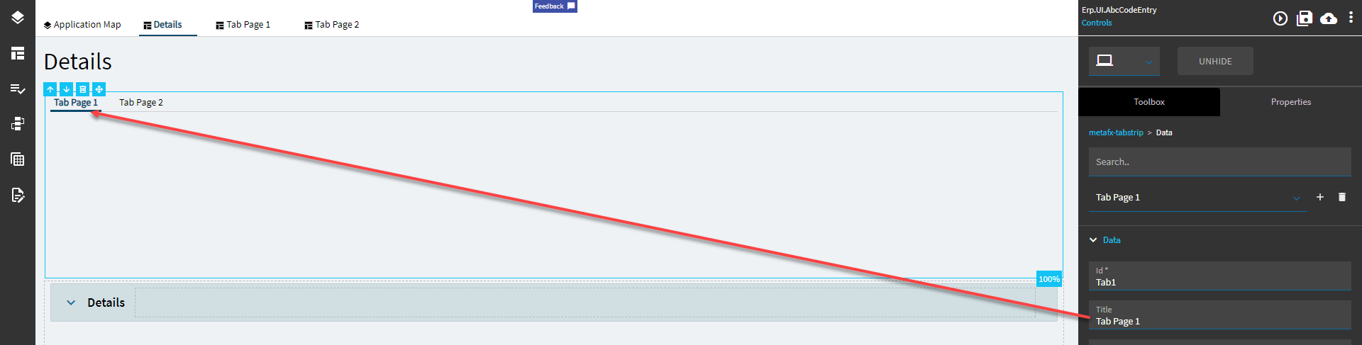
| Data > Data | Id | Unique ID for the tab. |
| Data > Data | Title | Title for the tab. (Fig. B) |
| Data > Data | EpBinding | EpBinding for the tab in the format of DataView.Column. You can use this to enact row rules on the tab (like hiding or showing by user or something). |
| Data > Data | Selected | Specifies the tab to be selected by default. |
| Data > Data | Page | Dropdown of pages available to bind to the tabs. |
Figure A: Comments
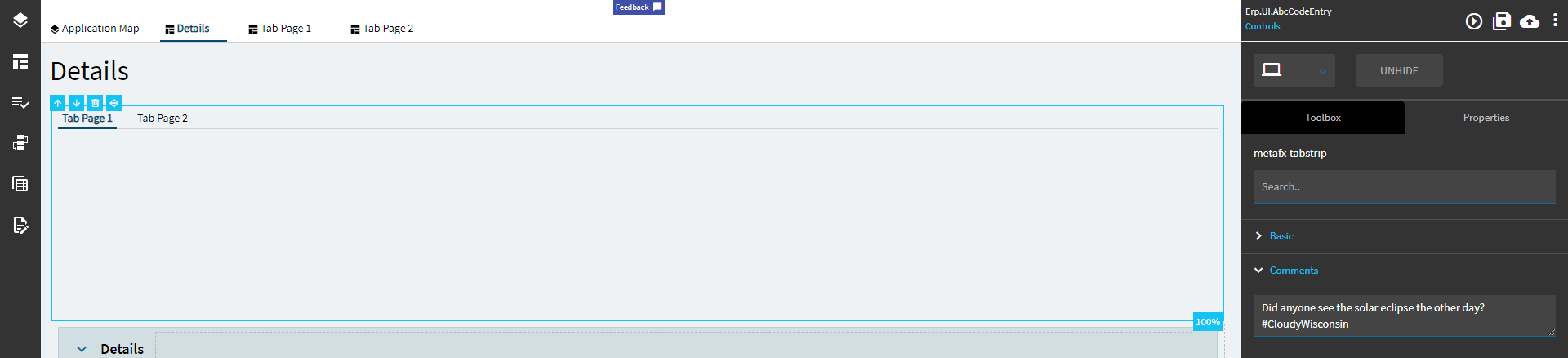
Figure B: Title