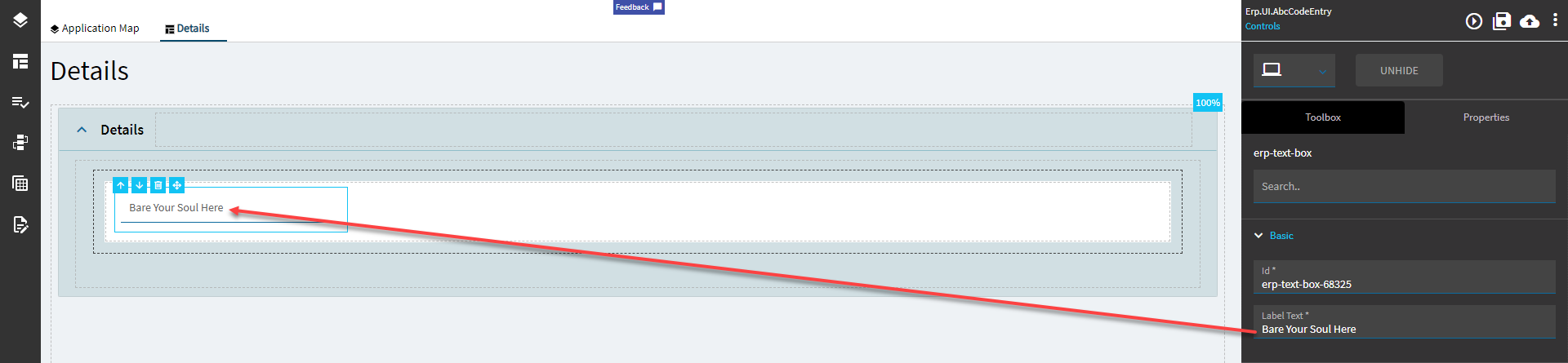
| Basic |
Id |
Unique identifier for the control |
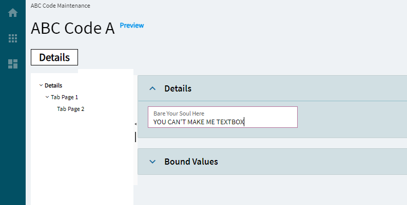
| Basic |
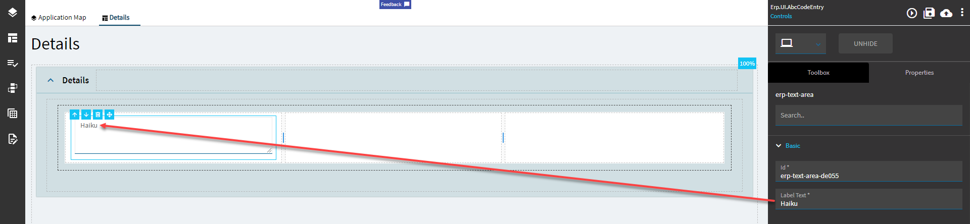
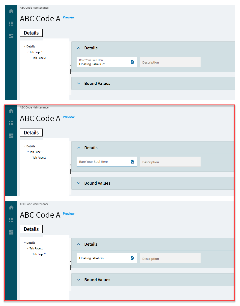
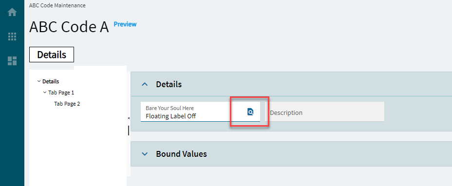
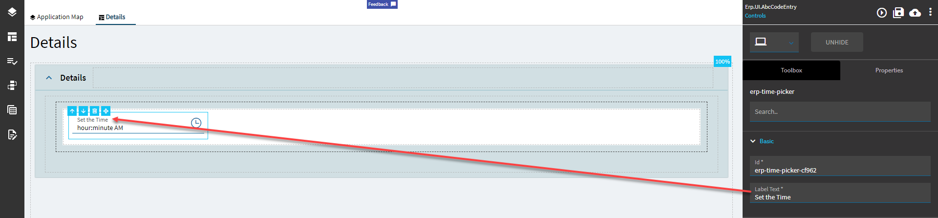
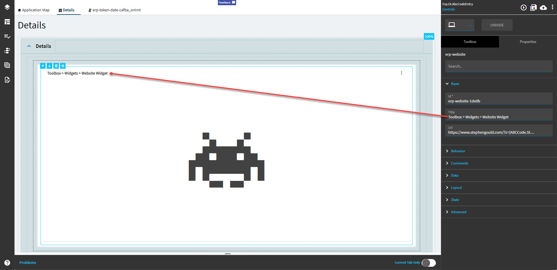
Label Text |
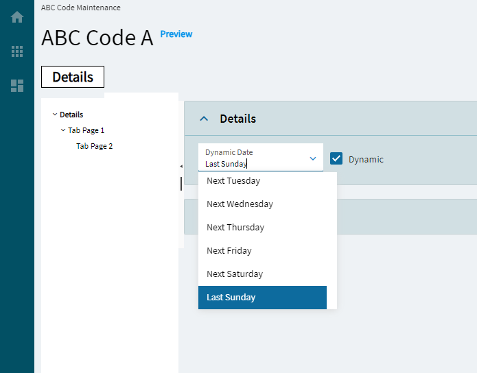
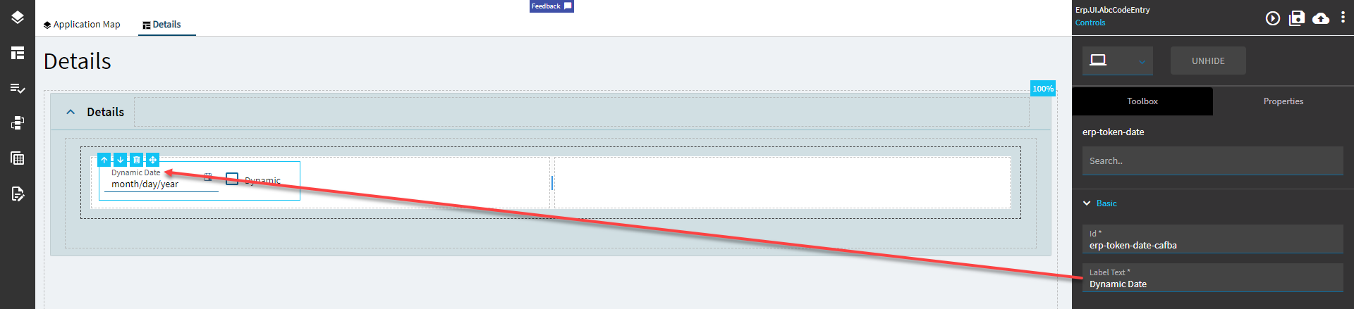
Sets the label within the control. (Fig. A) |
| Behavior |
On Blur |
Click this to create an OnBlur event for the control. On Blur is triggered when the control loses focus. |
| Behavior |
On Create |
Click this to create an OnCreate event for the control On Create is triggered when the control is painted to the GUI. |
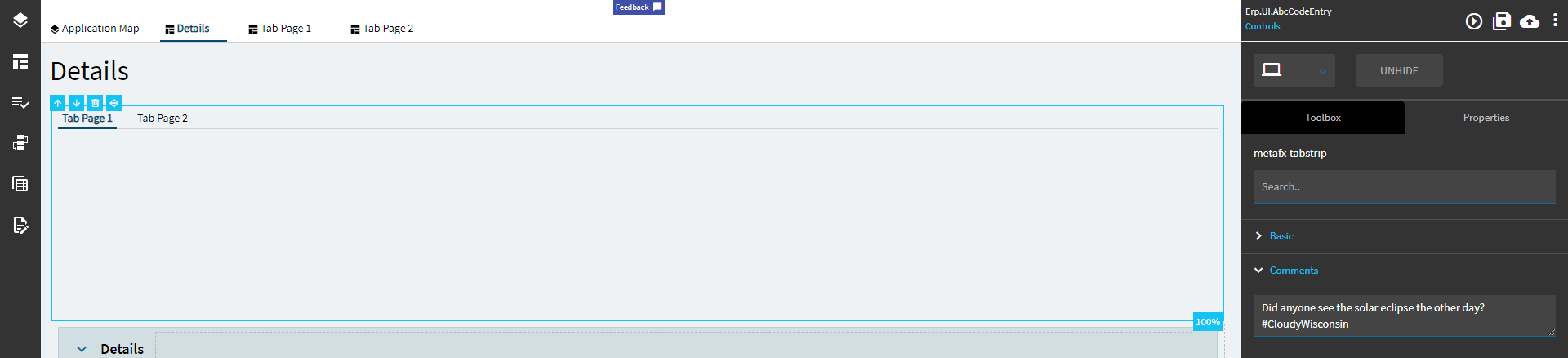
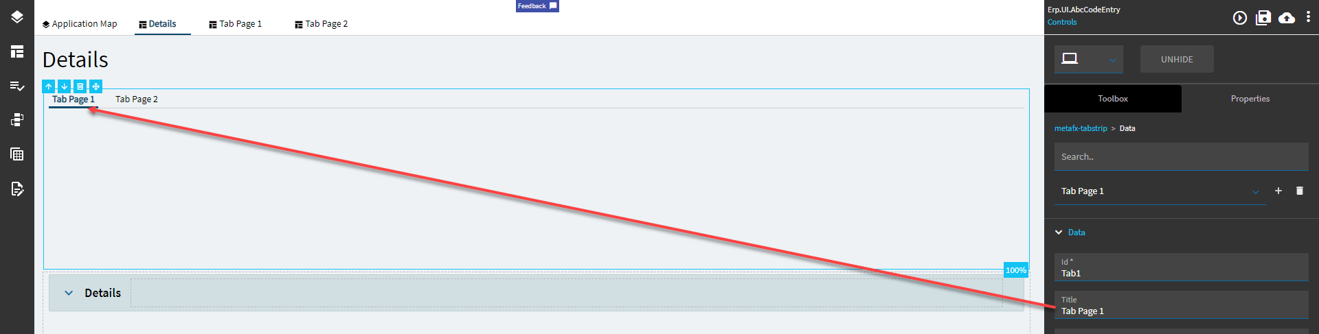
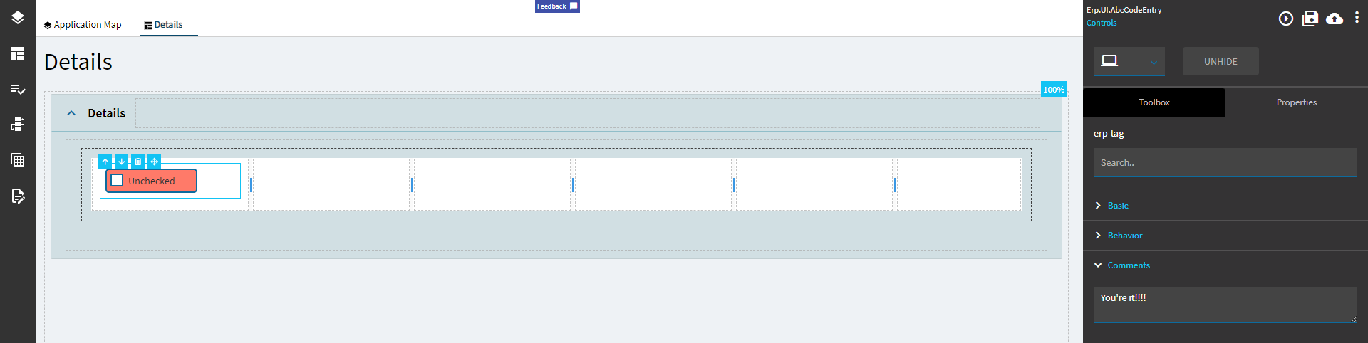
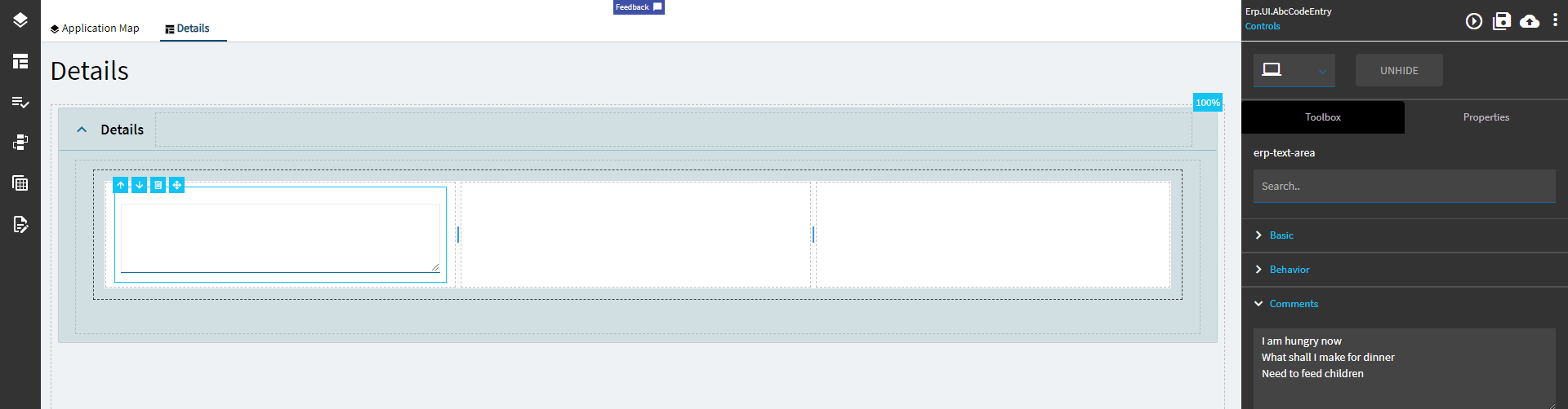
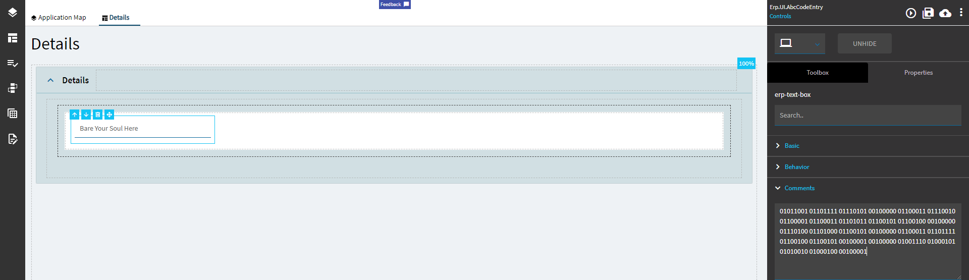
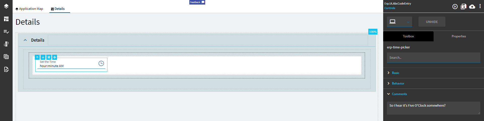
| Comments |
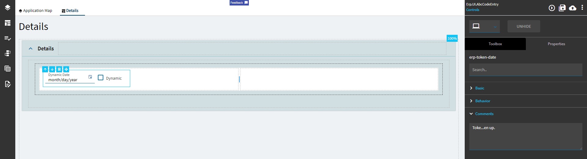
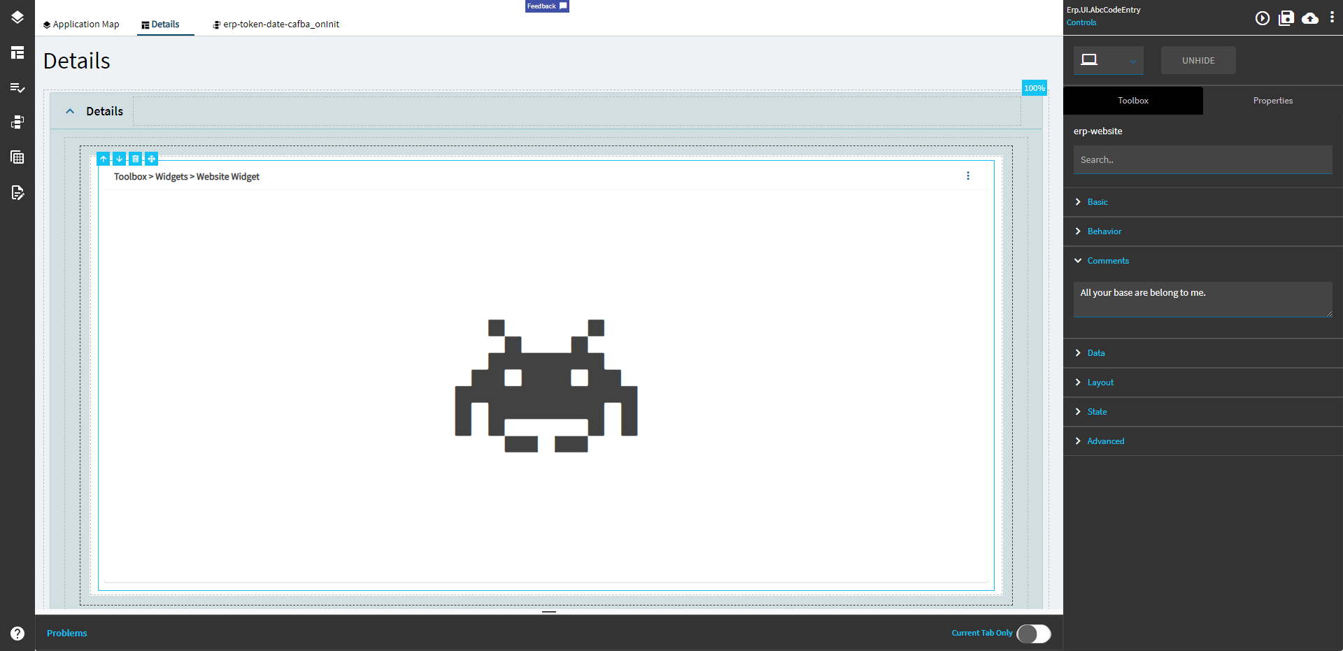
Comments |
Add some developer notes to the control. These are not customer-facing and are only visible in App Studio (Fig. B) |
| Data |
Key Field |
Indicates that a bound component is a key field. If true, the field is enabled if there is no current record, allowing the user to select an existing record or create a new one. |
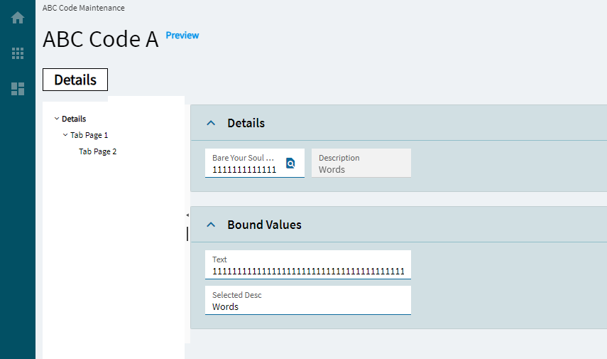
| Data |
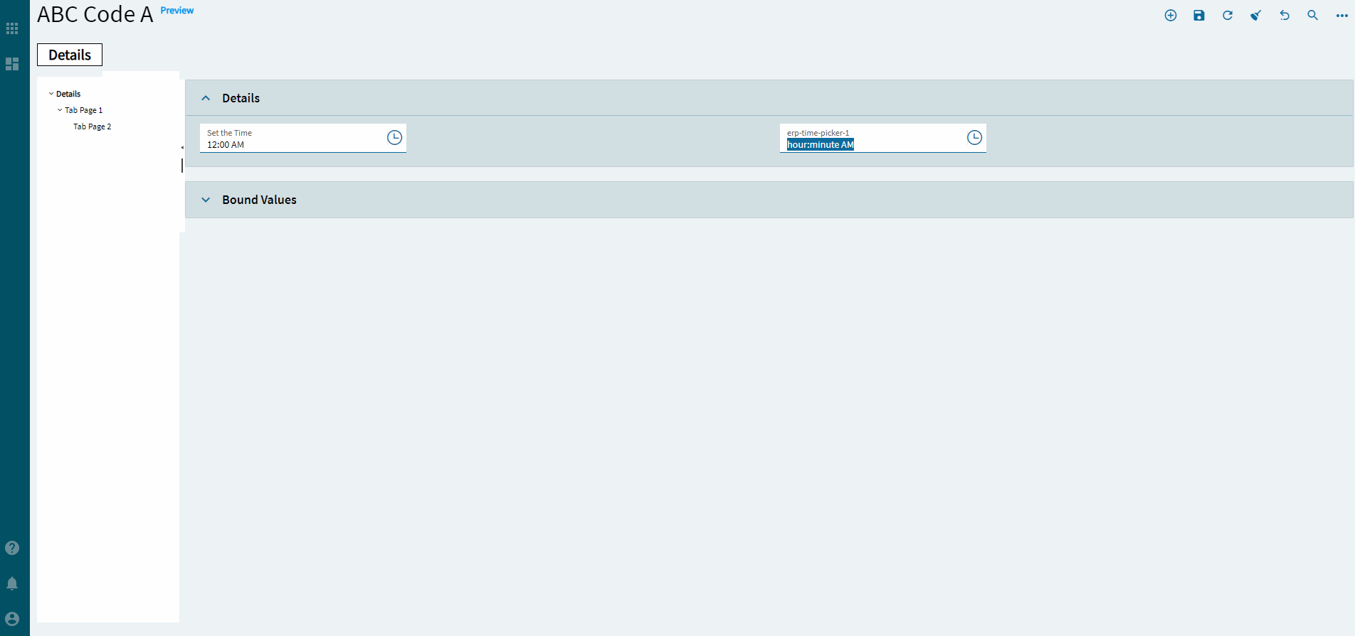
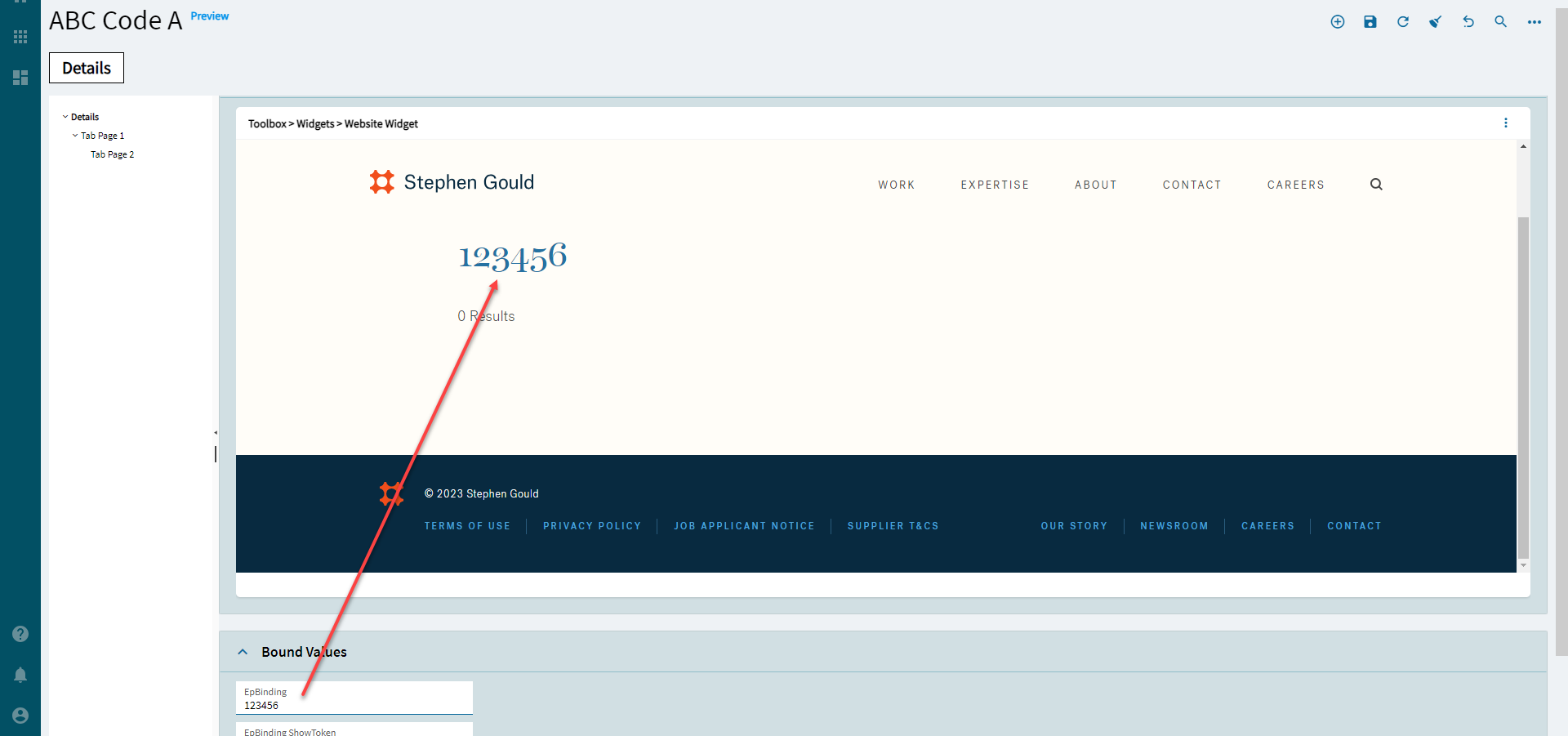
EpBinding |
Bind the control to a DataView.Column. |
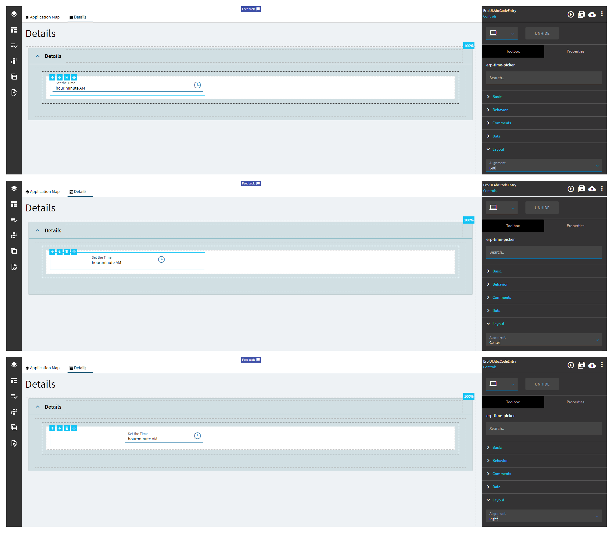
| Layout |
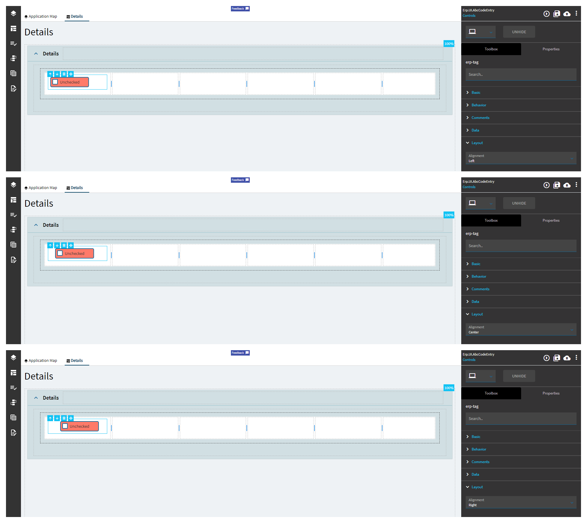
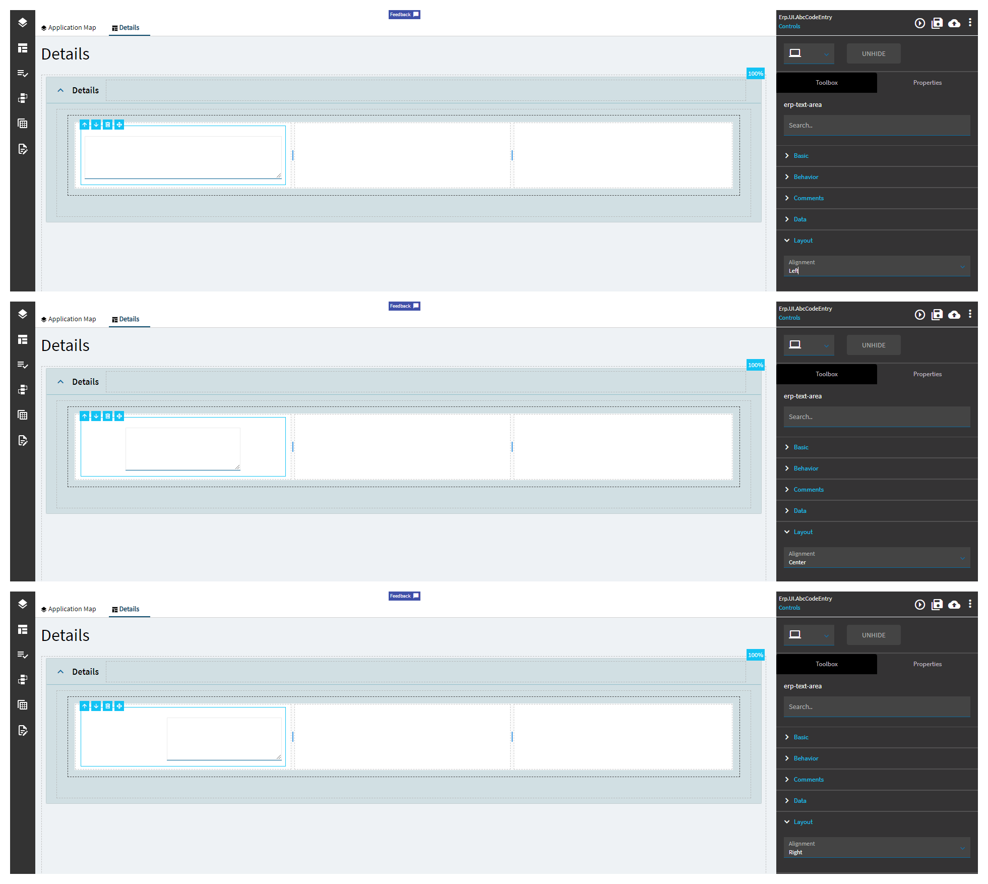
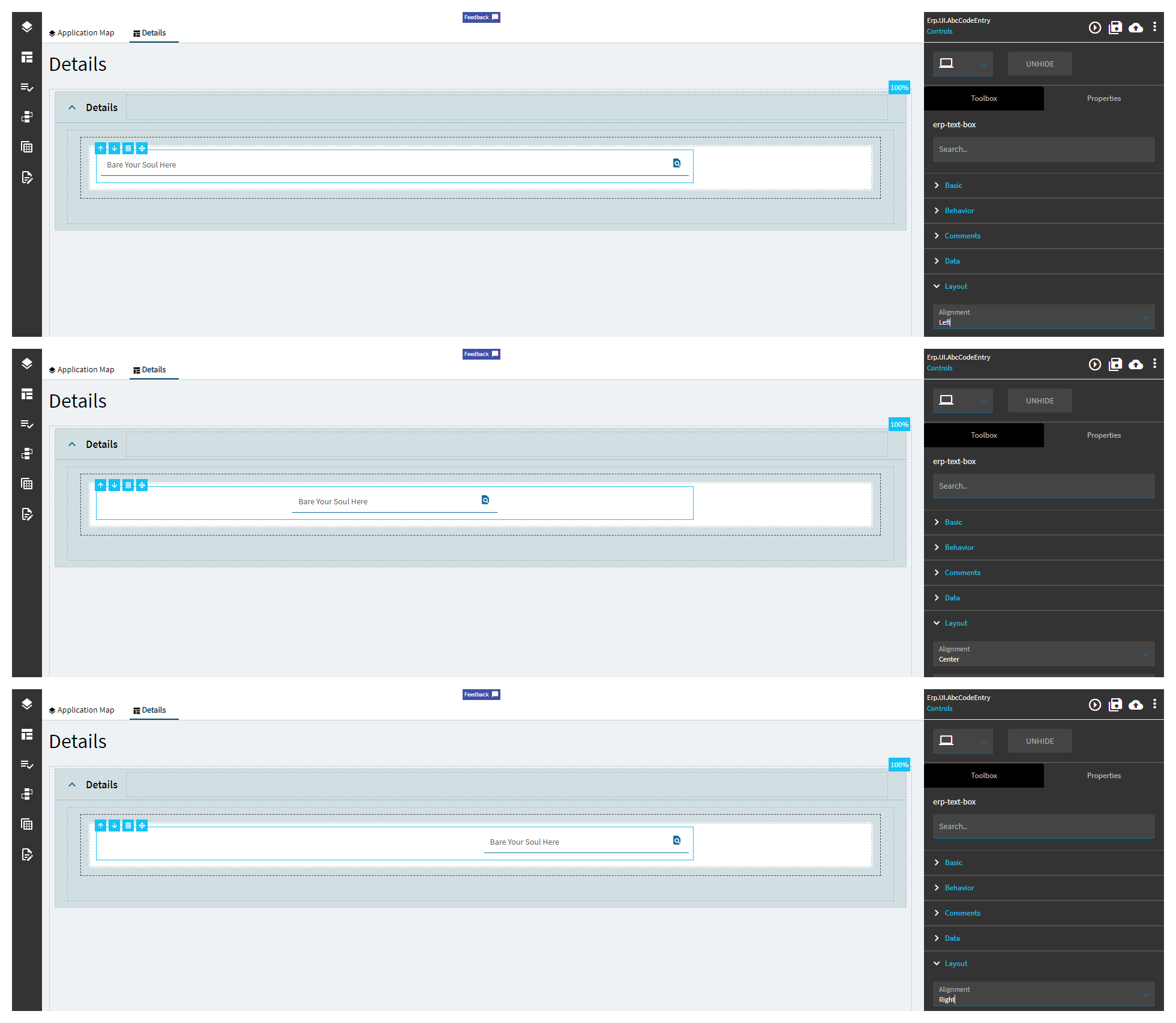
Alignment |
Sets the alignment of the control. (Fig. C) |
| Layout |
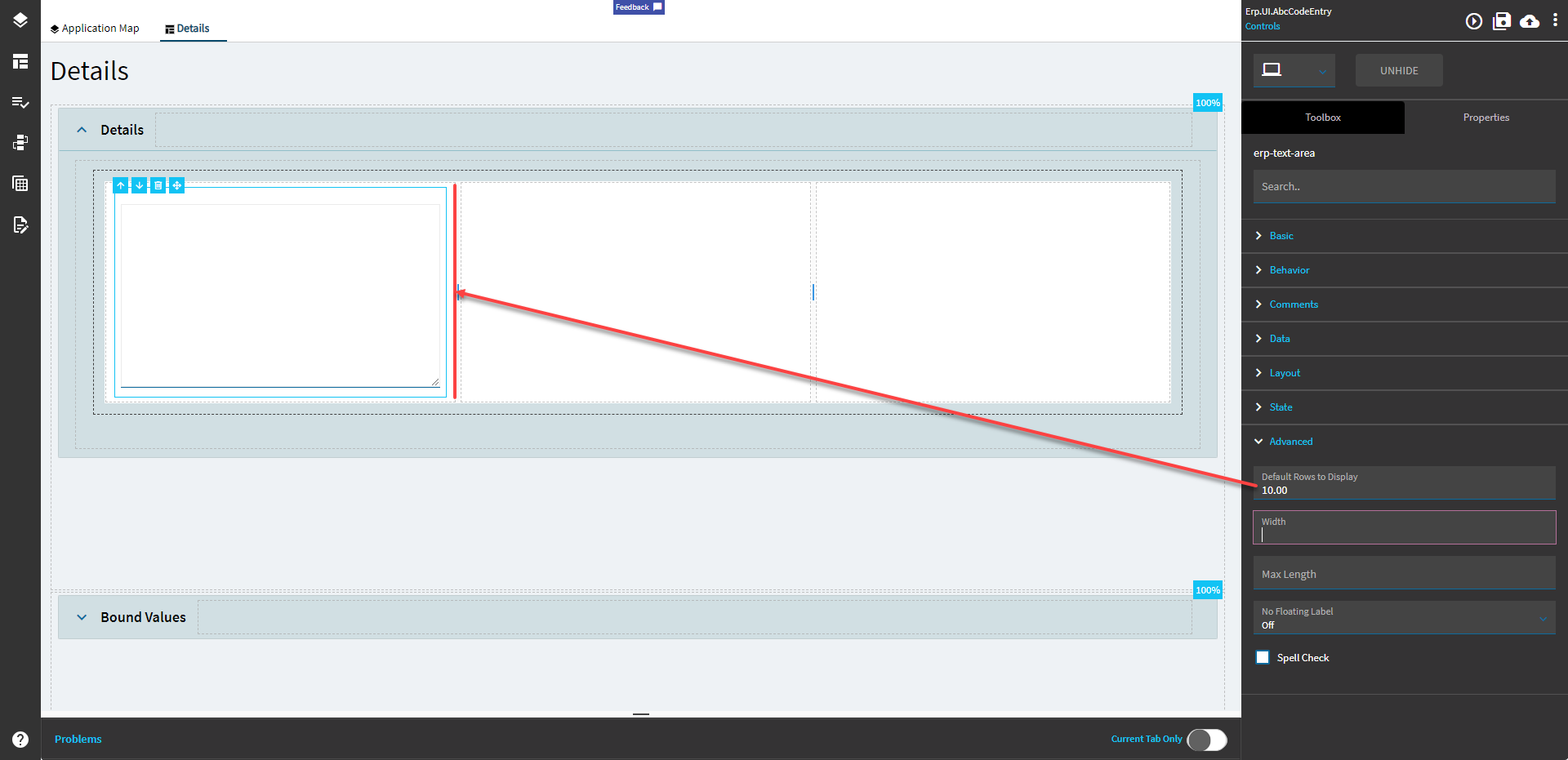
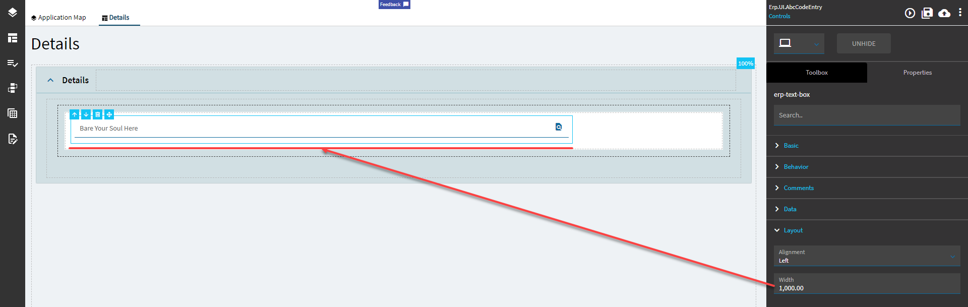
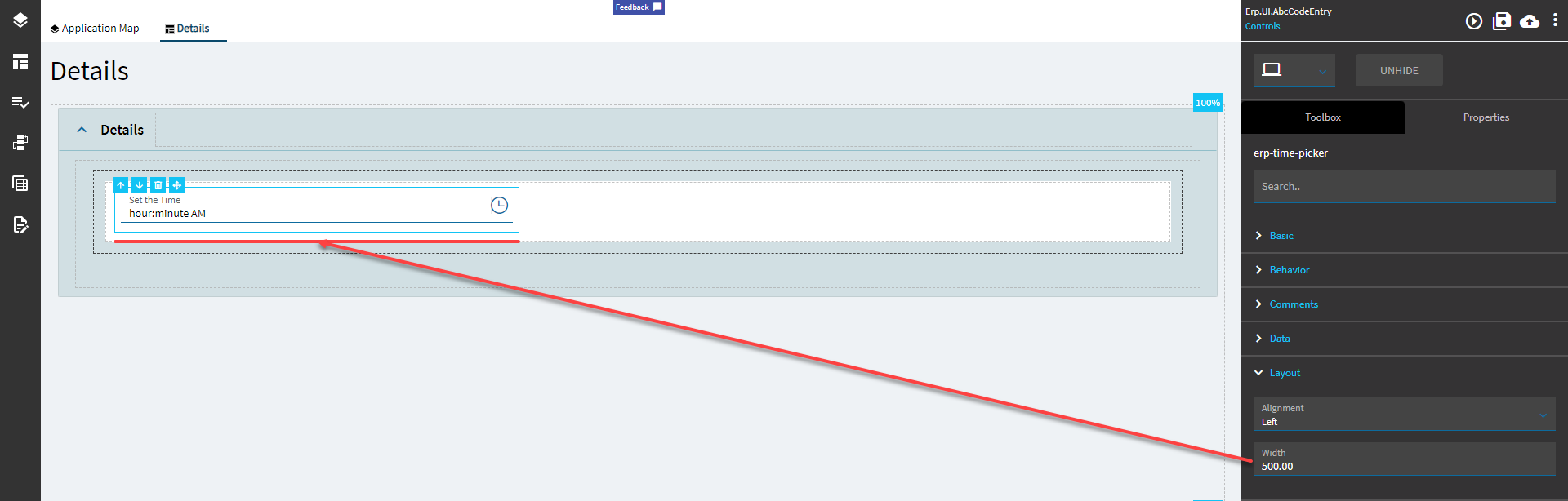
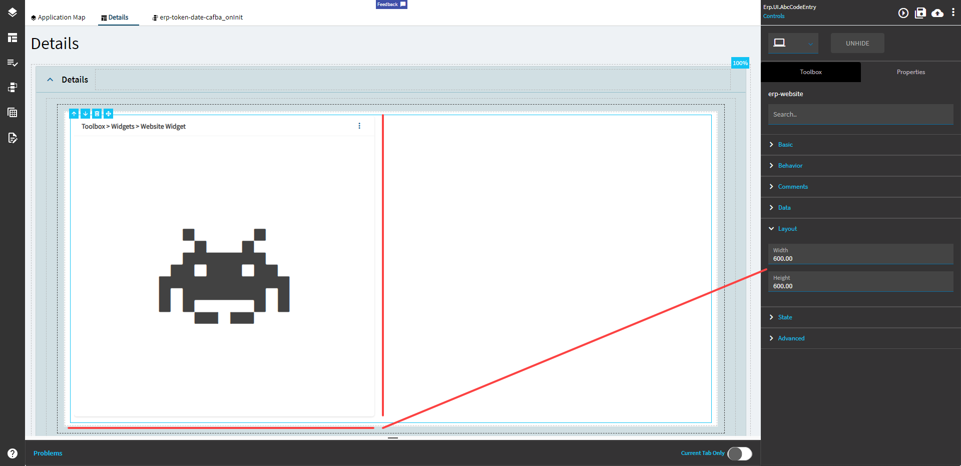
Width |
Sets the specific width (pixels) for the control. (Fig. D) |
| State |
Personalizable |
If true, a user can personalize this component(hide/show) |
| State |
Customizable |
If true, a user can customize this component in child layers |
| State |
Hidden |
Hides the control from view. |
| State |
Disabled |
Disables the control. The control will not allow editing or focus. |
| State |
Read Only |
Makes the control read only so that it will not allow editing. The control can still be focused. |
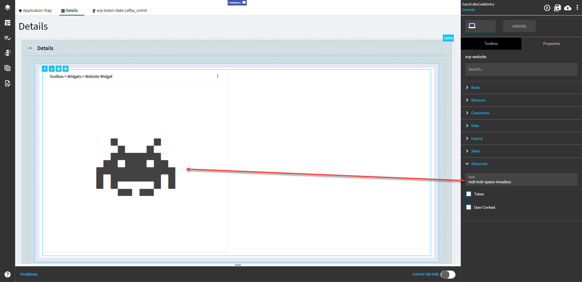
| Advanced |
Format |
 Specifies the time format such as HH:mm:ss or hh:mm. The visual changes in App Studio, but nothing functionally happens. Specifies the time format such as HH:mm:ss or hh:mm. The visual changes in App Studio, but nothing functionally happens. |
| Advanced |
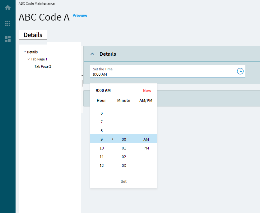
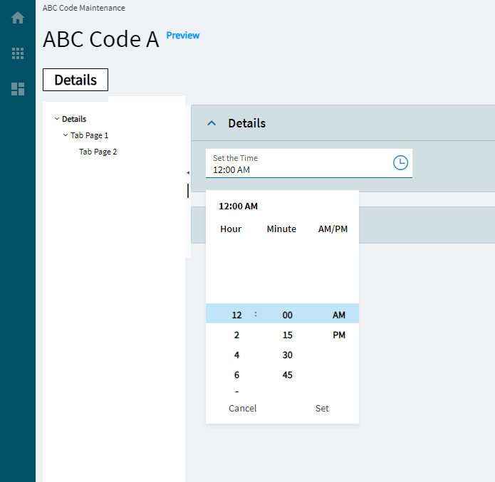
Now Button |
Displays a Now button in the popup. (Fig. E) |
| Advanced |
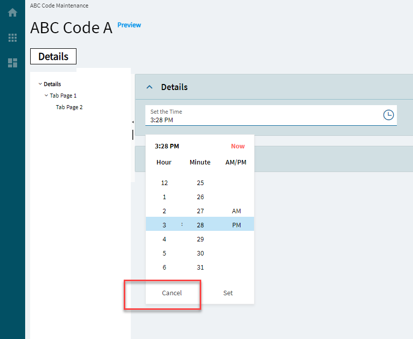
Cancel Button |
Displays a Cancel button in the popup. Or… OR… You could just click out of it? (Fig. F) |
| Advanced |
Format Placeholder |
Defines the descriptions of the format sections in the input field. Valid options include: Short, Narrow, Wide, formatPattern (Fig. G) |
| Advanced |
Placeholder |
Specifies the hint the TimePicker displays when its value is null. But it doesn’t. |
| Advanced |
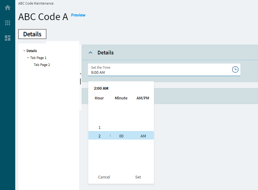
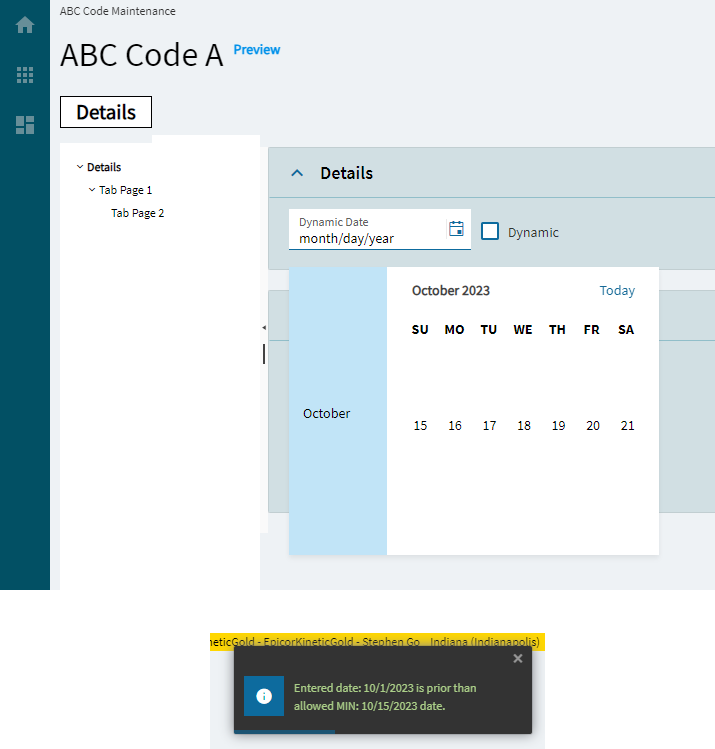
Max |
Specifies the largest, valid time value. (Fig. H) |
| Advanced |
Min |
Specifies the smallest, valid time value. (Fig. H) |
| Advanced |
Popup Settings |
Configures the popup of the Time Picker |
| Advanced > Popup Settings |
Animate |
Controls the popup animation. By default, the open and close animations are disabled. (Fig. I) |
| Advanced > Popup Settings |
AppendTo |
Controls the popup container. By default, the popup will be appended to the root component. Couldn’t get this to do anything. |
| Advanced > Popup Settings |
Popup Class |
Specifies a list of CSS classes that are used to style the popup. Couldn’t get this to do anything. |
| Advanced |
Steps |
Configures the incremental steps of the TimePicker |
| Advanced > Steps |
Hour |
Controls the hours incremental value. (Fig. J) |
| Advanced > Steps |
Minutes |
Controls the Minutes incremental value. (Fig. J) |
| Advanced > Steps |
Seconds |
Controls the Seconds incremental value. (Fig. J) |
| Advanced |
Range Validation |
Determines whether the built-in min or max validators are enforced when the form is being validated. Couldn’t get this to do anything. |
| Advanced |
ReadOnly Input |
Sets the read-only state of the TimePicker input field. Note: this does not gray out the field. |
| Advanced |
Mask |
Override the default display format for the time value using standard DateTime formats. Examples: hh:mm:ss (01:02:34.75), hh:mm TT (01:02 AM), h:mm:ss TT (1:02 AM) (Fig. K) |
| Advanced |
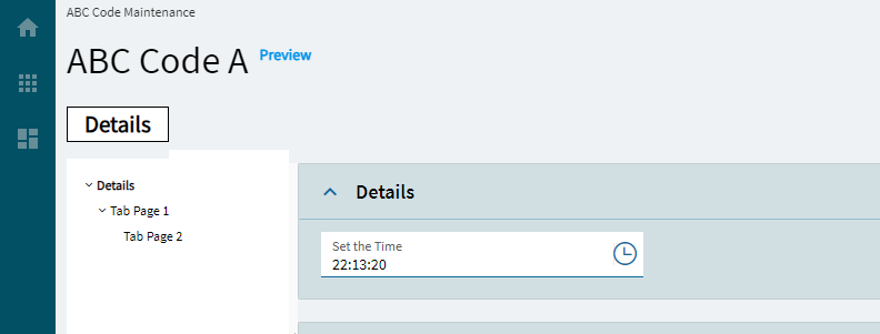
Use 24Hour Clock |
Determines whether to use the 24H clock. (Fig. L) |
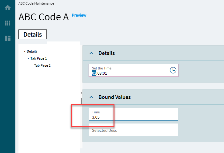
| Advanced |
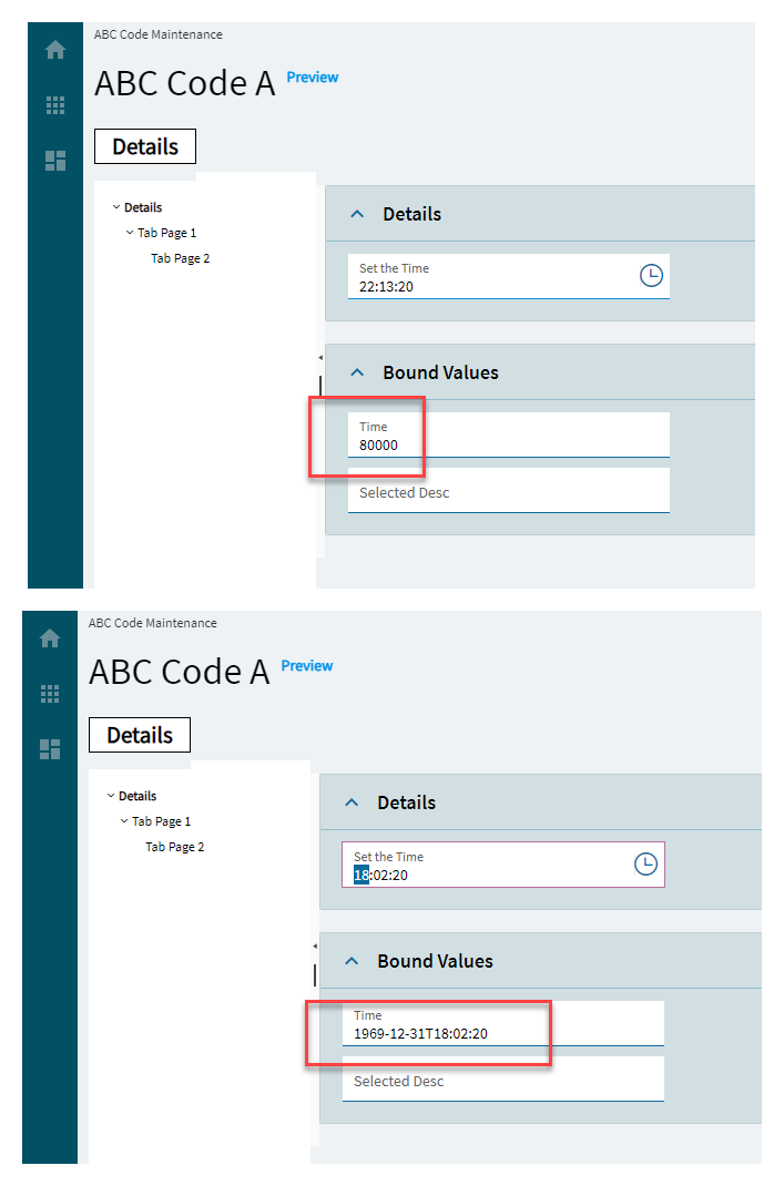
Time Stored As Date Time |
Determines whether to store the selected time as datetime or an integer (seconds from midnight). (Fig. M) |
| Advanced |
Is Decimal |
Determines whether to store the time as a decimal. (Fig. N) |
| Advanced |
Round To Minutes |
Specifies whether to round off seconds to minutes. Doesn’t work. |
| Advanced |
Treat Zero As Null |
Specifies whether to treat 0 as null or 12:00AM. |

 )
)


