We are starting to prepare for our upgrade to Kinetic from 10 but our executive team is asking me to get feedback from other companies that have moved over to Kinetic and what the response has been. If you could leave some feedback positive or negative that would help me a lot. Appreciate it in advance!
Well, it depends.
If you mean Kinetic–as in the new name for Epicor, but still using the classic screens, then it’s fine. Not much has changed.
If you’re referring to the new UX design, then, well. I have a hard time endorsing it. It’s getting better, don’t get me wrong, but in my opinion, the stuff they have released should have never made it out of QA. It feels half finished and is ugly. It’s very “clicky” for a data entry program and quite clunky to customize. There are a number of bugs that still need to be addressed.
It’s also visually unappealing (personal opinion).
I have to agree wholeheartedly. I cannot say anything good about Kinetic yet. Everything about it feels like a forced downgrade to help support features we will never use. But it is forced… so if you’re in Epicor, prepare for Kinetic, or start looking for a new ERP.
Ditto the same. It feels like its catered more to small-mid sized it needs to be more condensed and treated as an Enterprise application, not your mom-dads Quick Books or Turbotax UI. It has alot of visual bugs, context menus are odd, some font is like 48px etc…
I also preferred the dark theme, especially if you look at it all day.
@hmwillett in a browser the whole open with is going to be a bit tough… it was nice to bring up mini window as popups in WinForms… Users will get lost in tabs or the whole drill down. In an Enterprise level atleast.
As far as functionality its still Epicor, love it.
For those who remember the transition to .NET from the Vantage 6 VB Client, this sounds all too familiar. If you told the folks back then that you’re fighting to keep that client, they wouldn’t believe you. For example:
Well, staying on the sustaining .NET Framework certainly isn’t a long-term option. Like VB6, the technology stack of the current client will receive less and less support and more importantly will be more difficult to secure.
What is more possible with Kinetic than Vantage is the ability to make external apps that easily upgrade. With REST and Epicor functions, one can completely skip the new UI and write your own web applications that enforce your business logic. It will also be easier to integrate Kinetic into other web applications by creating components that are embeddable into Teams/SharePoint/SalesForce/Dynamics/etc. reducing the amount of context switching that the old client had. And finally, this architecture will make it easier to use progressive web apps to provide offline capabilities to mobile devices like phones and tablets.
Will it be a bumpy ride? Yes. Yes it will be…again. Will it be worth it. IMHO, very much so.
Like doing cash receipt entries and setting the apply to yes on all of those rows. You have to click twice.
@Steve1286, The Kinetic is very nice for the speed and the options for customizations. With the current iteration, there are too many glitches and the flow is not intuitive on a lot of the trackers. Not everything works like a cascade. You have to sometimes flip back and forth between “Tabs” to get to the full picture. I'm looking at you job tracker...
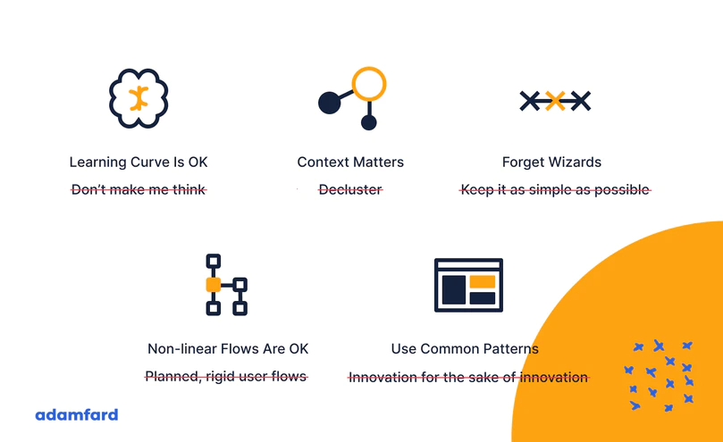
Consumer UX is really passionate about sleek UIs, while enterprise software must ensure that users are able to do their work comfortably. Therefore, simplified, minimalistic interfaces aren’t really what eUX designers are after.
This article resonated with me after building eUX for 6 years, I found the same to be true. Especially:
After running a series of tests, we found out that enterprise users tend to prefer to leave the app or platform for instructions.
Enterprise users are power users — and it’s imperative that we take this into account when designing products for them. They interact with niche software on a daily basis and quite possibly for many years. They know their way around the logic of the products they use.
The complicated part, however, is not to force users into flows and scenarios. Experts and professional users need that freedom to make decisions and use the platform as they see fit.
Consumer UX is really passionate about sleek UIs, while enterprise software must ensure that users are able to do their work comfortably. Therefore, simplified, minimalistic interfaces aren’t really what eUX designers are after.
Like when I open up Order Entry, dont land me on a search page - just take me to Order Entry and let me search from there or create a new one. Remove the Wizard feel
We’re very well aware of the importance of keeping interfaces simple and obvious. However, it’s essential to keep in mind the complexity of the tasks typically performed in enterprise software. The pursuit for a clean UI could rid users of the vital context necessary to get work done.
Off-page instructions can provide more in-depth explanations rather than the ones that are placed on the screen. Compare, for instance, a tool-tip and an article dedicated to a particular function.
One thing we seriously miss in Kinetic is the ability to export to excel when you need only a few lines and only for a quick analysis. Now everything is a full file download.
Also pasting from excel into Kinetic screen is very finicky and does not work in all screens, in fact I had to go back to classic screen in some instances just to be able to do that.
Of course when they don’t as many are learning with high level of turn over these days.
While UI discussions are interesting, I honestly think the trouble with all software is how well it matches the domain of the organization. {Insert warning about Conway’s Law} We are siloed and our software keeps us that way through wizards and power-user mode alike. It caters to one silo or another either by specialized solutions (CRM, Task Management, etc.) or modules within larger programs (ERP, Office Productivity, etc.). There’s very little domain modeling done. “Buy this solution, and this solution, and this module…” It’s great for software companies but it’s awful for the users. Duplicate capabilities all over the place, difficult integrations, just a show.
I think the next big thing will be Domain Model systems that become service orchestrators. You define your domain model and then call loosely-coupled services required to fulfill that model. By using a Domain Driven architecture, it becomes easier to swap out the pieces: Notifications, Document Management, UI, even an entire ERP system. It should also be easier to change your processes and not get locked into what one software developer or another chooses for you.
We are a small company and I double as the Production Planner when not chasing down Epicor issues and light customizations/Modifications. While the new UI is easier to customize on a visual standpoint ( once they got rid of the Pin the Tail on the Container Game) , light mods like adding UD fields are quite easy. My first stab at customizing forms ( a year ago, part Tracker, everybody uses it) got rather cumbersome because I could only fit so much on 1 screen. Everybody here has mentioned it as a gripe, where you could fit 5 data items in classic, the same space in the new UI can fit 2. So much padding on every object. This was really evident on dashboards… Never did figure out how to get 2 grids on the same horizontal plane. Therefor everything had to be tabbed or go vertical. Our power users generally use 2 monitors but still, need to make the best use of the real estate available.
Then with the 2021.2 upgrade, they did away with the Part Tracker dll for Kinetic screens, that threw a wrench in things. Later they ( Epicor) enabled the open as read only so we could modify the Part Maint. Screen and have the users use it as a Tracker.
Copy and Paste is still an issue, seeing that open with is so slow on the new ui ,trying toCopy/Paste to open new form is just as cumbersome. We kept getting promises of Open with and change row on grid would " follow’ on form opened with. Never happened.
I have abandoned all Kinetic forms for our company and had cloud services turn off Kinetic UI for our Company. We will jump back in and re evaluate it in our pilot environment next Summer.
One of the last straws was on a search screen for a customer, the first 30 or so customers would show up over and over and over. The more you scrolled down, the more times you would see those same 30 customers.
Don’t get me wrong, I really hope Epicor gets this UI use-able for our purposes . My first day here in this company was 7 years ago and they just completed the rollout of Epicor 9 from vantage 6. They had a team of 6 IT people to work on the conversions. Now there is just me and maybe 1 other Manager that could help in a conversion to a different ERP. Not something I would look forward to…
I haven’t got this out of dev yet, but two things jump out at me from our Q2C exercises and reviews with super users:
I haven’t actually met anyone who finds it intuitive on a desktop or laptop, but;
Everyone who sees it on my phone or tablet thinks it’s awesome
Modern UI/UX is really broadening the gap between the users and the technical people. This improves user accessibility, for sure; but lowering the barrier to entry on Enterprise-level work is not necessarily desirable. However, it’s getting harder to hire from the intelligentsia, so I guess it’s going to be useful in the long run as more work goes to Android.
Also have to acknowledge the several Epicor employees on the last Midwest users’ group meeting, who really seem determined to improve the product.
Yes, when thinking about straight data entry…I’m reminded DataFlo (think unix/green screens) where repetitive data entry was REALLY fast.
When moving to V6. complaints on the the increase “clickyness” were common.
When moving from V6 to V8, another round of complaints on even more “clickyness” creeping in. After that E9 thru E10… users were able to so many more things that “clickyness” wasn’t much of an issue anymore.
I’m also thinking it will be worth it.
Having said that, I personally prefer lag a year or two behind releases. That way the most egregious “stuff” will usually been worked out already… by people other than myself.
An area that doesn’t appear to have been addressed is how effective people that are visually and/or physically challenged can handle Kinetic. For example, can the screen be navigated without using a mouse? There are people that can’t use a mouse.
I find location of key items in the upper right-hand corner not in line with key data is usually in the upper left-hand corner so your eyes are located there but you have relocate to the upper right to perform key functions.
On-prem. We upgraded from 10.2.500.30 to Kinetic 2021.1.11. Note that we only use AP and GL, so we’re probably a very small subset of the population haunting these forums.
We chose not use the new interface in order to keep things simple for our users, so we have kept on the thick client and 100% classic mode. This has the added value of giving the new UI time to get further baked in, and missing features added.
This was the first time we had to send our rather large database through Epicor’s database conversion process. I was shocked that it was really quite easy to do, and rather fast all things considered.
Most of our form level customizations “just worked”, as did our custom reports and the like. There were a few hiccups with security for some new things we had to adjust, but we worked them out.
We took the liberty of moving from Windows 2016 to 2019 for our app server. Patching 2016 is an epic nightmare of hours due to Microsoft’s patch mess they never fixed. This actually was a good process, because it let us jettison some of the bitrot and minor mistakes we had made in the initial install a couple of years back. So starting fresh was not bad at all. We had professional services support for that because - let’s face it, we’re not doing this every month, so a couple of hours of time is well spent having the help.
For us, the database changes were extremely minor. We had two CSG customizations under support which they upgraded, and everything was fine there as well.
All in all, rather pleased. We also started using the new web API 2.0 for some custom transactions, and that worked exactly as advertised. If you’re doing that kind of thing in .Net, highly recommend NSwagStudio to automatically convert the Swagger to classes for you - saved hours of time.
Overall the lack of a dark mode, the fact that they took most popup search and print screens from a one tab page of checkboxes and fields and changed it to a bunch of drop down tabs, and the lack of a useful tree view for menus has me definitely not wanting to switch to this new Kinetic UI. It is really terrible in my opinion.
Coming to this a little late but I still thought I’d throw out a what might be a slightly different perspective. Our small company went live, with Kinetic (cloud), about 6 months ago.
I’m coming at this with a website maintenance & software admin background (not a dev, though I understand enough of the basics of html, css, etc to modify things when needed, and not a programmer). I much prefer Kinetic to classic.
Are there bugs? Absolutely. We knew that going live with a brand new product there were bound to be, but for our small shop the trade off of not having to teach a system with an outdated UI only to turn around and teach them another one in a few years was worth it. And the more intuitive UI (for someone absolutely new to ERP) definitely helps.
I love that most of the main screens automatically give you a dashboard view of your data, rather than a search bar. BAQ grids are awesome. And I love being able to modify screens easily. And they really do seem to be improving things with every update, which I appreciate.
I should clarify that I don’t necessarily think the UI is very intuitive (probably because ERP systems are just complicated), but definitely more intuitive. Especially for someone new to ERPs that is used to seeing intuitive user interfaces in almost every other aspect of their lives.
I can totally see that for someone used to keyboarding their way around screens, and for someone who knows how to make classic do exactly what they want it to - the change would be very frustrating.
For our small shop with limited tech skills, Kinetic is great.
this is a really great perspective. Despite my complaints, I also realise that a lot of our issues are self-inflicted wounds due to over-customization. If you start with an app-like ui and work with the software, it’s probably a much more effective solution.
For us its simple; we are high volume shop. Of course we automated alot… we process 10,000 Invoices a day.
But even a normal mid sized business who needs to jump from screen to screen, open multiple, use 2 monitors open a tracker and another tracker and see them in a grid of 4… will struggle with Kinetic.
For your small businesses this is awesome. Hopefully within time it will become more intuitive. Hence my comment dont confuse UX with EUX. TurboTax is beautiful, but if I did taxes for 100 people a day. I would never use TurboTax.
I do not know if this bug still exists, but at some point after we went live with Kinetic, one of our purchasing staff entered a Po with the year as xx/xx/21 - And the database saved it at 1921… because Y2K apparently never happened.
So I we have not been using kinetic screens until more of the bugs are worked out. We cannot trust they are working properly at this time.