We had a BAQ that was changed into a dashboard. From there, we created chart views for various data.
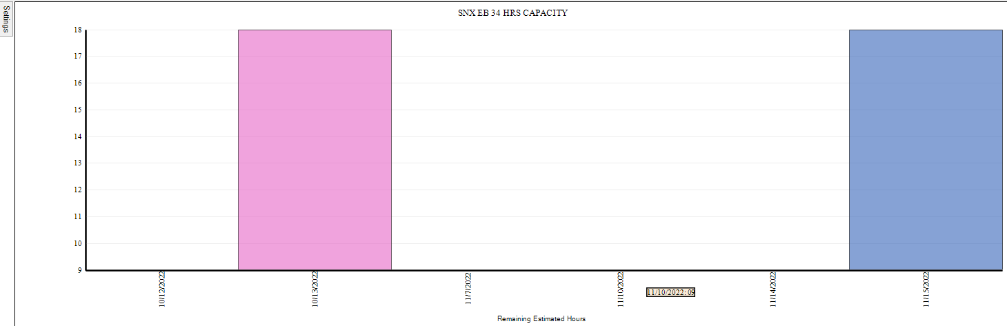
An issue we’re noticing is that the chart view graphs start at the lowest production hours instead of 0. I’ve looked in the Dashboard and Chart View properties to see if there’s any way to set 0 as a default. I’m not seeing this.
I’ve attached a screenshot of the dashboard chart. I’m hovering over a date that has 9 estimated hours and it’s right at the line.
I don’t think this is possible in the classic chart dashboard view. Perhaps, with some customizations it could be done. You could also try Epicor Data Discovery. There you can create new views, point them to your BAQ as the data source, and do a lot more customization with the charts.
Good luck!
Thanks for the information. It just seems strange that it starts at the lowest number instead of starting at zero. I’m tempted to create a job far off in the future that has 0 hours or .5 hours allocated to it. Seems to be the simple solution…