Rich Text Editor
Allows a user to enter text and images which could be formatted according to their preferences… Unless that preference is the color red… or purple.  Plenty of choices for blue, though!
| Property Group | Property | Description |
|---|---|---|
| Basic | Id | Unique identifier for the control |
| Basic | Label Text |
 Sets the label within the control. Doesn’t do anything. Sets the label within the control. Doesn’t do anything. |
| Behavior | On Blur | Click this to create an OnBlur event for the control. On Blur is triggered when the control loses focus. |
| Behavior | On Create | Click this to create an OnCreate event for the control On Create is triggered when the control is painted to the GUI. |
| Comments | Comments | Add some developer notes to the control. These are not customer-facing and are only visible in App Studio (Fig. A) |
| Data | Key Field | Indicates that a bound component is a key field. If true, the field is enabled if there is no current record, allowing the user to select an existing record or create a new one. |
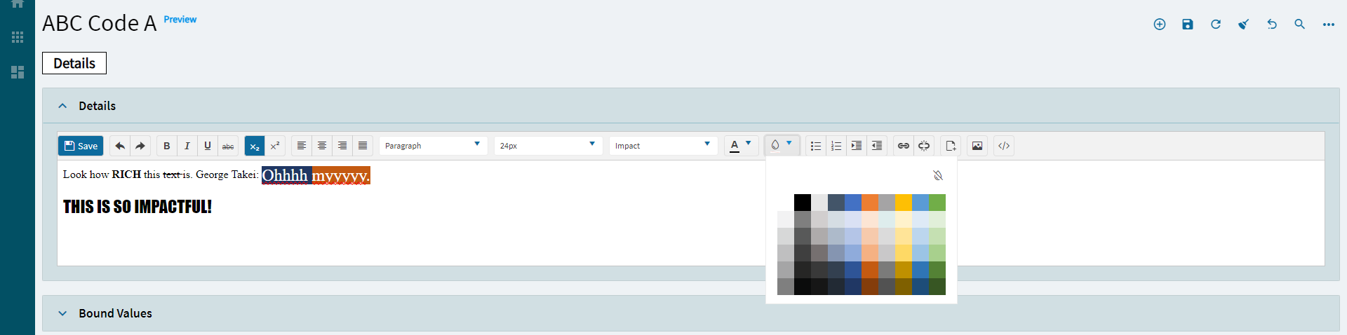
| Data | EpBinding | Bind the control to a DataView.Column. Turns out you can get red text here, or any color, but it’s stuuuuupid; you just need to change the hex value. (Fig. B) |
| Layout | Alignment | Sets the alignment of the control. (Fig. C) |
| Layout | Width | Sets the specific width (pixels) for the control. (Fig. D) |
| Layout | Height | Sets the specific height (pixels) for the control. (Fig. D) |
| State | Personalizable | If true, a user can personalize this component(hide/show) |
| State | Customizable | If true, a user can customize this component in child layers |
| State | Hidden | Hides the control from view. |
| State | Disabled | Disables the control. The control will not allow editing or focus. |
| State | Read Only | Makes the control read only so that it will not allow editing. The control can still be focused. |
| State | Auto Focus | When enabled, the control is automatically focused on creation. |
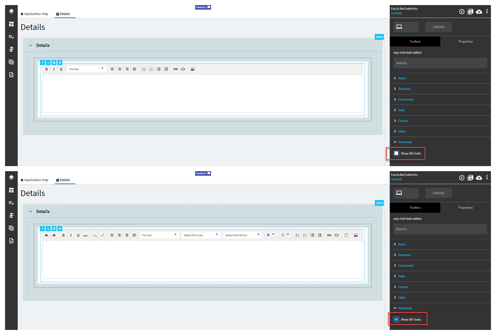
| Advanced | Show All Tools | Toggle to show or hide advanced tools for the control. (Fig. E) |
Figure A: Comments
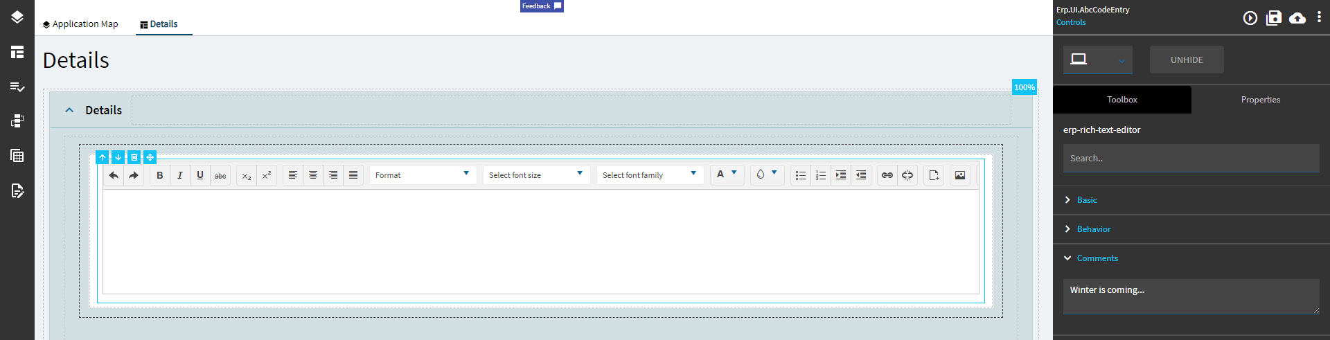
Figure B: EpBinding
Figure C: Alignment
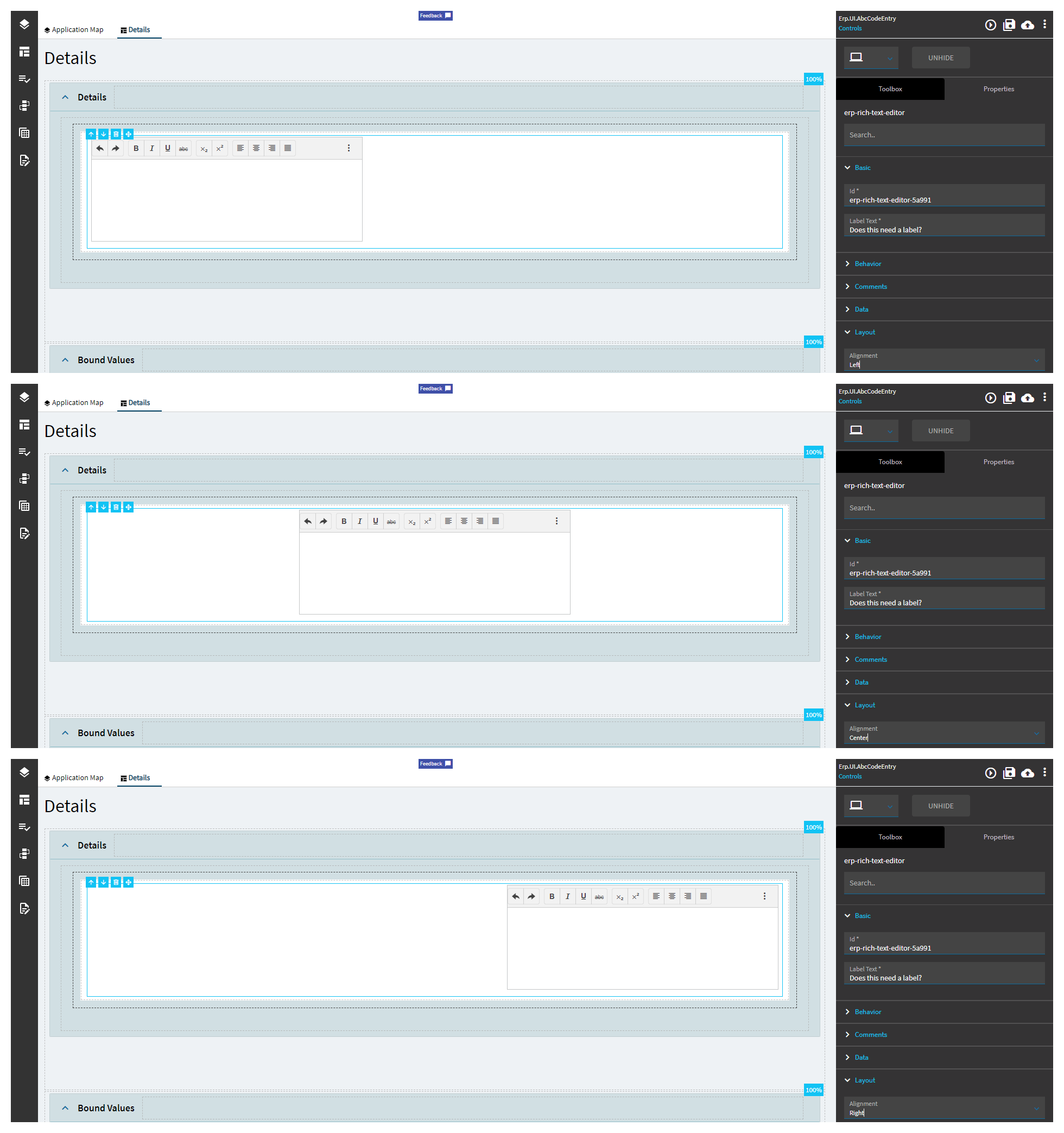
Figure D: Width and Height
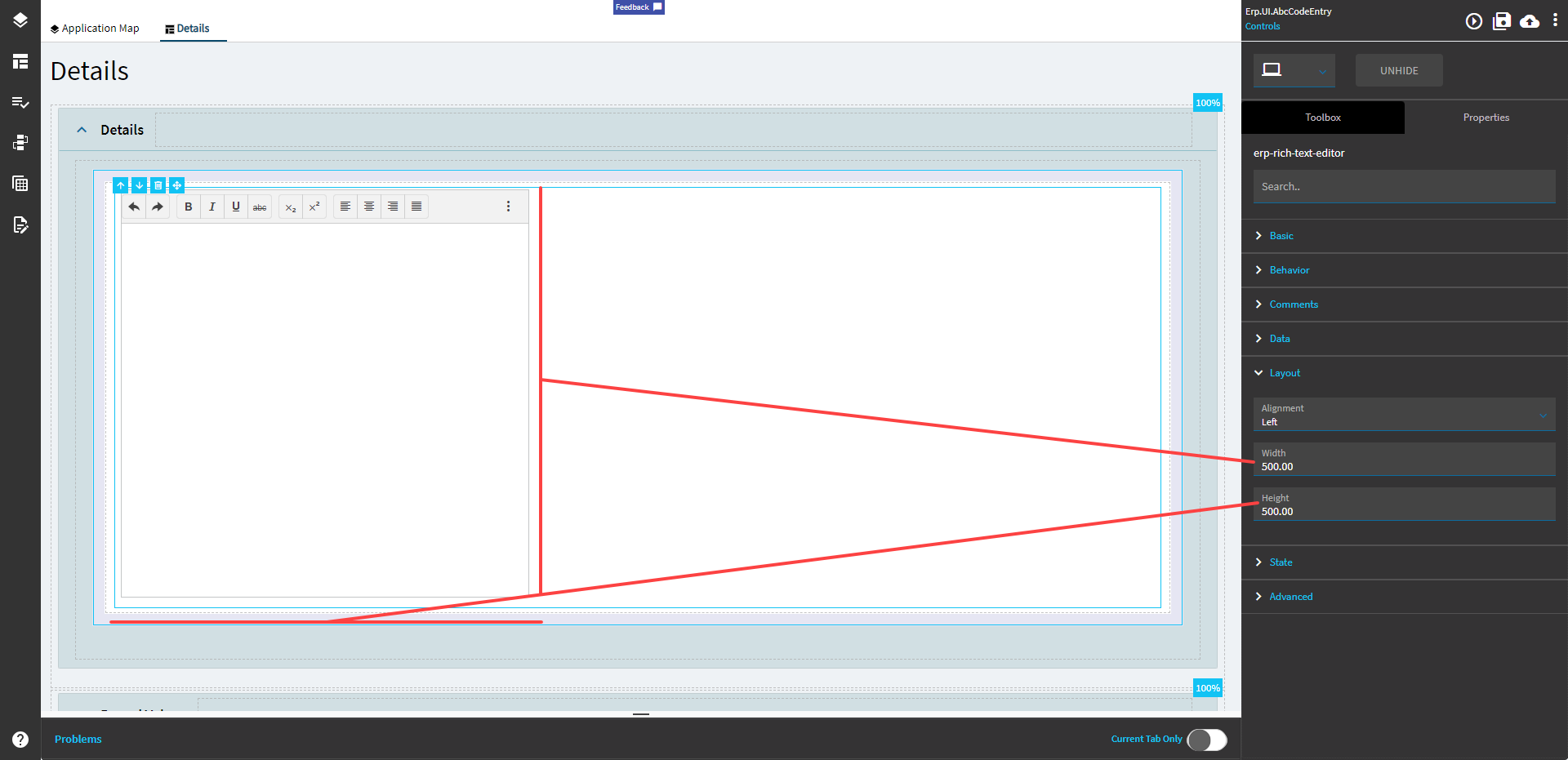
Figure E: Show All Tools