Selection List
Allows a user to select and sort a collection of data items.
This control has a few different flavors to it and can be changed up visually in a number of different ways.
| Property Group | Property | Description |
|---|---|---|
| Basic | Id | Unique identifier for the control |
| Basic | Label Text | Sets the label within the control. (Fig. A) |
| Behavior | On Blur | Click this to create an OnBlur event for the control. On Blur is triggered when the control loses focus. |
| Behavior | On Create | Click this to create an OnCreate event for the control On Create is triggered when the control is painted to the GUI. |
| Comments | Comments | Add some developer notes to the control. These are not customer-facing and are only visible in App Studio (Fig. B) |
| Data | Key Field | Indicates that a bound component is a key field. If true, the field is enabled if there is no current record, allowing the user to select an existing record or create a new one. Not relevant to this control. |
| Data | EpBinding | Bind the control to a DataView.Column. This is used to store the delimited list of items. Can be used to apply row rules to the control. |
| Data | List | This can be used to define hard coded items for the list instead of a dataview. |
| Data > List | Id | Unique ID for the item. (Fig. C) |
| Data > List | Text | Set the text value for the item (Fig. C) |
| Data > List | Id Name |  Obsolete Obsolete |
| Data > List | Description | Set the detailed description for the item (Fig. C) |
| Data > List | SubText | Set the sub-text value for the item. Doesn’t seem to do anything. |
| Data > List | LeftIcon | Set the icon for the list item. Doesn’t seem to do anything. |
| Data > List | Command | Set the command string for the list item. No clue here. |
| Data > List | Selected | Set the flag to indicated if the item is selected by default. (Fig. C) |
| Data > List | Checkmark Hidden | Set the flag to indicate if the selected item has a hidden checkmark. Seems weird, but okay. (Fig. C) |
| Data > List | Toggle Disabled | Set the flag to indicate if the item is disabled. This works, as in you cannot select it, but there’s no visual indicator to indicate that. (Fig. C) |
| Data > List | Required | Set the flag to require this list item. (Fig. C) |
| Data > List | Bookmark | Set the flag indicating the list item has a bookmark. #Shrug |
| Dataviews | Source View Name | Set the view name used to populated the source list. Format: DataView |
| Dataviews | Source Table Name | Set the table name used to populate the source list. Unsure on this one. It’s not clear what a table is within the context of App Studio. |
| Dataviews | Source Code Col | Column name used to populate the source list item ID. Format: ColumnName |
| Dataviews | Source Desc Col | Column name used to populate the source list item description. Format: ColumnName |
| Dataviews | Target View Name | Set the view name used to populated the targetlist. Format: DataView |
| Dataviews | Target Table Name | Set the table name used to populate the target list. Unsure on this one. It’s not clear what a table is within the context of App Studio. |
| Dataviews | Target Code Col | Column name used to populate the target list item ID. Format: ColumnName |
| Dataviews | Target Desc Col | Column name used to populate the target list item description. It yells at you in Dev Tools if you populate this. Format: ColumnName |
| Dataviews | Table Name | Set the table name used with source AND target codes and descriptions |
| Dataviews | Parent Related Col | Set the name of the column on the parent table. Used when binding to parent/child related tables. |
| Dataviews | Child Related Col | Set the name of the column on the child table. Used when binding to parent/child related tables. |
| Dataviews | Related Col | Set the shared name of the column on both the parent and child tables. Used when binding to parent/child related tables. |
| Layout | Alignment | Sets the alignment of the control. (Fig. D) |
| Layout | Width | Sets the specific width (pixels) for the control. (Fig. E) |
| State | Personalizable | If true, a user can personalize this component(hide/show) |
| State | Customizable | If true, a user can customize this component in child layers |
| State | Hidden | Hides the control from view. |
| State | Disabled | Disables the control. The control will not allow editing or focus. |
| State | Read Only | Makes the control read only so that it will not allow editing. The control can still be focused. |
| State | Auto Focus | When enabled, the control is automatically focused on creation. |
| Advanced | Target Label Text | Set the label text for the target list. (Fig. F) |
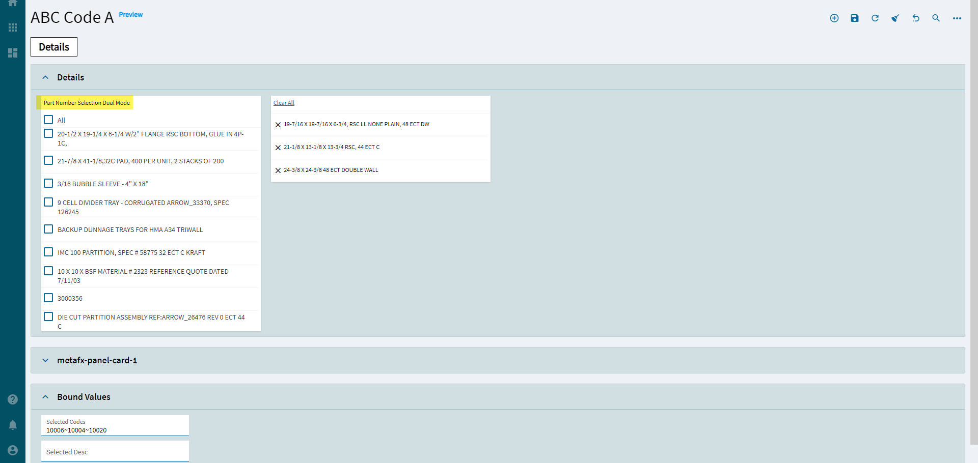
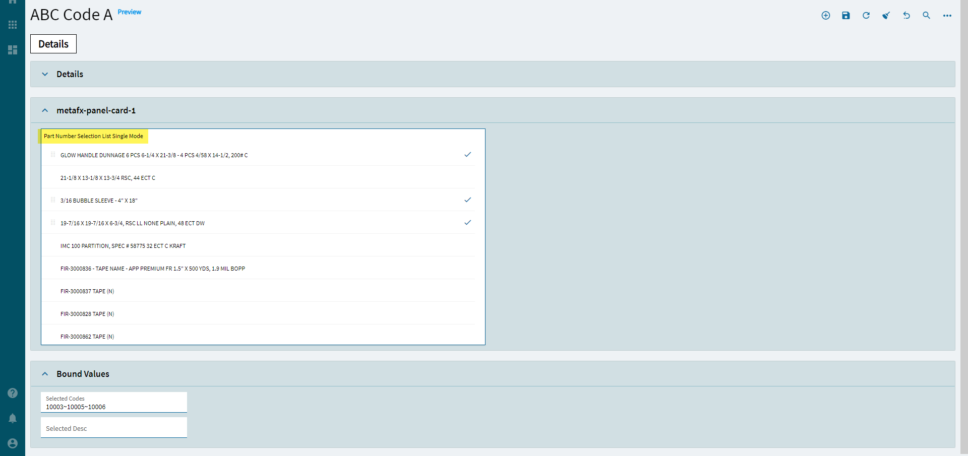
| Advanced | Mode Type | Set the display mode. Valid options include: Single and Dual. (Fig. G) |
| Advanced | UI Mode | Set the selection mode. Valid options include: Select, Switch, SingleSelect (Doesn’t really stop you), Checkbox. (Fig. H) |
| Advanced | Position Mode | Set the position of the text. Valid Options Include: Left or Right (Fig. I) |
| Advanced | Reorder | Set the reorder mode. Valid Options Include: Select or All (Fig. J) |
| Advanced | Header | Sets the label text for the list. Only used on Panel Mode. Not sure what panel mode is, but it ain’t this! |
| Advanced | Limit | Sets the limit of the items to be displayed. Only used on Panel Mode. Not sure what panel mode is, but it ain’t this! |
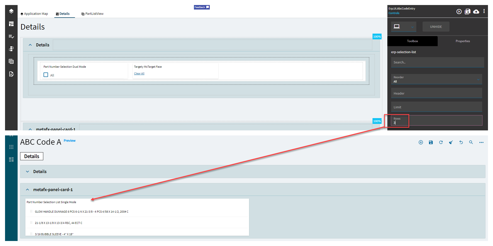
| Advanced | Rows | Sets the number of items to be displayed (can scroll for more). Used in all modes except Panel. (Fig. K) |
| Advanced | Manual Sort | Sets the flag indicating if a sort button should be shown. Doesn’t do anything. Might be only for “Panel Mode” |
| Advanced | Show Edit | Set the flag indicating if an edit button should be shown. Only for Panel Mode. WTF IS PANEL MODE?? |
| Advanced | Enable Edit | Set the flag indicating if editing of list items is allowed. Only used on… you guess it… Panel Mode. |
| Advanced | Enable Header Edit | Sets the flag indicating if the edit button should be presented at the top of the list. OnLy UsEd In PaNeL mOdE. |
| Advanced | Value Primitive | Specify the type of the selected value. If set to true, the selected value has to be of a primitive value. |
| Advanced | Delimited | Set the flag indicating if the multi-select value for binding is delimited. This is required for multi select. |
| Advanced | Delimiter | Set the delimiter character. Valid options include: ~ , ` (tilde, comma, tick). |
| Advanced | EpiLabel | Obsolete |
| Advanced | Draggable | Obsolete |
Figure A: Label Text
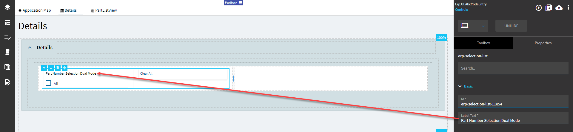
Figure B: Comments
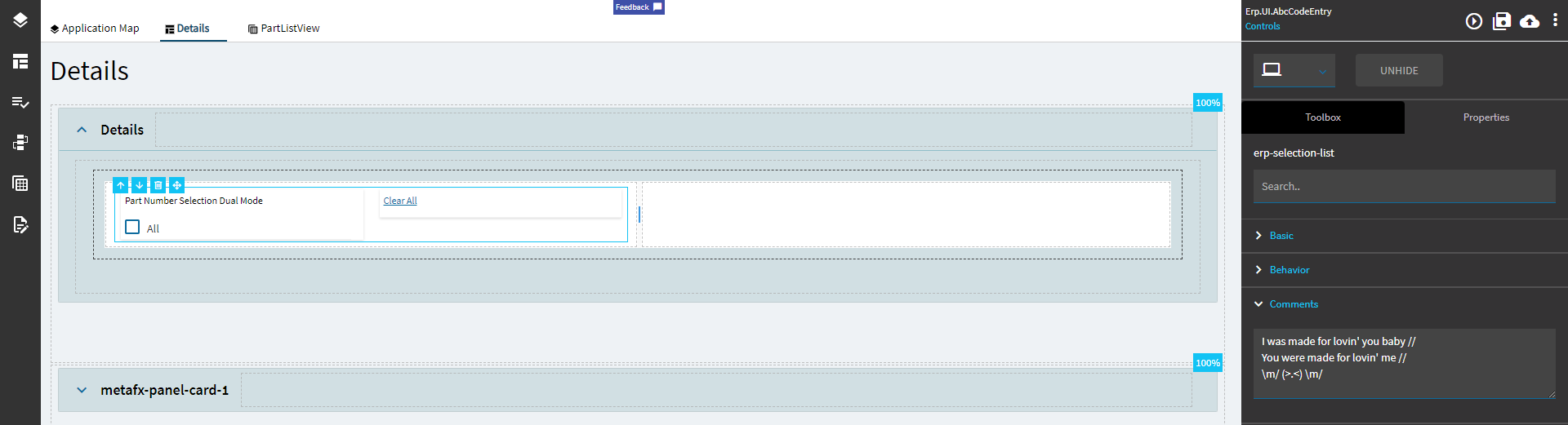
Figure C: Items
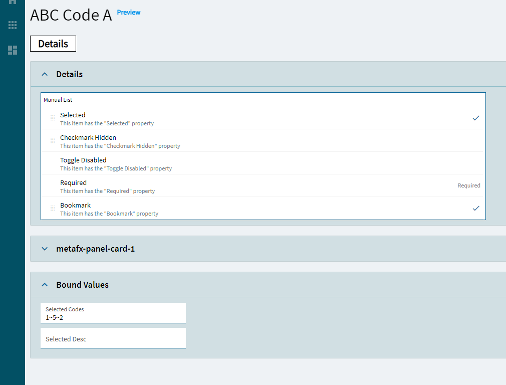
Figure D: Alignment
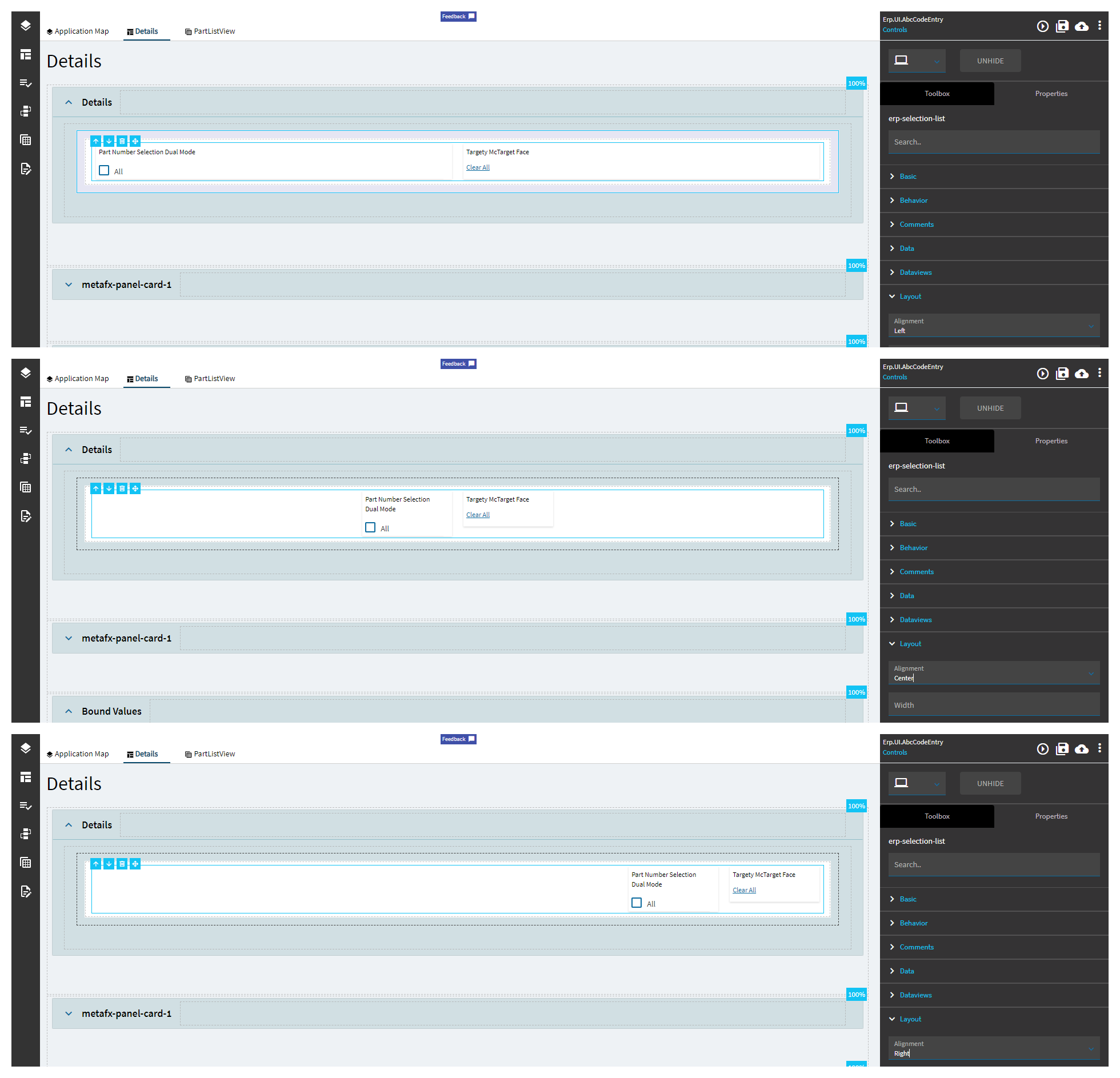
Figure E: Width
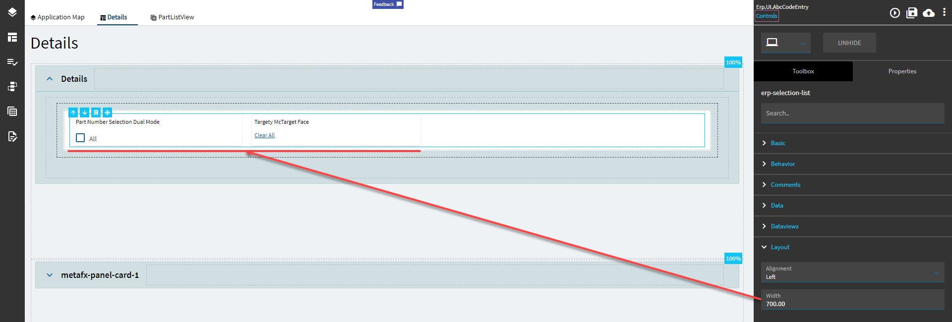
Figure F: Target Label Text
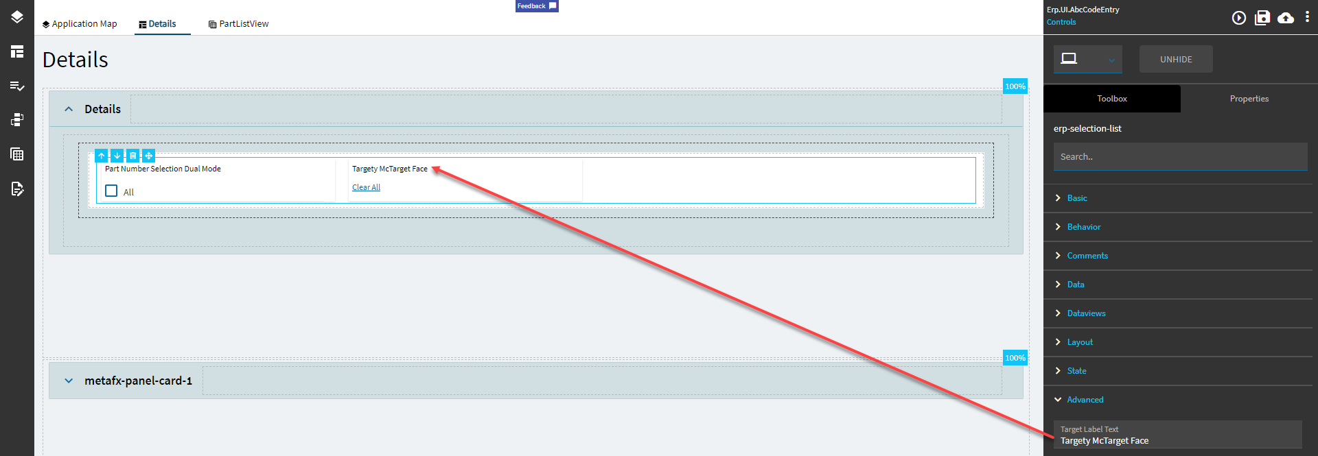
Figure G: Mode Type
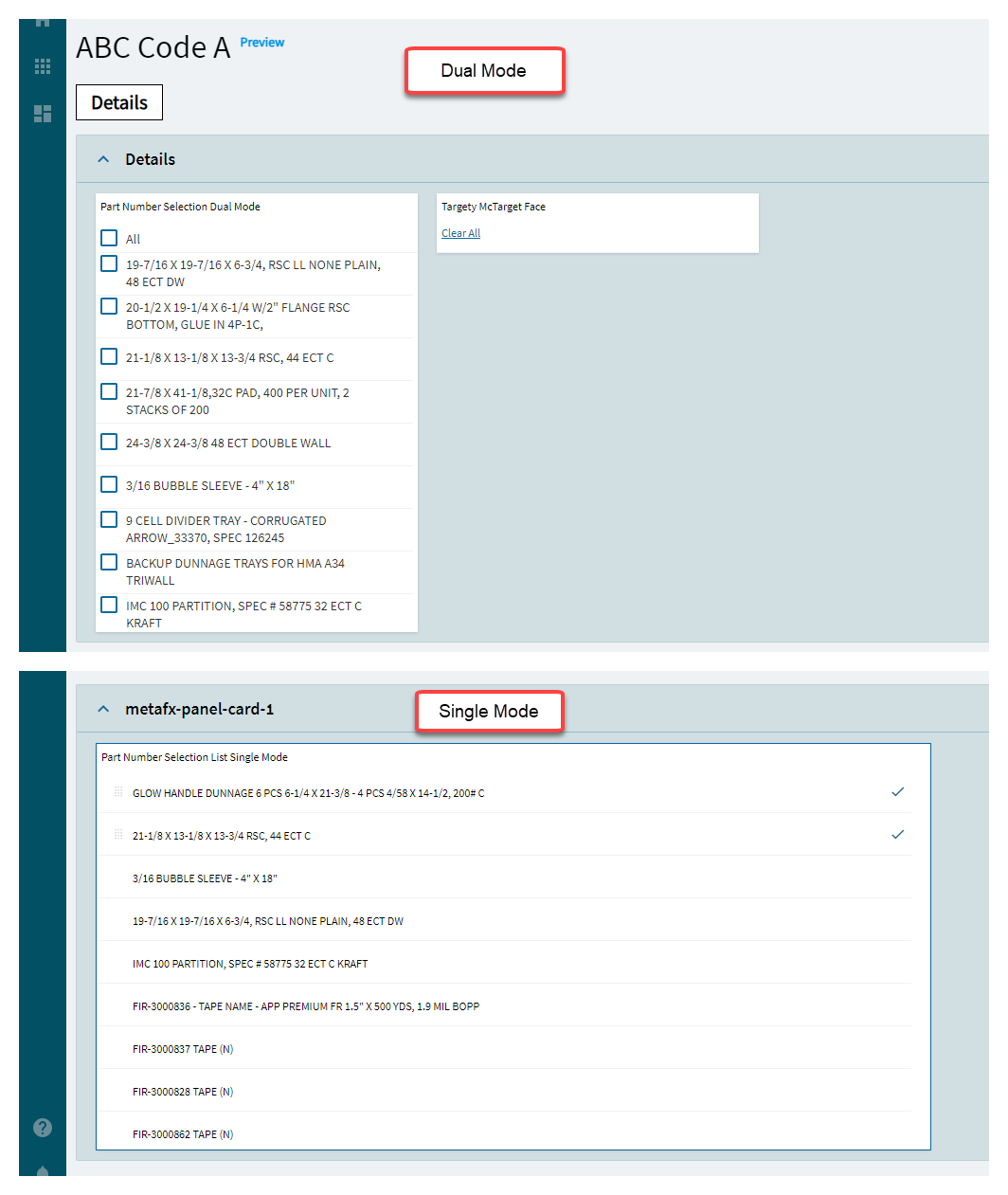
Figure H: UI Mode
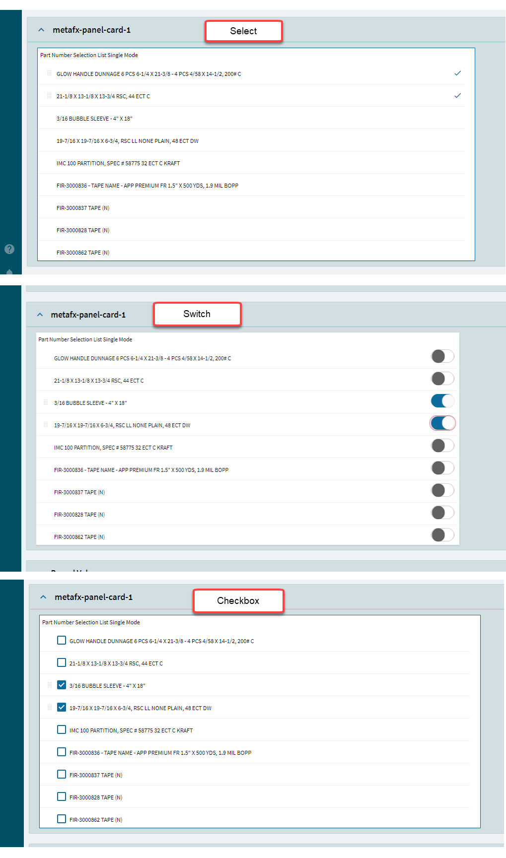
Figure I: Position Mode
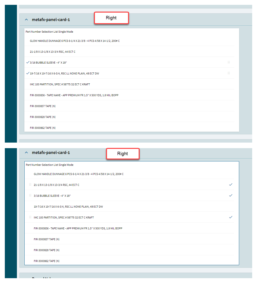
Figure J: Reorder
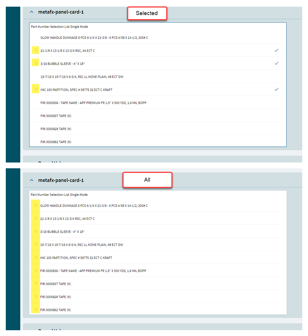
Figure K : Rows
More info on setup from an older post: How To: Kinetic Selectable List