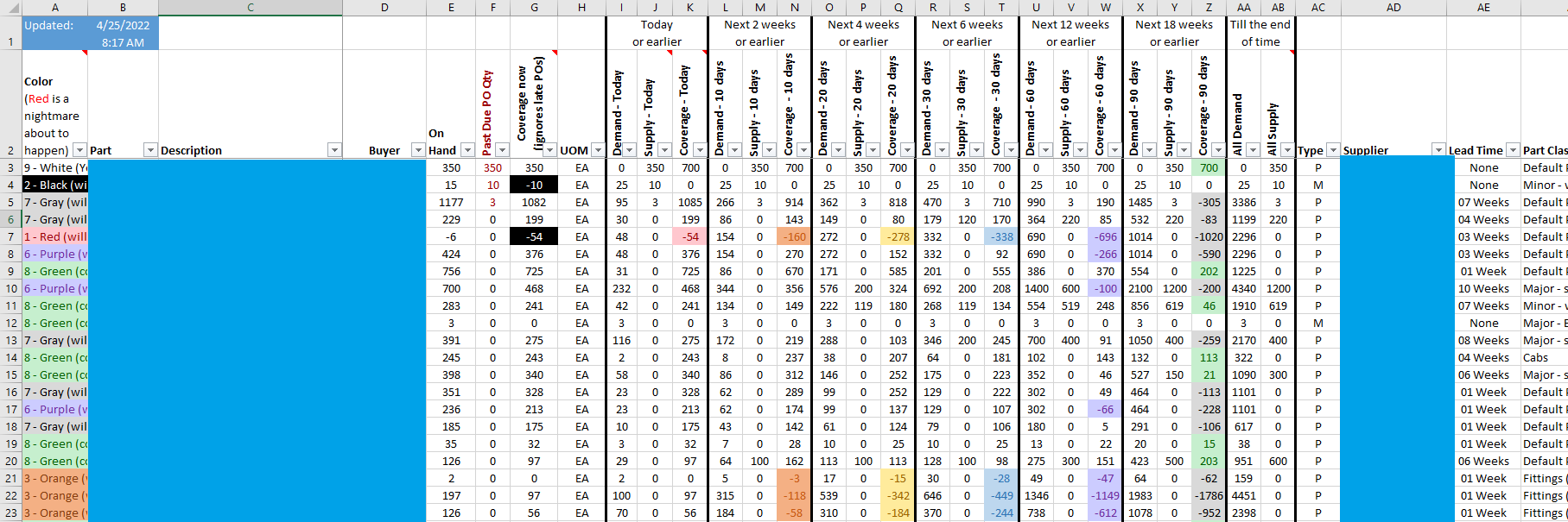
We developed this from PartDtl (it’s in Epicor, too, but it looks way better in color). I made it, but the idea was from someone smarter. Obviously I blanked out sensitive info for the pic.
This aggregates over 2 million rows of data into, what, 2 dozen columns of “when are we in trouble for this part?”
In hindsight, the columns that I called “supply” are confusing. It’s really the incoming qty and you add that to the OH to get total supply at that point in time. Of course, you could do the opposite and pre-add it. I like it this way because it shows me what parts have no POs for them whatsoever and I can say “What are you doing?! Do you think this part will buy itself?” Anyway, I digress, it’s all subjective, I just wanted you to know why my math stinks.
My point in sharing this is, this is the eternal challenge - users want to know everything but then they hate information overload. I thought this was a really good balance of the two.