Column (Includes 1 and 2 Column controls)
This is a basic container component. It allows you to organize additional components in a single area.
| Property Group | Property | Description |
|---|---|---|
| Basic | Id | This is the control’s unique identifier |
| Basic | Label Text | Give the column control a bolded header (Fig. A) |
| Comments | Comments | Add some developer notes to the control. These are not customer-facing and are only visible in App Studio (Fig. B) |
| Data | Key Field | Indicates that a bound component is a key field. If true, the field is enabled if there is no current record, allowing the user to select an existing record or create a new one. Not relevant to this component |
| State | Personalizable | If true, a user can personalize this component(hide/show) |
| State | Customizable | If true, a user can customize this component in child layers |
| State | Hidden | Hide or show the component |
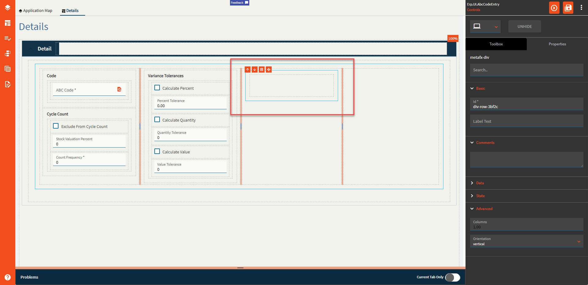
| Advanced | Columns | Changes the number of columns in this component. Valid numbers are between 1 and 10 (Fig. C) |
| Advanced | Orientation | Direction to show the controls. Options are Vertical (Fig. D) and Horizontal (Fig. E) |
Figure A: Label Text
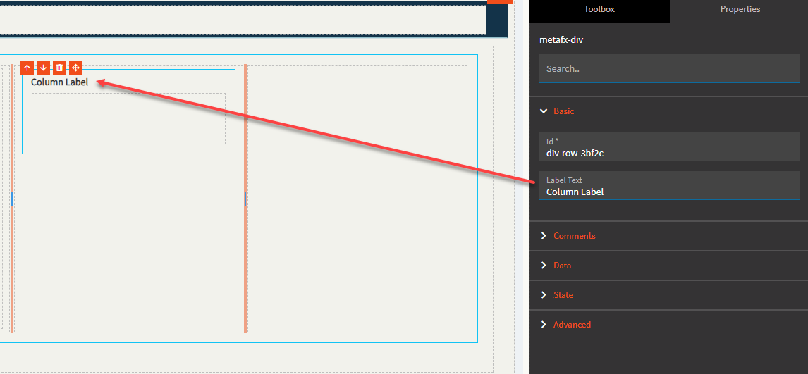
Figure B: Comments
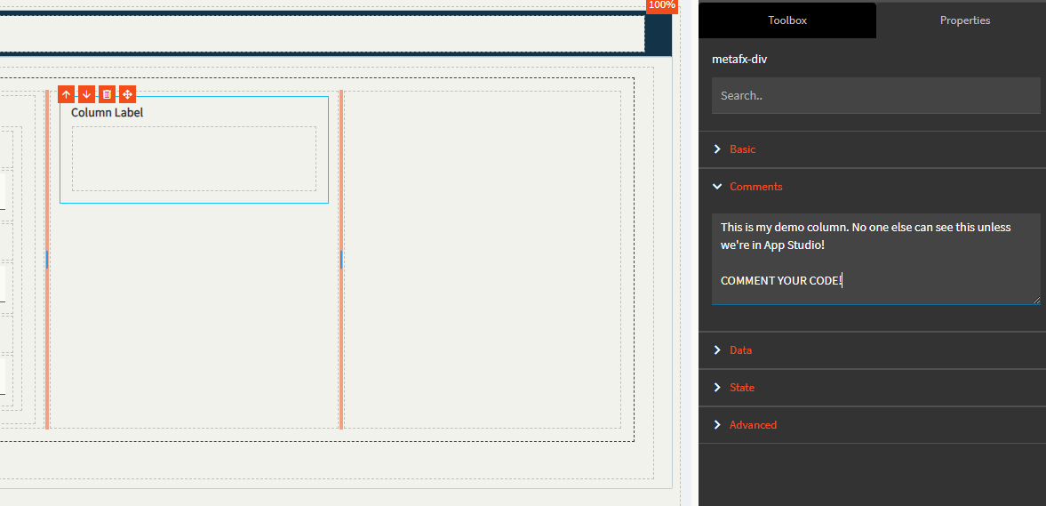
Figure C: Columns
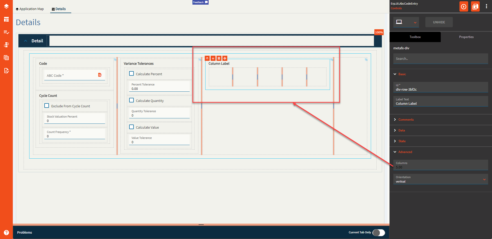
Figure D: Vertical Orientation
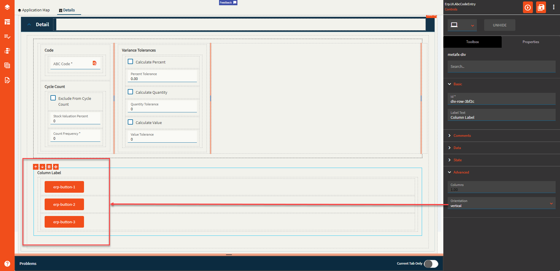
Figure E: Horizontal Orientation
