Nav Link
Navigation link uses anchor tags to display links.

| Property Group | Property | Description |
|---|---|---|
| Basic | Id | Unique identifier for the control |
| Basic | Name | Set the text to be displayed on the anchor tag. (Fig. A) |
| Basic | Text | Set the text for the anchor tag. (Fig. B) |
| Behavior | On Blur | Click this to create an OnBlur event for the control. On Blur is triggered when the control loses focus. |
| Behavior | On Create | Click this to create an OnCreate event for the control On Create is triggered when the control is painted to the GUI. |
| Comments | Comments | Add some developer notes to the control. These are not customer-facing and are only visible in App Studio (Fig. C) |
| Data | Key Field | Indicates that a bound component is a key field. If true, the field is enabled if there is no current record, allowing the user to select an existing record or create a new one. |
| Data | EpBinding |
 Bind the button to a DataView.Column. This doesn’t seem to control anything. Bind the button to a DataView.Column. This doesn’t seem to control anything. |
| Data | Page | Specifies the page to open within the application. (Fig. D) |
| Layout | Alignment | Set the alignment for the control. Valid options are Left, Center, Right. (Fig. E). |
| State | Personalizable | If true, a user can personalize this component(hide/show) |
| State | Customizable | If true, a user can customize this component in child layers |
| State | Hidden | Hides the control from view. |
| State | Disabled | Disables the control. The control will not allow editing or focus. |
| State | Read Only | Makes the control read only so that it will not allow editing. The control can still be focused. |
| Advanced | Href | Set a URL to redirect to when clicking the anchor tag. If you have the page specified as well, it will briefly navigate to that page, then redirect to the Url. (Fig. F) |
| Advanced | Icon | Specifies the icon next to the anchor tag. Format: mdi icon-name. Example: mdi mdi-triforce. Icons found here: Material Design Icons (pictogrammers.github.io) (Fig. G) |
| Advanced | Target | Specifies how the href link will open. Valid options include: _blank (opens in new tab), _parent (deprecated in HTML5), _self (opens in current tab), _top (deprecated in HTML5). |
| Advanced | Relationship | Specifies the relationship between the current document and the link. Examples: HTML attribute: rel - HTML: HyperText Markup Language | MDN |
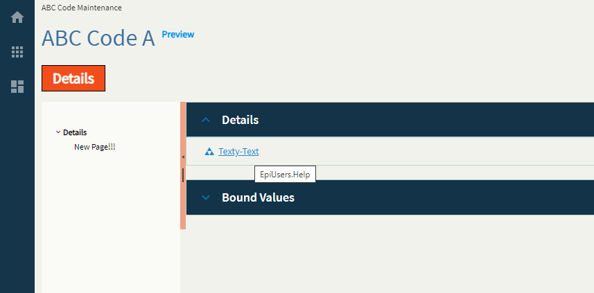
| Advanced | Title | Specifies the tool tip for the link. (Fig. H) |
Figure A: Name
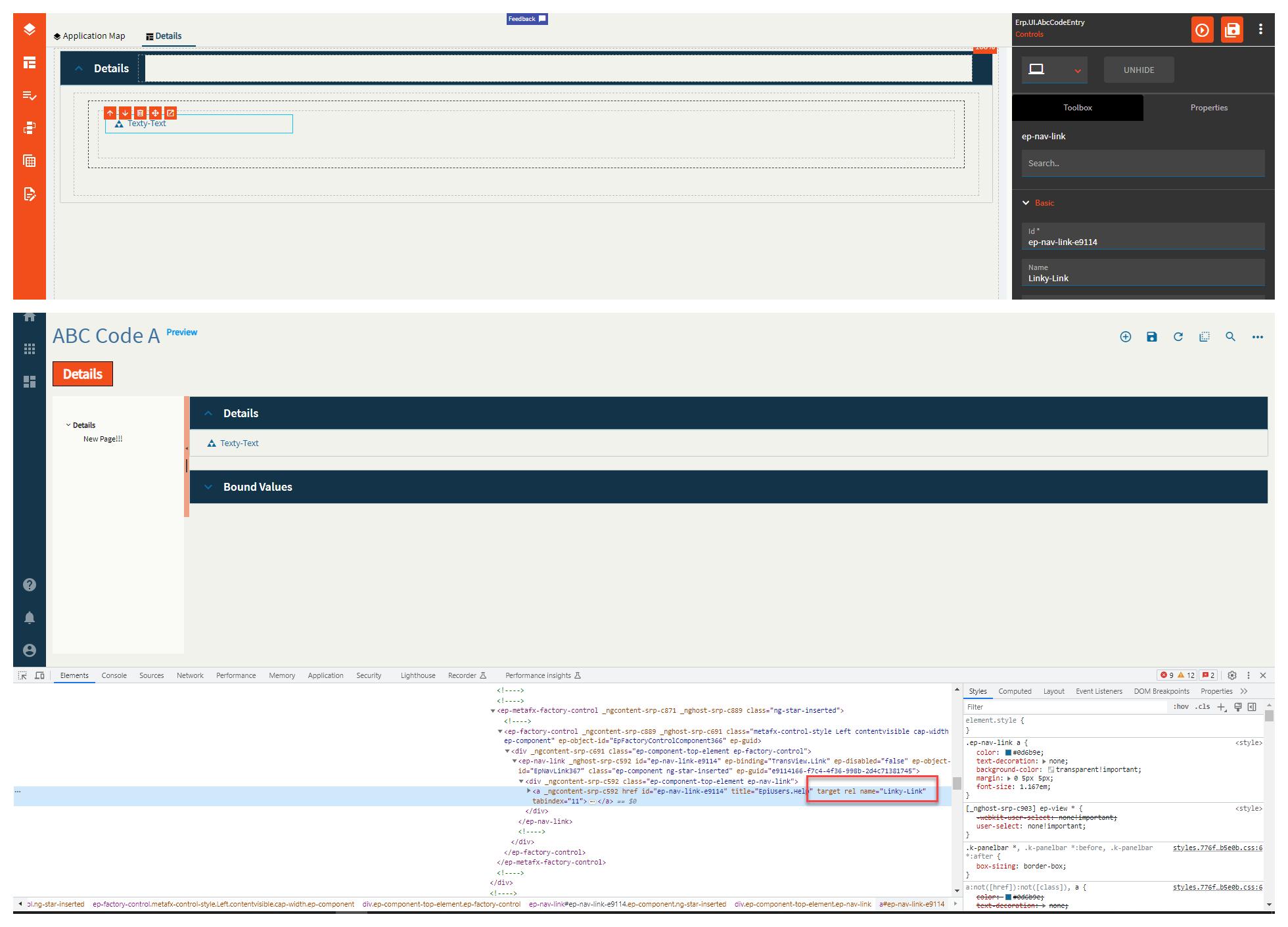
Figure B: Text
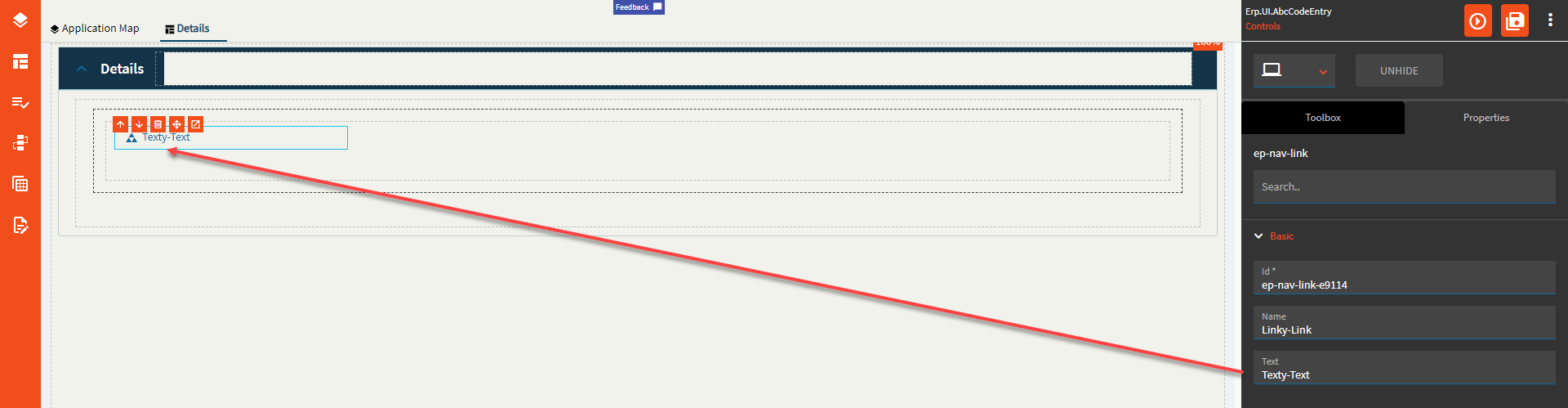
Figure C: Comments

Figure D: Page

Figure E: Alignment
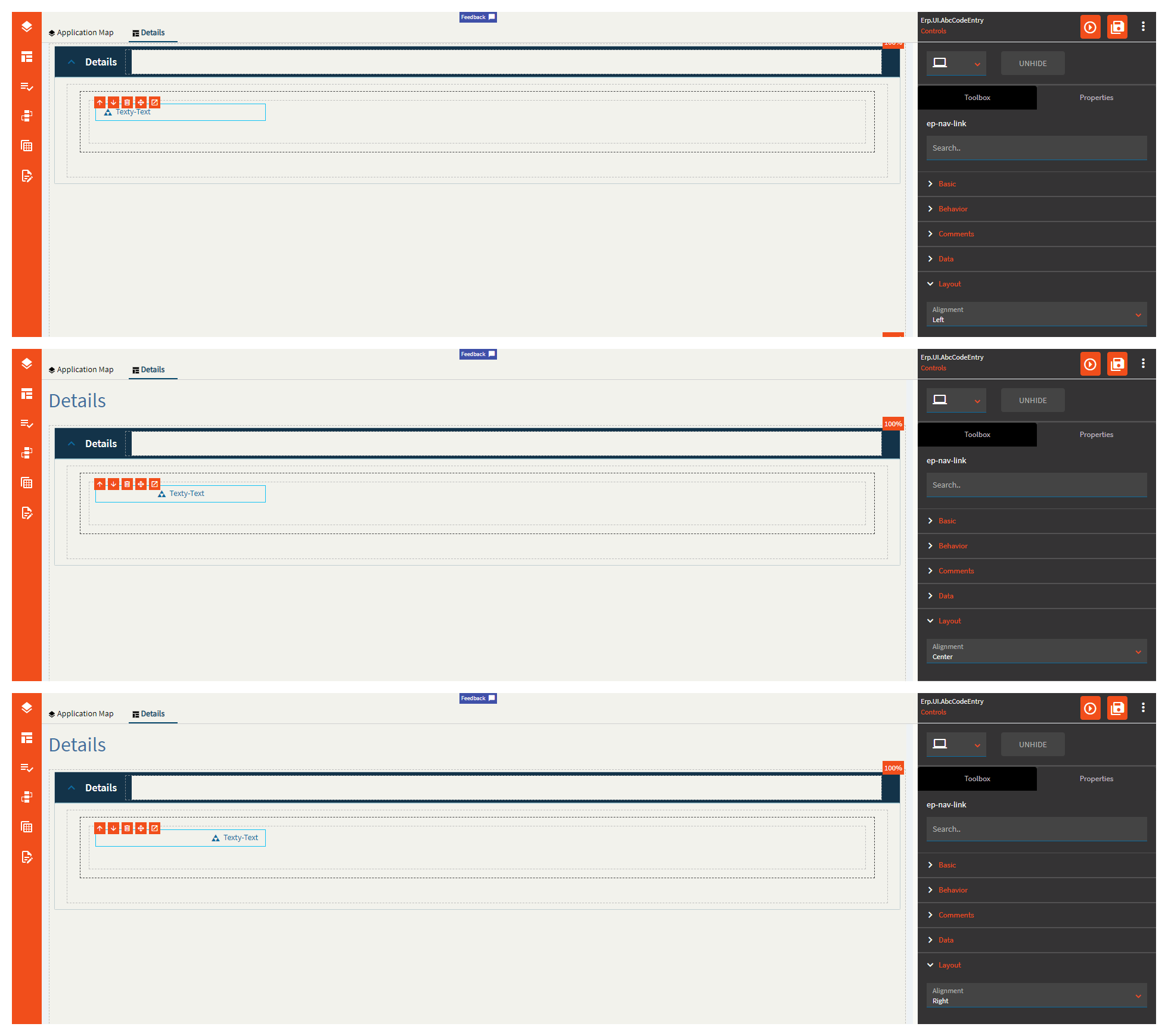
Figure F: Href
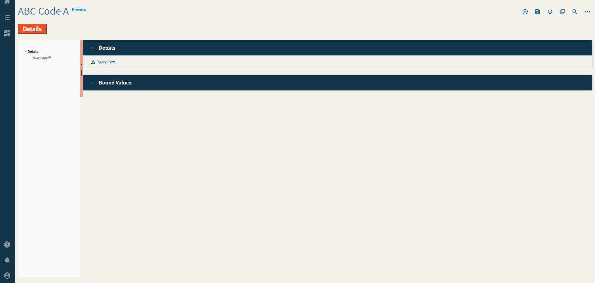
Figure G: Icon
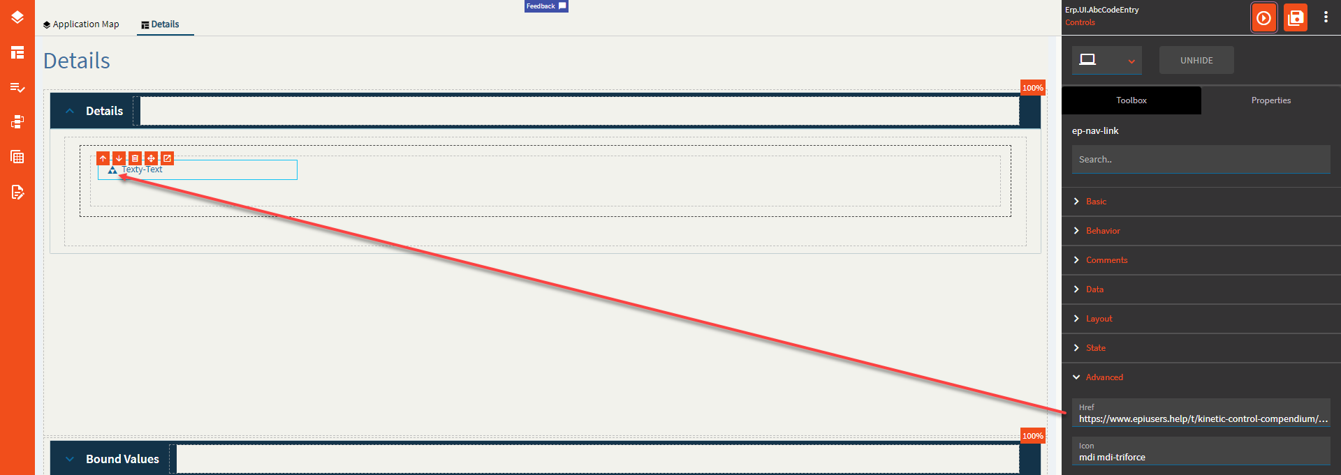
Figure H: Title
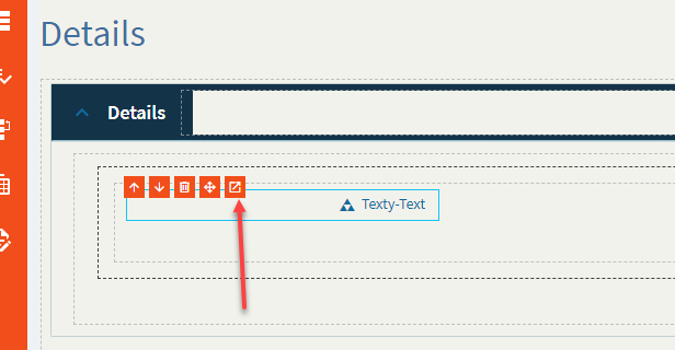
 Word of caution: don’t click this. After clicking it, it would not let me return to the properties window for any control until I fully closed App Studio and went back in.