Row Navigator
Row Navigator scrubs among the records in a DataView that might be linked to an EpBinding component on the target page/panel to display the current record details or to a grid.
| Property Group | Property | Description |
|---|---|---|
| Basic | Id | Unique identifier for the control |
| Basic | Label Text | Sets the label within the control. (Fig. A) |
| Behavior | On Blur | Click this to create an OnBlur event for the control. On Blur is triggered when the control loses focus. |
| Behavior | On Create | Click this to create an OnCreate event for the control On Create is triggered when the control is painted to the GUI. |
| Comments | Comments | Add some developer notes to the control. These are not customer-facing and are only visible in App Studio (Fig. B) |
| Data | Key Field | Indicates that a bound component is a key field. If true, the field is enabled if there is no current record, allowing the user to select an existing record or create a new one. |
| Data | EpBinding | Bind the control to a DataView. This won’t show data, but is the source for the nav combo. |
| Layout | Alignment | Marginally sets the alignment for the control. (Fig. C) |
| State | Personalizable | If true, a user can personalize this component(hide/show) |
| State | Customizable | If true, a user can customize this component in child layers |
| State | Hidden | Hides the control from view. |
| State | Disabled | Disables the control. The control will not allow editing or focus. |
| State | Read Only | Makes the control read only so that it will not allow editing. The control can still be focused. |
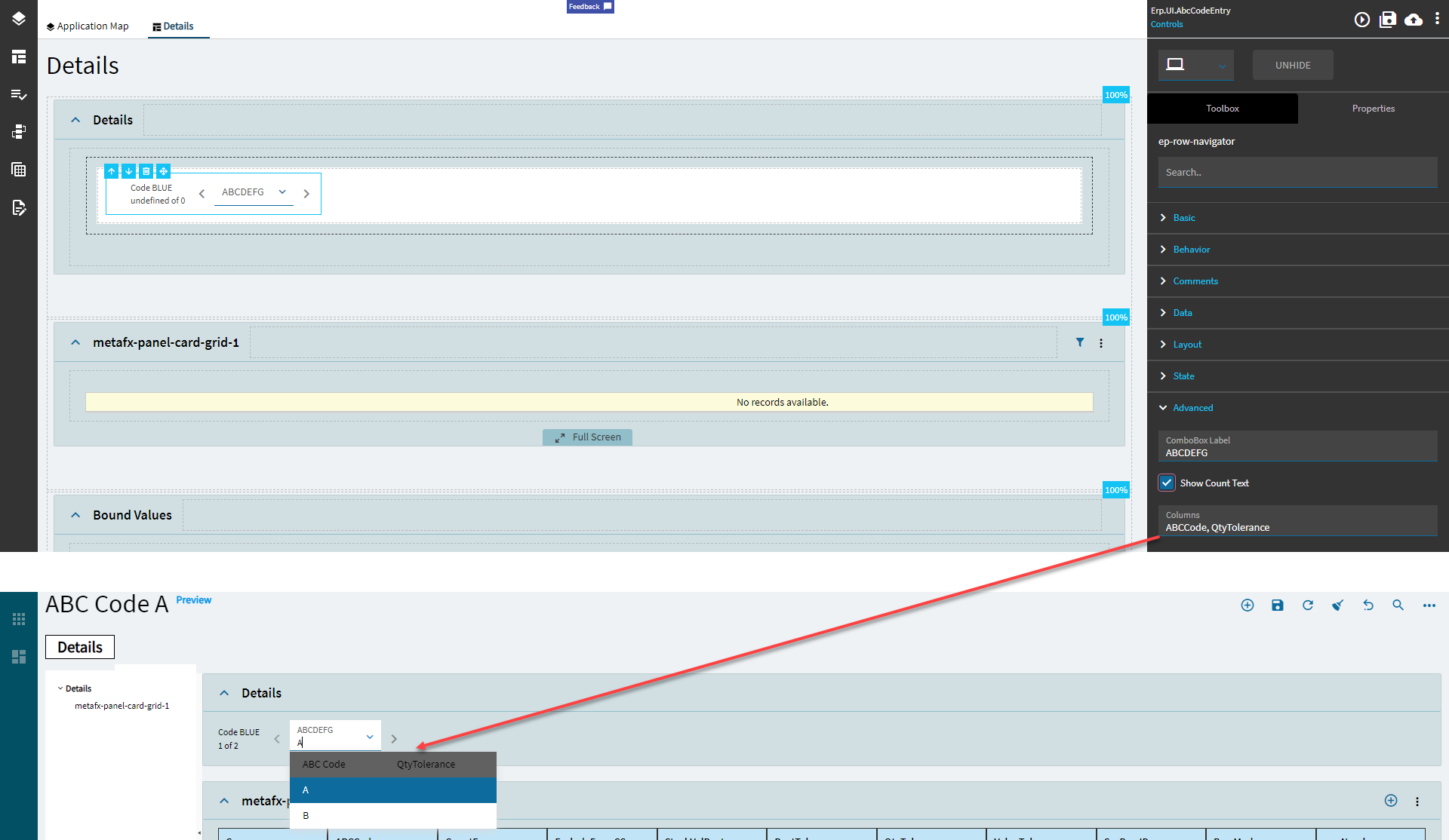
| Advanced | CombBox Label | The label shown in the combo box portion of the control. (Fig. D) |
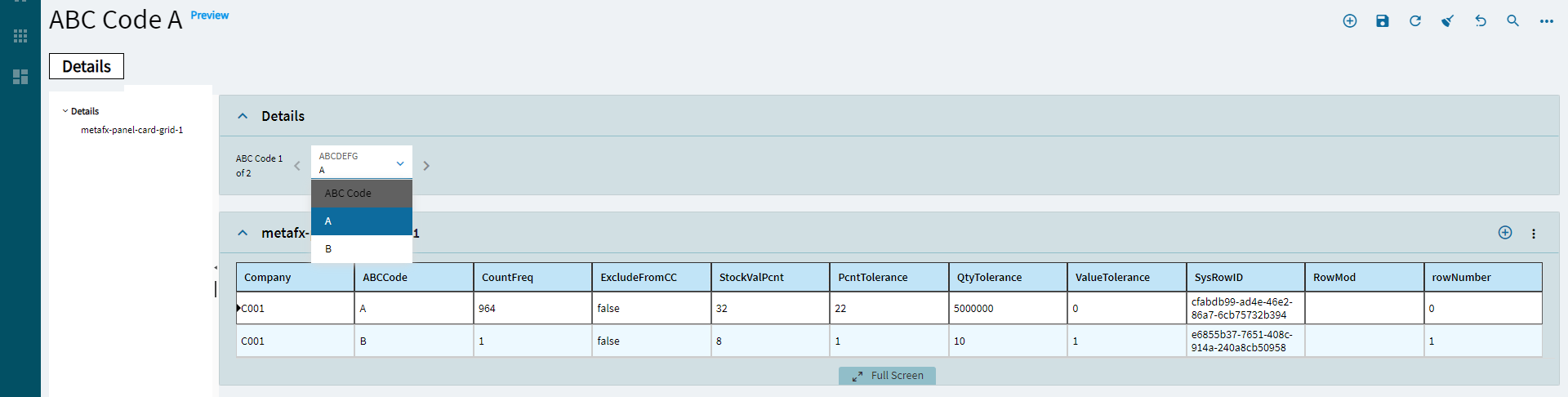
| Advanced | Show Count Text | Shows the a count of the records within the view. (Fig. E) |
| Advanced | Columns |  The columns to show in the combo. Supposedly, this is supposed to work with multiple columns, but I can only get it to show data from the first one. (Fig. F) The columns to show in the combo. Supposedly, this is supposed to work with multiple columns, but I can only get it to show data from the first one. (Fig. F) |
Figure A: Label Text
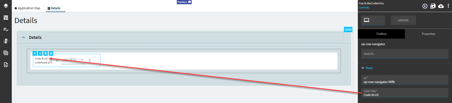
Figure B: Comments
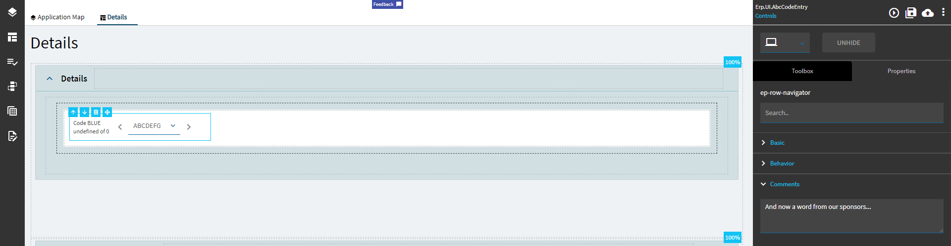
Figure C: Alignment
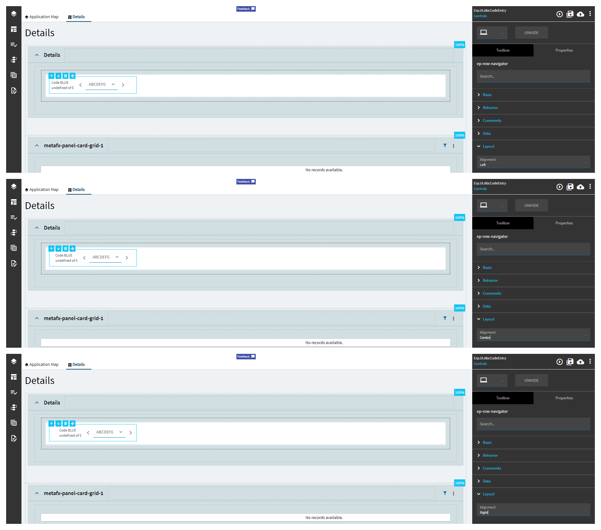
Figure D: ComboBox Label
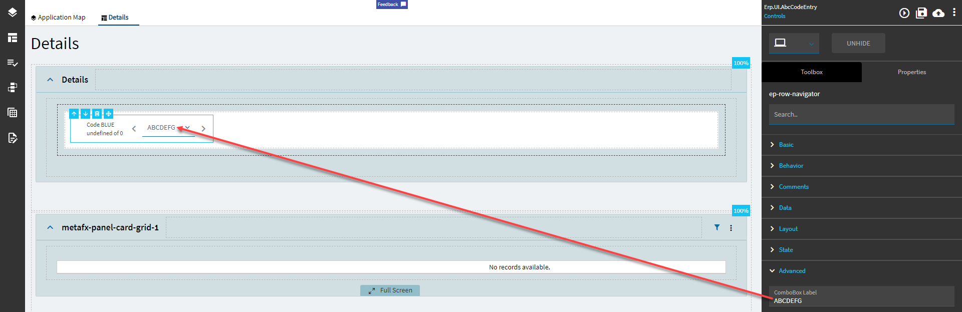
Figure E: Show Count Text
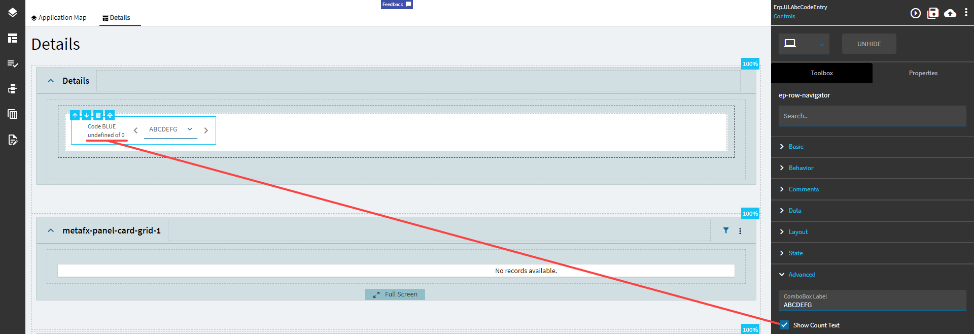
Figure F: Columns