Scheduler
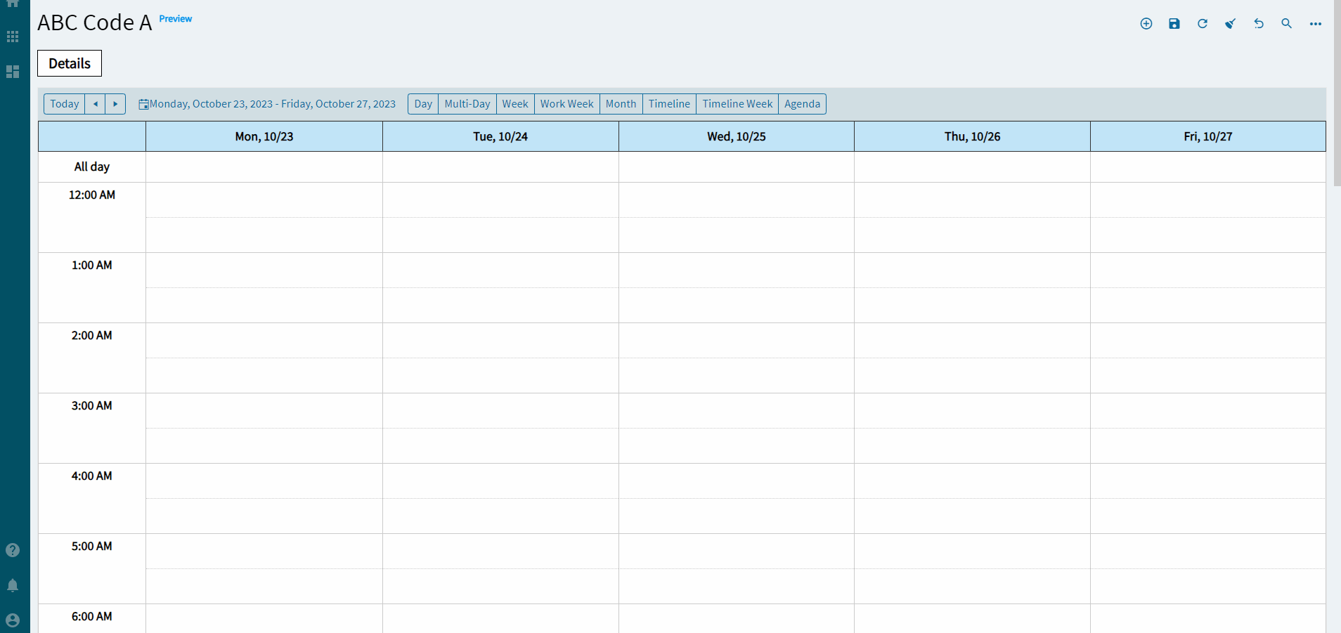
The scheduler component provides options for scheduling and displaying events in different views for a user. See the appendix for some necessary events to make this work.
I forgot to click the different views at the top and was too lazy to re-record it.
You get what you get!
| Property Group | Property | Description |
|---|---|---|
| Basic | Id | Unique identifier for the control |
| Behavior | On Blur | Click this to create an OnBlur event for the control. On Blur is triggered when the control loses focus. |
| Behavior | On Create | Click this to create an OnCreate event for the control On Create is triggered when the control is painted to the GUI. |
| Comments | Comments | Add some developer notes to the control. These are not customer-facing and are only visible in App Studio (Fig. A) |
| Data | Key Field | Indicates that a bound component is a key field. If true, the field is enabled if there is no current record, allowing the user to select an existing record or create a new one. Not really relevant for this control. |
| Data | EpBinding | Bind the control to a DataView. This is the DataView it will look to when specifying the upcoming columns. |
| Data > Column Bindings | Event Id Column | This is the unique identifier for the event. Generating a GUID would be ideal for this. I used the current dateTime because that’s what Epicor did. (Fig. B) |
| Data > Column Bindings | Event Start Date Column | The column that holds the start date (and time!) (Fig. B) |
| Data > Column Bindings | Event End Date Column | The column that holds the end date (and time!) (Fig. B) |
| Data > Column Bindings | Event Title Column | The column that holds the title label for the event. (Fig. B) |
| Data > Column Bindings | Event Description Column | The column that holds the description. (Fig. B) |
| Data > Column Bindings | All Day Event Column | The column that holds a boolean for if it’s an all day event or not. (Fig. B) |
| Data > Editable | Select this to enable editing of events once created, including additional options for reoccurring and whatnot. (Fig. C) | |
| Layout | Width | Sets the specific width (pixels) for the control. (Fig. D) |
| State | Personalizable | If true, a user can personalize this component(hide/show) |
| State | Customizable | If true, a user can customize this component in child layers |
| State | Hidden | Hides the control from view. |
| State | Disabled | Disables the control. The control will not allow editing or focus. |
| State | Read Only | Makes the control read only so that it will not allow editing. The control can still be focused. |
| Advanced | Disable Day View | Removes the option to select this view from the top of the scheduler. (Fig. E) |
| Advanced | Disable MultiDay View | Removes the option to select this view from the top of the scheduler. (Fig. E) |
| Advanced | Disable Week View | Removes the option to select this view from the top of the scheduler. (Fig. E) |
| Advanced | Disable Work Week View | Removes the option to select this view from the top of the scheduler. (Fig. E) |
| Advanced | Disable Month View | Removes the option to select this view from the top of the scheduler. (Fig. E) |
| Advanced | Disable Timeline View | Removes the option to select this view from the top of the scheduler. (Fig. E) |
| Advanced | Disable Timeline Week View | Removes the option to select this view from the top of the scheduler. (Fig. E) |
| Advanced | Disable Agenda View | Removes the option to select this view from the top of the scheduler. (Fig. E) |
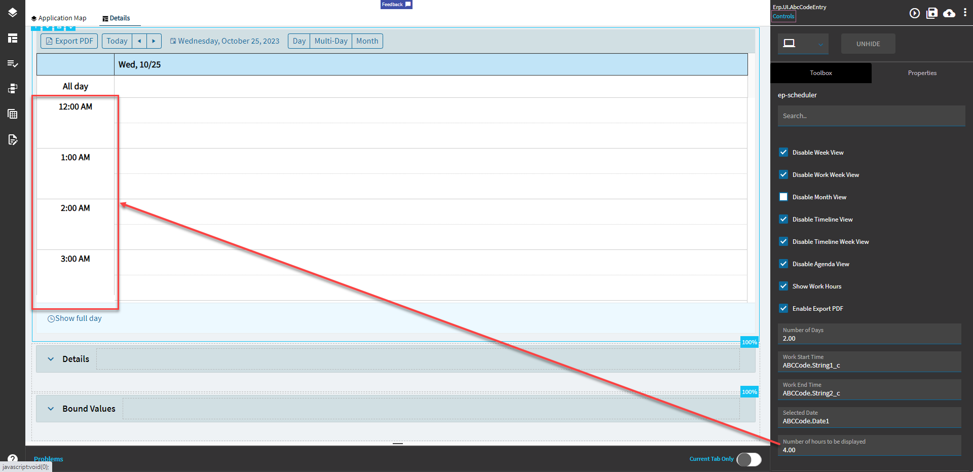
| Advanced | Show Work Hours | If set to true, the view will be initially shown in the business hours mode. By default, the view is displayed in the full-day mode. Applicable for the Day, Week, and Timeline Views. When Enabled, it also displays two, new properties called Work Start Time and Work End Time to define the working hours. (Fig. F) |
| Advanced | Enable Export to PDF | Shows a button that enables a user to export the view currently displayed to a PDF (Fig. G) |
| Advanced | Number of Days | Number of days to show in the MultiDay view. (Fig. H) |
| Advanced | Work Start Time | EpBinding to define the start time for the work day (it’s a string… ) Format: DataView.Column (Fig. I) ) Format: DataView.Column (Fig. I) |
| Advanced | Work End Time | EpBinding to define the end time for the work day (it’s a string…) Format: DataView.Column (Fig. I) |
| Advanced | Selected Date | EpBinding for the selected date. Format: DataView.Column. (Fig. J) |
| Advanced | Number of hours to be displayed | Specifies the number of hours that the view will render. Applicable for the Day, MultiDay, WorkWeek, and Week Views. (Fig. K) |
Figure A: Comments
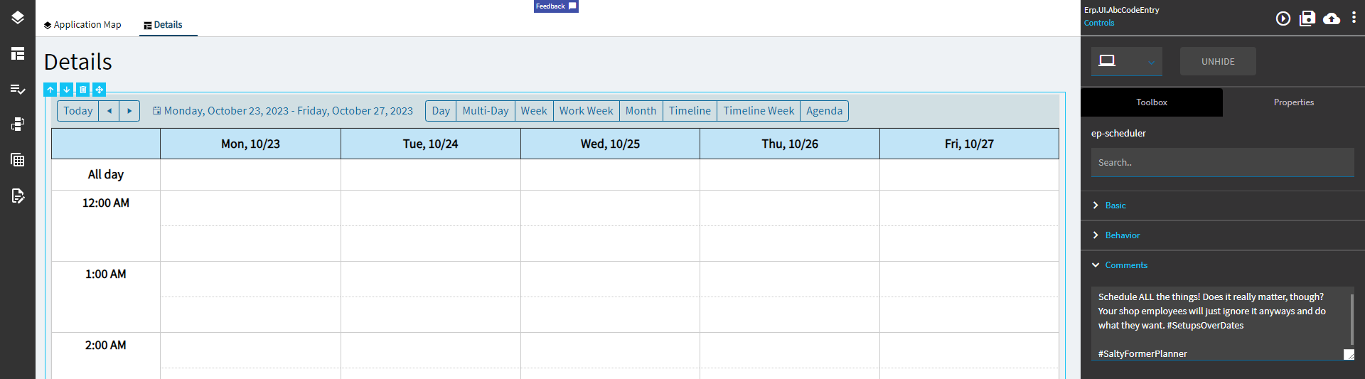
Figure B: Column Bindings
Remember, these come from whatever DataView you specified in the Data > EpBinding
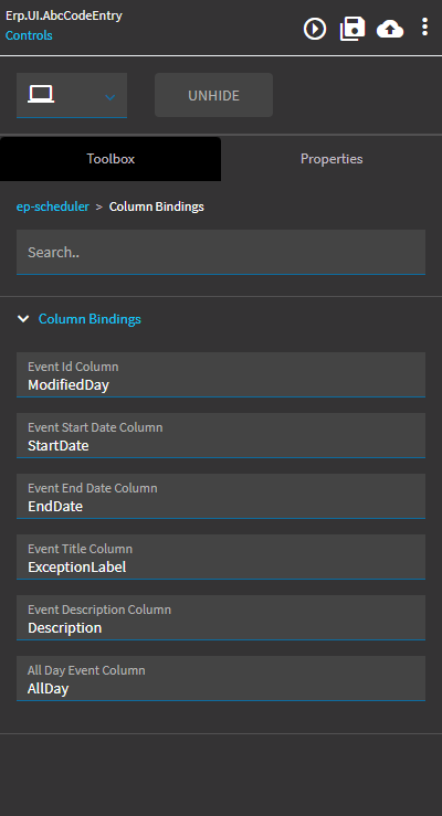
Figure C: Editable
Probably should add some condition to the double click event, but I’m too lazy. I’m sure y’all can figure that but out.
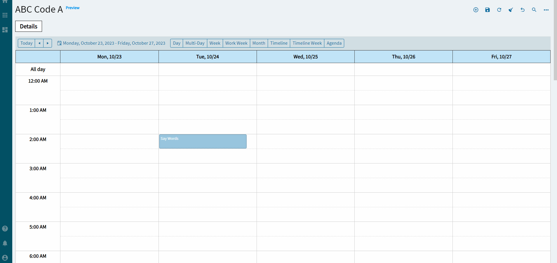
Figure D: Width
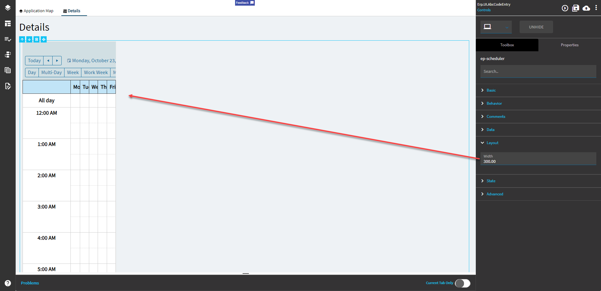
Figure E: Disable Views
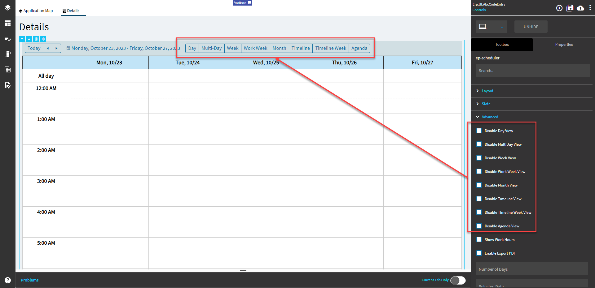
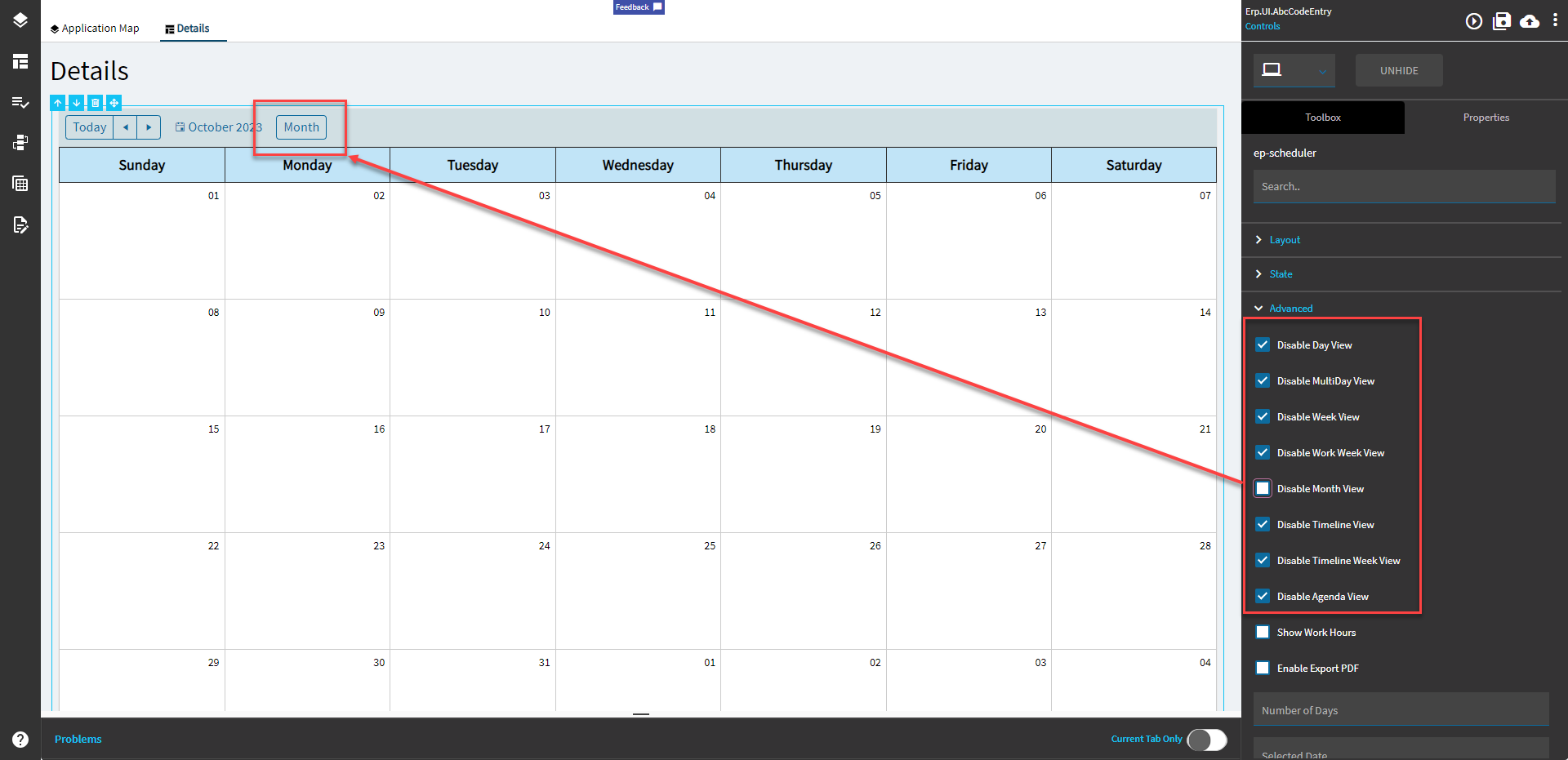
Figure E: Show Work Hours
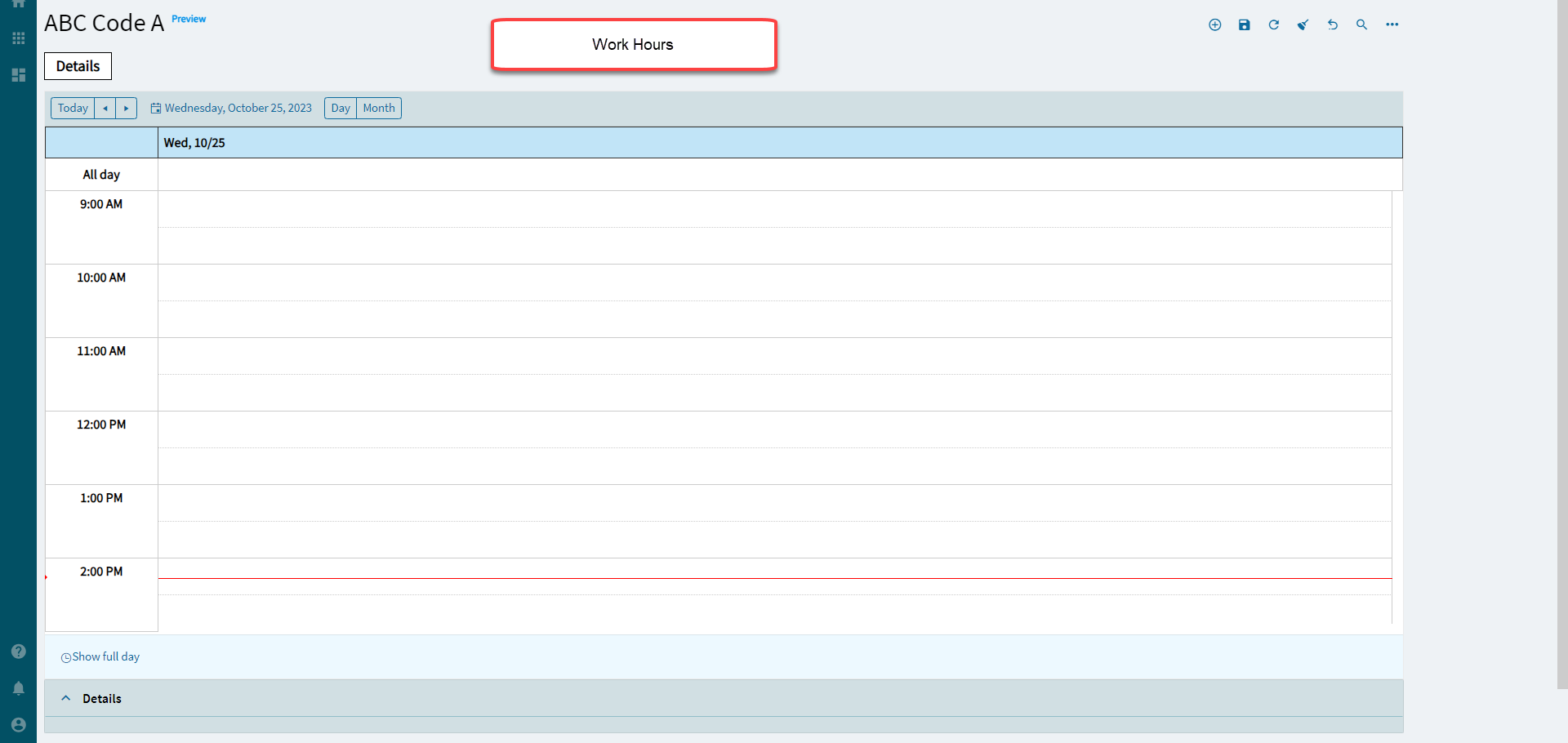
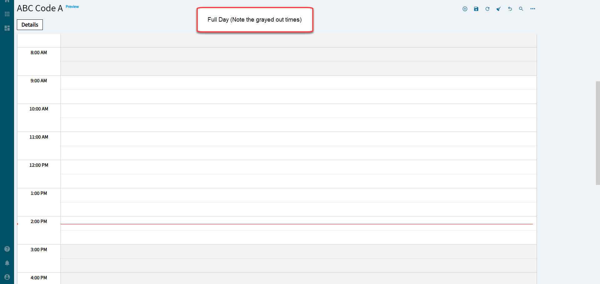
Figure G: Enable Export PDF
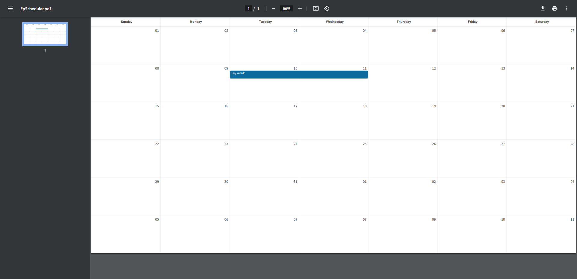
Figure H: Number of Days
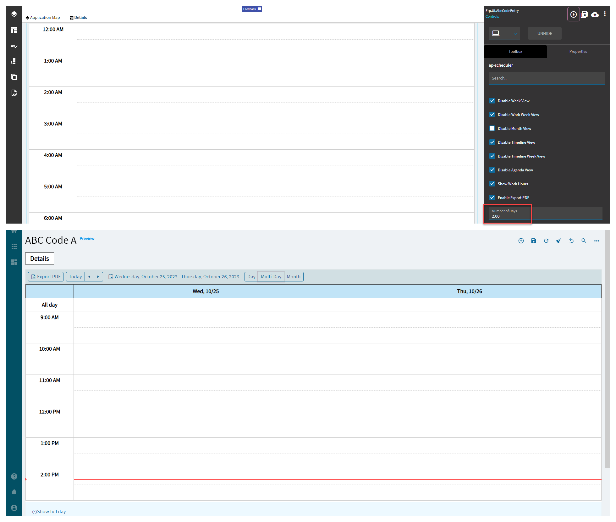
Figure I: Work Start and End Times
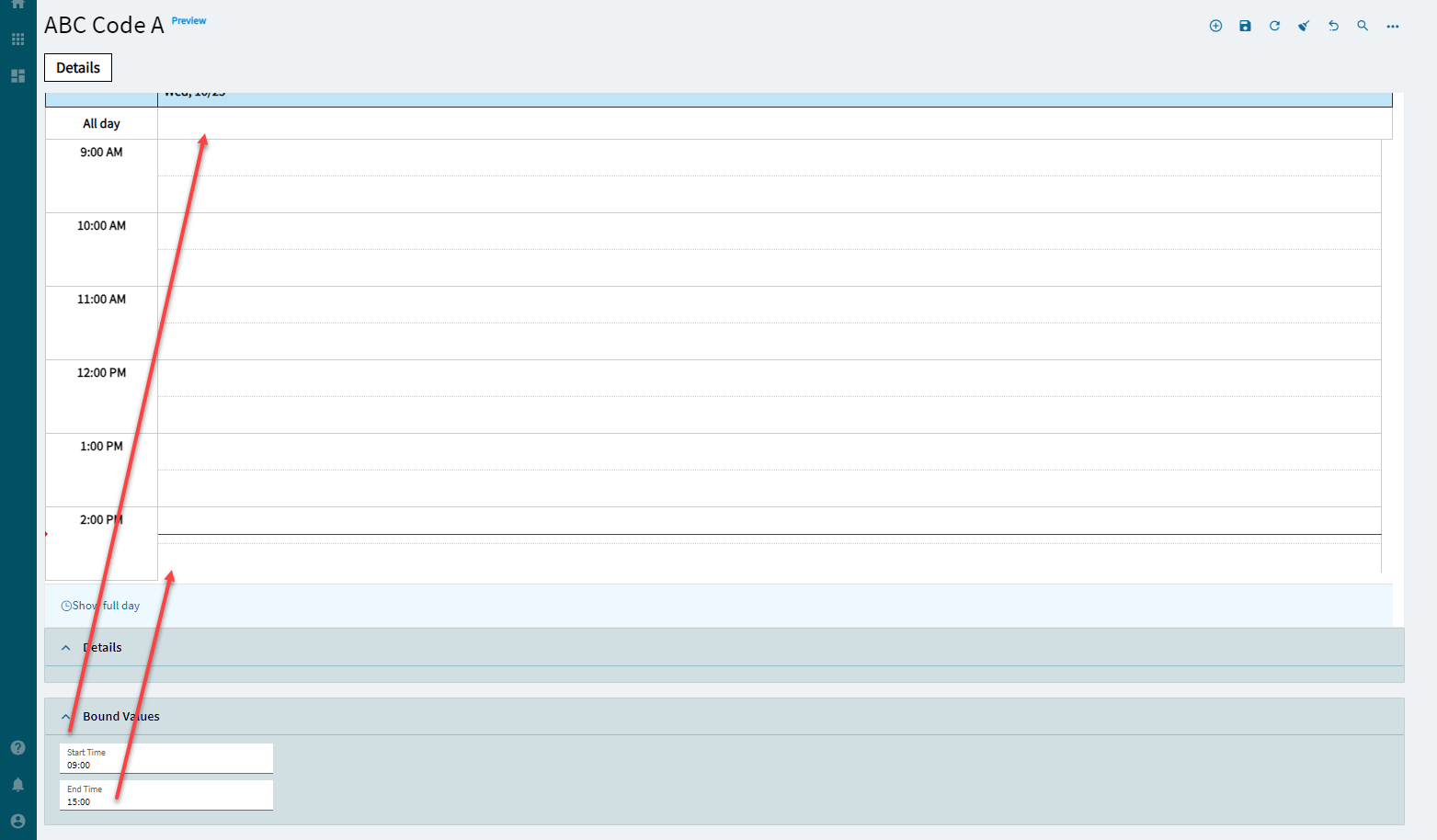
Figure J: Selected Date
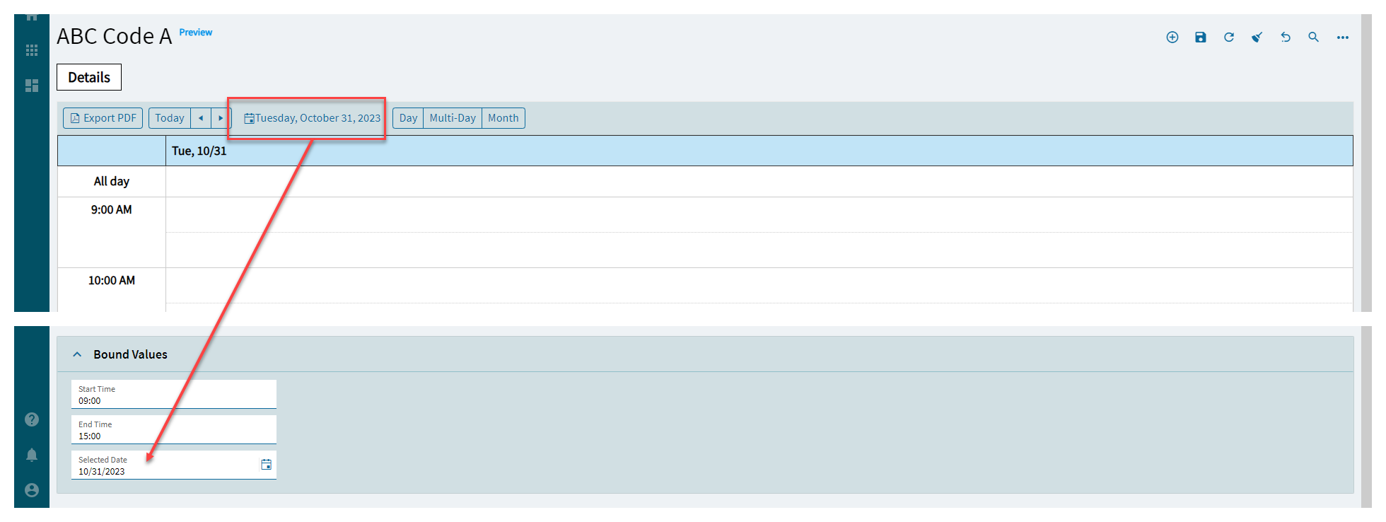
Figure K: Number of hours to be displayed
Appendix
DataViews
Create a dataview to hold the column bindings and to bind your grid to.
Slider
Create a slider or some other method for data input. All fields in the slider are bound to the “TransView” variation of the previous dataview. For instance, cdv_Calander.StartDate = TransView.StartDate on the slider. Don’t bind them to the cdv_Calander or it will create records upon opening.
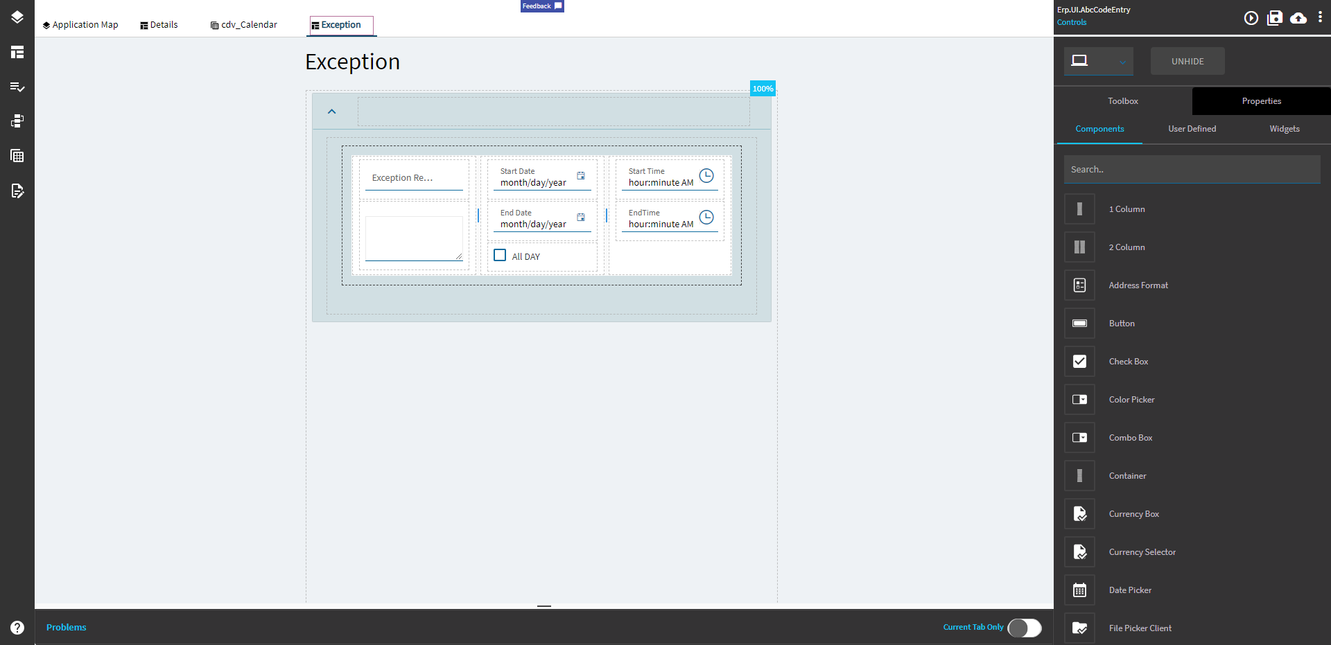
Don’t forget to add some buttons. (Delete is unnecessary if you make the Scheduler editable)

Events
ce_calendar_onDoubleClick
Double click event to add a new item to the calendar. This initializes the TransView fields and then opens the slider.
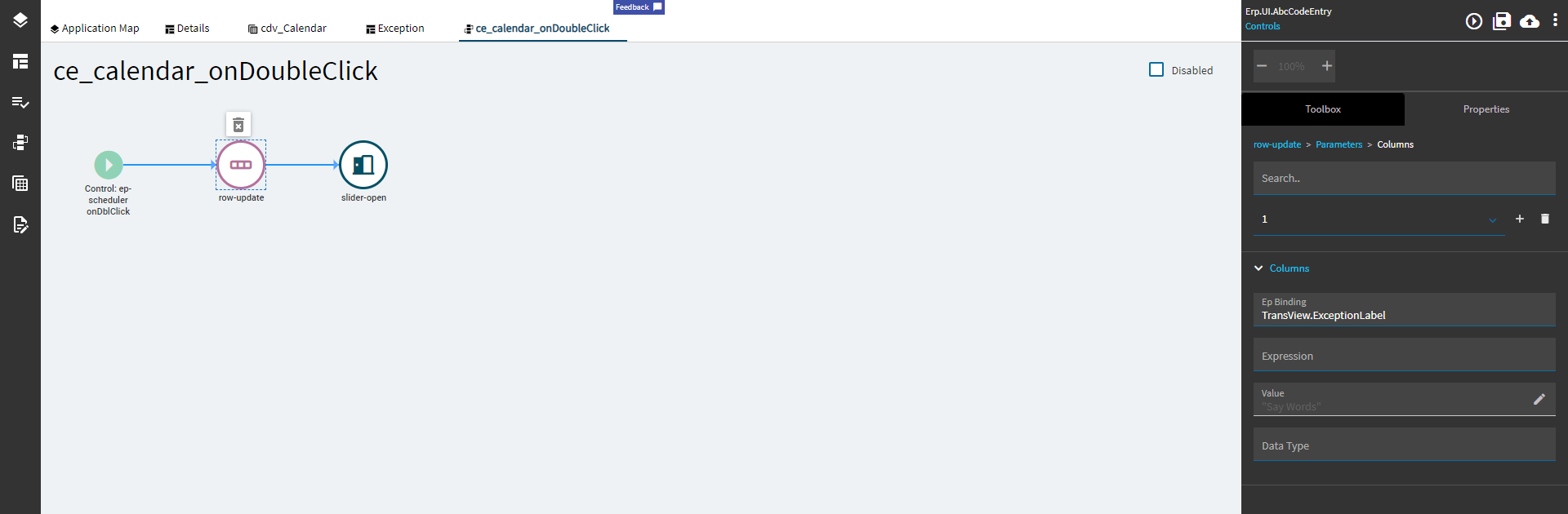
I had to do some JS magic to get the fields to do what I wanted.
Here are each of the row-update items:
EpBinding: TransView.StartDate
Expression: new Date(new Date("%startDateTime%").setHours(0,0,0,0))
Notes: %startDateTime% is a built-in variable that will get the start date and time from the scheduler when you double click. For instance, if you click 10/14/2023 @ 1:00AM, the variable will yield 2023-10-14T01:00:00Z (24 hour time). The setHours(0,0,0,0) is to zero out the time and only provide the date since I’m setting the time in a different control.
EpBinding: TransView.StartTime
Expression: (new Date("%startDateTime%").getHours() * 3600) + (new Date("%startDateTime%").getMinutes() * 60) + (new Date("%startDateTime%").getSeconds())
Notes: This is converting the hours, minutes, and seconds into a seconds from midnight value.
EpBinding: TransView.EndDate
Expression: new Date(new Date("%endDateTime%").setHours(0,0,0,0))
Notes: %endDateTime% is a built-in variable that will get the end date and time in 30 minute increments from the scheduler when you double click. For instance, if you click 10/14/2023 @ 1:00AM, the variable will yield 2023-10-14T01:30:00Z (24 hour time). The setHours(0,0,0,0) is to zero out the time and only provide the date since I’m setting the time in a different control.
EpBinding: TransView.EndTime
Expression: (new Date("%endDateTime%").getHours() * 3600) + (new Date("%endDateTime%").getMinutes() * 60) + (new Date("%endDateTime%").getSeconds())
Notes: This is converting the hours, minutes, and seconds into a seconds from midnight value.
EpBinding: TransView.AllDay
Value: false
EpBinding: TransView.Description
Value: ""
EpBinding: TransView.ExceptionLabel
Value: "Say Words"
EpBinding: TransView.StartDateTime
Value: "%startDateTime%"
Notes: This is my unique ID for column binding. Again, might be better to use a GUID, but I just followed what Epicor did and it seems to work fine.
ce_SliderOK
This event adds the new records to the dataview and subsequently adds the visual to the calendar.
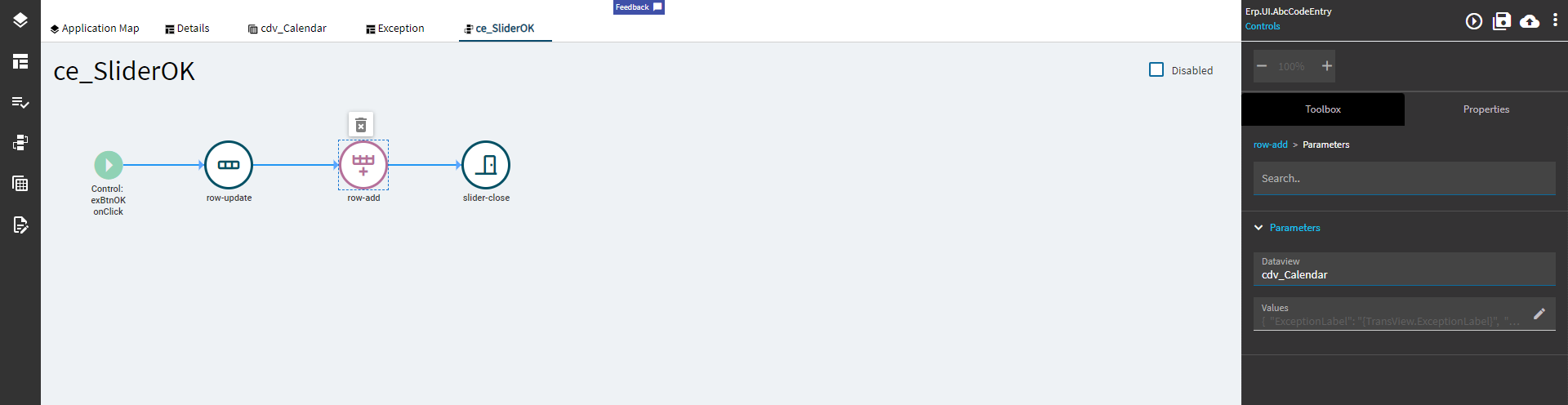
Again, some more JS magic for the row-update.
EpBinding: TransView.StartDate
Expression: new Date((new Date("{TransView.StartDate}")).setSeconds((new Date("{TransView.StartDate}")).getSeconds() + {TransView.StartTime}));
Notes: This is adding the seconds from the time control to the date control.
EpBinding: TransView.EndDate
Expression: new Date((new Date("{TransView.EndDate}")).setSeconds((new Date("{TransView.EndDate}")).getSeconds() + {TransView.EndTime}));
Notes: This is adding the seconds from the time control to the date control.
row-add
DataView: cdv_Calander (or whatever yours is called)
Values:
{
	"ExceptionLabel": "{TransView.ExceptionLabel}",
	"ModifiedDay": "{TransView.StartDateTime}",
	"AllDay": "{TransView.AllDay}",
	"Description": "{TransView.Description}",
	"StartDate": "{TransView.StartDate}",
	"EndDate": "{TransView.EndDate}"
}
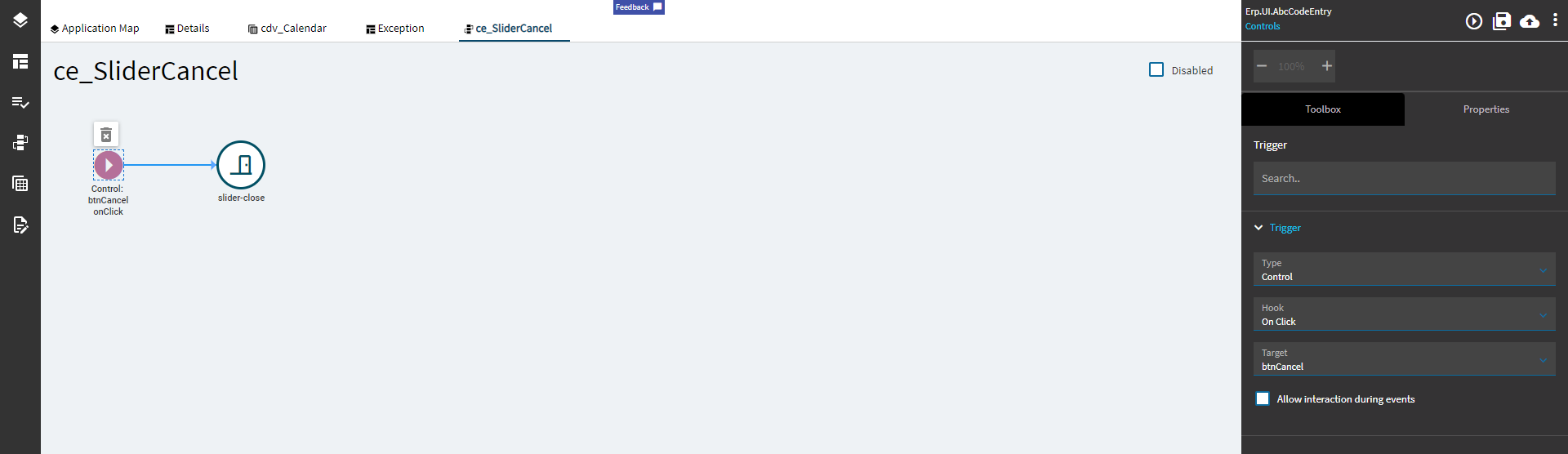
ce_SliderCancel
Just closes the slider without modifying data.
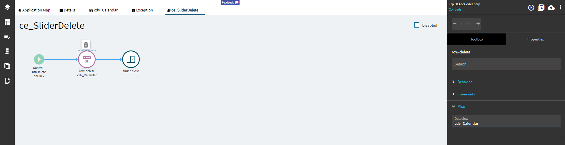
ce_SliderDelete
Again, this is unnecessary with the editable button, but here it is for demonstration purposes.