Hi
Anybody know what the bars underneath a graph on EDD are supposed to represent, and how to turn them off? I guess @bconner would know 

Thanks!
Hi
Anybody know what the bars underneath a graph on EDD are supposed to represent, and how to turn them off? I guess @bconner would know
Thanks!
it maybe due to record count going in negative?
Good idea, but I don’t think it’s that. The record count is all positive. It’s almost like those bars are a small representation of the larger bars - but it seems pointless to me!
Use this lower portion of the bar chart to select a range and the top portion will display the range selected.
I don’t know how to turn this off.
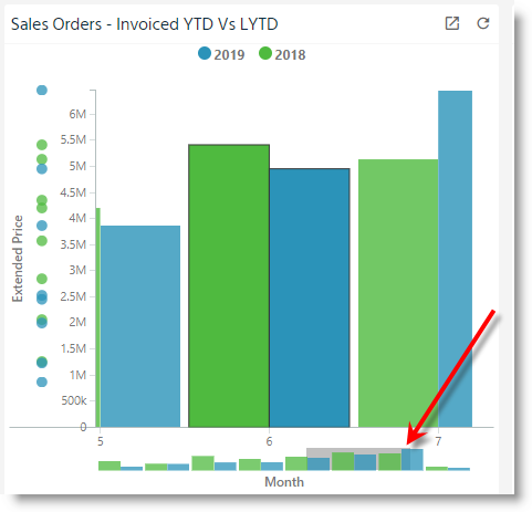
@mhelfrey is correct. The micro chart is for zooming and scrolling. so is the rugplot on the left of that chart example which also shows a bit of value distrubtion info. We’re changing the way this looks and when it appears slightly in the future so it’s more obvious what it’s for.
also sorry there’s no way to turn these off. There’s a small design issue here in that I only intended the scroller on the bottom to show up when the chart has a lot of members or you’ve zoomed in. aka - act like a scrollbar when it’s visible or not but we made it just visible all the time. So that’s what we’re correcting in the future.
Cool thanks for the explanation - I would vote for an option to disable this too. Sometimes it will be helpful, other times just want a clean looking KPI sheet.
Only just started using EDD in anger, it’s great - though confusing on the config. Where do I find guides on how to use?