EDIT: THANK YOU ALL for your very quick response. I “guaranteed” my team members that I could get a quick 5-10 interested parties by the end of Friday… Instead, you came through with 13… and over the weekend, another 6. You came through… we now have 19 people who have applied including 3 partners. So… for now, I will be closing the books, and no longer need additional participants.
Thank you all again!
Tim Shoemaker.
Hey all… you are always so helpful in giving your opinions (that was me buttering you up)… We need some help to know if we are approaching a change in the correct manner.
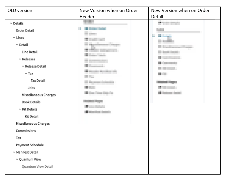
What we want to review is a proposed change to how the Navigation tree within ALL Kinetic screens could work in the future. It has been determined through your feedback (Epicor Ideas, Insights, phone calls, support calls) that we need to adjust how the nav tree works (see current nav tree below).
OUR ASK:
We need several customers to participate in a one-on-one session with one of our designers to see Navigation Tree 2.0
We need your opinions, insights, and feelings about what you observe.
What you will do:
Participate in a brief overview
test the new changes to see if you find it easier to navigate
answer a Q&A at the end so we can gather more information about the results.
CANDIDATE CRITERIA: A successful candidate will have, at a minimum the following:
Know and use the new Kinetic screens,
know and understand how to navigate with the current tree view.
Your company runs on Kinetic 2021.2 or above
You run in the cloud, or on prem (It doesn’t matter)
You are interested in making the Kinetic world a better place
I’d jump at this but we’re not using the new screens yet.
However - the obscured version already looks to be an improvement - nothing I dislike more than whitespace for no reason - and causing me to scroll for no reason. Eliminate both of those and you have my vote!
the color you are seeing may be some weird graphic problem when i expanded the view… but also… we are looking at adding a little arrow to show the card rather than just bolding the card to show your current location
Clarification… you do not need to be live to have experience with the new screens… so if you have been using/testing the new screens on a current version, we also want your opinion.
well… it is not released yet… it isn’t even programmed yet… so anything that we show has to be covered by Safe Harbor statements… Theoretically, even the fact that I am saying it might change is covered by Safe Harbor. I dont want anybody to make assumptions based on a screenshot without seeing the whole story, which is why I am hiding it.
I think an arrow will be confusing, as it is used in every treeview ever since the advent of graphical computing to show hierarchy. A highlighted background on the current row would make more sense, probably with a pale color… To me an arrow means “click me and I will expand into a list”.
Apply to participate and share your concerns directly with the appropriate party folks we won’t solve anything in this thread. Nor should we, Epicor wants to do this the right way and speak to us one on one about it. Do it, it will be well worth it in the end for all of us.
well, you all came through… I promised my management that I could get 5-10 volunteers by the end of friday… we now have 16.
So… no more people needed at this time, but we may come back to show more once we refine things.
it is hard to judge without seeing the new view… it is not my design, but after seeing it, i felt that it was so much better than before. BUT as I was taught in Product Management school… My opinion doesn’t count. what counts is the opinion of the customer.
I’ve seen the full design and in that context of the design it looks less like an arrow and more like a selected item indicator. In the screenshot above in isolation it looks more like an expand me than it really is.
I really miss seeing the data in the tree… a List of Details (Order Lines) clickable to go to the row. Thats probably the only feedback I have at this time.