Multiview Calendar
The Multi-View calendar is an Angular form control that represents a graphical Gregorian calendar with multiple horizontal views. It supports the selection of and navigation between dates as well as data templates and ranges for scheduling appointments.
| Property Group | Property | Description |
|---|---|---|
| Basic | Id | Unique identifier for the control |
| Basic | Label Text | Sets the label within the control. (Fig. A) |
| Behavior | On Blur | Click this to create an OnBlur event for the control. On Blur is triggered when the control loses focus. |
| Behavior | On Create | Click this to create an OnCreate event for the control On Create is triggered when the control is painted to the GUI. |
| Comments | Comments | Add some developer notes to the control. These are not customer-facing and are only visible in App Studio (Fig. B) |
| Data | Key Field | Indicates that a bound component is a key field. If true, the field is enabled if there is no current record, allowing the user to select an existing record or create a new one. |
| Data | EpBinding | Bind the button to a DataView.Column. |
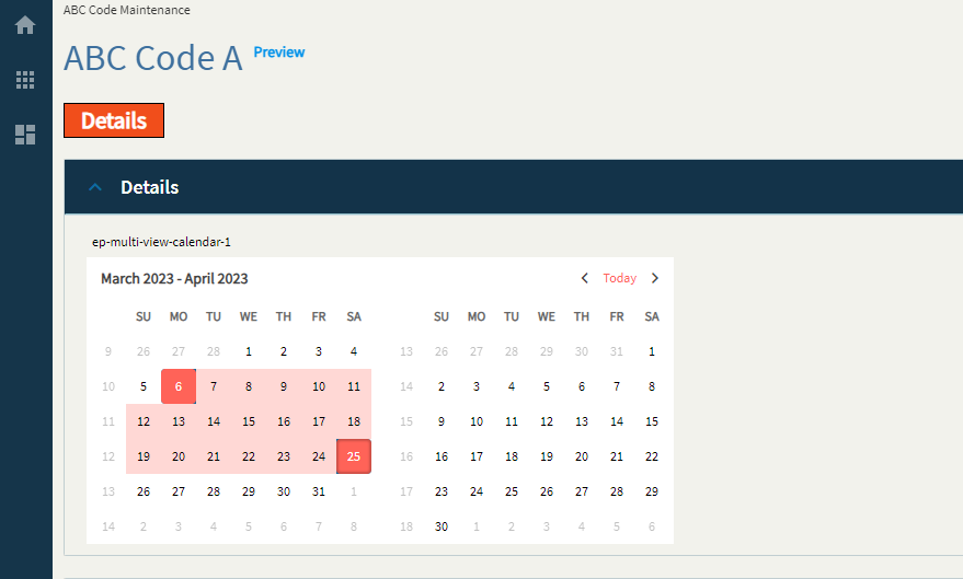
| Data | Range Start EpBinding | Set the data binding to hold the start date of the selected range. Only used if the “Range Selection” property is enabled. (Fig. C) |
| Data | Range End EpBinding | Set the data binding to hold the end date of the selected range. Only used if the “Range Selection” property is enabled. (Fig. C) |
| Data > Selection Range | Sets or gets the selection range property of the calendar and defines the selection range of the component. This really only works if the Range EpBindings are null. | |
| Data > Selection Range | Range Start Date | The default start date for the range. |
| Data > Selection Range | Range End Date | The default end date for the range. |
| Layout | Alignment |
 Set the alignment for the control. Valid options are Left, Center, Right. Kinda wonky depending on where it’s placed… (Fig. D) Set the alignment for the control. Valid options are Left, Center, Right. Kinda wonky depending on where it’s placed… (Fig. D) |
| Layout | Width |
Sets the specific width (pixels) for the control. (Fig. E) |
| Layout | Months Displayed | Show the number of months. By default this is 2. (Fig. F) |
| State | Personalizable | If true, a user can personalize this component(hide/show) |
| State | Customizable | If true, a user can customize this component in child layers |
| State | Hidden | Hides the control from view. |
| State | Disabled | Disables the control. The control will not allow editing or focus. |
| State | Read Only | Makes the control read only so that it will not allow editing. The control can still be focused. |
| State | Auto Focus | When enabled, the control is automatically focused on creation. |
| Advanced | Range Selection | Set to enable a range selection. Otherwise, this will be single select. |
| Advanced | Range Validation |
Supposed to enforce some min/max validators, but those do not exist on this control, so this does not work. |
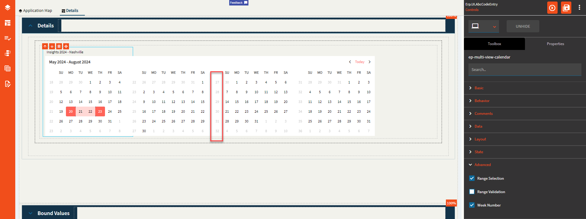
| Advanced | Week Number | Set to display the week number column. (Fig. G) |
Figure A: Label Text
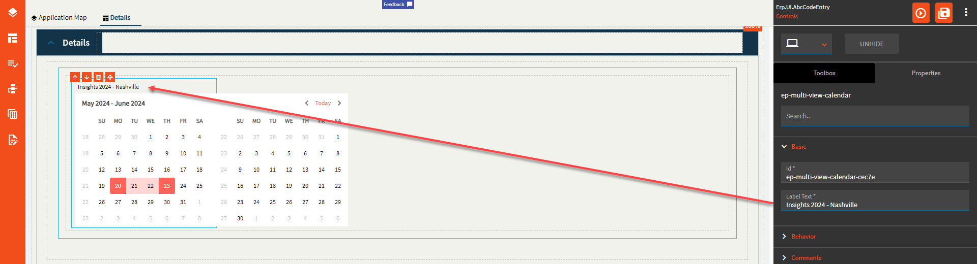
Figure B: Comments
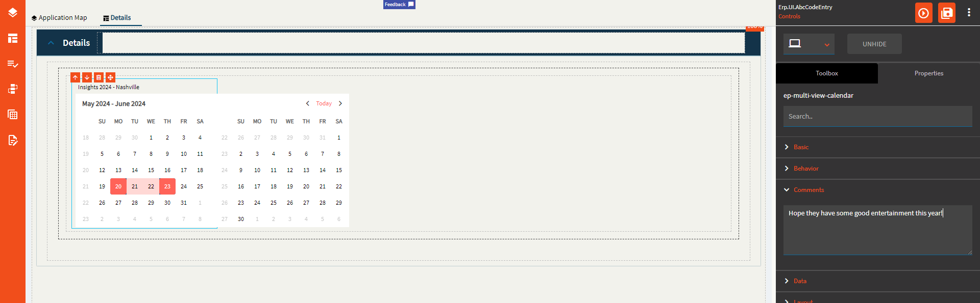
Figure C: Range EpBindings
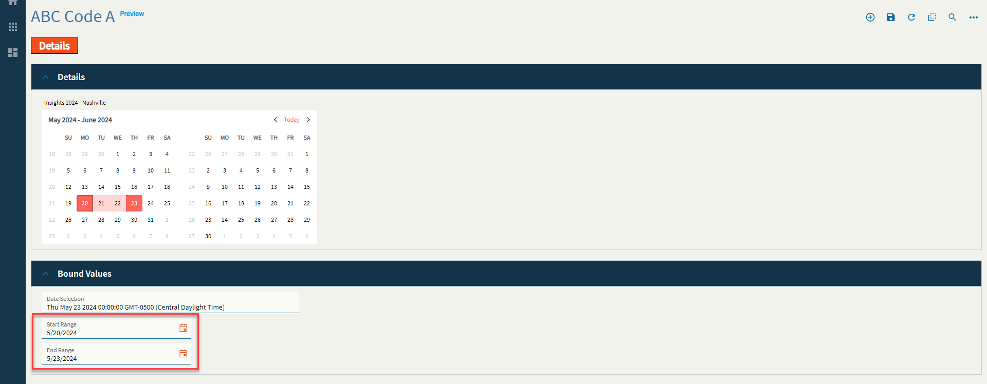
Figure D: Alignment
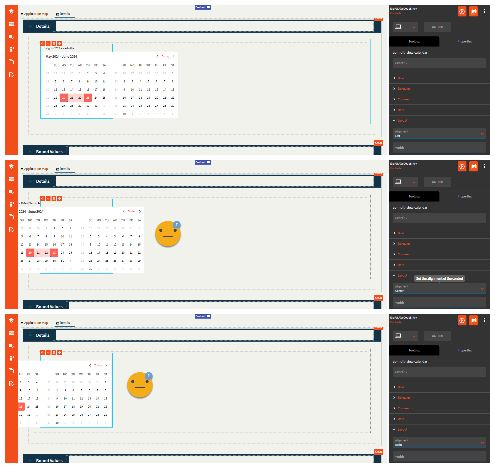
Figure E: Width
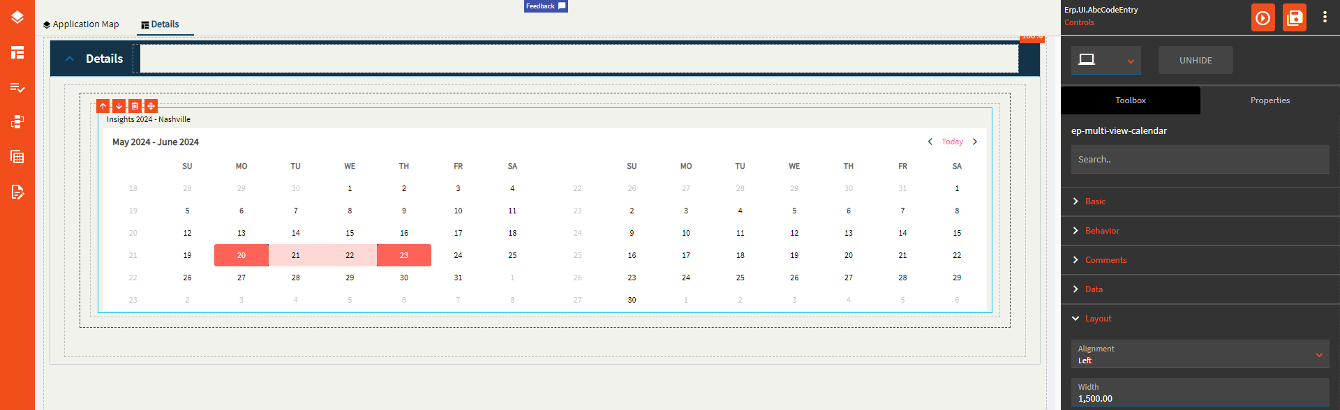
Figure F: Months Displayed
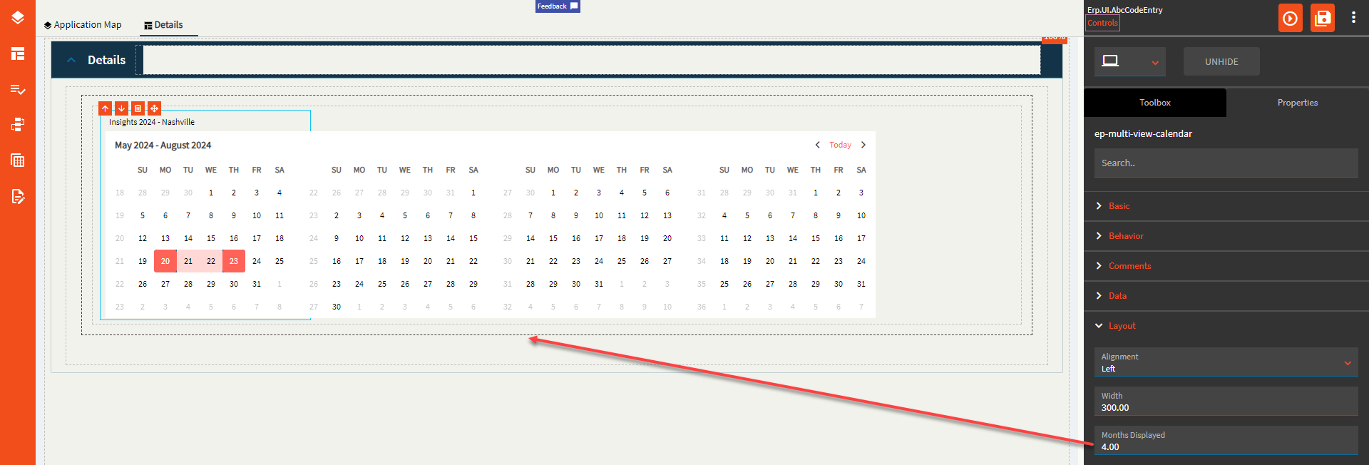
Figure G: Week Number