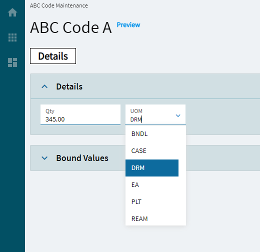
Quantity UOM
This control is a combination of a numeric box and combo combined into one control.
| Property Group | Property | Description |
|---|---|---|
| Basic | Id | Unique identifier for the control |
| Behavior | On Blur | Click this to create an OnBlur event for the control. On Blur is triggered when the control loses focus. |
| Behavior | On Create | Click this to create an OnCreate event for the control On Create is triggered when the control is painted to the GUI. |
| Comments | Comments | Add some developer notes to the control. These are not customer-facing and are only visible in App Studio (Fig. A) |
| Data | Key Field | Indicates that a bound component is a key field. If true, the field is enabled if there is no current record, allowing the user to select an existing record or create a new one. |
| Data | EpBinding | Bind the control to a DataView.Column. |
| Data > Quantity Model > Basic | Qty Label Text | Sets the label for the quantity portion of the control. (Fig. B) |
| Data > Quantity Model > Data | Qty EpBinding | Sets the data binding for the quantity potion of the control. Format is DataView.Column. |
| Data > Quantity Model > Advanced | All Properties | These are reviewed in the advanced section of the numeric control |
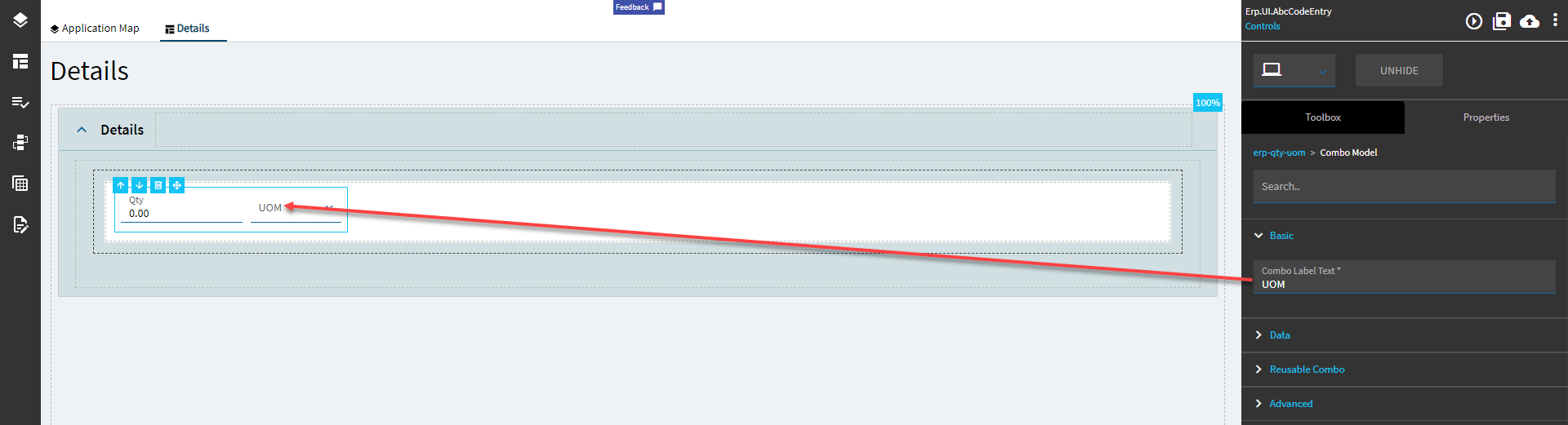
| Data > Combo Model > Basic | Combo Label Text | Sets the label of the combo portion of the control. (Fig C.) |
| Data > Combo Model > Data | EpBinding Text Column |
 Defines the column to get the label text value from, at least it’s supposed to. Narrator: It does not. Defines the column to get the label text value from, at least it’s supposed to. Narrator: It does not. |
| Data > Combo Model > Data | Combo EpBinding | Sets the data binding for the combo potion of the control. Format is DataView.Column. |
| Data > Combo Model > Reusable Combo | All Properties | Nothing needs to be set here. It pulls in the UOMs by default by using some unknown magic; it has some preset filters, but no known datasource. #Shrug If you care to override it, review the Reuseable Combo section of the Combo control here. |
| Data > Combo Model > Advanced | All Properties | Nothing needs to be set here. It pulls in the UOMs by default by using some unknown magic; it has some preset filters, but no known datasource. #Shrug If you care to override it, review the Reuseable Combo section of the Combo control here. |
| Layout | Alignment |
Sets the alignment of the control. Does not seem to work. |
| State | Personalizable | If true, a user can personalize this component(hide/show) |
| — | — | — |
| State | Customizable | If true, a user can customize this component in child layers |
| State | Hidden | Hides the control from view. |
| State | Disabled | Disables the control. The control will not allow editing or focus. |
| State | Read Only | Makes the control read only so that it will not allow editing. The control can still be focused. |
| State | Auto Focus | When enabled, the control is automatically focused on creation. |
Figure A: Comments
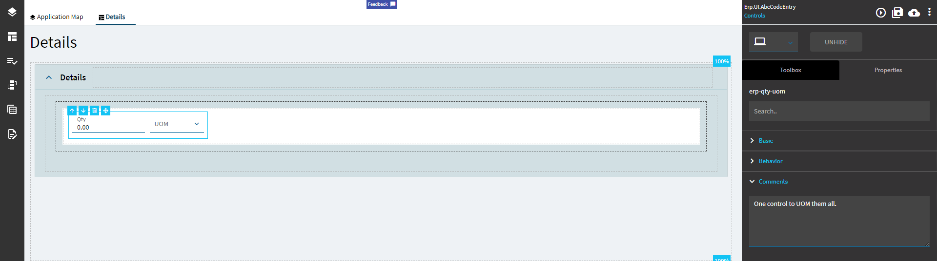
Figure B: Qty Label Text
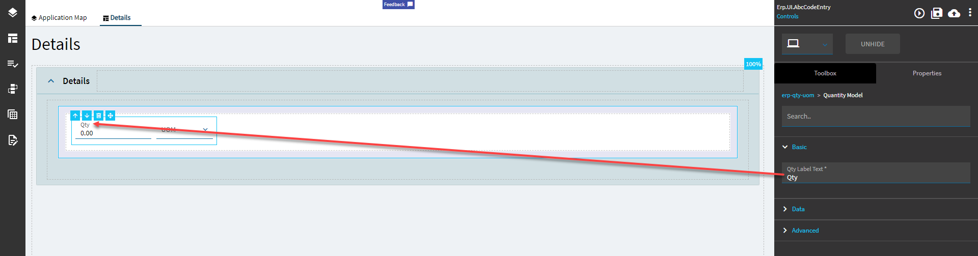
Figure C: Combo Label Text